|
Chapter 8
Exploration and
Transformation of Data
So far we have examined techniques for handling data when we believe the following:
1. The data are modeled by a linear relationship, especially a straight line or curve.
2. The data are modeled by a nonlinear relationship, such as a Gaussian.
3. The data are "smooth" in some sense and/or can be described by some nonparametric fit.
4. The data contain "outliers" which should be suppressed in the context of the analysis.
Sometimes we are confronted by data about which we have no knowledge of the relations that may exist within it, or what sort of values might be expected for some relation or model. This chapter discusses some techniques for exploring such a data set. As we shall see, sometimes the exploration leads us to transform the original data into other forms.
Also included in Section 8.3 is a discussion of the EDA function FindPeaks briefly introduced in Chapter 5.
Section 8.4 discusses a convenience routine FitPeaks which bundles FindPeaks and FindFit together for fitting reasonably simple spectra to Gaussians or Lorentzians; the routine is named FitPeaks. Also discussed in this section is another convenience routine FitExponent to automatically fit data to exponentials of the form y = A  without introducing the biases inherent in simple linearization schemes. without introducing the biases inherent in simple linearization schemes.
Mathematica is a particularly rich environment for exploratory data analysis, and there is a growing literature on using it for this purpose. This chapter does not attempt to repeat the material readily available elsewhere. Some references are listed in Section 8.4.
8.1 Graphical Exploration
As we have seen repeatedly in the previous chapters, graphs are invaluable in data analysis. Experimental Data Analyst (EDA) supplies some specific graphics functions, such as ShowLinearFit discussed in Chapter 4. EDA also supplies some general purpose graphical functions that supplement the standard graphics routines of Mathematica, and those functions are described in this section.
8.1.1 EDAListPlot
The EDA function EDAListPlot was briefly introduced in Chapter 1. Here we review and extend that introduction.
One primary advantage of EDAListPlot over the built-in Mathematica function ListPlot is that it recognizes the data format of EDA. Thus, if the data contain errors in one or both coordinates, those error bars will be automatically displayed by EDAListPlot.
EDAListPlot can also handle more than one data set in a single plot. We generate two made-up data sets.
In[1]:=
In[3]:=
In[4]:=

EDAListPlot can also use different symbols for the different data sets.
In[5]:=
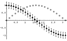
Here is the simple syntax for PlotSymbol.
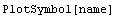 Here is another syntax.
 Both forms can take an optional Filled -> False option. Possible values for name are: Star, Diamond, Box, or Triangle.
EDAListPlot also automatically loads the Graphics`Legend` package that is standard with Mathematica, so we can use legends to label the plot.
In[8]:=

Finally, if EDAListPlot is given a single data set which does not contain explicit errors and the number of data points is "small", it will display the data points with a small diamond.
In[9]:=

If we have a "large" number of data points, the data points are displayed as dots.
In[10]:=
In[11]:=

In fact, in this case EDAListPlot has invoked ListPlot to do the graph. The number of data points above which ListPlot will be invoked is controlled by the ListPlotThreshold option to EDAListPlot. Its default value is 100.
We can force EDAListPlot to do the plot itself for mydata3 by setting ListPlotThreshold above the number of data points.
In[12]:=
Out[12]=
In[13]:=

8.1.2 EDAHistogram
The histogram is a popular way to view the distribution of values of a sample of data, and EDA supplies a function, EDAHistogram, to produce them.
Critics of high energy physics have sometimes accused researchers in that field of doing little beyond hunting bumps in histograms. We will introduce the EDAHistogram function with some data from high energy physics.
In[1]:=
In[2]:=

In[3]:=

In[4]:=

If the K*(1780) decayed by just "falling apart", the above plot should be uniformly populated in the central region. We see clearly that this is not the case here.
We form a histogram of the invariant mass (not mass squared) of the (K0, Pi-) combination.
In[5]:=

The peak corresponds to the formation of the "resonance" K*(890), which then decays into (K0, Pi-).
Similarly we can examine the (Pi+, Pi-) mass.
In[6]:=
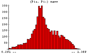
This shows the formation of the Rho(780), which then decays into (Pi+, Pi-).
By default, EDAHistogram chooses a "reasonable" number of bins and spreads the horizontal axis from the minimum to the maximum values. The number of bins can be controlled by adding a second argument, which is the number of bins.
 Full control of the histogram can be achieved by calling it with four arguments.
 Here min is the left-hand side of the histogram and max the right-hand side. We give an example of this form.
In[7]:=

This displays the data in 75 bins from 0.5 through 1.25. Note that some data has been lost on the left- and right-hand sides of this plot. We can display these "underflows" and "overflows" by setting the ShowAll option to True.
In[8]:=

Internally, EDAHistogram uses the GeneralizedBarChart function in the Graphics`Graphics` package that is standard with Mathematica. With the exception of the ShowAll option discussed above, all other options to EDAHistogram are passed to GeneralizedBarChart.
8.1.3 BoxPlot
The box plot, sometimes called the "box and whisker plot", is a way of visualizing distributions of data. We will illustrate with some data taken by Darwin in 1878.
In[1]:=
In[2]:=

In[3]:=

In[4]:=

The data are some of the most analyzed ever, largely in pedagogical contexts. We form histograms of the two data sets.
In[5]:=

This seems to indicate that the cross-fertilized plants are somewhat larger.
The statistical reports, after some digging, seem to indicate the same.
In[6]:=
In[7]:=
Out[7]=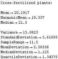
In[8]:=
Out[8]=
However, the EDA function BoxPlot shows the effect of fertilization clearly.
In[9]:=

The "waist" in each box (which is actually two joined trapezoids) is the median of the data, the "shoulders" are at the upper quartile, and the "hips" are at the lower quartile. The vertical lines from the shoulders and hips extend to the maximum/minimum values of the data which are less/greater than the cutoffs; the cutoffs are the upper/lower quartiles plus or minus 3/2 of the height of the box, respectively. Any data that are represented as a point in the box plot is outside the cutoffs; there is one such datum in each of the data sets shown above.
Darwin threw out the data from Pot #1, which are the first three data points out of 15 for each sample; one of the plants died, another was diseased, and a third never grew to full height although a cause was not identified. The histograms and descriptive statistics are not very helpful in seeing the effect of throwing out this data.
In[10]:=

In[11]:=
Out[11]=
In[12]:=
Out[12]=
Using BoxPlot makes the comparison easy.
In[13]:=

In particular, since the box plot is based on robust descriptors of data such as the median and the quartiles, the effect of throwing out the three data points is shown to have virtually no effect on our conclusions regarding the fertilization's influence on plant growth.
Internally, BoxPlot uses the graphics primitives Point and Line. Options given to BoxPlot are passed to the Show function, and the defaults differ from the defaults for Show only in setting Frame -> True and PlotRange -> All.
8.1.4 Log and Log-Log Plots
The standard add-on Mathematica package Graphics`Graphics` contains the functions LogListPlot and LogLogListPlot to do log plots and log-log plots. As a convenience, EDA includes two routines that take data formatted for EDA, reformats it, and passes it to the functions in Graphics`Graphics`. The convenience routines are named EDALogListPlot and EDALogLogListPlot. Any explicit errors in the data are ignored and all options are passed to LogListPlot or LogLogListPlot.
Reference: Wolfram Research, Mathematica 4.0 Standard Add-on Packages.
8.1.5 Summary of General Purpose EDA Graphics Routines
In[1]:=
In[2]:=

In[3]:=
Out[3]//TableForm=
In[4]:=

In[5]:=

In[6]:=
Out[6]//TableForm=
In[7]:=

In[8]:=

In[9]:=
Out[9]//TableForm=
In[10]:=

In[11]:=

8.2 Transforming Data
There are three similar reasons why one may wish to transform a data set. First, sometimes the data itself suggests a transformation. Second, it can happen that a model exists for the data, but the model is not formulated directly in terms of the variables of the data. Third, a transformation can sometimes point out hidden features of the data. In this section, we will examine these three related cases. No new functions from EDA are introduced in this section; rather, Mathematica built-in functions and EDA functions discussed previously are used to perform transformations of the data.
8.2.1 The Data Itself Suggests a Transformation
We begin by considering some data on the population of cities.
In[1]:=
In[2]:=

In[3]:=

Using the BoxPlot function discussed in the previous section, we examine this data.
In[4]:=

Some of the features of the data include the fact that, with two exceptions, all countries' city populations are skewed toward larger cities. We also see that for every country but one (the Netherlands) the biggest city is designated as an outlier.
The feature of the data seen above that will be of most concern here is the fact that as the median (the "level") of the population increases, the height of the box (the "spread") also tends to increase. In order to compare the data for the various countries, we will seek a transformation that minimizes the change in the spread with the level.
For this particular data, there is some theoretical justification for choosing a logarithmic transformation, since many models assume that populations tend to grow exponentially. We form the box plot for the logarithm of the populations.
In[5]:=

Even if we were ignorant of demography, we will show that the data itself suggests a logarithmic transformation.
Suppose that the spread is proportional to a power of the median.
 Take the logarithm of both sides.
Log[ spread ] = Log[ c ] + b * Log[ median ]
Thus, a fit of Log[spread] versus Log[median] to a straight line allows us to estimate b. Then we do a transformation of the data.
transf = original^(1 - b)
This transformation will, at least approximately, eliminate the dependence of spread on level.
In practice, we only estimate (1 - b), which leads to the following table.
In[6]:=
Out[6]//TableForm=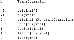
This is often called Tukey's "ladder of powers".
The transformation Log[original] when (1 - b) is zero may seem to be artificial, but it is not. In fact,  behaves much like the logarithm when (1 - b) is close to zero. For example, the derivative of Log[x] is 1/x, and the derivative of behaves much like the logarithm when (1 - b) is close to zero. For example, the derivative of Log[x] is 1/x, and the derivative of  is proportional to is proportional to  . .
When in doubt about what transformation to try, the logarithm is usually a good first choice. The reason is that often the factor we are trying to eliminate is multiplicative instead of additive, such as perhaps some percentage of the variable. A logarithmic transformation will give equal differences in the case of equal multiplicative factors.
Applying the ladder of powers to the population data, we first extract the quartiles.
In[7]:=
In[8]:=
Out[8]=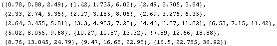
The medians are the center value of each triple.
In[9]:=
Out[9]=
We calculate the quartile spreads.
In[10]:=
Out[10]=
Thus, we form a data set of { median, spread }.
In[11]:=
We fit the logarithms to a straight line with the EDA LinearFit function; since mydata is not the normal type of experimental data the program was mainly designed for, we set the Reweight option to False.
In[12]:=

Out[12]=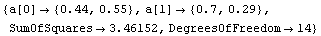
The slope is between 0.4 and 1.0. The latter suggests the logarithmic transformation we have already examined, while the former suggests a square-root transformation.
In[13]:=

This transformation also reduces the dependence of spread on the median, although perhaps not as well as the logarithmic one.
Although we have been dealing with transformations as a tool to enhance visual comparison, these sorts of transformations are sometimes necessary in order to use common confirmatory methods. For example, classical analysis-of-variance models assume constant variance within groups.
A similar example of when transformations can be required or preferred is illustrated by the ganglion data which we have already examined in Chapters 4, 6, and 7.
We will load the data and review the fit to a parabola which we have made to it.
In[14]:=

In[15]:=

Remember that CP denotes central to peripheral cell density ratio and area denotes retinal area.
In[16]:=

Out[16]=
We have also previously used the EDA function LoessFit to show that the average residuals for this fit are very close to zero.
In[17]:=

However, the square root of the absolute values of the residuals is not constant but rather tends to increase. We form a level-spread data set, ignoring the errors in the residuals contained in result.
In[18]:=
In[20]:=
In[21]:=

The details of why we take each data point to be the following are discussed in Section 8.2.1.1.
 For now, we simply state that this is the equivalent of the {median, quartile spread} data set we formed earlier for the city population.
In attempting to compute confidence intervals for the results of the fit to the data using the standard Statistics`ConfidenceIntervals` package, for example, the technique used depends on whether or not the residuals increase or decrease with level. If the absolute values of the residuals depend on level it is called a "monotone" behavior. Eliminating monotone behavior by a transformation of the data gives a more reliable statistical result.
We fit the logarithm of the level-spread data to a straight line.
In[22]:=

Out[22]=
From Tukey's ladder of powers, we can reasonably transform with Log[CP]or Sqrt[CP]. We form a data set in which we do the logarithmic transformation.
In[23]:=
We fit to a line.
In[24]:=

Out[24]=
We form a level-spread data set analogous to the one before, again ignoring the errors in the residuals.
In[25]:=
Examination shows that we have effectively eliminated the monotone behavior of the residuals.
In[26]:=

Finally, in the fit of the original ganglion data to a parabola in Chapter 4, the data were reweighted using a statistical assumption, which is the default for LinearFit when there are no errors in the data. Although the result was fairly reasonable, we can now see that the fact that the residuals of that fit increase with the value of the dependent variable means that the reweight procedure is not entirely reasonable. For the transformed ganglion data transfGanglionData, however, it is reasonable.
We have been pushing this ganglion data pretty hard here and in previous chapters. Some problems inherent in many experiments, especially in the life sciences, are that variations in samples, inherent noise in the measurements, and limited sample sizes are common. Here we see problems in the fact that, for example, there is a triple of data points on the right that have almost the same value of the CP ratio for measurably different areas. Whether this triple is due to differences in the individual fetuses or difficulty in measurement is not certain, but it is not grounds for criticizing the experimenters. The existence of such features, however, means that any analysis of this data should be viewed skeptically.
That having been said, in the absence of a theoretical model for the way the CP ratios could be related to the retinal area, we can go a bit further with the result of this last fit to the data. We have used the data itself to make a model of the following form.
Log[ CP ] = a[0] + a[1]*area
Such a model can arise when the change in the CP ratio, call it Delta(CP) is proportional to the value of CP itself times the change in the area of the retina, Delta(area). Thus, the conclusion is that by transforming the data we have found a suggestion of a model for the growth of the retina.
8.2.1.1 Level and Spread for Bivariate Data
When we examined the level and spread for the city population data, the level was chosen to be the median and the spread was chosen to be the quartile spread. These choices for data with only one coordinate, a "univariate" data set, are perfectly reasonable and natural.
When the data has two coordinates ("bivariate") like the ganglion data, we made two decisions that may not be quite so obvious. First, we chose the level to be the fitted value of the dependent variable. Second, we chose the spread to be the square root of the absolute value of the residuals. In this section we discuss these decisions.
Regarding the level, imagine that the univariate city data were not sorted by the value of the medians.
In[27]:=
In[28]:=
In[29]:=

Further, imagine that we characterize each country's data by its position in the list. Clearly, the "level" of each country is not that position. Similarly, for a bivariate data set, it is not the value of the independent variable that sets the level, but the value of the dependent variable.
Considering the "level" for a data set such as the Cobalt60Data we have examined in previous chapters may make this realization even clearer.
In[30]:=

In[31]:=

In[32]:=

Clearly, in this case the level must be the value of the dependent variable, not the independent one.
To illustrate why we should use the fitted value of the dependent variable to measure the level instead of the experimental data value, we will repeat a couple of straight-line fits we performed earlier.
In[33]:=

In[34]:=
In[35]:=

Out[35]=
In[36]:=
Out[36]=
We form level-spread data sets using the values of y for the level.
In[37]:=
In[38]:=
These two sets look about the same, despite the fact that the data that generated them are so very different.
In[39]:=

However using a "better" level, the fitted values of y, makes the differences between the two sets obvious.
In[40]:=
In[41]:=
In[42]:=

The reason for using the square root transformation on the residuals is more heuristic: absolute residuals are almost always skewed toward large values and the square root transformation reduces the asymmetry. In addition, since the level is the fitted values, in some sense information about the residuals is contained in both axes of the plot. Experience has shown that in terms of a first estimate of a data transformation using the ladder of powers, the square root of the residuals does a better job of suppressing both the asymmetry in the absolute residuals and the fact that we are "double-counting" the residuals in the plot.
8.2.2 Transforming to Match a Model
Often we have a data set whose variables do not directly correspond to a model to which we will try to fit the data. For example, in the next subsection we will take some pressure-volume data of the form {p, v} and fit it to a model based on Boyle's law, which states that the pressure times the volume is a constant. Thus, we will form a new data set of {p, 1/v} and fit it to a straight line.
The powerful list manipulation facilities of Mathematica, plus the techniques for combining data which has experimental errors already described in Chapter 3, often makes this type of transformation easy to do.
However, one aspect of this type of transformation that can be important is that it can introduce biases in the results of the analysis. Those biases will be the principle focus of this subsection.
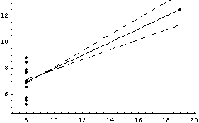
We will illustrate with some made-up, noisy data that obeys the following relation.
y = a 
We will generate the noise with a Monte-Carlo technique.
In[1]:=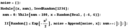
The noise contains 100 numbers, distributed as a Gaussian with mean of zero and standard deviation of 1.
In[3]:=
In[4]:=

We will add the noise to the dependent variable for 100 generated data points.
In[5]:=
We can fit this using the EDA function FindFit.
In[6]:=

Out[6]=
This fit matches the data very nicely.
We take the logarithm of the model.
Log[y] = Log[a] - b*x
This transformation is sometimes called linearization. A fit of Log[y] versus x will give a straight line of slope b and intercept Log[a]. We form a transformed data set of {x, Log[y]}.
In[7]:=
We fit this transformed data to a straight line.
In[8]:=

Out[8]=
In the previous subsection, we found that transforming can eliminate monotone behavior in the residuals. Since here the original data mydata by construction has random residuals which are independent of the level (that is the value of y) it is not surprising that transforming the data creates a monotone behavior in the residuals: their absolute value increases as the level decreases.
The nature of these residuals is reflected in the large error for the estimate of a. And the estimate of a, although falling within 32750+6500 and 32750-6500, has been systematically shifted away from the right number. This shift is a parameter bias introduced by the transformation. The estimate of b is not biased by this transformation.
In general, calculating the amount of bias introduced by transforming the data is complicated. Thompson calculates the bias for a logarithmic transformation when the noise in the original data is proportional to the level, which is not the case here.
Section 8.4 discusses a convenience routine, FitExponent, that automatically fits data to the form y = A  by estimating parameter values by linearization of the model and using LinearFit and then using those estimates to fit to the exponential with FindFit. by estimating parameter values by linearization of the model and using LinearFit and then using those estimates to fit to the exponential with FindFit.
Reference: William J. Thompson, Computing for Scientists and Engineers (Wiley, 1992), Section 6.5.
In conclusion, it is important to keep in mind that arbitrary transformations of data can have unintended side effects by introducing biases in parameter estimates. The material in this subsection underlines the importance of transforming data to eliminate monotone behavior in residuals when fitting models.
8.2.3 Finding Hidden Features of the Data
We load and examine some data on pressure and volume of a fixed quantity of dry air.
In[1]:=
In[2]:=

In[3]:=

In[4]:=

Boyle's law states that the pressure times the volume is a constant number. Thus, a fit of pressure versus 1/volume should be a straight line. We transform to a data set of {1/v, p} and try the fit. First we extract the pressure and volume data.
In[5]:=
In[6]:=
We wish to propagate the errors in the volume when we form the inverse of v, so we will use the Data construct introduced in Section 3.3.1.1.
In[7]:=
Now we form a new data set.
In[8]:=
We fit to a straight line.
In[9]:=

Out[9]=
Note that everything about this fit looks fine except perhaps a small inverse parabolic shape to the residuals. But a little further thought will indicate that all is not well with this data. Since the independent variable is 1/v, the intercept corresponds to the pressure when the volume is infinite, so it should be zero. We repeat the fit, forcing the intercept to be zero.
In[10]:=

Out[10]=
This fit is awful.
One of the difficulties here is that the errors in the data are sufficiently small that we are having some difficulty seeing exactly what is going on. But if Boyle's law is true, then the value of pressure times volume should be exactly the same within errors for each datum. We form the product, including errors, and examine the result.
In[11]:=
In[12]:=

The air sample for which this data is taken is inside a vertical glass tube. The top of the tube has been closed, and mercury fills the bottom part of the tube. The volume of air is deduced from the length of the tube containing the sample . However, the top of the tube has been closed in a sloppy fashion so the experimenter must guess the position of the top. If the guess is poor, a systematic error in the volume will be generated that can lead to data such as seen in the above plot. (The sloppiness in the closing of the top of the tube is by design for this experiment in a teaching laboratory.)
We fit this data to a line.
In[13]:=

Out[13]=
The intercept corresponds to the value of pressure times volume when the inverse of the volume is zero. This is the value for infinite volume, when this systematic effect should become zero.
We can find the correction needed for the volume data by realizing that there is some value for c for which the following is true.
 We rearrange the equation.

The mean over all the data points is given by the following.
In[14]:=
Out[15]=
Thus, the volumes are systematically too low by .155  . We add this figure to the volume data. . We add this figure to the volume data.
In[16]:=
Next we recalculate the inverse of the volume.
In[17]:=
Finally, we repeat the fit of p versus the inverse of v to a line with zero intercept.
In[18]:=

Out[18]=
Thus, after transforming the data based on graphical exploration and with an understanding of the actual apparatus used to take the data, we have confirmed that Boyle's law is consistent with this experiment. We also note that the student has apparently overestimated the experimental errors since the ChiSquared per DegreesOfFreedom is small.
8.3 Estimating Parameters for Peaks
As mentioned in Section 5.1.2, there is no known software that can find peaks in a spectrum and estimate parameters for them as well as a human expert. As also discussed there, the most promising software for doing this task may be based on neural networks; the computational requirements of these networks and the fact that this is still an active area of research means that EDA does not attempt to supply such technology at this time.
However, in the case of fairly simple spectra EDA does supply a function (FindPeaks) which can often find and estimate peaks well enough for the EDA function FindFit to successfully find a fit to the data. This section discusses that FindPeaks function. The following section discusses a convenience function that bundles FindPeaks and FindFit together into a FitPeaks function that automatically fits to reasonably simple spectra.
One basic idea used by FindPeaks is that the peak position corresponds to a minimum in the second derivative of the spectrum provided that the second derivative is negative, and the width of the peak is measured by where the second derivatives are equal to zero.
The other basic idea of FindPeaks involves the question of the function of which we should be taking the second derivatives. As discussed in some detail in Section 6.1.5, a reasonable choice is to form an InterpolationFunction, take its derivative and smooth the result using the EDA function SmoothData. We then interpolate the smoothed first derivatives, take its derivative, and smooth the result to get the second derivatives.
We will first load and examine some data we looked at in Chapter 5.
In[1]:=
In[2]:=

In[3]:=

In[4]:=

We use FindPeaks on this data.
In[5]:=
Out[5]=
Note that FindPeaks has returned the intercept Bkgd[0] and slope Bkgd[1] of a linear background term. It has also estimated the peak to have an amplitude Amplitude[1] of 146.924 and center value CenterValue[1] of 1830. PeakWidth[1] is the estimated full width of the peak. It is estimated from the values where the second derivatives of the peak are equal to zero. Also returned is PeaksFound, which is the number of peaks found in the data.
FindPeaks can accept a second argument specifying a peak shape.
In[6]:=
Out[6]=
Now FindPeaks has returned a Model, which in this case is a function of parameters Bkgd[0], Bkgd[1], and a Gaussian with amplitude Amplitude[1], center value CenterValue[1], standard deviation Sigma[1], and independent variable IndependentVariable. Also, FindPeaks has returned a rule for EDAParameters specifying the names and initial guesses of the parameters. Thus, the result from FindPeaks is in a form suitable for giving to the EDA function FindFit.
In[7]:=


Out[7]=
FindPeaks can also try to estimate parameters and form a model assuming that the shape is a Lorentzian or Breit-Wigner.
In[8]:=
Out[8]=
Now the Model is a background plus a Lorentzian.
FindPeaks can find more than one peak in a data set. We will illustrate with some data we have already examined.
In[9]:=

In[10]:=

In[11]:=

FindPeaks has a EDAShowProgress option which, if set to True, displays graphs illustrating its progress.
In[12]:=


Out[12]=
The first graph shows the data after smoothing and subtracting the background, if any. Then the graph of the first derivatives is displayed, followed by the graph of the second derivatives. The minimum negative value in this graph is used to locate and characterize the first peak. Then all the second derivatives for this peak are set to a small positive number, as shown in the second graph labeled "Second derivatives", and the new minimum negative value is used to find the second peak. The values for this peak are set to a small positive number, as shown in the final graph, and FindPeaks concludes there are no more peaks to be found.
As our final example, we will generate some made-up data for two Gaussians with significant overlap and with some noise.
In[13]:=
In[15]:=

Note for future reference that the first Gaussian has amplitude = 10, center = 5, and sigma = 2, while the second Gaussian has amplitude = 8, center = 10, and sigma = 2.
In[16]:=


Out[16]=
The estimated parameter values are fairly close, and certainly close enough for FindFit to complete their determination,
In[17]:=

Out[17]=
8.3.1 Summary of FindPeaks
In[18]:=

In[19]:=
Out[19]//TableForm=
In[20]:=

In[21]:=

In[22]:=
In[23]:=

In[24]:=

In[25]:=

In[26]:=

In[27]:=

In[28]:=

In[29]:=

In[30]:=

In[31]:=

In[32]:=

In[33]:=

8.4 FitPeaks and FitExponent
As a convenience, EDA bundles up some other EDA functions into routines to handle specific tasks. This section discusses two of them, FitPeaks and FitExponent.
8.4.1 FitPeaks
The idea behind FitPeaks is discussed in the previous section: use FindPeaks to estimate the number and values of the peaks in a spectrum and then use those estimates for FindFit to fit the data.
By default, FitPeaks fits to a Gaussian model. We shall use it to fit to mydata, which was first constructed in the previous section. Recall that the data contains two overlapping Gaussians.
In[1]:=
In[2]:=
In[4]:=

In[5]:=

Out[5]=
As seen above, by default FitPeaks fits to Gaussians. A PeakShape option may be set to Lorentzian, in which case that is the shape used for the fit. All other options given to FitPeaks are passed to FindPeaks or FindFit as appropriate.
8.4.2 FitExponent
As discussed in Section 8.2.2, fitting to an exponential y = A  by linearization to Log[y] = Log[A] + B × x introduces biases in the parameters. However, fitting to the full exponential often requires that we have at least an approximate idea of the values of the parameters A and B. The FitExponent function uses the fact that the biases introduced by linearization are often fairly small, so estimates of the parameter values found through a linear fit may then be used for the full nonlinear one.Null by linearization to Log[y] = Log[A] + B × x introduces biases in the parameters. However, fitting to the full exponential often requires that we have at least an approximate idea of the values of the parameters A and B. The FitExponent function uses the fact that the biases introduced by linearization are often fairly small, so estimates of the parameter values found through a linear fit may then be used for the full nonlinear one.Null
In Section 8.2.2 we constructed mydata, which is a noisy exponential with A equal to 32750 and B equal to 0.10.
In[1]:=
In[3]:=
In[4]:=
In[5]:=

We fit the data to an exponential.
In[6]:=

Out[6]=
Any options given to FitExponent are passed to FindFit, which actually performs the fit.
8.5 References
As mentioned at the beginning of this chapter, there is a growing literature on using Mathematica in ways particularly appropriate for the topics of this chapter. The first subsection below lists some of these titles.
The second subsection below refers to a cross section of the literature on exploratory data analysis and transformation techniques.
Both lists are to be viewed as a selection, and readers may have personal favorites that do not appear below.
8.5.1 References to Mathematica
Alfred Riddle and Samuel Dick, Applied Electronic Engineering with Mathematica (Addison-Wesley, 1995). Although tied to electronics, much of the analysis discussed here has a much wider applicability than just in that field
William T. Shaw and Jason Tigg, Applied Mathematica: Getting Started, Getting It Done (Addison-Wesley, 1994). A collection of techniques that are of great value to any worker in the physical sciences or engineering
Stan Wagon, The Power of Visualization: Notes from a Mathematica Course (Front Range Press, 1994). A concise introduction to the topic of visualization of data
Tom Wickham-Jones, Mathematica Graphics: Techniques and Applications (TELOS/Springer-Verlag, 1994). Much of data exploration relies on graphical techniques, and this book provides both an introduction to Mathematica's built-in graphics capabilities and rich extensions to those capabilities
8.5.2 References on Exploratory Data Analysis and Transformation
William S. Cleveland, Visualizing Data (AT&T Bell Labs, 1993). Although visualization is prominently featured here, there are also extensive discussions of fitting techniques, transformations, smoothing, etc.
David C. Hoaglin, Frederick Mosteller, and John W. Tukey, eds., Understanding Robust and Exploratory Data Analysis (John Wiley, 1983). A wide-ranging discussion of many of the topics of this chapter by experts
John W. Tukey, Exploratory Data Analysis (Addison-Wesley, 1977). Although the topics of this chapter go back to Descartes, this classic book caused an increased interest in them.
|