CheckboxBar
✖
CheckboxBar
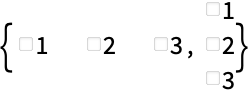
represents a checkbox bar with setting x and with checkboxes for values vali to include in the list x.
takes the setting to be the dynamically updated current value of x, with the values in the list x being reset every time a checkbox is clicked.
represents a checkbox bar in which the checkbox associated with value vali has label lbli.
Details and Options
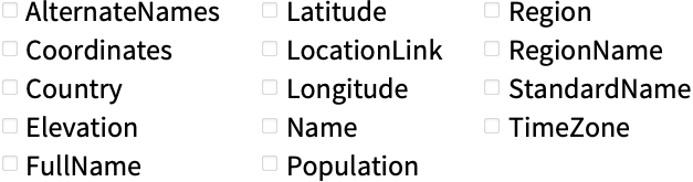
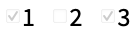
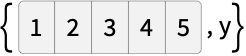
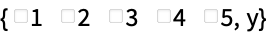
- Multiple checkboxes in a CheckboxBar can be checked at the same time. The values associated with all checked checkboxes are given in a list. »
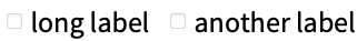
- The vali and lbli can be strings, boxes, graphics, or any other expressions, including dynamic expressions. »
- In CheckboxBar[x,list], Delimiter can appear as an element of list, specifying a vertical delimiter in the displayed setter bar.
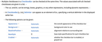
- The following options can be given:
-
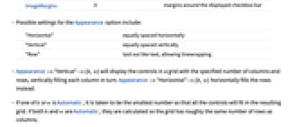
Appearance Automatic the overall appearance of the checkbox bar Background Automatic background color to use BaselinePosition Automatic alignment relative to surrounding text BaseStyle {} base style specifications for each checkbox bar Enabled Automatic whether the checkbox bar is enabled, or grayed out ImageMargins 0 margins around the displayed checkbox bar - Possible settings for the Appearance option include:
-
"Horizontal" equally spaced horizontally "Vertical" equally spaced vertically "Row" laid out like text, allowing linewrapping - Appearance->"Vertical"->{h,w} will display the controls in a grid with the specified number of columns and rows, vertically filling each column in turn. Appearance->"Horizontal"->{h,w} horizontally fills the rows instead.
- If one of h or w is Automatic, it is taken to be the smallest number so that all the controls will fit in the resulting grid. If both h and w are Automatic, they are calculated so the grid has roughly the same number of rows as columns.
- Method->"Active" will cause the active area for each item to include the corresponding label.
- The settings for BaseStyle and LabelStyle are appended to the default styles typically given by the "CheckboxBar" and "CheckboxBarLabel" styles in the current stylesheet.
Examples
open allclose allBasic Examples (2)Summary of the most common use cases
Scope (3)Survey of the scope of standard use cases
Use a dynamically updated setting:
https://wolfram.com/xid/01ysue7mj8i-ekg1zm
Use any expression as a value:

https://wolfram.com/xid/01ysue7mj8i-ingf4s
https://wolfram.com/xid/01ysue7mj8i-b4wk9z
Separate choices with a Delimiter:
https://wolfram.com/xid/01ysue7mj8i-f2xmrp
Options (9)Common values & functionality for each option
Appearance (4)
https://wolfram.com/xid/01ysue7mj8i-h64j06
https://wolfram.com/xid/01ysue7mj8i-nkc9gb
Using the "Row" setting will allow the row of checkboxes to line break:
https://wolfram.com/xid/01ysue7mj8i-d4ot3r
https://wolfram.com/xid/01ysue7mj8i-bs6qtp
Specify a three-column layout with elements ordered vertically:
https://wolfram.com/xid/01ysue7mj8i-2t99uh
Background (2)
BaselinePosition (1)
Enabled (1)
By default, CheckboxBar is enabled:
https://wolfram.com/xid/01ysue7mj8i-wq5k5
By setting Enabled->False, the checkbox bar is disabled but visible in its current state:
https://wolfram.com/xid/01ysue7mj8i-eosakv
Method (1)
Normally, toggling the checkbox requires clicking the checkbox directly:
https://wolfram.com/xid/01ysue7mj8i-iumjtz
With Method->"Active", the label can also be clicked to toggle the checkbox:
https://wolfram.com/xid/01ysue7mj8i-yrgsi
Properties & Relations (2)Properties of the function, and connections to other functions
CheckboxBar is a special case of TogglerBar:
https://wolfram.com/xid/01ysue7mj8i-fxx69
https://wolfram.com/xid/01ysue7mj8i-tto7u
CheckboxBar is built using Checkbox and can be used to track a list of values:
https://wolfram.com/xid/01ysue7mj8i-230zwg
https://wolfram.com/xid/01ysue7mj8i-zx3efc
Wolfram Research (2007), CheckboxBar, Wolfram Language function, https://reference.wolfram.com/language/ref/CheckboxBar.html (updated 2008).Text
Wolfram Research (2007), CheckboxBar, Wolfram Language function, https://reference.wolfram.com/language/ref/CheckboxBar.html (updated 2008).
Wolfram Research (2007), CheckboxBar, Wolfram Language function, https://reference.wolfram.com/language/ref/CheckboxBar.html (updated 2008).CMS
Wolfram Language. 2007. "CheckboxBar." Wolfram Language & System Documentation Center. Wolfram Research. Last Modified 2008. https://reference.wolfram.com/language/ref/CheckboxBar.html.
Wolfram Language. 2007. "CheckboxBar." Wolfram Language & System Documentation Center. Wolfram Research. Last Modified 2008. https://reference.wolfram.com/language/ref/CheckboxBar.html.APA
Wolfram Language. (2007). CheckboxBar. Wolfram Language & System Documentation Center. Retrieved from https://reference.wolfram.com/language/ref/CheckboxBar.html
Wolfram Language. (2007). CheckboxBar. Wolfram Language & System Documentation Center. Retrieved from https://reference.wolfram.com/language/ref/CheckboxBar.htmlBibTeX
@misc{reference.wolfram_2025_checkboxbar, author="Wolfram Research", title="{CheckboxBar}", year="2008", howpublished="\url{https://reference.wolfram.com/language/ref/CheckboxBar.html}", note=[Accessed: 22-April-2025
]}
BibLaTeX
@online{reference.wolfram_2025_checkboxbar, organization={Wolfram Research}, title={CheckboxBar}, year={2008}, url={https://reference.wolfram.com/language/ref/CheckboxBar.html}, note=[Accessed: 22-April-2025
]}