Model Center—Component Browser
The component browser on the right-hand side of the model editor lists all components of the currently open class in a tree view. The components are grouped with respect to the class in which they are declared. Base classes in the component browser are recognized by the "extends" prefix before their name.
Components and classes with no declared components appear as leaves in the tree view, while components and classes containing components are represented as branches. To expand a component or class, click the symbol to the left of its icon (or name if no icon is available). Clicking the symbol of an expanded component or class will collapse it again.
The tree view has two columns where the first column shows the icon (if available) and the name of the class or component, while the second column shows the component type for components and the full hierarchical name for classes. The second column showing type information is not visible by default. See the section Toggling Column Visibility on how to toggle the visibility of the columns.
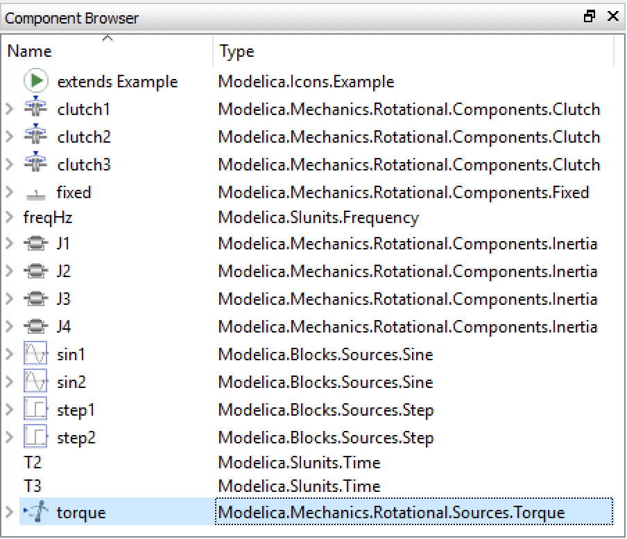
The components of the Modelica.Mechanics.Rotational.Examples.CoupledClutches model.
Toggling Column Visibility
The columns of the component browser can be toggled on and off by right-clicking the column header. This will bring up a popup menu from which you can choose the name of the column to show or hide. By default, only the Name column is shown.
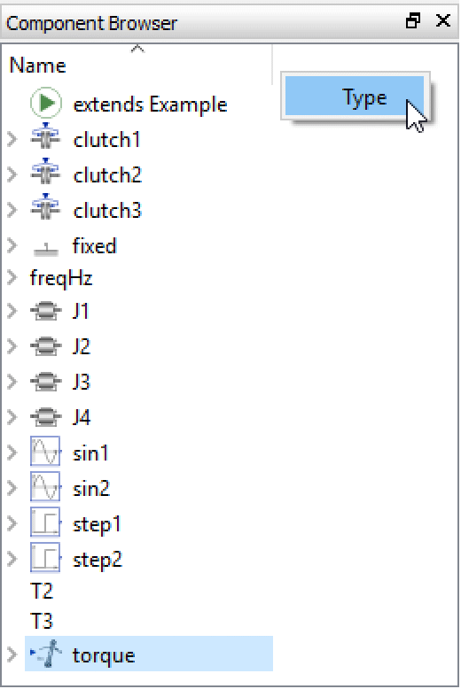
Toggling the visibility of component browser columns.
Sorting Components
The items in the component browser can be sorted by name or type. By default, the components are sorted by name in ascending order, which is indicated by the arrow pointing upward in the right corner of the Name column title.
To sort the items by type in ascending order, click once on the Type column title (if the Type column is not visible, see this section on how to toggle the visibility of the columns). Click the Type column title a second time to sort the components by type in descending order.
Note how the pointing direction of the arrow switches when toggling between the ascending and descending sorting orders.
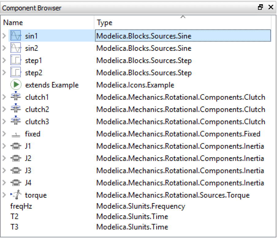
Sorting the components in the component browser by their type.
Editing Classes
The base classes and the classes of the components listed in the component browser can be edited by right-clicking a class or component and choosing Open Class from the popup menu. The class will be opened in a new class window unless already open.
Removing Components
The component browser can also be used to remove components from a class. First, make sure that the active view of the class window is either the Icon View or the Diagram View. Select the component(s) to remove and choose Edit ▶ Delete or right-click the component's name and choose Delete from the popup menu. Note that it is not possible to delete individual inherited components, nor is it possible to delete components while editing a class in the Modelica Text View.
To remove all components inherited from a specific extended class, you can remove the inheritance relationship by selecting the extended class in the component browser and deleting it. For more information, see the section on removing inheritance relationships.
Removing Inheritance Relationships
The component browser groups components with regard to their declaration class, making it easy to see from what class components are inherited. By selecting an extended class in the component browser and choosing Edit ▶ Delete, the inheritance relationship can be removed. The class will be removed from the list of extended classes, causing all components inherited from that class to be removed.
The list of extended classes can also be edited from the Class Properties dialog box, where you may also add classes; see the section on editing class properties.
Note that it is not possible to remove an inheritance relationship using the component browser while editing a class in the Modelica Text View.
Renaming Components
A component can be renamed from the Component Browser, or from the graphical views (Icon View or Diagram View) if present, by right-clicking it and choosing Rename from the popup menu. It is also possible to rename a component by selecting it and pressing the F2 key. Components that appear in any of the variable views can also be renamed from that view: just click the name of the component and chose Rename from the popup menu.
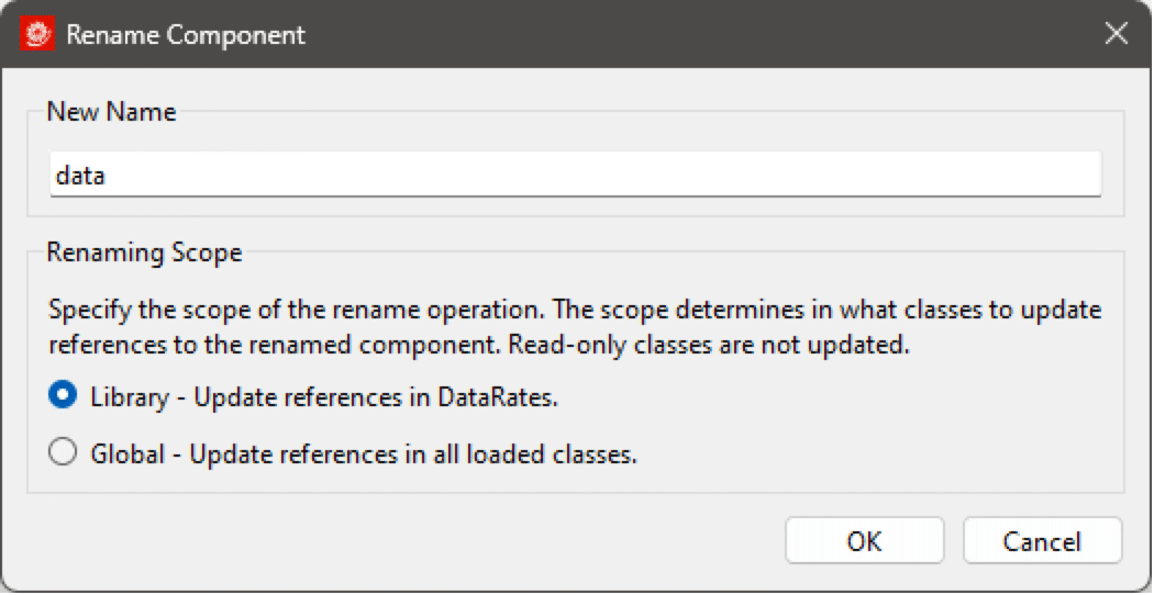
When renaming a component, all references to the renamed component will be updated automatically. The scope of this operation can be specified in the Rename Component dialog. With the Library scope selected, only references to the renamed component within the library itself will be updated, while the Global scope, if selected, will also search for references in classes outside the library.
Renaming the component data within a library named DataRates, updating references to the component data only within the library.
When the renaming operation is completed, a list of all classes that were modified (if any) due to references to the renamed component is shown.
Note that it is not possible to rename a component using the Component Browser, graphical views or variable views while editing a class in the Modelica Text View, nor is it possible to rename an inherited component.
Making Components Final
To prevent a component from being further modified, it can be made final. It is still possible to modify the component in the class in which it is made made final, but not from any class creating a component of that class or extending that class.
To make a variable final, right-click the component. In the menu that is shown, click final to toggle its final property. A check mark to the left of final is an indication that it has been made final. If the component is present on one of the graphical views (Icon View or Diagram View), the final property can also be toggled from there.
Sometimes the final item is disabled and cannot be clicked. This can happen, for instance, when a component is part of another component that has been made final, making all components inside that component implicitly final as well.
Changing the Type of Components
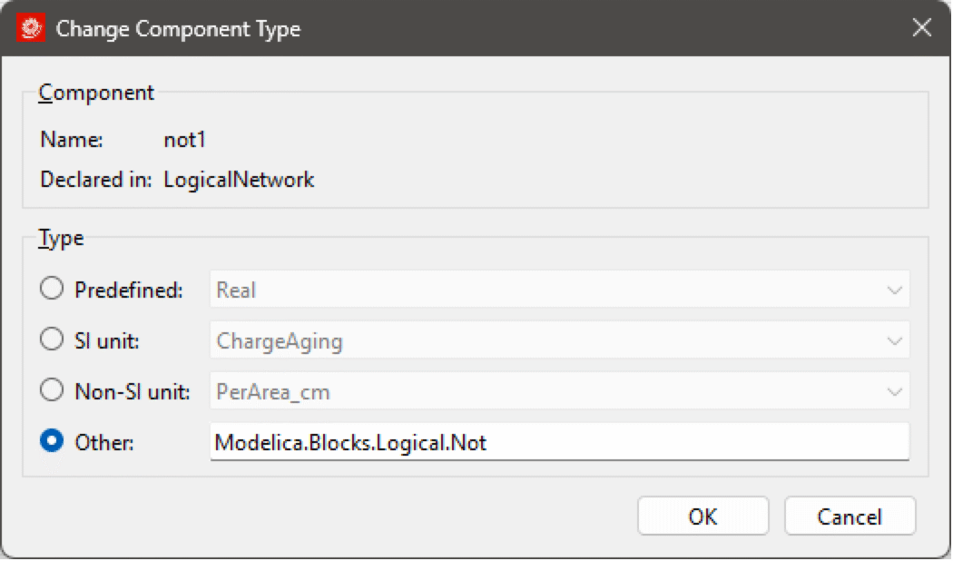
The type of an existing component can be changed. If the component is declared in the class of the active class window, its type can be changed by right-clicking the component in the Component Browser (or Diagram View if the component is present there) and choosing Change Component Type... from the popup menu. Changing the type this way substitutes the declared type of the component in the class definition, affecting all classes extending the class or using it as a component.
In the dialog box that is shown, enter the new type of the component and click OK. It is also possible to drag a class from the Class Browser and drop it in the text box.
Changing the type of a component.
Another way of changing a type is by redeclarations. This is possible when a component is declared as replaceable (by default, components are not replaceable). For information on how to make a component replaceable, see how to edit component properties.
The use of replaceable components is a powerful way of making models configurable on a component level. Model Center also automatically provides assistance in finding compatible components when redeclaring a replaceable component.
If the replaceable component is inherited from a base class, the component can be redeclared in any subclasses without any changes being made to the base class. The redeclaration of the component is performed by introducing a redeclare modification in the subclass. Likewise, replaceable components located inside other components can be redeclared. This makes it possible to replace components anywhere in the component hierarchy without actually changing the definition of the class in which it is declared; only the class of the active class window is affected.
It is also possible to redeclare a replaceable component in the class in which it is declared. While the result of this operation will be no different than actually changing its declared type, it has the benefit of Model Center providing assistance in the form of a list of components with compatible types.
For more information on replaceable components, component redeclarations and model reusability in general, see the tutorial Reusable and Configurable Models.
To redeclare a replaceable component, right-click the component in the Component Browser and choose Redeclare Component from the popup menu. All components with compatible types are shown as menu items under the submenu All Matching Types. To freely choose a new type, click the Other... menu item. This can also be done from the Diagram View if the component is present there.
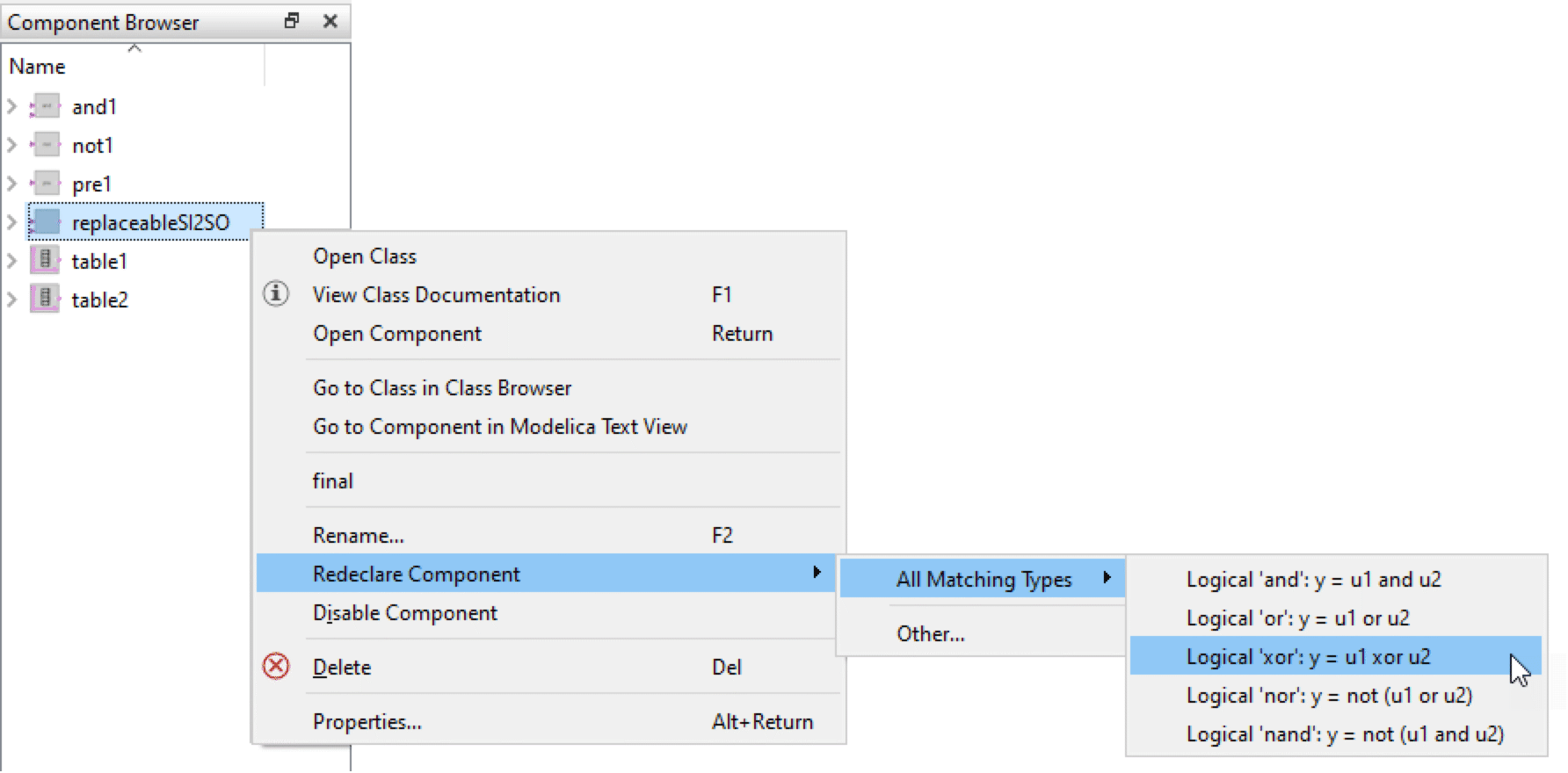
Redeclaring a replaceable logical block component (Modelica.Blocks.Interfaces.partialBooleanSI2SO).
Note that the Modelica language restricts the possibilities when changing the type of a component using a redeclare modification. One of the more basic requirements is that the new type must have an interface compatible with the interface of the original declaration.
Providing a Set of Candidate Components for Component Redeclarations
If you develop a model with replaceable components, you may want to provide a customized list of components for the user to choose from when a component is redeclared. This can be done using the choices annotation, which is a standard Modelica annotation.
If, for instance, you have an electrical model of a main board with a CPU, you can make the CPU replaceable and introduce a choices annotation with configurations of pin-compatible processors, making it possible for a user of the main board to easily test the main board with different processors. The choices annotation will be an annotation for the CPU component in the main board model.
replaceable Electrical.MC68000 cpu annotation(
  choices(
    choice(redeclare Computer.MC68000 cpu(freq=8)
      "Motorola 68000 at 8MHz"),
    choice(redeclare Computer.MC68000 cpu(freq=16)
      "Motorola 68000 at 16MHz"),
    choice(redeclare Computer.MC68010 cpu(freq=16)
      "Motorola 68010 at 16MHz")
  ), Placement(...)));
In the preceding example, three candidates are provided for the redeclaration: an MC68000 CPU at 8MHz, an MC68000 CPU at 16MHz and an MC68010 CPU at 16MHz. When the user adds the main board as a component in their computer model, changing the CPU becomes a matter of right-clicking the CPU, choosing Redeclare from the menu, and then selecting the new processor from a list of candidates. As can be seen in the screenshot following, the strings in the choices annotation represent the candidates when redeclaring the CPU component.
Choices annotations for components can also be created and edited using the Component Properties dialog. For more information, see the section Choices for Component Redeclarations in the Reusable and Configurable Models tutorial.
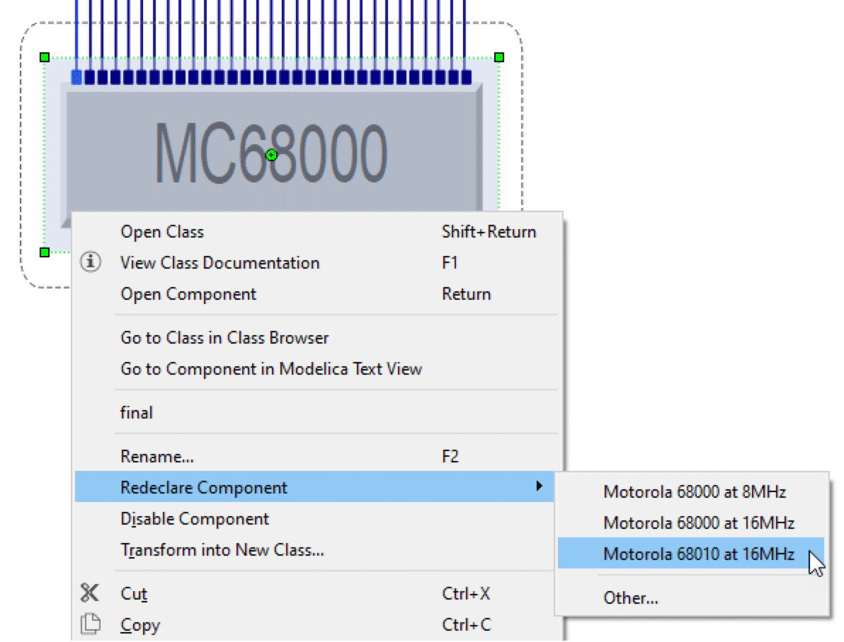
Redeclaring a component with a choices annotation.
Editing the Properties of Components
The properties of a component can be edited by right-clicking the component and choosing Properties from the popup menu or by selecting the component and choosing Properties from the Edit menu.
For more information on the Component Properties dialog box, see this section. Note that it is not possible to edit the properties of a component using the Component Properties dialog box while the Modelica Text View is active.
Adding Graphical Representations for Components
When adding a component to a class in the Modelica Text View, you may notice that the component does not appear in the Diagram View unless you specify a graphical annotation for it. The graphical annotation describes the placement of the component in the Diagram View, and for connector components, also their placement in the Icon View.
The model editor can generate a graphical annotation for a component if you drag the component from the component browser and drop it in the Diagram View. If the component is a connector component, it will also appear in the Icon View.
Graphical annotations for several components can be generated at once by dragging a selection of components from the component browser and dropping them in the Diagram View. The components will then be laid out in a grid.
Graphical annotations for existing connections will also be generated, if missing, when graphical annotations for connected components are generated.

