


GraphicsGrid
GraphicsGrid[{{g11,g12,…},…}]
generates a graphic in which the gij are laid out in a two-dimensional grid.
Details and Options
- If the gij are graphics with ImageSize->Automatic, GraphicsGrid will if possible resize them to make them fit into the grid as well as possible, while preserving their individual aspect ratios.
- The output from GraphicsGrid can interactively be resized, or edited as a graphic.
- The listi in GraphicsGrid[{list1,list2,…}] do not all need to be the same length; there will be empty space in the grid at the ends of shorter rows.
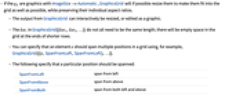
- You can specify that an element e should span multiple positions in a grid using, for example, GraphicsGrid[{{e,SpanFromLeft,SpanFromLeft},…}].
- The following specify that a particular position should be spanned:
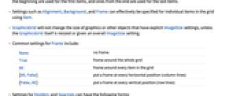
-
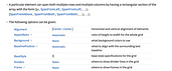
SpanFromLeft span from left SpanFromAbove span from above SpanFromBoth span from both left and above - A particular element can span both multiple rows and multiple columns by having a rectangular section of the array with the form {{e,SpanFromLeft,SpanFromLeft,…}, {SpanFromAbove,SpanFromBoth,SpanFromBoth,…},…}.
- The following options can be given:
-
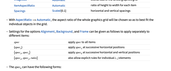
Alignment {Center,Center} horizontal and vertical alignment of elements AspectRatio Automatic ratio of height to width for the whole grid Background None what background colors to use BaselinePosition Automatic what to align with the surrounding text baseline BaseStyle {} base style specifications for the grid Dividers None where to draw divider lines in the grid Frame None where to draw frames in the grid FrameStyle Automatic styles to use for frames ImageSize Automatic overall size of the whole graphics grid ItemAspectRatio Automatic ratio of height to width for each item Spacings Scaled[0.1] horizontal and vertical spacings - With AspectRatio->Automatic, the aspect ratio of the whole graphics grid will be chosen so as to best fit the individual objects in the grid.
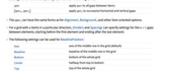
- Settings for the options Alignment, Background, and Frame can be given as follows to apply separately to different items:
-
spec apply spec to all items {specx} apply specx at successive horizontal positions {specx,specy} apply speck at successive horizontal and vertical positions ,spec_(y),rules}")
also allow explicit rules for individual  elements
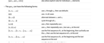
 - The speck can have the following forms:
-
{s1,s2,…,sn} use ") through
through ") , then use defaults
, then use defaults {{c}} use  in all cases
 {{c1,c2}} alternate between ") and
and ")
{{c1,c2,…}} cycle through all ci {s,{c}} use  , then repeatedly use
{s1,{c},sn} use ") , then repeatedly use
, then repeatedly use  , but use
 ") at the end
at the end {s1,s2,…,{c1,c2,…},sm,…,sn} use the first sequence of  at the beginning, then cyclically use the ci, then use the last sequence of
  at the end
 {s1,s2,…,{},sm,…,sn} use the first sequence of  at the beginning and the last sequence at the end
{i1->v1,i2->v2,…} specify what to use at positions ik {spec,rules} use rules to override specifications in spec - With settings of the form
,s_(2),...,{...},s_(m),...,s_(n)}") , if there are more
, if there are more  specified than items across the grid,
  from the beginning are used for the first items, and ones from the end are used for the last items.
 - Settings such as Alignment, Background, and Frame can effectively be specified for individual items in the grid using Item.
- GraphicsGrid will not change the size of graphics or other objects that have explicit ImageSize settings, unless the GraphicsGrid itself is resized or given an overall ImageSize setting.
- Common settings for Frame include:
-
None no frame True frame around the whole grid All frame around every item in the grid {All,False} put a frame at every horizontal position (column lines) {False,All} put a frame at every vertical position (row lines) - Settings for Dividers and Spacings can have the following forms:
-
spec apply spec to all gaps between items {specx,specy} apply speci to successive horizontal and vertical gaps - The speci can have the same forms as for Alignment, Background, and other item-oriented options.
- For a grid with
 items in a particular direction, Dividers and Spacings can specify settings for the
  gaps between elements, starting before the first element and ending after the last element.
 - The following settings can be used for BaselinePosition:
-
Axis axis of the middle row in the grid (default) Baseline baseline of the middle row in the grid Bottom bottom of the whole grid Center halfway from top to bottom Top top of the whole grid {{i,j},pos} position pos in element 
- The settings for BaseStyle are appended to the default style typically given by the "GraphicsGrid" style in the current stylesheet.
Examples
open all close allScope (17)
Frames and Grid Lines (5)
Put a frame around the whole grid:
Put a frame around every element:
Put a frame around the first row and column:
Draw different frames with different styles:
Put dividers at all horizontal positions:
Put dividers at all vertical positions:
Put dividers at the third horizontal and second vertical positions:
Spanning Elements (3)
Styling (5)
Options (17)
AspectRatio (2)
If possible GraphicsGrid will choose an aspect ratio suitable to its elements:
When no reasonable choice can be made, a default aspect ratio of 1 is used:
Background (7)
Draw the grid with a pink background:
Pink and red backgrounds for the first and second horizontal positions:
Pink and red backgrounds for the first and second vertical positions:
Alternating pink and red backgrounds:
Alternating backgrounds with yellow superimposed in the first and last positions:
BaselinePosition (1)
Frame (3)
FrameStyle (3)
FrameStyle supports a variety of graphics directives:
FrameStyle is applied to all sources of grid lines, including Dividers and Item:
Directives given with FrameStyle are combined with those specified elsewhere:
ImageSize (1)
By default, GraphicsGrid will display graphics at their specified sizes:
Giving an ImageSize setting to the GraphicsGrid will scale the graphics appropriately:
Applications (2)
Possible Issues (1)
To span across both rows and columns requires appropriate use of SpanFromBoth:
Text
Wolfram Research (2007), GraphicsGrid, Wolfram Language function, https://reference.wolfram.com/language/ref/GraphicsGrid.html.
CMS
Wolfram Language. 2007. "GraphicsGrid." Wolfram Language & System Documentation Center. Wolfram Research. https://reference.wolfram.com/language/ref/GraphicsGrid.html.
APA
Wolfram Language. (2007). GraphicsGrid. Wolfram Language & System Documentation Center. Retrieved from https://reference.wolfram.com/language/ref/GraphicsGrid.html