Model Center—Graphical Views
The graphical views of a Class Window, i.e. the Diagram View and the Icon View, and the Component Browser are synchronized to give a consistent view of a Modelica class. When a component is selected in the icon or diagram view, it also becomes selected in the Component Browser and vice versa.
When the Diagram View is shown for the first time for a class, the view is automatically zoomed to fit the window. For models with a small diagram layer, this may result in a zoom level above 100%. To cap the zoom level at 100%, open the Options dialog by choosing Options from the Tools menu, go to the Graphical Class Views section and check Do not zoom Diagram view beyond 100% on first show. This setting is automatically saved when closing the dialog and restored the next time Model Center is started.
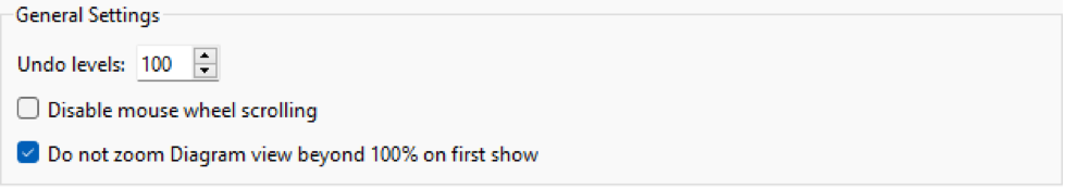
Ensuring the Diagram View is never zoomed beyond 100% on first show.
It is possible to view balloon help (onscreen information) for a component or connection in graphical views by moving the mouse cursor over the item and holding it still for a short period of time. For components, the component type, name and description (if available) are shown. For connections, the name of the connected components and connection description (if available) are shown.

Viewing balloon help for a connection in the Diagram View.
Selecting Objects
A single object in the Icon View or Diagram View is selected by clicking it once with the left mouse button. When an object is selected, a green selection outline appears, and unless the class is read only, selection handles appear as well. If the selection handles appear in red, this indicates that the object is inherited from another class and it is not possible to modify the object in any other way than by changing the values of its variables and parameters. To remove or modify other properties of an inherited object, open the class window of the class from which the object is inherited. Base classes are easily accessible by right-clicking an empty area of the graphical view. In the popup menu that appears when right-clicking, choose Open Base Class and the name of the class to edit. Base classes are also accessible from the Component Browser; see the section describing the Component Browser.
There is a total of nine selection handles, except for components whose class has the preserve aspect ratio property set, in which case they have five selection handles.
Eight of the selection handles have the shape of a square and one has the shape of a circle with a dot in it. The square-shaped selection handles are used to resize an object, change the shape of the object or rotate an object. The circular selection handle defines the origin point of the object, which is used as the center of rotation when an object is rotated, as well as the center of flip operations. The circular selection handle moves along with the object when moved or transformed. To move the circular selection handle independently of the object by using the mouse, place the mouse cursor on top of it and hold down the Shift key and left mouse button while moving the mouse.
To select multiple objects, click the pointer tool and then drag a rectangle around all the objects that you want to select, or hold down the Shift key and then click to select other objects one at a time. It is also possible to select all objects by choosing Select All from the Edit menu.
An entire selection can be canceled by clicking an empty area of the view. To cancel the selection of one object when several are selected, hold down the Shift key and click the object.
Adding Components
To add a component to a model, open the class window of the model, locate the class you want to create a component from in the Class Browser and drag the class to the Diagram View of the class window.
If the component is a connector, it will also appear in the Icon View once it is dropped onto the Diagram View. All non-protected connectors are visible in both the Icon View and the Diagram View. A protected connector is only visible in the Diagram View.
The initial size of the component is determined by the component icon settings of the class the component is representing. See this section for information on how to change this property.
The name of the component is autogenerated based on the name of the class, unless a default component configuration is present in its class. See the section Changing the Default Component Name and Attributes for a Class for more information.
Connecting Components
The Connection Line Tool in the Pointer and Connection Tools toolbar is used when connecting components.
The Connection Line Tool in the Pointer and Connection Tools toolbar.
To connect two components, select the Connection Line Tool and place the mouse cursor over a connector. When the cursor is close enough, the connector becomes larger to indicate that a connection is possible.
An enlarged connector indicates that a connection is possible.
Information about the connection will also be displayed in the status bar at the bottom of the main window.
Information in the status bar when connecting components.
Press and hold down the left mouse button, move the cursor to the other connector, and release the mouse button to complete the connection. The connection line will be drawn as a right-angle connection line. Note that once the cursor gets close enough to the connector, and the connector becomes larger, the information in the status bar is also updated to show the name of the second connector in the connect equation.
The status bar when making a legal connection.
If the connection is illegal, the shape of the mouse cursor will change to indicate this (black circle with a black line across it) and the connection will not be possible to complete. Information is also displayed in the status bar.
The status bar when attempting to create an illegal connection.
Connection lines have a smooth attribute to make them curved with smooth edges. This attribute can be set at drawing time by holding down the Shift key when creating the first point of the connection line. The Shift key can be released once the first point has been specified. To temporarily disable all snapping while creating a connection line, hold down the Alt key.
Connection lines, when created, are given a style determined by the source connector. If you have models with existing connection lines that you wish to style according to their respective source connector, you can do this by selecting the connection lines and choosing Style Connection Line from the Shape menu or right-clicking the connection line and choosing Style Connection Line from the popup menu.
Creating a customized connection line with multiple segments is just as simple, but instead of releasing the mouse button when the mouse cursor is over a connector, release it when the mouse cursor is anywhere else. Press the mouse button for each new line segment you want to create and complete the connection by pressing the mouse button while the mouse cursor is over a connector. To turn a customized connection line into a standard connection line, select the line and choose Reset Connection Line from the Shape menu, or right-click the connection line and choose Reset Connection Line from the popup menu.
If you connect two components, Model Center makes sure the components remain connected when you rearrange the components. Model Center also tries to keep orthogonal line segments orthogonal. To temporarily disable this behavior, you can hold down the Alt key while moving a component or selection handle of a connection line. Holding down the Alt key allows the target to move freely.
Selected connection lines can be turned into a curved connection line by right-clicking one of them and choosing Curved Connection Line from the popup menu.
In the case that one of the connectors has sub-connectors, a dialog box for selecting what connectors to connect is displayed.

Choosing sub-connectors in the Add Connection dialog box.
In the preceding figure, a connection from the part.subControlBus connector to the controlBus.subControlBus connector is created. The connectors have several nested connectors, all of which are displayed in the drop-down lists.
The icon shown next to the name of the connector indicates what type of connector it is.
From left to right: standard connector, expandable connector, Real connector, Integer connector, Boolean connector, record connector.
When choosing the connectors of the connection, it is important that the two connectors are compatible. The icons assist you in accomplishing this.
By definition, all variables in an expandable connector are sub-connectors, and variables can be added to an expandable connector without having to declare them in the class of the expandable connector. Such a variable, without a declaration, becomes a virtual connector, and its type is inferred from the connector it is connected to. To introduce a new variable when creating a connection, choose the item that ends with <Add Variable> of the expandable connector of your choice.
A connector visualized in the Diagram View can also be an array of connectors or part of an array of components. When a connection is created between arrays of connectors that contain sub-connectors, the dialog will let you edit the indices of the connectors that are declared as arrays. By default, a colon is used for the array indices, which means all indices of the dimensions will be connected.
When a connection is created between an array of connectors that do not contain sub-connectors, a dialog box for specifying just the array indices is displayed.

Specifying array indices in the Add Connection dialog.
The dimension size of a specific array of connectors can be viewed by moving the mouse cursor over the corresponding text box and holding it still for a short period of time.
Adding Graphic Items
Graphic items can be added using the Graphic Tools toolbar. There are six types of graphic items: line, rectangle, ellipse, polygon, text and bitmap. A bitmap item can be a raster image (BMP, GIF, JPEG or PNG) or a vector image (SVG). Bitmap items can also be added to the Icon or Diagram views by drag and drop of image files onto the view. Arcs and pies can be created by editing the properties of an ellipse item after it has been added. For more information on how to edit the properties of graphic items, see this section.
For instance, to draw a line, select the line tool and place the mouse cursor at the point where you want the line to begin. Press the left mouse button and hold it down while moving the mouse cursor to the point where you want the first segment of the line to end and release the mouse button. If you want a line consisting of a single segment only, press the left mouse button once without moving the mouse cursor. If you want to add more segments to the line, move the mouse cursor to the point where you want the segment to end and press the mouse button. When you no longer want to add more segments, press the left mouse button once again without moving the mouse cursor.
At any time during the process of adding the line, you can press the right mouse button to cancel the operation.
Line items and polygon items have a smooth attribute to give them smooth edges. This attribute can be set at drawing time by holding down the Shift key when creating the first point of the line or polygon. The Shift key can be released once the first point has been specified.

Drawing a line with smooth edges by holding down the Shift key.
Holding down the Shift key while creating a rectangle, ellipse or text will restrict the new shape to equal-length sides.
Removing Objects
Select the objects to remove and choose Edit ▶ Delete or click the Delete button. This will remove the object from the model. If a component with connections to other components is removed, the connections will be removed as well. Note that implicitly removed connections may cause new connections to be created if one of the connectors of the removed component acted as a shared connection point. An example follows.

Two connections replaced by a new connection when removing a component.
Note that a class extending a class in which a component is removed is not modified in any way. Connections to or from an inherited component that is removed in its base class become unresolvable.
Making Components Final
To prevent a component from being further modified, it can be made final. This can be done from one of the graphical views or from the Component Browser. Please refer to the corresponding section of the Component Browser chapter for more information.
Changing the Type of Components
The type of a component can be changed from one of the graphical views (Icon View or Diagram View) or from the Component Browser. This procedure is described in detail in the corresponding section of the Component Browser chapter.
Transforming Components into a New Class
A model with a large amount of components is often hard to overview and understand. Such models benefit from being divided up into one or more hierarchical levels by encapsulating groups of components into new components. This is tedious work to do manually, but quick and straightforward to do in Model Center.
Start by identifying groups of components that by themselves describe some entity that is easily understood. Continue by selecting all the components in one of these groups and choose Transform into New Class from the Edit menu.

Transforming a group of logical block components into a new class.
You will be asked to give the new class a specialization, name, description (optional) and icon (optional), as well as to specify a location for the new class. Click the OK button to close the dialog box and start the transformation process. Once completed, the selected components will have been replaced by a single component, an instance of the class you named in the dialog box. If you open the class you will see that the class contains all of the replaced components, along with a set of automatically created connectors that define the interface of the class. You may wish to edit the class to rearrange its connectors and to create some graphics for its icon.

The Transform into New Class dialog box.
Adding Inheritance Relationships
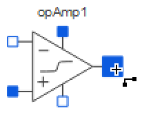
One way to add an inheritance relationship to an existing class is to use the Class Properties dialog box and add the class to the list of extended classes. Another way, which is more convenient, is to simply drag the class to extend from the Class Browser, while holding down the Ctrl key, and drop it on one of the graphical views of the class. When the mouse button is released, a popup menu will appear in which you may choose to extend the class, create the component, or create the component and show its properties.
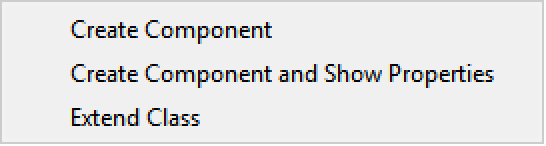
The popup menu that appears when dragging and dropping a component onto a graphical view while holding down the Ctrl key.
Renaming Components
A component can be renamed by right-clicking it and choosing Rename from the popup menu or by selecting it and pressing the F2 key.
See the section Renaming Components in the Component Browser chapter for more information on the rename component operation.
Duplicating Objects
At times you may wish to create several objects with identical or nearly identical properties. This can be a tedious task if the object is a complex shape or a component with many parameters. Instead of creating and customizing each object individually, it is only necessary to create one of the objects and then duplicate it as many times as desired. To duplicate an object, select it and choose Duplicate from the Edit menu or right-click an object and choose Duplicate from the popup menu.
Copying Objects
Objects can easily be copied or moved from one view to another. Begin with selecting the objects you wish to copy. Once the objects are selected, choose Copy (or Cut to move) from the Edit menu, or right-click an object and use the popup menu. Switch to the class and view where you want the objects to be pasted and choose Edit ▶ Paste, or right-click anywhere on the view and choose Paste from the popup menu. You can paste the objects any number of times and to any number of views.
Moving Objects within the View
Select the objects to be moved and point the mouse cursor toward one of them. Once in position, the mouse cursor will change to a four-headed arrow. Now drag the objects to where you want them. Be careful not to point to a selection handle when you move an object, as this will resize the object instead.
An object can also be moved by editing its properties in a dialog box. Right-click an object and choose Properties from the menu.
If the object is a component or connection line, switch to the Placement view of the properties dialog box. To specify a new position for the object, edit the value of the Origin attribute. Note that for connector components you will be able to edit the position in both the Icon View and the Diagram View, as connectors are visualized in both of these views.

The Placement view of the Component Properties dialog box.
Resizing Objects
Objects in the graphical views are resized using their selection handles. Select the object to resize and drag one of its square selection handles until the object is the desired size. Rectangular graphic items (rectangles, ellipses, text and bitmaps) and components can be resized proportionally by dragging one of their corner handles.
Depending on the preserve aspect ratio setting of the class a component represents, a component may only have five selection handles (four corner handles and one center handle), restricting the resizing of the component to only proportional resizing. See this section for more information about the preserve aspect ratio property.
An object can also be resized by editing its properties in a dialog box. Right-click an object and choose Properties from the menu.
If the object is a component or connection line, click the Placement tab in the properties dialog box. To resize the object, edit the Left, Top, Right and Bottom attributes, or the points that define the item if the object is a line or polygon. For connector components, you will be able to edit the size in both the Icon View and the Diagram View, as connectors are visualized in both of these views.
If the object is a graphic item, edit the points that define the item in the properties dialog box to resize the item.
Flipping Objects
Most objects in the Icon View and Diagram View can be flipped horizontally or vertically by selecting the object and choosing Shape ▶ Rotate or Flip ▶ Flip Horizontal or Shape ▶ Rotate or Flip ▶ Flip Vertical.
Objects can also be flipped using the Flip Horizontal and Flip Vertical tools found on the Transformation toolbar.
The Flip Horizontal and Flip Vertical buttons on the Transformation toolbar.
An object is always flipped around its origin point, which is the circular selection handle visible when the object is selected. To move the origin point independently of the object, place the mouse cursor on top of the selection handle and hold down the Shift key and the left mouse button while moving the mouse. The origin point can also be specified in the properties dialog box of the object.
Rotating Objects
To rotate an object 90 degrees counterclockwise or clockwise, choose the corresponding menu item in the Shape ▶ Rotate or Flip menu, or use the rotation tools available on the Transformation toolbar.
The rotation tool buttons on the Transformation toolbar.
All objects can also be rotated freely using their selection handles. Select the object and place the mouse cursor slightly outside of one of its square selection handles. The mouse cursor will change its appearance when it is within the triggering area. Once the mouse cursor has changed, hold down the left mouse button while moving the mouse to rotate the object.
Finally, the rotation of an object can also be specified by editing the rotation attribute in the properties dialog box. For components and connection lines, the rotation attribute can be found in the Placement view of the properties dialog.
The rotation of an object is always performed around its origin point, which is the circular selection handle visible when the object is selected. To move the origin point independently of the object, place the mouse cursor on top of the selection handle and hold down the Shift key and the left mouse button while moving the mouse. The origin point can also be specified in the properties dialog box of the object.
Changing Stacking Order of Graphic Items
The stacking order of graphic items is the order in which graphic items overlap other graphic items in the graphical views. The first item added to a graphical view will be at the back of the stack and the item most recently added will be at the front.
To change a graphic item's position in the stacking order, select the item and choose one of the commands available from the Shape ▶ Order menu:
The stacking tools are also available as buttons in the Stacking toolbar. The Stacking toolbar is not visible by default, but can be made visible by right-clicking anywhere on the toolbar and choosing Stacking.
The toolbar buttons for changing stacking order of graphic items.
Note that the stacking order applies to graphic items only and not to components or connections. Components are always drawn on top of all other graphic items, and connections are drawn on top of both graphic items and components.
Showing Attributes of a Component in Its Icon
The name, description and parameter values of a component can be shown in its icon by adding a Text item in the Icon View of the component's class window. To show the name of the component, set the text of the Text item to %name. The description of the component can be shown by setting text to %comment, and any of the component's parameter values are shown by setting the text to % followed by the parameter name.

Adding a Text item to show the value of parameter R in a resistor model.
For information on how to add a Text item to a class, see the section on adding graphic items.
Disabling Components
It is possible to disable a component to exclude it from builds and simulations. If a component is disabled, its modifiers and any equations involving the component are also excluded, including connect equations.
If you want a component to be enabled only if a certain condition in your model is met (evaluates to true), the correct way is to make use of the Enable Expression for components. To define such an expression for a component, open the Component Properties dialog by right-clicking the component and choosing Properties in the popup menu. Enable the Conditional Component section by clicking the checkbox next to it, and then enter the expression in the text box. See Editing the Properties of Components for more information on the Component Properties dialog.
Regardless if a component has an enable expression or not, it is always possible to disable it unconditionally. This is done by right-clicking the component and choosing Disable Component from the popup menu. The component will now be disabled, even if it had an enable expression that evaluates to true. To enable the component again, that is, to restore its enable expression to what it was before disabling it, right-click the component and choose (the now checked) Disable Component menu item again.
In the icon and diagram views, a disabled component is recognized by being semitransparent. When a component is disabled, any connection lines to the component are rendered semitransparent as well.
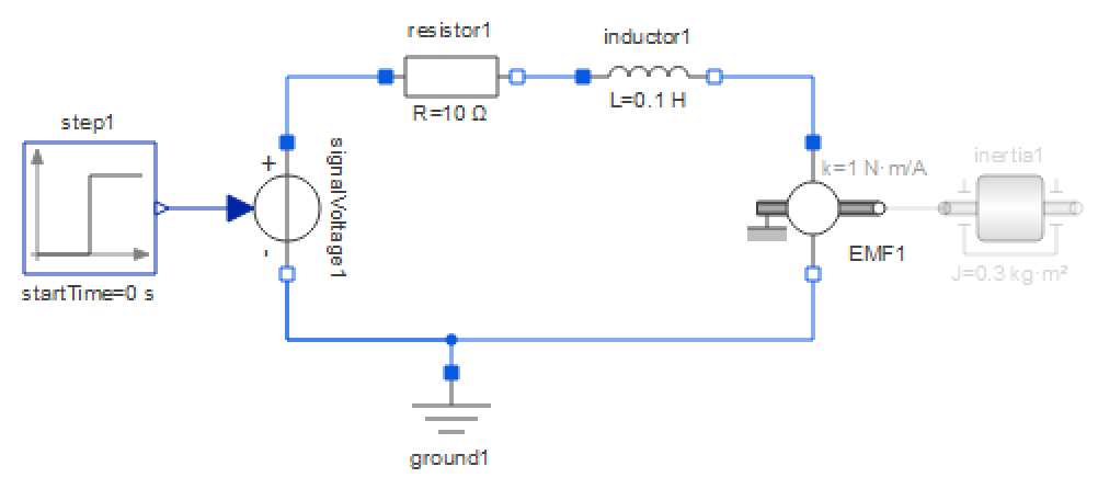
The IntroductoryExamples.MultiDomain.DCMotor model with the inertia1 component disabled.
Editing the Properties of Components
To edit the properties of a component, open the properties dialog box for the component by right-clicking it and choosing Properties from the popup menu, or by selecting it and choosing Properties from the Edit menu.
The dialog box can have up to five views:
- General. Provides the possibility of renaming the component and changing its description. This view also contains type information about the component.
- Placement. If the component is visible in one of the graphical views, it has a placement annotation describing its placement and transformations in that view. This annotation can be edited directly from the Placement view of the properties dialog box.
- Choices. The choices annotation for a component associates a set of predefined values or redeclarations with the component. The choices are typically presented to the user in the form of a drop-down box or menu in different contexts.
- Advanced. Gives you control over more advanced component settings, such as parameter evaluation, visibility of simulation results, etc.

The General view of the Component Properties dialog box.
The sections of each view in the dialog box are described in the following sections.
- Class specialization. The class specialization of the component's type. Available only if the type of the component is a class.
- Change Component Type. This button is used to change the type of the component. The button is not available if the class in which the component is declared is read only, or if the component is hierarchical or inherited. See this section for information on changing types of components.
- General: Replaceable Component. Allows modifications of the component in the form of redeclarations. See this section for information on how to change the type of a component by using redeclaration modifications.
- Constraining type. A constraining type can be specified to relax the allowed redeclarations of the component. The type of a redeclaration must be a subtype of the constraining type. By default, if no constraining type is specified, the component's declared type will be used as the constraining type.
- General: Show in Variable Views. Specifies whether the component should be visible in the variable views (variables with an initial value, and parameters are always visible). This section is only present if the component is an instance of a predefined Modelica type or a Modelica class of specialization record or type.
- Show. Specifies whether the value or the initial value should be shown for continuous and discrete variables in the variable views. Available only for continuous and discrete variables.
- View. The name of the view in which to show the variable. This is the name of the tab in the bottom area of Model Center.
- Protected. Access to the component is restricted to the class in which it is declared and to classes inheriting that class. Clear this checkbox to make the component accessible from all classes. This property is not available for components declared in connectors, as only public sections are allowed in connectors.
- Flow. Applies only to components declared in connector classes. The flow property specifies whether the sum of the quantity should sum to zero when connected. Select this checkbox for components specifying a flow quantity such as current, fluid, force, etc. Clear this checkbox for components specifying potential (non-flow) quantities, such as voltage, pressure, position, etc.
- Stream. Applies only to components declared in connector classes. A stream variable describes a quantity that is carried by a flow variable. The value of the stream variable is the specific property inside the component close to the boundary, assuming that matter flows out of the component into the connection point.
- Attributes: Variability. Specifies the variability of the component, with respect to simulation time.
- Unspecified (default). For variables of type Real, the variability (continuous or discrete) will be determined by the context in which the variable is used. The variability will be discrete for variables of type Boolean, Integer, String and enumeration.
- Placement. A placement annotation specifies the visibility, position, size and orientation of components in the icon and diagram views. Only connector components are visualized in the icon views.
- Choices: Choices Annotation. The choices annotation for a component associates a set of predefined values or redeclarations with the component. The choices are typically presented to the user in the form of a drop-down box or menu in different contexts.
- Advanced: Parameter Evaluation. Allows you to control the evaluation of specific parameters during the translation and compilation of models. When a parameter is evaluated to a constant, it makes it possible for the Modelica compiler to perform optimizations and improve symbolic processing, but as a result, it will no longer be possible to change the value of the parameter between simulations. In System Modeler, the choices Avoid Evaluation and Automatic are equivalent. This setting is applied using the standard Modelica annotation Evaluate.
- Advanced: Quantity Configuration. Allows you to specify if the quantity of a variable is a relative or absolute quantity (the default is absolute). This is of importance when unit conversions are performed in the user interface. For a type with a relative quantity, such as Modelica.Units.SI.TemperatureDifference, the offset in the unit conversion formula is ignored. This setting is only available for variables of type Real, as no other type can have a unit. The standard Modelica annotation absoluteValue is used for the quantity configuration.
- Advanced: Simulation Result. Gives explicit control of whether or not the results of a specific variable should be present in the simulation results. This setting is applied using the standard Modelica annotation HideResult.
Editing the Properties of Connections
The properties of a connection can be edited by right-clicking the connection and choosing Properties from the popup menu or by selecting the connection and choosing Edit ▶ Properties.

The General view of the Connection Properties dialog box.
The Connection Properties dialog box has two views, a General view and a Graphics view. The General view provides you with information about the connectors of the connection and the connection's declaration class. It also lets you edit the description of the connection. The Graphics view lets you edit the appearance and placement of the connection in the Diagram View.
The color of a connection line can either be specified in the Connection Properties dialog box or be derived from the source connector of the connection. To color one or more connection lines using the border color of their respective source connectors, select the lines and choose Color Connection Line from the Shape menu, or right-click one of the lines and choose Color Connection Line from the popup menu.
Editing the Properties of Graphic Items
When a graphic item is created, it is automatically given default values for all its attributes. For instance, the border color of an ellipse is always set to black. All attributes of a graphic item can be edited by selecting the graphic item and choosing Properties from the Edit menu, or by right-clicking the item and choosing Properties from the popup menu. A third option of how to open the properties dialog box is to double-click the graphic item.

The Line Properties dialog box.
Most of the common properties of graphic items can also be edited by using the tools in the formatting toolbar.
Tools to update common properties of graphic items.
The tools operate on the selected graphic items. Configure the tools by clicking their arrows. Any selected items are affected immediately by any changes made by the tools. Apply the current setting of a tool to the selected graphic items by clicking the tool's icon.
Adding or Removing Points of a Line or Polygon Item
To remove points from a line or polygon, select the item in the graphical view, place the mouse pointer next to the point that should be removed and press the - key on your keyboard. Similarly, to add a point to a line or polygon, select the item, place the mouse pointer where you want the point to be added and press the + key on your keyboard.
Editing the Dynamic Graphics of Graphic Items
When simulating a class in the Wolfram Language, it is possible to show an animated view of the diagram, with graphic items changing properties such as size, color, visibility or position depending on variable values at a given time point in the simulation. These dynamic properties can be configured in the Properties dialog of graphical primitives. This dialog can be opened by right-clicking the item and choosing Properties from the popup menu. In the resulting dialog, select the Dynamic Graphics tab. The dialog shows all properties in a list. The properties that are colored gray do not have a dynamic setting, and therefore show the static view, which is what is normally used in the diagram view. By double-clicking the value of a property, the static value can be edited to any Modelica expression, referencing variable and parameter names from the class. This screenshot shows how the extent of a rectangle depends on the variable h.

The Dynamic Graphics tab of a Rectangle Properties dialog box.
Visualize Component Hierarchies
One step involved when configuring components in a hierarchical model is the process of identifying the components. You may use the component browser's tree structure to expand the internals of a component in your model, but the presentation of these internals, which is simply a list of component names, makes the identification hard, as you need to know the name of the component.
Identification is a lot easier by viewing the internals of a component graphically. This is possible by right-clicking a component and selecting Open Component from the popup menu. Double-clicking a component gives the same result. The class window will enter component mode, where the component is graphically visualized in the context of the class. The component mode makes it possible to visualize the internals of components at any level in the component hierarchy of a class.
In component mode, you can select components in the graphical views and configure them using the variable and parameter views at the bottom of the application. All changes made will be stored as a component modification in the top-level class. No other models will be affected by the changes except your top-level class. Keep in mind that as you are visualizing a component and not a class, no changes can be made in the graphical views.

Showing the internals of component axis6 in MultiBody example Systems.RobotR3.FullRobot.
When in component mode, the name of the visualized component is shown at the top of the class window, along with a small toolbar with buttons for Back, Forward, Up, Open Class and Exit component mode.
The Exit component mode button will let you exit component mode and return to the graphical view of the class. Clicking the model name in the shown bar will also exit component mode. If a hierarchical component is visualized, such as in the screenshot above, you can step up in the component hierarchy by clicking the hierarchical parts of the component name or by using the Up button. The Back and Forward buttons are used to navigate back and forth in the component browsing history. Finally, Open Class will exit the component mode and open the diagram view of the component you are currently browsing.
The toolbar of the class window when in Component Mode.
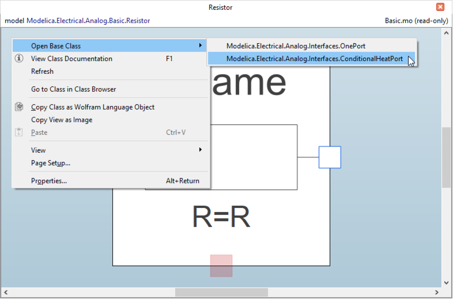
Opening Base Classes
If a class extends one or several other classes, you may want to open one of them. Instead of finding the correct class in the Class Browser, you can right-click an empty location in the graphical view and choose Open Base Class and then the name of the class to open from the popup menu.
Opening a base class from the popup menu.
The Component Browser can also be used to open base classes; for more information on how to use the Component Browser, see the section describing the component browser.
Zooming In and Out
When working with a detailed icon or diagram, you may want a closer view of certain objects to make it easier to work with them.
To quickly zoom in or out on any icon or diagram, rotate the mouse wheel while holding down the Ctrl key on the keyboard.
To specify a certain zoom level, use the zoom drop-down menu at the lower-right corner of Model Center and select one of the predefined levels, or click the zoom box to type your own zoom level. If you enter a zoom level of your own, press Return to confirm the input.
The zoom box in the lower-right corner of Model Center.
Panning and Scrolling
It is possible to pan any icon or model within a graphical view by using the mouse. Press and hold the middle mouse button. The mouse cursor will change into an open hand. Drag the model to the desired location. Panning can also be achieved using the left mouse button in combination with the Ctrl key.
If you have a mouse with a wheel, you can scroll up and down within a graphical view by rotating the wheel forward or backward. To scroll left and right, hold the Shift key while rotating the wheel.
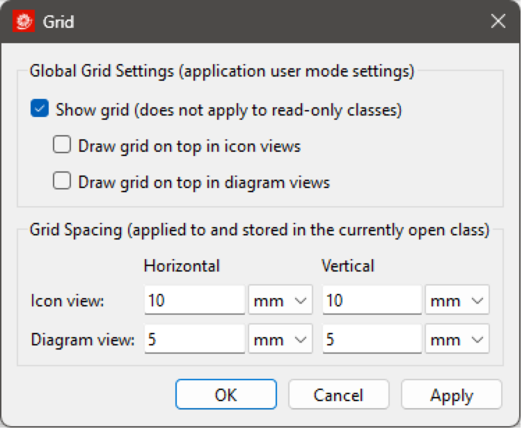
Grid
A grid helps you position objects visually in the Icon View and Diagram View of a class and can also be used to snap objects; see the section on snapping.
The grid can be toggled on and off by clicking View ▶ Show Grid or by opening the Grid dialog (View ▶ Grid) and clicking the corresponding checkbox. The Grid dialog also allows you to choose whether the grid should be drawn on top of all objects, making it easier to align objects and to specify the grid spacing for the class views.
The grid spacing can be set individually for the Icon View and Diagram View for every class and is saved along with the class definition when the class is saved. While the grid spacing setting only affects the views of the currently active class window, the grid visibility and on-top settings are global and affect all class views for the currently active user mode.
See this section for information on how to change default grid settings for the icon and diagram layers. The default grid settings are applied to all new models when created.
Snap
The snap function helps you position and align objects. Snapping pulls objects to grid lines when objects are being moved, to orthogonal angles when objects are being rotated, and so on. You can control the type of snapping and the snap strength from the Snap dialog box, which can be reached from the View menu (View ▶ Snapping...). Custom snap settings are applied to the visible view of the active class window and will remain active until you choose to exit Model Center.

By default, all objects snap to grid lines when the objects are created or moved. The origin points of an object are by default also snapped to the grid as well as the center of the object. The points of a line or polygon object also snap to neighboring points, and components are snapped to orthogonal angles while being rotated.
You may not always want to snap objects, for instance, if you want an object to be rotated close to an orthogonal angle. Hold down the Alt key to temporarily disable all snapping. To disable a certain type of snapping, uncheck it in the Snap dialog box.
On Drop Action
It is possible to specify an action to be performed when a class is dropped in any of the two graphical views of a class window while holding the Ctrl key. The default action is to show a context menu of all possible actions. To change this action, open the Options dialog by choosing Options from the Tools menu and go to the Graphical Class Views section. The on drop action applies to all class windows. The setting is automatically saved when closing the dialog and restored the next time Model Center is started.

Specifying an on drop action for the graphical views in the Options dialog box.
Resizing Graphical Layers
To resize the icon layer or diagram layer of a class, click anywhere on its border to show its selection handles and then drag the handles until the page is the desired size.
The size of the icon layer and diagram layer can also be set from the page setup dialog box by editing the coordinate systems.
To edit the coordinate systems of the class in the active class window, choose Page Setup from the File menu, or right-click an empty part of the class window and choose Page Setup from the popup menu. Choose whether to edit the properties of the icon layer or diagram layer by clicking the Icon Layer or Diagram Layer tab. The settings are saved along with the class definition when the class is saved.

Editing the icon layer properties of a class in the Page Setup dialog box.
For all classes except connectors, the default size of the diagram layer is 297×210 mm, which corresponds to the size of a landscape A4 sheet, and the size of the icon layer is 200×200 mm. For connector classes, the default size of the diagram layer is 200×200 mm, as a square is the most common shape of a connector. Also, by default, the coordinate systems of both layers have their origin (0,0) at the center of the page.
See this section for information on how to change the default page properties of the graphical layers.
Changing the Initial Component Size for a Class
The initial size of the component of a class when dropped in the Icon View or Diagram View can be specified in the Page Setup dialog box. For all classes except connectors, the icon layer of the class is used to represent the class when it appears as a component in the Diagram View of another model. For connector classes, however, the icon layer is used as a representation in the Icon View, while the diagram layer is used as a representation in the Diagram View.
To edit the property of the class in the active class window, choose Page Setup from the File menu, or right-click an empty part of the class window and choose Page Setup from the popup menu. Choose whether to edit the property of the icon layer or diagram layer (available for connector classes only) by selecting the Icon Layer or Diagram Layer tab. The initial component icon size for the chosen graphical layer is specified by a scale factor in the Component section of the dialog box. The initial size of a component icon is the scale factor multiplied with the width and height of the graphical layer.

The Component section of the Page Setup dialog box.
It is also possible to preserve the aspect ratio of component icons representing the chosen layer of the class by checking the Preserve aspect ratio box. The settings are saved along with the class definition when the class is saved.
See this section for information on how to change the default page properties of the graphical layers.
Changing the Default Component Name and Attributes for a Class
The name of a component is normally autogenerated when the class of the component is dropped in the Icon View or Diagram View. If a default component name for a class is specified, that name will be used instead of the autogenerated one. Similarly, when a component is created using drag and drop, the component is created with no attributes, but sometimes it can be useful to ensure that all components of a class are declared with some specific component attributes by default.
The default component name and default component attributes for a class can be specified in the Class Properties dialog box; see the Editing the Properties of Classes section.
Changing Default Page Properties for Graphical Layers
The default page properties for the icon layer and diagram layer can be changed in the Graphical Class Views section of the Options dialog box. To open the dialog box, choose Options from the Tools menu.

Editing the default icon layer properties for non-connector classes in the Options dialog box.
The default page properties are used when new Modelica classes are created. Changing the default page properties does not affect existing classes. The default page properties are automatically saved when closing the dialog box and restored the next time Model Center is started.
Changing the Appearance of Component Text
Text belonging to a component in the graphical views, such as the component name and parameters, is rendered using a fixed font size. If text does not fit its given boundaries, it is by default compressed by elision and expanded only on mouseover.
Both the font size and elision behavior may be changed in the Graphical Class Views section of the Options dialog box. To open the Options dialog box, choose Options from the Tools menu.

The Display section with the Component Text properties of the Options dialog box.
Printing
You can print the contents of the visible graphical view by choosing File ▶ Print. The contents of the view will automatically be scaled to fit the selected paper size if necessary.
Copy View as Image
The contents of the graphical view can be copied to the clipboard as an image by right-clicking anywhere in the view and choosing Copy View as Image. The image is a representation of the graphical view rendered to show the complete class.