Simulation Center—Plot Windows
The main purpose of Simulation Center is to plot and study the results of a simulation. There are two kinds of plot windows: the Y(T) plot window and the Y(X) plot window. The Y(T) plot window shows how the values of one or more variables change over time, whereas the Y(X) plot window shows how the point (x(t),y(t)) changes over time. The plotted variables may all be from the same experiment or from different experiments.
Arranging the Windows
If you have more than one plot window open, you can view all windows at the same time. To display the windows side by side, choose Tile from the Window menu. To arrange the windows so that the title bar of every window is visible, choose Cascade from the Window menu.
Creating a New Plot Window
When creating a new experiment, an empty Y(T) plot window is automatically created. If more plot windows are needed, choose Plot ▶ New Y(T) Plot Window or Plot ▶ New Y(X) Plot Window in the toolbar to create new plot windows. You can also use the buttons available on the toolbar.
![]()
The New Y(T) Plot Window and New Y(X) Plot Window buttons.
Creating a New Subplot
An alternative to creating new plot windows is to use a subplot, i.e. create several plots in the same window. To create a new subplot, choose Plot ▶ New Subplot or click the New Subplot button on the Plot toolbar.
![]()
The New Subplot button on the Plot toolbar.
Removing a Subplot
Select the subplot by clicking somewhere in it and choose Plot ▶ Remove Subplot or click the Remove Subplot button in the toolbar.
![]()
The Remove Subplot button in the toolbar.
Zooming In and Out
It is possible to zoom by pressing the mouse button and dragging the mouse inside the window to create a rectangle. When releasing the mouse button, the window will zoom to the specified rectangle. To go back to the previous zoom level, press the Backspace key (Cmd+[ on macOS). Double-clicking within the plot window resets the zoom to the default, which is auto scale on all axes unless it is a model plot with a manually specified axis range. Then it will reset to the specified range.
To manually zoom in on one axis and preserve the zoom (manual or auto scale) on all other axes, left-click and drag on the desired axis to specify the zoom range.
Restricting the Plotted Time Interval
It is possible to restrict the plotted time interval by right-clicking in the plot window and choosing Restrict time interval. The plotted time interval is then controlled by adjusting the slider at the bottom of the plot window. This slider is by default visible in all Y(X) plot windows.
Changing the  Axis
Axis
To change the ![]() axis for a plot curve, right-click the curve and select Move to Right/Left Y Axis.
axis for a plot curve, right-click the curve and select Move to Right/Left Y Axis.
Removing All Plotted Variables
To remove all plotted variables from a plot window, right-click the plot window and choose Clear from the popup menu that appears.
Exporting Plots
To save the contents of the active plot window to a file, choose File ▶ Export ▶ Plot as Image or File ▶ Export ▶ Plot as CSV. In the file selector window, choose a location and specify a file name. Images can be saved in BMP, JPEG, or PNG format, while choosing plot as CSV (comma-separated values) will result in a text file.
Storing Plots
The definitions for a plot can be stored in the model, to easily reproduce the same plot from a future simulation; see Model Plots.
Printing Plots
To print the active plot window, choose File ▶ Print.
Copying Plots
To copy the contents of the active plot window to the clipboard as an image, choose Edit ▶ Copy or right-click in the plot window and choose Copy as Image. To copy the contents of a plot window to the clipboard as tab-delimited data suitable for pasting into, for example, Excel, right-click in the plot window and choose Copy as Data.
Plot Expressions
In addition to plotting individual result variables, it is also possible to plot expression of result variables; see Plot Expressions.
Plot Markers
Plot markers are vertical or horizontal support lines in the plot that are associated with one of the axes in a plot. To add a plot marker, press and hold down the Ctrl key and click the desired axis and value. Alternatively, choose Plot ▶ Add Plot Marker to open the Add Plot Marker dialog. When using the dialog, it is also possible to give the plot marker an optional label.
To move an existing plot marker or its label, click and drag it to its new desired location in the plot.
Plot Data Setup
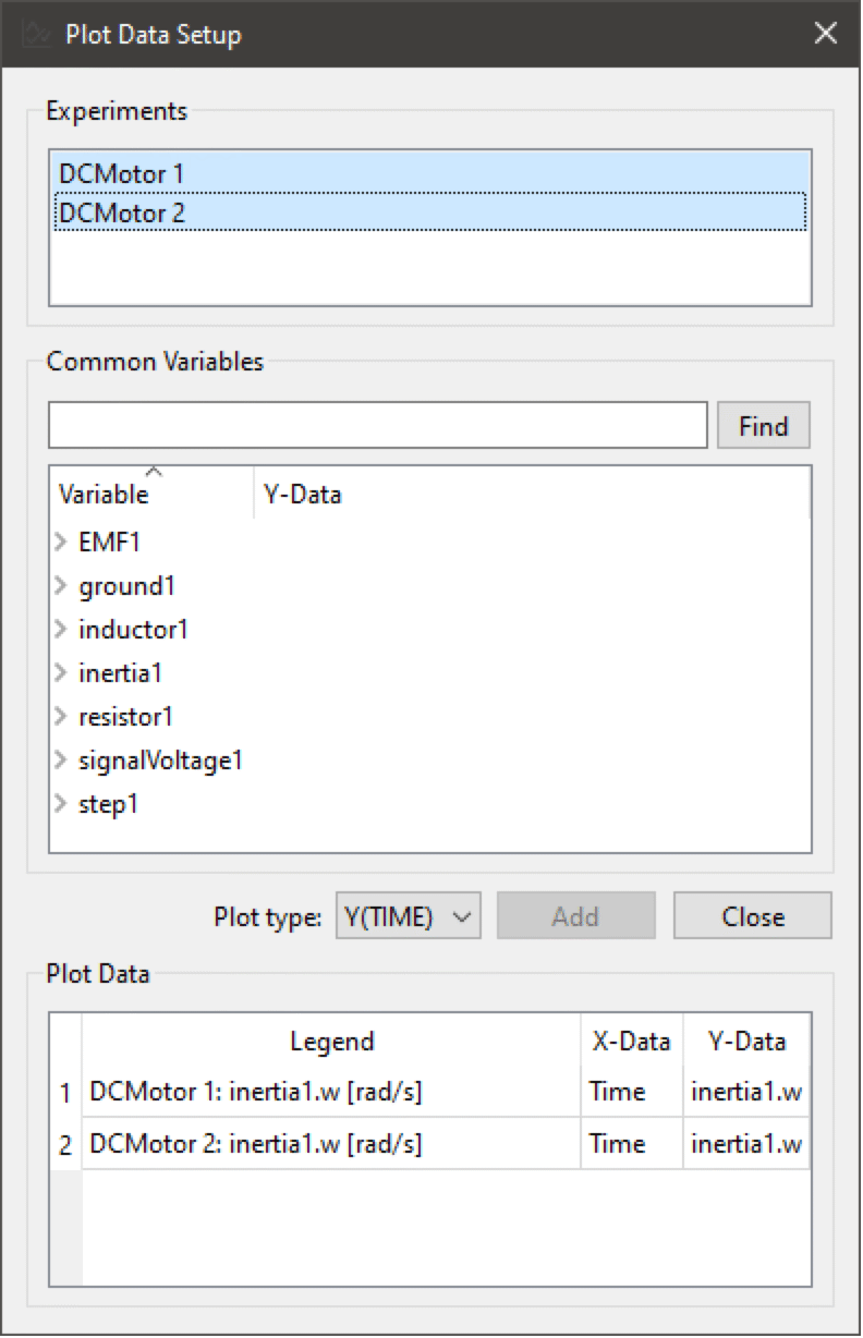
To open the Plot Data Setup dialog, choose Plot ▶ Plot Data Setup. From this dialog it is possible to plot the same variable from several experiments. First select the experiments of interest in the list of experiments. The Common Variables view will then show the common set of variables in the selected experiments. The experiments do not need to be from the same model; they only have to contain some common variable. Select the variables to plot by checking their Y-Data checkbox and clicking the Add button. This will add one plot for each variable from all of the selected experiments. It is also possible to create Y(X) plots from this dialog by selecting Y(X) from the plot type box.
The plot data view in the dialog shows all datasets from the plot. It is possible to remove datasets from the plot by selecting them and pressing the Delete key.
Plot Properties
To change the properties of a plot, choose Plot ▶ Properties or right-click somewhere in the plot window and choose Properties. This will open the Plot Properties dialog.
Plot Window Properties
A plot window can have a title and a caption that can be edited in the Plot Window part of the Plot Properties dialog. If the plot is a stored model plot, it must have a unique identifier that can be used to reference the plot from, for example, the Wolfram Language. When applying a changed plot identifier, the model plot will be updated immediately in the model. This also means that all other clients (e.g. the Wolfram Language) will lose its connection to the plot.
For quick access to the caption, it is possible to double-click an existing caption in the plot window to open the plot window properties. Captions can contain markup for links and variable replacements.
The Plot Window part of the Plot Properties dialog box.
Links
With links, it is possible to link to generic URIs, subplots and variables in captions. Links are written in the following form %[<link-text>](<link-target>), where [<link-text>] is an optional manually specified link text. The <link-target> can take any of the following forms:
- variable:<component-reference>, where <component-reference> is a component reference such as resistor1.v.
- plot:<subplot-identifier>, where <subplot-identifier> is the identifier of a subplot in the current plot window.
To insert a link, click the Insert link button. To edit an existing link, place the cursor somewhere in the link and click the Insert link button.
Variable Replacements
With variable replacements it's possible to insert the final value of a variable in a caption. Variable replacements are written on the form %{<component-reference>}, where <component-reference> is a component reference such as resistor1.v.
To insert a variable replacement, click on the Insert final value of variable button. To edit an existing variable, place the cursor somewhere in the variable replacement and click on the Insert final value of variable button.
Subplot Title
To add or change the title for a subplot, open the Plot Properties dialog and select the title tab. For quick access to the title, it is possible to double-click an existing title in the plot window.
It is also possible to give the subplot an identifier that can be used to link to the subplot in, for example, captions.
The Subplot part of the Plot Properties dialog box with the Title tab opened.
Axis Properties
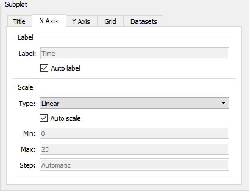
To change the axis properties for a subplot, open the Plot Properties dialog and select the appropriate axis tab. For quick access to the axis properties, it is possible to double-click the axis in the subplot. Here you can specify an axis label and set up the axis scale. An automatic label will be generated if the Auto label checkbox is checked. To specify an axis label, uncheck the Auto label checkbox and write the label text in the Label text box. If Show axis unit is checked and a unit can be determined for the axis, that unit will be shown next to the axis.
The Subplot part of the Plot Properties dialog box with the X Axis tab opened.
If the subplot is in a plot window that contains more than one subplot, it is possible to enable Synchronize with compatible subplots. When that is enabled, all scale changes to the selected axis will be propagated to the other subplots.
The Subplot part of the Plot Properties dialog box with the X Axis tab opened and the Synchronize with compatible subplots checkbox enabled.
Grid Properties
To change the grid properties for a subplot, open the Plot Properties dialog and select the Grid tab. Here you can turn on and off the different grid lines as well as change their line style and color.
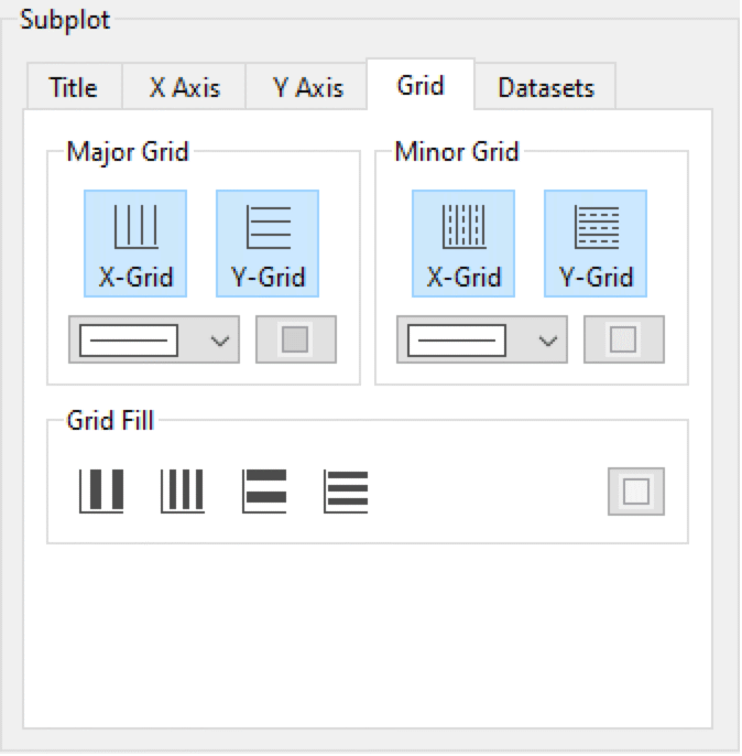
The Subplot part of the Plot Properties dialog box with the Grid tab opened.
Dataset Properties
To change the dataset properties for a subplot, open the Plot Properties dialog and select the Datasets tab. For quick access to the dataset properties, click the legend item for the dataset that you want to edit. Here you can specify line properties for each dataset. To change the same property for multiple datasets, press and hold down the Ctrl key and mark multiple datasets by clicking the desired datasets. To edit the legend text for a dataset, double-click in the Legend column for that dataset. To turn off the legend for a dataset, uncheck the checkbox in the Legend column for that dataset.
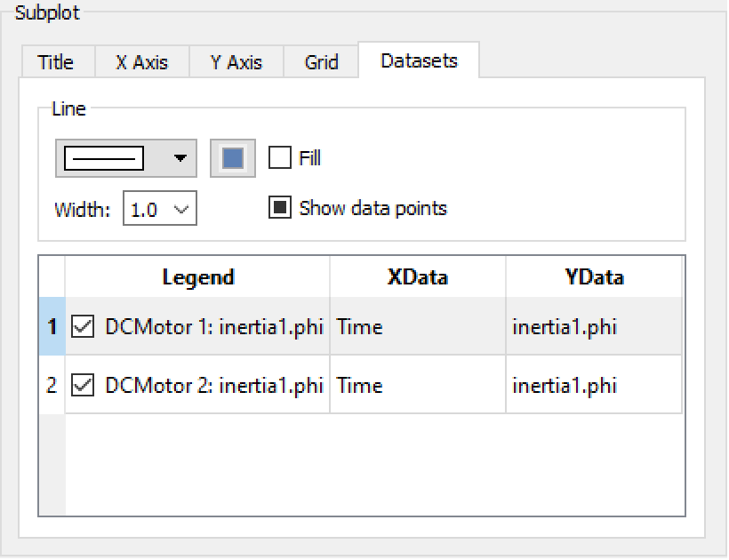
The Subplot part of the Plot Properties dialog box with the Datasets tab opened.
Plot Themes
To apply predefined themes to a plot, click the Plot Themes button on the Plot toolbar or choose Themes in the Plot menu. In the Select Plot Theme dialog that opens, select one of the themes to apply it to the plot.
![]()
The Plot Themes button on the Plot toolbar.
Clocked Variables
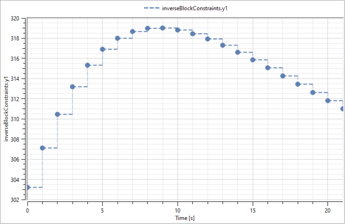
Plots of clocked variables will by default be styled with dashed lines. If clock information is available (depending on output settings), each clock tick will be represented by a solid, circular marker.
In the default plot style for clocked variables with clock information, each clock tick is represented by a solid, circular marker.


