CheckboxBar
CheckboxBar[x,{val1,val2,…}]
represents a checkbox bar with setting x and with checkboxes for values vali to include in the list x.
CheckboxBar[Dynamic[x],{val1,val2,…}]
takes the setting to be the dynamically updated current value of x, with the values in the list x being reset every time a checkbox is clicked.
CheckboxBar[x,{val1lbl1,val2lbl2,…}]
represents a checkbox bar in which the checkbox associated with value vali has label lbli.
Details and Options


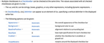
- Multiple checkboxes in a CheckboxBar can be checked at the same time. The values associated with all checked checkboxes are given in a list. »
- The vali and lbli can be strings, boxes, graphics, or any other expressions, including dynamic expressions. »
- In CheckboxBar[x,list], Delimiter can appear as an element of list, specifying a vertical delimiter in the displayed setter bar.
- The following options can be given:
-
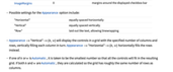
Appearance Automatic the overall appearance of the checkbox bar Background Automatic background color to use BaselinePosition Automatic alignment relative to surrounding text BaseStyle {} base style specifications for each checkbox bar Enabled Automatic whether the checkbox bar is enabled, or grayed out ImageMargins 0 margins around the displayed checkbox bar - Possible settings for the Appearance option include:
-
"Horizontal" equally spaced horizontally "Vertical" equally spaced vertically "Row" laid out like text, allowing linewrapping - Appearance->"Vertical"->{h,w} will display the controls in a grid with the specified number of columns and rows, vertically filling each column in turn. Appearance->"Horizontal"->{h,w} horizontally fills the rows instead.
- If one of h or w is Automatic, it is taken to be the smallest number so that all the controls will fit in the resulting grid. If both h and w are Automatic, they are calculated so the grid has roughly the same number of rows as columns.
- Method->"Active" will cause the active area for each item to include the corresponding label.
- The settings for BaseStyle and LabelStyle are appended to the default styles typically given by the "CheckboxBar" and "CheckboxBarLabel" styles in the current stylesheet.
Examples
open allclose allScope (3)
Use a dynamically updated setting:
Use any expression as a value:
Separate choices with a Delimiter:
Options (9)
Appearance (4)
Enabled (1)
By default, CheckboxBar is enabled:
By setting Enabled->False, the checkbox bar is disabled but visible in its current state:
Method (1)
Normally, toggling the checkbox requires clicking the checkbox directly:
With Method->"Active", the label can also be clicked to toggle the checkbox:
Properties & Relations (2)
CheckboxBar is a special case of TogglerBar:
CheckboxBar is built using Checkbox and can be used to track a list of values:
Text
Wolfram Research (2007), CheckboxBar, Wolfram Language function, https://reference.wolfram.com/language/ref/CheckboxBar.html (updated 2008).
CMS
Wolfram Language. 2007. "CheckboxBar." Wolfram Language & System Documentation Center. Wolfram Research. Last Modified 2008. https://reference.wolfram.com/language/ref/CheckboxBar.html.
APA
Wolfram Language. (2007). CheckboxBar. Wolfram Language & System Documentation Center. Retrieved from https://reference.wolfram.com/language/ref/CheckboxBar.html