


LogLogPlot
LogLogPlot[f,{x,xmin,xmax}]
generates a log-log plot of f as a function of x from xmin to xmax.
LogLogPlot[{f1,f2,…},{x,xmin,xmax}]
plots several functions fi.
LogLogPlot[{…,w[fi],…},…]
plots fi with features defined by the symbolic wrapper w.
LogLogPlot[…,{x}∈reg]
takes the variable x to be in the geometric region reg.
Details and Options
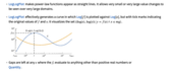


- LogLogPlot makes power-law functions appear as straight lines. It allows very small or very large value changes to be seen over very large domains.
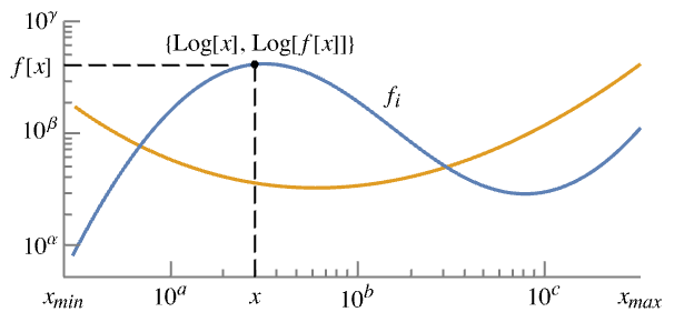
- LogLogPlot effectively generates a curve in which Log[f] is plotted against Log[x], but with tick marks indicating the original values of f and x. It visualizes the set
 .
. - Gaps are left at any x where the fi evaluate to anything other than positive real numbers or
Quantity. - The limits xmin and xmax can be real numbers or Quantity expressions.
- The region reg can be any RegionQ object in 1D.
- LogLogPlot treats the variable x as local, effectively using Block.
- LogLogPlot has attribute HoldAll and evaluates f only after assigning specific numerical values to x.
- In some cases, it may be more efficient to use Evaluate to evaluate f symbolically before specific numerical values are assigned to x.
- The following wrappers w can be used for the fi:
-
Annotation[fi,label] provide an annotation for the fi Button[fi,action] evaluate action when the curve for fi is clicked Callout[fi,label] label the function with a callout Callout[fi,label,pos] place the callout at relative position pos EventHandler[fi,events] define a general event handler for fi Highlighted[fi,effect] dynamically highlight fi with an effect Highlighted[fi,Placed[effect,pos]] statically highlight fi with an effect at position pos Hyperlink[fi,uri] make the function a hyperlink Labeled[fi,label] label the function Labeled[fi,label,pos] place the label at relative position pos Legended[fi,label] identify the function in a legend PopupWindow[fi,cont] attach a popup window to the function StatusArea[fi,label] display in the status area on mouseover Style[fi,styles] show the function using the specified styles Tooltip[fi,label] attach a tooltip to the function Tooltip[fi] use functions as tooltips - Wrappers w can be applied at multiple levels:
-
w[fi] wrap the fi w[{f1,…}] wrap a collection of fi w1[w2[…]] use nested wrappers - Callout, Labeled, and Placed can use the following positions pos:
-
Automatic automatically placed labels Above, Below, Before, After positions around the curve x near the curve at a position x Scaled[s] scaled position s along the curve {s,Above},{s,Below},… relative position at position s along the curve {pos,epos} epos in label placed at relative position pos of the curve - LogLogPlot has the same options as Graphics, with the following additions and changes: [List of all options]
-
AspectRatio 1/GoldenRatio ratio of height to width Axes True whether to draw axes ClippingStyle None what to draw where curves are clipped ColorFunction Automatic how to determine the coloring of curves ColorFunctionScaling True whether to scale arguments to ColorFunction EvaluationMonitor None expression to evaluate at every function evaluation Exclusions Automatic points in x to exclude ExclusionsStyle None what to draw at excluded points Filling None filling to insert under each curve FillingStyle Automatic style to use for filling LabelingSize Automatic maximum size of callouts and labels MaxRecursion Automatic the maximum number of recursive subdivisions allowed Mesh None how many mesh points to draw on each curve MeshFunctions {#1&} how to determine the placement of mesh points MeshShading None how to shade regions between mesh points MeshStyle Automatic the style for mesh points Method Automatic the method to use for refining curves PerformanceGoal $PerformanceGoal aspects of performance to try to optimize PlotHighlighting Automatic highlighting effect for curves PlotInteractivity $PlotInteractivity whether to allow interactive elements PlotLabel None overall label for the plot PlotLabels None labels to use for curves PlotLegends None legends for curves PlotPoints Automatic initial number of sample points PlotRange {Full,Automatic} the range of y or other values to include PlotRangeClipping True whether to clip at the plot range PlotStyle Automatic graphics directives to specify the style for each curve PlotTheme $PlotTheme overall theme for the plot RegionFunction (True&) how to determine whether a point should be included ScalingFunctions None how to scale individual coordinates TargetUnits Automatic units to display in the plot WorkingPrecision MachinePrecision the precision used in internal computations - Possible settings for ClippingStyle are:
-
Automatic use a dotted line for the clipped portion 
None omit the clipped portion of the curve 
style use style for the clipped portion - Possible settings for PlotLayout that show single curves in multiple plot panels include:
-
"Column" use separate curves in a column of panels "Row" use separate curves in a row of panels {"Column",k},{"Row",k} use k columns or rows {"Column",UpTo[k]},{"Row",UpTo[k]} use at most k columns or rows - With the default settings Exclusions->Automatic and ExclusionsStyle->None, LogLogPlot breaks curves at discontinuities and singularities it detects. Exclusions->None joins across discontinuities and singularities.
- Exclusions->{x1,x2,…} is equivalent to Exclusions->{x==x1,x==x2,…}.
- PlotLegends->"Expressions" uses the fi as the legend text.
- ColorData["DefaultPlotColors"] gives the default sequence of colors used by PlotStyle.
- Possible highlighting effects for Highlighted and PlotHighlighting include:
-
style highlight the indicated curve 
"Ball" highlight and label the indicated point in a curve 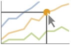
"Dropline" highlight and label the indicated point in a curve with droplines to the axes 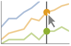
"XSlice" highlight and label all points along a vertical slice 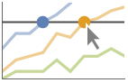
"YSlice" highlight and label all points along a horizontal slice 
Placed[effect,pos] statically highlight the given position pos - Highlight position specifications pos include:
-
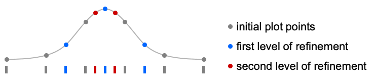
x, {x} effect at {x,y} with y chosen automatically {x,y} effect at {x,y} {pos1,pos2,…} multiple positions posi - LogLogPlot initially evaluates f at a number of equally spaced sample points specified by PlotPoints. Then it uses an adaptive algorithm to choose additional sample points, subdividing a given interval at most MaxRecursion times.
- Since only a finite number of sample points are used, it is possible for LogLogPlot to miss features of f. Increasing the settings for PlotPoints and MaxRecursion will often catch such features.
- Themes that affect curves include:
-

"ThinLines" thin plot lines 
"MediumLines" medium plot lines 
"ThickLines" thick plot lines - The arguments supplied to functions in MeshFunctions and RegionFunction are x, y. Functions in ColorFunction are by default supplied with scaled versions of these arguments.
- Possible settings for ScalingFunctions include:
-
sy scale the y axis {sx,sy} scale x and y axes - Common built-in scaling functions s include:
-
"Log" 
log scale with automatic tick labeling "Log10" 
base-10 log scale with powers of 10 for ticks "SignedLog" 
log-like scale that includes 0 and negative numbers "Reverse" 
reverse the coordinate direction "Infinite" 
infinite scale - If a scaling function is specified for either direction, it is applied after the normal log scaling.
-
 Highlight options with settings specific to LogLogPlot
-
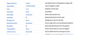
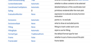
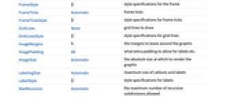
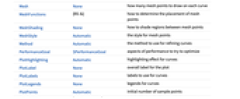
AlignmentPoint Center the default point in the graphic to align with AspectRatio 1/GoldenRatio ratio of height to width Axes True whether to draw axes AxesLabel None axes labels AxesOrigin Automatic where axes should cross AxesStyle {} style specifications for the axes Background None background color for the plot BaselinePosition Automatic how to align with a surrounding text baseline BaseStyle {} base style specifications for the graphic ClippingStyle None what to draw where curves are clipped ColorFunction Automatic how to determine the coloring of curves ColorFunctionScaling True whether to scale arguments to ColorFunction ContentSelectable Automatic whether to allow contents to be selected CoordinatesToolOptions Automatic detailed behavior of the coordinates tool Epilog {} primitives rendered after the main plot EvaluationMonitor None expression to evaluate at every function evaluation Exclusions Automatic points in x to exclude ExclusionsStyle None what to draw at excluded points Filling None filling to insert under each curve FillingStyle Automatic style to use for filling FormatType TraditionalForm the default format type for text Frame False whether to put a frame around the plot FrameLabel None frame labels FrameStyle {} style specifications for the frame FrameTicks Automatic frame ticks FrameTicksStyle {} style specifications for frame ticks GridLines None grid lines to draw GridLinesStyle {} style specifications for grid lines ImageMargins 0. the margins to leave around the graphic ImagePadding All what extra padding to allow for labels etc. ImageSize Automatic the absolute size at which to render the graphic LabelingSize Automatic maximum size of callouts and labels LabelStyle {} style specifications for labels MaxRecursion Automatic the maximum number of recursive subdivisions allowed Mesh None how many mesh points to draw on each curve MeshFunctions {#1&} how to determine the placement of mesh points MeshShading None how to shade regions between mesh points MeshStyle Automatic the style for mesh points Method Automatic the method to use for refining curves PerformanceGoal $PerformanceGoal aspects of performance to try to optimize PlotHighlighting Automatic highlighting effect for curves PlotInteractivity $PlotInteractivity whether to allow interactive elements PlotLabel None overall label for the plot PlotLabels None labels to use for curves PlotLegends None legends for curves PlotPoints Automatic initial number of sample points PlotRange {Full,Automatic} the range of y or other values to include PlotRangeClipping True whether to clip at the plot range PlotRangePadding Automatic how much to pad the range of values PlotRegion Automatic the final display region to be filled PlotStyle Automatic graphics directives to specify the style for each curve PlotTheme $PlotTheme overall theme for the plot PreserveImageOptions Automatic whether to preserve image options when displaying new versions of the same graphic Prolog {} primitives rendered before the main plot RegionFunction (True&) how to determine whether a point should be included RotateLabel True whether to rotate y labels on the frame ScalingFunctions None how to scale individual coordinates TargetUnits Automatic units to display in the plot Ticks Automatic axes ticks TicksStyle {} style specifications for axes ticks WorkingPrecision MachinePrecision the precision used in internal computations
List of all options
Examples
open all close allBasic Examples (4)
Scope (30)
Sampling (7)
More points are sampled when the function changes quickly:
The plot range is selected automatically:
Ranges where the function becomes negative are excluded:
The curve is split when there are discontinuities in the function:
Use PlotPoints and MaxRecursion to control adaptive sampling:
Use PlotRange to focus in on areas of interest:
Use Exclusions to remove points or split the resulting curve:
Labeling and Legending (11)
Label curves with Labeled:
Place the labels relative to the curves:
Label curves with PlotLabels:
Place the label near the curve at an ![]() value:
value:
Specify the text position relative to the point:
Label curves automatically with Callout:
Place labels at specific locations:
Include legends for each curve:
Use Legended to provide a legend for a specific curve:
Use Placed to change the legend location:
Curves usually have interactive callouts showing the coordinates when you mouse over them:
Including specific wrappers or interactions, such as tooltips, turns off the interactive features:
Choose from multiple interactive highlighting effects:
Use Highlighted to emphasize specific points in a plot:
Presentation (12)
Multiple curves are automatically colored to be distinct:
Provide explicit styling to different curves:
Create legends from the functions:
Provide an interactive Tooltip for each curve:
Use a theme with a frame, grid lines, and an automatic legend:
Style the curve segments between mesh points:
Show multiple curves in a row of separate panels:
Use a column instead of a row:
Use ScalingFunctions to reverse the y axis:
Options (96)
ClippingStyle (5)
ColorFunction (5)
Color by scaled ![]() coordinate and scaled
coordinate and scaled ![]() coordinate, respectively:
coordinate, respectively:
Color a curve red when its absolute ![]() coordinate is above 1:
coordinate is above 1:
Fill with the color used for the curve:
ColorFunction has higher priority than PlotStyle for coloring the curve:
ColorFunctionScaling (3)
EvaluationMonitor (3)
Find the list of values sampled by LogLogPlot:
Show where LogLogPlot evaluates the function:
Exclusions (2)
ExclusionsStyle (2)
Filling (7)
FillingStyle (4)
Fill with red below ![]() and blue above:
and blue above:
Use a variable filling style obtained from a ColorFunction:
LabelingSize (4)
MaxRecursion (2)
Each level of MaxRecursion will subdivide the initial mesh into a finer mesh:
Mesh (3)
MeshFunctions (4)
Use a mesh evenly spaced in the ![]() and
and ![]() directions:
directions:
Mesh functions use the unscaled values in the ![]() and
and ![]() directions:
directions:
Use Log to scale the mesh functions:
Show 5 mesh levels in the ![]() direction (red) and 10 in the
direction (red) and 10 in the ![]() direction (blue):
direction (blue):
MeshShading (6)
Alternate red and blue segments of equal width in the ![]() direction:
direction:
Use None to remove segments:
MeshShading can be used with PlotStyle:
MeshShading has higher priority than PlotStyle for styling the curve:
Use PlotStyle for some segments by setting MeshShading to Automatic:
MeshShading can be used with ColorFunction:
MeshStyle (4)
PerformanceGoal (2)
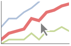
PlotHighlighting (8)
Plots have interactive coordinate callouts with the default setting PlotHighlightingAutomatic:
Use PlotHighlightingNone to disable the highlighting for the entire plot:
Use Highlighted[…,None] to disable highlighting for a single curve:
Move the mouse over the curve to highlight it with a ball and label:
Use a ball and label to highlight a specific point on the curve:
Move the mouse over the curve to highlight it with a label and droplines to the axes:
Use a ball and label to highlight a specific point on the curve:
Move the mouse over the plot to highlight it with a slice showing ![]() values corresponding to the
values corresponding to the ![]() position:
position:
Highlight the curves at a fixed ![]() value:
value:
Move the mouse over the plot to highlight it with a slice showing ![]() values corresponding to the
values corresponding to the ![]() position:
position:
Use a component that shows the points on the curve closest to the ![]() position of the mouse cursor:
position of the mouse cursor:
Specify the style for the points:
Use a component that shows the coordinates on the curve closest to the mouse cursor:
Use Callout options to change the appearance of the label:
PlotInteractivity (4)
PlotLabels (5)
Place the labels above the curves:
Place the labels differently for each curve:
PlotLabels->"Expression" uses functions as curve labels:
Use callouts to identify the points:
Use None to not add a label:
PlotLayout (2)
PlotLegends (7)
No legends are used by default:
Create a legend based on the functions:
Create a legend with placeholder text:
Specify labels for each curve:
PlotLegends picks up PlotStyle values automatically:
Use Placed to position legends:
Use LineLegend to modify the appearance of the legend:
PlotStyle (6)
Use different style directives:
By default, different styles are chosen for multiple curves:
Explicitly specify the style for different curves:
PlotStyle can be combined with ColorFunction:
PlotStyle can be combined with MeshShading:
PlotTheme (1)
Properties & Relations (4)
LogLogPlot samples more points where it needs to:
LogLogPlot is a special case of Plot for curves:
Use LogPlot and LogLinearPlot for logarithmic plots in the other directions:
Use ListLogPlot for data:
Text
Wolfram Research (2007), LogLogPlot, Wolfram Language function, https://reference.wolfram.com/language/ref/LogLogPlot.html (updated 2025).
CMS
Wolfram Language. 2007. "LogLogPlot." Wolfram Language & System Documentation Center. Wolfram Research. Last Modified 2025. https://reference.wolfram.com/language/ref/LogLogPlot.html.
APA
Wolfram Language. (2007). LogLogPlot. Wolfram Language & System Documentation Center. Retrieved from https://reference.wolfram.com/language/ref/LogLogPlot.html