


QuantilePlot
QuantilePlot[list]
generates a plot of quantiles of list against the quantiles of a normal distribution.
QuantilePlot[dist]
generates a plot of quantiles of the distribution dist against the quantiles of a normal distribution.
QuantilePlot[data,rdata]
generates a plot of the quantiles of data against the quantiles of rdata.
QuantilePlot[data,rdist]
generates a plot of the quantiles of data against the quantiles of a symbolic distribution rdist.
QuantilePlot[{data1,data2,…},ref]
generates a plot of quantiles of datai against the quantiles of a reference distribution ref.
Details and Options
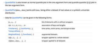
- QuantilePlot is also known as normal quantile plot in the one-argument form and quantile-quantile (Q-Q) plot in the two-argument form.
- QuantilePlot[data1,data2] works with datai being either a dataset of real values or a symbolic univariate distribution.
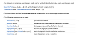
- Data for QuantilePlot can be given in the following forms:
-
{e1,e2,…} list of elements with or without wrappers <k1y1,k2y2,…> association of keys and lengths TimeSeries[…],EventSeries[…],TemporalData[…] time series, event series, and temporal data WeightedData[…],EventData[…] augmented datasets w[{e1,e2,…},…] wrapper applied to a whole dataset w[{data1,data1,…},…] wrapper applied to all datasets - For datasets list empirical quantiles are used, and for symbolic distributions dist exact quantiles are used.
- QuantilePlot[data,dist[θ1,…]] with symbolic parameters θi is equivalent to QuantilePlot[data,EstimatedDistribution[data,dist[θ1,…]]].
- The form w[data] or w[dist] provides a wrapper w to be applied to the resulting graphics primitives.
- QuantilePlot[Tabular[…]cspec] extracts and plots values from the tabular object using the column specification cspec.
- The following forms of column specifications cspec are allowed for plotting tabular data:
-
colx plot the values from column x {colx1,colx2,…} plot columns x1, x2, … - The following wrappers can be used:
-
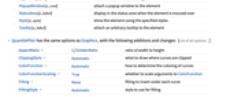
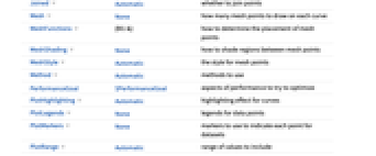
Annotation[e,label] provide an annotation Button[e,action] define an action to execute when the element is clicked EventHandler[e,…] define a general event handler for the element Highlighted[datai,effect] dynamically highlight fi with an effect Highlighted[datai,Placed[effect,pos]] statically highlight fi with an effect at position pos Hyperlink[e,uri] make the element act as a hyperlink PopupWindow[e,cont] attach a popup window to the element StatusArea[e,label] display in the status area when the element is moused over Style[e,opts] show the element using the specified styles Tooltip[e,label] attach an arbitrary tooltip to the element - QuantilePlot has the same options as Graphics, with the following additions and changes: [List of all options]
-
AspectRatio 1/GoldenRatio ratio of width to height ClippingStyle Automatic what to draw where curves are clipped ColorFunction Automatic how to determine the coloring of curves ColorFunctionScaling True whether to scale arguments to ColorFunction Filling None filling to insert under each curve FillingStyle Automatic style to use for filling Joined Automatic whether to join points Mesh None how many mesh points to draw on each curve MeshFunctions {#1&} how to determine the placement of mesh points MeshShading None how to shade regions between mesh points MeshStyle Automatic the style for mesh points Method Automatic methods to use PerformanceGoal $PerformanceGoal aspects of performance to try to optimize PlotHighlighting Automatic highlighting effect for curves PlotLegends None legends for data points PlotMarkers None markers to use to indicate each point for datasets PlotRange Automatic range of values to include PlotRangeClipping True whether to clip at the plot range PlotStyle Automatic graphics directives to specify the style for each object PlotTheme $PlotTheme overall theme for the plot ReferenceLineStyle Automatic style for the reference line ScalingFunctions None how to scale individual coordinates WorkingPrecision MachinePrecision the precision used in internal computations for symbolic distributions - With Filling->Automatic, the region between a dataset and reference line will be filled. By default, "stems" are used for datasets and "solid" filling is used for symbolic distributions. The setting Joined->True will force "solid" filling for datasets.
- The arguments supplied to functions in MeshFunctions and RegionFunction are
 ,
,  . Functions in ColorFunction are by default supplied with scaled versions of these arguments.
 - The setting Joined->Automatic is equivalent to Joined->True when comparing two distributions, and Joined->False otherwise.
- The setting PlotStyle->Automatic uses a sequence of different plot styles for different lines.
- ColorData["DefaultPlotColors"] gives the default sequence of colors used by PlotStyle.
- With the ReferenceLineStyle->None, no reference line will be drawn.
- Possible highlighting effects for Highlighted and PlotHighlighting include:
-
style highlight the indicated data 
"Ball" highlight and label the indicated point in data 
"Dropline" highlight and label the indicated point in data with droplines to the axes 
"XSlice" highlight and label all points along a vertical slice 
"YSlice" highlight and label all points along a horizontal slice 
Placed[effect,pos] statically highlight the given position pos - Highlight position specifications pos include:
-
x, {x} effect at {x,y} with y chosen automatically {x,y} effect at {x,y} {pos1,pos2,…} multiple positions posi - Typical settings for PlotLegends include:
-
None no legend Automatic automatically determine legend {lbl1,lbl2,…} use lbl1, lbl2, … as legend labels Placed[lspec,…] specify placement for legend - With ScalingFunctions->{sx,sy}, the
 coordinate is scaled using sx and the
  coordinate is scaled using sy.
 -
 Highlight options with settings specific to QuantilePlot
-
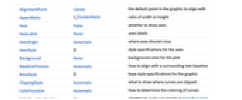
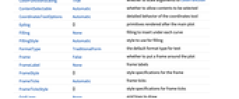
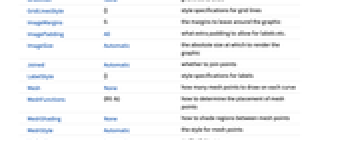
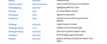
AlignmentPoint Center the default point in the graphic to align with AspectRatio 1/GoldenRatio ratio of width to height Axes False whether to draw axes AxesLabel None axes labels AxesOrigin Automatic where axes should cross AxesStyle {} style specifications for the axes Background None background color for the plot BaselinePosition Automatic how to align with a surrounding text baseline BaseStyle {} base style specifications for the graphic ClippingStyle Automatic what to draw where curves are clipped ColorFunction Automatic how to determine the coloring of curves ColorFunctionScaling True whether to scale arguments to ColorFunction ContentSelectable Automatic whether to allow contents to be selected CoordinatesToolOptions Automatic detailed behavior of the coordinates tool Epilog {} primitives rendered after the main plot Filling None filling to insert under each curve FillingStyle Automatic style to use for filling FormatType TraditionalForm the default format type for text Frame False whether to put a frame around the plot FrameLabel None frame labels FrameStyle {} style specifications for the frame FrameTicks Automatic frame ticks FrameTicksStyle {} style specifications for frame ticks GridLines None grid lines to draw GridLinesStyle {} style specifications for grid lines ImageMargins 0. the margins to leave around the graphic ImagePadding All what extra padding to allow for labels etc. ImageSize Automatic the absolute size at which to render the graphic Joined Automatic whether to join points LabelStyle {} style specifications for labels Mesh None how many mesh points to draw on each curve MeshFunctions {#1&} how to determine the placement of mesh points MeshShading None how to shade regions between mesh points MeshStyle Automatic the style for mesh points Method Automatic methods to use PerformanceGoal $PerformanceGoal aspects of performance to try to optimize PlotHighlighting Automatic highlighting effect for curves PlotLabel None an overall label for the plot PlotLegends None legends for data points PlotMarkers None markers to use to indicate each point for datasets PlotRange Automatic range of values to include PlotRangeClipping True whether to clip at the plot range PlotRangePadding Automatic how much to pad the range of values PlotRegion Automatic the final display region to be filled PlotStyle Automatic graphics directives to specify the style for each object PlotTheme $PlotTheme overall theme for the plot PreserveImageOptions Automatic whether to preserve image options when displaying new versions of the same graphic Prolog {} primitives rendered before the main plot ReferenceLineStyle Automatic style for the reference line RotateLabel True whether to rotate y labels on the frame ScalingFunctions None how to scale individual coordinates Ticks Automatic axes ticks TicksStyle {} style specifications for axes ticks WorkingPrecision MachinePrecision the precision used in internal computations for symbolic distributions
List of all options
Examples
open all close allBasic Examples (5)
Scope (25)
Data and Distributions (11)
QuantilePlot works with numeric data:
QuantilePlot works with symbolic distributions:
Use multiple datasets and distributions:
The default reference distribution is the closest estimated NormalDistribution:
Specify data or distributions as the reference:
Reference distributions are estimated for each dataset:
Estimate specific reference distributions for numeric datasets:
Use all forms of built-in distributions:
Numeric values in an association are used as the ![]() coordinates:
coordinates:
Numeric keys and values in an association are used as the ![]() and
and ![]() coordinates:
coordinates:
The weights in WeightedData are ignored:
Tabular Data (1)
Compare the data to a normal distribution:
Compare multiple sets of data:
Use PivotToColumns to generate columns of "SepalWidth" per species:
Compare probability of sepal width per species:
Use abbreviated names for extended keys when the elements are unique:
Presentation (13)
Multiple datasets are automatically colored to be distinct:
Provide explicit styling to different sets:
Include legends for each dataset:
Use specific styles for the reference line:
Provide an interactive Tooltip for the data:
Provide a specific tooltip for the data:
Use shapes to distinguish different datasets:
Use Joined to connect datasets with lines:
Plots usually have interactive callouts showing the coordinates when you mouse over them:
Including specific wrappers or interactions, such as tooltips, turns off the interactive features:
Options (84)
ClippingStyle (4)
ColorFunction (6)
ColorFunction requires at least one dataset to be Joined:
Color by scaled ![]() and
and ![]() coordinates:
coordinates:
Color with a named color scheme:
Fill to the reference line with the color used for the curve:
ColorFunction has higher priority than PlotStyle for coloring the curve:
Use Automatic in MeshShading to use ColorFunction:
ColorFunctionScaling (2)
Filling (7)
FillingStyle (3)
Joined (2)
Mesh (4)
Use 20 mesh levels evenly spaced in the ![]() direction:
direction:
Use the mesh to divide the curve into deciles:
Use an explicit list of values for the mesh in the ![]() direction:
direction:
Specify Style and mesh levels in the ![]() direction:
direction:
MeshFunctions (2)
MeshShading (6)
Alternate red and blue segments of equal width in the ![]() direction:
direction:
Use None to remove segments:
MeshShading can be used with PlotStyle:
MeshShading has higher priority than PlotStyle for styling the curve:
Use PlotStyle for some segments by setting MeshShading to Automatic:
MeshShading can be used with ColorFunction:
MeshStyle (4)
Method (4)
PlotHighlighting (9)
Plots have interactive coordinate callouts with the default setting PlotHighlightingAutomatic:
Use PlotHighlightingNone to disable the highlighting for the entire plot:
Move the mouse over a set of points to highlight it using arbitrary graphics directives:
Move the mouse over the points to highlight them with balls and labels:
Move the mouse over the curve to highlight it with a label and droplines to the axes:
Move the mouse over the plot to highlight it with a slice showing ![]() values corresponding to the
values corresponding to the ![]() position:
position:
Move the mouse over the plot to highlight it with a slice showing ![]() values corresponding to the
values corresponding to the ![]() position:
position:
Use a component that shows the points on the plot closest to the ![]() position of the mouse cursor:
position of the mouse cursor:
Specify the style for the points:
Use a component that shows the coordinates on the points closest to the mouse cursor:
Use Callout options to change the appearance of the label:
PlotLegends (7)
By default, no legends are used:
Generate a legend using labels:
Generate a legend using placeholders:
Legends use the same styles as the plot:
Use Placed to specify the legend placement:
Place the legend inside the plot:
Use LineLegend to change the legend appearance:
PlotMarkers (7)
QuantilePlot normally uses distinct colors to distinguish different sets of data:
Use colors and shapes to distinguish sets of data:
Change the size of the default plot markers:
Use arbitrary text for plot markers:
PlotRange (3)
PlotRange is automatically calculated:
Show the distribution for ![]() between 1 and 2 and
between 1 and 2 and ![]() between -1 and 3:
between -1 and 3:
PlotStyle (3)
PlotTheme (2)
ReferenceLineStyle (4)
ReferenceLineStyle by default uses a Dotted form of PlotStyle:
Draw a red dotted reference line:
Draw a solid red reference line:
Use None to turn off the reference line:
ReferenceLineStyle can be combined with PlotStyle:
Applications (5)
Visually test whether data was drawn from a particular distribution:
Linearity occurs when the data was drawn from the reference distribution:
Deviations from linearity occur when the data was not drawn from the reference distribution:
The residuals resulting from a LinearModelFit should be normally distributed. Here, some data is simulated with normal and exponential noise of equal variance:
Fit linear models to the simulated data:
There is strong visual evidence that the residuals are not normal in the first model:
DistributionFitTest can be used to make a quantitative statement about normality:
The heights of singers from the New York Choral Society were recorded along with the voice part of each singer. Voice parts, in increasing order of pitch, include bass, tenor, alto, and soprano:
The mean heights for each voice part:
Plotting the height quantiles of Soprano 1 against the other voice parts suggests that there is an additive shift in height with a voice part:
Rainfall, in acre-feet, was recorded from 52 clouds, of which 26 were chosen randomly and seeded with silver oxide:
Clearly, the seeded clouds produce more rain than the control:
A log-log scaled plot suggests that the increase is about one order of magnitude:
Properties & Relations (9)
With no second argument, data is compared against an estimated normal distribution:
Comparing with UniformDistribution[{0,1}] is equivalent to plotting the quantile:
ProbabilityPlot compares CDF values for the data.
ProbabilityScalePlot scales the axes so that points from distributions are on a straight line:
BoxWhiskerChart and DistributionChart can be used to visualize the distribution of data:
SmoothHistogram and Histogram can be used to visualize the distribution of data:
DiscretePlot can be used to visualize the discrete distributions:
Use ListPlot to see the data:
QuantilePlot ignores time stamps when input is a TimeSeries:
Text
Wolfram Research (2010), QuantilePlot, Wolfram Language function, https://reference.wolfram.com/language/ref/QuantilePlot.html (updated 2025).
CMS
Wolfram Language. 2010. "QuantilePlot." Wolfram Language & System Documentation Center. Wolfram Research. Last Modified 2025. https://reference.wolfram.com/language/ref/QuantilePlot.html.
APA
Wolfram Language. (2010). QuantilePlot. Wolfram Language & System Documentation Center. Retrieved from https://reference.wolfram.com/language/ref/QuantilePlot.html