


SectorChart
SectorChart[{{x1,y1},{x1,y2},…}]
makes a sector chart with sector angles proportional to xi and radii yi.
SectorChart[{…,wi[{xi,yi},…],…,wj[{xj,yj},…],…}]
makes a sector chart with sector features defined by the symbolic wrappers wk.
SectorChart[{data1,data2,…}]
makes a sector chart from multiple datasets datai.
Details and Options
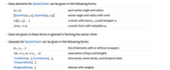
- Data elements for SectorChart can be given in the following forms:
-
{xi,yi} pure sector angle and radius {Quantity[xi,ux],Quantity[yi,uy]} sector angle and radius with units wi[{xi,yi},…] a sector with size {xi,yi} and wrapper wi formi->mi a sector form with metadata mi - Data not given in these forms is ignored in forming the sector chart.
- Datasets for SectorChart can be given in the following forms:
-
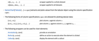
{e1,e2,…} list of elements with or without wrappers <k1e1,k2e2,…> association of keys and lengths TimeSeries[…],EventSeries[…],TemporalData[…] time series, event series, and temporal data WeightedData[…] dataset with weights w[{e1,e2,…},…] wrapper applied to a whole dataset w[{data1,data1,…},…] wrapper applied to all datasets - SectorChart[Tabular[…]cspec] extracts and plots values from the tabular object using the column specification cspec.
- The following forms of column specifications cspec are allowed for plotting tabular data:
-
{colx,coly} plot column y against column x {{colx1,coly1},{colx2,coly2},…} plot column y1 against column x1, y2 against x2, … - The following wrappers can be used for chart elements:
-
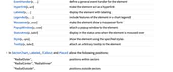
Annotation[e,label] provide an annotation Button[e,action] define an action to execute when the element is clicked Callout[e,label] display the element with a callout EventHandler[e,…] define a general event handler for the element Hyperlink[e,uri] make the element act as a hyperlink Labeled[e,…] display the element with labeling Legended[e,…] include features of the element in a chart legend Mouseover[e,over] make the element show a mouseover form PopupWindow[e,cont] attach a popup window to the element StatusArea[e,label] display in the status area when the element is moused over Style[e,opts] show the element using the specified styles Tooltip[e,label] attach an arbitrary tooltip to the element - In SectorChart, Labeled, Callout and Placed allow the following positions:
-
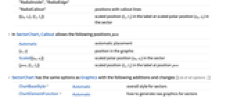
"RadialOuter","RadialCenter","RadialInner" positions within sectors "RadialOutside","RadialInside","RadialEdge" positions outside sectors "RadialCallout" positions with callout lines {{sθ,sr},{lx,ly}} scaled position {lx,ly} in the label at scaled polar position {sθ,sr} in the sector - In SectorChart, Callout allows the following positions pos:
-
Automatic automatic placement {x,y} position in the graphic Scaled[{sθ,sr}] scaled polar position {sθ,sr} in the sector {pos,{lx,ly}} scaled position {lx,ly} in the label at position pos - SectorChart has the same options as Graphics with the following additions and changes: [List of all options]
-
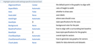
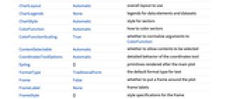
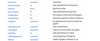
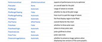
ChartBaseStyle Automatic overall style for sectors ChartElementFunction Automatic how to generate raw graphics for sectors ChartLabels None labels for data elements and datasets ChartLayout Automatic overall layout to use ChartLegends None legends for data elements and datasets ChartStyle Automatic style for sectors ColorFunction Automatic how to color sectors ColorFunctionScaling True whether to normalize arguments to ColorFunction LabelingFunction Automatic how to label sectors LabelingSize Automatic maximum size of callouts and labels LegendAppearance Automatic overall appearance of legends PerformanceGoal $PerformanceGoal aspects of performance to try to optimize PlotInteractivity $PlotInteractivity whether to allow interactive elements PlotRange Automatic range of values to include PlotTheme $PlotTheme overall theme for the chart PolarAxes False whether to draw polar axes PolarAxesOrigin Automatic where to draw polar axes PolarGridLines None polar gridlines to draw PolarTicks Automatic polar axes ticks SectorOrigin Automatic initial angle and radius of sectors SectorSpacing Automatic spacing between sectors TargetUnits Automatic units to display in the chart - Possible settings for ChartLayout that show multiple datasets in a single display panel include:
-

"Grouped" separate the data for each dataset 
"Stacked" accumulate the data for each dataset - Possible settings for ChartLayout that show individual datasets in different panels include:
-
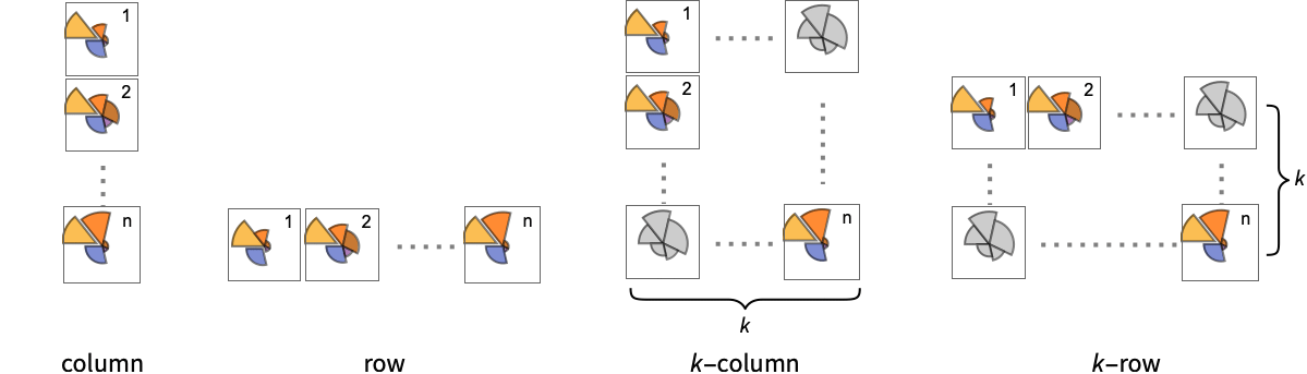
"Column" use separate group sectors in a column of panels "Row" use separate group sectors in a row of panels {"Column",k},{"Row",k} use k columns or rows {"Column",UpTo[k]},{"Row",UpTo[k]} use at most k columns or rows - The arguments supplied to ChartElementFunction are the sector region {{θmin,θmax},{rmin,rmax}}, the values {xi,yi}, and the metadata {m1,m2,…} from each level in a nested list of datasets.
- A list of built-in settings for ChartElementFunction can be obtained from ChartElementData["SectorChart"].
- The arguments supplied to ColorFunction are θ and r, where θ is the angle of sector and r the radius.
- Style and other specifications from options and other constructs in SectorChart are effectively applied in the order ChartStyle, ColorFunction, Style and other wrappers, and ChartElementFunction, with later specifications overriding earlier ones.
-
 Highlight options with settings specific to SectorChart
-
AlignmentPoint Center the default point in the graphic to align with AspectRatio Automatic ratio of height to width Axes False whether to draw axes AxesLabel None axes labels AxesOrigin Automatic where axes should cross AxesStyle {} style specifications for the axes Background None background color for the plot BaselinePosition Automatic how to align with a surrounding text baseline BaseStyle {} base style specifications for the graphic ChartBaseStyle Automatic overall style for sectors ChartElementFunction Automatic how to generate raw graphics for sectors ChartLabels None labels for data elements and datasets ChartLayout Automatic overall layout to use ChartLegends None legends for data elements and datasets ChartStyle Automatic style for sectors ColorFunction Automatic how to color sectors ColorFunctionScaling True whether to normalize arguments to ColorFunction ContentSelectable Automatic whether to allow contents to be selected CoordinatesToolOptions Automatic detailed behavior of the coordinates tool Epilog {} primitives rendered after the main plot FormatType TraditionalForm the default format type for text Frame False whether to put a frame around the plot FrameLabel None frame labels FrameStyle {} style specifications for the frame FrameTicks Automatic frame ticks FrameTicksStyle {} style specifications for frame ticks GridLines None grid lines to draw GridLinesStyle {} style specifications for grid lines ImageMargins 0. the margins to leave around the graphic ImagePadding All what extra padding to allow for labels etc. ImageSize Automatic the absolute size at which to render the graphic LabelingFunction Automatic how to label sectors LabelingSize Automatic maximum size of callouts and labels LabelStyle {} style specifications for labels LegendAppearance Automatic overall appearance of legends Method Automatic details of graphics methods to use PerformanceGoal $PerformanceGoal aspects of performance to try to optimize PlotInteractivity $PlotInteractivity whether to allow interactive elements PlotLabel None an overall label for the plot PlotRange Automatic range of values to include PlotRangeClipping False whether to clip at the plot range PlotRangePadding Automatic how much to pad the range of values PlotRegion Automatic the final display region to be filled PlotTheme $PlotTheme overall theme for the chart PolarAxes False whether to draw polar axes PolarAxesOrigin Automatic where to draw polar axes PolarGridLines None polar gridlines to draw PolarTicks Automatic polar axes ticks PreserveImageOptions Automatic whether to preserve image options when displaying new versions of the same graphic Prolog {} primitives rendered before the main plot RotateLabel True whether to rotate y labels on the frame SectorOrigin Automatic initial angle and radius of sectors SectorSpacing Automatic spacing between sectors TargetUnits Automatic units to display in the chart Ticks Automatic axes ticks TicksStyle {} style specifications for axes ticks
List of all options
 Highlight options with settings specific to SectorChart
Examples
open all close allBasic Examples (5)
Scope (39)
Data and Layouts (13)
Items in a dataset are grouped together:
Datasets do not need to have the same number of items:
Nonreal data is taken to be missing and typically is ignored in the pie chart:
The time stamps in TimeSeries, EventSeries, and TemporalData are ignored:
The values in associations are taken as the values of the sectors:
The weights in WeightedData are ignored:
Use different layouts to display multiple datasets:
Use a column of sector charts:
Control the direction of sectors:
Control the starting angle of sectors:
Tabular Data (1)
Wrappers (4)
Use wrappers on individual data, datasets, or collections of datasets:
Override the default tooltips:
Use any object in the tooltip:
Use PopupWindow to provide additional dropdown information:
Button can be used to trigger any action:
Styling and Appearance (9)
Use an explicit list of styles for the sectors:
Use any gradient or indexed color schemes from ColorData:
Use color schemes designed for charting:
Use themes to control the overall appearance:
ChartBaseStyle can be used to set an initial style for all chart elements:
Style can be used to override styles:
Use built-in programmatically generated sectors:
For detailed settings, use Palettes ▶ ChartElementSchemes:
Labeling and Legending (12)
Use Labeled to add a label to a sector:
Use symbolic positions for label placement:
Provide categorical labels for the columns of data:
Use Placed to control the positioning of labels, using the same positions as for Labeled:
Use Callout to add a label to a sector:
Change the appearance of the callout:
Automatically position callouts:
Provide value labels for sectors by using LabelingFunction:
Generate callouts from the data:
Add categorical legend entries for the columns of data:
Use Legended to add additional legend entries:
Use Placed to affect the positioning of legends:
Options (85)
AspectRatio (4)
By default, the ratio of the height to width for the plot is determined automatically:
Make the height the same as the width with AspectRatio1:
Use a numerical value to specify the height-to-width ratio:
AspectRatioFull adjusts the height and width to tightly fit inside other constructs:
Axes (3)
AxesLabel (3)
AxesOrigin (2)
AxesStyle (3)
ChartBaseStyle (5)
Use ChartBaseStyle to style all sectors:
ChartBaseStyle combines with ChartStyle:
ChartStyle may override settings for ChartBaseStyle:
ChartBaseStyle combines with Style:
Style may override settings for ChartBaseStyle:
ChartBaseStyle combines with ColorFunction:
ColorFunction may override settings for ChartBaseStyle:
ChartElementFunction (5)
Get a list of built-in settings for ChartElementFunction:
For detailed settings, use Palettes ▶ ChartElementSchemes:
Use ChartElementData to specify the same chart element rendering function as above:
Write a custom ChartElementFunction:
Use metadata passed on from the input, in this case charting the data:
ChartLabels (8)
By default, labels are placed in the center:
Labeled wrappers in data will place additional labels:
Use Placed to control label placement:
Coordinate-based placement relative to a sector:
Place all labels at the first outer corner and vary the coordinates within the label:
Use the third argument to Placed to control formatting:
By default, labels are associated with columns of data:
Associate labels with rows or datasets:
Use Placed to affect placements:
Use Callout to connect the labels to the sectors:
ChartLayout (4)
ChartLayout is grouped by default in concentric rings:
The stacked layout can display many datasets:
Place each of the sectors in a separate panel using shared scales:
ChartLegends (4)
ChartStyle (6)
Use ChartStyle to style sectors:
Use "Gradient" colors from ColorData:
Use "Indexed" colors from ColorData:
Style both rows and columns of data:
With both row and column styles the last style may override earlier ones:
Style overrides settings for ChartStyle:
ColorFunction overrides settings for ChartStyle:
ColorFunction (4)
Use ColorFunctionScaling->False to get unscaled angular values:
ColorFunction overrides styles in ChartStyle:
Use ColorFunction to combine different style effects:
ColorFunctionScaling (2)
Frame (4)
SectorChart doesn't use a frame by default:
Use FrameTrue to draw a frame around the chart:
FrameLabel (4)
ImageSize (7)
Use named sizes, such as Tiny, Small, Medium and Large:
Specify the width of the plot:
Specify the height of the plot:
Allow the width and height to be up to a certain size:
Specify the width and height for a graphic, padding with space if necessary:
Use maximum sizes for the width and height:
Use ImageSizeFull to fill the available space in an object:
Specify the image size as a fraction of the available space:
LabelingFunction (8)
Use automatic labeling by values through Tooltip and StatusArea:
Use Placed to control label placement:
Symbolic positions outside the sector:
Coordinate-based placement relative to a bar:
Use Callout to place labels automatically:
Control the formatting of labels:
Use the given chart labels as arguments to the labeling function:
LabelingSize (3)
Applications (7)
Generate a circular column graph:
Click on the sectors to hear the name of the country, its GDP per capita, and population:
Create a radar graph of nutritional content:
Add a fancy Tooltip label for each sector:
Wind direction from WeatherData ranges from 0° to 360°:
Get wind direction data for Willard Airport (CMI) in Champaign, Illinois:
Define a chart element function that stores bin width and count data using Sow:
Create a histogram of the wind directions, and store the bin width and frequencies:
Properties & Relations (4)
SectorChart is a generalization of PieChart:
Use SectorChart3D to render sectors in 3D:
Use RectangleChart to render pairs as bars:
Use ListPlot and ListLinePlot to produce line graphs from pairs of numbers:
Text
Wolfram Research (2008), SectorChart, Wolfram Language function, https://reference.wolfram.com/language/ref/SectorChart.html (updated 2025).
CMS
Wolfram Language. 2008. "SectorChart." Wolfram Language & System Documentation Center. Wolfram Research. Last Modified 2025. https://reference.wolfram.com/language/ref/SectorChart.html.
APA
Wolfram Language. (2008). SectorChart. Wolfram Language & System Documentation Center. Retrieved from https://reference.wolfram.com/language/ref/SectorChart.html