|
2.5.3 Nichol Plots
Yet another method of visualizing frequency responses is Nichol's chart. A Nichol plot is similar to a Nyquist plot but shows gain on a logarithmic scale ( ) vs. phase on a linear scale (degrees), with an axis origin at the point ) vs. phase on a linear scale (degrees), with an axis origin at the point  . The advantage of Nichol's chart is the ease by which gain and phase margins can be determined graphically. The gain margin is simply the negative value of the gain axis intersect. The phase margin is equal to the distance between the axis origin and the phase axis intersect. . The advantage of Nichol's chart is the ease by which gain and phase margins can be determined graphically. The gain margin is simply the negative value of the gain axis intersect. The phase margin is equal to the distance between the axis origin and the phase axis intersect.
Nichol charts are computed by the function NicholPlot. The argument sequence is the same as for NyquistPlot or BodePlot.
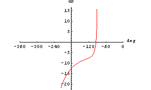
Let's use a Nichol chart to determine the gain and phase margins of a system which is characterized by the following transfer function.
In[9]:= H3[s_] := 20*(3 + s)/(s*(5 + s)*(20 + 5*s + 2*s^2))
We draw a Nichol chart of H3[I w] for an angular frequency  varying from varying from  to to  . Again, we increase the number of plot points to produce a smooth curve. . Again, we increase the number of plot points to produce a smooth curve.
In[10]:= NicholPlot[H3[I w], {w, 0.1, 5.},
AspectRatio -> 0.8, PlotPoints -> 100]

Out[10]= 
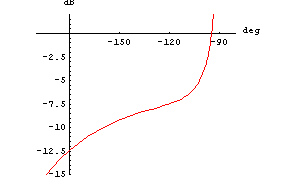
Now, in order to read off the margins better, we zoom in on the part of the curve located in the fourth quadrant.
In[11]:= NicholPlot[H3[I w], {w, 0.1, 5.}, AspectRatio -> 0.8,
PlotPoints -> 100, PlotRange -> {{-200, -80}, {-15, 2}}]

Out[11]= 
The curve crosses the gain axis at a gain of  , so we have a gain margin of , so we have a gain margin of  . At the phase axis intersect we have a phase value of approximately . At the phase axis intersect we have a phase value of approximately  which is which is  away from the axis origin. Hence, the phase margin is away from the axis origin. Hence, the phase margin is  . .
NicholPlot Options
Like NyquistPlot, NicholPlot inherits its options from ListPlot. NicholPlot has additional options like, for example, PhaseDisplay (see Section 2.5.1) and FrequencyScaling (see Section 2.5.2).
|