


BulletGauge
BulletGauge[value,reference,{min,max}]
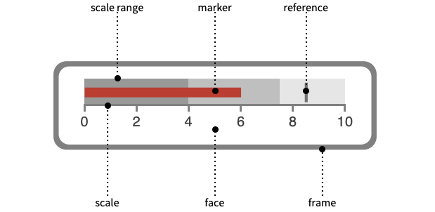
draws a bullet gauge showing value and reference in a range of min to max.
BulletGauge[value,reference,{min,m1,m2,…,max}]
draws a bullet gauge with performance regions split at the mi.
BulletGauge[{v1,v2,…},…]
draws a bullet gauge with multiple values v1, v2, ….
BulletGauge[values,{r1,r2,…},…]
draws a bullet gauge with multiple references r1, r2, ….
Details and Options
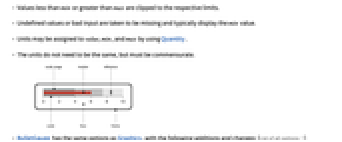
- Values less than min or greater than max are clipped to the respective limits.
- Undefined values or bad input are taken to be missing and typically display the min value.
- Units may be assigned to value, min, and max by using Quantity.
- The units do not need to be the same, but must be commensurate.
- BulletGauge has the same options as Graphics, with the following additions and changes: [List of all options]
-
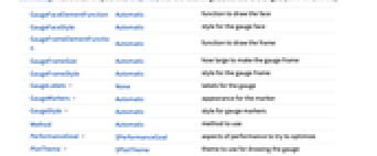
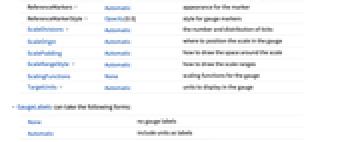
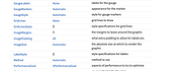
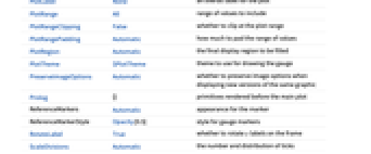
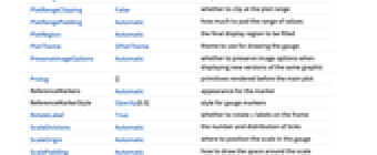
GaugeFaceElementFunction Automatic function to draw the face GaugeFaceStyle Automatic style for the gauge face GaugeFrameElementFunction Automatic function to draw the frame GaugeFrameSize Automatic how large to make the gauge frame GaugeFrameStyle Automatic style for the gauge frame GaugeLabels None labels for the gauge GaugeMarkers Automatic appearance for the marker GaugeStyle Automatic style for gauge markers Method Automatic method to use PerformanceGoal $PerformanceGoal aspects of performance to try to optimize PlotTheme $PlotTheme theme to use for drawing the gauge ReferenceMarkers Automatic appearance for the marker ReferenceMarkerStyle Opacity[0.5] style for gauge markers ScaleDivisions Automatic the number and distribution of ticks ScaleOrigin Automatic where to position the scale in the gauge ScalePadding Automatic how to draw the space around the scale ScaleRangeStyle Automatic how to draw the scale ranges ScalingFunctions None scaling functions for the gauge TargetUnits Automatic units to display in the gauge - GaugeLabels can take the following forms:
-
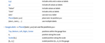
None no gauge labels Automatic include units as labels Full include units and a value as labels All include all values as labels "Value" include values as labels "Unit" include units as labels label use label as a label Placed[label,pos] place label at position pos {label1,label2,…} use multiple labels - GaugeLabels->Placed[label,pos] can use the positions pos:
-
Top,Bottom,Left,Right,Center positions within the gauge face bs position along the scale Scaled[bs] scaled position along the scale {bx,by} scaled position {bx,by} in the gauge {pos,{lx,ly}} scaled position {lx,ly} in the label at a general position pos in the gauge - A list of built-in settings for GaugeMarkers, GaugeFaceElementFunction, and GaugeFrameElementFunction can be obtained from ChartElementData["BulletGauge"]. A visual gallery is available in the Chart Element Schemes palette.
- GaugeMarkers by default uses a bar appearance when min≤0≤max, and a discrete marker otherwise.
- ReferenceMarkers by default uses a rectangular appearance for the marker.
- GaugeMarkers and ReferenceMarkers can take the following forms:
-
"name" named marker appearance Graphics[…],Image[…],… graphic or image to be used for a marker ChartElementData["name",…] chart element function None omit the marker for value f pure function for creating a gauge element {marker1,marker2,…} use markeri for the i ") value
valuePlaced[spec,location] place the markers in spec at location - BulletGauge supports the following locations inside Placed for GaugeMarkers and ReferenceMarkers:
-
"DivisionCenter" cumulative markers centered on division marks "DivisionInterval" cumulative markers between division marks "Scale" within the scale region "Center" marker centered on the scale "OppositeScale" within the scale region on the side of the axis opposite the ticks "ScaleRange" cumulative marker within the scale region "Frame" within the dial frame - By default, the styles used for the gauge markers and reference markers are based on GaugeStyle.
-
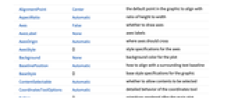
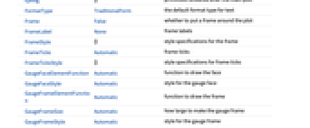
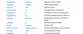
AlignmentPoint Center the default point in the graphic to align with AspectRatio Automatic ratio of height to width Axes False whether to draw axes AxesLabel None axes labels AxesOrigin Automatic where axes should cross AxesStyle {} style specifications for the axes Background None background color for the plot BaselinePosition Automatic how to align with a surrounding text baseline BaseStyle {} base style specifications for the graphic ContentSelectable Automatic whether to allow contents to be selected CoordinatesToolOptions Automatic detailed behavior of the coordinates tool Epilog {} primitives rendered after the main plot FormatType TraditionalForm the default format type for text Frame False whether to put a frame around the plot FrameLabel None frame labels FrameStyle {} style specifications for the frame FrameTicks Automatic frame ticks FrameTicksStyle {} style specifications for frame ticks GaugeFaceElementFunction Automatic function to draw the face GaugeFaceStyle Automatic style for the gauge face GaugeFrameElementFunction Automatic function to draw the frame GaugeFrameSize Automatic how large to make the gauge frame GaugeFrameStyle Automatic style for the gauge frame GaugeLabels None labels for the gauge GaugeMarkers Automatic appearance for the marker GaugeStyle Automatic style for gauge markers GridLines None grid lines to draw GridLinesStyle {} style specifications for grid lines ImageMargins 0. the margins to leave around the graphic ImagePadding All what extra padding to allow for labels etc. ImageSize Automatic the absolute size at which to render the graphic LabelStyle {} style specifications for labels Method Automatic method to use PerformanceGoal $PerformanceGoal aspects of performance to try to optimize PlotLabel None an overall label for the plot PlotRange All range of values to include PlotRangeClipping False whether to clip at the plot range PlotRangePadding Automatic how much to pad the range of values PlotRegion Automatic the final display region to be filled PlotTheme $PlotTheme theme to use for drawing the gauge PreserveImageOptions Automatic whether to preserve image options when displaying new versions of the same graphic Prolog {} primitives rendered before the main plot ReferenceMarkers Automatic appearance for the marker ReferenceMarkerStyle Opacity[0.5] style for gauge markers RotateLabel True whether to rotate y labels on the frame ScaleDivisions Automatic the number and distribution of ticks ScaleOrigin Automatic where to position the scale in the gauge ScalePadding Automatic how to draw the space around the scale ScaleRangeStyle Automatic how to draw the scale ranges ScalingFunctions None scaling functions for the gauge TargetUnits Automatic units to display in the gauge Ticks Automatic axes ticks TicksStyle {} style specifications for axes ticks
List of all options
Examples
open all close allBasic Examples (3)
Scope (13)
Data and Layouts (5)
Styling and Appearance (5)
Labeling and Legending (3)
Use GaugeLabels to add a label to the gauge face:
Use Placed to change the location of the label on the face of the gauge:
Options (52)
AspectRatio (2)
By default, BulletGauge uses a fixed ratio for the height to width of the gauge:
GaugeLabels (9)
Use Placed to control label placement:
Position labels at values along the scale:
Position labels using a scaled coordinate system along the scale:
Use a scaled coordinate system over the entire gauge:
Place all labels at the middle of the scale and vary the coordinates within the label:
GaugeMarkers (5)
List built-in settings for GaugeMarkers:
For detailed settings, use Palettes ▶ Chart Element Schemes:
Use an image or graphic for a marker:
Use Placed to change the location of the marker:
GaugeStyle (4)
ImageSize (7)
Use named sizes such as Tiny, Small, Medium and Large:
Specify the width of the plot:
Specify the height of the plot:
Allow the width and height to be up to a certain size:
Specify the width and height for a graphic, padding with space if necessary:
Setting AspectRatioFull will fill the available space:
Use maximum sizes for the width and height:
Use ImageSizeFull to fill the available space in an object:
Specify the image size as a fraction of the available space:
PerformanceGoal (2)
PlotTheme (4)
ReferenceMarkers (5)
List built-in settings for ReferenceMarkers:
For detailed settings, use Palettes ▶ Chart Element Schemes:
Use an image or graphic for a marker:
Use Placed to change the location of the marker:
ScaleRangeStyle (5)
Text
Wolfram Research (2012), BulletGauge, Wolfram Language function, https://reference.wolfram.com/language/ref/BulletGauge.html (updated 2014).
CMS
Wolfram Language. 2012. "BulletGauge." Wolfram Language & System Documentation Center. Wolfram Research. Last Modified 2014. https://reference.wolfram.com/language/ref/BulletGauge.html.
APA
Wolfram Language. (2012). BulletGauge. Wolfram Language & System Documentation Center. Retrieved from https://reference.wolfram.com/language/ref/BulletGauge.html