


ListContourPlot
ListContourPlot[{{f11,…,f1n},…,{fm1,…,fmn}}]
generates a contour plot from an array of values fij.
ListContourPlot[{{x1,y1,f1},…,{xk,yk,fk}}]
generates a contour plot from values fi specified at points {xi,yi}.
Details and Options
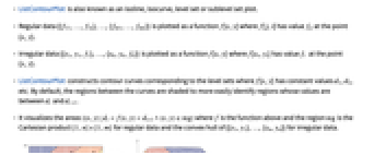

- ListContourPlot is also known as an isoline, isocurve, level set or sublevel set plot.
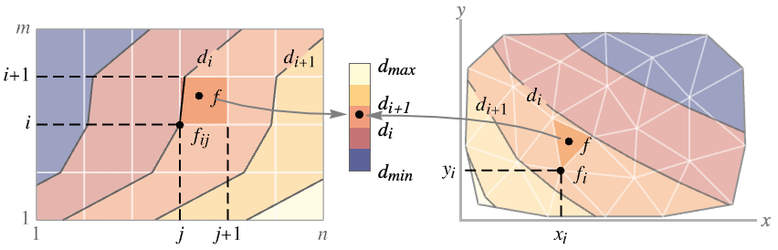
- Regular data {{f11,…,f1n},…,{fm1,…,fmn}} is plotted as a function f[x,y] where f[j,i] has value fij at the point {x,y}.
- Irregular data {{x1,y1,f1},…,{xk,yk,fk}} is plotted as a function f[x,y] where f[xi,yi] has value fi at the point {x,y}.
- ListContourPlot constructs contour curves corresponding to the level sets where f[x,y] has constant values d1, d2, etc. By default, the regions between the curves are shaded to more easily identify regions whose values are between di and di+1.
- It visualizes the areas
 where f is the function above and the region
  is the Cartesian product
  for regular data and the convex hull of {{x1,y1},…,{xn,yn}} for irregular data.
 - For regular data {{f11,…,f1n},…,{fm1,…,fmn}}, the
 location for value fij is taken to be
  . Use the option DataRange to override that.
 - By default, the color scale generates output in which larger values are shown as lighter colors.
- ListContourPlot linearly interpolates values to give smooth contours.
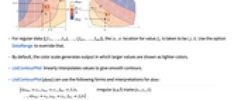
- Data values xi, yi and zi can be given in the following forms:
-
xi a real-valued number Quantity[xi,unit] a quantity with a unit - ListContourPlot[data] can use the following forms and interpretations for data:
-
{<xkeyx1,ykeyy1,fkeyf1>,…,<xkeyxn,ykeyyn,fkeyfn>} irregular  triples {xi,yi,fi}
{{x1,y1},…,{xn,yn}}{f1,…,fn} irregular  triples {xi,yi,fi}
Dataset values as a normal array NumericArray values as a normal array QuantityArray magnitudes SparseArray values as a normal array - ListContourPlot[Tabular[…]cspec] extracts and plots values from the tabular object using the column specification cspec.
- The following forms of column specifications cspec are allowed for plotting tabular data:
-
{colx,coly,colz} plot column z against columns x and y {{colx1,coly1,colz1},{colx2,coly2,colz2},…} plot column z1 against column x1 and y1 , z2 against x2 and y2, etc. - ListContourPlot has the same options as Graphics, with the following additions and changes: [List of all options]
-
AspectRatio 1 ratio of height to width BoundaryStyle None how to draw RegionFunction boundaries BoxRatios Automatic effective 3D bounding box ratios ClippingStyle None how to draw values clipped by PlotRange ColorFunction Automatic how to determine the color of regions between contour lines ColorFunctionScaling True whether to scale the argument to ColorFunction ContourLabels Automatic how to label contour levels Contours Automatic how many or what contours to use ContourShading Automatic how to shade regions between contours ContourStyle Automatic the style for contour lines DataRange Automatic the range of x and y values to assume for data Frame True whether to draw a frame around the plot FrameTicks Automatic frame tick marks InterpolationOrder None the polynomial degree in each variable of the function interpolated between data points LightingAngle None effective angle of the simulated light source MaxPlotPoints Automatic the maximum number of points to include Mesh None how many mesh lines in each direction to draw MeshFunctions {} how to determine the placement of mesh lines MeshStyle Automatic the style for mesh lines Method Automatic the method to use for interpolation and data reduction PerformanceGoal $PerformanceGoal aspects of performance to try to optimize PlotFit None how to fit a curve to the points PlotFitElements Automatic fitted elements to show in the plot PlotInteractivity $PlotInteractivity whether to allow interactive elements PlotLayout Automatic how to position contours PlotLegends None legends for contour regions PlotRange {Full,Full,Automatic} the range of f or other values to include PlotRangeClipping True whether to clip at the plot range PlotRangePadding Automatic how much to pad the range of values PlotTheme $PlotTheme overall theme for the plot RegionFunction (True&) how to determine whether a point should be included ScalingFunctions None how to scale individual coordinates - Possible settings for PlotLayout that show single contours in multiple plot panels include:
-
"Column" use separate contours in a column of panels "Row" use separate contours in a row of panels {"Column",k},{"Row",k} use k columns or rows {"Column",UpTo[k]},{"Row",UpTo[k]} use at most k columns or rows - DataRange determines the {x,y} position for value fij in the array {{f11,…,f1n},…,{fm1,…,fmn}}. Possible settings include:
-
Automatic,All uniform in x from 1 to n and in y from 1 to m {{xmin,xmax},{ymin,ymax}} uniform in x from xmin to xmax and in y from ymin to ymax - The case ListContourPlot[{{a11,a12,a13},…}] can be interpreted as both regular and irregular data. With DataRange->Automatic it is interpreted as irregular {{x1,y1,f1},{x2,y2,f2},…} and with DataRangeAll it is interpreted as regular {{f11,…,f1n},…,{fm1,…,fmn}}.
- In determining how to color regions between contour levels, ListContourPlot looks first at any explicit setting given for ContourShading, then at the setting for ColorFunction.
- ListContourPlot works with SparseArray objects.
- The arguments supplied to functions in MeshFunctions and RegionFunction are x, y, f.
- ColorFunction is by default supplied with a single argument, given by the average of the scaled values of f for each pair of successive contour levels.
- Typical settings for PlotLegends include:
-
None no legend Automatic automatically determine legend Placed[lspec,…] specify placement for legend - Possible settings for ScalingFunctions include:
-
sf scale the f-values {sx,sy} scale x and y axes {sx,sy,sf} scale x and y axes and f-values - Each scaling function si is either a string "scale" or {g,g-1}, where g-1 is the inverse of g.
- ListContourPlot returns Graphics[GraphicsComplex[data]].
-
 Highlight options with settings specific to ListContourPlot
-
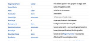
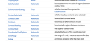
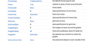
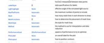
AlignmentPoint Center the default point in the graphic to align with AspectRatio 1 ratio of height to width Axes False whether to draw axes AxesLabel None axes labels AxesOrigin Automatic where axes should cross AxesStyle {} style specifications for the axes Background None background color for the plot BaselinePosition Automatic how to align with a surrounding text baseline BaseStyle {} base style specifications for the graphic BoundaryStyle None how to draw RegionFunction boundaries BoxRatios Automatic effective 3D bounding box ratios ClippingStyle None how to draw values clipped by PlotRange ColorFunction Automatic how to determine the color of regions between contour lines ColorFunctionScaling True whether to scale the argument to ColorFunction ContentSelectable Automatic whether to allow contents to be selected ContourLabels Automatic how to label contour levels Contours Automatic how many or what contours to use ContourShading Automatic how to shade regions between contours ContourStyle Automatic the style for contour lines CoordinatesToolOptions Automatic detailed behavior of the coordinates tool DataRange Automatic the range of x and y values to assume for data Epilog {} primitives rendered after the main plot FormatType TraditionalForm the default format type for text Frame True whether to draw a frame around the plot FrameLabel None frame labels FrameStyle {} style specifications for the frame FrameTicks Automatic frame tick marks FrameTicksStyle {} style specifications for frame ticks GridLines None grid lines to draw GridLinesStyle {} style specifications for grid lines ImageMargins 0. the margins to leave around the graphic ImagePadding All what extra padding to allow for labels etc. ImageSize Automatic the absolute size at which to render the graphic InterpolationOrder None the polynomial degree in each variable of the function interpolated between data points LabelStyle {} style specifications for labels LightingAngle None effective angle of the simulated light source MaxPlotPoints Automatic the maximum number of points to include Mesh None how many mesh lines in each direction to draw MeshFunctions {} how to determine the placement of mesh lines MeshStyle Automatic the style for mesh lines Method Automatic the method to use for interpolation and data reduction PerformanceGoal $PerformanceGoal aspects of performance to try to optimize PlotFit None how to fit a curve to the points PlotFitElements Automatic fitted elements to show in the plot PlotInteractivity $PlotInteractivity whether to allow interactive elements PlotLabel None an overall label for the plot PlotLayout Automatic how to position contours PlotLegends None legends for contour regions PlotRange {Full,Full,Automatic} the range of f or other values to include PlotRangeClipping True whether to clip at the plot range PlotRangePadding Automatic how much to pad the range of values PlotRegion Automatic the final display region to be filled PlotTheme $PlotTheme overall theme for the plot PreserveImageOptions Automatic whether to preserve image options when displaying new versions of the same graphic Prolog {} primitives rendered before the main plot RegionFunction (True&) how to determine whether a point should be included RotateLabel True whether to rotate y labels on the frame ScalingFunctions None how to scale individual coordinates Ticks Automatic axes ticks TicksStyle {} style specifications for axes ticks

List of all options
Examples
open all close allBasic Examples (4)
Scope (17)
Data (8)
For regular data consisting of ![]() values, the
values, the ![]() and
and ![]() data ranges are taken to be integer values:
data ranges are taken to be integer values:
Provide explicit ![]() and
and ![]() data ranges by using DataRange:
data ranges by using DataRange:
For irregular data consisting of ![]() triples, the
triples, the ![]() and
and ![]() data ranges are inferred from data:
data ranges are inferred from data:
Areas around where the data is nonreal are excluded:
Use MaxPlotPoints to limit the number of points used:
PlotRange is selected automatically:
Use PlotRange to focus in on areas of interest:
Use RegionFunction to restrict the density to a region given by inequalities:
Tabular Data (1)
Presentation (8)
Options (107)
AspectRatio (4)
By default, ListContourPlot uses the same width and height:
Use numerical value to specify the height to width ratio:
AspectRatioAutomatic determines the ratio from the plot ranges:
AspectRatioFull adjusts the height and width to tightly fit inside other constructs:
Axes (4)
By default, ListContourPlot uses a frame instead of axes:
Use AxesOrigin to specify where the axes intersect:
AxesLabel (4)
AxesOrigin (2)
AxesStyle (4)
BoundaryStyle (4)
No boundary is used by default:
Use a red boundary around the edges of the contours:
BoundaryStyle applies to holes cut by RegionFunction:
BoundaryStyle applies where there are jumps in the surface:
ClippingStyle (4)
Contours (7)
ContourShading (4)
The automatic shading is darker at low values and lighter at high values:
Use None to only show the contour lines:
ContourStyle (5)
The default contour style is a partially transparent line:
Use None to not show contour lines:
DataRange (4)
ImageSize (7)
Use named sizes such as Tiny, Small, Medium and Large:
Specify the width of the plot:
Specify the height of the plot:
Allow the width and height to be up to a certain size:
Specify the width and height for a graphic, padding with space if necessary:
Setting AspectRatioFull will fill the available space:
Use maximum sizes for the width and height:
Use ImageSizeFull to fill the available space in an object:
Specify the image size as a fraction of the available space:
InterpolationOrder (5)
Contours are normally based on a linear interpolation of the data:
Use zero-order or piecewise constant interpolation:
Use third-order spline interpolation to fit the data:
With a limited number of points, irregular data is linearly interpolated:
Irregular data with InterpolationOrder->1 uses natural neighbor interpolation:
MaxPlotPoints (4)
ListContourPlot normally uses all of the points in the dataset:
Limit the number of points used in each direction:
MaxPlotPoints imposes a regular grid on irregular data:
The grid does not extend beyond the convex hull of the original data:
MeshFunctions (2)
MeshStyle (2)
PerformanceGoal (2)
PlotFit (4)
By default, contours can be very detailed:
Fitting the data results in smoother contours:
Fit a quadratic surface to the data:
Use KernelModelFit to approximate the data:
PlotInteractivity (2)
PlotLayout (3)
PlotLegends (6)
PlotRange (3)
RegionFunction (4)
The region depends on DataRange:
ScalingFunctions (9)
By default, plots have linear scales in each direction:
Use a log scale in the ![]() direction:
direction:
Use a linear scale in the ![]() direction that shows smaller numbers at the top:
direction that shows smaller numbers at the top:
Use a reciprocal scale in the ![]() direction:
direction:
Use different scales in the ![]() and
and ![]() directions:
directions:
Reverse the ![]() axis without changing the
axis without changing the ![]() axis:
axis:
Use a scale defined by a function and its inverse:
Positions in Ticks and GridLines are automatically scaled:
PlotRange is automatically scaled:
Applications (2)
Properties & Relations (15)
ListContourPlot is similar to ListDensityPlot, but with bands of discrete colors:
ListContourPlot and ListPlot3D view ![]() as a function of
as a function of ![]() and
and ![]() :
:
The data has only one ![]() value for each
value for each ![]() ,
, ![]() pair:
pair:
The data has two ![]() values for each
values for each ![]() ,
, ![]() pair:
pair:
Use ArrayPlot for arrays of discrete data:
Use MatrixPlot for structural plots of matrices:
Use ReliefPlot for matrices corresponding to medical and geographic values:
Use GeoContourPlot to plot geographic data:
Use ListContourPlot3D to generate contour surfaces from four-dimensional data:
Use ContourPlot for functions:
Use ListPointPlot3D to show three-dimensional points:
Use ListDensityPlot to create densities from continuous data:
Use ListPlot3D to create surfaces from continuous data:
Use ListLogPlot, ListLogLogPlot, and ListLogLinearPlot for logarithmic plots:
Use ListPolarPlot for polar plots:
Use DateListPlot to show data over time:
Use ParametricPlot3D for three-dimensional parametric curves and surfaces:
Text
Wolfram Research (1988), ListContourPlot, Wolfram Language function, https://reference.wolfram.com/language/ref/ListContourPlot.html (updated 2025).
CMS
Wolfram Language. 1988. "ListContourPlot." Wolfram Language & System Documentation Center. Wolfram Research. Last Modified 2025. https://reference.wolfram.com/language/ref/ListContourPlot.html.
APA
Wolfram Language. (1988). ListContourPlot. Wolfram Language & System Documentation Center. Retrieved from https://reference.wolfram.com/language/ref/ListContourPlot.html