


ListLogLinearPlot
ListLogLinearPlot[{y1,y2,…}]
makes a log-linear plot of the yi, assumed to correspond to x coordinates 1, 2, ….
ListLogLinearPlot[{{x1,y1},{x2,y2},…}]
makes a log-linear plot of the specified list of x and y values.
ListLogLinearPlot[{list1,list2,…}]
plots several lists of values.
ListLogLinearPlot[{…,w[datai,…],…}]
plots datai with features defined by the symbolic wrapper w.
Details and Options
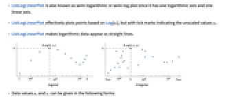


- ListLogLinearPlot is also known as semi-logarithmic or semi-log plot since it has one logarithmic axis and one linear axis.
- ListLogLinearPlot effectively plots points based on Log[xi], but with tick marks indicating the unscaled values xi.
- ListLogLinearPlot makes logarithmic data appear as straight lines.
- Data values xi and yi can be given in the following forms:
-
xi a real-valued number Quantity[xi,unit] a quantity with a unit Around[xi,ei] value xi with uncertainty ei Interval[{xmin,xmax}] values between xmin and xmax - Values xi and yi that are not of the preceding form are taken to be missing and are not shown.
- The datai have the following forms and interpretations:
-
<"k1"y1,"k2"y2,…> values {y1,y2,…} <x1y1,x2y2,…> key-value pairs {{x1,y1},{x2,y2},…} {y1"lbl1",y2"lbl2",…}, {y1,y2,…}{"lbl1","lbl2",…} values {y1,y2,…} with labels {lbl1,lbl2,…} SparseArray values as a normal array TimeSeries, EventSeries time-value pairs QuantityArray magnitudes WeightedData unweighted values - ListLogLinearPlot[Tabular[…]cspec] extracts and plots values from the tabular object using the column specification cspec.
- The following forms of column specifications cspec are allowed for plotting tabular data:
-
{colx,coly} plot column y against column x {{colx1,coly1},{colx2,coly2},…} plot column y1 against column x1, y2 against x2, … coly, {coly} plot column y as a sequence of values {{coly1},…,{colyi},…} plot columns y1, y2, … as sequences of values - The colx can also be Automatic, in which case, sequential values are generated using DataRange.
- The following wrappers w can be used for the datai:
-
Annotation[datai,label] provide an annotation for the data Button[datai,action] define an action to execute when the data is clicked Callout[datai,label] label the data with a callout Callout[datai,label,pos] place the callout at relative position pos EventHandler[datai,…] define a general event handler for the data Highlighted[datai,effect] dynamically highlight fi with an effect Highlighted[datai,Placed[effect,pos]] statically highlight fi with an effect at position pos Hyperlink[datai,uri] make the data a hyperlink Labeled[datai,label] label the data Labeled[datai,label,pos] place the label at relative position pos Legended[datai,label] identify the data in a legend PopupWindow[datai,cont] attach a popup window to the data StatusArea[datai,label] display in the status area on mouseover Style[datai,styles] show the data using the specified styles Tooltip[datai,label] attach a tooltip to the data Tooltip[datai] use data values as tooltips - Wrappers w can be applied at multiple levels:
-
{…,w[yi],…} wrap the value yi in data {…,w[{xi,yi}],…} wrap the point {xi,yi} w[datai] wrap the data w[{data1,…}] wrap a collection of datai w1[w2[…]] use nested wrappers - Callout, Labeled, and Placed can use the following positions pos:
-
Automatic automatically placed labels Above, Below, Before, After positions around the data x near the data at a position x Scaled[s] scaled position s along the data {s,Above},{s,Below},… relative position at position s along the data {pos,epos} epos in label placed at relative position pos of the data - ListLogLinearPlot has the same options as Graphics, with the following additions and changes: [List of all options]
-
AspectRatio 1/GoldenRatio ratio of height to width Axes True whether to draw axes DataRange Automatic the range of x values to assume for data IntervalMarkers Automatic how to render uncertainty IntervalMarkersStyle Automatic style for uncertainty elements Filling None how to fill in stems for each point FillingStyle Automatic style to use for filling Joined False whether to join points LabelingFunction Automatic how to label points LabelingSize Automatic maximum size of callouts and labels LabelingTarget Automatic how to determine automatic label positions PerformanceGoal $PerformanceGoal aspects of performance to try to optimize PlotFit None how to fit a curve to the points PlotFitElements Automatic fitted elements to show in the plot PlotHighlighting Automatic highlighting effect for curves PlotInteractivity $PlotInteractivity whether to allow interactive elements PlotLabel None overall label for the plot PlotLabels None labels for data PlotLayout "Overlaid" how to position data PlotLegends None legends for data PlotMarkers None markers to use to indicate each point PlotRange Automatic range of values to include PlotRangeClipping True whether to clip at the plot range PlotStyle Automatic graphics directives to determine styles of points PlotTheme $PlotTheme overall theme for the plot ScalingFunctions None how to scale individual coordinates TargetUnits Automatic units to display in the plot - DataRange determines how values {y1,…,yn} are interpreted into {{x1,y1},…,{xn,yn}}. Possible settings include:
-
Automatic,All uniform from 1 to n {xmin,xmax} uniform from xmin to xmax - In general, a list of pairs {{x1,y1},{x2,y2},…} is interpreted as a list of points, but the setting DataRangeAll forces it to be interpreted as multiple datai {{y11,y12},{y21,y23},…}.
- LabelingFunction->f specifies that each point should have a label given by f[value,index,lbls], where value is the value associated with the point, index is its position in the data, and lbls is the list of relevant labels.
- Possible settings for PlotLayout that show multiple curves in a single plot panel include:
-
"Overlaid" show all the data overlapping 
"Stacked" accumulate the data 
"Percentile" accumulate and normalize the data - Possible settings for PlotLayout that show single curves in multiple plot panels include:
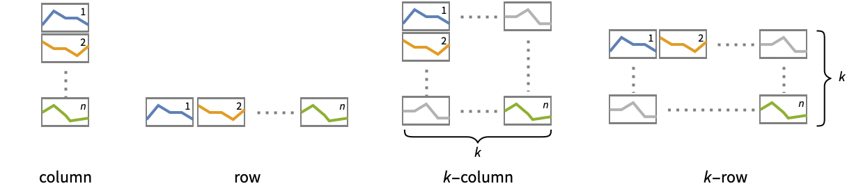
-
"Column" use separate curves in a column of panels "Row" use separate curves in a row of panels {"Column",k},{"Row",k} use k columns or rows {"Column",UpTo[k]},{"Row",UpTo[k]} use at most k columns or rows - Typical settings for PlotLegends include:
-
None no legend Automatic automatically determine legend {lbl1,lbl2,…} use lbl1, lbl2, … as legend labels Placed[lspec,…] specify placement for legend - ColorData["DefaultPlotColors"] gives the default sequence of colors used by PlotStyle.
- Possible highlighting effects for Highlighted and PlotHighlighting include:
-
style highlight the indicated data 
"Ball" highlight and label the indicated point in data 
"Dropline" highlight and label the indicated point in data with droplines to the axes 
"XSlice" highlight and label all points along a vertical slice 
"YSlice" highlight and label all points along a horizontal slice 
Placed[effect,pos] statically highlight the given position pos - Highlight position specifications pos include:
-
x, {x} effect at {x,y} with y chosen automatically {x,y} effect at {x,y} {pos1,pos2,…} multiple positions posi - Possible settings for ScalingFunctions include:
-
sy scale y axis {sx,sy} scale x and y axes - Common built-in scaling functions s include:
-
"Reverse" 
reverse the coordinate direction "Infinite" 
infinite scale - Scales for the x axis are applied after the default log scale has been applied.
-
 Highlight options with settings specific to ListLogLinearPlot
-
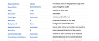
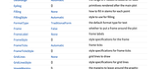
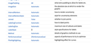
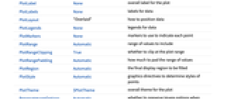
AlignmentPoint Center the default point in the graphic to align with AspectRatio 1/GoldenRatio ratio of height to width Axes True whether to draw axes AxesLabel None axes labels AxesOrigin Automatic where axes should cross AxesStyle {} style specifications for the axes Background None background color for the plot BaselinePosition Automatic how to align with a surrounding text baseline BaseStyle {} base style specifications for the graphic ContentSelectable Automatic whether to allow contents to be selected CoordinatesToolOptions Automatic detailed behavior of the coordinates tool DataRange Automatic the range of x values to assume for data Epilog {} primitives rendered after the main plot Filling None how to fill in stems for each point FillingStyle Automatic style to use for filling FormatType TraditionalForm the default format type for text Frame False whether to put a frame around the plot FrameLabel None frame labels FrameStyle {} style specifications for the frame FrameTicks Automatic frame ticks FrameTicksStyle {} style specifications for frame ticks GridLines None grid lines to draw GridLinesStyle {} style specifications for grid lines ImageMargins 0. the margins to leave around the graphic ImagePadding All what extra padding to allow for labels etc. ImageSize Automatic the absolute size at which to render the graphic IntervalMarkers Automatic how to render uncertainty IntervalMarkersStyle Automatic style for uncertainty elements Joined False whether to join points LabelingFunction Automatic how to label points LabelingSize Automatic maximum size of callouts and labels LabelingTarget Automatic how to determine automatic label positions LabelStyle {} style specifications for labels Method Automatic details of graphics methods to use PerformanceGoal $PerformanceGoal aspects of performance to try to optimize PlotFit None how to fit a curve to the points PlotFitElements Automatic fitted elements to show in the plot PlotHighlighting Automatic highlighting effect for curves PlotInteractivity $PlotInteractivity whether to allow interactive elements PlotLabel None overall label for the plot PlotLabels None labels for data PlotLayout "Overlaid" how to position data PlotLegends None legends for data PlotMarkers None markers to use to indicate each point PlotRange Automatic range of values to include PlotRangeClipping True whether to clip at the plot range PlotRangePadding Automatic how much to pad the range of values PlotRegion Automatic the final display region to be filled PlotStyle Automatic graphics directives to determine styles of points PlotTheme $PlotTheme overall theme for the plot PreserveImageOptions Automatic whether to preserve image options when displaying new versions of the same graphic Prolog {} primitives rendered before the main plot RotateLabel True whether to rotate y labels on the frame ScalingFunctions None how to scale individual coordinates TargetUnits Automatic units to display in the plot Ticks Automatic axes ticks TicksStyle {} style specifications for axes ticks
List of all options
Examples
open all close allBasic Examples (4)
Scope (54)
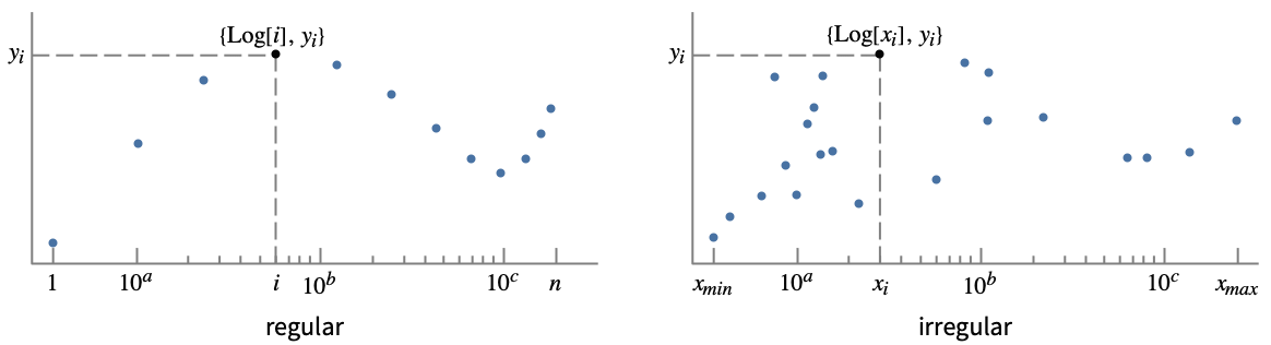
General Data (9)
For regular data consisting of ![]() values, the
values, the ![]() data range is taken to be integer values:
data range is taken to be integer values:
Provide an explicit ![]() data range by using DataRange:
data range by using DataRange:
Plot multiple sets of regular data:
For irregular data consisting of ![]() ,
, ![]() value pairs, the
value pairs, the ![]() data range is inferred from data:
data range is inferred from data:
Plot multiple sets of irregular data:
Plot multiple sets of data, regular or irregular, using DataRange to map them to the same ![]() range:
range:
Ranges where the data is nonpositive are excluded:
Use MaxPlotPoints to limit the number of points used:
PlotRange is selected automatically:
Use PlotRange to focus on areas of interest:
Special Data (9)
Use Quantity to include units with the data:
Include different units for the ![]() and
and ![]() coordinates:
coordinates:
Plot data in a QuantityArray:
Specify the units used with TargetUnits:
Specify strings to use as labels:
Specify a location for labels:
Numeric values in an Association are used as the ![]() coordinates:
coordinates:
Numeric keys and values in an Association are used as the ![]() and
and ![]() coordinates:
coordinates:
Plot TimeSeries directly:
Plot data in a SparseArray:
The weights in WeightedData are ignored:
Tabular Data (1)
Data Wrappers (6)
Use wrappers on individual data, datasets, or collections of datasets:
Use the value of each point as a tooltip:
Use a specific label for all the points:
Labels points with automatically positioned text:
Use PopupWindow to provide additional drilldown information:
Button can be used to trigger any action:
Labeling and Legending (16)
Label points with automatically positioned text:
Place the labels relative to the points:
Label data with Labeled:
Label data with PlotLabels:
Place the label near the points at an ![]() value:
value:
Specify the text position relative to the point:
Label data automatically with Callout:
Place a label with a specific location:
Specify label names with LabelingFunction:
Specify the maximum size of labels:
For dense sets of points, some labels may be turned into tooltips by default:
Increasing the size of the plot will show more labels:
Include legends for each curve:
Use Legended to provide a legend for a specific dataset:
Use Placed to change the legend location:
Use association keys as labels:
Plots usually have interactive callouts showing the coordinates when you mouse over them:
Including specific wrappers or interactions, such as tooltips, turns off the interactive features:
Choose from multiple interactive highlighting effects:
Use Highlighted to emphasize specific points in a plot:
Presentation (13)
Multiple datasets are automatically colored to be distinct:
Provide explicit styling to different sets:
Include legends for each curve:
Provide an interactive Tooltip for the data:
Use shapes to distinguish different datasets:
Use labels to distinguish different datasets:
Use Joined to connect datasets with lines:
Use InterpolationOrder to smooth joined data:
Use a theme with detailed frame ticks and grid lines:
Use a theme with a dark background and vibrant colors:
Plot the data in a stacked layout:
Plot the data as percentiles of the total of the values:
Use ScalingFunctions to scale the y axis on the plot:
Options (138)
ClippingStyle (6)
ClippingStyle only applies to Joined datasets:
Omit clipped regions of the plot:
Show clipped regions like the rest of the curve:
Show clipped regions with red lines:
Show clipped regions as red at the bottom and thick at the top:
ColorFunction (6)
ColorFunction only applies to Joined datasets:
Color by scaled ![]() and
and ![]() coordinates:
coordinates:
Color with a named color scheme:
Fill with the color used for the curve:
ColorFunction has higher priority than PlotStyle for coloring the curve:
Use Automatic in MeshShading to use ColorFunction:
ColorFunctionScaling (3)
ColorFunctionScaling only applies to Joined datasets:
Use no argument scaling on the left and automatic scaling on the right:
Scaling is done on a linear scale in the original coordinates:
DataRange (5)
Lists of height values are displayed against the number of elements:
Rescale to the sampling space:
Each dataset is scaled to the same domain:
Pairs are interpreted as ![]() ,
, ![]() coordinates:
coordinates:
Specifying DataRange in this case has no effect, since ![]() values are part of the data:
values are part of the data:
Filling (8)
Use symbolic or explicit values for "stem" filling:
Fill between corresponding points in two datasets:
Fill between datasets using a particular style:
Fill between datasets 1 and 2; use red when 1 is less than 2 and blue otherwise:
Fill to the axis for irregularly sampled data:
Use several irregular datasets, filling between them:
Joined datasets fill with solid areas:
The type of filling depends on whether the first set is joined:
FillingStyle (4)
InterpolationOrder (5)
Lines created with Joined can be interpolated:
By default, linear interpolation is used:
Use zero-order or piecewise-constant interpolation:
IntervalMarkers (3)
IntervalMarkersStyle (2)
Joined (4)
LabelingFunction (6)
By default, points are automatically labeled with strings:
Use LabelingFunction->None to suppress the labels:
Put the labels above the points:
Use callouts to label the points:
LabelingSize (4)
LabelingTarget (7)
Labels are automatically placed to maximize readability:
Use a denser layout for the labels:
Show the quarter of the labels that are easiest to read:
Only allow labels that are orthogonal to the points:
Only allow labels that are diagonal to the points:
Restrict labels to be above or to the right of the points:
MaxPlotPoints (3)
Mesh (6)
MeshFunctions (2)
MeshFunctions only applies to Joined datasets:
Use a mesh evenly spaced in the ![]() direction and unscaled in the
direction and unscaled in the ![]() direction:
direction:
MeshShading (7)
MeshShading only applies to Joined datasets:
Alternate red and blue segments of equal width in the ![]() direction:
direction:
Use None to remove segments:
MeshShading can be used with PlotStyle:
MeshShading has higher priority than PlotStyle for styling the curve:
Use PlotStyle for some segments by setting MeshShading to Automatic:
MeshShading can be used with ColorFunction and has higher priority:
MeshStyle (5)
PlotFit (4)
Automatically fit a model to the data:
Fit a straight line to the data:
Fit a quadratic curve to the data:
Use KernelModelFit to approximate the data:
PlotFitElements (3)
PlotHighlighting (9)
Plots have interactive coordinate callouts with the default setting PlotHighlightingAutomatic:
Use PlotHighlightingNone to disable the highlighting for the entire plot:
Use Highlighted[…,None] to disable highlighting for a single set:
Move the mouse over a set of points to highlight it using arbitrary graphics directives:
Move the mouse over the points to highlight them with balls and labels:
Move the mouse over the curve to highlight it with a label and droplines to the axes:
Use a ball and label to highlight a specific point in the plot:
Move the mouse over the plot to highlight it with a slice showing ![]() values corresponding to the
values corresponding to the ![]() position:
position:
Highlight a particular set of points at a fixed ![]() value:
value:
Move the mouse over the plot to highlight it with a slice showing ![]() values corresponding to the
values corresponding to the ![]() position:
position:
Use a component that shows the points on the plot closest to the ![]() position of the mouse cursor:
position of the mouse cursor:
Specify the style for the points:
Use a component that shows the coordinates on the points closest to the mouse cursor:
Use Callout options to change the appearance of the label:
PlotInteractivity (3)
PlotLabels (5)
Specify text to label sets of points:
Place the labels above the points:
Use callouts to identify the points:
Use the keys from an Association as labels:
Use None to not add a label:
PlotLayout (1)
PlotLegends (6)
Generate a legend using labels:
Generate a legend using placeholders:
Legends use the same styles as the plot:
Use Placed to specify the legend placement:
Place the legend inside the plot:
Use PointLegend to change the legend appearance:
PlotMarkers (8)
ListLogPlot normally uses distinct colors to distinguish different sets of data:
Automatically use colors and shapes to distinguish sets of data:
Change the size of the default plot markers:
Use arbitrary text for plot markers:
Use explicit graphics for plot markers:
PlotRange (2)
PlotStyle (7)
Use different style directives:
By default, different styles are chosen for multiple datasets:
Explicitly specify the style for different datasets:
PlotStyle applies to both lines and points:
PlotStyle can be combined with ColorFunction and has lower priority:
PlotStyle can be combined with MeshShading and has lower priority:
PlotTheme (1)
ScalingFunctions (2)
By default ListLogLinearPlot uses a Log scale on the x axis and natural scale for y:
Text
Wolfram Research (2007), ListLogLinearPlot, Wolfram Language function, https://reference.wolfram.com/language/ref/ListLogLinearPlot.html (updated 2025).
CMS
Wolfram Language. 2007. "ListLogLinearPlot." Wolfram Language & System Documentation Center. Wolfram Research. Last Modified 2025. https://reference.wolfram.com/language/ref/ListLogLinearPlot.html.
APA
Wolfram Language. (2007). ListLogLinearPlot. Wolfram Language & System Documentation Center. Retrieved from https://reference.wolfram.com/language/ref/ListLogLinearPlot.html