


PairedBarChart
PairedBarChart[{y1,y2,…},{z1,z2,…}]
makes a paired bar chart with bar lengths y1, y2, … and z1, z2, …, respectively.
PairedBarChart[{…,wi[yi,…],…},{…,wj[zj,…],…}]
makes a paired bar chart with bar features defined by the symbolic wrappers wk.
PairedBarChart[{data11,…},{data21,…}]
makes a paired bar chart from multiple datasets data1i and data2j.
Details and Options
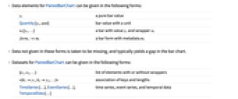
- Data elements for PairedBarChart can be given in the following forms:
-
yi a pure bar value Quantity[yi,unit] bar value with a unit wi[yi,…] a bar with value yi and wrapper wi formi->mi a bar form with metadata mi - Data not given in these forms is taken to be missing, and typically yields a gap in the bar chart.
- Datasets for PairedBarChart can be given in the following forms:
-
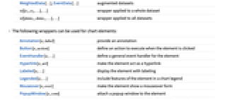
{e1,e2,…} list of elements with or without wrappers <k1y1,k2y2,…> association of keys and lengths TimeSeries[…],EventSeries[…],TemporalData[…] time series, event series, and temporal data WeightedData[…],EventData[…] augmented datasets w[{e1,e2,…},…] wrapper applied to a whole dataset w[{data1,data1,…},…] wrapper applied to all datasets - The following wrappers can be used for chart elements:
-
Annotation[e,label] provide an annotation Button[e,action] define an action to execute when the element is clicked EventHandler[e,…] define a general event handler for the element Hyperlink[e,uri] make the element act as a hyperlink Labeled[e,…] display the element with labeling Legended[e,…] include features of the element in a chart legend Mouseover[e,over] make the element show a mouseover form PopupWindow[e,cont] attach a popup window to the element StatusArea[e,label] display in the status area when the element is moused over Style[e,opts] show the element using the specified styles Tooltip[e,label] attach an arbitrary tooltip to the element - PairedBarChart[Tabular[…]cspec, …] extracts and plots values from the tabular object using the column specification cspec.
- The following forms of column specifications cspec are allowed for plotting tabular data:
-
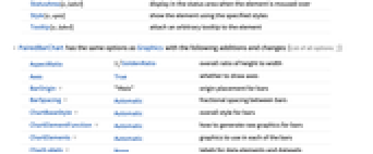
col plot values from column col {col1,col2,…,coln} plot columns {col1, …, coln} as a group of values - PairedBarChart has the same options as Graphics with the following additions and changes: [List of all options]
-
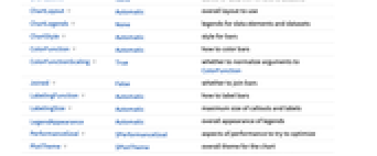
AspectRatio 1/GoldenRatio overall ratio of height to width Axes True whether to draw axes BarOrigin "YAxis" origin placement for bars BarSpacing Automatic fractional spacing between bars ChartBaseStyle Automatic overall style for bars ChartElementFunction Automatic how to generate raw graphics for bars ChartElements Automatic graphics to use in each of the bars ChartLabels None labels for data elements and datasets ChartLayout Automatic overall layout to use ChartLegends None legends for data elements and datasets ChartStyle Automatic style for bars ColorFunction Automatic how to color bars ColorFunctionScaling True whether to normalize arguments to ColorFunction Joined False whether to join bars LabelingFunction Automatic how to label bars LabelingSize Automatic maximum size of callouts and labels LegendAppearance Automatic overall appearance of legends PerformanceGoal $PerformanceGoal aspects of performance to try to optimize PlotTheme $PlotTheme overall theme for the chart ScalingFunctions None how to scale individual coordinates TargetUnits Automatic units to display in the chart - Possible settings for BarOrigin include "XAxis" and "YAxis".
- With the setting BarSpacing->{sp,sg,sb}, sp can be used to control the space between the pair of bar charts. The unit for sp is in fractions of the width of the resulting graphic.
- The following settings for ChartLayout can be used to display multiple sets of data:
-
"Grouped" separate the data for each dataset 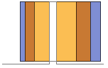
"Stacked" accumulate the data for each dataset 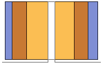
"Percentile" accumulate and normalize the data for each dataset - The arguments supplied to ChartElementFunction are the bar region {{xmin,xmax},{ymin,ymax}}, the data value yi, and metadata {m1,m2,…} from each level in a nested list of datasets.
- A list of built-in settings for ChartElementFunction can be obtained from ChartElementData["PairedBarChart"].
- The argument supplied to ColorFunction and ScalingFunctions is yi.
- Style and other specifications from options and other constructs in PairedBarChart are effectively applied in the order ChartStyle, ColorFunction, Style and other wrappers, ChartElements, and ChartElementFunction, with later specifications overriding earlier ones.
-
 Highlight options with settings specific to PairedBarChart
-
AlignmentPoint Center the default point in the graphic to align with AspectRatio 1/GoldenRatio overall ratio of height to width Axes True whether to draw axes AxesLabel None axes labels AxesOrigin Automatic where axes should cross AxesStyle {} style specifications for the axes Background None background color for the plot BarOrigin "YAxis" origin placement for bars BarSpacing Automatic fractional spacing between bars BaselinePosition Automatic how to align with a surrounding text baseline BaseStyle {} base style specifications for the graphic ChartBaseStyle Automatic overall style for bars ChartElementFunction Automatic how to generate raw graphics for bars ChartElements Automatic graphics to use in each of the bars ChartLabels None labels for data elements and datasets ChartLayout Automatic overall layout to use ChartLegends None legends for data elements and datasets ChartStyle Automatic style for bars ColorFunction Automatic how to color bars ColorFunctionScaling True whether to normalize arguments to ColorFunction ContentSelectable Automatic whether to allow contents to be selected CoordinatesToolOptions Automatic detailed behavior of the coordinates tool Epilog {} primitives rendered after the main plot FormatType TraditionalForm the default format type for text Frame False whether to put a frame around the plot FrameLabel None frame labels FrameStyle {} style specifications for the frame FrameTicks Automatic frame ticks FrameTicksStyle {} style specifications for frame ticks GridLines None grid lines to draw GridLinesStyle {} style specifications for grid lines ImageMargins 0. the margins to leave around the graphic ImagePadding All what extra padding to allow for labels etc. ImageSize Automatic the absolute size at which to render the graphic Joined False whether to join bars LabelingFunction Automatic how to label bars LabelingSize Automatic maximum size of callouts and labels LabelStyle {} style specifications for labels LegendAppearance Automatic overall appearance of legends Method Automatic details of graphics methods to use PerformanceGoal $PerformanceGoal aspects of performance to try to optimize PlotLabel None an overall label for the plot PlotRange All range of values to include PlotRangeClipping False whether to clip at the plot range PlotRangePadding Automatic how much to pad the range of values PlotRegion Automatic the final display region to be filled PlotTheme $PlotTheme overall theme for the chart PreserveImageOptions Automatic whether to preserve image options when displaying new versions of the same graphic Prolog {} primitives rendered before the main plot RotateLabel True whether to rotate y labels on the frame ScalingFunctions None how to scale individual coordinates TargetUnits Automatic units to display in the chart Ticks Automatic axes ticks TicksStyle {} style specifications for axes ticks
List of all options
 Highlight options with settings specific to PairedBarChart
Examples
open all close allBasic Examples (3)
Scope (35)
Data and Layouts (13)
Items in a dataset are grouped together:
Datasets do not need to have the same number of items:
Nonreal data is taken to be missing and typically yields a gap in the bar chart:
The time stamps in TimeSeries, EventSeries, and TemporalData are ignored:
The values in associations are taken as the heights of the bars:
The weights in WeightedData are ignored:
The censoring and truncation information in EventData is ignored:
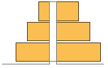
Use different layouts to display multiple datasets:
Stacked layouts are more compact in the horizontal direction:
Use Joined to indicate connections between data points:
Wrappers (5)
Use wrappers on individual data, datasets, or collections of datasets:
Override the default tooltips:
Use any object in the tooltip:
Use PopupWindow to provide additional drilldown information:
Button can be used to trigger any action:
Styling and Appearance (8)
Use an explicit list of styles for the bars:
Use any gradient or indexed color schemes from ColorData:
Use color schemes designed for charting:
ChartBaseStyle can be used to set an initial style for all chart elements:
Style can be used to override styles:
Use any graphic for pictorial bars:
Use built-in programmatically generated bars:
For detailed settings use Palettes ▶ ChartElementSchemes:
Use a theme with detailed frame ticks and grid lines:
Use a theme with simple ticks and edge-fading rectangles in a high contrast color scheme:
Labeling and Legending (8)
Use Labeled to add a label to a bar:
Use symbolic positions for label positions:
Provide categorical labels for the columns of data:
Use Placed to control the positioning of labels, using the same positions as for Labeled:
Provide value labels for bars by using LabelingFunction:
Use Placed to control placement and formatting:
Add categorical legend entries for the columns of data:
Use Placed to affect the positioning of legends:
Options (70)
BarSpacing (6)
ChartBaseStyle (5)
Use ChartBaseStyle to style bars:
ChartBaseStyle combines with ChartStyle:
ChartStyle may override settings for ChartBaseStyle:
ChartBaseStyle combines with Style:
Style may override settings for ChartBaseStyle:
ChartBaseStyle combines with ColorFunction:
ColorFunction may override settings for ChartBaseStyle:
ChartElementFunction (6)
Get a list of built-in settings for ChartElementFunction:
For detailed settings, use Palettes ▶ ChartElementSchemes:
This ChartElementFunction is appropriate to show the global scale:
Write a custom ChartElementFunction:
Use metadata passed on from the input, in this case charting the data:
Built-in element functions may have options; use Palettes ▶ ChartElementSchemes to set them:
ChartElements (9)
Create a pictorial chart based on any Graphics object:
Use a stretched version of the graphic:
Use explicit sizes for width and height:
Without AspectRatio->Full, the original aspect ratio is preserved:
Using All for width or height causes that direction to stretch to the full size of the bar:
Use a different graphic for each column of data:
Use a different graphic for each row of data:
Use a different graphic for each bar pair:
Styles are inherited from styles set through ChartStyle etc.:
Explicit styles set in the graphic will override other style settings:
The orientation of the pictorial graphic is unaffected by BarOrigin:
ChartLabels (5)
ChartLayout (5)
ChartLayout is grouped by default:
ChartLegends (6)
ChartStyle (7)
Use ChartStyle to style bars:
Use "Gradient" colors from ColorData:
Use "Indexed" colors from ColorData:
Style each side of the pair and both rows and columns of data:
With row, column, and pair styles the latter styles may override earlier ones:
Style overrides settings for ChartStyle:
ColorFunction overrides settings for ChartStyle:
ChartElements may override settings for ChartStyle:
ColorFunction (3)
Use ColorFunctionScaling->False to get unscaled height values:
ColorFunction overrides styles in ChartStyle:
Use ColorFunction to combine different style effects:
ColorFunctionScaling (2)
By default scaled height values are used:
Use ColorFunctionScaling->False to get unscaled height values:
Joined (5)
LabelingFunction (3)
Use automatic labeling by values through Tooltip and StatusArea:
Use the given chart labels as arguments to the labeling function:
LabelingSize (3)
PerformanceGoal (3)
Applications (3)
Properties & Relations (3)
BarChart plots multiple datasets on a common height axis; PairedBarChart on a categorical axis:
PairedHistogram computes heights from arbitrary data:
PairedBarChart uses heights directly:
PieChart shows multiple datasets in rings:
Possible Issues (1)
PairedBarChart does not accept negative values:
Text
Wolfram Research (2010), PairedBarChart, Wolfram Language function, https://reference.wolfram.com/language/ref/PairedBarChart.html (updated 2025).
CMS
Wolfram Language. 2010. "PairedBarChart." Wolfram Language & System Documentation Center. Wolfram Research. Last Modified 2025. https://reference.wolfram.com/language/ref/PairedBarChart.html.
APA
Wolfram Language. (2010). PairedBarChart. Wolfram Language & System Documentation Center. Retrieved from https://reference.wolfram.com/language/ref/PairedBarChart.html