


Plot
Details and Options
- Plot is known as a function plot or graph of a function.
- Plot evaluates f at values of x in the domain being plotted over and connects the points {x,f[x]} to form a curve showing how f varies with x. It visualizes the curve
 .
. - Gaps are left at any x where the fi evaluate to anything other than real numbers or Quantity.
- The limits xmin and xmax can be real numbers or Quantity expressions.
- The region reg can be any RegionQ object in 1D.
- Plot treats the variable x as local, effectively using Block.
- Plot has attribute HoldAll and evaluates f only after assigning specific numerical values to x.
- In some cases, it may be more efficient to use Evaluate to evaluate f symbolically before specific numerical values are assigned to x.
- The following wrappers w can be used for the fi:
-
Annotation[fi,label] provide an annotation for the fi Button[fi,action] evaluate action when the curve for fi is clicked Callout[fi,label] label the function with a callout Callout[fi,label,pos] place the callout at relative position pos EventHandler[fi,events] define a general event handler for fi Highlighted[fi,effect] dynamically highlight fi with an effect Highlighted[fi,Placed[effect,pos]] statically highlight fi with an effect at position pos Hyperlink[fi,uri] make the function a hyperlink Labeled[fi,label] label the function Labeled[fi,label,pos] place the label at relative position pos Legended[fi,label] identify the function in a legend PopupWindow[fi,cont] attach a popup window to the function StatusArea[fi,label] display in the status area on mouseover Style[fi,styles] show the function using the specified styles Tooltip[fi,label] attach a tooltip to the function Tooltip[fi] use functions as tooltips - Wrappers w can be applied at multiple levels:
-
w[fi] wrap the fi w[{f1,…}] wrap a collection of fi w1[w2[…]] use nested wrappers - Callout, Labeled, and Placed can use the following positions pos:
-
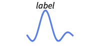
Above position above curve 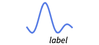
Below position below curve 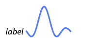
Before position before curve 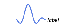
After position after curve 
Start position at start of each curve 
End position at end of each curve 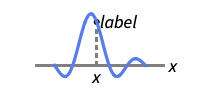
x near the curve at a position x 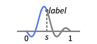
Scaled[s] scaled position s along the curve 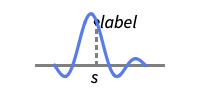
{s,Above} above relative position at position s along the curve 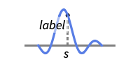
{s,Below} below relative position at position s along the curve 
{pos,epos} epos in label placed at relative position pos of the curve - Plot has the same options as Graphics, with the following additions and changes: [List of all options]
-
AspectRatio 1/GoldenRatio ratio of height to width Axes True whether to draw axes ClippingStyle None what to draw where curves are clipped » ColorFunction Automatic how to determine the coloring of curves ColorFunctionScaling True whether to scale arguments to ColorFunction EvaluationMonitor None expression to evaluate at every function evaluation Exclusions Automatic points in x to exclude ExclusionsStyle None what to draw at excluded points Filling None filling to insert under each curve FillingStyle Automatic style to use for filling LabelingSize Automatic maximum size of callouts and labels MaxRecursion Automatic the maximum number of recursive subdivisions allowed Mesh None how many mesh points to draw on each curve MeshFunctions {#1&} how to determine the placement of mesh points MeshShading None how to shade regions between mesh points MeshStyle Automatic the style for mesh points Method Automatic the method to use for refining curves PerformanceGoal $PerformanceGoal aspects of performance to try to optimize PlotHighlighting Automatic highlighting effect for curves PlotInteractivity $PlotInteractivity whether to allow interactive elements PlotLabel None overall label for the plot PlotLabels None labels to use for curves PlotLayout Automatic how to position curves PlotLegends None legends for curves PlotPoints Automatic initial number of sample points PlotRange {Full,Automatic} the range of y or other values to include PlotRangeClipping True whether to clip at the plot range PlotStyle Automatic graphics directives to specify the style for each curve PlotTheme $PlotTheme overall theme for the plot RegionFunction (True&) how to determine whether a point should be included ScalingFunctions None how to scale individual coordinates TargetUnits Automatic units to display in the plot WorkingPrecision MachinePrecision the precision used in internal computations - Possible settings for ClippingStyle are:
-
Automatic use a dotted line for the clipped portion 
None omit the clipped portion of the curve 
style use style for the clipped portion - Possible settings for PlotLayout that show single curves in multiple plot panels include:
-
"Column" use separate curves in a column of panels "Row" use separate curves in a row of panels {"Column",k},{"Row",k} use k columns or rows {"Column",UpTo[k]},{"Row",UpTo[k]} use at most k columns or rows - With the default settings Exclusions->Automatic and ExclusionsStyle->None, Plot breaks curves at discontinuities and singularities it detects. Exclusions->None joins across discontinuities and singularities.
- Exclusions->{x1,x2,…} is equivalent to Exclusions->{x==x1,x==x2,…}.
- Possible highlighting effects for Highlighted and PlotHighlighting include:
-
style highlight the indicated curve 
"Ball" highlight and label the indicated point in a curve 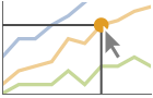
"Dropline" highlight and label the indicated point in a curve with droplines to the axes 
"XSlice" highlight and label all points along a vertical slice 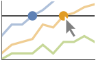
"YSlice" highlight and label all points along a horizontal slice 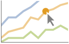
Placed[effect,pos] statically highlight the given position pos - Highlight position specifications pos include:
-
x, {x} effect at {x,y} with y chosen automatically {x,y} effect at {x,y} {pos1,pos2,…} multiple positions posi - Typical settings for PlotLegends include:
-
None no legend Automatic automatically determine the legend "Expressions" use f1, f2, … as the legend labels {lbl1,lbl2,…} use lbl1, lbl2, … as the legend labels Placed[lspec,…] specify placement for the legend - PlotStylesty specifies the styles to use for each curve. Possible settings include:
-
{sty1,sty2,…} sequence of styles for the datasets <"key"val,…> styling elements for different levels of data - The accepted keys are:
-
"Base" overall style for all the fi "Functions" list of styles styi for each fi - ColorData["DefaultPlotColors"] gives the default sequence of colors used by PlotStyle.
- Plot initially evaluates f at a number of equally spaced sample points specified by PlotPoints. Then it uses an adaptive algorithm to choose additional sample points, subdividing a given interval at most MaxRecursion times.
- Since only a finite number of sample points are used, it is possible for Plot to miss features of f. Increasing the settings for PlotPoints and MaxRecursion will often catch such features.
- Themes that affect curves include:
-

"ThinLines" thin plot lines 
"MediumLines" medium plot lines 
"ThickLines" thick plot lines - The arguments supplied to functions in MeshFunctions and RegionFunction are x, y. Functions in ColorFunction are by default supplied with scaled versions of these arguments.
- Possible settings for ScalingFunctions include:
-
sy scale the y axis {sx,sy} scale x and y axes - Each scaling function si is either a string "scale" or {g,g-1}, where g-1 is the inverse of g.


List of all options
Examples
open all close allBasic Examples (5)
Plot[Sin[x], {x, 0, 6Pi}]Plot several functions with a legend:
Plot[{Sin[x], Sin[2x], Sin[3x]}, {x, 0, 2Pi}, PlotLegends -> "Expressions"]Plot[{Sin[x], Cos[x]}, {x, 0, 2Pi}, PlotLabels -> "Expressions"]Plot[2Sin[x] + x, {x, 0, 15}, Filling -> Bottom]Plot[{Sin[x] + x / 2, Sin[x] + x}, {x, 0, 10}, Filling -> {1 -> {2}}]Plot multiple filled curves, automatically using transparent colors:
Plot[Evaluate[Table[BesselJ[n, x], {n, 4}]], {x, 0, 10}, Filling -> Axis]Scope (33)
Sampling (10)
More points are sampled when the function changes quickly:
Plot[Sin[30Sin[x]], {x, 0, 10}]The plot range is selected automatically:
Plot[1 / x, {x, -1, 1}]Ranges where the function becomes nonreal are excluded:
Plot[Sqrt[x], {x, -1, 1}]The curve is split when there are discontinuities in the function:
Plot[Floor[Sqrt[x]], {x, 0, 100}]Use Exclusions->None to draw a connected curve:
Plot[Floor[Sqrt[x]], {x, 0, 100}, Exclusions -> None]Use PlotPoints and MaxRecursion to control adaptive sampling:
Grid@Table[Plot[Sin[x], {x, 0, 15}, PlotPoints -> pp, MaxRecursion -> mr], {mr, {0, 1, 2}}, {pp, {5, 10}}]Use PlotRange to focus in on areas of interest:
{Plot[x ^ 4 - x ^ 2 + 1, {x, -2, 2}], Plot[x ^ 4 - x ^ 2 + 1, {x, -2, 2}, PlotRange -> {0, 2}]}The domain can be specified by a region:
𝒟 = ImplicitRegion[x ≤ -1∨x ≥ 1, {x}];Plot[Sin[x], {x}∈𝒟]Specify a domain using a MeshRegion:
𝒟 = MeshRegion[{{-2}, {-1}, {-1 / 2}, {1 / 2}, {1}, {2}}, Line[{{1, 2}, {3, 4}, {5, 6}}]];Plot[x ^ 3 + 1, {x}∈𝒟]Plot[Sinc[x], {x, -Infinity, Infinity}]Use ScalingFunctions to scale the axes:
Plot[Abs[Gamma[z]], {z, -4, 8}, ScalingFunctions -> "Log"]Labeling and Legending (11)
Label curves with Labeled:
Plot[Evaluate@Table[Labeled[x ^ n, x ^ n], {n, 1, 3}], {x, -3, 3}]Place the labels relative to the curves:
Table[Plot[Labeled[Cos[x], Cos[x], p], {x, 0, 2Pi}, PlotLabel -> p], {p, {Above, Below, Before, After}}]Label curves with PlotLabels:
Plot[{Sin[x], Sin[2x]}, {x, 0, 6}, PlotLabels -> {Sin[x], Sin[2x]}]Place the label near the curve at an ![]() value:
value:
Plot[Labeled[Sin[x], "sin(x)", 3], {x, 0, 2π}]Plot[Labeled[Sin[x], "sin(x)", Scaled[0.25]], {x, 0, 2π}]Specify the text position relative to the point:
Plot[Labeled[Sin[x], Sin[x], {Scaled[0.25], Above}], {x, 0, 2π}]Label curves automatically with Callout:
Plot[{Callout[n ^ Sin[n], n ^ Sin[n]], Callout[n, n]}, {n, 0, 20}]Place a label with specific locations:
Plot[Callout[n ^ Sin[n], "label", Above], {n, 1, 10}]Plot[Callout[n ^ Sin[n], "label", 2], {n, 1, 10}]Include legends for each curve:
Plot[{Sin[x], Cos[x]}, {x, 0, 2π}, PlotLegends -> {Sin[x], Cos[x]}]Use Legended to provide a legend for a specific curve:
Plot[{Sin[x], Legended[Mean[{Sin[x], Cos[x]}], "average"], Cos[x]}, {x, 0, 2π}]Use Placed to change the legend location:
Plot[{Sin[x], Legended[Mean[{Sin[x], Cos[x]}], Placed["average", Below]], Cos[x]}, {x, 0, 2π}]Curves usually have interactive callouts showing the coordinates when you mouse over them:
Plot[Sin[x] + x, {x, 0, 10}]Including specific wrappers or interactions such as tooltips turns off the interactive features:
Plot[Callout[Sin[x] + x, "hello", 6], {x, 0, 10}]Choose from multiple interactive highlighting effects:
{Plot[{Sin[x] / x, Cos[x] / x}, {x, 0, 10}, PlotHighlighting -> "Dropline"], Plot[{Sin[x] / x, Cos[x] / x}, {x, 0, 10}, PlotHighlighting -> "XSlice"]}Use Highlighted to emphasize specific points in a plot:
Plot[Highlighted[Sinc[x], Placed["Ball", 2]], {x, 0, 10}]Plot[Highlighted[Sinc[x], Placed["Ball", {{2}, {7}}]], {x, 0, 10}]Presentation (12)
Multiple curves are automatically colored to be distinct:
Plot[{x ^ (1 / 4), x ^ (3 / 4), x ^ (3 / 2), x ^ (7 / 2)}, {x, 0, 2}]Provide explicit styling to different curves:
Plot[{x ^ (1 / 4), x ^ (3 / 4), x ^ (3 / 2), x ^ (7 / 2)}, {x, 0, 2}, PlotStyle -> {Thick, Automatic, Red, Dashed}]Plot[{x ^ (1 / 4), x ^ (3 / 4), x ^ (3 / 2), x ^ (7 / 2)}, {x, 0, 2}, PlotStyle -> {Thick, Automatic, Red, Dashed}, PlotLegends -> Automatic]Add labels for the axes and overall plot:
Plot[Sin[x], {x, 0, 2Pi}, AxesLabel -> {x, y}, PlotLabel -> Sin[x]]Plot[{x, x ^ 2, x ^ 3}, {x, -2, 2}, PlotLabels -> Automatic]Label positions along a curve:
Plot[Labeled[x ^ 4 - 25 x ^ 2 + 20 x + 15, {"abs max", "abs min", "rel max", "rel min"}, {Above, Below, 0.5, 3.5}], {x, -5, 5}]Provide an interactive Tooltip for each curve:
Plot[{Tooltip[Sin[x]], Tooltip[Sin[2x]]}, {x, 0, 2Pi}]Plot[{Sin[x], Cos[x]}, {x, 0, 2Pi}, Filling -> Axis]Plot[{Sin[x], Cos[x]}, {x, 0, 2Pi}, PlotTheme -> "Marketing"]Plot[Sin[x], {x, 0, 2Pi}, Mesh -> 20]Style the curve segments between mesh points:
Plot[Sin[x], {x, 0, 2Pi}, Mesh -> 10, MeshShading -> {Red, None, Blue}]Plot over an infinite domain with automatic ticks:
Plot[{Sin[x] / x, 1 / x, -1 / x}, {x, -Infinity, Infinity}]Show multiple curves in a row of separate panels:
Plot[{Sin[t], Cos[t]}, {t, 0, 4Pi}, PlotLayout -> "Row"]Use a column instead of a row:
Plot[{Sin[t], Cos[t]}, {t, 0, 4Pi}, PlotLayout -> "Column"]Plot[{BesselJ[0, x], BesselJ[1, x], BesselJ[2, x], BesselJ[3, x], BesselJ[4, x], BesselJ[5, x]}, {x, -20, 20}, PlotLayout -> {"Row", 2}]Options (132)
AspectRatio (1)
Axes (2)
AxesLabel (2)
Use labels based on variables specified in Plot:
Plot[Sinc[u], {u, 0, 10}, AxesLabel -> Automatic]Specify a label for each axis:
Plot[Sinc[x], {x, 0, 10}, AxesLabel -> {x, Sinc[x]}]AxesOrigin (2)
AxesStyle (3)
Change the style for the axes:
Plot[Sinc[x], {x, 0, 10}, AxesStyle -> Red]Specify the style of each axis:
Plot[Sinc[x], {x, 0, 10}, AxesStyle -> {Thick, Blue}]Use different styles for the ticks and the axes:
Plot[Sinc[x], {x, 0, 10}, AxesStyle -> Blue, TicksStyle -> Red]Use different styles for the labels and the axes:
Plot[Sinc[x], {x, 0, 10}, AxesStyle -> Blue, LabelStyle -> Red]BaselinePosition (1)
ClippingStyle (5)
Omit clipped regions of the plot:
Plot[Sin[x] / x ^ 2, {x, -10, 10}, ClippingStyle -> None]Show the clipped regions like the rest of the curve:
Plot[Sin[x] / x ^ 2, {x, -10, 10}, ClippingStyle -> Automatic]Show clipped regions with red lines:
Plot[Sin[x] / x ^ 2, {x, -10, 10}, ClippingStyle -> Red]Show clipped regions as red at the bottom and thick at the top:
Plot[Sin[x] / x ^ 2, {x, -10, 10}, ClippingStyle -> {Red, Thick}]Show clipped regions as red and thick:
Plot[Sin[x] / x ^ 2, {x, -10, 10}, ClippingStyle -> Directive[Red, Thick]]ColorFunction (5)
Color by a scaled ![]() coordinate and scaled
coordinate and scaled ![]() coordinate, respectively:
coordinate, respectively:
{Plot[Sinc[x], {x, 0, 10}, ColorFunction -> Function[{x, y}, Hue[y]]], Plot[Sinc[x], {x, 0, 10}, ColorFunction -> Function[{x, y}, Hue[x]]]}Color with a named color scheme:
Plot[Sinc[x], {x, 0, 10}, ColorFunction -> "DarkRainbow"]Color a curve red when its absolute ![]() coordinate is above 0:
coordinate is above 0:
Plot[Sinc[x], {x, 0, 10}, ColorFunction -> Function[{x, y}, If[y > 0, Red, StandardBlue]], ColorFunctionScaling -> False, PlotStyle -> Thick]Fill with the color used for the curve:
Plot[Sin[x], {x, 0, 2Pi}, ColorFunction -> Function[{x, y}, Hue[y]], Filling -> Axis]ColorFunction has higher priority than PlotStyle for coloring the curve:
Plot[Sinc[x], {x, 0, 10}, ColorFunction -> "DarkRainbow", PlotStyle -> Directive[Red, Thick]]ColorFunctionScaling (3)
No argument scaling on the left; automatic scaling on the right:
Table[Plot[Sin[4Pi x], {x, 0, 1 / 2}, PlotStyle -> Thick, ColorFunction -> Function[{x, y}, Hue[x]], ColorFunctionScaling -> cf], {cf, {False, True}}]Color a curve red when its absolute ![]() coordinate is above 0:
coordinate is above 0:
Plot[Sinc[x], {x, 0, 10}, ColorFunction -> Function[{x, y}, If[y > 0, Red, StandardBlue]], ColorFunctionScaling -> False, PlotStyle -> Thick]Use hue to indicate ![]() direction and brightness to indicate amplitude:
direction and brightness to indicate amplitude:
Plot[Sin[2x], {x, 0, 2Pi}, ColorFunction -> Function[{x, y}, Hue[x, 1, Abs[y]]], ColorFunctionScaling -> {True, False}, PlotStyle -> Thick]Epilog (2)
This inserts the graphics object in the resulting graphic:
Plot[Sin[x], {x, 0, 2Pi}, Epilog -> {PointSize[0.04], Point[{0, 0}], Point[{Pi, 0}], Point[{2Pi, 0}]}]Insert special markers to indicate whether a point belongs to the curve or not:
Plot[Floor[x], {x, -2, 3}, Epilog -> {Table[Disk[{i, i}, Offset[2.]], {i, -2, 2}], Table[{EdgeForm[StandardGray], White, Disk[{i + 1, i}, Offset[2]]}, {i, -2, 2}]}]EvaluationMonitor (3)
Find the list of values sampled by Plot:
Reap[Plot[Sin[x], {x, 0, 10}, EvaluationMonitor :> Sow[x]];]//ShortShow where Plot evaluates Sin[x]:
data = Reap[ Plot[ Sin[x], {x, 0, 2Pi}, EvaluationMonitor :> Sow[{x, Sin[x]}]] ][[-1, 1]];ListPlot[data , Filling -> Axis]Count how many times the function is evaluated:
Block[{k = 0}, Plot[Sin[x], {x, 0, 2Pi}, EvaluationMonitor :> k++];k]Exclusions (7)
Use automatic methods for computing exclusions, in this case for a piecewise function:
Plot[Floor[x ^ 2], {x, 0, 5}]In this case, the exclusion comes from a branch cut discontinuity:
Plot[Im[Sqrt[-1 + I (y + 1)]], {y, -2, 0}]Indicate that no exclusions should be computed:
Plot[Im[Sqrt[-1 + I (y + 1)]], {y, -2, 0}, Exclusions -> None]Exclude a fixed set of points:
Plot[Tan[x], {x, -2, 2}, Exclusions -> {-Pi / 2, Pi / 2}]Give a set of exclusions as an equation:
Plot[1 / (x ^ 3 - x + 1), {x, -2, 2}, Exclusions -> {x ^ 3 - x + 1 == 0}]This gives two sets of exclusions:
Plot[Tan[x ^ 3 - x + 1] + 1 / (x + 3Exp[x]), {x, -2, 2}, Exclusions -> {Cos[x ^ 3 - x + 1] == 0, x + 3Exp[x] == 0}]Exclude an equation and the automatically chosen points:
Plot[Floor[Tan[x]], {x, -2, 2}, Exclusions -> {Automatic, Cos[x] == 0}]ExclusionsStyle (2)
Filling (7)
Use symbolic or explicit values:
Table[Plot[Sin[x], {x, 0, 2Pi}, Filling -> f], {f, {Axis, Top, Bottom, 0.3}}]By default, overlapping fills combine using opacity:
Plot[{Sin[x], Cos[x]}, {x, 0, 2Pi}, Filling -> Axis]Fill between curve 1 and the ![]() axis:
axis:
Plot[{Sin[x], Cos[x]}, {x, 0, 2Pi}, Filling -> {1 -> Axis}]Plot[{Sin[x], Cos[x]}, {x, 0, 2Pi}, Filling -> {1 -> {2}}]Fill between curves 1 and 2 with a specific style:
Plot[{Sin[x], Cos[x]}, {x, 0, 2Pi}, Filling -> {1 -> {{2}, StandardGray}}]Fill between curves 1 and ![]() with gray:
with gray:
Plot[{Sin[x], Cos[x]}, {x, 0, 2Pi}, Filling -> {1 -> {1 / 2, StandardGray}}]Fill between curves 1 and 2; use gray when 1 is below 2 and green when 1 is above 2:
Plot[{Sin[x], Cos[x]}, {x, 0, 2Pi}, Filling -> {1 -> {{2}, {StandardGray, StandardGreen}}}]FillingStyle (4)
Table[Plot[Sin[x], {x, 0, 2Pi}, Filling -> Axis, FillingStyle -> c], {c, {Red, StandardGreen, StandardBlue, StandardYellow}}]Plot[{Sin[x], Cos[x]}, {x, 0, 2Pi}, Filling -> Axis, FillingStyle -> Directive[Opacity[0.5], Orange]]Fill with red below the ![]() axis and blue above:
axis and blue above:
Plot[Sin[x], {x, 0, 2Pi}, Filling -> Axis, FillingStyle -> {Red, Blue}]Use a variable filling style obtained from a ColorFunction:
Plot[Sin[x], {x, 0, 2Pi}, ColorFunction -> Function[{x, y}, Hue[y]], Filling -> Axis, FillingStyle -> Automatic]ImageSize (6)
Use named sizes such as Tiny, Small, Medium and Large:
{Plot[Sin[x], {x, 0, 10}, ImageSize -> Tiny], Plot[Sin[x], {x, 0, 10}, ImageSize -> Small]}Specify the width of the plot:
{Plot[Sin[x], {x, 0, 10}, ImageSize -> 150], Plot[Sin[x], {x, 0, 10}, AspectRatio -> 2, ImageSize -> 150]}Specify the height of the plot:
{Plot[Sin[x], {x, 0, 10}, ImageSize -> {Automatic, 150}], Plot[Sin[x], {x, 0, 10}, AspectRatio -> 2, ImageSize -> {Automatic, 150}]}Allow the width and height to be up to a certain size:
{Plot[Sin[x], {x, 0, 10}, ImageSize -> UpTo[200]], Plot[Sin[x], {x, 0, 10}, AspectRatio -> 2, ImageSize -> UpTo[200]]}Specify the width and height for a graphic, padding with space if necessary:
Plot[Sin[x], {x, 0, 10}, ImageSize -> {200, 200}, Background -> StandardOrange]Setting AspectRatioFull will fill the available space:
Plot[Sin[x], {x, 0, 10}, AspectRatio -> Full, ImageSize -> {200, 200}, Background -> StandardOrange]Use ImageSizeFull to fill the available space in an object:
Framed[Pane[Plot[Sin[x], {x, 0, 10}, ImageSize -> Full, Background -> StandardOrange], {200, 100}]]Specify the image size as a fraction of the available space:
Framed[Pane[Plot[Sin[x], {x, 0, 10}, ImageSize -> Scaled[0.5], Background -> StandardOrange], {200, 100}]]LabelingSize (3)
Textual labels are shown at their actual sizes:
Plot[{Sin[x] + x, x Log[x]}, {x, 0, 5}, PlotLabels -> {"barcarole", "perilously"}]Image labels are automatically resized:
Plot[{Sin[x] + x, x Log[x]}, {x, 0, 5}, PlotLabels -> {[image], [image]}]Specify a maximum size for textual labels:
Plot[{Sin[x] + x, x Log[x]}, {x, 0, 5}, PlotLabels -> {"barcarole", "perilously"}, LabelingSize -> 30]Specify a maximum size for image labels:
Plot[{Sin[x] + x, x Log[x]}, {x, 0, 5}, PlotLabels -> {[image], [image]}, LabelingSize -> 50]MaxRecursion (2)
Plot[Sin[1 / x], {x, 0.001, 0.1}, Mesh -> All]Each level of MaxRecursion will subdivide the initial mesh into a finer mesh:
Table[ Plot[Sin[1 / x], {x, 0.001, 0.1}, MaxRecursion -> i, Mesh -> All, Ticks -> None], {i, {0, 3, 6}}]Mesh (3)
Show the initial and final sampling meshes:
{Plot[Sin[x], {x, 0, 2Pi}, Mesh -> Full],
	Plot[Sin[x], {x, 0, 2Pi}, Mesh -> All]}
Use 20 mesh levels evenly spaced in the ![]() direction:
direction:
Plot[Sin[x], {x, 0, 2Pi}, Mesh -> 20]Use an explicit list of values for the mesh in the ![]() direction:
direction:
Plot[Sin[x], {x, 0, 2Pi}, Mesh -> {Range[0, 2Pi, Pi / 4]}, MeshStyle -> PointSize[Medium]]MeshFunctions (2)
Use a mesh evenly spaced in the ![]() and
and ![]() directions:
directions:
Table[Plot[Tan[x], {x, 0, Pi / 2}, MeshFunctions -> {f}, Mesh -> 20], {f, {Function[{x, y}, x], Function[{x, y}, y]}}]Show 5 mesh levels in the ![]() direction (red) and 10 in the
direction (red) and 10 in the ![]() direction (blue):
direction (blue):
Plot[Tan[x], {x, 0, Pi / 2}, Mesh -> {5, 10}, MeshFunctions -> {#1&, #2&}, MeshStyle -> {Directive[PointSize[Medium], Red], Blue}]MeshShading (6)
Alternate red and blue segments of equal width in the ![]() direction:
direction:
Plot[Sin[x], {x, 0, 2Pi}, Mesh -> 10, MeshFunctions -> {#1&}, MeshShading -> {Red, Blue}]Use None to remove segments:
Plot[Sin[x], {x, 0, 2Pi}, Mesh -> 10, MeshFunctions -> {#1&}, MeshShading -> {Red, None}]MeshShading can be used with PlotStyle:
Plot[Sin[x], {x, 0, 2Pi}, Mesh -> 10, PlotStyle -> Thick, MeshFunctions -> {#1&}, MeshShading -> {Red, Blue}]MeshShading has higher priority than PlotStyle for styling the curve:
Plot[Sin[x], {x, 0, 2Pi}, Mesh -> 10, PlotStyle -> Green, MeshFunctions -> {#1&}, MeshShading -> {Red, Blue}]Use PlotStyle for some segments by setting MeshShading to Automatic:
Plot[Sin[x], {x, 0, 10}, Mesh -> 10, PlotStyle -> Directive[Thick, Yellow], MeshFunctions -> {#1&}, MeshShading -> {Red, Automatic}]MeshShading can be used with ColorFunction:
Plot[Sin[x], {x, 0, 10}, Mesh -> 10, PlotStyle -> Thick, MeshFunctions -> {#1&}, MeshShading -> {StandardGray, Automatic},
	ColorFunction -> Function[{x, y}, Hue[x]]]
MeshStyle (4)
Color the mesh the same color as the plot:
Plot[Sin[x], {x, 0, 2Pi}, Mesh -> 10, MeshStyle -> Automatic]Use a red mesh in the ![]() direction:
direction:
Plot[Sin[x], {x, 0, 2Pi}, Mesh -> 10, MeshStyle -> Red]Use a red mesh in the ![]() direction and a blue mesh in the
direction and a blue mesh in the ![]() direction:
direction:
Plot[Sin[x], {x, 0, 2Pi}, Mesh -> 10, MeshStyle -> {Red, Blue}, MeshFunctions -> {#1&, #2&}]Use big, red mesh points in the ![]() direction:
direction:
Plot[Sin[x], {x, 0, 2Pi}, Mesh -> 10, MeshStyle -> Directive[PointSize[Large], Red]]PerformanceGoal (2)
PlotHighlighting (9)
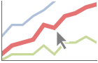
Plots have interactive coordinate callouts with the default setting PlotHighlightingAutomatic:
Plot[{Sin[x] + x, Sin[x]x}, {x, 0, 10}]Use PlotHighlightingNone to disable the highlighting for the entire plot:
Plot[{Sin[x] + x, Sin[x]x}, {x, 0, 10}, PlotHighlighting -> None]Use Highlighted[…,None] to disable highlighting for a single curve:
Plot[{Sin[x] + x, Highlighted[Sin[x]x, None]}, {x, 0, 10}]Move the mouse over a curve to highlight it using arbitrary graphics directives:
Plot[{Sin[x] + x, Sin[x]x}, {x, 0, 10}, PlotHighlighting -> Directive[Red, Dashed, DropShadowing[]]]Move the mouse over the curve to highlight it with a ball and label:
Plot[Sin[x] + x, {x, 0, 10}, PlotHighlighting -> "Ball"]Use a ball and label to highlight a specific point on the curve:
Plot[Highlighted[Sin[x] + x, Placed["Ball", 7]], {x, 0, 10}]Move the mouse over the curve to highlight it with a label and droplines to the axes:
Plot[Sin[x] + x, {x, 0, 10}, PlotHighlighting -> "Dropline"]Use a ball and label to highlight a specific point on the curve:
Plot[Highlighted[Sin[x] + x, Placed["Dropline", 7]], {x, 0, 10}]Move the mouse over the plot to highlight it with a slice showing ![]() values corresponding to the
values corresponding to the ![]() position:
position:
Plot[{Sin[x] + x, Cos[x] + x}, {x, 0, 10}, PlotHighlighting -> "XSlice"]Highlight the curves at a fixed ![]() value:
value:
Plot[Highlighted[{Sin[x] + x, Cos[x] + x}, Placed["XSlice", 6]], {x, 0, 10}]Move the mouse over the plot to highlight it with a slice showing ![]() values corresponding to the
values corresponding to the ![]() position:
position:
Plot[{Sin[x] + x, Cos[x] + x}, {x, 0, 10}, PlotHighlighting -> "YSlice"]Highlight the curves at a fixed ![]() value:
value:
Plot[Highlighted[{Sin[x] + x, Cos[x] + x}, Placed["YSlice", 6]], {x, 0, 10}]Use a component that shows the points on the curve closest to the ![]() position of the mouse cursor:
position of the mouse cursor:
Plot[{Sin[x] + x, Cos[x] + x}, {x, 0, 10}, PlotHighlighting -> "XNearestPoint"]Specify the style for the points:
Plot[{Sin[x] + x, Cos[x] + x}, {x, 0, 10}, PlotHighlighting -> {"XNearestPoint", <|"Style" -> StandardGray|>}]Use a component that shows the coordinates on the curve closest to the mouse cursor:
Plot[Sin[x] + x, {x, 0, 10}, PlotHighlighting -> "XYLabel"]Use Callout options to change the appearance of the label:
Plot[Sin[x] + x, {x, 0, 10}, PlotHighlighting -> {"XYLabel", <|"Appearance" -> "Corners", "CalloutMarker" -> "Circle"|>}]Combine components to create a custom effect:
Plot[Sin[x] + x, {x, 0, 10}, PlotHighlighting -> {{"XNearestPoint", <|"Style" -> StandardGray|>}, {"XYLabel", <|"Appearance" -> "Corners", "CalloutMarker" -> "Circle"|>}}]PlotInteractivity (4)
Plots have interactive highlighting by default:
Plot[x + Sin[x], {x, 0, 20}]Turn off all the interactive elements:
Plot[x + Sin[x], {x, 0, 20}, PlotInteractivity -> False]Interactive elements provided as part of the input are disabled:
Plot[Tooltip[x + Sin[x], "hello"], {x, 0, 20}, PlotInteractivity -> False]Allow provided interactive elements and disable automatic ones:
Plot[Tooltip[x + Sin[x], "hello"], {x, 0, 20}, PlotInteractivity -> <|"User" -> True, "System" -> False|>]PlotLabel (1)
PlotLabels (5)
Plot[{Sin[x], Cos[x]}, {x, 0, 2π}, PlotLabels -> {"sine", "cosine"}]Place the labels above the curves:
Plot[{Sin[x], Cos[x]}, {x, 0, 2π}, PlotLabels -> Placed[{"sine", "cosine"}, Above]]Place the labels differently for each curve:
Plot[{Sin[x], Cos[x]}, {x, 0, 2π}, PlotLabels -> {Placed["sine", Below], Placed["cosine", Above]}]PlotLabels->"Expressions" uses functions as curve labels:
Plot[{Sin[x], Cos[x]}, {x, 0, 2π}, PlotLabels -> "Expressions"]Use callouts to identify the curves:
Plot[{Sin[x], Cos[x]}, {x, 0, 2π}, PlotLabels -> {Callout["sin", {Scaled[0.25], Above}], Callout["cos", {Scaled[0.5], Below}]}]Use None to not add a label:
Plot[{Sin[x], Cos[x]}, {x, 0, 2π}, PlotLabels -> {"sine", None}]PlotLayout (2)
Place each curve in a separate panel using shared axes:
Plot[{Sin[x], Sin[2 x], Sin[3 x]}, {x, 0, 10}, PlotLayout -> "Column"]Use a row instead of a column:
Plot[{Sin[x], Sin[2 x], Sin[3 x]}, {x, 0, 10}, PlotLayout -> "Row"]Plot[{BesselJ[0, x], BesselJ[1, x], BesselJ[2, x], BesselJ[3, x], BesselJ[4, x], BesselJ[5, x]}, {x, -20, 20}, PlotLayout -> {"Column", 4}]Plot[{BesselJ[0, x], BesselJ[1, x], BesselJ[2, x], BesselJ[3, x], BesselJ[4, x], BesselJ[5, x]}, {x, -20, 20}, PlotLayout -> {"Column", UpTo[4]}]PlotLegends (7)
No legends are used by default:
Plot[{Sin[x], Cos[x]}, {x, 0, 10}]Create a legend based on the functions:
Plot[{Sin[x], Cos[x]}, {x, 0, 10}, PlotLegends -> "Expressions"]Create a legend with placeholder text:
Plot[{Sin[x], Cos[x]}, {x, 0, 10}, PlotLegends -> "Placeholder"]Create a legend with specific labels:
Plot[{Sin[x], Cos[x]}, {x, 0, 10}, PlotLegends -> {"one", "two"}]PlotLegends picks up PlotStyle values automatically:
Plot[{Sin[x], Cos[x]}, {x, 0, 10}, PlotStyle -> {Red, Blue}, PlotLegends -> "Placeholder"]Use Placed to position legends:
Plot[{Sin[x], Cos[x]}, {x, 0, 10}, PlotStyle -> {Red, Blue}, PlotLegends -> Placed["Placeholder", Below]]Plot[{x, Sqrt[x]}, {x, 0, 5}, PlotStyle -> {Red, Blue}, PlotLegends -> Placed["Expressions", {0.25, 0.75}]]Use LineLegend to modify the appearance of the legend:
Plot[{Sin[x], Cos[x]}, {x, 0, 10}, PlotLegends -> LineLegend["Expressions", LegendFunction -> Frame]]PlotPoints (1)
PlotRange (3)
Show the curve over the whole domain:
Plot[Sqrt[x], {x, -5, 5}, PlotRange -> Full]Show the curve only where it is real valued:
Plot[Sqrt[x], {x, -5, 5}, PlotRange -> Automatic]Show the curve from ![]() to
to ![]() over the whole domain:
over the whole domain:
Plot[Sqrt[x], {x, -5, 5}, PlotRange -> 2]PlotRangeClipping (2)
PlotStyle (6)
Use different style directives:
Table[Plot[Sin[x], {x, 0, 2Pi}, PlotStyle -> ps], {ps, {Red, Thick, Dashed, Directive[Red, Thick]}}]By default, different styles are chosen for multiple curves:
Plot[{Sin[x], Sin[2x], Sin[3x]}, {x, 0, 2Pi}]Explicitly specify the style for different curves:
Plot[{Sin[x], Sin[2x], Sin[3x]}, {x, 0, 2Pi}, PlotStyle -> {Red, Green, Blue}]PlotStyle can be combined with ColorFunction:
Plot[Sin[x], {x, 0, 2Pi}, PlotStyle -> Thick, ColorFunction -> Function[{x, y}, Hue[y]]]PlotStyle can be combined with MeshShading:
Plot[Sin[x], {x, 0, 2Pi}, PlotStyle -> Directive[Opacity[0.5], Thick], Mesh -> 10, MeshFunctions -> {#1&}, MeshShading -> {Red, Blue}]MeshStyle by default uses the same style as PlotStyle:
Plot[Sin[x], {x, 0, 2Pi}, PlotStyle -> Red, Mesh -> All]PlotTheme (2)
RegionFunction (2)
ScalingFunctions (9)
By default, plots have linear scales in each direction:
Plot[x ^ 2, {x, 0, 10}]Use a log scale in the ![]() direction:
direction:
Plot[x ^ 2, {x, 0, 10}, ScalingFunctions -> "Log"]Use a linear scale in the ![]() direction that shows smaller numbers at the top:
direction that shows smaller numbers at the top:
Plot[x ^ 2, {x, 0, 10}, ScalingFunctions -> "Reverse"]Use a reciprocal scale in the ![]() direction:
direction:
Plot[x ^ 2, {x, 1, 10}, ScalingFunctions -> "Reciprocal"]Use different scales in the ![]() and
and ![]() directions:
directions:
Plot[x ^ 2, {x, 0, 10}, ScalingFunctions -> {"Reverse", "Log"}]Reverse the ![]() axis without changing the
axis without changing the ![]() axis:
axis:
Plot[x ^ 2, {x, 0, 10}, ScalingFunctions -> {"Reverse", None}]Use a scale defined by a function and its inverse:
Plot[x ^ 2, {x, 0, 10}, ScalingFunctions -> {None, {-Log[#]&, Exp[-#]&}}]Positions in Ticks and GridLines are automatically scaled:
Plot[x ^ 2, {x, 1, 10}, ScalingFunctions -> "Log", Ticks -> {Automatic, 2 ^ Range[10]}, GridLines -> {None, 2 ^ Range[10]}]PlotRange and AxesOrigin are automatically scaled:
Plot[x ^ 2, {x, 1, 10}, ScalingFunctions -> "Log", PlotRange -> {1, 100}, AxesOrigin -> {Automatic, 10}]WorkingPrecision (2)
Applications (19)
Basic Applications (3)
Plot[{x^1 / 2, x, x^2}, {x, 0, 2}, PlotLegends -> "Expressions"]A function and its inverse are reflections in ![]() :
:
Plot[{Exp[x], Log[x], x}, {x, -3, 3}, PlotRange -> 3, PlotStyle -> {Red, Green, Dashed}, AspectRatio -> Automatic]Illustrate that -Abs[x]≤x Sin[1/x]≤Abs[x] in the interval:
Plot[{x Sin[1 / x], Abs[x], -Abs[x]}, {x, -1 / 2, 1 / 2}, PlotStyle -> {Red, Directive[Dashed, Gray], Directive[Dashed, Gray]}]Highlighting Discrete Function Features (8)
Curves are broken where a function has singularities:
Plot[Tan[x], {x, -5, 5}]Emphasize the singularities by specifying ExclusionsStyle:
Plot[Tan[x], {x, -5, 5}, ExclusionsStyle -> Dashed]Highlight the discontinuities in a function ![]() using ExclusionsStyle:
using ExclusionsStyle:
Plot[Sin[Floor[x]], {x, 0, 10}, ExclusionsStyle -> Dotted]The discontinuities are automatically derived but can also be specified:
Plot[Sin[Floor[x]], {x, 0, 10}, Exclusions -> {Sin[π x] == 0}, ExclusionsStyle -> Dashed]Highlight zeros of a function ![]() :
:
Plot[Sin[Sqrt[2]x] + Sin[x], {x, 0, 20}]The second argument passed to MeshFunctions is ![]() :
:
Plot[Sin[Sqrt[2]x] + Sin[x], {x, 0, 20}, MeshFunctions -> {Function[{x, y}, y]}, Mesh -> {{0}}, MeshStyle -> Directive[PointSize[Medium], Red]]Highlight local extrema for a function ![]() using MeshFunctions:
using MeshFunctions:
Plot[Sin[Sqrt[2]x] + Sin[x], {x, 0, 50}]mf = Function[{x, y}, Evaluate@D[Sin[Sqrt[2]x] + Sin[x], x]];Plot[Sin[Sqrt[2]x] + Sin[x], {x, 0, 50}, MeshFunctions -> {mf}, Mesh -> {{0}}, MeshStyle -> Directive[PointSize[Medium], Red]]Highlight the local maximums and minimums of a function ![]() :
:
f = Sin[Sqrt[2]x] + Sin[x];Plot[f, {x, 0, 50}]The local maximums are the points where ![]() and
and ![]() :
:
Plot[f, {x, 0, 50}, Exclusions -> {{D[f, x] == 0, D[f, {x, 2}] ≤ 0}}, ExclusionsStyle -> Directive[Thickness[0.02], Red]]Similarly the local minimums are given by ![]() and
and ![]() :
:
Plot[f, {x, 0, 50}, Exclusions -> {{D[f, x] == 0, D[f, {x, 2}] ≥ 0}}, ExclusionsStyle -> Directive[Thickness[0.02], Purple]]Highlight the non-negative and non-positive parts of a function ![]() :
:
f = Sin[Sqrt[2]x] + Sin[x];Plot[f, {x, 0, 50}]Using the Filling specification allows this to be readily achieved:
Plot[f, {x, 0, 50}, Filling -> {{1 -> {0, {Red, Blue}}}}, PlotLegends -> SwatchLegend[{Blue, Red}, {"non-negative", "non-positive"}]]Highlight the segments where the function ![]() is increasing or decreasing:
is increasing or decreasing:
f = Sin[Sqrt[2]x] + Sin[x];plot = Plot[f, {x, 0, 50}]A function is increasing when ![]() :
:
rfi = Function[{x, y}, Evaluate[D[f, x] ≥ 0]];incr = Plot[f, {x, 0, 50}, RegionFunction -> rfi, PlotStyle -> Blue]A function is decreasing when ![]() :
:
rfd = Function[{x, y}, Evaluate[D[f, x] ≤ 0]];decr = Plot[f, {x, 0, 50}, RegionFunction -> rfd, PlotStyle -> Red]Show them together and add a legend:
Legended[Show[incr, decr], SwatchLegend[{Blue, Red}, {"increasing", "decreasing"}]]Highlight the parts where a function ![]() is convex or concave:
is convex or concave:
f = Sin[Sqrt[2]x] + Sin[x];plot = Plot[f, {x, 0, 50}]rfcvx = Function[{x, y}, Evaluate[D[f, {x, 2}] ≥ 0]];cvx = Plot[f, {x, 0, 50}, RegionFunction -> rfcvx, PlotStyle -> Orange]rfccv = Function[{x, y}, Evaluate[D[f, {x, 2}] ≤ 0]];ccv = Plot[f, {x, 0, 50}, RegionFunction -> rfccv, PlotStyle -> Blue]Show them together with a legend:
Legended[Show[cvx, ccv], SwatchLegend[{Orange, Blue}, {"convex", "concave"}]]Highlighting Continuous Function Features (1)
Use color to overlay the derivative ![]() of function on top of the curve for
of function on top of the curve for ![]() :
:
f = Sin[Sqrt[2]x] + Sin[x];Plot[f, {x, 0, 20}]By rescaling the derivative to be between 0 and 1, you can easily map to a color:
{min, max} = {NMinValue[{D[f, x], 0 ≤ x ≤ 20}, x], NMaxValue[{D[f, x], 0 ≤ x ≤ 20}, x]};df = Rescale[D[f, x], {min, max}, {0, 1}]Plot[df, {x, 0, 20}]From ColorData you can get a variety of color scales:
cf = Function[{x}, Evaluate[ColorData["Rainbow"][ df]]]leg = BarLegend[{ColorData["Rainbow"][Rescale[#, {min, max}, {0, 1}]]&, {min, max}}, LegendMarkerSize -> 150];The derivative can now be overlaid as color on top of the curve using ColorFunction:
Plot[f, {x, 0, 20}, ColorFunction -> cf, ColorFunctionScaling -> False, PlotLegends -> leg]Using Filling emphasizes the color more:
Plot[f, {x, 0, 20}, ColorFunction -> cf, ColorFunctionScaling -> False, Filling -> 0, PlotLegends -> leg]Epigraph and Hypograph of a Function (2)
The epigraph of a function ![]() is given by
is given by ![]() . You can visualize the epigraph by using Filling:
. You can visualize the epigraph by using Filling:
Plot[Sin[x], {x, 0, 2π}, Filling -> {1 -> Top}, PlotRange -> 2]The hypograph of a function ![]() is given by
is given by ![]() . You can visualize the hypograph by using Filling:
. You can visualize the hypograph by using Filling:
Plot[Sin[x], {x, 0, 2π}, Filling -> {1 -> Bottom}, PlotRange -> 2]Complex-Valued Functions (3)
Plot the real and imaginary parts of a complex-valued function of a real variable:
Plot[{Re[Exp[I ω]], Im[Exp[I ω]]}, {ω, 0, 10}, PlotLegends -> "Expressions"]Plot the magnitude and phase of a complex-valued function of a real variable:
Plot[{Abs[Exp[I ω] / (1 + ω^2)], Arg[Exp[I ω] / (1 + ω^2)]}, {ω, -π, π}, PlotLegends -> "Expressions"]Plot the magnitude and color based on the phase of the function:
f = Exp[I ω] / (1 + ω^2);
cf = Function[ω, Evaluate[Hue[Arg[f] / (2π), 0.5]]]Plot[Abs[f], {ω, -π, π}, ColorFunction -> cf, ColorFunctionScaling -> False]Add filling and a color legend that provides a separate axis for the phase:
Plot[Abs[f], {ω, -π, π}, ColorFunction -> cf, ColorFunctionScaling -> False, Filling -> Bottom, PlotLegends -> BarLegend[{cf, {-π, π}}, LegendMarkerSize -> 150]]Equation Solutions (2)
The general solution to a differential equation:
s = DSolve[y'[x] == (1/1 + y[x]), y, x]Plot two particular solutions:
Plot[Evaluate[y[x] /. s /. C[1] -> 0], {x, -2, 5}]Plot[Evaluate[y[x] /. s /. C[1] -> Range[0, 5]], {x, -5, 5}]The general solution to an algebraic equation:
s = Reduce[Sin[x ^ 2 + y] == 0, {x, y}]Plot[Evaluate[{-x^2 + 2 π C[1], π - x^2 + 2 π C[1]} /. C[1] -> Range[-5, 5]], {x, -5, 5}]Properties & Relations (9)
Plot samples more points where it needs to:
Plot[Sin[x], {x, 0, 10}, Mesh -> All]Plot is a special case of ParametricPlot for curves:
{Plot[Sin[x ^ 2], {x, 0, 5}], ParametricPlot[{x, Sin[x ^ 2]}, {x, 0, 5}, AspectRatio -> 1 / GoldenRatio]}Use ParametricPlot for parametric curves and regions:
{ParametricPlot[{Cos[θ], Sin[θ]}, {θ, 0, 2Pi}], ParametricPlot[{r Cos[θ], r Sin[θ]}, {θ, 0, 2Pi}, {r, 1, 2}]}Use ContourPlot and RegionPlot for implicit curves and regions:
{ContourPlot[x ^ 2 + y ^ 2 == 1, {x, -1, 1}, {y, -1, 1}], RegionPlot[1 < x ^ 2 + y ^ 2 < 4, {x, -2, 2}, {y, -2, 2}]}Use LogPlot, LogLinearPlot, and LogLogPlot for logarithmic plots:
LogLogPlot[Abs[10 ^ 2 / ((I ω) ^ 2 + 100)], {ω, 10 ^ 0, 10 ^ 5}]Use ListPlot and ListLinePlot for data:
{ListLinePlot[Table[{x, Sin[x]}, {x, 0, 10, 0.25}]], Plot[Sin[x], {x, 0, 10}]}AbsArgPlot is a special case of Plot:
{Plot[Abs[ArcSin[x]], {x, -3, 3}],
	AbsArgPlot[ArcSin[x], {x, -3, 3}]}
ReImPlot is a special case of Plot:
{Plot[ReIm[ArcSin[x]], {x, -3, 3}],
	ReImPlot[ArcSin[x], {x, -3, 3}]}
Use Plot3D and ParametricPlot3D for function and parametric surfaces:
Plot3D[(x ^ 2 + y ^ 2)Exp[-(x ^ 2 + y ^ 2)], {x, -2, 2}, {y, -2, 2}]ParametricPlot3D[{-2 Cos[u] Cos[v] ^ 3, -2 Cos[v] ^ 2 Sin[u], 2 Tan[v]}, {u, 0, 2Pi}, {v, -1, 1}]Neat Examples (1)
Eigenfunctions in a potential well:
f[n_, x_] := Abs[((1 / Pi) ^ (1 / 4)HermiteH[n, x]) / (E ^ (x ^ 2 / 2)Sqrt[2 ^ n n!])] ^ 2Plot[Evaluate@
Append[Table[f[n, x] + n + 1 / 2, {n, 0, 7}], x ^ 2 / 2], {x, -4, 4}, Filling -> Table[n -> n - 1 / 2, {n, 1, 8}]]Related Links
Text
Wolfram Research (1988), Plot, Wolfram Language function, https://reference.wolfram.com/language/ref/Plot.html (updated 2026).
CMS
Wolfram Language. 1988. "Plot." Wolfram Language & System Documentation Center. Wolfram Research. Last Modified 2026. https://reference.wolfram.com/language/ref/Plot.html.
APA
Wolfram Language. (1988). Plot. Wolfram Language & System Documentation Center. Retrieved from https://reference.wolfram.com/language/ref/Plot.html