ButtonBar[{lbl1:>act1,lbl2:>act2,…}]
represents a bar of buttons with labels lbli that perform actions acti when pressed.


ButtonBar
ButtonBar[{lbl1:>act1,lbl2:>act2,…}]
represents a bar of buttons with labels lbli that perform actions acti when pressed.
Details and Options

- The lbli and acti can be any expressions.
- ButtonBar has the same options as Button.
- Possible additional settings for the Appearance option include:
-
"Horizontal" equally spaced horizontally "Vertical" equally spaced vertically "Row" laid out like text, allowing linewrapping
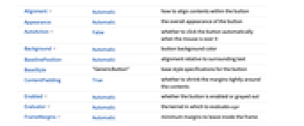
List of all options

Examples
open all close allOptions (16)
AutoAction (2)
By default, the button function does not evaluate until you click it:
By setting AutoAction, the button function evaluates as you mouseover the button area:
Enabled (2)
Evaluator (3)
By default, the button function is sent to the kernel for evaluation:
By setting Evaluator, the button functions are evaluated in the front end:
FrameMargins (1)
By setting FrameMargins, you make the button content area larger:
ImageMargins (1)
By setting ImageMargins, you make the button area larger:
ImageSize (4)
Method (1)
Button functions are evaluated on a preemptive link, which times out after five seconds:
Use Method->"Queued" to evaluate button functions on the main link, which never times out:
Related Guides
Related Workflows
- Create a Palette ▪
- Build a Manipulate
History
Text
Wolfram Research (2008), ButtonBar, Wolfram Language function, https://reference.wolfram.com/language/ref/ButtonBar.html.
CMS
Wolfram Language. 2008. "ButtonBar." Wolfram Language & System Documentation Center. Wolfram Research. https://reference.wolfram.com/language/ref/ButtonBar.html.
APA
Wolfram Language. (2008). ButtonBar. Wolfram Language & System Documentation Center. Retrieved from https://reference.wolfram.com/language/ref/ButtonBar.html
BibTeX
@misc{reference.wolfram_2025_buttonbar, author="Wolfram Research", title="{ButtonBar}", year="2008", howpublished="\url{https://reference.wolfram.com/language/ref/ButtonBar.html}", note=[Accessed: 24-April-2026]}
BibLaTeX
@online{reference.wolfram_2025_buttonbar, organization={Wolfram Research}, title={ButtonBar}, year={2008}, url={https://reference.wolfram.com/language/ref/ButtonBar.html}, note=[Accessed: 24-April-2026]}