Button[label,action]
represents a button that is labeled with label, and evaluates action whenever it is clicked.


Button
Button[label,action]
represents a button that is labeled with label, and evaluates action whenever it is clicked.
Details and Options


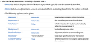
- label can be any expression, including a dynamic one. »
- Button by default displays label in "Button" style, which typically uses the system button font.
- Button[label,action] maintains action in unevaluated form, evaluating it each time the button is clicked.
- The following options can be given:
-
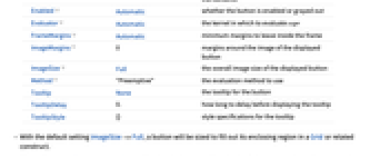
Alignment Automatic how to align contents within the button Appearance Automatic the overall appearance of the button AutoAction False whether to click the button automatically when the mouse is over it Background Automatic button background color BaselinePosition Automatic alignment relative to surrounding text BaseStyle "GenericButton" base style specifications for the button ContentPadding True whether to shrink the margins tightly around the contents Enabled Automatic whether the button is enabled or grayed out Evaluator Automatic the kernel in which to evaluate expr FrameMargins Automatic minimum margins to leave inside the frame ImageMargins 0 margins around the image of the displayed button ImageSize Full the overall image size of the displayed button Method "Preemptive" the evaluation method to use Tooltip None the tooltip for the button TooltipDelay 0.` how long to delay before displaying the tooltip TooltipStyle {} style specifications for the tooltip - With the default setting ImageSize->Full, a button will be sized to fill out its enclosing region in a Grid or related construct.
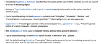
- The setting ImageSize->Automatic specifies that the button will be sized to fit its contents, but will not expand to fill out an enclosing region.
- Settings of Tiny, Small, Medium, and Large for ImageSize specify buttons with certain system-standard minimum sizes.
- Typical possible settings for the Appearance option include "DialogBox", "Frameless", "Palette", and "FramedPalette". In some cases, "AbuttingLeftRight", "AbuttingRight", etc. are also supported.
- Appearance->"Pressed" gives a button with a pressed appearance. Appearance->{type,"Pressed"} gives a button of a certain type with a pressed appearance.
- With Appearance->None, label is displayed literally, without being placed in a button. »
- Typical possible settings for the Method option include "Preemptive" and "Queued".
- With the default setting Method->"Preemptive", button actions are performed immediately, preempting any other evaluation, but are allocated only a limited time to complete.
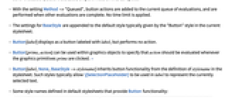
- With the setting Method->"Queued", button actions are added to the current queue of evaluations, and are performed when other evaluations are complete. No time limit is applied.
- The settings for BaseStyle are appended to the default style typically given by the "Button" style in the current stylesheet.
- Button[label] displays as a button labeled with label, but performs no action.
- Button[prims,action] can be used within graphics objects to specify that action should be evaluated whenever the graphics primitives prims are clicked. »
- Button[label,None,BaseStyle->stylename] inherits button functionality from the definition of stylename in the stylesheet. Such styles typically allow \[SelectionPlaceholder] to be used in label to represent the currently selected text.
- Some style names defined in default stylesheets that provide Button functionality:
-
"Paste" effectively use NotebookApply upon the current selection using the button label as the applied data "Evaluate" use NotebookApply and SelectionEvaluate in sequence upon the current selection "EvaluateCell" use NotebookApply upon the current selection, then evaluate the entire cell containing the selection "CopyEvaluate" equivalent to "Evaluate", but paste the result into a new cell instead of changing the currently selected cell "CopyEvaluateCell" equivalent to "EvaluateCell", but apply changes to a newly created copy of the input cell instead of changing the currently selected cell
Examples
open all close allScope (7)
Button Content (3)
Button Control (2)
Create a list of buttons; use With to ensure evaluation of i:
Another way to get the contents of a button evaluated:
Display the label literally, without the appearance of a button:
Button Styles (2)
Display a button that sorts the selected expression:
Select the list below, and click the button to sort it:
Display a button that wraps Factor around an expression, then evaluates the entire cell:
Select the first three terms below, then click the button to factor them:
Generalizations & Extensions (2)
Options (23)
Appearance (4)
AutoAction (1)
By default, the button function does not evaluate until you click it:
By setting AutoAction, the button function evaluates as you mouse over the button area:
BaselinePosition (2)
BaseStyle (2)
Enabled (1)
Evaluator (1)
By default, the button function is sent to the kernel for evaluation:
By setting Evaluator, the button function is evaluated in the front end:
FrameMargins (1)
By setting FrameMargins, you make the button content area larger:
ImageMargins (1)
By setting ImageMargins, you make the button area larger:
ImageSize (4)
Method (2)
By default, button functions are evaluated on a preemptive link and time out after 5 seconds:
Use Method->"Queued" to evaluate button functions on the main link, which never times out:
Specify that the stop button event needs to preemptively interrupt an evaluation:
Applications (5)
Properties & Relations (2)
Possible Issues (4)
Some functions require the kernel in order to be evaluated:
Specifying the Background option forces a generic appearance for the button:
Use ImageSize to control buttons in a Grid:
Use Method->"Queued" to avoid evaluation timeout on the preemptive link:
Tech Notes
Related Workflows
- Create a Palette
Text
Wolfram Research (2007), Button, Wolfram Language function, https://reference.wolfram.com/language/ref/Button.html (updated 2010).
CMS
Wolfram Language. 2007. "Button." Wolfram Language & System Documentation Center. Wolfram Research. Last Modified 2010. https://reference.wolfram.com/language/ref/Button.html.
APA
Wolfram Language. (2007). Button. Wolfram Language & System Documentation Center. Retrieved from https://reference.wolfram.com/language/ref/Button.html
BibTeX
@misc{reference.wolfram_2025_button, author="Wolfram Research", title="{Button}", year="2010", howpublished="\url{https://reference.wolfram.com/language/ref/Button.html}", note=[Accessed: 25-April-2026]}
BibLaTeX
@online{reference.wolfram_2025_button, organization={Wolfram Research}, title={Button}, year={2010}, url={https://reference.wolfram.com/language/ref/Button.html}, note=[Accessed: 25-April-2026]}