Grid[{{expr11,expr12,…},{expr21,expr22,…},…}]
is an object that formats with the exprij arranged in a two-dimensional grid.


Grid
Grid[{{expr11,expr12,…},{expr21,expr22,…},…}]
is an object that formats with the exprij arranged in a two-dimensional grid.
Details and Options
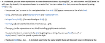
- In a notebook, you can enter expressions in a two-dimensional layout by using
 to add columns and
  to add rows. By default, this layout evaluates to a nested list. You can make a Grid that preserves the layout by using Grid[layout].
 - You can use
 to move to the next placeholder in a Grid.
  moves out of the whole Grid.
 - Grid[…] formats as a grid in StandardForm and TraditionalForm.
- In InputForm, Grid[…] formats literally as Grid[…].
- Normal[grid] extracts the list of lists that make up a grid.
- The exprij can be expressions of any kind, including graphics and controls.
- You can enter text in an element of a Grid by giving it as a string. You can use Text["string"] or Style["string","style"] to specify a particular style.
- The listi in Grid[{list1,list2,…}] do not all need to be the same length; there will be empty space in the grid at the ends of shorter rows.
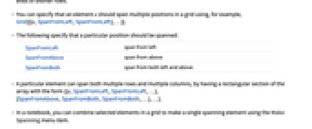
- You can specify that an element e should span multiple positions in a grid using, for example, Grid[{{e,SpanFromLeft,SpanFromLeft},…}].
- The following specify that a particular position should be spanned:
-
SpanFromLeft span from left SpanFromAbove span from above SpanFromBoth span from both left and above - A particular element can span both multiple rows and multiple columns, by having a rectangular section of the array with the form {{e,SpanFromLeft,SpanFromLeft,…}, {SpanFromAbove,SpanFromBoth,SpanFromBoth,…},…}.
- In a notebook, you can combine selected elements in a grid to make a single spanning element using the Make Spanning menu item.
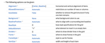
- The following options can be given:
-
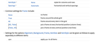
Alignment {Center,Baseline} horizontal and vertical alignment of items AllowedDimensions Automatic restrictions on number of rows or columns AutoDelete False whether to remove the grid structure if only one item remains Background None what background colors to use BaselinePosition Automatic what to align with a surrounding text baseline BaseStyle {} base style specifications for the grid DefaultElement "" what element to insert in an empty item Dividers {} where to draw divider lines in the grid Frame None where to draw frames in the grid FrameStyle Automatic style to use for frames ItemSize Automatic width and height of each item ItemStyle None styles for columns and rows Spacings Automatic horizontal and vertical spacings - Common settings for Frame include:
-
None no frame True frame around the whole grid All frame around every item in the grid {All, False} put a frame at every horizontal position (column lines) {False, All} put a frame at every vertical position (row lines) - Settings for the options Alignment, Background, Frame, ItemSize and ItemStyle can be given as follows to apply separately to different items:
-
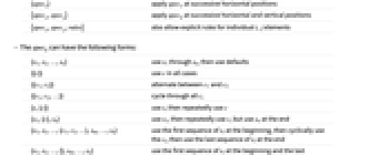
spec apply spec to all items {specx} apply specx at successive horizontal positions {specx,specy} apply speck at successive horizontal and vertical positions {specx,specy,rules} also allow explicit rules for individual i,j elements - The speck can have the following forms:
-
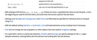
{s1,s2,…,sn} use s1 through sn, then use defaults {{c}} use c in all cases {{c1,c2}} alternate between c1 and c2 {{c1,c2,…}} cycle through all ci {s,{c}} use s, then repeatedly use c {s1,{c},sn} use s1, then repeatedly use c, but use sn at the end {s1,s2,…,{c1,c2,…},sm,…,sn} use the first sequence of si at the beginning, then cyclically use the ci, then use the last sequence of si at the end {s1,s2,…,{},sm,…,sn} use the first sequence of si at the beginning and the last sequence at the end {i1->v1,i2->v2,…} specify what to use at positions ik {spec,rules} use rules to override specifications in spec - With settings of the form {s1,s2,…,{…},sm,…,sn}, if there are more si specified than items across the grid, si from the beginning are used for the first items, and ones from the end are used for the last items.
- Settings such as Alignment, Background, and Frame can effectively be specified for individual items in the grid using Item.
- With the default setting ItemSize->Automatic, Grid will break elements across multiple lines if necessary.
- Grid will not change the size of graphics or other objects that have explicit ImageSize settings.
- For a grid with n items in a particular direction, Dividers and Spacings can specify settings for the n+1 gaps between elements, starting before the first element and ending after the last element.
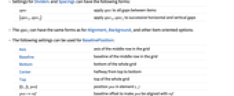
- Settings for Dividers and Spacings can have the following forms:
-
spec apply spec to all gaps between items {specx,specy} apply specx, specy to successive horizontal and vertical gaps - The speci can have the same forms as for Alignment, Background, and other item-oriented options.
- The following settings can be used for BaselinePosition:
-
Axis axis of the middle row in the grid Baseline baseline of the middle row in the grid Bottom bottom of the whole grid Center halfway from top to bottom Top top of the whole grid {{i,j},pos} position pos in element i,j pos->ref baseline offset to make pos be aligned with ref - The BaselinePosition is by default taken to be Center->Axis.
- The settings for BaseStyle are appended to the default style typically given by the "Grid" style in the current stylesheet.
Examples
open all close allBasic Examples (3)
Put a frame around every element:
Use Text to format grid elements as text:
Scope (42)
Elements in Grids (5)
Frames and Grid Lines (5)
Put a frame around the whole grid:
Put a frame around every element:
Put a frame around the first row and column:
Draw different frames with different styles:
Put dividers at all horizontal positions:
Put dividers at all vertical positions:
Put dividers at the third horizontal and second vertical positions:
Spanning Elements (3)
Styling (21)
Background Colors (13)
Draw the grid with a light blue background:
Make the first columns light blue and gray:
Make the first rows light blue and gray:
Make all rows except the first one gray:
Make the first and last rows light blue:
Use a repeating pattern for rows:
Make the first row gray, then a repeating pattern of none and light blue:
Combine a final column highlight with a repeating row pattern:
Highlight a specific column using its column index:
Specify colors for the first two rows, and then additional rows using a column index:
Specify rows as a repeating pattern with an exception specified with its row index:
Spacing (4)
Options (36)
Background (7)
Draw the grid with a pink background:
Pink and gray backgrounds for the columns at the first and second horizontal positions:
Pink and gray backgrounds for the rows at the first and second vertical positions:
Alternating pink and gray backgrounds:
Alternating backgrounds with yellow superimposed in the first and last positions:
BaselinePosition (3)
Dividers (3)
Frame (4)
FrameStyle (3)
FrameStyle supports a variety of graphics directives:
FrameStyle is applied to all sources of grid lines, including Dividers and Item:
Directives given with FrameStyle are combined with those specified elsewhere:
ItemSize (4)
ItemStyle (5)
Set one overall style for grid items:
Use Directive to wrap multiple style directives:
Possible Issues (2)
Styles given in a list will be interpreted as corresponding to successive columns or rows:
Directive groups styles into a single collective unit:
To span across both rows and columns requires appropriate use of SpanFromBoth:
See Also
TextGrid GraphicsGrid Row Column Multicolumn TableForm MatrixForm TableView GalleryView ArrayPlot MatrixPlot Labeled Overlay Item SemanticImport FormControl
Function Repository: PrettyGrid GridTableForm NiceGrid
Tech Notes
Related Guides
-
▪
- Grids & Tables ▪
- Layout & Tables ▪
- Notebook Document Generation ▪
- User Interface Structuring & Layout ▪
- Computation with Structured Datasets ▪
- Data Visualization ▪
- Mathematical Typesetting ▪
- Automated Reports ▪
- Palettes ▪
- Text Generation ▪
- Handling Arrays of Data ▪
- Creating Form Interfaces & Apps ▪
- Standalone Interfaces
Related Workflows
- Make a Grid Containing Text ▪
- Make a Grid of Output Data ▪
- Put Graphics in a Grid ▪
- Create a Palette
Related Links
- An Elementary Introduction to the Wolfram Language : Arrays, or Lists of Lists
- An Elementary Introduction to the Wolfram Language : Pure Anonymous Functions
- An Elementary Introduction to the Wolfram Language : More about Pure Functions
- An Elementary Introduction to the Wolfram Language : Rearranging Lists
- An Elementary Introduction to the Wolfram Language : Layout and Display
History
Introduced in 2007 (6.0) | Updated in 2008 (7.0) ▪ 2012 (9.0)
Text
Wolfram Research (2007), Grid, Wolfram Language function, https://reference.wolfram.com/language/ref/Grid.html (updated 2012).
CMS
Wolfram Language. 2007. "Grid." Wolfram Language & System Documentation Center. Wolfram Research. Last Modified 2012. https://reference.wolfram.com/language/ref/Grid.html.
APA
Wolfram Language. (2007). Grid. Wolfram Language & System Documentation Center. Retrieved from https://reference.wolfram.com/language/ref/Grid.html
BibTeX
@misc{reference.wolfram_2025_grid, author="Wolfram Research", title="{Grid}", year="2012", howpublished="\url{https://reference.wolfram.com/language/ref/Grid.html}", note=[Accessed: 11-May-2026]}
BibLaTeX
@online{reference.wolfram_2025_grid, organization={Wolfram Research}, title={Grid}, year={2012}, url={https://reference.wolfram.com/language/ref/Grid.html}, note=[Accessed: 11-May-2026]}