TextGrid[{{expr11,expr12,…},{expr21,expr22,…},…}]
is an object that formats exprij textually and arranged in a two-dimensional grid.


TextGrid
TextGrid[{{expr11,expr12,…},{expr21,expr22,…},…}]
is an object that formats exprij textually and arranged in a two-dimensional grid.
Details and Options


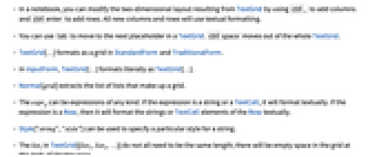
- In a notebook, you can modify the two-dimensional layout resulting from TextGrid by using
 to add columns and
  to add rows. All new columns and rows will use textual formatting.
 - You can use
 to move to the next placeholder in a TextGrid.
  moves out of the whole TextGrid.
 - TextGrid[…] formats as a grid in StandardForm and TraditionalForm.
- In InputForm, TextGrid[…] formats literally as TextGrid[…].
- Normal[grid] extracts the list of lists that make up a grid.
- The exprij can be expressions of any kind. If the expression is a string or a TextCell, it will format textually. If the expression is a Row, then it will format the strings or TextCell elements of the Row textually.
- Style["string","style"] can be used to specify a particular style for a string.
- The listi in TextGrid[{list1,list2,…}] do not all need to be the same length; there will be empty space in the grid at the ends of shorter rows.
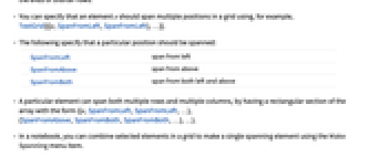
- You can specify that an element e should span multiple positions in a grid using, for example, TextGrid[{{e,SpanFromLeft,SpanFromLeft},…}].
- The following specify that a particular position should be spanned:
-
SpanFromLeft span from left SpanFromAbove span from above SpanFromBoth span from both left and above - A particular element can span both multiple rows and multiple columns, by having a rectangular section of the array with the form {{e,SpanFromLeft,SpanFromLeft,…}, {SpanFromAbove,SpanFromBoth,SpanFromBoth,…},…}.
- In a notebook, you can combine selected elements in a grid to make a single spanning element using the Make Spanning menu item.
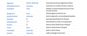
- TextGrid has the same options as Grid.
- The settings for BaseStyle are appended to the default style typically given by the "TextGrid" style in the current stylesheet.
List of all options

Examples
open all close allSee Also
Grid TextCell Text Multicolumn TableForm TableView GalleryView
Tech Notes
Related Guides
Related Workflows
- Make a Grid Containing Text
History
Text
Wolfram Research (2015), TextGrid, Wolfram Language function, https://reference.wolfram.com/language/ref/TextGrid.html.
CMS
Wolfram Language. 2015. "TextGrid." Wolfram Language & System Documentation Center. Wolfram Research. https://reference.wolfram.com/language/ref/TextGrid.html.
APA
Wolfram Language. (2015). TextGrid. Wolfram Language & System Documentation Center. Retrieved from https://reference.wolfram.com/language/ref/TextGrid.html
BibTeX
@misc{reference.wolfram_2025_textgrid, author="Wolfram Research", title="{TextGrid}", year="2015", howpublished="\url{https://reference.wolfram.com/language/ref/TextGrid.html}", note=[Accessed: 07-May-2026]}
BibLaTeX
@online{reference.wolfram_2025_textgrid, organization={Wolfram Research}, title={TextGrid}, year={2015}, url={https://reference.wolfram.com/language/ref/TextGrid.html}, note=[Accessed: 07-May-2026]}