InputField
represents a blank editable input field.
InputField[x]
represents an editable input field that currently contains the expression x.
InputField[Dynamic[x]]
takes the contents of the input field to be the dynamically updated current value of x, with the value of x being reset if new contents are entered.
InputField[x,String]
represents an input field whose contents are taken to be a string.
InputField[x,Number]
represents an input field whose contents are taken to be a number.
InputField[x,type]
represents an input field whose contents are taken to be of the specified type.
Details and Options


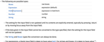
- The following are possible types:
-
Boxes raw boxes Expression expression (default) Hold[Expression] expression in held form Number number String string - The setting for the input field is not updated until its contents are explicitly entered, typically by pressing
![TemplateBox[{return}, Key0, BaseStyle -> {Notes, FontWeight -> Plain, FontFamily -> Source Sans Pro}] TemplateBox[{return}, Key0, BaseStyle -> {Notes, FontWeight -> Plain, FontFamily -> Source Sans Pro}]](Files/InputField.en/1.png) or by moving focus away from the input field.
or by moving focus away from the input field. - If the data given in the input field cannot be converted to the type specified, then the setting for the input field will not be updated.
- For String and Boxes types the conversion can always be done.
- For expressions, a blank input field is taken to have value Null. For strings and boxes, it is taken to have value "".
 moves between input fields.
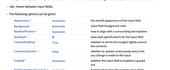
 - The following options can be given:
-
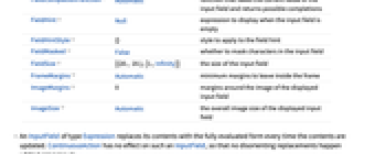
Appearance Automatic the overall appearance of the input field Background Automatic input field background color BaselinePosition Automatic how to align with a surrounding text baseline BaseStyle {} base style specifications for the input field ContentPadding True whether to shrink the margins tightly around the contents ContinuousAction False whether to update continuously every time any change is made to the input Enabled Automatic whether the input field is enabled or grayed out FieldCompletionFunction Automatic function that takes the current value of the input field and returns possible completions FieldHint Null expression to display when the input field is empty FieldHintStyle {} style to apply to the field hint FieldMasked False whether to mask characters in the input field FieldSize {{20., 20.},{1.,Infinity}} the size of the input field FrameMargins Automatic minimum margins to leave inside the frame ImageMargins 0 margins around the image of the displayed input field ImageSize Automatic the overall image size of the displayed input field - An InputField of type Expression replaces its contents with the fully evaluated form every time the contents are updated. ContinuousAction has no effect on such an InputField, so that no disorienting replacements happen while typing inputs.
- Possible settings for Appearance include "Framed" and "Frameless".
- InputField[] is equivalent to InputField[Null].
- The settings for BaseStyle are appended to the default style typically given by the "InputField" style in the current stylesheet.
Examples
open allclose allBasic Examples (2)
Scope (2)
Options (16)
Appearance (1)
Display InputField without a frame:
BaselinePosition (1)
Align InputField with text:
ContinuousAction (2)
By default, variables are not continuously updated:
Setting ContinuousAction makes variable updates whenever a change is made to the input:
Enabled (2)
By default, InputField is enabled:
By setting Enabled->False, the field is disabled but visible in its current state:
FieldCompletionFunction (1)
Properties & Relations (1)
Manipulator is constructed with InputField:
Possible Issues (4)
InputField will remain unevaluated if the expression does not match the type:
Use a cleared Dynamic variable to create an empty input field that only accepts numbers:
Null indicates no value in an input field of style Boxes:
The box representation of the symbol Null is the string "Null":
Null in an Expression style input field produces an empty result:
Text
Wolfram Research (2007), InputField, Wolfram Language function, https://reference.wolfram.com/language/ref/InputField.html (updated 2016).
CMS
Wolfram Language. 2007. "InputField." Wolfram Language & System Documentation Center. Wolfram Research. Last Modified 2016. https://reference.wolfram.com/language/ref/InputField.html.
APA
Wolfram Language. (2007). InputField. Wolfram Language & System Documentation Center. Retrieved from https://reference.wolfram.com/language/ref/InputField.html