Introduction to Toolbars
Introduction to Toolbars
The Wolfram Language's unique symbolic architecture makes it easy to add toolbars with any possible appearance and action to a Wolfram System notebook.
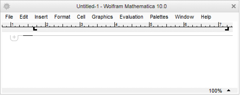
The ruler is a toolbar used to set the text margins of selected cells and the indentation of cell names and keywords. The notebook ruler can be added to a notebook by selecting Toolbar ▶ Ruler in the Window menu or programmatically by using the notebook option WindowToolbars.
| WindowToolbars->"RulerBar" | notebook option value to show the margin settings ruler |
| Window ▶ Toolbar ▶ Ruler | menu item toggling the ruler display along the top of a notebook |
For example, the ruler can be shown in the current notebook by evaluating SetOptions[EvaluationNotebook[],WindowToolbars->"RulerBar"].
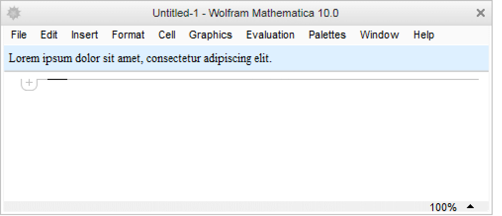
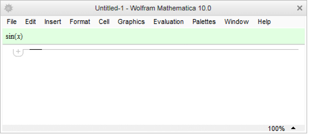
Docked cells are cells that are displayed as a toolbar or banner at the top of the notebook and treated as deployed.
| DockedCells->cells | notebook option that gives a list of cells that are displayed as "docked" at the top of the notebook |
While any type of cells can be included in cells, it is recommended that only those with the cell style "DockedCell" be used. The style "DockedCell" ensures that the cell behaves like a toolbar.
One way to implement a docked cell in the current notebook is to use SetOptions[EvaluationNotebook[],DockedCells->cells].
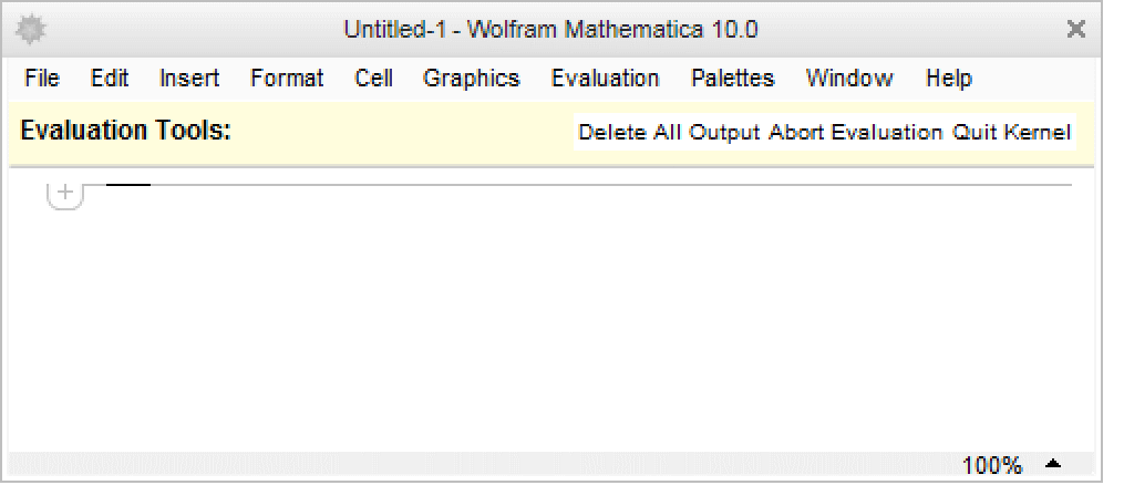
Control objects such as action menus, popup menus, buttons, input fields, etc. can also be used in a docked cell. Create the toolbar contents and then wrap ToBoxes around it to generate the front end box structure automatically. Then place the ToBoxes expression into the BoxData of a Cell. For example, the following input creates an action menu toolbar that places a cell with the chosen style at the insertion point.
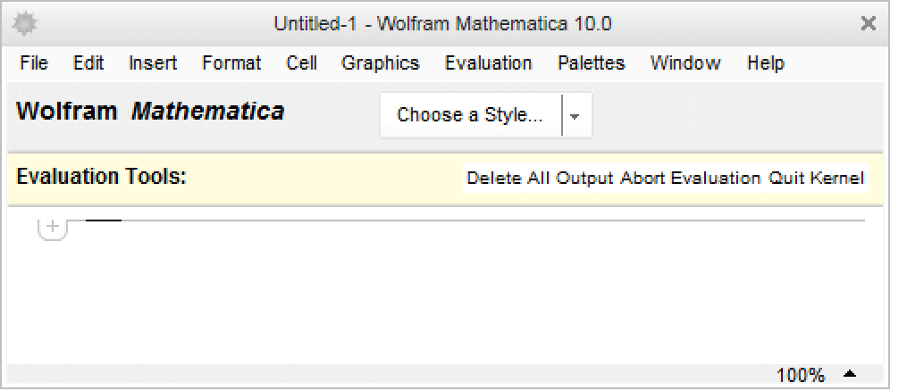
If the spacing between the toolbar elements is static, some elements in a docked cell may become hidden at certain window widths. This can be solved by scaling the item sizes in Grid. The following example includes a label and ButtonBar.
Word Processing Toolbar
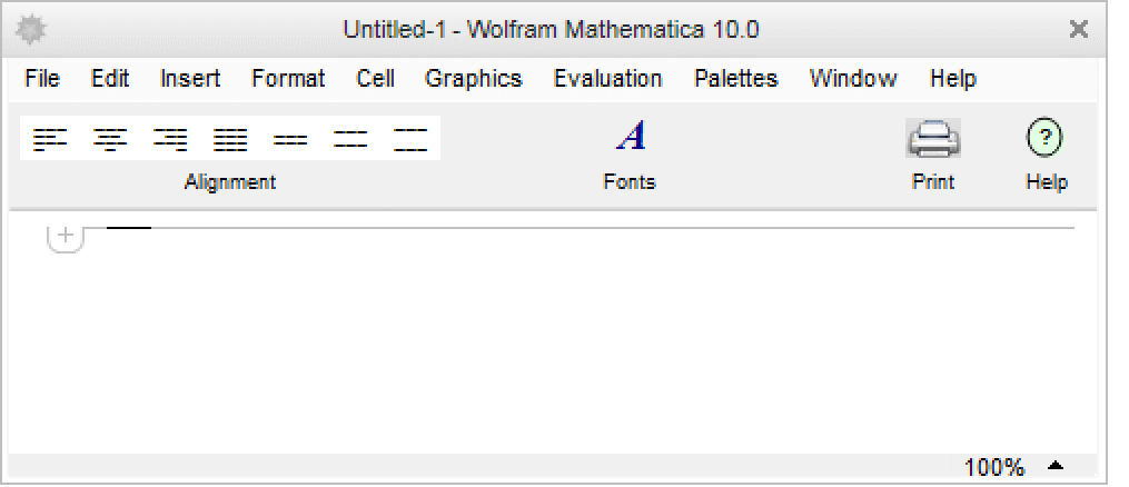
This example includes buttons for setting text alignments and spacings, and opening the font dialog, print dialog, and the Documentation Center. In this example, each of the toolbar elements is generated separately and then converted into boxes using ToBoxes in the CreateWindow statement at the end.
Decorative Toolbar
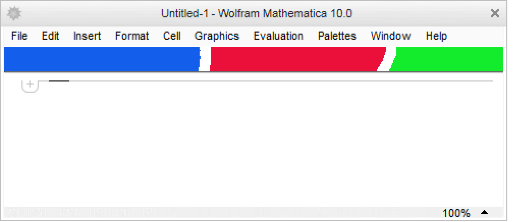
Images can also be used as docked cells. Below, a 1399×24 pixel image is being used as a decorative docked cell similar to those seen in many stylesheets.
Defining Toolbars in a Stylesheet
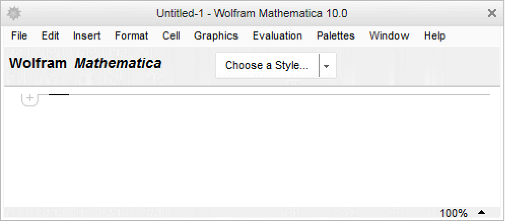
A docked cell can also be defined in a stylesheet instead of in an individual notebook. For example, notebooks with the NaturalColor stylesheet all have the following docked cell at the top of each notebook.
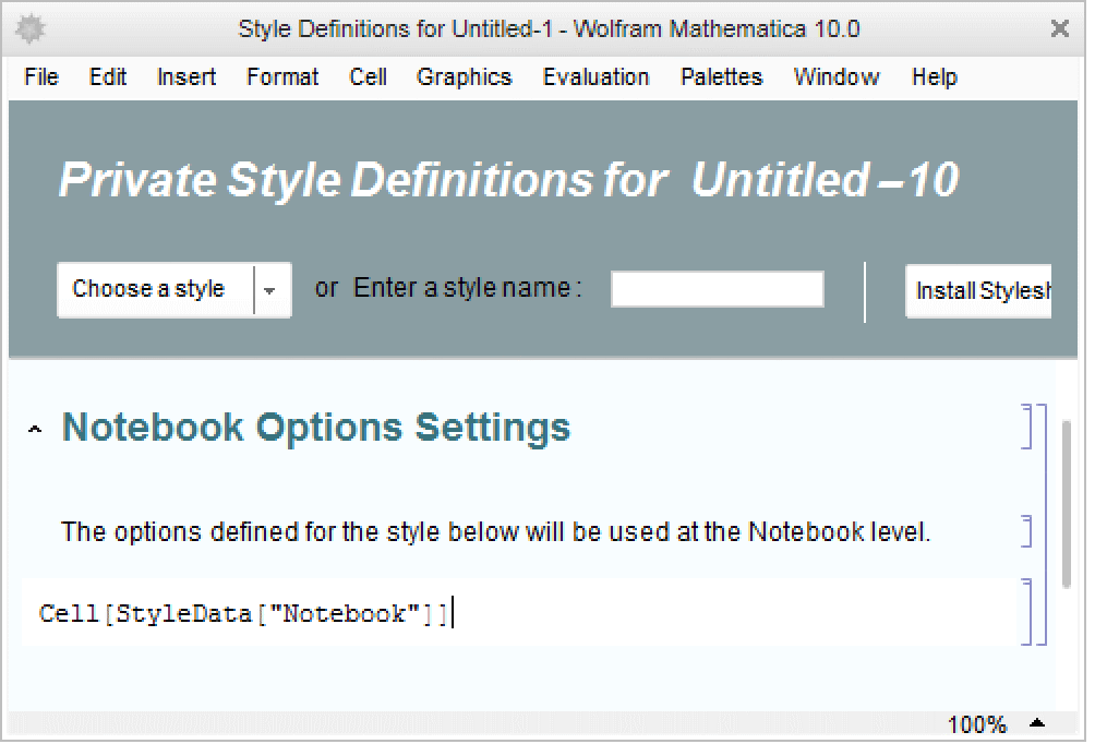
The DockedCells option value for stylesheets is stored in the notebook style definitions cell within a stylesheet notebook. To add a docked cell, start by opening a stylesheet notebook. If the cell does not already exist in the stylesheet, create a new cell with an expression of the form Cell[StyleData["Notebook"]] and place it near the top of the notebook.
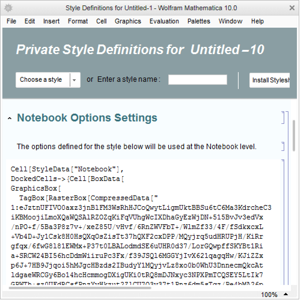
Add the docked cell(s) cells to the stylesheet by updating the notebook style definitions cell expression to resemble the following form: Cell[StyleData["Notebook"],DockedCells->{cells}]. For example, print the cell from the previous example.
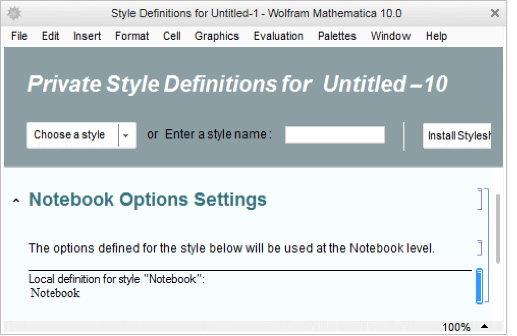
Unformat the printed cell and copy the cell expression into the notebook style definitions cell as the DockedCells option value.
