Label a Plot
Use flexible options for labeling plots to present ideas more clearly in presentations and publications.
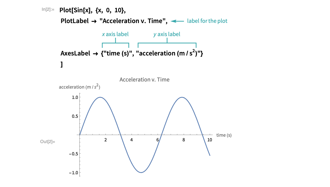
Using PlotLabel and AxesLabel…
Create a plot
Use Plot to create a plot of ![]() :
:
Plot[Sin[x], {x, 0, 10}]Add labels
Use the options PlotLabel to add a label for the entire plot and AxesLabel to add labels for the ![]() and
and ![]() axes:
axes:
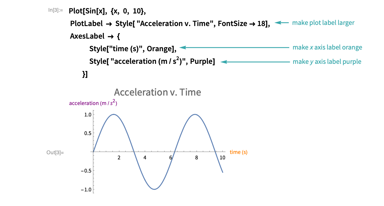
Style the labels
Use Style options to control the appearance of the labels:
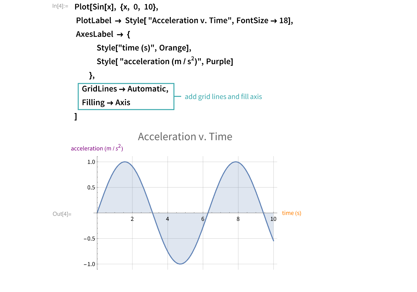
Add additional styling
Use the option GridLines to add more grid lines to the plot and the option Filling to fill the area between the curve and the ![]() axis:
axis:
Using Frame and FrameLabel…
Create a plot
Use Plot to create a plot of ![]() :
:
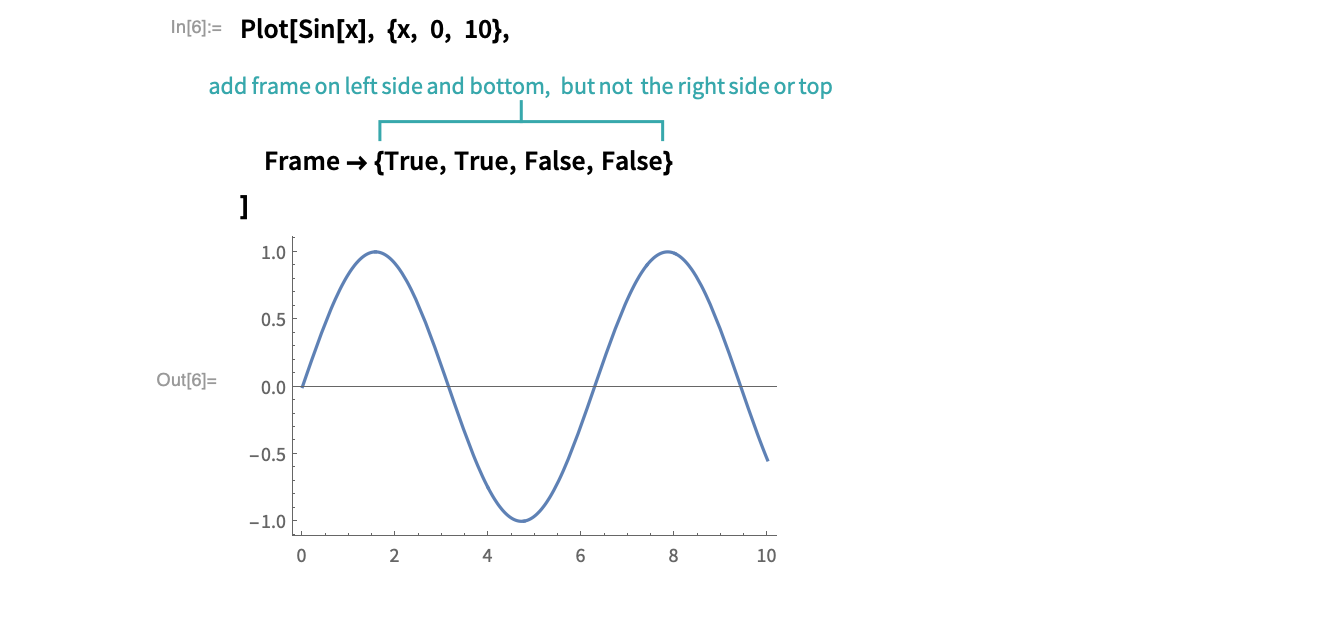
Plot[Sin[x], {x, 0, 10}]Add a frame
Use the option Frame to indicate which parts of the graph should have a frame:
Add labels
Use the options PlotLabel to add a label for the entire plot and FrameLabel to add labels for the ![]() and
and ![]() axes:
axes:
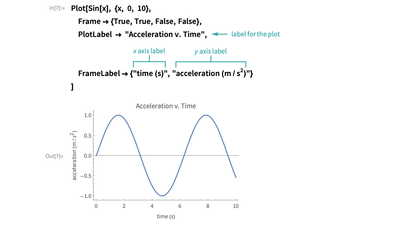
- You cannot add a FrameLabel without a Frame.
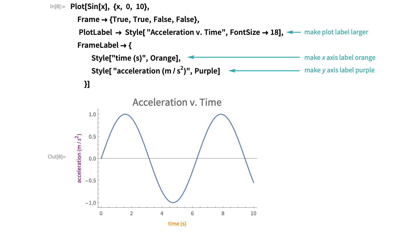
Style the labels
Use Style options to control the appearance of the labels:
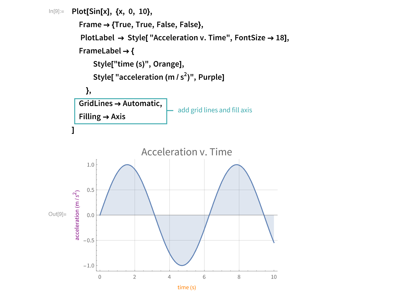
Add additional styling
Use the option GridLines to add more grid lines to the plot and the option Filling to fill the area between the curve and the ![]() axis:
axis:
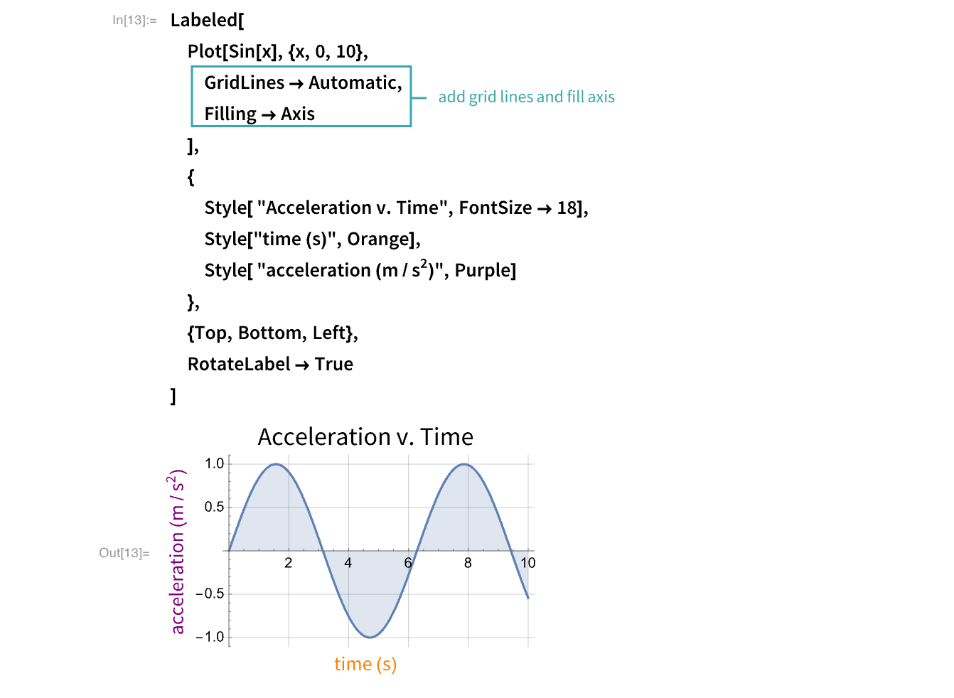
Using Labeled…
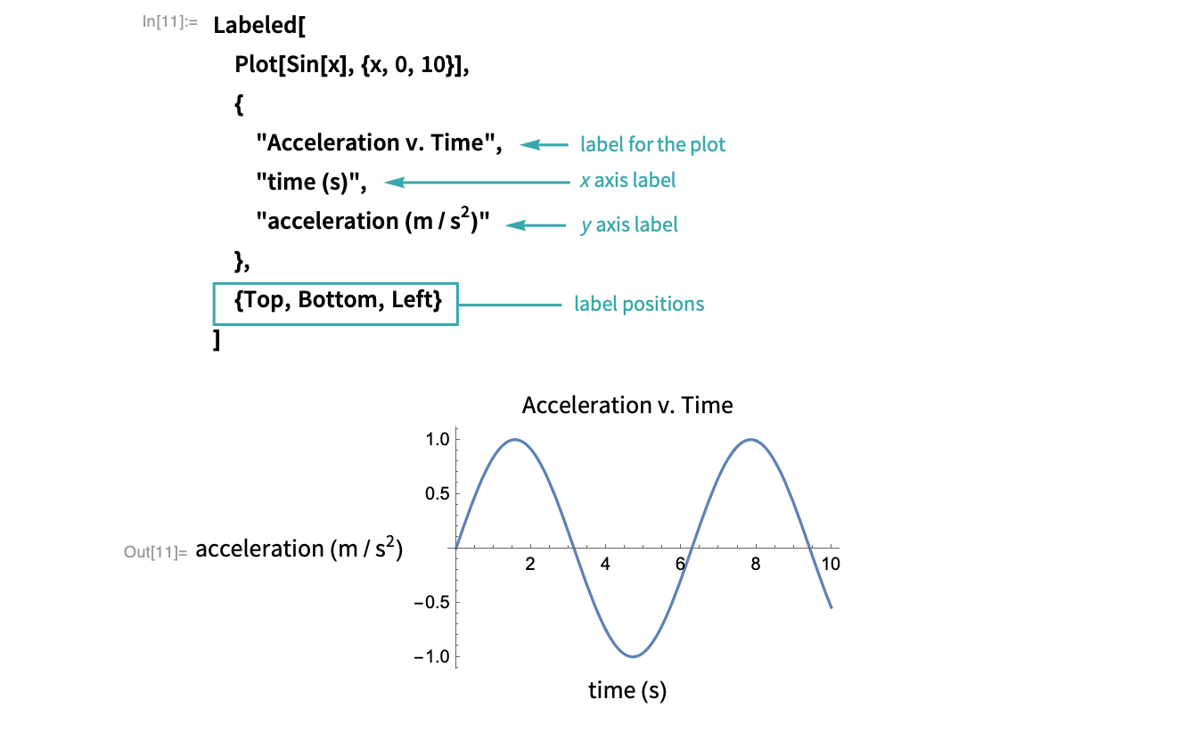
Create a plot
Use Plot to create a plot of ![]() :
:
Plot[Sin[x], {x, 0, 10}]Add labels
Wrap the plot with Labeled and create a list of labels and a list of their positions:
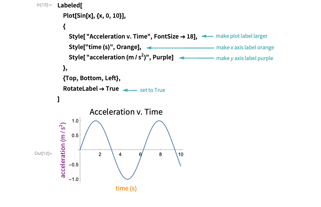
Style the labels
Use Style options to control the appearance of the labels and RotateLabel to rotate the label on the ![]() axes:
axes:
Add additional styling
Use the option GridLines to add more grid lines to the plot and the option Filling to fill the area between the curve and the ![]() axis:
axis: