ButtonBox[boxes]
is a low-level box construct that represents a button in a notebook expression.


ButtonBox
ButtonBox[boxes]
is a low-level box construct that represents a button in a notebook expression.
Details


- ButtonBox is the low-level representation of Button. Except for low-level notebook expression manipulation, ButtonBox should not need to be used directly.
- ButtonBox[boxes] displays as boxes and performs an action when it is clicked.
- The default action is to paste boxes at your current insertion point. Other actions can be specified using options.
- ButtonBox objects are used to implement palette buttons, hyperlinks, and other active elements in notebooks.
- ButtonBox objects are active when either they or the cell that contains them has the option Enabled->True.
- When ButtonBox objects are active, they perform an action whenever they are clicked. Otherwise, clicking them simply selects them or their contents.
- ButtonBox[boxes,BaseStyle->"style"] takes the properties of the ButtonBox from the specified style. The style for a ButtonBox can specify both its appearance and its action.
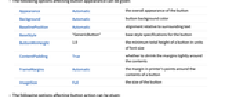
- The following options affecting button appearance can be given:
-
Appearance Automatic the overall appearance of the button Background Automatic button background color BaselinePosition Automatic alignment relative to surrounding text BaseStyle "GenericButton" base style specifications for the button ButtonMinHeight 1.0 the minimum total height of a button in units of font size ContentPadding True whether to shrink the margins tightly around the contents FrameMargins Automatic the margin in printer's points around the contents of a button ImageSize Full the size of the button - The following options affecting button action can be given:
-
ButtonData Automatic the second argument to supply to the button function ButtonFunction (pasting function) the function to apply when the button is clicked ButtonSource Automatic where to get the first argument of the button function Enabled Automatic whether to make the button always active Evaluator None where to send the button function expression for evaluation Method "Preemptive" the evaluation method to use Tooltip None the tooltip for the button TooltipDelay 0.` how long to delay before displaying the tooltip TooltipStyle {} style specifications for the tooltip - ButtonBox[…] is by default interpreted as Button[…] if it is given as input to the Wolfram Language kernel.
Tech Notes
Related Guides
History
Introduced in 1996 (3.0) | Updated in 2007 (6.0) ▪ 2010 (8.0)
Text
Wolfram Research (1996), ButtonBox, Wolfram Language function, https://reference.wolfram.com/language/ref/ButtonBox.html (updated 2010).
CMS
Wolfram Language. 1996. "ButtonBox." Wolfram Language & System Documentation Center. Wolfram Research. Last Modified 2010. https://reference.wolfram.com/language/ref/ButtonBox.html.
APA
Wolfram Language. (1996). ButtonBox. Wolfram Language & System Documentation Center. Retrieved from https://reference.wolfram.com/language/ref/ButtonBox.html
BibTeX
@misc{reference.wolfram_2025_buttonbox, author="Wolfram Research", title="{ButtonBox}", year="2010", howpublished="\url{https://reference.wolfram.com/language/ref/ButtonBox.html}", note=[Accessed: 30-April-2026]}
BibLaTeX
@online{reference.wolfram_2025_buttonbox, organization={Wolfram Research}, title={ButtonBox}, year={2010}, url={https://reference.wolfram.com/language/ref/ButtonBox.html}, note=[Accessed: 30-April-2026]}