


ListPolarPlot
ListPolarPlot[{r1,r2,…}]
plots points equally spaced in angle at radii ri.
ListPolarPlot[{{θ1,r1},{θ2,r2},…}]
plots points at polar coordinates θi, ri.
ListPolarPlot[{list1,list2,…}]
plots several lists of values.
Details and Options


- ListPolarPlot[list] by default plots each element of list as a separate point.
- ListPolarPlot[list,Joined->True] draws a line through the list of points.
- The angle
 is measured in radians, counterclockwise from the positive
  axis.
axis. - The
 ,
,  position corresponding to
  ,
,  is
is  ,
,  . The value of
  need not be between 0 and
  .
. - In ListPolarPlot[{r1,…,rn}], r1 is taken to be associated with
 , and rn with
  .
. - ListPolarPlot[Tabular[…]cspec] extracts and plots values from the tabular object using the column specification cspec.
- The following forms of column specifications cspec are allowed for plotting tabular data:
-
{colθ,colr} plot column r against column θ {{colθ1,colr1},{colθ2,colr2},…} plot column r1 against column θ1, r2 against θ2, … colr, {colr} plot column r as a sequence of values {{colr1},…,{colri},…} plot columns y1, y2, … as sequences of values - The following wrappers w can be used for the listi:
-
Annotation[listi,label] provide an annotation for the data Button[listi,action] define an action to execute when the data is clicked Callout[listi,label] label the data with a callout Callout[listi,label,pos] place the callout at relative position pos EventHandler[listi,…] define a general event handler for the data Hyperlink[listi,uri] make the data a hyperlink Labeled[listi,label] label the data Labeled[listi,label,pos] place the label at relative position pos Legended[listi,label] identify the data in a legend PopupWindow[listi,cont] attach a popup window to the data StatusArea[listi,label] display in the status area on mouseover Style[listi,styles] show the data using the specified styles Tooltip[listi,label] attach a tooltip to the data Tooltip[listi] use data values as tooltips - Wrappers w can be applied at multiple levels:
-
{…,w[ri],…} wrap the value ri in data {…,w[{θ1,r1}],…} wrap the point {θ1,r1} w[listi] wrap the data w[{list1,…}] wrap a collection of listi w1[w2[…]] use nested wrappers - Callout, Labeled and Placed can use the following positions pos:
-
Automatic automatically placed labels Above, Below, Before, After positions around the data {x,y} at a position {x,y} Scaled[s] scaled position s along the data {s,Above},{s,Below},… relative position at position s along the data {pos,epos} epos in label placed at relative position pos of the data - ListPolarPlot has the same options as ListPlot, with the following changes: [List of all options]
-
AspectRatio Automatic ratio of height to width AxesOrigin {0,0} where axes should cross LabelingFunction Automatic how to label points LabelingSize Automatic maximum size of callouts and labels LabelingTarget Automatic how to determine automatic label positions MeshFunctions {#3&} how to determine placement of mesh points PlotInteractivity $PlotInteractivity whether to allow interactive elements PlotLabels None labels for data PlotLegends None legends for data PolarAxes False whether to draw polar axes PolarAxesOrigin Automatic where to draw polar axes PolarGridLines None polar grid lines to draw PolarTicks Automatic polar axes ticks ScalingFunctions None how to scale individual coordinates - ColorData["DefaultPlotColors"] gives the default sequence of colors used by PlotStyle.
- Possible settings for ScalingFunctions include:
-
sr scale the r axis {sx,sy} scale the r axis {sx,sy,sθ,sr} scale x, y, θ and r - Common built-in scaling functions s include:
-
"Log" 
log scale with automatic tick labeling "Log10" 
base-10 log scale with powers of 10 for ticks "SignedLog" 
log-like scale that includes 0 and negative numbers "Reverse" 
reverse the coordinate direction "Infinite" 
infinite scale - In general, you cannot scale both x or y and r simultaneously.
-
 Highlight options with settings specific to ListPolarPlot
-
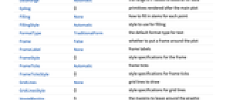
AlignmentPoint Center the default point in the graphic to align with AspectRatio Automatic ratio of height to width Axes True whether to draw axes AxesLabel None axes labels AxesOrigin {0,0} where axes should cross AxesStyle {} style specifications for the axes Background None background color for the plot BaselinePosition Automatic how to align with a surrounding text baseline BaseStyle {} base style specifications for the graphic ColorFunction Automatic how to determine the coloring of points ColorFunctionScaling True whether to scale data to ColorFunction ContentSelectable Automatic whether to allow contents to be selected CoordinatesToolOptions Automatic detailed behavior of the coordinates tool DataRange Automatic the range of x values to assume for data Epilog {} primitives rendered after the main plot Filling None how to fill in stems for each point FillingStyle Automatic style to use for filling FormatType TraditionalForm the default format type for text Frame False whether to put a frame around the plot FrameLabel None frame labels FrameStyle {} style specifications for the frame FrameTicks Automatic frame ticks FrameTicksStyle {} style specifications for frame ticks GridLines None grid lines to draw GridLinesStyle {} style specifications for grid lines ImageMargins 0. the margins to leave around the graphic ImagePadding All what extra padding to allow for labels etc. ImageSize Automatic the absolute size at which to render the graphic IntervalMarkers Automatic how to render uncertainty IntervalMarkersStyle Automatic style for uncertainty elements Joined False whether to join points LabelingFunction Automatic how to label points LabelingSize Automatic maximum size of callouts and labels LabelingTarget Automatic how to determine automatic label positions LabelStyle {} style specifications for labels MeshFunctions {#3&} how to determine placement of mesh points Method Automatic details of graphics methods to use MultiaxisArrangement None how to arrange multiple axes for data PerformanceGoal $PerformanceGoal aspects of performance to try to optimize PlotFit None how to fit a curve to the points PlotFitElements Automatic fitted elements to show in the plot PlotHighlighting Automatic highlighting effect for curves PlotInteractivity $PlotInteractivity whether to allow interactive elements PlotLabel None overall label for the plot PlotLabels None labels for data PlotLayout "Overlaid" how to position data PlotLegends None legends for data PlotMarkers None markers to use to indicate each point PlotRange Automatic range of values to include PlotRangeClipping True whether to clip at the plot range PlotRangePadding Automatic how much to pad the range of values PlotRegion Automatic the final display region to be filled PlotStyle Automatic graphics directives to determine styles of points PlotTheme $PlotTheme overall theme for the plot PolarAxes False whether to draw polar axes PolarAxesOrigin Automatic where to draw polar axes PolarGridLines None polar grid lines to draw PolarTicks Automatic polar axes ticks PreserveImageOptions Automatic whether to preserve image options when displaying new versions of the same graphic Prolog {} primitives rendered before the main plot RotateLabel True whether to rotate y labels on the frame ScalingFunctions None how to scale individual coordinates TargetUnits Automatic units to display in the plot Ticks Automatic axes ticks TicksStyle {} style specifications for axes ticks
List of all options
Examples
open all close allBasic Examples (3)
Scope (30)
Data (9)
For regular data consisting of r values, the θ data range is uniformly spaced:
Provide an explicit θ data range by using DataRange:
Plot multiple sets of regular data:
For irregular data consisting of θ, r value pairs, the θ data range is inferred from data:
Plot multiple sets of irregular data:
Ranges where the data is nonreal are excluded:
Use MaxPlotPoints to limit the number of points used:
PlotRange is selected automatically:
Use PlotRange to focus on areas of interest:
Plot a TimeSeries:
Tabular Data (1)
Labeling and Legending (11)
Use Callout to add a label to a set of points:
Place the label at a position:
Place the label at scaled position:
Place the labels relative to the inside of the data:
Place the labels relative to the outside of the data:
Label the data with PlotLabels:
Specify the text position relative to the point:
Specify the label at {x,y} position:
Presentation (9)
Use Joined to connect datasets with lines:
Multiple datasets are automatically colored to be distinct:
Provide explicit styling to different sets:
Provide an interactive Tooltip for the data:
Use shapes to distinguish different datasets:
Use Legended to add an additional legend:
Use InterpolationOrder to smooth joined data:
Options (102)
ColorFunction (5)
ColorFunction only applies to Joined datasets:
Color by scaled ![]() ,
, ![]() ,
, ![]() , and
, and ![]() coordinates:
coordinates:
Color with a named color scheme:
ColorFunction has higher priority than PlotStyle for coloring the curve:
Use Automatic in MeshShading to use ColorFunction:
ColorFunctionScaling (3)
ColorFunctionScaling only applies to Joined datasets:
DataRange (4)
Lists of radii are equally spaced in angle around the origin:
Give the starting and ending angles:
Each dataset is scaled to the same domain:
Pairs are interpreted as θ, r coordinates:
Specifying DataRange in this case has no effect, since θ values are part of the data:
ImageSize (7)
Use named sizes such as Tiny, Small, Medium and Large:
Specify the width of the plot:
Specify the height of the plot:
Allow the width and height to be up to a certain size:
Specify the width and height for a graphic, padding with space if necessary:
Setting AspectRatioFull will fill the available space:
Use maximum sizes for the width and height:
Use ImageSizeFull to fill the available space in an object:
Specify the image size as a fraction of the available space:
InterpolationOrder (5)
Joined lines can be interpolated:
By default, linear interpolation is used:
Use zero-order or piecewise-constant interpolation:
Joined (3)
LabelingFunction (7)
By default, points are automatically labeled with strings:
Use LabelingFunction->None to suppress the labels:
Put the labels above the points:
Use Callout to label the points:
Label the points with their values:
Label the points with their indices:
Specify an overall label with PlotLabels and put individual labels in Tooltip:
LabelingSize (2)
LabelingTarget (6)
Labels are automatically placed to maximize readability:
Use a denser layout for the labels:
Show the half of the labels that are easiest to read:
Only allow labels that are orthogonal to the points:
Only allow labels that are diagonal to the points:
MaxPlotPoints (2)
Mesh (6)
MeshFunctions (3)
MeshFunctions only applies to Joined datasets:
Use a mesh evenly spaced in the ![]() ,
, ![]() ,
, ![]() , and
, and ![]() directions:
directions:
Show 5 mesh levels in the ![]() direction (red) and 10 in the
direction (red) and 10 in the ![]() direction (blue):
direction (blue):
MeshShading (7)
MeshShading only applies to Joined datasets:
Alternate red and blue segments of equal angles in the θ direction:
Use None to remove segments:
MeshShading can be used with PlotStyle:
MeshShading has higher priority than PlotStyle for styling the curve:
Use PlotStyle for some segments by setting MeshShading to Automatic:
MeshShading can be used with ColorFunction and has higher priority:
MeshStyle (5)
PlotLabels (5)
Place the labels above the data:
Place the labels in different locations:
Use scaled position to place the labels:
Place labels relatively to the data:
Use None to not add a label:
PlotLegends (7)
No legend is used, by default:
Use a list of labels for a legend:
Generate a legend using placeholders:
Legends use the same styles as the plot:
Use Placed to specify the legend placement:
Place the legend inside the plot:
Legend layout changes automatically along with position:
Use PointLegend to change the legend appearance:
PlotMarkers (8)
ListPolarPlot normally uses distinct colors to distinguish different sets of data:
Automatically use colors and shapes to distinguish sets of data:
Change the size of the default plot markers:
Use arbitrary text for plot markers:
Use explicit graphics for plot markers:
PlotRange (2)
PlotStyle (7)
Use different style directives:
By default, different styles are chosen for multiple datasets:
Explicitly specify the style for different datasets:
PlotStyle applies to both lines and points:
PlotStyle can be combined with ColorFunction:
PlotStyle can be combined with MeshShading and has lower priority:
PlotTheme (1)
PolarAxesOrigin (1)
PolarGridLines (1)
PolarTicks (1)
ScalingFunctions (3)
By default, ListPolarPlot uses natural scale in both axes:
Use ScalingFunctions to reverse the coordinate direction in the y direction:
Properties & Relations (13)
ListPolarPlot is a special case of ListPlot:
Use PolarPlot for functions:
Use ListPlot and ListLinePlot for Cartesian plots:
Use ListLogPlot, ListLogLogPlot, and ListLogLinearPlot for logarithmic plots:
Use DateListPlot to show data over time:
Use ListPointPlot3D to show three-dimensional points:
Use ListPlot3D to create surfaces from data:
Use ListContourPlot to create contours from continuous data:
Use ListDensityPlot to create densities from continuous data:
Use ArrayPlot and MatrixPlot for arrays of discrete values:
Use RevolutionPlot3D and SphericalPlot3D for cylindrical and spherical coordinates:
Use ParametricPlot for parametric curves:
RadialAxisPlot displays coordinates of ![]() -dimensional points around a circle:
-dimensional points around a circle:
Text
Wolfram Research (2007), ListPolarPlot, Wolfram Language function, https://reference.wolfram.com/language/ref/ListPolarPlot.html (updated 2025).
CMS
Wolfram Language. 2007. "ListPolarPlot." Wolfram Language & System Documentation Center. Wolfram Research. Last Modified 2025. https://reference.wolfram.com/language/ref/ListPolarPlot.html.
APA
Wolfram Language. (2007). ListPolarPlot. Wolfram Language & System Documentation Center. Retrieved from https://reference.wolfram.com/language/ref/ListPolarPlot.html