Statistical Visualization
Statistical visualization is used to understand how data is distributed and how that compares to other datasets and distributions. Histograms and smooth histograms both effectively estimate the various distribution functions, either through binning or smoothing. Quantile and related plots compare data to a reference distribution. Box-and-whisker and distribution charts compare a number of data distributions to each other. All the statistical visualization functions provide high levels of automation of aesthetics and statistical computations including automatic bin selection, bandwidth determination, and distribution parameter estimation. All functions also give detailed access to customize both aesthetics and statistical computations.
Distribution Shapes
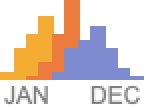
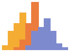 Histogram — plot a histogram of data
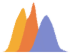 SmoothHistogram — plot a density estimate of data
 Histogram3D ▪
  SmoothHistogram3D ▪
  DensityHistogram
 SmoothDensityHistogram ▪
  PairedHistogram ▪
  PairedSmoothHistogram
BarSpacing ▪ BarOrigin ▪ GridLines ▪ ScalingFunctions ▪ ...
Distribution Fits
 QuantilePlot — quantile-quantile plot of data or distributions
 ProbabilityPlot — probability-probability plot of data or distributions
 ProbabilityScalePlot — normal plot, Weibull plot, Gumbel plot, etc.
ReferenceLineStyle ▪ ScalingFunctions ▪ GridLines ▪ ...
Distribution Comparisons
 BoxWhiskerChart — box-and-whisker chart of multiple datasets
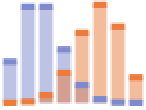
 DistributionChart — distribution chart of multiple datasets
BarSpacing ▪ BarOrigin ▪ ChartElementFunction ▪ ScalingFunctions ▪ ...
Model Fitting
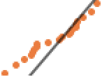
 ListFitPlot — plot data with fitted curves
 ListFitPlot3D — plot data with fitted surfaces
Charting »
 BarChart ▪
  PieChart ▪
  BubbleChart ▪ ...
Data Visualization »
 ListPlot ▪
  ListPlot3D ▪
  ListContourPlot ▪ ...
Date & Time Visualization »
 DateListPlot ▪
 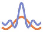 TimelinePlot ▪
  DateHistogram ▪ ...
Function Visualization »
 Plot ▪
 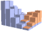 Plot3D ▪
  DiscretePlot ▪
  DiscretePlot3D ▪
  ContourPlot ▪ ...