TableView[{{expr11,expr12,…},{expr21,expr22,…},…}]
displays as a spreadsheet-like table view for editing and viewing exprij.
takes the contents of the table view to be the dynamically updated current value of x, with the value of x being reset as the table view is interactively edited.
TableView[table,type]
uses the specified type by default to represent newly edited or created entries in the table view.
displays an empty table view.


TableView
TableView[{{expr11,expr12,…},{expr21,expr22,…},…}]
displays as a spreadsheet-like table view for editing and viewing exprij.
takes the contents of the table view to be the dynamically updated current value of x, with the value of x being reset as the table view is interactively edited.
TableView[table,type]
uses the specified type by default to represent newly edited or created entries in the table view.
displays an empty table view.
Details and Options


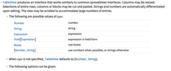
- TableView produces an interface that works similarly to common spreadsheet interfaces. Columns may be resized. Selections of entire rows, columns or blocks may be cut and pasted. Strings and numbers are automatically differentiated upon editing. The view may be scrolled to accommodate large numbers of entries.
- The following are possible values of type:
-
Number number String string Expression expression Hold[Expression] expression in held form Boxes raw boxes {Number,String} use numbers when possible, or strings otherwise - When type is not specified, TableView defaults to {Number,String}.
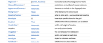
- The following options can be given:
-
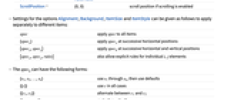
Alignment {Center,Baseline} horizontal and vertical alignment of items AllowedDimensions Automatic restrictions on number of rows or columns AppearanceElements Automatic elements to include in the displayed view Background None what background colors to use BaselinePosition Automatic what to align with a surrounding text baseline BaseStyle {} base style specifications for the grid Enabled True whether the individual entries can be edited HeaderSize Automatic width and height of headers Headers Automatic row and column labels ImageSize Automatic the overall size of the table view ItemSize Automatic width and height of each item ItemStyle None styles for columns and rows Scrollbars Automatic whether to include scrollbars ScrollPosition {0,0} scroll position if scrolling is enabled - Settings for the options Alignment, Background, ItemSize and ItemStyle can be given as follows to apply separately to different items:
-
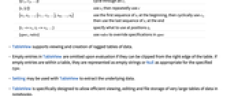
spec apply spec to all items {specx} apply specx at successive horizontal positions {specx,specy} apply speck at successive horizontal and vertical positions {specx,specy,rules} also allow explicit rules for individual i, j elements - The speck can have the following forms:
-
{s1,s2,…,sn} use s1 through sn, then use defaults {{c}} use c in all cases {{c1,c2}} alternate between c1 and c2 {{c1,c2,…}} cycle through all ci {s,{c}} use s, then repeatedly use c {s1,s2,…,{c1, c2,…},sm,…,sn} use the first sequence of si at the beginning, then cyclically use ci, then use the last sequence of si at the end {i1->v1,i2->v2,…} specify what to use at positions ik {spec,rules} use rules to override specifications in spec - TableView supports viewing and creation of ragged tables of data.
- Empty entries in TableView are omitted upon evaluation if they can be clipped from the right edge of the table. If empty entries are within a table, they are represented as empty strings or Null as appropriate for the specified type.
- Setting may be used with TableView to extract the underlying data.
- TableView is specifically designed to allow efficient viewing, editing and file storage of very large tables of data in notebooks.
- Possible elements in AppearanceElements include "RowHeaders", "CollapsedRowHeaders", "ColumnHeaders", "CollapsedColumnHeaders", "Frame" and "ResizeArea".
Examples
open all close allBasic Examples (2)
Scope (11)
Structure (5)
An empty TableView:
Options (20)
AllowedDimensions (2)
Set the dimensions to be exactly 4 columns by 3 rows:
Automatic scrollbars appear if the allowed dimensions cannot be displayed all at once:
With unconstrained dimensions, the scroll position can be set arbitrarily high:
With constrained dimensions, the scroll position will not move past the constraints:
AppearanceElements (2)
Show collapsed headers and collapsed columns:
The "Frame" element always displays as a thin gray frame:
To use a customized frame, omit the "Frame" element and use Framed:
Background (7)
Draw the view with a pink background:
Pink and gray backgrounds for the columns at the first and second horizontal positions:
Pink and gray backgrounds for the rows at the first and second vertical positions:
Alternating pink and gray backgrounds:
Alternating backgrounds with yellow superimposed in the first and last positions:
BaselinePosition (2)
Scrollbars (3)
Properties & Relations (1)
Neat Examples (1)
Use Magnify to see an overview of a large number of cells:
See Also
Related Guides
History
Text
Wolfram Research (2020), TableView, Wolfram Language function, https://reference.wolfram.com/language/ref/TableView.html.
CMS
Wolfram Language. 2020. "TableView." Wolfram Language & System Documentation Center. Wolfram Research. https://reference.wolfram.com/language/ref/TableView.html.
APA
Wolfram Language. (2020). TableView. Wolfram Language & System Documentation Center. Retrieved from https://reference.wolfram.com/language/ref/TableView.html
BibTeX
@misc{reference.wolfram_2025_tableview, author="Wolfram Research", title="{TableView}", year="2020", howpublished="\url{https://reference.wolfram.com/language/ref/TableView.html}", note=[Accessed: 11-April-2026]}
BibLaTeX
@online{reference.wolfram_2025_tableview, organization={Wolfram Research}, title={TableView}, year={2020}, url={https://reference.wolfram.com/language/ref/TableView.html}, note=[Accessed: 11-April-2026]}