BubbleChart[{{x1,y1,z1},{x2,y2,z2},…}]
制作一个气泡图,气泡在坐标 {xi,yi} 处的大小为 zi.
BubbleChart[{…,wi[{xi,yi,zi},…],…,wj[{xj,yj,zj},…],…}]
制作一个气泡图,其气泡特征由符号式封装 wk 定义.
BubbleChart[{data1,data2,…}]
根据多个数据集 datai 制作一个气泡图.
BubbleChart
BubbleChart[{{x1,y1,z1},{x2,y2,z2},…}]
制作一个气泡图,气泡在坐标 {xi,yi} 处的大小为 zi.
BubbleChart[{…,wi[{xi,yi,zi},…],…,wj[{xj,yj,zj},…],…}]
制作一个气泡图,其气泡特征由符号式封装 wk 定义.
BubbleChart[{data1,data2,…}]
根据多个数据集 datai 制作一个气泡图.
更多信息和选项
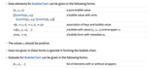
- BubbleChart 的数据元素可以按下列形式给出:
-
{xi,yi,zi} 纯气泡值 {Quantity[xi,ux],Quantity[yi,uy],Quantity[zi,uz]} 带有单位的气泡值 <|kxxi,kyyi,kzzi|> 键和气泡值的关联 wi[{xi,yi,zi},…] 值为 {xi,yi,zi}、封装为 wi 的气泡 formi->mi 有元数据 mi 的扇形 - 值 zi 应为正值.
- 没有按这些形式给出的数据在形成气泡图过程中被忽略.
- BubbleChart 的数据集可以按下列形式给出:
-
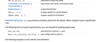
{e1,e2,…} 有封装和无封装的元素列表 <|k1e1,k2e2,…|> 键和值的关联 TimeSeries[…],EventSeries[…],TemporalData[…] 时间序列、事件序列和时间数据 WeightedData[…] 扩展数据集 w[{e1,e2,…},…] 应用到整个数据集中的封装 w[{data1,data1,…},…] 应用到所有数据集中的封装 - BubbleChart[objcspec] 用列指定 cspec 从 Tabular、TimeSeries 或 EventSeries 对象 obj 中提取值并绘制.
- 可使用以下形式的列指定 cspec 来绘制表格数据:
-
{colx,coly,colz} 绘制列 x、y 和 z 的数据 {{colx1,coly1,colz1},{colx2,coly2,colz2},…} 绘制列的多个集 - 下列封装可以在图表元素中使用:
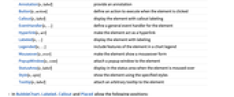
-
Annotation[e,label] 提供一个注解 Button[e,action] 当点击元素时执行的行为 Callout[e,label] 显示具有标注标签的元素 EventHandler[e,…] 对元素定义一个普通的事件处理器 Hyperlink[e,uri] 元素作为超链接 Labeled[e,…] 用标签显示元素 Legended[e,…] 在图例中包含元素的特点 Mouseover[e,over] 元素显示鼠标指向的形式 PopupWindow[e,cont] 对元素附上一个弹出窗口 StatusArea[e,label] 当鼠标指向元素时,显示在状态栏上 Style[e,opts] 用指定样式显示元素 Tooltip[e,label] 对元素增加任意工具提示 - 在 BubbleChart 中,Labeled 、Callout 和 Placed 允许使用下列坐标:
-
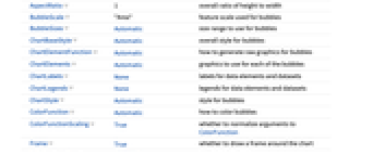
Top,Bottom,Left,Right,Center 在气泡图中的坐标 Above,Below, Before, After 在气泡图外的坐标 {{bx,by},{lx,ly}} 缩放尺度坐标 {lx,ly} 到气泡图坐标 {bx,by} - BubbleChart 有和 Graphics 相同的选项,并有下列附加变化: [所有选项的列表]
-
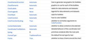
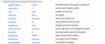
AspectRatio 1 整体高宽比 BubbleScale "Area" 气泡图使用的特征尺度 BubbleSizes Automatic 气泡图使用的尺寸范围 ChartElementFunction Automatic 如何产生气泡的原始图形 ChartElements Automatic 每个气泡使用的图形 ColorFunction Automatic 如何对气泡着色 ColorFunctionScaling True 是否归一化 ColorFunction 的参数 Frame True 在边界框上绘制的网格线 LabelingFunction Automatic 如何标注气泡 LabelingSize Automatic 标注和标签的最大尺寸 LabelingTarget Automatic 如何确定自动放置的标签的位置 LegendAppearance Automatic 图例的整体外观 PerformanceGoal $PerformanceGoal 优化的目标 PlotFit None 怎样将曲线拟合到气泡 PlotFitElements Automatic 在气泡图中显示的拟合元素 PlotInteractivity $PlotInteractivity 是否允许绘制互动元素 PlotLabels None 气泡的类别标签 PlotLegends None 数据元素和数据集的图例 PlotStyle Automatic 气泡的样式 PlotTheme $PlotTheme 绘图的整体主题 ScalingFunctions None 如何调整单个坐标 TargetUnits Automatic 在图中显示的单位 - 为了最大的能见性,BubbleChart 从最大气泡到最小气泡来布局.
- PlotLegends 的常见设置包括:
-
None 没有图例 Automatic 自动确定图例 {lbl1,lbl2,…} 用 lbl1, lbl2, … 作为图例的标签 Placed[lspec,…] 指定图例的位置 - PlotStylesty 指定每组数据使用的样式. 可能的设置包括:
-
{sty1,sty2,…} 针对每组数据的一系列样式 <|"key"val,…|> 针对不同层级的数据的样式元素 - 接受的键有:
-
"Base" 所有气泡的整体样式 "Elements" 针对每个组中的元素 yi 的样式列表 "Groups" 每个数据组 datai 的样式列表 - ColorData["DefaultChartColors"] 给出 PlotStyle 使用的默认颜色序列.
- ChartElementFunction 的参数是气泡区域 {{xmin,xmax},{ymin,ymax}}、值 {xi,yi,zi} 和从数据集的嵌套列表中每层获得的元数据 {m1,m2,…}.
- ChartElementFunction 的内置设置列表可以从 ChartElementData["BubbleChart"] 中获得.
- 提供给 ColorFunction 的参数是 x,y 和 z.
- 图表特征主题影响着数据的图形样式. 主题包括:
-

"BoldScheme" 图表元素方案中的粗体元素 
"FadeScheme" 图表元素方案中的褪色元素 - BubbleChart 中对样式及用于选项及其它结构的说明实际上按 ChartStyle、ColorFunction、Style 和其它封装,ChartElements 和 ChartElementFunction,的先后顺序应用,后面的规范说明会覆盖之前的规范说明.
所有选项的列表
范例
打开所有单元 关闭所有单元基本范例 (3)
BubbleChart[RandomReal[1, {10, 3}]]BubbleChart[RandomReal[1, {5, 7, 3}]]BubbleChart[RandomReal[1, {5, 7, 3}], PlotStyle -> {RGBColor[0.237736, 0.340215, 0.575113], RGBColor[0.277947, 0.45009699999999997, 0.32815550000000004], RGBColor[0.624866, 0.673302, 0.264296], RGBColor[0.8453409999999999, 0.6248695, 0.3151775], RGBColor[0.72987, 0.239399, 0.230961]}]BubbleChart[RandomReal[1, {10, 3}], ChartElements -> [image]]BubbleChart[RandomReal[1, {10, 3}], ChartElementFunction -> "NoiseBubble"]范围 (32)
数据和封装 (14)
BubbleChart[{Table[{i, i, 1}, {i, 3}], Table[{i, i + 1, 1}, {i, 3}], Table[{i, i + 2, 1}, {i, 3}]}]data = ReplacePart[Flatten[Table[{i, j, 1}, {i, 4}, {j, 4}], 1], {2 -> Missing[], 4 -> 1 + I, 6 -> foo}]BubbleChart[data, PlotLabels -> Range[16]]BubbleChart[{{Quantity[2, "Feet"], Quantity[-4, "Feet"], Quantity[14, "Feet"]}, {Quantity[6, "Feet"], Quantity[25, "Feet"], Quantity[22, "Feet"]}, {Quantity[-3, "Feet"], Quantity[17, "Feet"], Quantity[1, "Feet"]}, {Quantity[11, "Feet"], Quantity[17, "Feet"], Quantity[7, "Feet"]}, {Quantity[25, "Feet"], Quantity[-3, "Feet"], Quantity[21, "Feet"]}}, FrameLabel -> Automatic]BubbleChart[{{Quantity[2, "Feet"], Quantity[-4, "Feet"], Quantity[14, "Feet"]}, {Quantity[6, "Feet"], Quantity[25, "Feet"], Quantity[22, "Feet"]}, {Quantity[-3, "Feet"], Quantity[17, "Feet"], Quantity[1, "Feet"]}, {Quantity[11, "Feet"], Quantity[17, "Feet"], Quantity[7, "Feet"]}, {Quantity[25, "Feet"], Quantity[-3, "Feet"], Quantity[21, "Feet"]}}, FrameLabel -> Automatic, TargetUnits -> {"Meters", "Yards", "Inches"}]TimeSeries、EventSeries 和 TemporalData 的时间标记将被忽略:
BubbleChart[TimeSeries[{{23, 12, 24}, {15, 3, 9}, {3, 23, 12}, {7, 11, 6}, {5, 24, 20}, {5, 17, 8}}, {"May 24, 1982"}]]BubbleChart[<|"a" -> {3, 1, 5}, "b" -> {2, 2, 4}, "c" -> {1, 2, 3}, "d" -> {2, 1.5, 8}|>]BubbleChart[<|"a" -> {3, 1, 5}, "b" -> {2, 2, 4}, "c" -> {1, 2, 3}, "d" -> {2, 1.5, 8}|>, PlotLabels -> Automatic]BubbleChart[<|"a" -> {3, 1, 5}, "b" -> {2, 2, 4}, "c" -> {1, 2, 3}, "d" -> {2, 1.5, 8}|>, PlotLegends -> Automatic, PlotStyle -> {Hue[0.61, 0.7, 1], Hue[0.17, 0.4, 0.65], Hue[0.64, 0.5, 0.75], Hue[0.45, 0.4, 0.7]}]BubbleChart[<|"a" -> <|"x" -> 3, "y" -> 1, "z" -> 5|>, "b" -> <|"x" -> 2, "y" -> 2, "z" -> 4|>, "c" -> <|"x" -> 1, "y" -> 2, "z" -> 3|>|>, PlotLegends -> Automatic, PlotStyle -> {Hue[0.61, 0.7, 1], Hue[0.17, 0.4, 0.65], Hue[0.64, 0.5, 0.75]}, FrameLabel -> Automatic]BubbleChart[<|"group1" -> <|"a" -> {3, 1, 5}, "b" -> {2, 2, 4}, "c" -> {1, 2, 3}, "d" -> {2, 1.5, 8}|>, "group2" -> <|"a" -> {2, 5, 9}, "b" -> {6, 1, 3}, "c" -> {1, 3, 6}, "d" -> {3, 2, 6}|>|>, PlotLegends -> Automatic, PlotStyle -> {Hue[0.08, 1, 1], Hue[0.17, 0.8, 0.5]}]WeightedData 中的权值将被忽略:
BubbleChart[WeightedData[{{23, 12, 24}, {15, 3, 9}, {3, 23, 12}, {7, 11, 6}, {5, 24, 20}, {5, 17, 8}}, {0.4, 0.2, 0.6, 0.3, 0.4, 0.3}]]{d1, d2, d3} = {{1, 2, 1}, {2, 2, 1}, {3, 2, 1}};
{e1, e2, e3} = {{1, 1, 1}, {2, 1, 1}, {3, 1, 1}};{BubbleChart[{{d1, Style[d2, RGBColor[0.93, 0.27, 0.27]], d3}, {e1, e2, e3}}], BubbleChart[{Style[{d1, d2, d3}, RGBColor[0.93, 0.27, 0.27]], {e1, e2, e3}}], BubbleChart[Style[{{d1, d2, d3}, {e1, e2, e3}}, RGBColor[0.93, 0.27, 0.27]]]}{d1, d2, d3} = {{1, 2, 1}, {2, 2, 1}, {3, 2, 1}};
{e1, e2, e3} = {{1, 1, 1}, {2, 1, 1}, {3, 1, 1}};{BubbleChart[{{d1, Style[d2, RGBColor[0.93, 0.27, 0.27]], d3}, {e1, e2, e3}}, PlotStyle -> GrayLevel[0.62]], BubbleChart[{Style[{d1, Style[d2, RGBColor[0.93, 0.27, 0.27]], d3}, RGBColor[0.14, 0.8, 0.14]], {e1, e2, e3}}, PlotStyle -> GrayLevel[0.62]], BubbleChart[Style[{Style[{d1, Style[d2, RGBColor[0.93, 0.27, 0.27]], d3}, RGBColor[0.14, 0.8, 0.14]], {e1, e2, e3}}, RGBColor[0.4, 0.6, 1]], PlotStyle -> GrayLevel[0.62]]}BubbleChart[{{1, 2, 1}, Tooltip[{1, 1, 2}, "median"], {2, 3, 3}}, BubbleSizes -> {0.2, 0.7}]data = Table[Tooltip[{CountryData[c, #]& /@ {"LifeExpectancy", "GDPPerCapita", "Population"}}, CountryData[c, "Flag"]], {c, CountryData["G8"]}];BubbleChart[data]用 PopupWindow 提供其它的向下钻取(drill down)的信息:
BubbleChart[{{1, 2, 2}, {1, 1, 1}, PopupWindow[{2, 3, 3}, DateListPlot[FinancialData["IBM", "Jan. 1, 2004"]]]}, BubbleSizes -> {0.2, 0.7}]Button 可以用于触发任何行为:
BubbleChart[{{1, 2, 2}, {1, 1, 1}, Button[{2, 3, 3}, Speak[2]]}, BubbleSizes -> {0.2, 0.7}]表格数据 (3)
cars = ResourceData["Sample Tabular Data: Car Models"]BubbleChart[cars -> {"displacement", "horsepower", "mpg"}]pivot = PivotToColumns[cars, "origin" -> "mpg"]BubbleChart[pivot -> {{"displacement", "horsepower", ExtendedKey["mpg", "europe"]}, {"displacement", "horsepower", ExtendedKey["mpg", "japan"]}, {"displacement", "horsepower", ExtendedKey["mpg", "usa"]}}, PlotLegends -> {"Europe", "Japan", "USA"}]BubbleChart[TimeSeries[TimeEventSeries`TimestampData[Association["UniformlySpacedQ" -> True, "Count" -> 5,
"Endpoints" -> TabularColumn[Association[
"Data" -> {2, {{NumericArray[{20563, -2147483648}, "Integer32"], {},
DataStructure["BitVec ... ularColumn[Association[
"Data" -> {{17, 5, 7, 6, 13}, {}, None}, "ElementType" -> "Integer64"]],
TabularColumn[Association["Data" -> {{3, 2, 2, 1, 1}, {}, None},
"ElementType" -> "Integer64"]]}}]]]], Association[]]]绘制 TimeSeries 或 EventSeries 中一个分量的值:
ts = TimeSeries[TimeEventSeries`TimestampData[Association["UniformlySpacedQ" -> True, "Count" -> 5,
"Endpoints" -> TabularColumn[Association[
"Data" -> {2, {{NumericArray[{20563, -2147483648}, "Integer32"], {},
DataStructure["BitVec ... e" -> "Integer64"]], TabularColumn[Association[
"Data" -> {{3.5511999004449324, 1.777675777376151, 1.3490852490420469,
3.8396388450135266, 4.100051503528421}, {}, None}, "ElementType" -> "Real64"]]}}]]]],
Association[]];BubbleChart[ts -> {"a", "b", "c"}]BubbleChart[ts -> {{"a", "b", "c"}, {"d", "e", "f"}}]样式和外观 (6)
BubbleChart[RandomReal[1, {3, 5, 3}], PlotStyle -> {RGBColor[0.93, 0.27, 0.27], RGBColor[0.14, 0.8, 0.14], RGBColor[0.4, 0.6, 1]}]PlotStyle 可以对所有图表元素设置一个初始样式:
BubbleChart[{{1, 2, 2}, {1, 1, 1}, {2, 3, 3}}, PlotStyle -> <|"Base" -> EdgeForm[Dashed], "Elements" -> {RGBColor[0.797253, 0.904982, 0.410498], RGBColor[0.934691, 0.945708, 0.75346], RGBColor[0.769879, 0.92369, 0.977371]}|>, BubbleSizes -> {0.2, 0.7}]Style 可以用于屏蔽样式:
BubbleChart[{{1, 2, 2}, {1, 1, 1}, Style[{2, 3, 3}, RGBColor[0.93, 0.27, 0.27]], {3, 4, 1}}, PlotStyle -> GrayLevel[0.62], BubbleSizes -> {0.2, 0.7}]BubbleChart[{{1, 2, 2}, {1, 1, 1}, {2, 3, 3}}, ChartElements -> Graphics3D[Cylinder[], Boxed -> False], BubbleSizes -> {0.2, 0.7}]ChartElementData["BubbleChart"]Table[BubbleChart[{{1, 2, 2}, {1, 1, 1}, {2, 3, 3}}, ChartElementFunction -> f, PlotStyle -> {RGBColor[0.761959, 0.470832, 0.940597], RGBColor[0.9584254999999999, 0.877884, 0.5906629999999999], RGBColor[0.431296, 0.709773, 0.927077]}, BubbleSizes -> {0.2, 0.7}], {f, {"PolyhedronBubble", "MarkerBubble"}}]BubbleChart[{{1, 2, 2}, {1, 1, 1}, {2, 3, 3}}, ChartElementFunction -> ChartElementDataFunction["Bubble", "Shape" -> "Hexagon"], BubbleSizes -> {0.2, 0.7}]BubbleChart[RandomReal[1, {3, 3, 3}], PlotTheme -> "Business"]BubbleChart[RandomReal[1, {3, 3, 3}], PlotTheme -> "Marketing"]标签和图例 (9)
用 Labeled 对一个气泡添加标签:
BubbleChart[{{1, 2, 1}, Labeled[{1, 1, 2}, "label", Left], {2, 3, 3}}, BubbleSizes -> {0.2, 0.7}]Table[BubbleChart[{{1, 2, 2}, Labeled[{2, 3, 3}, "label", p], {1, 1, 1}}, BubbleSizes -> {0.2, 0.7}, PlotLabel -> p, Ticks -> None], {p, {Bottom, Center, Top}}]用 Placed 控制标签坐标,用和 Labeled 的相同坐标:
BubbleChart[{{{2, 1, 1}, {1, 1, 1}}, {{1, 2, 2}, {2, 3, 3}}}, PlotLabels -> <|"Elements" -> Placed[{"c1", "c2"}, Center]|>, BubbleSizes -> {0.2, 0.7}]用 LabelingFunction 对气泡提供值的标签:
labeler[v_, {i_, j_}, {ri_, cj_}] := Placed[{v, ri[[1]], cj[[1]]}, Tooltip, MatrixForm]BubbleChart[{{{2, 3, 3}, {1, 2, 2}, {1, 1, 1}}, {{1, 3, 2}, {2, 1, 1}}}, PlotLabels -> <|"Groups" -> {"r1", "r2"}, "Elements" -> {"c1", "c2", "c3"}|>, FrameTicks -> None, BubbleSizes -> {0.2, 0.7}, LabelingFunction -> labeler]data = Table[Callout[RandomReal[1, 3], RandomWord[]], {i, 20}];BubbleChart[data, LabelingSize -> 30]BubbleChart[data, LabelingSize -> Full]data = Table[Callout[RandomReal[1, 3], RandomWord[]], {i, 100}];BubbleChart[data]BubbleChart[data, ImageSize -> 400]data = RandomReal[1, {7, 3}];BubbleChart[{data, data + 1}, PlotLegends -> {"data1", "data2"}, PlotStyle -> {RGBColor[0.761959, 0.470832, 0.940597], RGBColor[0.431296, 0.709773, 0.927077]}]用 Legended 增加其它图例项:
BubbleChart[{{{2, 3, 3}, Legended[Style[{1, 2, 2}, RGBColor[1, 0.75, 0]], "extra"], {1, 1, 1}}, {{1, 3, 2}, {2, 1, 1}}}, PlotLegends -> {"data1", "data2"}, PlotStyle -> {RGBColor[0.761959, 0.470832, 0.940597], RGBColor[0.431296, 0.709773, 0.927077]}]用 Placed 影响图例坐标:
data = RandomReal[1, {7, 3}];Table[BubbleChart[{data, data + 1}, PlotLegends -> Placed[{"data1", "data2"}, p], PlotStyle -> {RGBColor[0.761959, 0.470832, 0.940597], RGBColor[0.431296, 0.709773, 0.927077]}], {p, {Below, Above}}]选项 (122)
AspectRatio (3)
默认情况下,BubbleChart 使用固定的高宽比:
BubbleChart[IconizedObject[«data»]]BubbleChart[IconizedObject[«data»], AspectRatio -> 1 / 2]AspectRatioAutomatic 根据数值确定范围:
BubbleChart[IconizedObject[«data»], AspectRatio -> Automatic]Axes (3)
默认情况下,BubbleChart 使用边框而非轴:
BubbleChart[IconizedObject[«data»]]BubbleChart[IconizedObject[«data»], Frame -> False, Axes -> True]{BubbleChart[IconizedObject[«data»], Frame -> False, Axes -> {True, False}], BubbleChart[IconizedObject[«data»], Frame -> False, Axes -> {False, True}]}AxesLabel (4)
BubbleChart[IconizedObject[«data»], Frame -> False, Axes -> True]BubbleChart[IconizedObject[«data»], Frame -> False, Axes -> True, AxesLabel -> "Y-axis"]BubbleChart[IconizedObject[«data»], Frame -> False, Axes -> True, AxesLabel -> {"x position", "y position"}]BubbleChart[QuantityArray[IconizedObject[«data»], "Meters"], Frame -> False, Axes -> True, AxesLabel -> Automatic]AxesOrigin (2)
AxesStyle (4)
BubbleChart[IconizedObject[«data»], Frame -> False, Axes -> True, AxesStyle -> RGBColor[0.93, 0.27, 0.27]]**BubbleChart[IconizedObject[«data»], Frame -> False, Axes -> True, AxesStyle -> {{Thick, RGBColor[0.93, 0.27, 0.27]}, {Thick, RGBColor[0.4, 0.6, 1]}}]****BubbleChart[IconizedObject[«data»], Frame -> False, Axes -> True, AxesStyle -> RGBColor[0.14, 0.8, 0.14], TicksStyle -> GrayLevel[0.62]]****BubbleChart[IconizedObject[«data»], Frame -> False, Axes -> True, AxesStyle -> RGBColor[0.14, 0.8, 0.14], LabelStyle -> RGBColor[0.93, 0.27, 0.27]]**BubbleScale (2)
BubbleChart[RandomReal[1, {3, 3, 3}], BubbleSizes -> {0.1, 0.4}, BubbleScale -> "Diameter"]data = Table[{i, i, i}, {i, 10}];Table[BubbleChart[data, BubbleSizes -> {0.1, 0.4}, BubbleScale -> scale, PlotLabel -> scale], {scale, {"Area", "Diameter"}}]BubbleSizes (1)
ChartElementFunction (5)
获得 ChartElementFunction 的内置设置的列表:
ChartElementData["BubbleChart"]data = {{1, 0, 1}, {0, 1, 2}, {1, 2, 3}};Table[BubbleChart[data, ChartElementFunction -> f, PlotStyle -> {RGBColor[0.761959, 0.470832, 0.940597], RGBColor[0.9584254999999999, 0.877884, 0.5906629999999999], RGBColor[0.431296, 0.709773, 0.927077]}, PlotLabel -> f], {f, {"Bubble", "MarkerBubble"}}]Table[BubbleChart[data, ChartElementFunction -> f, PlotStyle -> {RGBColor[0.761959, 0.470832, 0.940597], RGBColor[0.9584254999999999, 0.877884, 0.5906629999999999], RGBColor[0.431296, 0.709773, 0.927077]}, PlotLabel -> f], {f, {"SphereBubble", "PolyhedronBubble"}}]Table[BubbleChart[data, ChartElementFunction -> f, PlotStyle -> {RGBColor[0.761959, 0.470832, 0.940597], RGBColor[0.9584254999999999, 0.877884, 0.5906629999999999], RGBColor[0.431296, 0.709773, 0.927077]}, PlotLabel -> f], {f, {"NoiseBubble", "OscillatingBubble"}}]写入一个自定义的 ChartElementFunction:
f[{{xmin_, xmax_}, {ymin_, ymax_}}, v_, meta_, style___] :=
{Rectangle[{xmin, ymin}, {xmax, ymax}]}BubbleChart[{{1, 0, 1}, {0, 1, 2}, {1, 2, 3}}, ChartElementFunction -> f]DataDrilldownBubble[{{xmin_, xmax_}, {ymin_, ymax_}}, v_, {meta_}, style___] :=
PopupWindow[Polygon[{{xmin, ymin}, {xmax, ymax}, {xmin, ymax}, {xmax, ymin}}], PieChart[meta]]DataDrilldownBubble[{{xmin_, xmax_}, {ymin_, ymax_}}, y_, ___] :=
Rectangle[{xmin, ymin}, {xmax, ymax}]BubbleChart[{{1, 0, 1} -> Range[5], {0, 1, 2}, {1, 2, 3} -> RandomReal[1, 10]}, ChartElementFunction -> DataDrilldownBubble]内置元素函数可能有选项;用 面板 ▶ 图表元素方案 设置它们:
ChartElementData["MarkerBubble", "Options"]Table[BubbleChart[{{1, 0, 1}, {0, 1, 2}, {1, 2, 3}}, ChartElementFunction -> ChartElementDataFunction["MarkerBubble", "Shape" -> s, "Filled" -> True]], {s, {"CircleTimes", "Diamond"}}]ChartElements (5)
创建基于任何 Graphics 对象的绘图图表:
data = RandomReal[1, {7, 3}];BubbleChart[data, ChartElements -> Graphics[Rectangle[]]]BubbleChart[data, ChartElements -> Graphics3D[Sphere[]]]BubbleChart[data, ChartElements -> ExampleData[{"TestImage", "House"}]]data = {{{1, 0, 3}, {0, 1, 2}, {1, 2, 3}}, {{5, 4, 5}, {4, 5, 6}, {5, 6, 5}}};BubbleChart[data, ChartElements -> {[image], [image]}]BubbleChart[{{1, 1, 1}, {2, 2, 1}, {3, 3, 1}, {4, 4, 1}, {5, 5, 1}}, ChartElements -> {[image], [image], [image]}]样式可以继承 PlotStyle 等样式:
BubbleChart[RandomReal[1, {10, 3}], ChartElements -> [image], PlotStyle -> {RGBColor[0.761959, 0.470832, 0.940597], RGBColor[0.9584254999999999, 0.877884, 0.5906629999999999], RGBColor[0.431296, 0.709773, 0.927077]}]BubbleChart[RandomReal[1, {10, 3}], ChartElements -> [image], PlotStyle -> {RGBColor[0.761959, 0.470832, 0.940597], RGBColor[0.9584254999999999, 0.877884, 0.5906629999999999], RGBColor[0.431296, 0.709773, 0.927077]}]g = Graphics3D[{Specularity[White, 30], Sphere[]}, ViewPoint -> {0, -Infinity, 0}, Boxed -> False, Lighting -> "Neutral"];BubbleChart[RandomReal[1, {10, 3}], ChartElements -> g, PlotStyle -> {RGBColor[0.782803, 0.164904, 0.400458], RGBColor[0.909499, 0.613916, 0.204196], RGBColor[0.806577, 0.385397, 0.762768], RGBColor[0.698817, 0.873304, 0.295247], RGBColor[0.378897, 0.873304, 0.787549], RGBColor[1, 0.529198, 0.324819], RGBColor[1, 0.998367, 0.434775], RGBColor[0.873304, 0.150484, 0.255131], RGBColor[0.723598, 0.791043, 0.963806], RGBColor[0.85037, 0.558389, 0]}]ColorFunction (3)
BubbleChart[RandomInteger[100, {2, 70, 3}], ColorFunction -> Function[{x, y, r}, Lighter[RGBColor[0.14, 0.8, 0.14], x]]]用 ColorFunctionScaling->False,获得未缩放的高度值:
BubbleChart[{{0, 0, 1}, {0.1, 0.8, 2}, {1, 2, 3}}, ColorFunction -> Function[{x, y, r}, Switch[{x, y, r}, {0, 0, 1}, RGBColor[1, 0.75, 0], {0.1, 0.8, 2}, RGBColor[0.98, 0.56, 0.17], {1, 2, 3}, RGBColor[0.93, 0.27, 0.27]]], ColorFunctionScaling -> False]ColorFunction 屏蔽 PlotStyle 中的样式:
data = {{0, 0, 1}, {0.1, 0.8, 2}, {1, 2, 3}};BubbleChart[data, PlotStyle -> RGBColor[0.14, 0.8, 0.14], ColorFunction -> "SolarColors"]用 ColorFunction 组合不同样式效果:
BubbleChart[data, PlotStyle -> EdgeForm /@ {None, Dashed, Dotted}, ColorFunction -> "SolarColors"]ColorFunctionScaling (2)
BubbleChart[RandomInteger[100, {2, 70, 3}], ColorFunction -> Function[{x, y, r}, Lighter[RGBColor[0.14, 0.8, 0.14], x]]]用 ColorFunctionScaling->False 得到未缩放的高度值:
BubbleChart[{{0, 0, 1}, {0.1, 0.8, 2}, {1, 2, 3}}, ColorFunction -> Function[{x, y, r}, Switch[{x, y, r}, {0, 0, 1}, RGBColor[1, 0.75, 0], {0.1, 0.8, 2}, RGBColor[0.98, 0.56, 0.17], {1, 2, 3}, RGBColor[0.93, 0.27, 0.27]]], ColorFunctionScaling -> False]Frame (4)
BubbleChart 默认情况下使用边框:
BubbleChart[IconizedObject[«data»]]BubbleChart[IconizedObject[«data»], Frame -> False]BubbleChart[IconizedObject[«data»], Frame -> {{True, True}, {False, False}}]BubbleChart[IconizedObject[«data»], Frame -> {{True, False}, {True, False}}]FrameLabel (4)
BubbleChart[IconizedObject[«data»], FrameLabel -> {"label"}]BubbleChart[IconizedObject[«data»], FrameLabel -> {"Bottom", "Left"}]BubbleChart[IconizedObject[«data»], FrameLabel -> {{"left", "right"}, {"bottom", "top"}}]BubbleChart[IconizedObject[«data»], FrameLabel -> {{"left", "right"}, {"bottom", "top"}}, LabelStyle -> Directive[Bold, GrayLevel[0.62]]]FrameStyle (2)
BubbleChart[IconizedObject[«data»], FrameStyle -> Directive[GrayLevel[0.62], Thick]]BubbleChart[IconizedObject[«data»], FrameStyle -> {{Directive[RGBColor[0.14, 0.8, 0.14], Thick], Directive[RGBColor[0.93, 0.27, 0.27]]}, {Directive[GrayLevel[0.62], Thick], Directive[RGBColor[0.4, 0.6, 1]]}}]FrameTicks (7)
BubbleChart[IconizedObject[«data»]]BubbleChart[IconizedObject[«data»]]使用 All 可在所有边上添加刻度标签:
BubbleChart[IconizedObject[«data»], FrameTicks -> All]BubbleChart[IconizedObject[«data»], FrameTicks -> {{{.1, .5, .8}, Automatic}, {Automatic, Automatic}}]BubbleChart[IconizedObject[«data»], FrameTicks -> {{{{.1, a}, {.5, b}, {.8, c}}, Automatic}, {{{.1, a}, {.5, b}, {.8, c}}, Automatic}}]BubbleChart[IconizedObject[«data»], FrameTicks -> {{{{.1, a, .1}, {.5, b, .1}, {.8, c, .1}}, Automatic}, {{{.1, a, .2}, {.5, b, .2}, {.8, c, .2}}, Automatic}}]BubbleChart[IconizedObject[«data»], FrameTicks -> {{{{.1, a, {.1, .1}}, {.5, b, {.1, .1}}, {.8, c, {.1, .1}}}, Automatic}, {{{.1, a, {.2, .05}}, {.5, b, {.2, .05}}, {.8, c, {.2, .05}}}, Automatic}}]BubbleChart[IconizedObject[«data»], FrameTicks -> {{{{.1, a, {.1, .1}, Directive[Thick, RGBColor[0.4, 0.6, 1], Dashed]}, {.5, b, {.1, .1}, Directive[Thick, RGBColor[0.14, 0.8, 0.14]]}, {.8, c, {.1, .1}, Directive[Thick, RGBColor[0.93, 0.27, 0.27]]}}, Automatic}, {Automatic, Automatic}}]FrameTicksStyle (3)
BubbleChart[IconizedObject[«data»], FrameStyle -> Directive[RGBColor[0.93, 0.27, 0.27]]]BubbleChart[IconizedObject[«data»], FrameTicksStyle -> Directive[RGBColor[0.4, 0.6, 1], Thick], FrameStyle -> GrayLevel[0.85]]BubbleChart[IconizedObject[«data»], FrameTicksStyle -> {{Directive[RGBColor[0.93, 0.27, 0.27], Thick], Directive[RGBColor[0.4, 0.6, 1], Thick]}, {Directive[RGBColor[0.98, 0.56, 0.17], Thick], Directive[RGBColor[0.14, 0.8, 0.14], Thick]}}, FrameTicks -> All, FrameStyle -> GrayLevel[0.85]]ImageSize (7)
使用有名称的尺寸如 Tiny、Small、Medium 和 Large:
{BubbleChart[IconizedObject[«data»], ImageSize -> Tiny], BubbleChart[IconizedObject[«data»], ImageSize -> Small]}{BubbleChart[IconizedObject[«data»], ImageSize -> 150], BubbleChart[IconizedObject[«data»], AspectRatio -> 1.5, ImageSize -> 150]}{BubbleChart[IconizedObject[«data»], ImageSize -> {Automatic, 150}], BubbleChart[IconizedObject[«data»], AspectRatio -> 2, ImageSize -> {Automatic, 150}]}{BubbleChart[IconizedObject[«data»], ImageSize -> UpTo[200]], BubbleChart[IconizedObject[«data»], AspectRatio -> 2, ImageSize -> UpTo[200]]}BubbleChart[IconizedObject[«data»], ImageSize -> {200, 200}, Background -> GrayLevel[0.62]]设置 AspectRatioFull 可填充可用空间:
BubbleChart[IconizedObject[«data»], AspectRatio -> Full, ImageSize -> {200, 200}, Background -> GrayLevel[0.62]]{BubbleChart[IconizedObject[«data»], ImageSize -> {UpTo[150], UpTo[100]}], BubbleChart[IconizedObject[«data»], AspectRatio -> 2, ImageSize -> {UpTo[150], UpTo[100]}]}使用 ImageSizeFull 可填充对象中的可用空间:
Framed[Pane[BubbleChart[IconizedObject[«data»], ImageSize -> Full, Background -> GrayLevel[0.62]], {200, 100}]]Framed[Pane[BubbleChart[IconizedObject[«data»], AspectRatio -> Full, ImageSize -> {Scaled[0.5], Scaled[0.5]}, Background -> GrayLevel[0.62]], {200, 100}]]LabelingFunction (7)
Tooltip 和 StatusArea 使用自动标签值:
BubbleChart[{{0, 0, 1}, {0.1, 0.8, 2}, {1, 2, 3}}, BubbleSizes -> {0.2, 0.7}, LabelingFunction -> Automatic]BubbleChart[{{0, 0, 1}, {0.1, 0.8, 2}, {1, 2, 3}}, BubbleSizes -> {0.2, 0.7}, LabelingFunction -> None]用 Placed 控制标签坐标:
Table[BubbleChart[{{1, 0, 1}, {0, 1, 2}, {1, 2, 3}}, BubbleSizes -> {0.2, 0.7}, LabelingFunction -> (Placed[#, p]&), PlotLabel -> p, Ticks -> None], {p, {Bottom, Center, Top}}]Table[BubbleChart[{{1, 0, 1}, {0, 1, 2}, {1, 2, 3}}, PlotRange -> All, BubbleSizes -> {0.2, 0.7}, LabelingFunction -> (Placed[#, p]&), PlotLabel -> p, Ticks -> None], {p, {{0, 0}, {1 / 2, 1 / 2}, {1, 1}}}]使用 Callout 自动放置标签:
BubbleChart[{{1, 0, 1}, {0, 1, 2}, {1, 2, 3}}, PlotRange -> All, BubbleSizes -> {0.2, 0.7}, LabelingFunction -> (Callout[Row[#, ","], Automatic]&)]使用符号位置放置 Callout 标签:
Table[BubbleChart[{{1, 0, 1}, {0, 1, 2}, {1, 2, 3}}, PlotRange -> All, BubbleSizes -> {0.2, 0.7}, LabelingFunction -> (Callout[#, p]&)], {p, {Above, Below}}]BubbleChart[{{1, 0, 1}, {0, 1, 2}, {1, 2, 3}}, LabelingFunction -> (Placed[#1, Tooltip, MatrixForm]&), BubbleSizes -> {0.2, 0.7}]bubbleLabel[v : {x_, y_, w_}, level_, {r_, c_}] := Placed[Grid[{{Row[{r[[1]], c[[1]], "Fund"}, " "], SpanFromLeft}, {"Age", x}, {"Return %", y}, {"Market Cap", w}}, Frame -> All, Alignment -> Left], Tooltip]data = {{{1, 11, 300}, {2, 50, 200}, {3, 20, 300}}, {{6, 20, 300}, {2, 8, 600}, {6, 16, 500}}};BubbleChart[data, PlotLabels -> <|"Groups" -> {"Growth", "Value"}, "Elements" -> Placed[{"Small-Cap", "Mid-Cap", "Large-Cap"}, None]|>, LabelingFunction -> bubbleLabel]LabelingSize (4)
BubbleChart[{{0, 0, 1}, {0.1, 0.8, 2}, {1, 2, 3}}, PlotLabels -> Callout[{"healthfulness", "obstreperous", "spectrogram"}]]BubbleChart[{{0, 0, 1}, {0.1, 0.8, 2}, {1, 2, 3}}, PlotLabels -> Callout[{[image], [image], [image]}]]BubbleChart[{{0, 0, 1}, {0.1, 0.8, 2}, {1, 2, 3}}, PlotLabels -> Callout[{"healthfulness", "obstreperous", "spectrogram"}], LabelingSize -> 30]BubbleChart[{{0, 0, 1}, {0.1, 0.8, 2}, {1, 2, 3}}, PlotLabels -> Callout[{[image], [image], [image]}], LabelingSize -> 20]BubbleChart[{{0, 0, 1}, {0.1, 0.8, 2}, {1, 2, 3}}, PlotLabels -> Callout[{[image], [image], [image]}], LabelingSize -> Full]LabelingTarget (7)
BubbleChart[IconizedObject[«data»]]BubbleChart[IconizedObject[«data»], LabelingTarget -> All]BubbleChart[IconizedObject[«data»], LabelingTarget -> "Dense"]BubbleChart[IconizedObject[«data»], LabelingTarget -> 0.25]BubbleChart[IconizedObject[«data»], LabelingTarget -> <|"AllowedLabelingPositions" -> "Sides"|>]BubbleChart[IconizedObject[«data»], LabelingTarget -> <|"AllowedLabelingPositions" -> "Corners"|>]BubbleChart[IconizedObject[«data»], LabelingTarget -> <|"AllowedLabelingPositions" -> {"Right", "Top"}|>]BubbleChart[IconizedObject[«data»], LabelingTarget -> <|"AllowedOverlaps" -> {"Points"}|>]BubbleChart[IconizedObject[«data»], LabelingTarget -> <|"AllowLabelClipping" -> True|>]PerformanceGoal (1)
data = RandomReal[1, {3, 6, 3}];BubbleChart[data, PerformanceGoal -> "Quality"]BubbleChart[data, PerformanceGoal -> "Speed"]Table[ByteCount@BubbleChart[data, PerformanceGoal -> p], {p, {"Quality", "Speed"}}]PlotInteractivity (4)
BubbleChart[{{1, 1, 1}, {2, 2, 2}, {3, 3, 3}}]BubbleChart[{{1, 1, 1}, {2, 2, 2}, {3, 3, 3}}, PlotInteractivity -> False]BubbleChart[{{1, 1, 1}, {2, 2, 2}, Tooltip[{3, 3, 3}, "hello"]}, PlotInteractivity -> False]BubbleChart[{{1, 1, 1}, {2, 2, 2}, Tooltip[{3, 3, 3}, "hello"]}, PlotInteractivity -> <|"User" -> True, "System" -> False|>]PlotLabels (9)
BubbleChart[RandomReal[1, {4, 3}], PlotLabels -> {"a", "b", "c", "d"}]{BubbleChart[RandomReal[1, {4, 3}], PlotLabels -> {"c1", "c2", "c3"}],
BubbleChart[RandomReal[1, {2, 4, 3}], PlotLabels -> {"r1", "r2", "r3"}]}BubbleChart[RandomReal[1, {4, 3, 3}], PlotLabels -> <|"Elements" -> {"c1", "c2", "c3"}|>]BubbleChart[RandomReal[1, {4, 3, 3}], PlotLabels -> <|"Groups" -> {"r1", "r2"}, "Elements" -> {"c1", "c2", "c3"}|>]数据中的 Labeled 封装将会放置额外的标签:
data = {{1, 0, 1}, Labeled[{0, 1, 2}, "label", Below], {2, 2, 3}};BubbleChart[data, PlotLabels -> {"a", "b", "c"}]用 Placed 控制标签的放置:
data = {{1, 0, 1}, {0, 1, 2}, {2, 2, 3}};BubbleChart[data, PlotLabels -> <|"Groups" -> Placed[{"r1", "r2"}, Center], "Elements" -> Placed[{"c1", "c2", "c3"}, Below]|>]Table[BubbleChart[{{1, 0, 1}, {0, 1, 2}, {2, 2, 3}}, PlotLabels -> Placed[{"a", "b", "c"}, p], PlotLabel -> p, Ticks -> None], {p, {Below, Above}}]Table[BubbleChart[{{1, 0, 1}, {0, 1, 2}, {2, 2, 3}}, PlotLabels -> Placed[{"a", "b", "c"}, p], PlotLabel -> p, Ticks -> None], {p, {Before, After}}]Table[BubbleChart[{{1, 0, 1}, {0, 1, 2}, {2, 2, 3}}, PlotLabels -> Placed[{"aa", "bb", "cc"}, p], PlotLabel -> p], {p, {{0, 0}, {1 / 2, 1 / 2}, {1, 1}}}]Table[BubbleChart[{{1, 0, 1}, {0, 1, 2}, {2, 2, 3}}, PlotLabels -> Placed[Framed /@ {"aa", "bb", "cc"}, {{1, 1}, p}], Ticks -> None, PlotLabel -> p], {p, {{0, 0}, {1 / 2, 1 / 2}, {1, 1}}}]用 Placed 的第三个参数控制格式:
BubbleChart[{{1, 0, 1}, {0, 1, 2}, {2, 2, 3}}, BubbleSizes -> {0.3, 0.4}, PlotLabels -> Placed[{"aaa", "bbb", "ccc"}, Center, Rotate[#, 45Degree]&]]BubbleChart[{{1, 0, 1}, {0, 1, 2}, {2, 2, 3}}, BubbleSizes -> {0.3, 0.4}, PlotLabels -> Placed[{"aaa", "bbb", "ccc"}, Center, Panel[#, FrameMargins -> 0]&]]BubbleChart[{{1, 0, 1}, {0, 1, 2}, {2, 2, 3}}, PlotLabels -> Placed[{"aaa", "bbb", "ccc"}, Center, Hyperlink[#, "http://www.wolfram.com"]&]]BubbleChart[{{1, 0, 1}, {0, 1, 2}, {2, 2, 3}}, PlotLabels -> Placed[{"aaa", "bbb", "ccc"}, Center, Rotate[#, Pi / 4]&]]用 Callout 连接标签与气泡:
BubbleChart[{{1, 0, 1}, {0, 1, 2}, {2, 2, 3}}, PlotLabels -> Callout[{"c1", "c2", "c3"}]]用 Placed 放置多个标签:
BubbleChart[{{1, 0, 1}, {0, 1, 2}, {2, 2, 3}}, BubbleSizes -> {0.4, 0.6}, PlotLabels -> Placed[{{"a", "b", "c"}, {"x", "y", "z"}}, {Top, Bottom}, Framed[#, FrameMargins -> 1, Background -> RGBColor[1, 0.75, 0]]&]]PlotLegends (7)
data = {{{1, 0, 3}, {0, 1, 2}, {1, 2, 1}}, {{5, 4, 1}, {4, 5, 6}, {5, 6, 5}}};BubbleChart[data, PlotLegends -> <|"Elements" -> {"ccc1", "ccc2", "ccc3"}|>, PlotStyle -> <|"Elements" -> {RGBColor[0.761959, 0.470832, 0.940597], RGBColor[0.9584254999999999, 0.877884, 0.5906629999999999], RGBColor[0.431296, 0.709773, 0.927077]}|>]BubbleChart[data, PlotLegends -> <|"Groups" -> {"rr1", "rr2"}|>, PlotStyle -> <|"Groups" -> {RGBColor[0.761959, 0.470832, 0.940597], RGBColor[0.431296, 0.709773, 0.927077]}|>]用 Legended 添加其他图例:
BubbleChart[{{{1, 0, 3}, Legended[Style[{0, 1, 2}, RGBColor[0.93, 0.27, 0.27]], "aa"], {1, 2, 1}}, {{5, 4, 1}, {4, 5, 6}, {5, 6, 5}}}, PlotStyle -> <|"Elements" -> {RGBColor[0.761959, 0.470832, 0.940597], RGBColor[0.9584254999999999, 0.877884, 0.5906629999999999], RGBColor[0.431296, 0.709773, 0.927077]}|>, PlotLegends -> <|"Elements" -> {"ccc1", "ccc2", "ccc3"}|>]用 Legended 指定几个图例:
BubbleChart[{{1, 0, 3}, Legended[{0, 1, 2}, "aa"], {1, 2, 1}, Legended[{5, 4, 1}, "bb"], {4, 5, 6}}, PlotStyle -> <|"Elements" -> {RGBColor[0.761959, 0.470832, 0.940597], RGBColor[0.898695, 0.686452, 0.6785475], RGBColor[0.9584254999999999, 0.877884, 0.5906629999999999], RGBColor[0.86116075, 0.930182, 0.758764], RGBColor[0.431296, 0.709773, 0.927077]}|>]data = {{{1, 0, 3}, {0, 1, 2}, {1, 2, 1}}, {{5, 4, 1}, {4, 5, 6}, {5, 6, 5}}};BubbleChart[data, PlotLegends -> <|"Groups" -> {"Group A", "Group B"}|>, PlotStyle -> <|"Groups" -> {RGBColor[0.761959, 0.470832, 0.940597], RGBColor[0.431296, 0.709773, 0.927077]}|>]data = {{{1, 0, 3}, {0, 1, 2}, {1, 2, 1}}, {{5, 4, 1}, {4, 5, 6}, {5, 6, 5}}};BubbleChart[data, PlotLegends -> <|"Groups" -> {"Group A", "Group B", "Group C"}|>, PlotStyle -> <|"Groups" -> {RGBColor[0.761959, 0.470832, 0.940597], RGBColor[0.431296, 0.709773, 0.927077]}|>]data = {{{1, 0, 3}, {0, 1, 2}, {1, 2, 1}}, {{5, 4, 1}, {4, 5, 6}, {5, 6, 5}}};BubbleChart[data, PlotLegends -> <|"Groups" -> {"Test A", "Test B"}, "Elements" -> {"John", "Mary", "Bob"}|>, PlotStyle -> <|"Elements" -> {RGBColor[0.761959, 0.470832, 0.940597], RGBColor[0.9584254999999999, 0.877884, 0.5906629999999999], RGBColor[0.431296, 0.709773, 0.927077]}, "Groups" -> {EdgeForm[{Opacity[1], RGBColor[0.93, 0.27, 0.27]}], EdgeForm[{Opacity[1], RGBColor[0.4, 0.6, 1]}]}|>]用 Placed 控制图例的放置:
data = {{{1, 0, 3}, {0, 1, 2}, {1, 2, 1}}, {{5, 4, 1}, {4, 5, 6}, {5, 6, 5}}};Table[BubbleChart[data, PlotLegends -> <|"Elements" -> Placed[{"John", "Mary", "Bob"}, pos]|>, PlotStyle -> <|"Elements" -> {RGBColor[0.761959, 0.470832, 0.940597], RGBColor[0.9584254999999999, 0.877884, 0.5906629999999999], RGBColor[0.431296, 0.709773, 0.927077]}|>], {pos, {Below, Above, Before, After}}]PlotStyle (10)
BubbleChart[RandomReal[1, {4, 3}], PlotStyle -> {RGBColor[0.93, 0.27, 0.27], RGBColor[0.14, 0.8, 0.14], RGBColor[0.4, 0.6, 1], RGBColor[1, 0.75, 0]}]BubbleChart[RandomReal[1, {4, 3}], PlotStyle -> Directive[Opacity[0.7], EdgeForm[Dashed], RGBColor[0.3655821205642109, 0.582006632236133, 0.0357851567943297]]]data = {{{1, 0, 3}, {0, 1, 2}, {1, 2, 1}}, {{5, 4, 1}, {4, 5, 6}, {5, 6, 5}}};BubbleChart[data, PlotStyle -> {RGBColor[0.93, 0.27, 0.27], RGBColor[0.4, 0.6, 1]}]BubbleChart[RandomReal[1, {5, 3}], PlotStyle -> <|"Elements" -> {RGBColor[0.93, 0.27, 0.27], RGBColor[0.14, 0.8, 0.14]}|>]BubbleChart[RandomReal[1, {4, 3}], PlotStyle -> <|"Elements" -> {RGBColor[0.93, 0.27, 0.27], RGBColor[0.14, 0.8, 0.14], RGBColor[0.4, 0.6, 1], RGBColor[1, 0.75, 0]}|>]data = {{{1, 0, 3}, {0, 1, 2}, {1, 2, 1}}, {{5, 4, 1}, {4, 5, 6}, {5, 6, 5}}};BubbleChart[data, PlotStyle -> <|"Groups" -> {RGBColor[0.93, 0.27, 0.27], RGBColor[0.14, 0.8, 0.14]}|>]BubbleChart[data, PlotStyle -> <|"Base" -> {EdgeForm[Dashed], Opacity[0.7]}|>]BubbleChart[data, PlotStyle -> <|"Groups" -> {EdgeForm[Dotted], EdgeForm[Dashed]}, "Elements" -> {RGBColor[0.93, 0.27, 0.27], RGBColor[0.14, 0.8, 0.14], RGBColor[0.4, 0.6, 1]}|>]当同时为元素和数据组指定样式时,元素的样式可能会覆盖组的样式:
data = {{{1, 0, 3}, {0, 1, 2}, {1, 2, 1}}, {{5, 4, 1}, {4, 5, 6}, {5, 6, 5}}};BubbleChart[data, PlotStyle -> <|"Elements" -> {RGBColor[0.93, 0.27, 0.27], RGBColor[0.14, 0.8, 0.14], RGBColor[0.4, 0.6, 1]}, "Groups" -> {RGBColor[1, 0.75, 0], RGBColor[0.95, 0.43, 0.96]}|>]BubbleChart[{{1, 0, 3}, Style[{0, 1, 2}, Opacity[0.1]], {1, 2, 1}}, PlotStyle -> {RGBColor[0.93, 0.27, 0.27], RGBColor[0.14, 0.8, 0.14], RGBColor[0.4, 0.6, 1]}]BubbleChart[{{1, 0, 3}, Style[{0, 1, 2}, EdgeForm[Dashed]], {1, 2, 1}}, PlotStyle -> {RGBColor[0.93, 0.27, 0.27], RGBColor[0.14, 0.8, 0.14], RGBColor[0.4, 0.6, 1]}]BubbleChart[{{1, 0, 3}, Style[{0, 1, 2}, RGBColor[1, 0.75, 0]], {1, 2, 1}}, PlotStyle -> {RGBColor[0.93, 0.27, 0.27], RGBColor[0.14, 0.8, 0.14], RGBColor[0.4, 0.6, 1]}]可组合使用 ColorFunction 的 PlotStyle 的样式:
BubbleChart[{{1, 0, 3}, {0, 1, 2}, {2, 2, 1}}, PlotStyle -> EdgeForm /@ {Dashed, Dotted, DotDashed}, ColorFunction -> (Blend[{RGBColor[0.4, 0.6, 1], RGBColor[0.93, 0.27, 0.27]}, #]&)]ColorFunction 可能会覆盖 PlotStyle 的设置:
BubbleChart[{{1, 0, 3}, {0, 1, 2}, {2, 2, 1}}, PlotStyle -> {RGBColor[0.93, 0.27, 0.27], RGBColor[0.14, 0.8, 0.14], RGBColor[0.4, 0.6, 1]}, ColorFunction -> "SolarColors"]ChartElements 可能会覆盖 PlotStyle 的设置:
BubbleChart[{{1, 0, 3}, {0, 1, 2}, {2, 2, 1}}, ChartElements -> [image], PlotStyle -> {RGBColor[0.93, 0.27, 0.27], RGBColor[0.14, 0.8, 0.14], RGBColor[0.4, 0.6, 1]}]PlotTheme (2)
Ticks (6)
BubbleChart[IconizedObject[«data»], Frame -> False, Axes -> True]BubbleChart[IconizedObject[«data»], Frame -> False, Axes -> True, Ticks -> None]BubbleChart[IconizedObject[«data»], Frame -> False, Axes -> True, Ticks -> {{.1, .5, .8}, {.1, .5, .8}}]BubbleChart[IconizedObject[«data»], Frame -> False, Axes -> True, Ticks -> {{{.1, a}, {.5, b}, {.8, c}}, {{.1, a}, {.5, b}, {.8, c}}}]BubbleChart[IconizedObject[«data»], Frame -> False, Axes -> True, Ticks -> {{{.1, a, .1}, {.5, b, .1}, {.8, c, .1}}, {{.1, a, .2}, {.5, b, .2}, {.8, c, .2}}}]BubbleChart[IconizedObject[«data»], Frame -> False, Axes -> True, Ticks -> {{{.1, a, {.1, .1}}, {.5, b, {.1, .15}}, {.8, c, {.1, .2}}}, Automatic}]BubbleChart[IconizedObject[«data»], Frame -> False, Axes -> True, Ticks -> {{{.04, a, .45, Directive[Thick, RGBColor[0.93, 0.27, 0.27]]}, {.64, b, .35, Directive[RGBColor[0.93, 0.27, 0.27]]}, {.72, c, .1, Directive[Thick, RGBColor[0.4, 0.6, 1]]}}, Automatic}]TicksStyle (4)
BubbleChart[IconizedObject[«data»], Frame -> False, Axes -> True]BubbleChart[IconizedObject[«data»], Frame -> False, Axes -> True, TicksStyle -> RGBColor[0.93, 0.27, 0.27]]BubbleChart[IconizedObject[«data»], Frame -> False, Axes -> True, TicksStyle -> {Directive[RGBColor[0.93, 0.27, 0.27], Thick], Directive[RGBColor[0.4, 0.6, 1], Thick]}]BubbleChart[IconizedObject[«data»], Frame -> False, Axes -> True, TicksStyle -> Directive[RGBColor[0.93, 0.27, 0.27], Thick], LabelStyle -> RGBColor[0.4, 0.6, 1]]应用 (4)
countries = CountryData["Africa"];
properties = {"PovertyFraction", "GDPPerCapita", "Population"};
data = {#1, Log@QuantityMagnitude@#2, #3}&@@@Table[CountryData[c, p], {c, countries}, {p, properties}];labeler[v_, {r_, c_}, ___] := Placed[Grid[{{Style[countries[[c]], Bold, 12], SpanFromLeft}, {"Poverty", Row[{Round[100v[[1]]], "%"}]}, {"GDP Per Capita", Row[{"$", Round[Exp[v[[2]]]]}]}, {"Population", Row[{NumberForm[v[[3]] 10 ^ -6, {4, 2}], " million"}]}}, Alignment -> Left], Tooltip]BubbleChart[data, PlotStyle -> {RGBColor[0.9215686274509803, 0.49411764705882355, 0.43137254901960786], RGBColor[1., 0.7215686274509804, 0.2196078431372549], RGBColor[0.9490196078431372, 0.8627450980392157, 0.43529411764705883], RGBColor[0.6705882352941176, 0.8784313725490196, 0.9372549019607843], RGBColor[0.3176470588235294, 0.6549019607843137, 0.7529411764705882], RGBColor[0.09019607843137255, 0.33725490196078434, 0.49411764705882355], RGBColor[0.5333333333333333, 0.23529411764705882, 0.3058823529411765], RGBColor[0.8941176470588236, 0.7098039215686275, 0.7490196078431373]}, LabelingFunction -> labeler, FrameLabel -> {"Poverty Fraction", "Log GDP Per Capita"}]用 PieChart 指示输入和输出,显示 G15 国的原油数据:
countries = CountryData["G15"];
properties = {"OilConsumption", "OilProduction", "OilReserves", "OilExports", "OilImports"};
data = Table[CountryData[c, p], {c, countries}, {p, properties}];BubbleChart[data[[All, 1 ;; 3]], ChartElements -> Table[PieChart[d, LabelingFunction -> None], {d, data[[All, 4 ;; 5]]}], BubbleSizes -> {0.05, 0.15}, PlotLabels -> Placed[countries, Tooltip], FrameLabel -> properties[[1 ;; 2]]]data = Table[Tooltip[Flatten@{Reverse@CityData[city, "Coordinates"], CityData[city, "Population"]}, Column[{CityData[city, "Name"], WeatherData[city, "Temperature"] "°C"}]], {city, CityData[{Large, "Japan"}]}];map = Graphics[{LightGray, CountryData["Japan", "Polygon"]}]Show[map, BubbleChart[data, BubbleSizes -> {0.01, 0.15}, PlotStyle -> {RGBColor[0.70135, 0.093019, 0.00140383], RGBColor[0.289647, 0.222614, 0.484169], RGBColor[0.98677, 0.98793, 0.458686], RGBColor[0.42948, 0.524086, 0.719463], RGBColor[0.30808, 0.443137, 0.124895], RGBColor[0.895125, 0.71606, 0.0964523], RGBColor[0.138415, 0.184848, 0.429862], RGBColor[0.882353, 0.0253147, 0.11165], RGBColor[0.895125, 0.870893, 0.632624]}], PlotLabel -> Style["Current Temperature of the Largest Cities in Japan", "Title", 14]]properties = {"Density", "BoilingPoint", "ThermalConductivity"};
elements = Table[ElementData[z], {z, 1, 80}];
data = Table[Table[ElementData[e, p], {p, properties}] -> e, {e, elements}];
clusters = FindClusters[QuantityMagnitude[#[[1]]] -> #[[2]]& /@ data, 10];tooltipLabel[elem_Entity] := Module[{d, bPt, tc, dat}, {d, bPt, tc} = dat = Table[ElementData[elem, p], {p, properties}];
Tooltip[dat, Grid[{{elem}, {"Density", d, "kg/SuperscriptBox[m, 3]"}, {"BoilingPoint", bPt, "°C"}, {"ThermalConductivity", tc, "W/mK"}}, Alignment -> Left]]]BubbleChart[Table[tooltipLabel /@ d, {d, clusters}], ImageSize -> 400, PlotLegends -> <|"Groups" -> Table[Row[{"Cluster ", i}], {i, Length[clusters]}]|>, PlotStyle -> {RGBColor[0.33725490196078434, 0.403921568627451, 0.6235294117647059], RGBColor[0.08627450980392157, 0.1411764705882353, 0.28627450980392155], RGBColor[0.20784313725490197, 0.23921568627450981, 0.3215686274509804], RGBColor[0.7019607843137254, 0.7450980392156863, 0.8235294117647058], RGBColor[1., 0.8784313725490196, 0.5058823529411764], RGBColor[0.4823529411764706, 0.18823529411764706, 0.03529411764705882], RGBColor[1., 0.4549019607843137, 0.2549019607843137], RGBColor[1., 0.26666666666666666, 0.], RGBColor[0.8588235294117647, 0.00784313725490196, 0.00784313725490196]}, FrameLabel -> properties[[1 ;; 2]]]属性和关系 (2)
用 BubbleChart3D 获得三维的气泡图:
{BubbleChart[{{3, 4, 4}, {3, 6, 3}, {4, 3, 5}}], BubbleChart3D[{{3, 4, 1, 4}, {3, 6, 1, 3}, {4, 3, 1, 5}}]}用 SectorChart3D 和 RectangleChart3D 选择可视化:
Table[f[{{3, 4, 4}, {3, 6, 3}, {4, 3, 5}}], {f, {RectangleChart3D, SectorChart3D, BubbleChart}}]巧妙范例 (2)
BubbleChart[Table[{i, Mod[i ^ 2, 67], i}, {i, 300}], BubbleSizes -> {0.01, 0.05}]BubbleChart[RandomReal[1, {80, 3}], Frame -> False, PerformanceGoal -> "Speed", ChartElementFunction -> "FadingRectangle", PlotStyle -> <|"Base" -> EdgeForm[None], "Elements" -> {RGBColor[0.6235294117647059, 0.1450980392156863, 0.12549019607843137], RGBColor[0.6588235294117647, 0.3058823529411765, 0.17254901960784313], RGBColor[0.24313725490196078, 0.11764705882352941, 0.058823529411764705], RGBColor[0.9450980392156862, 0.7529411764705882, 0.6352941176470588], RGBColor[0.8392156862745098, 0.4745098039215686, 0.21176470588235294], RGBColor[0.8274509803921568, 0.7254901960784313, 0.43529411764705883], RGBColor[0.44313725490196076, 0.4980392156862745, 0.5490196078431373], RGBColor[0.24705882352941178, 0.30980392156862746, 0.37254901960784315], RGBColor[0.16862745098039217, 0.23921568627450981, 0.3803921568627451], RGBColor[0.2980392156862745, 0.17647058823529413, 0.19607843137254902]}|>]历史
2008年引入 (7.0) | 在以下年份被更新:2010 (8.0) ▪ 2012 (9.0) ▪ 2014 (10.0) ▪ 2017 (11.1) ▪ 2018 (11.3) ▪ 2025 (14.2) ▪ 2025 (14.3) ▪ 2026 (15.0)
文本
Wolfram Research (2008),BubbleChart,Wolfram 语言函数,https://reference.wolfram.com/language/ref/BubbleChart.html (更新于 2026 年).
CMS
Wolfram 语言. 2008. "BubbleChart." Wolfram 语言与系统参考资料中心. Wolfram Research. 最新版本 2026. https://reference.wolfram.com/language/ref/BubbleChart.html.
APA
Wolfram 语言. (2008). BubbleChart. Wolfram 语言与系统参考资料中心. 追溯自 https://reference.wolfram.com/language/ref/BubbleChart.html 年
BibTeX
@misc{reference.wolfram_2026_bubblechart, author="Wolfram Research", title="{BubbleChart}", year="2026", howpublished="\url{https://reference.wolfram.com/language/ref/BubbleChart.html}", note=[Accessed: 17-August-2026]}
BibLaTeX
@online{reference.wolfram_2026_bubblechart, organization={Wolfram Research}, title={BubbleChart}, year={2026}, url={https://reference.wolfram.com/language/ref/BubbleChart.html}, note=[Accessed: 17-August-2026]}