


PieChart
Details and Options
- Pie charts are also known as donut charts when a hole is left in the middle.
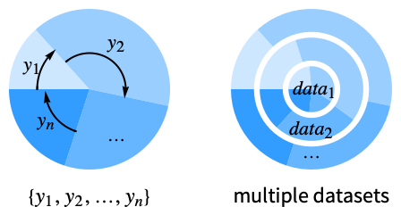
- PieChart shows the values in a dataset as proportional slices of a whole circle. Pie charts are typically used when the data is small.
- Data elements for PieChart can be given in the following forms:
-
yi a pure sector value Quantity[yi,unit] sector value with a unit wi[yi,…] a sector with value yi and wrapper wi formi->mi a sector form with metadata mi - Data not given in these forms is ignored in forming the pie chart.
- Datasets for PieChart can be given in the following forms:
-
{e1,e2,…} list of elements with or without wrappers <k1y1,k2y2,…> association of keys and values TimeSeries[…],EventSeries[…],TemporalData[…] time series, event series, and temporal data WeightedData[…],EventData[…] augmented datasets w[{e1,e2,…},…] wrapper applied to a whole dataset w[{data1,data1,…},…] wrapper applied to all datasets - PieChart[objcspec] extracts and plots values from the Tabular, TimeSeries or EventSeries object obj using the column specification cspec.
- The following forms of column specifications cspec are allowed for plotting tabular data:
-
col plot values from column col {col1,col2,…,coln} plot columns {col1, …, coln} as a group of values - The following wrappers can be used for chart elements:
-
Annotation[e,label] provide an annotation Button[e,action] define an action to execute when the element is clicked Callout[e,label] display the element with a callout EventHandler[e,…] define a general event handler for the element Hyperlink[e,uri] make the element act as a hyperlink Labeled[e,…] display the element with labeling Legended[e,…] include features of the element in a chart legend Mouseover[e,over] make the element show a mouseover form PopupWindow[e,cont] attach a popup window to the element StatusArea[e,label] display in the status area when the element is moused over Style[e,opts] show the element using the specified styles Tooltip[e,label] attach an arbitrary tooltip to the element - In PieChart, Labeled and Placed allow the following positions:
-
"RadialOuter","RadialCenter","RadialInner" positions within sectors "RadialOutside","RadialInside","RadialEdge" positions outside sectors "RadialCallout", "VerticalCallout" positions with callout lines {{sθ,sr},{lx,ly}} scaled position {lx,ly} in the label at scaled polar position {sθ,sr} in the sector - In PieChart, Callout allows the following positions pos:
-
Automatic automatic placement {x,y} position in the graphic Scaled[{sθ,sr}] scaled polar position {sθ,sr} in the sector {pos,{lx,ly}} scaled position {lx,ly} in the label at position pos - PieChart has the same options as Graphics with the following additions and changes: [List of all options]
-
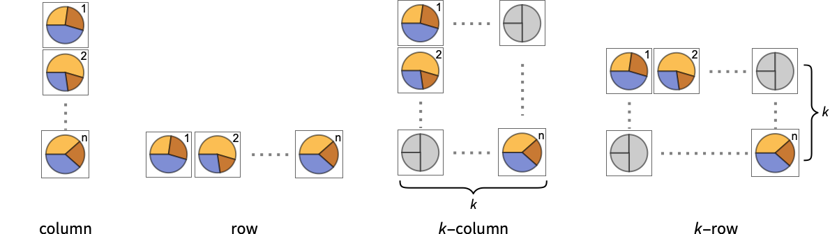
ChartElementFunction Automatic how to generate raw graphics for sectors ColorFunction Automatic how to color sectors ColorFunctionScaling True whether to normalize arguments to ColorFunction LabelingFunction Automatic how to label sectors LabelingSize Automatic maximum size of callouts and labels LegendAppearance Automatic overall appearance of legends PerformanceGoal $PerformanceGoal aspects of performance to try to optimize PlotInteractivity $PlotInteractivity whether to allow interactive elements PlotLabels None category labels for sectors PlotLayout Automatic overall layout to use PlotLegends None legends for data elements and datasets PlotRange Automatic range of values to include PlotStyle Automatic style for sectors PlotTheme $PlotTheme overall theme for the chart PolarAxes False whether to draw polar axes PolarAxesOrigin Automatic where to draw polar axes PolarGridLines None polar gridlines to draw PolarTicks Automatic polar axes ticks SectorOrigin Automatic initial angle and radius of sectors SectorSpacing Automatic spacing between sectors TargetUnits Automatic units to display in the chart - Possible settings for PlotLayout that show multiple datasets in a single display panel include:
-

"Grouped" separate the data for each dataset 
"Stacked" accumulate the data for each dataset - Possible settings for PlotLayout that show individual datasets in different panels include:
-
"Column" use separate charts in a column of panels "Row" use separate charts in a row of panels {"Column",k},{"Row",k} use k columns or rows {"Column",UpTo[k]},{"Row",UpTo[k]} use at most k columns or rows - Typical settings for PlotLegends include:
-
None no legend Automatic automatically determine legend {lbl1,lbl2,…} use lbl1, lbl2, … as legend labels Placed[lspec,…] specify placement for legend - PlotStylesty specifies the styles to use for each curve. Possible settings include:
-
{sty1,sty2,…} sequence of styles for the data <"key"val,…> styling elements for different levels of data - The accepted keys are:
-
"Base" overall style for all the sectors "Elements" list of styles for the elements yi in each group "Groups" list of styles of each group of values datai - ColorData["DefaultChartColors"] gives the default sequence of colors used by PlotStyle.
- The arguments supplied to ChartElementFunction are the sector region {{θmin,θmax},{rmin,rmax}}, the values yi, and the metadata {m1,m2,…} from each level in a nested list of datasets.
- A list of built-in settings for ChartElementFunction can be obtained from ChartElementData["PieChart"].
- The argument supplied to ColorFunction is yi.
- Style and other specifications from options and other constructs in PieChart are effectively applied in the order PlotStyle, ColorFunction, Style and other wrappers, and ChartElementFunction, with later specifications overriding earlier ones.
List of all options
Examples
open all close allBasic Examples (4)
Generate a pie chart for a list of values:
PieChart[{1, 2, 3, 4}]Generate a donut chart for a list of values:
PieChart[{1, 2, 3, 4}, SectorOrigin -> {Automatic, 1}]Generate a pie chart for multiple datasets:
PieChart[{{1, 2, 3}, {2, 2, 1}}]Show multiple sets as a row of pie charts:
PieChart[{{1, 2, 3}, {2, 2, 1}}, ChartLayout -> "Row"]PieChart[Range[5], PlotStyle -> {RGBColor[0.237736, 0.340215, 0.575113], RGBColor[0.277947, 0.45009699999999997, 0.32815550000000004], RGBColor[0.624866, 0.673302, 0.264296], RGBColor[0.8453409999999999, 0.6248695, 0.3151775], RGBColor[0.72987, 0.239399, 0.230961]}]Scope (33)
Data and Layouts (13)
Items in a dataset are grouped together:
PieChart[{{1, 1, 1}, {2, 2, 2}, {3, 3, 3}}]Datasets do not need to have the same number of items:
PieChart[{{1, 2}, {1, 2, 3}, {1, 2, 3, 4}}]Nonreal data is taken to be missing and typically is ignored in the pie chart:
PieChart[{{1, Missing[], 3}, {4, 2, 1 + I, 2}, {foo, 2, 4}}]PieChart[{{1, 1, 1, 1}, {Quantity[1, "Meters"], Quantity[1, "Feet"], Quantity[1, "Yards"], Quantity[1, "Inches"]}}]PieChart[{Quantity[1, "Meters"], Quantity[1, "Feet"], Quantity[1, "Yards"], Quantity[1, "Inches"]}, TargetUnits -> "Meters", PolarAxes -> {True, False}]The time stamps in TimeSeries, EventSeries, and TemporalData are ignored:
PieChart[TimeSeries[{19, 16, 9, 3, 7, 2, 17}, {"May 24, 1982"}]]The values in associations are taken as the values of the sectors:
PieChart[<|"a" -> 1, "b" -> 2, "c" -> 5, "d" -> 3|>]PieChart[<|"a" -> 1, "b" -> 2, "c" -> 5, "d" -> 3|>, PlotLabels -> Automatic]Use the keys as callouts above the sectors:
PieChart[<|"a" -> 1, "b" -> 2, "c" -> 5, "d" -> 3|>, PlotLabels -> Callout[Automatic]]PieChart[<|"a" -> 1, "b" -> 2, "c" -> 5, "d" -> 3|>, PlotStyle -> {Hue[0.61, 0.7, 1], Hue[0.17, 0.4, 0.65], Hue[0.64, 0.5, 0.75], Hue[0.45, 0.4, 0.7]}, PlotLegends -> Automatic]PieChart[<|"group a" -> <|"a" -> 1, "b" -> 2, "c" -> 5, "d" -> 3|>, "group b" -> <|"a" -> 4, "b" -> 1, "c" -> 3, "d" -> 2|>|>, PlotLegends -> Automatic]The weights in WeightedData are ignored:
PieChart[WeightedData[{1, 2, 3, 4, 5}, {0.5, 0.2, 0.1, 0.2, 0.3}]]The censoring and truncation information in EventData is ignored:
PieChart[EventData[{8, 3, 5, 4, 9}, {0, 1, 1, 0, 0}]]Use different layouts to display multiple datasets:
Table[PieChart[{{1, 2, 3}, {1, 3, 2, 4}}, ChartLayout -> l], {l, {"Grouped", "Stacked"}}]Control the direction of sectors:
Table[PieChart[{1, 2, 3}, SectorOrigin -> o, PlotLabel -> o], {o, {{Pi / 6, "Clockwise"}, {Pi / 6, "Counterclockwise"}}}]Control the starting angle of sectors:
Table[PieChart[{1, 2, 3}, SectorOrigin -> o, PlotLabel -> o], {o, {0, Pi / 2}}]Control the starting radius of sectors:
Table[PieChart[{1, 2, 3}, SectorOrigin -> o, PlotLabel -> o], {o, {{{0, "Clockwise"}, 0}, {{0, "Clockwise"}, 1}}}]Adjust the spacing between sectors and groups of sectors:
Table[PieChart[{Range[4], Range[4]}, SectorSpacing -> s, PlotLabel -> s], {s, {Automatic, {0, 1}, {0.1, 1}}}]Tabular Data (3)
Get tabular data, counted by the "class" and "survived" columns:
titanic = ResourceData["Sample Tabular Data: Titanic"]Create a chart of how many passengers were in each ticket class:
AggregateRows[titanic, "count" -> Function[Length[#class]], "class"]PieChart[% -> "count", PlotLabels -> {"1st", "2nd", "3rd"}]Show how many passengers survived and how many perished:
AggregateRows[titanic, "count" -> Function[Length[#class]], "survived"]PieChart[% -> "count", PlotLabels -> {"survived", "perished"}]Display the number of passengers who survived by ticket class:
pivot = PivotToColumns[AggregateRows[titanic, "count" -> Function[Length[#class]], {"class", "survived"}], "class" -> "count"]Plot the values for all the components in TimeSeries or EventSeries:
PieChart[TimeSeries[TimeEventSeries`TimestampData[Association["UniformlySpacedQ" -> True, "Count" -> 5,
   "Endpoints" -> TabularColumn[Association[
      "Data" -> {2, {{NumericArray[{20551, -2147483648}, "Integer32"], {},
          DataStructure["BitVec ... rColumn[Association[
           "Data" -> {{2, 3, 4, 5, 9}, {}, None}, "ElementType" -> "Integer64"]],
         TabularColumn[Association["Data" -> {{15, 15, 13, 11, 10}, {}, None},
           "ElementType" -> "Integer64"]]}}]]]], Association[]]]
Plot the values for a component of a TimeSeries or EventSeries:
ts = TimeSeries[TimeEventSeries`TimestampData[Association["UniformlySpacedQ" -> True, "Count" -> 5,
   "Endpoints" -> TabularColumn[Association[
      "Data" -> {2, {{NumericArray[{20551, -2147483648}, "Integer32"], {},
          DataStructure["BitVec ... rColumn[Association[
           "Data" -> {{2, 3, 4, 5, 9}, {}, None}, "ElementType" -> "Integer64"]],
         TabularColumn[Association["Data" -> {{15, 15, 13, 11, 10}, {}, None},
"ElementType" -> "Integer64"]]}}]]]], Association[]];PieChart[ts -> "fish"]Plot values from multiple components:
PieChart[ts -> {"cats", "dogs"}]Wrappers (5)
Use wrappers on individual data, datasets, or collections of datasets:
{PieChart[{{1, Style[2, RGBColor[0.93, 0.27, 0.27]], 3}, {4, 5, 6}}], PieChart[{Style[{1, 2, 3}, RGBColor[0.14, 0.8, 0.14]], {4, 5, 6}}], PieChart[Style[{{1, 2, 3}, {4, 5, 6}}, RGBColor[0.4, 0.6, 1]]]}{PieChart[{{1, Style[2, RGBColor[0.93, 0.27, 0.27]], 3}, {4, 5, 6}}], PieChart[{Style[{1, Style[2, RGBColor[0.93, 0.27, 0.27]], 3}, RGBColor[0.14, 0.8, 0.14]], {4, 5, 6}}], PieChart[Style[{Style[{1, Style[2, RGBColor[0.93, 0.27, 0.27]], 3}, RGBColor[0.14, 0.8, 0.14]], {4, 5, 6}}, RGBColor[0.4, 0.6, 1]]]}Override the default tooltips:
PieChart[{1, Tooltip[2, "median"], 3}]Use any object in the tooltip:
PieChart[Table[Tooltip[CountryData[c, "Population"], CountryData[c, "Flag"]], {c, CountryData["G7"]}]]Use PopupWindow to provide additional drilldown information:
PieChart[{1, PopupWindow[2, DateListPlot[FinancialData["IBM", "Jan. 1, 2004"]]], 3}]Button can be used to trigger any action:
PieChart[{1, Button[2, Speak[2]], 3}]Styling and Appearance (5)
Use an explicit list of styles for the sectors:
PieChart[{1, 2, 3, 4}, PlotStyle -> {RGBColor[0.93, 0.27, 0.27], RGBColor[0.14, 0.8, 0.14], RGBColor[0.4, 0.6, 1], RGBColor[1, 0.75, 0]}]PlotStyle can be used to set an initial style for all chart elements:
PieChart[Range[5], PlotStyle -> EdgeForm[Dashed]]Style can be used to override styles:
PieChart[{1, 2, Style[3, StandardBlue], 4, 5}, PlotStyle -> ColorData[37, "ColorList"]]Use built-in programmatically generated sectors:
ChartElementData["PieChart"]Table[PieChart[{1, 2, 3, 4, 5}, ChartElementFunction -> f, PlotStyle -> {RGBColor[0.761959, 0.470832, 0.940597], RGBColor[0.898695, 0.686452, 0.6785475], RGBColor[0.9584254999999999, 0.877884, 0.5906629999999999], RGBColor[0.86116075, 0.930182, 0.758764], RGBColor[0.431296, 0.709773, 0.927077]}], {f, {"NoiseSector", "PlateauSector"}}]For detailed settings use Palettes ▶ ChartElementSchemes:
PieChart[{1, 2, 3, 4, 5}, ChartElementFunction -> ChartElementDataFunction["GlassSector", "GradientDirection" -> "Angular"], PlotStyle -> {StandardRed, StandardOrange, StandardYellow, StandardGreen, StandardBlue}]Use a theme with a high-contrast color scheme and bezel sectors:
PieChart[Tuples[{1, 2}, 2], PlotTheme -> "Marketing"]PieChart[Tuples[{1, 2}, 3], PlotTheme -> "Monochrome"]Labeling and Legending (7)
Use Labeled to add a label to a sector:
PieChart[{1, Labeled[2, "label"], 3}]Use symbolic positions for label placement:
Table[PieChart[{1, Labeled[2, "label", p], 3}, PlotLabel -> p, SectorOrigin -> {Automatic, 1}], {p, {"RadialInner", "RadialCenter", "RadialOuter"}}]Table[PieChart[{1, Labeled[2, "label", p], 3}, PlotLabel -> p, SectorOrigin -> {Automatic, 1}], {p, {"RadialInside", "RadialOutside"}}]Table[PieChart[{Labeled[1, "label 1", p], Labeled[2, "label 2", p], Labeled[3, "label 3", p]}, PlotLabel -> p, PlotRange -> 1.5], {p, {"RadialCallout", "VerticalCallout"}}]Use Callout to add a label to a sector:
PieChart[{1, Callout[2, "label"], 3}]Change the appearance of the callout:
PieChart[{1, Callout[2, "label", Appearance -> "Balloon"], 3}]Automatically position callouts:
PieChart[Callout[#, Unique["label"]]& /@ RandomReal[{0, 1}, 6]]Provide value labels for sectors by using LabelingFunction:
PieChart[{1, 2, 3}, LabelingFunction -> "RadialOutside"]Generate callouts from the data:
PieChart[{5, 2, 9, 3, 2, 7}, LabelingFunction -> (Callout[Style[#, 10 + 5#], Automatic]&)]Options (71)
ChartElementFunction (6)
Possible string values for ChartElementFunction:
ChartElementData["PieChart"]For detailed settings, use Palettes ▶ ChartElementSchemes:
Table[PieChart[{1, 2, 3, 4, 5}, ChartElementFunction -> f, PlotStyle -> {RGBColor[0.761959, 0.470832, 0.940597], RGBColor[0.898695, 0.686452, 0.6785475], RGBColor[0.9584254999999999, 0.877884, 0.5906629999999999], RGBColor[0.86116075, 0.930182, 0.758764], RGBColor[0.431296, 0.709773, 0.927077]}, PlotLabel -> f], {f, {"Sector", "PlateauSector"}}]Table[PieChart[{1, 2, 3, 4, 5}, ChartElementFunction -> f, PlotStyle -> {RGBColor[0.761959, 0.470832, 0.940597], RGBColor[0.898695, 0.686452, 0.6785475], RGBColor[0.9584254999999999, 0.877884, 0.5906629999999999], RGBColor[0.86116075, 0.930182, 0.758764], RGBColor[0.431296, 0.709773, 0.927077]}, PlotLabel -> f], {f, {"NoiseSector", "OscillatingSector"}}]Table[PieChart[{1, 2, 3, 4, 5}, ChartElementFunction -> f, PlotStyle -> {RGBColor[0.761959, 0.470832, 0.940597], RGBColor[0.898695, 0.686452, 0.6785475], RGBColor[0.9584254999999999, 0.877884, 0.5906629999999999], RGBColor[0.86116075, 0.930182, 0.758764], RGBColor[0.431296, 0.709773, 0.927077]}, PlotLabel -> f], {f, {"SquareWaveSector", "TriangleWaveSector"}}]Table[PieChart[{1, 2, 3, 4, 5}, ChartElementFunction -> f, PlotStyle -> {RGBColor[0.761959, 0.470832, 0.940597], RGBColor[0.898695, 0.686452, 0.6785475], RGBColor[0.9584254999999999, 0.877884, 0.5906629999999999], RGBColor[0.86116075, 0.930182, 0.758764], RGBColor[0.431296, 0.709773, 0.927077]}, PlotLabel -> f], {f, {"GlassSector", "GradientSector"}}]Use ChartElementData to specify the full chart element rendering function:
PieChart[{1, 2, 3, 4}, ChartElementFunction -> Function[{angleRadiusMinMax, yr, meta}, ChartElementData["TriangleWaveSector"][angleRadiusMinMax, yr, meta]]]Write a custom ChartElementFunction:
f[{{t0_, t1_}, {r0_, r1_}}, ___] := Disk[{0, 0}, r1, {t0, t1}]PieChart[{1, 2, 3, 4, 5}, ChartElementFunction -> f]g[{{t0_, t1_}, {r0_, r1_}}, ___] := GraphicsGroup[{Circle[{0, 0}, r0, {t0, t1}], Circle[{0, 0}, r1, {t0, t1}],
Line[{r0{Cos[t0], Sin[t0]}, r1{Cos[t1], Sin[t1]}}]}]PieChart[{1, 2, 3, 4, 5}, PlotStyle -> Directive[{Thick, Blue}], ChartElementFunction -> g]Use metadata passed on from the input, in this case charting the data:
DataDrilldownSector[{{t0_, t1_}, {r0_, r1_}}, y_, {data_List}] :=
PopupWindow[ChartElementData["NoiseSector"][{{t0, t1}, {r0, r1}}, y], BarChart[data]]DataDrilldownSector[{{t0_, t1_}, {r0_, r1_}}, y_, _] :=
ChartElementData["Sector"][{{t0, t1}, {r0, r1}}, y]PieChart[{1 -> Range[5], 2, 3 -> RandomReal[1, 10]}, ChartElementFunction -> DataDrilldownSector]Built-in element functions may have options; use Palettes ▶ ChartElementSchemes to set them:
ChartElementData["GradientSector", "Options"]Table[PieChart[{1, 2, 3}, ChartElementFunction -> ChartElementData["GradientSector", "ColorScheme" -> "DeepSeaColors", "GradientDirection" -> dir]], {dir, {"Angular", "Radial", "DescendingAngular", "DescendingRadial"}}]ColorFunction (3)
PieChart[Table[Exp[-t ^ 2], {t, -2, 2, 0.25}], ColorFunction -> "Rainbow"]Use ColorFunctionScaling->False to get unscaled height values:
PieChart[{1, 2, 3}, ColorFunction -> (Switch[#, 1, RGBColor[1, 0.75, 0], 2, RGBColor[0.98, 0.56, 0.17], 3, RGBColor[0.93, 0.27, 0.27]]&), ColorFunctionScaling -> False]ColorFunction overrides styles in PlotStyle:
PieChart[{1, 2, 3}, PlotStyle -> {RGBColor[0.93, 0.27, 0.27], RGBColor[0.14, 0.8, 0.14], RGBColor[0.4, 0.6, 1]}, ColorFunction -> (Blend[{LightBlue, LightRed}, #]&)]Use ColorFunction to combine different style effects:
PieChart[Table[Exp[-t ^ 2], {t, -2, 2, 0.25}], ColorFunction -> Function[{angle}, Opacity[angle]], PlotStyle -> RGBColor[0.8, 0.3, 0.8]]ColorFunctionScaling (3)
By default, scaled height values are used:
PieChart[{1, 2, 3}, ColorFunction -> (Blend[{LightBlue, LightRed}, #]&)]Set ColorFunctionScaling to False to allow raw values to be passed to the color function:
PieChart[Range@25, ColorFunction -> Function[{y}, ColorData[2][y]], ColorFunctionScaling -> False]Use ColorFunctionScaling->False to get unscaled height values:
PieChart[{1, 2, 3}, ColorFunction -> (Switch[#, 1, RGBColor[1, 0.75, 0], 2, RGBColor[0.98, 0.56, 0.17], 3, RGBColor[0.93, 0.27, 0.27]]&), ColorFunctionScaling -> False]ImageSize (7)
Use named sizes, such as Tiny, Small, Medium and Large:
{PieChart[{1, 2, 3, 4}, ImageSize -> Tiny], PieChart[{1, 2, 3, 4}, ImageSize -> Small]}Specify the width of the plot:
PieChart[{1, 2, 3, 4}, ImageSize -> 150]Specify the height of the plot:
PieChart[{1, 2, 3, 4}, ImageSize -> {Automatic, 150}]Allow the width and height to be up to a certain size:
PieChart[{1, 2, 3, 4}, ImageSize -> UpTo[200]]Specify the width and height for a graphic, padding with space if necessary:
PieChart[{1, 2, 3, 4}, ImageSize -> {250, 200}, Background -> LightBlue]Use maximum sizes for the width and height:
PieChart[{1, 2, 3, 4}, ImageSize -> {UpTo[150], UpTo[100]}]Use ImageSizeFull to fill the available space in an object:
chart = PieChart[{1, 2, 3, 4}, ImageSize -> Full];{Framed[Pane[chart, {100, 100}]], Framed[Pane[chart, {200, 200}]]}Specify the image size as a fraction of the available space:
Framed[Pane[PieChart[{1, 2, 3, 4}, ImageSize -> {Scaled[0.5], Scaled[0.5]}, Background -> LightBlue], {200, 100}]]LabelingFunction (6)
Use automatic labeling by values through Tooltip and StatusArea:
PieChart[{1, 2, 3}, LabelingFunction -> Automatic]PieChart[{1, 2, 3}, LabelingFunction -> None]Use Placed to control label placement:
Table[PieChart[{1, 2, 3}, LabelingFunction -> p, PlotLabel -> p, Ticks -> None], {p, {"RadialInner", "RadialCenter", "RadialOuter"}}]Table[PieChart[{1, 2, 3}, SectorOrigin -> {Automatic, 1}, LabelingFunction -> p, PlotLabel -> p, Ticks -> None], {p, {"RadialInside", "RadialOutside", "RadialEdge"}}]Table[PieChart[{1, 2, 3, 4, 5}, SectorOrigin -> {Automatic, 1}, LabelingFunction -> p, PlotLabel -> p, Ticks -> None], {p, {"RadialCallout", "VerticalCallout"}}]Coordinate-based placement relative to a sector:
Table[PieChart[{1, 2, 3}, SectorOrigin -> {Automatic, 1}, LabelingFunction -> p, PlotLabel -> p], {p, {{0.1, 0.1}, {1 / 2, 1 / 2}, {1, 1}}}]Use Callout to place labels automatically:
PieChart[RandomReal[{1, 10}, 5], LabelingFunction -> (Callout[Row[{"$", NumberForm[#, {2, 2}]}], Automatic]&)]Control the formatting of labels:
PieChart[{1, 2, 3}, LabelingFunction -> (Placed[Row[{"$", #}], "RadialOutside"]&)]LabelingSize (4)
Textual labels are shown at their actual sizes:
PieChart[{1, 2, 3, 3, 5, 6}, PlotLabels -> {"healthfulness", "obstreperous", "spectrogram", "vestige", "coinage", "limey"}]Image labels are automatically resized:
PieChart[{1, 2, 3, 3, 5, 6}, PlotLabels -> {[image], [image], [image], [image], [image], [image], [image]}]Specify a maximum size for textual labels:
PieChart[{1, 2, 3, 3, 5, 6}, PlotLabels -> {"healthfulness", "obstreperous", "spectrogram", "vestige", "coinage", "limey"}, LabelingSize -> 50]Specify a maximum size for image labels:
PieChart[{1, 2, 3, 3, 5, 6}, PlotLabels -> {[image], [image], [image], [image], [image], [image], [image]}, LabelingSize -> 50]Show image labels at their natural sizes:
PieChart[{1, 2, 3, 3, 5, 6}, PlotLabels -> {[image], [image], [image], [image], [image], [image], [image]}, LabelingSize -> Full, ImageSize -> Medium]PerformanceGoal (3)
Generate a pie chart with interactive highlighting:
PieChart[Range[10], PerformanceGoal -> "Quality"]Emphasize performance by disabling interactive behaviors:
PieChart[Range[10], PerformanceGoal -> "Speed"]Typically, less memory is required for noninteractive charts:
Table[ByteCount@PieChart[Range[10], PerformanceGoal -> p], {p, {"Quality", "Speed"}}]PlotInteractivity (4)
Charts with a moderate number of sectors automatically have tooltips and mouseover effects:
PieChart[{1, 2, 3}]Turn off all the interactive elements:
PieChart[{1, 2, 3}, PlotInteractivity -> False]Interactive elements provided as part of the input are disabled:
PieChart[{1, 2, Tooltip[3, "Hello"]}, PlotInteractivity -> False]Allow provided interactive elements and disable automatic ones:
PieChart[{1, 2, Tooltip[3, "Hello"]}, PlotInteractivity -> <|"User" -> True, "System" -> False|>]PlotLabels (9)
By default, labels are placed radially centered:
PieChart[{1, 2, 3}, PlotLabels -> {"a", "b", "c"}]PieChart[{{1, 2, 3}, {1, 2}}, PlotLabels -> {"a", "b"}]Labeled wrappers in data will place additional labels:
PieChart[{1, Labeled[2, "label", "RadialOutside"], 3}, PlotLabels -> {"a", "b", "c"}]Use Placed to control label placement:
Table[PieChart[{1, 2, 3}, PlotLabels -> Placed[{"a", "b", "c"}, p], PlotLabel -> p], {p, {"RadialInner", "RadialCenter", "RadialOuter"}}]Table[PieChart[{1, 2, 3}, SectorOrigin -> {Automatic, 1}, PlotLabels -> Placed[{"a", "b", "c"}, p], PlotLabel -> p, Ticks -> None], {p, {"RadialInside", "RadialOutside", "RadialEdge"}}]Table[PieChart[{1, 2, 3, 4, 5}, SectorOrigin -> {Automatic, 1}, PlotLabels -> Placed[{"a", "b", "c", "d", "e"}, p], PlotLabel -> p, Ticks -> None], {p, {"RadialCallout", "VerticalCallout"}}]Use Callout to connect the labels to the sectors:
PieChart[{5, 4, 7}, PlotLabels -> Callout[{"c1", "c2", "c3"}, Automatic]]Use Callout to automatically optimize label locations:
PieChart[ReverseSort@RandomReal[10, 20], PlotLabels -> Callout[Range[20], Automatic]]Coordinate-based placement relative to a sector:
Table[PieChart[{1, 2, 3}, SectorOrigin -> {Automatic, 1}, PlotLabels -> Placed[{"aa", "bb", "cc"}, p], Ticks -> None, PlotLabel -> p], {p, {{0.1, 0.1}, {1 / 2, 1 / 2}, {1, 1}}}]Place all labels at the first outer corner and vary the coordinates within the label:
Table[PieChart[{1, 2, 3}, PlotRange -> 2.8, SectorOrigin -> {Automatic, 1}, PlotLabels -> Placed[Framed /@ {"aa", "bb", "cc"}, {{1, 1}, p}], Ticks -> None, PlotLabel -> p], {p, {{0.1, 0.1}, {1 / 2, 1 / 2}, {1, 1}}}]Use the third argument to Placed to control formatting:
PieChart[{1, 2, 3}, PlotLabels -> Placed[{"aaa", "bbb", "ccc"}, "RadialCenter", Rotate[#, 45Degree]&]]PieChart[{1, 2, 3}, PlotLabels -> Placed[{"aaa", "bbb", "ccc"}, "RadialCenter", Panel[#, FrameMargins -> 0]&]]PieChart[{1, 2, 3}, PlotLabels -> Placed[{"aaa", "bbb", "ccc"}, "RadialCenter", Hyperlink[#, "http://www.wolfram.com"]&]]By default, labels are associated with rows of data:
PieChart[{{1, 2, 3}, {4, 5, 6}}, PlotLabels -> {"r1", "r2"}]Associate labels with rows or datasets:
PieChart[{{1, 2, 3}, {4, 5, 6}}, PlotLabels -> <|"Elements" -> {"c1", "c2", "c3"}|>]PieChart[{{1, 2, 3}, {4, 5, 6}}, PlotLabels -> <|"Groups" -> {"r1", "r2"}, "Elements" -> {"c1", "c2", "c3"}|>]Use Placed to affect placements:
PieChart[{{1, 2, 3}, {4, 5, 6}}, PlotLabels -> <|"Groups" -> Placed[{"r1", "r2"}, "VerticalCallout"], "Elements" -> Placed[{"c1", "c2", "c3"}, "RadialCenter"]|>]PieChart[{1, 2, 3}, PlotLabels -> Placed[{{"a", "b", "c"}, {"x", "y", "z"}}, {"RadialCenter", "RadialCallout"}]]PlotLayout (4)
PlotLayout is grouped by default in concentric rings:
PieChart[{{1, 2, 3}, {2, 2, 1}}]PieChart[{{1, 2, 3}, {2, 2, 1}}, PlotLayout -> "Grouped"]PieChart[{{1, 2, 3}, {2, 2, 1}}, PlotLayout -> "Stacked"]The stacked layout can effectively display many datasets:
PieChart[RandomReal[1, {10, 5}], PlotLayout -> "Stacked"]Place each set in a separate panel:
PieChart[{{1, 2, 3}, {2, 2, 1}}, PlotLayout -> "Column"]Use a row instead of a column:
PieChart[{{1, 2, 3}, {2, 2, 1}}, ImageSize -> Medium, PlotLayout -> "Row"]PieChart[{{1, 2, 3}, {2, 2, 1}, {4, 1, 3}, {5, 6, 3}, {4, 3, 3}, {5, 2, 3}}, ImageSize -> Small, PlotLayout -> {"Column", 4}]PieChart[{{1, 2, 3}, {2, 2, 1}, {4, 1, 3}, {5, 6, 3}, {4, 3, 3}, {5, 2, 3}}, ImageSize -> Small, PlotLayout -> {"Column", UpTo[4]}]PlotLegends (7)
Add categorical legend entries for the elements of data:
PieChart[{{1, 2, 3}, {1, 2}}, PlotLegends -> <|"Elements" -> {"ccc1", "ccc2", "ccc3"}|>, PlotStyle -> <|"Elements" -> {RGBColor[0.761959, 0.470832, 0.940597], RGBColor[0.9584254999999999, 0.877884, 0.5906629999999999], RGBColor[0.431296, 0.709773, 0.927077]}|>]PieChart[{{1, 2, 3}, {4, 5}}, PlotLegends -> <|"Groups" -> {"rr1", "rr2"}|>, PlotStyle -> <|"Groups" -> {RGBColor[0.761959, 0.470832, 0.940597], RGBColor[0.431296, 0.709773, 0.927077]}|>]Use Legended to add additional legend entries:
PieChart[{{1, Legended[Style[2, RGBColor[0.93, 0.27, 0.27]], "aa"], 3}, {4, 2}}, PlotStyle -> <|"Elements" -> {RGBColor[0.761959, 0.470832, 0.940597], RGBColor[0.9584254999999999, 0.877884, 0.5906629999999999], RGBColor[0.431296, 0.709773, 0.927077]}|>, PlotLegends -> <|"Elements" -> {"ccc1", "ccc2", "ccc3"}|>]Use Legended to specify individual legend entries:
PieChart[{1, Legended[2, "aa"], 3, 4, Legended[5, "bb"], 6}, PlotStyle -> <|"Elements" -> {RGBColor[0.761959, 0.470832, 0.940597], RGBColor[0.8750956, 0.6580038, 0.746929], RGBColor[0.9440982, 0.7955892, 0.5942686], RGBColor[0.9537862, 0.937389, 0.6180996], RGBColor[0.7952328000000001, 0.8988539999999999, 0.8302508], RGBColor[0.431296, 0.709773, 0.927077]}|>]Generate a legend for datasets:
PieChart[{{1, 2, 3}, {4, 5, 6}}, PlotLegends -> {"Group A", "Group B"}, PlotStyle -> <|"Groups" -> {RGBColor[0.761959, 0.470832, 0.940597], RGBColor[0.431296, 0.709773, 0.927077]}|>]Unused legend labels are dropped:
PieChart[{{1, 2, 3}, {4, 5, 6}}, PlotLegends -> {"Group A", "Group B", "Group C"}, PlotStyle -> <|"Groups" -> {RGBColor[0.761959, 0.470832, 0.940597], RGBColor[0.431296, 0.709773, 0.927077]}|>]Legends can be applied to several dimensions:
PieChart[{{1, 2, 3}, {4, 5, 6}}, PlotLegends -> <|"Groups" -> {"Test A", "Test B"}, "Elements" -> {"John", "Mary", "Bob"}|>, PlotStyle -> <|"Groups" -> {EdgeForm[Directive[RGBColor[0.93, 0.27, 0.27], Thickness[0.01]]], EdgeForm[Dashed]}, "Elements" -> {RGBColor[0.761959, 0.470832, 0.940597], RGBColor[0.9584254999999999, 0.877884, 0.5906629999999999], RGBColor[0.431296, 0.709773, 0.927077]}|>]Use Placed to control the placement of legends:
Table[PieChart[{{1, 2, 3}, {4, 5, 6}}, PlotLegends -> Placed[{"John", "Mary", "Bob"}, pos], PlotStyle -> {RGBColor[0.761959, 0.470832, 0.940597], RGBColor[0.431296, 0.709773, 0.927077]}], {pos, {Before, Below}}]PlotStyle (5)
Use PlotStyle to style sectors:
PieChart[{1, 2, 3, 4}, PlotStyle -> {RGBColor[0.93, 0.27, 0.27], RGBColor[0.14, 0.8, 0.14], RGBColor[0.4, 0.6, 1], RGBColor[1, 0.75, 0]}]PieChart[{1, 2, 3}, PlotStyle -> Directive[Opacity[0.7], EdgeForm[Dashed]]]Specify styles for different groups:
PieChart[{{1, 2, 3}, {1, 2}}, PlotStyle -> {RGBColor[0.93, 0.27, 0.27], RGBColor[0.4, 0.6, 1]}]PieChart[{{1, 2, 3}, {4, 5, 6}}, PlotStyle -> <|"Elements" -> {RGBColor[0.93, 0.27, 0.27], RGBColor[0.14, 0.8, 0.14], RGBColor[0.4, 0.6, 1]}|>]PieChart[{{1, 2, 3}, {4, 5, 6}}, PlotStyle -> <|"Groups" -> {RGBColor[0.93, 0.27, 0.27], RGBColor[0.14, 0.8, 0.14]}|>]Style base, elements and groups of data:
PieChart[{{1, 2, 3}, {4, 5, 6}}, PlotStyle -> <|"Base" -> EdgeForm[{Thick, Dashed}], "Groups" -> {Opacity[0.5], Opacity[0.9]}, "Elements" -> {RGBColor[0.93, 0.27, 0.27], RGBColor[0.14, 0.8, 0.14], RGBColor[0.4, 0.6, 1]}|>]PlotStyle combines with Style:
PieChart[{1, Style[2, EdgeForm[Dashed]], 3}, PlotStyle -> {RGBColor[0.93, 0.27, 0.27], RGBColor[0.14, 0.8, 0.14], RGBColor[0.4, 0.6, 1]}]Style may override settings for PlotStyle:
PieChart[{1, Style[2, EdgeForm[None]], 3}, PlotStyle -> EdgeForm[{Thick, Dashed}]]"Elements" or "Groups" may override "Base" settings:
PieChart[{1, 2, 3}, PlotStyle -> <|"Base" -> EdgeForm[None], "Elements" -> EdgeForm[Dashed]|>]Use ColorFunction to combine different style effects:
PieChart[{1, 2, 3}, PlotStyle -> EdgeForm /@ {Dashed, Dotted, DotDashed}, ColorFunction -> (Blend[{RGBColor[0.4, 0.6, 1], RGBColor[0.93, 0.27, 0.27]}, #]&)]PieChart[{{1, 2, 3, 4, 5, 6, 7, 8}, {9, 10, 11, 12, 13, 14, 15, 16}, {17, 18, 19, 20, 21, 22, 23, 24}}, PlotStyle -> <|"Groups" -> {RGBColor[0.471412, 0.108766, 0.527016], RGBColor[0.2484884, 0.3863264, 0.813373], RGBColor[0.38822480000000004, 0.674195, 0.6035436]}|>, ChartLayout -> "Grouped", ColorFunction -> Function[{height}, Opacity[height]]]PieChart[{{1, 2, 3, 4, 5}, {1, 2, 3}}, ChartElementFunction -> "TriangleWaveSector", PlotStyle -> {RGBColor[0.761959, 0.470832, 0.940597], RGBColor[0.431296, 0.709773, 0.927077]}]PlotTheme (1)
SectorOrigin (4)
By default, sectors start on the left and add clockwise:
{PieChart[{Labeled[1, "Begin"], 2, 3, 4}], PieChart[{Labeled[1, "Begin"], 2,
	3, 4}, SectorOrigin -> {{Pi, "Clockwise"}, 0}]}
Generate a donut chart for a list of values:
PieChart[{Labeled[1, "Begin"], 2, 3, 4}, SectorOrigin -> {{Pi, "Clockwise"}, 1}]Reverse the direction of the sectors:
PieChart[{Labeled[1, "Begin"], 2, 3, 4}, SectorOrigin -> {{Pi / 6, "Counterclockwise"}, 1}]
PieChart[{Labeled[1, "Begin"], 2, 3, 4}, SectorOrigin -> {{Pi / 6, "Clockwise"}, 1}]SectorSpacing (5)
Use automatically determined spacing between sectors:
PieChart[{{1, 3, 4}, {3, 3, 2}}, SectorSpacing -> Automatic]PieChart[{{1, 3, 4}, {3, 3, 2}}, SectorSpacing -> None]Table[PieChart[{{1, 3, 4}, {3, 3, 2}}, SectorSpacing -> s, PlotLabel -> s], {s, {Tiny, Small, Medium, Large}}]Use explicit spacing between sectors:
Table[PieChart[{{1, 3, 4}, {3, 3, 2}}, SectorSpacing -> s, PlotLabel -> s], {s, {Automatic, 0.3, 1}}]Use explicit spacing between sectors and groups of sectors:
Table[PieChart[{{1, 3, 4}, {3, 3, 2}}, SectorSpacing -> s, PlotLabel -> s], {s, {Automatic, {0.1, 1}, {0.05, 0.2}}}]Applications (13)
Histogram[RandomReal[NormalDistribution[0, 1], 100], {-2, 2, 0.25}, Function[{b, c}, bins = b;counts = c]]PieChart[counts, PlotLabels -> Callout[Table[Row[b, "to"], {b, bins}]], PlotRange -> All]Click on the sectors to hear the name of the country and its GDP per capita:
countries = CountryData["G7"];
data = Table[With[{country = c, v = Round@CountryData[c, "GDPPerCapita"]}, Button[v, Speak[StringJoin[country, ", $", ToString[v]]]]], {c, countries}];PieChart[data, PlotLabel -> "GDP Per Capita", PlotLabels -> Placed[countries, "RadialOutside"]]Proportion of each color in the United States flag:
flag = CountryData["UnitedStates", "FlagImage"]Tally the most frequently used colors:
{color, data} = Transpose[DominantColors[flag, 3, {"Color", "Count"}]]PieChart[N[data / Total[data]], PlotStyle -> color, LabelingFunction -> (Callout[Row[{NumberForm[100#, {3, 1}], "%"}]]&)
]PieChart[CountryData[#, "GDP"]& /@ CountryData["G7"], LabelingFunction -> (Placed[NumberForm[#, 2, NumberPadding -> {"$", ""}], Tooltip]&), PlotLabels -> Callout[CountryData["G7"]], PlotRange -> All]Percentage of total elements discovered by countries:
elem = SortBy[Tally[Flatten[Table[ElementData[z, "DiscoveryCountries"], {z, 1, 108}]]], Last];elemPercentage = Apply[Callout[#1, #2]&, Transpose[{N[(elem[[All, 2]] / Total[elem[[All, 2]]])], elem[[All, 1]]}], 1];PieChart[elemPercentage, LabelingFunction -> (Placed[Row[{NumberForm[100 #, 2], "%"}, " "], Tooltip]&), ColorFunction -> "LightTerrain", PlotRange -> All]Count the number of times each letter occurs in a sentence:
s = "making art with charts is fun";
sn = Tally[Characters[s]];PieChart[sn[[All, 2]], PlotLabels -> Callout[Row[{Style[#[[1]], Bold, StandardGray, Italic], " = ", Style[#[[2]], StandardGray]}]& /@ sn, LabelStyle -> 13]]Group sectors by product type:
sales = {15, 6, 13, 5, 9, 11, 4};
products = CharacterRange["A", "G"];
percent[v_] := Row[{NumberForm[100N[v / Total[sales]], {3, 2}], "%"}]labeler[v_, {1, c_}, ___] := Placed[{percent[v], Row[{products[[c]]}]}, {Tooltip, "RadialOuter"}]
labeler[v_, {2, c_}, ___] := Placed[Column[{{"hardware", "software", "services"}[[c]], percent[v]}], "RadialEdge"]PieChart[{Style[sales, LightGray], Total /@ {sales[[1 ;; 2]], sales[[3 ;; 5]], sales[[6 ;; 7]]}}, LabelingFunction -> labeler, SectorSpacing -> 0, ColorFunction -> "SolarColors", SectorOrigin -> {Automatic, 1}, Epilog -> Text["Products"],
PlotRange -> All]Create a pie chart capable of interactive drilling down of a stock portfolio:
portfolioData["Technology"] = {"AAPL", "MSFT", "GOOGL", "INTC", "CSCO"};
portfolioData["Banking"] = {"JPM", "BAC", "GS", "WFC", "C"};
portfolioData["Oil"] = {"XOM", "PSX", "OXY", "SLB", "RIG"};
sectors = {"Banking", "Technology", "Oil"};portfolioData["MarketCap"] = 0;
Table[portfolioData["MarketCap"] += (portfolioData[s, "MarketCap"] = Total@Table[FinancialData[c, "MarketCap"], {c, portfolioData[s]}]), {s, sectors}];labelStyle[label_] := Style[label, 12, FontFamily -> "Helvetica"]drilldown[sector_] := PieChart[Table[FinancialData[company, "MarketCap"], {company, portfolioData[sector]}], ColorFunction -> "ArmyColors", PlotLabels -> labelStyle /@ portfolioData[sector], ChartElementFunction -> "PlateauSector"]chartOptions = {ColorFunction -> "IslandColors", PlotLabels -> labelStyle /@ sectors, SectorOrigin -> {{0, 1}, 0.5}, PlotLabel -> Style["Portfolio MarketCap", "Title", 14]};Mouse over a sector to get a pie chart of the companies that comprise that sector:
PieChart[Tooltip[portfolioData[#, "MarketCap"], drilldown[#]]& /@ sectors, chartOptions]Click on a sector to get a pie chart of the companies that comprise that sector:
PieChart[PopupWindow[portfolioData[#, "MarketCap"], drilldown[#], WindowTitle -> #]& /@ sectors, chartOptions]Display oil data for the G15 countries using pie charts to indicate import and export:
countries = CountryData["G15"];
properties = {"OilConsumption", "OilProduction", "OilReserves", "OilExports", "OilImports"};
data = Table[CountryData[c, p], {c, countries}, {p, properties}];BubbleChart[data[[All, 1 ;; 3]], ChartElements -> Table[PieChart[d, LabelingFunction -> None], {d, data[[All, 4 ;; 5]]}], BubbleSizes -> {0.05, 0.15}, PlotLabels -> Placed[countries, Tooltip], FrameLabel -> properties[[1 ;; 2]]]Create a chart of individual pie chart sectors:
data = {70, 30, 10};Clear[sector]
sector[{{t0_, t1_}, {r0_, r1_}}, y_, {False}] := {}
sector[{t : {t0_, t1_}, {r0_, r1_}}, ___] := Disk[{0, 0}, r1, {t0, t1} - Mean[t]]GraphicsRow[Table[PieChart[{data[[d]], (Total[data] - data[[d]]) -> False}, PlotLabel -> {"2000", "2001", "2002"}[[d]], SectorOrigin -> Top, ChartElementFunction -> sector, PlotLabels -> Placed[PercentForm[N@data[[d]] / Total[data]], "RadialInner"], ImageSize -> Medium], {d, Length@data}], ImageSize -> Medium]Create a pie chart histogram of element discovery years from 1700 to 2000:
data = If[DateObjectQ[#], First@DateList[#], #]& /@ Table[ElementData[en, "DiscoveryYear"], {en, ElementData[]}];Define a chart element function that stores bin intervals and count data using Sow:
sowingBar[{x : {x0_, x1_}, {y0_, y1_}}, __] := (Sow[{x, (y1 - y0)}];Rectangle[{x0, y0}, {x1, y1}])Create a histogram of the discovery years and store the bin interval and frequencies:
{histogram, {newdata}} = Reap[Histogram[data, {1700, 2000, 25}, "Probability", ChartElementFunction -> sowingBar]];Create a histogram pie chart of element discovery years:
PieChart[newdata[[All, 2]], PlotLabels -> Callout[Row[#, "-"]& /@ newdata[[All, 1]]], SectorOrigin -> {Pi / 2, "Clockwise"}, PlotRange -> All]Visualize chemical composition using pie charts:
chemicalComposition[chemical_String] := Block[{chemData, plotStyle},
	chemData = ChemicalData[chemical, "ElementTally"];
	plotStyle = ColorData["Atoms", #]& /@ chemData[[All, 1]];
	PieChart[Tooltip[chemData[[All, 2]], ChemicalData[chemical, "ColorStructureDiagram"], TooltipStyle -> {Background -> White, CellFrameColor -> Blue}], PlotLabels -> Placed[ElementData /@ chemData[[All, 1]], "RadialCallout", Style[#, 9, Bold, Italic, FontFamily -> "Courier"]&], LabelingFunction -> (Placed[Style[#, 11], "RadialCenter"]&), PlotLabel -> Style[Column[{chemical,   ChemicalData[chemical, "Formula"]}, Alignment -> Center], 12, Bold, FontFamily -> "Courier"], PlotStyle -> plotStyle, ChartElementFunction -> "PlateauSector", PlotRange -> All]
]Grid[{{chemicalComposition["Caffeine"], chemicalComposition["MethylMagnesiumChloride"]}, {chemicalComposition["SulfuricAcid"], chemicalComposition["AcryloylChloride"]}, {chemicalComposition["Aspirin"], chemicalComposition["VinylCarbamate"]}}, Frame -> All]Analyze locations of strong earthquakes:
data = EarthquakeData[All, {6, 10}, {{2011, 1, 1}, {2013, 1, 1}}, "Position"]GeoGraphics[GeoMarker[#, "Scale" -> 4]& /@ data["Values"]]continents = CountryData["Continents"]oceans = {Entity["Ocean", "AtlanticOcean"], Entity["Ocean", "ArcticOcean"], Entity["Ocean", "IndianOcean"], Entity["Ocean", "PacificOcean"], Entity["Ocean", "SouthernOcean"]};Count the number of earthquakes per region:
res1 = Map[{Last@First[#["Continent"]], Count[GeoWithinQ[#, Normal@data["Values"]], True]}&, continents]res2 = Map[{#["Name"]//ToString, Count[GeoWithinQ[#, Normal@data["Values"]], True]}&, oceans]Select regions with earthquakes:
res = Select[Join[res1, res2], Last[#] > 0&];PieChart[res[[All, 2]], PlotLabels -> Placed[res[[All, 1]], "VerticalCallout"], PlotRange -> All]Properties & Relations (4)
Use PieChart3D to get a 3D rendering of pie charts:
PieChart3D[Range[5]]PieChart is a special case of SectorChart:
{PieChart[{1, 2, 3}], SectorChart[{{1, 1}, {2, 1}, {3, 1}}]}Use BarChart and BarChart3D to draw a list of data as bars:
{BarChart[{1, 2, 3, 4}], BarChart3D[{1, 2, 3, 4}]}Use ListPlot and ListLinePlot to produce line graphs:
{ListPlot[{1, 2, 3, 4}, Filling -> Axis], ListLinePlot[{1, 2, 3, 4}]}Related Links
-

 An Elementary Introduction to the Wolfram Language
: Displaying Lists
An Elementary Introduction to the Wolfram Language
: Displaying Lists
-

 An Elementary Introduction to the Wolfram Language
: Real-World Data
An Elementary Introduction to the Wolfram Language
: Real-World Data
-

 An Elementary Introduction to the Wolfram Language
: Ways to Apply Functions
An Elementary Introduction to the Wolfram Language
: Ways to Apply Functions
-

 An Elementary Introduction to the Wolfram Language
: Layout and Display
An Elementary Introduction to the Wolfram Language
: Layout and Display
-

 An Elementary Introduction to the Wolfram Language
: Datasets
An Elementary Introduction to the Wolfram Language
: Datasets
Text
Wolfram Research (2008), PieChart, Wolfram Language function, https://reference.wolfram.com/language/ref/PieChart.html (updated 2026).
CMS
Wolfram Language. 2008. "PieChart." Wolfram Language & System Documentation Center. Wolfram Research. Last Modified 2026. https://reference.wolfram.com/language/ref/PieChart.html.
APA
Wolfram Language. (2008). PieChart. Wolfram Language & System Documentation Center. Retrieved from https://reference.wolfram.com/language/ref/PieChart.html