


ListLinePlot
ListLinePlot[{y1,…,yn}]
plots a line through the points {1,y1}, …, {n,yn}.
ListLinePlot[{{x1,y1},…,{xn,yn}}]
plots a line through the points {x1,y1}, …, {xn,yn}.
ListLinePlot[{data1,data2,…}]
plots lines from all the datai.
ListLinePlot[{…,w[datai,…],…}]
plots datai with features defined by the symbolic wrapper w.
Details and Options
- ListLinePlot is also known as a line plot or line chart.
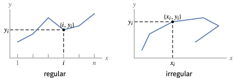
- Regular data {y1,…,yn} is plotted as a functional curve through the points {i,yi}.
- Irregular data {{x1,y1},…,{xn,yn}} is plotted as the free-form curve through the points {xi,yi}.
- Data values xi and yi can be given in the following forms:
-
xi a real-valued number Quantity[xi,unit] a quantity with a unit Around[xi,ei] value xi with uncertainty ei Interval[{xmin,xmax}] values between xmin and xmax - Values xi and yi that are not of the form above are taken to be missing and are not shown.
- The datai have the following forms and interpretations:
-
<"k1"y1,"k2"y2,…> values {y1,y2,…} <x1y1,x2y2,…> key-value pairs {{x1,y1},{x2,y2},…} {y1"lbl1",y2"lbl2",…}, {y1,y2,…}{"lbl1","lbl2",…} values {y1,y2,…} with labels {lbl1,lbl2,…} SparseArray values as a normal array TimeSeries, EventSeries time-value pairs QuantityArray magnitudes WeightedData unweighted values - ListLinePlot[Tabular[…]cspec] extracts and plots values from the tabular object using the column specification cspec.
- The following forms of column specifications cspec are allowed for plotting tabular data:
-
{colx,coly} plot column y against column x {{colx1,coly1},{colx2,coly2},…} plot column y1 against column x1, y2 against x2, … coly, {coly} plot column y as a sequence of values {{coly1},…,{colyi},…} plot columns y1, y2, … as sequences of values - The colx can also be Automatic, in which case, sequential values are generated using DataRange.
- ListLinePlot[TimeSeries[…]cspec] and ListLinePlot[EventSeries[…]cspec] extract and plot values from the time or event series using the component specification cspec.
- The following forms of component specifications cspec are allowed for plotting series data:
-
com plot component com against the timestamps {com1,com2,…} plot each component comi against the timestamps - The following wrappers w can be used for the datai:
-
Annotation[datai,label] provide an annotation for the data Button[datai,action] define an action to execute when the data is clicked Callout[datai,label] label the data with a callout Callout[datai,label,pos] place the callout at relative position pos EventHandler[datai,events] define a general event handler for the data Highlighted[datai,effect] dynamically highlight fi with an effect Highlighted[datai,Placed[effect,pos]] statically highlight fi with an effect at position pos Hyperlink[datai,uri] make the data a hyperlink Labeled[datai,label] label the data Labeled[datai,label,pos] place the label at relative position pos Legended[datai,label] identify the data in a legend PopupWindow[datai,cont] attach a popup window to the data StatusArea[datai,label] display in the status area on mouseover Style[datai,styles] show the data using the specified styles Tooltip[datai,label] attach a tooltip to the curve - Wrappers w can be applied at multiple levels:
-
{…,w[yi],…} wrap the value yi in data {…,w[{xi,yi}],…} wrap the point {xi,yi} w[datai] wrap the data w[{data1,…}] wrap a collection of datai w1[w2[…]] use nested wrappers - Callout, Labeled, and Placed can use the following positions pos:
-
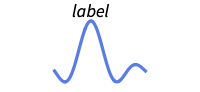
Above position above curve 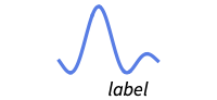
Below position below curve 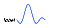
Before position before curve 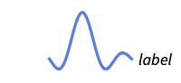
After position after curve 
"Start" position at start of each curve 
"End" position at end of each curve 
x near the curve at a position x 
Scaled[s] scaled position s along the curve 
{s,Above} Above relative position at position s along the curve 
{s,Below} Below relative position at position s along the curve 
{pos,epos} epos in label placed at relative position pos of the curve - ListLinePlot has the same options as Graphics, with the following additions and changes: [List of all options]
-
AspectRatio 1/GoldenRatio ratio of height to width Axes True whether to draw axes ClippingStyle None what to draw when lines are clipped ColorFunction Automatic how to determine the coloring of lines ColorFunctionScaling True whether to scale arguments to ColorFunction DataRange Automatic the range of x values to assume for data Filling None filling under each line FillingStyle Automatic style to use for filling InterpolationOrder None the polynomial degree of curves used in joining data points IntervalMarkers Automatic how to render uncertainty IntervalMarkersStyle Automatic style for uncertainty elements LabelingFunction Automatic how to label points LabelingSize Automatic maximum size of callouts and labels LabelingTarget Automatic how to determine automatic label positions MaxPlotPoints Infinity the maximum number of points to include Mesh None how many mesh points to draw on each line MeshFunctions {#1&} how to determine the placement of mesh points MeshShading None how to shade regions between mesh points MeshStyle Automatic the style for mesh points Method Automatic methods to use MultiaxisArrangement None how to arrange multiple axes for data PerformanceGoal $PerformanceGoal aspects of performance to try to optimize PlotFit None how to fit a curve to the points PlotFitElements Automatic fitted elements to show in the plot PlotHighlighting Automatic highlighting effect for points PlotInteractivity $PlotInteractivity whether to allow interactive elements PlotLabel None overall label for the plot PlotLabels None labels for data PlotLayout "Overlaid" how to position data PlotLegends None legends for data PlotMarkers None markers to use to indicate each point PlotRange Automatic range of values to include PlotRangeClipping True whether to clip at the plot range PlotStyle Automatic graphics directives to determine the style of each line PlotTheme $PlotTheme overall theme for the plot ScalingFunctions None how to scale individual coordinates TargetUnits Automatic units to display in the plot - DataRange determines how values {y1,…,yn} are interpreted into {{x1,y1},…,{xn,yn}}. Possible settings include:
-
Automatic,All uniform from 1 to n {xmin,xmax} uniform from xmin to xmax - In general a list of pairs {{x1,y1},{x2,y2},…} is interpreted as a list of points, but the setting DataRangeAll forces it to be interpreted as multiple data sources {{y11,y12},{y21,y23},…}. »
- LabelingFunction->f specifies that each point should have a label given by f[value,index,lbls], where value is the value associated with the point, index is its position in the data, and lbls is the list of relevant labels.
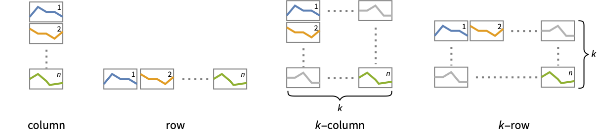
- Possible settings for PlotLayout that show multiple curves in a single plot panel include:
-

"Overlaid" show all the data overlapping 
"Stacked" accumulate the data 
"Percentile" accumulate and normalize the data - Possible settings for PlotLayout that show single curves in multiple plot panels include:
-
"Column" use separate curves in a column of panels "Row" use separate curves in a row of panels {"Column",k},{"Row",k} use k columns or rows {"Column",UpTo[k]},{"Row",UpTo[k]} use at most k columns or rows - Possible highlighting effects for Highlighted and PlotHighlighting include:
-
style highlight the indicated curve 
"Ball" highlight and label the indicated point in a curve 
"Dropline" highlight and label the indicated point in a curve with droplines to the axes 
"XSlice" highlight and label all points along a vertical slice 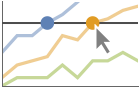
"YSlice" highlight and label all points along a horizontal slice 
Placed[effect,pos] statically highlight the given position pos - Typical settings for PlotLegends include:
-
None no legend Automatic automatically determine legend {lbl1,lbl2,…} use lbl1, lbl2, … as legend labels Placed[lspec,…] specify placement for legend - PlotStylesty specifies the styles to use for each curve. Possible settings include:
-
{sty1,sty2,…} sequence of styles for the datasets <"key"val,…> styling elements for different levels of data - The accepted keys are:
-
"Base" overall style for all the datai "Lists" list of styles styi for each datai - ColorData["DefaultPlotColors"] gives the default sequence of colors used by PlotStyle.
- ScalingFunctions->"scale" scales the
 coordinate; ScalingFunctions{"scalex","scaley"} scales both the
  and
and  coordinates.
List of all options
Examples
open all close allBasic Examples (6)
ListLinePlot[{1, 1, 2, 3, 5, 8}]Adding filling under the line:
ListLinePlot[Prime[Range[25]], Filling -> Axis]ListLinePlot[Table[{Cos[k 2Pi / 7], Sin[k 2Pi / 7]}, {k, 0, 21, 3}], Frame -> True, Axes -> False]Plot multiple datasets with a legend:
ListLinePlot[Table[Accumulate[RandomReal[{-1, 1}, 250]], {3}], Filling -> Axis, PlotLegends -> {"one", "two", "three"}]Plot multiple datasets in a row of panels:
ListLinePlot[{Labeled[Sqrt[Range[40]], "sqrt"], Labeled[Log[Range[40, 80]], "log"]}, PlotLayout -> "Row"]ListLinePlot[Quantity[{0, 3, 6, 8, 10, 11, 11, 16, 20, 22}, "Centimeters"], AxesLabel -> Automatic]Scope (58)
General Data (10)
Lines are drawn through the data points:
ListLinePlot[{1, 2, 3, 5, 8, 13, 21}]ListLinePlot[{{1, 1}, {2, 2}, {3, 4}, {5, 8}, {8, 16}, {13, 32}, {21, 64}}]ListLinePlot[{{1, 2, 3, 5, 8, 13, 21}, {1, 2, 4, 8, 16, 32, 64}}]The plot range is selected automatically:
ListLinePlot[{1, 2, 3, 4, 25, 8, 9}]Specify what values the data ranges over:
ListLinePlot[{1, 2, 4, 3, 5, 9, 8, 7}, DataRange -> {0, 1}]Ranges where the data is nonreal are excluded:
ListLinePlot[{1, 2, 3, None, 5, 6, Missing["NotAvailable"], 8, 9}]Use InterpolationOrder to smooth the data:
{ListLinePlot[{1, 2, 4, 7, 3, 5, 8, 10, 9}], ListLinePlot[{1, 2, 4, 7, 3, 5, 8, 10, 9}, InterpolationOrder -> 2]}Use MaxPlotPoints to limit the number of points used:
ListLinePlot[Table[Sin[5x], {x, 0, 2Pi, 0.1}], MaxPlotPoints -> 10]ListLinePlot[Table[{x, Sin[5x]}, {x, 0, 2Pi, 0.1}], MaxPlotPoints -> 10]Use PlotRange to focus in on areas of interest:
{ListLinePlot[Table[x ^ 4 - x ^ 2 + 1, {x, -2, 2, 0.1}]], ListLinePlot[Table[x ^ 4 - x ^ 2 + 1, {x, -2, 2, 0.1}], PlotRange -> {0, 2}]}Use ScalingFunctions to scale the axes:
ListLinePlot[Factorial[Range[20]], ScalingFunctions -> "Log"]Tabular Data (3)
timings = Tabular[IconizedObject[«timings»], {"vertices", "edges", "connected", "edge coloring", "spanning tree", "shortest tour"}]Plot the time to compute an edge coloring for a graph against the number of vertices:
ListLinePlot[timings -> {"vertices", "edge coloring"}]ListLinePlot[timings -> "edge coloring"]Plot timings for edge coloring and shortest tour on separate axes:
ListLinePlot[timings -> {{"vertices", "edge coloring"}, {"vertices", "shortest tour"}}, MultiaxisArrangement -> All]Plot all the data in TimeSeries or EventSeries:
ListLinePlot[TimeSeries[TimeEventSeries`TimestampData[Association["UniformlySpacedQ" -> False,
   "Timestamps" -> TabularColumn[Association[
      "Data" -> {7, {{NumericArray[{-248, 118, 298, 638, 865, 1006, 1216}, "Integer32"], {},
          None}}, None},  ...   "Data" -> {{32, 62, 112, 167, 179, 209, 214}, {}, None}, "ElementType" -> "Integer64"]],
         TabularColumn[Association["Data" -> {{30, 49, 81, 125, 142, 174, 177}, {}, None},
           "ElementType" -> "Integer64"]]}}]]]], Association[]]]
Plot a specific component of a TimeSeries or EventSeries:
trees = TimeSeries[TimeEventSeries`TimestampData[Association["UniformlySpacedQ" -> False,
   "Timestamps" -> TabularColumn[Association[
      "Data" -> {7, {{NumericArray[{-248, 118, 298, 638, 865, 1006, 1216}, "Integer32"], {},
          None}}, None},  ...   "Data" -> {{32, 62, 112, 167, 179, 209, 214}, {}, None}, "ElementType" -> "Integer64"]],
         TabularColumn[Association["Data" -> {{30, 49, 81, 125, 142, 174, 177}, {}, None},
"ElementType" -> "Integer64"]]}}]]]], Association[]];ListLinePlot[trees -> "tree 1"]ListLinePlot[trees -> {"tree 1", "tree 2"}]Special Data (9)
Use Quantity to include units with the data:
ListLinePlot[Quantity[Sqrt[Range[10]], "Meters"], AxesLabel -> Automatic]Include different units for the x and y coordinates:
data = EntityValue[EntityClass["Element", All], {"AtomicMass", "MeltingPoint"}];ListLinePlot[data, AxesLabel -> Automatic]Plot data in a QuantityArray:
data = QuantityArray[EntityValue[EntityClass["Element", All], {"AtomicMass", "MeltingPoint"}]]ListLinePlot[data, AxesLabel -> Automatic]Specify the units used with TargetUnits:
ListLinePlot[data, TargetUnits -> {Automatic, "Kelvin"}, AxesLabel -> Automatic]ListLinePlot[Table[Around[RandomReal[5], RandomReal[0.5]], 20]]ListLinePlot[Table[Interval[RandomReal[5] + {-0.5, 0.5}], 20]]Use bands to represent uncertainty:
ListLinePlot[Table[Interval[RandomReal[5] + {-0.5, 0.5}], 20], IntervalMarkers -> "Bands"]Specify strings to use as labels:
ListLinePlot[{2 -> "a", 3 -> "b", 5 -> "c", 7 -> "d", 11 -> "e", 13 -> "f", 17 -> "g"}]ListLinePlot[{2, 3, 5, 7, 11, 13, 17} -> {"a", "b", "c", "d", "e", "f", "g"}]Specify a location for labels:
ListLinePlot[{2, 3, 5, 7, 11, 13, 17} -> {"a", "b", "c", "d", "e", "f", "g"}, LabelingFunction -> Below]Numeric values in an Association are used as the y coordinates:
ListLinePlot[<|"a" -> 2, "b" -> 3, "c" -> 5, "d" -> 7, "e" -> 11, "f" -> 13|>]Numeric keys and values in an Association are used as the x and y coordinates:
ListLinePlot[<|2 -> 1, 3 -> 2, 5 -> 3, 7 -> 4, 11 -> 5, 13 -> 6|>]Plot TimeSeries directly with automatic date ticks:
data = CountryData["UnitedStates", {{"Population"}, {1988, 2013}}]ListLinePlot[data, AxesLabel -> Automatic]Plot data in a SparseArray:
ListLinePlot[SparseArray[Table[Prime[i] -> 1, {i, 25}]]]The weights in WeightedData are ignored:
ListLinePlot[WeightedData[{2, 3, 5, 7, 11, 13, 17, 19, 23, 29}, {1, 2, 3, 4, 5, 6, 7, 8, 9, 10}]]Data Wrappers (7)
Use wrappers on data sources or collections of data sources:
{ListLinePlot[{Style[{1, 2, 3}, Green], {4, 5, 6}}], ListLinePlot[Style[{{1, 2, 3}, {4, 5, 6}}, Blue]]}Use the value of each point as a tooltip:
ListLinePlot[Tooltip[Prime[Range[20]]], Mesh -> Full]Use a specific tooltip for the curve:
ListLinePlot[Tooltip[Prime[Range[20]], "primes"]]Use PopupWindow to provide additional drilldown information:
ListLinePlot[PopupWindow[{1, 2, 3}, DateListPlot[FinancialData["IBM", "Jan. 1, 2004"]]]]Button can be used to trigger any action:
ListLinePlot[Button[{1, 2, 3}, Speak["Hello"]]]Use Annotation for dynamic action when the mouse enters the plot:
{ListLinePlot[Annotation[Prime[Range[20]], "label", "Mouse"]], Dynamic[MouseAnnotation[]]}Use Hyperlink to jump to the specified link when clicked:
ListLinePlot[Hyperlink[Prime[Range[20]], "http://www.wolfram.com"]]Use StatusArea to display a string in the status area of the current notebook:
ListLinePlot[StatusArea[Prime[Range[20]], "String"]]Labeling and Legending (14)
Label data sources with Labeled:
data = Table[Table[{x, f}, {x, 0, 2Pi, 0.1}], {f, {Sin[x], Sin[2x]}}];ListLinePlot[MapThread[Labeled[#1, #2]&, {data, {Sin[x], Sin[2x]}}]]Specify the labels with PlotLabels:
data = Table[Table[{x, f}, {x, 0, 2Pi, 0.1}], {f, {Sin[x], Sin[2x]}}];ListLinePlot[data, PlotLabels -> {Sin[x], Sin[2x]}]Place the label near the points at an x value:
ListLinePlot[Labeled[Table[{x, Sin[x]}, {x, 0, 2Pi, 0.1}], "sin(x)", 3]]ListLinePlot[Labeled[Table[{x, Sin[x]}, {x, 0, 2Pi, 0.1}], "sin(x)", Scaled[0.25]]]Specify the text position relative to the point:
ListLinePlot[Labeled[Table[{x, Sin[x]}, {x, 0, 2Pi, 0.1}], Sin[x], {Scaled[0.25], Above}]]Label data automatically with Callout:
ListLinePlot[{Callout[Table[PartitionsQ[n], {n, 18}], PartitionsQ[n]], Callout[Table[n, {n, 18}], n]}]Place a label with specific locations:
ListLinePlot[Callout[Table[n ^ Sin[n], {n, 1, 10, 0.25}], "label", Above]]ListLinePlot[Callout[Table[n ^ Sin[n], {n, 1, 10, 0.25}], "label", 25]]Specify label names with LabelingFunction:
ListLinePlot[Prime[Range[10]], LabelingFunction -> (#1 &)]Specify the maximum size of labels:
data = Table[Labeled[Prime[i], RandomWord[]], {i, 10}];ListLinePlot[data, LabelingSize -> 30]ListLinePlot[data, LabelingSize -> Full]Include legends for each curve:
data = Table[Table[{x, f}, {x, 0, 2Pi, 0.1}], {f, {Sin[x], Sin[2x]}}];ListLinePlot[data, PlotLegends -> {Sin[x], Sin[2x]}]Use Legended to provide a legend for a specific dataset:
upper = RandomReal[{1.5, 2}, 50];
lower = RandomReal[0.5, 50];ListLinePlot[{lower, Legended[Mean[{lower, upper}], "average"], upper}]Use Placed to change the legend location:
ListLinePlot[{lower, Legended[Mean[{lower, upper}], Placed["average", Below]], upper}]Use association keys as labels:
ListLinePlot[<|"fibonacci" -> Fibonacci[Range[10]], "primes" -> Prime[Range[10]]|>, PlotLabels -> Automatic, PlotLegends -> None]Plots usually have interactive callouts showing the coordinates when you mouse over them:
ListLinePlot[{...}]Including specific wrappers or interactions, such as tooltips, turns off the interactive features:
ListLinePlot[Callout[{...}, "hello", 13]]Choose from multiple interactive highlighting effects:
{ListLinePlot[{{...}, {...}}, PlotHighlighting -> "Dropline"], ListLinePlot[{{...}, {...}}, PlotHighlighting -> "XSlice"]}Use Highlighted to emphasize specific points in a plot:
ListLinePlot[Highlighted[{...}, Placed["Ball", 7]]]ListLinePlot[Highlighted[{...}, Placed["Ball", {{7}, {17}}]]]Presentation (15)
Multiple curves are automatically colored to be distinct:
data = Table[Table[{x, f}, {x, 0, 2Pi, 0.1}], {f, {Sin[x], Sin[2x]}}];ListLinePlot[data]Provide explicit styling to different curves:
data = Table[Table[{x, f}, {x, 0, 2Pi, 0.1}], {f, {Sin[x], Sin[2x]}}];ListLinePlot[data, PlotStyle -> {Dashed, Red}]Use a theme with simple ticks in a bold color scheme:
ListLinePlot[{Prime[Range[20]], Range[20]}, PlotTheme -> "Marketing"]Include legends for each curve:
data = Table[Table[{x, f}, {x, 0, 2Pi, 0.1}], {f, {Sin[x], Sin[2x]}}];ListLinePlot[data, PlotLegends -> {Sin[x], Sin[2x]}]Use Legended to provide a legend for a specific dataset:
upper = RandomReal[{1.5, 2}, 50];
lower = RandomReal[0.5, 50];ListLinePlot[{lower, Legended[Mean[{lower, upper}], "average"], upper}]ListLinePlot[Table[{k, Binomial[15, k]}, {k, 0, 15}], AxesLabel -> {k, None}, PlotLabel -> Binomial[15, k]]Provide an interactive Tooltip for the data:
ListLinePlot[Tooltip[Table[If[PrimeQ[x], Tooltip[x, Row[{"prime: ", x}]], x], {x, 1, 25}]], Mesh -> All]ListLinePlot[{Tooltip[{1, 2, 4, 8, 16, 32, 64}, TraditionalForm[2 ^ k]], Tooltip[{1, 2, 3, 5, 8, 13, 21}, TraditionalForm[Fibonacci[k]]]}, Mesh -> Full]ListLinePlot[{{1, 2, 4, 8, 16, 32, 64}, {1, 2, 3, 5, 8, 13, 21}}, Filling -> {1 -> {2}}]ListLinePlot[{1, 2, 3, 5, 8, 13, 21}, Mesh -> 10]Use shapes to distinguish different datasets:
ListLinePlot[{Tooltip[{1, 2, 4, 8, 16, 32, 64}, TraditionalForm[2 ^ k]], Tooltip[{1, 2, 3, 5, 8, 13, 21}, TraditionalForm[Fibonacci[k]]]}, Mesh -> Full, PlotMarkers -> Automatic]Style the curve segments between mesh points:
ListLinePlot[{1, 2, 3, 5, 8, 13, 21}, Mesh -> 10, MeshShading -> {Red, None, Blue}]Show multiple curves in a row of separate panels:
ListLinePlot[{IconizedObject[«walk #1»], IconizedObject[«walk #2»]}, PlotLayout -> "Row"]Use a column instead of a row:
ListLinePlot[{IconizedObject[«walk #1»], IconizedObject[«walk #2»]}, PlotLayout -> "Column"]ListLinePlot[{IconizedObject[«walk #1»], IconizedObject[«walk #2»], IconizedObject[«walk #3»], IconizedObject[«walk #4»]}, PlotLayout -> {"Row", 2}]Plot the data in a stacked layout:
data = {{10, 9, 4, 3, 5, 3, 5, 5, 2, 6}, {2, 10, 5, 6, 9, 4, 9, 3, 7, 2}, {7, 8, 3, 4, 4, 2, 6, 3, 8, 7}};ListLinePlot[data, PlotLayout -> "Stacked", Joined -> True]Plot the data as percentiles of the total of the values:
ListLinePlot[data, PlotLayout -> "Percentile", Joined -> True]Use different axes for the different items:
ListLinePlot[{Prime[Range[10]], Range[10] ^ 2}, MultiaxisArrangement -> All]Specify where the axes should be placed:
ListLinePlot[{Range[10], Prime[Range[10]], Range[10] ^ 2}, MultiaxisArrangement -> {Right -> {1, 2}, Left -> 3}]ListLinePlot[{Range[10], Prime[Range[10]], Range[10] ^ 2}, MultiaxisArrangement -> {Right -> {{1, 2}}, Left -> 3}]Options (162)
ClippingStyle (5)
Omit clipped regions of the plot:
ListLinePlot[Table[{x, Sin[x] / x ^ 2}, {x, -10, 10, 0.2}], ClippingStyle -> None]//QuietShow the clipped regions like the rest of the curve:
ListLinePlot[Table[{x, Sin[x] / x ^ 2}, {x, -10, 10, 0.2}], ClippingStyle -> Automatic, PlotStyle -> Thick]//QuietShow clipped regions with red lines:
ListLinePlot[Table[{x, Sin[x] / x ^ 2}, {x, -10, 10, 0.2}], ClippingStyle -> Red]//QuietShow clipped regions as red at the bottom and thick at the top:
ListLinePlot[Table[{x, Sin[x] / x ^ 2}, {x, -10, 10, 0.2}], ClippingStyle -> {Red, Thick}]//QuietShow clipped regions as red and thick:
ListLinePlot[Table[{x, Sin[x] / x ^ 2}, {x, -10, 10, 0.2}], ClippingStyle -> Directive[Red, Thick]]//QuietColorFunction (5)
Color by scaled ![]() and
and ![]() coordinates:
coordinates:
Table[ListLinePlot[Sinc[Range[0, 10, 0.1]], ColorFunction -> Function[{x, y}, f], PlotLabel -> f, PlotStyle -> Thick], {f, {Hue[x], Hue[y]}}]Color with a named color scheme:
ListLinePlot[Sinc[Range[0, 10, 0.1]], ColorFunction -> "DarkRainbow"]Fill with the color used for the curve:
ListLinePlot[Sinc[Range[0, 10, 0.1]], ColorFunction -> Function[{x, y}, Hue[x]], Filling -> Axis]ListLinePlot[Array[Prime, 100], ColorFunction -> Function[{x, y}, Blend[{Yellow, Red}, x]], Filling -> Axis]ColorFunction has higher priority than PlotStyle for coloring the curve:
ListLinePlot[Sinc[Range[0, 10, 0.1]], ColorFunction -> "DarkRainbow", PlotStyle -> Directive[Red, Thick]]Use Automatic in MeshShading to use the ColorFunction:
ListLinePlot[Sin[Range[0, 10, 0.1]], ColorFunction -> "Rainbow", PlotStyle -> Directive[Red, Thick], Mesh -> 10, MeshShading -> {Automatic, StandardGray}, MeshStyle -> None]ColorFunctionScaling (2)
Color the line based on scaled ![]() value:
value:
ListLinePlot[Table[x ^ 2Exp[-x ^ 2], {x, -5, 5, 0.1}], ColorFunction -> Function[{x, y}, Hue[y]], PlotStyle -> Thick, ColorFunctionScaling -> True]Color the line based on unscaled ![]() value:
value:
ListLinePlot[Table[x ^ 2Exp[-x ^ 2], {x, -5, 5, 0.1}], ColorFunction -> Function[{x, y}, Hue[y]], PlotStyle -> Thick, ColorFunctionScaling -> False]DataRange (5)
Lists of height values are displayed against the number of elements:
ListLinePlot[Table[Sin[x], {x, 0, 2Pi, 0.1}]]Rescale to the sampling space:
ListLinePlot[Table[Sin[x], {x, 0, 2Pi, 0.1}], DataRange -> {0, 2Pi}]Each dataset is scaled to the same domain:
ListLinePlot[{{1, 2, 3}, {4, 5, 6, 7}, {8, 9, 10, 11, 12}}, DataRange -> {0, 1}]Pairs are interpreted as ![]() ,
, ![]() coordinates:
coordinates:
ListLinePlot[{{1, 1}, {2, 2}, {3, 2}}]Specifying DataRange in this case has no effect, since ![]() values are part of the data:
values are part of the data:
ListLinePlot[{{1, 1}, {2, 2}, {3, 2}}, DataRange -> {0, 1}]Force interpretation as multiple datasets:
ListLinePlot[{{1, 1}, {2, 2}, {3, 2}}, DataRange -> All, AxesOrigin -> {0, 0}]Filling (8)
Use symbolic or explicit values:
Table[ListLinePlot[Table[Prime[n], {n, 30}], Filling -> c], {c, {Top, Bottom, Axis, Prime[15]}}]Fills that overlap by default combine using opacity:
ListLinePlot[{Table[Sin[n / 3], {n, 20}], Table[Cos[n / 3], {n, 20}]}, Filling -> Axis]Fill between the first curve and the axis:
ListLinePlot[{Table[Sin[n / 3], {n, 20}], Table[Cos[n / 3], {n, 20}]}, Filling -> {1 -> Axis}]ListLinePlot[{Table[Sin[n / 3], {n, 20}], Table[Cos[n / 3], {n, 20}]}, Filling -> {1 -> {2}}]Fill between curves 1 and 2 with a specific style:
ListLinePlot[{Table[Sin[n / 3], {n, 20}], Table[Cos[n / 3], {n, 20}]}, Filling -> {1 -> {{2}, StandardCyan}}]Fill between curves 1 and ![]() with orange:
with orange:
ListLinePlot[{Table[Sin[n / 3], {n, 20}], Table[Cos[n / 3], {n, 20}]}, Filling -> {1 -> {1 / 2, Orange}}]Fill between curves 1 and 2; use yellow when 1 is below 2, and green when 1 is above 2:
ListLinePlot[{Table[Sin[n / 3], {n, 20}], Table[Cos[n / 3], {n, 20}]}, Filling -> {1 -> {{2}, {StandardYellow, StandardGreen}}}]Filling between curves applies where the curves overlap:
ListLinePlot[{Table[{i, i ^ 2 + 1}, {i, 0, 5}], Table[{i, i ^ 2 - 20}, {i, 2, 7}]}, Filling -> {1 -> {2}}]FillingStyle (4)
Table[ListLinePlot[Table[{x, Sin[x]}, {x, 0, 2Pi, 0.1}], Filling -> Axis, FillingStyle -> c], {c, {Red, StandardGreen, Blue, StandardYellow}}]ListLinePlot[{Table[{x, Sin[x]}, {x, 0, 2Pi, 0.1}], Table[{x, Cos[x]}, {x, 0, 2Pi, 0.1}]}, Filling -> Axis, FillingStyle -> Directive[Opacity[0.5], Orange]]Fill with red below the axis, and with blue above:
ListLinePlot[Table[{x, Sin[x]}, {x, 0, 2Pi, 0.1}], Filling -> Axis, FillingStyle -> {Red, Blue}]Use a variable filling style obtained from ColorFunction:
ListLinePlot[Table[{x, Sin[x]}, {x, 0, 2Pi, 0.1}], ColorFunction -> Function[{x, y}, Hue[y]], Filling -> Axis, FillingStyle -> Automatic]InterpolationOrder (3)
Points are normally joined with straight lines:
ListLinePlot[{{1, 4, 2, 3, 10, 8, 2}}, Mesh -> Full]Use quadratic spline interpolation to fit the data:
ListLinePlot[{{1, 4, 2, 3, 10, 8, 2}}, InterpolationOrder -> 2, Mesh -> Full]Use flat regions with steps at each data point:
ListLinePlot[{{1, 4, 2, 3, 10, 8, 2}}, InterpolationOrder -> 0, Mesh -> Full]IntervalMarkers (3)
By default, uncertainties are capped:
ListLinePlot[Table[Around[RandomReal[], 0.1], 10]]Use bars to denote uncertainties without caps:
ListLinePlot[Table[Around[RandomReal[], 0.1], 10], IntervalMarkers -> "Bars"]Use bands to represent uncertainties:
ListLinePlot[Table[Around[RandomReal[], .1], 10], IntervalMarkers -> "Bands"]IntervalMarkersStyle (2)
Uncertainties automatically inherit the plot style:
ListLinePlot[{Table[Around[RandomReal[20], 1], 10], Table[Around[RandomReal[20], 1], 10]}, PlotStyle -> {Red, Blue}]Specify the style for uncertainties:
ListLinePlot[{Table[Around[RandomReal[20], 1], 10], Table[Around[RandomReal[20], 1], 10]}, IntervalMarkersStyle -> Gray]Joined (3)
By default, the points are joined by a line:
ListLinePlot[Fibonacci[Range[11]]]Use Joined->False to just show data points:
ListLinePlot[Fibonacci[Range[11]], Joined -> False]Keep the first dataset joined but use points for the second dataset:
ListLinePlot[{Table[Prime[n], {n, 10}], Fibonacci[Range[9]]}, Joined -> {True, False}]LabelingFunction (6)
By default, points are automatically labeled with strings:
ListLinePlot[{1, 1, 2, 3, 5, 8} -> {"a", "b", "c", "d", "e", "f"}]Use LabelingFunction->None to suppress the labels:
ListLinePlot[{1, 1, 2, 3, 5, 8} -> {"a", "b", "c", "d", "e", "f"}, LabelingFunction -> None]Put the labels above the points:
ListLinePlot[{1, 1, 2, 3, 5, 8} -> {"a", "b", "c", "d", "e", "f"}, LabelingFunction -> Above]Use callouts to label the points:
ListLinePlot[{1, 1, 2, 3, 5, 8} -> {"a", "b", "c", "d", "e", "f"}, LabelingFunction -> Callout[Automatic, Automatic]]Label the points with their values:
ListLinePlot[{1, 1, 2, 3, 5, 8} -> {"a", "b", "c", "d", "e", "f"}, LabelingFunction -> (#1&)]Label the points with their indices:
ListLinePlot[{1, 1, 2, 3, 5, 8} -> {"a", "b", "c", "d", "e", "f"}, LabelingFunction -> (#2&)]LabelingSize (4)
Textual labels are shown at their actual sizes:
ListLinePlot[{1, 1, 2, 3, 5, 8} -> {"healthfulness", "obstreperous", "spectrogram", "vestige", "coinage", "limey"}, ImageSize -> Medium]Image labels are automatically resized:
ListLinePlot[{1, 1, 2, 3, 5, 8} -> {[image], [image], [image], [image], [image], [image]}, ImageSize -> Medium]Specify a maximum size for textual labels:
ListLinePlot[{1, 1, 2, 3, 5, 8} -> {"healthfulness", "obstreperous", "spectrogram", "vestige", "coinage", "limey"}, ImageSize -> Medium, LabelingSize -> 30]Specify a maximum size for image labels:
ListLinePlot[{1, 1, 2, 3, 5, 8} -> {[image], [image], [image], [image], [image], [image]}, ImageSize -> Medium, LabelingSize -> 20]Show image labels at their natural sizes:
ListLinePlot[{1, 1, 2, 3, 5, 8} -> {[image], [image], [image], [image], [image], [image]}, ImageSize -> Medium, LabelingSize -> Full]LabelingTarget (6)
Labels are automatically placed to maximize readability:
ListLinePlot[IconizedObject[«data»]]ListLinePlot[IconizedObject[«data»], LabelingTarget -> All]Use a denser layout for the labels:
ListLinePlot[IconizedObject[«data»], LabelingTarget -> "Dense"]Show the half of the labels that are easiest to read:
ListLinePlot[IconizedObject[«data»], LabelingTarget -> 0.5]Only allow labels that are orthogonal to the points:
ListLinePlot[IconizedObject[«data»], LabelingTarget -> <|"AllowedLabelingPositions" -> "Sides"|>]Only allow labels that are diagonal to the points:
ListLinePlot[IconizedObject[«data»], LabelingTarget -> <|"AllowedLabelingPositions" -> "Corners"|>]Allow labels to be clipped by the edges of the plot:
ListLinePlot[IconizedObject[«data»], LabelingTarget -> <|"AllowLabelClipping" -> True|>]MaxPlotPoints (4)
All points are included by default:
ListLinePlot[Table[Sin[10x], {x, 0, 2Pi, 0.1}]]Uniformly spaced data is downsampled:
Table[ListLinePlot[Table[Sin[2Pi n / 10], {n, 100}], MaxPlotPoints -> mp], {mp, {Infinity, 50, 30}}]In this case, downsampling from ![]() to
to ![]() points:
points:
ListLinePlot[Sin[Range[10^6]2.Pi / 10^5] + RandomReal[0.3, 10^6], MaxPlotPoints -> 10^3]Nonuniform data topologically subsampled, to preserve features:
Table[ListLinePlot[Table[{n, Sin[2Pi n / 10]}, {n, 100}], MaxPlotPoints -> mp], {mp, {Infinity, 50, 30}}]Table[ListLinePlot[Table[{Sqrt[n]Cos[n / 5], Sqrt[n]Sin[n / 5]}, {n, 100}], MaxPlotPoints -> mp], {mp, {Infinity, 50, 30}}]Points on either side of nonreal data are always included:
ListLinePlot[{1, 2, 3, None, 5, 6, 7, 8, None, 10, 11, 12}, MaxPlotPoints -> 3, Mesh -> All]Mesh (5)
The initial and final sampling meshes are typically the same:
{ListLinePlot[Table[Sin[x], {x, 8}], Mesh -> Full], ListLinePlot[Table[Sin[x], {x, 8}], Mesh -> All]}Interpolated data may introduce points:
{ListLinePlot[Table[Sin[x], {x, 8}], Mesh -> Full, InterpolationOrder -> 2], ListLinePlot[Table[Sin[x], {x, 8}], Mesh -> All, InterpolationOrder -> 2]}Use 20 mesh levels evenly spaced in the ![]() direction:
direction:
ListLinePlot[Table[Sin[x], {x, 0, 2Pi, 0.1}], Mesh -> 20]Use an explicit list of values for the mesh in the ![]() direction:
direction:
ListLinePlot[Table[{x, Sin[x]}, {x, 0, 2Pi, 0.1}], Mesh -> {Range[0, 2Pi, Pi / 4]}, MeshStyle -> PointSize[Medium]]Specify style and mesh levels in the ![]() direction:
direction:
ListLinePlot[Table[{x, Sin[x]}, {x, 0, 2Pi, 2Pi / 20}], Mesh -> {Table[{x, Hue[x / (2Pi)]}, {x, 0., 2Pi, 2Pi / 8}]}]MeshFunctions (2)
Use a mesh evenly spaced in the ![]() and
and ![]() directions:
directions:
Table[ListLinePlot[Table[Binomial[15, k], {k, 0, 15}], MeshFunctions -> {Function[{x, y}, Evaluate[f]]}, Mesh -> 9, PlotLabel -> f], {f, {x, y}}]Show 5 mesh levels in the ![]() direction (red) and 10 in the
direction (red) and 10 in the ![]() direction (blue):
direction (blue):
ListLinePlot[Table[Binomial[15, k], {k, 0, 15}], Mesh -> {5, 10}, MeshFunctions -> {#1&, #2&}, MeshStyle -> {Directive[PointSize[Medium], Red], Blue}]MeshShading (6)
Alternate red and blue segments of equal width in the ![]() direction:
direction:
ListLinePlot[Table[Binomial[15, k], {k, 0, 15}], Mesh -> 10, MeshFunctions -> {#1&}, MeshShading -> {Red, Blue}]Use None to remove segments:
ListLinePlot[Table[Binomial[15, k], {k, 0, 15}], Mesh -> 10, MeshFunctions -> {#1&}, MeshShading -> {Red, None}]MeshShading can be used with PlotStyle:
ListLinePlot[Table[Binomial[15, k], {k, 0, 15}], Mesh -> 10, PlotStyle -> Thick, MeshFunctions -> {#1&}, MeshShading -> {Red, Blue}]MeshShading has higher priority than PlotStyle for styling the curve:
ListLinePlot[Table[Binomial[15, k], {k, 0, 15}], Mesh -> 10, PlotStyle -> Green, MeshFunctions -> {#1&}, MeshShading -> {Red, Blue}]Use PlotStyle for some segments by setting MeshShading to Automatic:
ListLinePlot[Table[Binomial[15, k], {k, 0, 15}], Mesh -> 10, PlotStyle -> Directive[Thick, Yellow], MeshFunctions -> {#1&}, MeshShading -> {Red, Automatic}]MeshShading can be used with ColorFunction:
ListLinePlot[Table[Binomial[15, k], {k, 0, 15}], Mesh -> 10, PlotStyle -> Thick, MeshFunctions -> {#1&}, MeshShading -> {StandardGray, Automatic},
	ColorFunction -> Function[{x, y}, Hue[x]]]
MeshStyle (4)
Color the mesh the same color as the plot:
ListLinePlot[Table[Binomial[15, k], {k, 0, 15}], Mesh -> 10, MeshStyle -> Automatic]Use a red mesh in the ![]() direction:
direction:
ListLinePlot[Table[Binomial[15, k], {k, 0, 15}], Mesh -> 10, MeshStyle -> Red]Use a red mesh in the ![]() direction and a blue mesh in the
direction and a blue mesh in the ![]() direction:
direction:
ListLinePlot[Table[Binomial[15, k], {k, 0, 15}], Mesh -> 10, MeshStyle -> {Red, Blue}, MeshFunctions -> {#1&, #2&}]Use big red mesh points in the ![]() direction:
direction:
ListLinePlot[Table[Binomial[15, k], {k, 0, 15}], Mesh -> 10, MeshStyle -> Directive[PointSize[Large], Red]]MultiaxisArrangement (5)
By default, all items in a plot share the same scale:
ListLinePlot[{Range[10], Prime[Range[10]]}]Use different axes for the different items:
ListLinePlot[{Range[10], Prime[Range[10]]}, MultiaxisArrangement -> All]Any number of axes can be used:
ListLinePlot[{Range[10], Prime[Range[10]], Range[10] ^ 2}, MultiaxisArrangement -> All]Have the first and second curves share an axis:
ListLinePlot[{Range[10], Prime[Range[10]], Range[10] ^ 2}, MultiaxisArrangement -> {{1, 2}, 3}]Specify where the axes should be placed:
ListLinePlot[{Range[10], Prime[Range[10]], Range[10] ^ 2}, MultiaxisArrangement -> {Right -> {1, 2}, Left -> 3}]ListLinePlot[{Range[10], Prime[Range[10]], Range[10] ^ 2}, MultiaxisArrangement -> {Right -> {{1, 2}}, Left -> 3}]PlotFit (4)
Automatically fit a model to the data:
ListLinePlot[IconizedObject[«data»], PlotFit -> Automatic]Fit a straight line to the data:
ListLinePlot[IconizedObject[«data»], PlotFit -> "Linear"]Fit a quadratic curve to the data:
ListLinePlot[IconizedObject[«data»], PlotFit -> "Quadratic"]Use PowerModel to approximate the data:
ListLinePlot[IconizedObject[«data»], PlotFit -> PowerModel[]]PlotFitElements (3)
By default, the fitted model is shown with the data:
ListLinePlot[IconizedObject[«data»], PlotFit -> Automatic]Plot confidence bands for the data, with a default confidence level of 0.95:
ListLinePlot[IconizedObject[«data»], PlotFit -> Automatic, PlotFitElements -> "BandCurves"]Use a confidence level of 0.5 for the bands:
ListLinePlot[IconizedObject[«data»], PlotFit -> Automatic, PlotFitElements -> {"BandCurves", <|"ConfidenceLevel" -> 0.5|>}]Show residual lines from the data points to the fitted curve when the points are not joined:
ListLinePlot[IconizedObject[«data»], PlotFit -> Automatic, PlotFitElements -> "Residuals"]Combine the original points with red residual lines:
ListLinePlot[IconizedObject[«data»], PlotFit -> Automatic, PlotFitElements -> {"DataPoints", {"Residuals", <|"Style" -> Opacity[1, StandardRed]|>}}]PlotHighlighting (9)
Plots have interactive coordinate callouts with the default setting PlotHighlightingAutomatic:
ListPlot[{IconizedObject[«primes»], IconizedObject[«squares»]}]Use PlotHighlightingNone to disable the highlighting for the entire plot:
ListPlot[{IconizedObject[«primes»], IconizedObject[«squares»]}, PlotHighlighting -> None]Use Highlighted[…,None] to disable highlighting for a single set:
ListPlot[{IconizedObject[«primes»], Highlighted[IconizedObject[«squares»], None]}]Move the mouse over a set of points to highlight it using arbitrary graphics directives:
ListPlot[{IconizedObject[«primes»], IconizedObject[«squares»]}, PlotHighlighting -> Directive[Red, AbsolutePointSize[10], DropShadowing[]]]Move the mouse over the points to highlight them with balls and labels:
ListPlot[IconizedObject[«primes»], PlotHighlighting -> "Ball"]Use a ball and label to highlight a specific point on the plot:
ListPlot[Highlighted[IconizedObject[«primes»], Placed["Ball", 7]]]Move the mouse over the curve to highlight it with a label and droplines to the axes:
ListPlot[IconizedObject[«primes»], PlotHighlighting -> "Dropline"]Use a ball and label to highlight a specific point in the plot:
ListPlot[Highlighted[IconizedObject[«primes»], Placed["Dropline", 7]]]Move the mouse over the plot to highlight it with a slice showing ![]() values corresponding to the
values corresponding to the ![]() position:
position:
ListPlot[{IconizedObject[«primes»], IconizedObject[«squares»]}, PlotHighlighting -> "XSlice"]Highlight a particular set of points at a fixed ![]() value:
value:
ListPlot[{Highlighted[IconizedObject[«primes»], Placed["XSlice", 17]], IconizedObject[«squares»]}]Move the mouse over the plot to highlight it with a slice showing ![]() values corresponding to the
values corresponding to the ![]() position:
position:
ListPlot[{IconizedObject[«primes»], IconizedObject[«squares»]}, PlotHighlighting -> "YSlice"]Highlight the curves at a fixed ![]() value:
value:
ListPlot[{IconizedObject[«primes»], IconizedObject[«squares»]}, PlotHighlighting -> Placed["YSlice", 300]]Use a component that shows the points on the plot closest to the ![]() position of the mouse cursor:
position of the mouse cursor:
ListLinePlot[{IconizedObject[«primes»], IconizedObject[«squares»]}, PlotHighlighting -> "XNearestPoint"]Specify the style for the points:
ListLinePlot[{IconizedObject[«primes»], IconizedObject[«squares»]}, PlotHighlighting -> {"XNearestPoint", <|"Style" -> StandardGray|>}]Use a component that shows the coordinates on the points closest to the mouse cursor:
ListLinePlot[{IconizedObject[«primes»], IconizedObject[«squares»]}, PlotHighlighting -> "XYLabel"]Use Callout options to change the appearance of the label:
ListLinePlot[IconizedObject[«primes»], PlotHighlighting -> {"XYLabel", <|"Appearance" -> "Corners", "CalloutMarker" -> "Circle"|>}]Combine components to create a custom effect:
ListLinePlot[IconizedObject[«primes»], PlotHighlighting -> {{"XNearestPoint", <|"Style" -> StandardGray|>}, {"XYLabel", <|"Appearance" -> "Corners", "CalloutMarker" -> "Circle"|>}}]PlotInteractivity (3)
Plots have interactive highlighting by default:
ListLinePlot[{2, 3, 5, 7, 11, 13, 17, 19, 23, 29}]Turn off all the interactive elements:
ListLinePlot[{2, 3, 5, 7, 11, 13, 17, 19, 23, 29}, PlotInteractivity -> False]Allow provided interactive elements and disable automatic ones:
ListLinePlot[{2, 3, 5, 7, 11, 13, 17, 19, 23, Tooltip[29, "hello"]}, PlotInteractivity -> <|"User" -> True, "System" -> False|>]PlotLabel (1)
PlotLabels (6)
Specify text to label sets of points:
ListLinePlot[{Sin[Range[0, 2Pi, 0.1]], Cos[Range[0, 2Pi, 0.1]]}, PlotLabels -> {"sine", "cosine"}]Use an Association form to specify labels:
ListLinePlot[{Sin[Range[0, 2Pi, 0.1]], Cos[Range[0, 2Pi, 0.1]]}, PlotLabels -> <|"Lists" -> {"sine", "cosine"}|>]Place the labels above the points:
ListLinePlot[{Sin[Range[0, 2Pi, 0.1]], Cos[Range[0, 2Pi, 0.1]]}, PlotLabels -> Placed[{"sine", "cosine"}, Above]]Use callouts to identify the points:
ListLinePlot[{Sin[Range[0, 2Pi, 0.1]], Cos[Range[0, 2Pi, 0.1]]}, PlotLabels -> {Callout["sin", {Scaled[0.25], Above}], Callout["cos", {Scaled[0.5], Below}]}]Label curves with the keys from an association:
ListLinePlot[<|"sine" -> Sin[Range[0, 2Pi, 0.1]], "cosine" -> Cos[Range[0, 2Pi, 0.1]]|>, PlotLabels -> Automatic, PlotLegends -> None]Use None to not label a data source:
ListLinePlot[{Sin[Range[0, 2Pi, 0.1]], Cos[Range[0, 2Pi, 0.1]]}, PlotLabels -> {"sine", None}]PlotLayout (3)
By default, curves are overlaid on each other:
data = {{10, 9, 4, 3, 5, 3, 5, 5, 2, 6}, {2, 10, 5, 6, 9, 4, 9, 3, 7, 2}, {7, 8, 3, 4, 4, 2, 6, 3, 8, 7}};ListLinePlot[data]Plot the data in a stacked layout:
ListLinePlot[data, PlotLayout -> "Stacked"]Plot the data as percentiles of the total of the values:
ListLinePlot[data, PlotLayout -> "Percentile"]Place each curve in a separate panel using shared axes:
ListLinePlot[data, PlotLayout -> "Column", ImageSize -> Medium]ListLinePlot[data, PlotLayout -> "Row", ImageSize -> Medium]ListLinePlot[IconizedObject[«data»], ImageSize -> Medium, Joined -> True, PlotLayout -> {"Column", 4}]ListLinePlot[IconizedObject[«data»], ImageSize -> Medium, Joined -> True, PlotLayout -> {"Column", UpTo[4]}]ListLinePlot[{{...}, {...}}, Joined -> True, PlotLayout -> "Column", ImageSize -> Medium, PlotLabels -> {"First", "Second"}]PlotLegends (6)
Generate a legend using labels:
ListLinePlot[{Sqrt[Range[40]], Log[Range[40]]}, PlotLegends -> {"sqrt", "log"}]Use an Association form to specify legends:
ListLinePlot[{Sqrt[Range[40]], Log[Range[40]]}, PlotLegends -> <|"Lists" -> {"sqrt", "log"}|>]Generate a legend using placeholders:
ListLinePlot[{Sqrt[Range[40]], Log[Range[40]]}, PlotLegends -> Automatic]Legends use the same styles as the plot:
ListLinePlot[{Sqrt[Range[40]], Log[Range[40]]}, PlotStyle -> {Red, Blue}, PlotLegends -> {"sqrt", "log"}]Use Placed to specify legend placement:
Table[ListLinePlot[{Sqrt[Range[40]], Log[Range[40]]}, PlotLabel -> pos, PlotLegends -> Placed[{"sqrt", "log"}, pos]], {pos, {Above, Below, Before, After}}]Place the legend inside the plot:
ListLinePlot[{Sqrt[Range[40]], Log[Range[40]]}, PlotStyle -> {Red, Blue}, PlotLegends -> Placed[{"sqrt", "log"}, {0.85, 0.3}]]Use LineLegend to change the legend appearance:
ListLinePlot[{Sqrt[Range[40]], Log[Range[40]]}, PlotStyle -> {Red, Blue}, PlotLegends -> LineLegend[{"sqrt", "log"}, LegendMarkerSize -> 10, LegendFunction -> Frame]]PlotMarkers (8)
ListLinePlot normally uses distinct colors to distinguish different sets of data:
ListLinePlot[Table[n ^ (1 / p), {p, 4}, {n, 10}], PlotMarkers -> None]Automatically use colors and shapes to distinguish sets of data:
ListLinePlot[Table[n ^ (1 / p), {p, 4}, {n, 10}], PlotMarkers -> Automatic]ListLinePlot[Table[n ^ (1 / p), {p, 4}, {n, 10}], PlotMarkers -> Automatic, PlotStyle -> StandardBlue]Change the size of the default plot markers:
Table[ListLinePlot[Table[n ^ (1 / p), {p, 4}, {n, 5}], PlotMarkers -> {Automatic, s}], {s, {Small, Medium}}]Use arbitrary text for plot markers:
ListLinePlot[Table[n ^ (1 / p), {p, 4}, {n, 10}], PlotMarkers -> {"1", "2", "3", "4"}]Use explicit graphics for plot markers:
{m1, m2, m3, m4} = Graphics /@ {Circle[{0, 0}, 1], Disk[{0, 0}, 1], Line[{{-0.5, -0.5}, {0.5, -0.5}, {0.5, 0.5}, {-0.5, 0.5}, {-0.5, -0.5}}], Polygon[{{-0.5, -0.5}, {0.5, -0.5}, {0.5, 0.5}, {-0.5, 0.5}}]}ListLinePlot[Table[n ^ (1 / p), {p, 4}, {n, 10}], PlotMarkers -> Table[{s, 0.05}, {s, {m1, m2, m3, m4}}]]Use the same symbol for all the sets of data:
ListLinePlot[Table[n ^ (1 / p), {p, 4}, {n, 10}], PlotMarkers -> "●"]Explicitly use a symbol and size:
Table[ListLinePlot[Table[n ^ (1 / p), {p, 4}, {n, 10}], PlotMarkers -> {"●", s}], {s, {4, 8, 12}}]PlotRange (2)
PlotRange is automatically calculated:
ListLinePlot[{1, 2, 3, 45, 6, 7, 8}]ListLinePlot[{1, 2, 3, 45, 6, 7, 8}, PlotRange -> All]PlotStyle (7)
Use different style directives:
Table[ListLinePlot[Table[Binomial[10, k], {k, 0, 10}], PlotStyle -> ps], {ps, {Red, Thick, Dashed, Directive[Red, Thick]}}]By default, different styles are chosen for multiple curves:
ListLinePlot[Table[Table[Sin[k x], {x, 0, 2Pi, 0.1}], {k, {1, 2, 3}}]]Explicitly specify the style for different curves:
ListLinePlot[Table[Table[Sin[k x], {x, 0, 2Pi, 0.1}], {k, {1, 2, 3}}], PlotStyle -> {Red, Green, Blue}]Use the association-based syntax to set a base style for all data:
ListLinePlot[{IconizedObject[«p»], IconizedObject[«p^2»], IconizedObject[«p^3»]}, PlotStyle -> <|"Base" -> AbsoluteThickness[1]|>]Use a different style for each of the datasets:
ListLinePlot[{IconizedObject[«p»], IconizedObject[«p^2»], IconizedObject[«p^3»]}, PlotStyle -> <|"Lists" -> {StandardGreen, StandardRed, StandardBlue}|>]Provide an overall base style as well as styles for each dataset:
ListLinePlot[{IconizedObject[«p»], IconizedObject[«p^2»], IconizedObject[«p^3»]}, PlotStyle -> <|"Base" -> AbsoluteThickness[1], "Lists" -> {StandardGreen, StandardRed, StandardBlue}|>]PlotStyle can be combined with ColorFunction:
ListLinePlot[Table[Sin[x], {x, 0, 2Pi, 0.1}], PlotStyle -> Thick, ColorFunction -> Function[{x, y}, Hue[y]]]PlotStyle can be combined with MeshShading:
ListLinePlot[Table[Sin[x], {x, 0, 2Pi, 0.1}], PlotStyle -> Directive[Opacity[0.5], Thick], Mesh -> 10, MeshFunctions -> {#1&}, MeshShading -> {Red, Blue}]MeshStyle by default uses the same style as PlotStyle:
ListLinePlot[Table[Sin[x], {x, 0, 2Pi, 0.1}], PlotStyle -> Red, Mesh -> All]PlotTheme (3)
Use a theme with simple styling and plot markers in a bright color scheme:
ListLinePlot[{Prime[Range[10]], Fibonacci[Range[10]], Range[10]}, PlotTheme -> "Business"]ListLinePlot[{Prime[Range[10]], Fibonacci[Range[10]], Range[10]}, PlotTheme -> "Business", PlotStyle -> {StandardPurple, StandardYellow, StandardCyan}]Use a theme with minimal styling:
ListLinePlot[{Prime[Range[10]], Fibonacci[Range[10]], Range[10]}, PlotTheme -> "Minimal"]ScalingFunctions (9)
By default, plots have linear scales in each direction:
ListLinePlot[{1, 5, 10, 35, 60, 75, 140}]Use a log scale in the ![]() direction:
direction:
ListLinePlot[{1, 5, 10, 35, 60, 75, 140}, ScalingFunctions -> "Log"]Use a linear scale in the ![]() direction that shows smaller numbers at the top:
direction that shows smaller numbers at the top:
ListLinePlot[{1, 5, 10, 35, 60, 75, 140}, ScalingFunctions -> "Reverse"]Use a reciprocal scale in the ![]() direction:
direction:
ListLinePlot[{1, 5, 10, 35, 60, 75, 140}, ScalingFunctions -> "Reciprocal"]Use different scales in the ![]() and
and ![]() directions:
directions:
ListLinePlot[{1, 5, 10, 35, 60, 75, 140}, ScalingFunctions -> {"Reverse", "Log"}]Reverse the ![]() axis without changing the
axis without changing the ![]() axis:
axis:
ListLinePlot[{1, 5, 10, 35, 60, 75, 140}, ScalingFunctions -> {"Reverse", None}]Use a scale defined by a function and its inverse:
ListLinePlot[{1, 5, 10, 35, 60, 75, 140}, ScalingFunctions -> {None, {-Log[#]&, Exp[-#]&}}]Positions in Ticks and GridLines are automatically scaled:
ListLinePlot[{1, 5, 10, 35, 60, 75, 140}, ScalingFunctions -> "Log", Ticks -> {Automatic, 2 ^ Range[10]}, GridLines -> {None, 2 ^ Range[10]}]PlotRange and AxesOrigin are automatically scaled:
ListLinePlot[{1, 5, 10, 35, 60, 75, 140}, ScalingFunctions -> "Log", PlotRange -> {1, 100}, AxesOrigin -> {Automatic, 10}]TargetUnits (2)
Ticks (10)
Ticks are placed automatically in each plot:
ListLinePlot[Sinc[Range[0, 10, 0.1]]]Use TicksNone to draw axes without any tick marks:
ListLinePlot[Sinc[Range[0, 10, 0.1]], Ticks -> None]Use ticks on the ![]() axis, but not the
axis, but not the ![]() axis:
axis:
ListLinePlot[Sinc[Range[0, 10, 0.1]], Ticks -> {Automatic, None}]Place tick marks at specific positions:
ListLinePlot[Sinc[Range[0, 10, 0.1]], Ticks -> {{1, 50, 80}, {.1, .5, 1}}]Draw tick marks at the specified positions with the specified labels:
ListLinePlot[Sinc[Range[0, 10, 0.1]], Ticks -> {{{10, a}, {50, b}, {80, c}}, {{.1, d}, {.5, e}, {1, f}}}]Draw tick marks at the specified positions with the specified labels:
ListLinePlot[Sinc[Range[0, 10, 0.1]], Ticks -> {{{10, a}, {50, b}, {80, c}}, {{.1, d}, {.5, e}, {1, f}}}]Use specific ticks on one axis and automatic ticks on the other:
ListLinePlot[Sinc[Range[0, 10, 0.1]], Ticks -> {{{10, a}, {50, b}, {80, c}}, Automatic}]Specify the lengths for axes as a fraction on graphics size:
ListLinePlot[Sinc[Range[0, 10, 0.1]], Ticks -> {{{10, a, 0.1}, {50, b, 0.1}, {80, c, 0.1}}, Automatic}]Use different sizes in the positive and negative directions for each tick:
ListLinePlot[Sinc[Range[0, 10, 0.1]], Ticks -> {{{10, a, {0.5, 0.25}}, {50, b, {0.45, 0.15}}, {80, c, {0.35, 0.05}}}, Automatic}]Specify a style for each tick:
ListLinePlot[Sinc[Range[0, 10, 0.1]], Ticks -> {{{10, a, 0.1, Red}, {50, b, 0.1, Blue}, {80, c, 0.1, Purple}}, Automatic}, TicksStyle -> Thick]Construct a function that places ticks at the midpoint and extremes of the axis:
minMeanMax[min_, max_] := {{min, min}, {(max + min) / 2, (max + min) / 2}, {max, max}}ListLinePlot[Sinc[Range[0, 10, 0.1]], Ticks -> {Automatic, minMeanMax}, PlotRangePadding -> None]TicksStyle (4)
By default, the ticks and tick labels use the same styles as the axis:
ListLinePlot[Sinc[Range[0, 10, 0.1]], AxesStyle -> Red]Specify an overall ticks style, including the tick labels:
ListLinePlot[Sinc[Range[0, 10, 0.1]], TicksStyle -> Red]Specify ticks style for each of the axes:
ListLinePlot[Sinc[Range[0, 10, 0.1]], TicksStyle -> {Directive[StandardBlue, Thick], Directive[StandardGray, 15]}]Use a different style for the tick labels and tick marks:
ListLinePlot[Sinc[Range[0, 10, 0.1]],
  TicksStyle -> Directive[Red, Thick], LabelStyle -> StandardBlue]
Applications (9)
Compare the n![]() prime to an estimate:
prime to an estimate:
ListLinePlot[{Table[Prime[n], {n, 80}], Table[n Log[n], {n, 80}]}]Show a random walk in one dimension:
ListLinePlot[Accumulate[RandomReal[{-1, 1}, 250]]]Show a random walk in two dimensions:
ListLinePlot[Accumulate[RandomReal[{-1, 1}, {250, 2}]]]ListLinePlot[Accumulate[RandomChoice[{{1, 0}, {-1, 0}, {0, 1}, {0, -1}}, 250]], AspectRatio -> Automatic]Compute and plot the shortest tour through 100 random points:
pts = RandomReal[10, {100, 2}];ListLinePlot[pts[[Last@FindShortestTour[pts]]], Mesh -> All]data = {{2, 3, 3, 4, 8, 8, 8, 8, 9, 10}, {1, 1, 4, 5, 5, 6, 7, 9, 9, 10}, {1, 2, 4, 5, 7, 7, 8, 9, 9, 10}};ListLinePlot[Accumulate[data], Filling -> {1 -> Axis, 2 -> {1}, 3 -> {2}}, PlotStyle -> {Red, Orange, Blue}]Show the numbers of graphs with different numbers of nodes available in GraphData:
ListLinePlot[Table[Length[GraphData[n]], {n, 50}]]Show the density at standard temperature and pressure for the elements:
ListLinePlot[Table[ElementData[z, "Density"], {z, 118}]]Distribution of Wolfram Language symbols by length:
n = StringLength /@ Names["System`*"];ListLinePlot[Sort[Tally[n]]]Plot the sample behavior for different Wolfram Language functions:
Table[ListLinePlot[Sort@Reap[f[Sinc[x], {x, 0, 15}, EvaluationMonitor :> Sow[{x, Sinc[x]}]]][[2, 1]], Filling -> Axis, Mesh -> All, PlotLabel -> f, PlotRange -> All], {f, {NIntegrate, Plot, NSum}}]Plot the sample order in the ![]() ,
, ![]() space used by Plot3D:
space used by Plot3D:
Reap[Plot3D[Sin[x y], {x, 0, 2}, {y, 0, 2}, EvaluationMonitor :> Sow[{x, y}]], _, ListLinePlot[#2, AspectRatio -> Automatic]&]Properties & Relations (13)
By default, pairs are interpreted as ![]() values:
values:
ListLinePlot[{{1, 2}, {3, 6}, {7, 5}}]Interpret the data as multiple data sources:
ListLinePlot[{{1, 2}, {3, 6}, {7, 5}}, DataRange -> All]ListLinePlot is a special case of ListPlot:
{ListLinePlot[Table[Binomial[9, k], {k, 0, 9}]],
	ListPlot[Table[Binomial[9, k], {k, 0, 9}], Joined -> True]}
Use Plot to visualize functions:
{Plot[Sin[x ^ 2], {x, 0, 5}], ListLinePlot[Table[{x, Sin[x ^ 2]}, {x, 0, 5, 0.1}]]}Use ListLogPlot, ListLogLogPlot, and ListLogLinearPlot for logarithmic data plots:
ListLogPlot[Table[Binomial[25, k], {k, 0, 25}], Joined -> True]Use ListPolarPlot for polar plots:
ListPolarPlot[Table[{x, Sqrt[x]}, {x, 0, 2Pi, 0.1}], Joined -> True]Use DateListPlot to show data over time:
DateListPlot[{34, 51, 11, 5, 39, 47, 28, 42, 66, 13, 24, 31}, {2006, 1}, Joined -> True]Use ListPointPlot3D to show three-dimensional data plots:
ListPointPlot3D[Table[Sin[j ^ 2 + i], {i, 0, Pi, 0.1}, {j, 0, Pi, 0.1}]]Use ListLinePlot3D to plot curves through lists of points:
ListLinePlot3D[Table[{Cos[t], Sin[t], Sin[5t]}, {t, 0, 2Pi, 0.1}]]Plot curves through rows of heights in a table:
ListLinePlot3D[Table[Sin[j ^ 2 + i], {i, 0, 3, 0.25}, {j, 0, 3, 0.1}]]Use ListPlot3D to create surfaces from data:
ListPlot3D[Table[Sin[j ^ 2 + i], {i, 0, Pi, 0.1}, {j, 0, Pi, 0.1}]]Use ListContourPlot to create contours from continuous data:
ListContourPlot[Table[Sin[j ^ 2 + i], {i, 0, Pi, 0.1}, {j, 0, Pi, 0.1}]]Use ListDensityPlot to create densities from continuous data:
ListDensityPlot[Table[Sin[j ^ 2 + i], {i, 0, Pi, 0.1}, {j, 0, Pi, 0.1}]]Use ArrayPlot and MatrixPlot for arrays of discrete values:
ArrayPlot[Table[GCD[i, j], {i, 1, 20}, {j, 1, 20}]]Use ParametricPlot for parametric curves:
{ParametricPlot[{Cos[θ], Sin[θ]}, {θ, 0, 2Pi}], ListLinePlot[Table[{Cos[θ], Sin[θ]}, {θ, 0, 2Pi, 0.1}], AspectRatio -> 1]}Possible Issues (2)
Limiting the number of points may introduce artifacts:
ListLinePlot[Table[Sin[10x], {x, 0, 2Pi, 0.1}], MaxPlotPoints -> 30]Use more points to have fewer artifacts:
ListLinePlot[Table[Sin[10x], {x, 0, 2Pi, 0.1}], MaxPlotPoints -> 50]Unordered data may display in unexpected ways:
data = Table[{x, Sin[x]}, {x, RandomReal[{0, 2Pi}, 100]}];ListLinePlot[data]Sort the data to interpret as a function:
ListLinePlot[Sort[data]]Text
Wolfram Research (2007), ListLinePlot, Wolfram Language function, https://reference.wolfram.com/language/ref/ListLinePlot.html (updated 2026).
CMS
Wolfram Language. 2007. "ListLinePlot." Wolfram Language & System Documentation Center. Wolfram Research. Last Modified 2026. https://reference.wolfram.com/language/ref/ListLinePlot.html.
APA
Wolfram Language. (2007). ListLinePlot. Wolfram Language & System Documentation Center. Retrieved from https://reference.wolfram.com/language/ref/ListLinePlot.html