


DateListPlot
DateListPlot[{{date1,y1},{date2,y2},…,{daten,yn}}]
plots points with values yi at a sequence of dates.
DateListPlot[{y1,y2,…,yn},datespec]
plots points with dates at equal intervals specified by datespec.
DateListPlot[tseries]
plots the time series tseries.
DateListPlot[{data1,data2,…}]
plots data from all the datai.
DateListPlot[{…,w[datai],…}]
plots datai with features defined by the symbolic wrapper w.
Details and Options
- DateListPlot is also known as a time series plot or chronological plot.
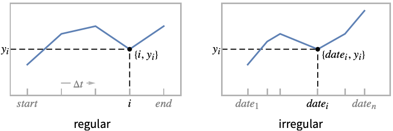
- Regular data {y1,…,yn} is plotted as a functional curve through the points {datei,yi}, with the datei evenly spaced between the starting and ending dates from datespec.
- Irregular data {{date1,y1},…,{daten,yn}} is plotted as the ordered curve through the points {datei,yi} in chronological order.
- Possible forms of datei include:
-
DateObject[…],TimeObject[…] date or time object "string" DateString specification {y,m,d,h,m,s} DateList specification {y},{y,m},{y,m,d},… shortened date list t absolute time given as a single number - In shortened date lists, omitted elements are taken to have default values {y,1,1,0,0,0}.
- Possible forms of datespec include:
-
{start,end} dates from start to end in equal increments {start,Automatic,Δt} dates beginning with start in increments Δt {Automatic,end,Δt} dates ending with end in increments Δt start dates with increments determined by the form of start - The Δt in datespec can be a {y,m,d,h,m,s} date list specification or any of the special forms "Year", "Quarter", "Month", "Week", "Day", "Hour", "Minute", "Second", and "Millisecond".
- If no explicit Δt is given, the increments used will be the smallest time unit specified explicitly in start.
- Data values yi can be given in the following forms:
-
yi a real-valued number Quantity[yi,unit] a quantity with a unit Around[yi,ei] value yi with uncertainty ei Interval[{ymin,ymax}] values between ymin and ymax - Values yi that are not of the preceding form are taken to be missing and are not shown.
- The datai have the following forms and interpretations:
-
<"k1"y1,"k2"y2,…> values {y1,y2,…} <date1y1,date2y2,…> key-value pairs {{date1,y1},{date2,y2},…} TimeSeries, EventSeries time-value pairs QuantityArray magnitudes WeightedData unweighted values - DateListPlot[Tabular[…]cspec] extracts and plots values from the tabular object using the column specification cspec.
- The following forms of column specifications cspec are allowed for plotting tabular data:
-
{colx,coly} plot column y against column x {{colx1,coly1},{colx2,coly2},…} plot column y1 against column x1, y2 against x2, … coly, {coly} plot column y as a sequence of values {{coly1},…,{colyi},…} plot columns y1, y2, … as sequences of values - The colx can also be Automatic, in which case, sequential values are generated using DataRange.
- DateListPlot[TimeSeries[…]cspec] and DateListPlot[EventSeries[…]cspec] extract and plot values from the time or event series using the component specification cspec.
- The following forms of component specifications cspec are allowed for plotting series data:
-
com plot component com against the timestamps {com1,com2,…} plot each component comi against the timestamps - The following wrappers w can be used for the datai:
-
Annotation[datai,label] provide an annotation for the data Button[datai,action] define an action to execute when the points are clicked Callout[datai,label] label the data with a callout EventHandler[datai,…] define a general event handler for the points Highlighted[datai,effect] dynamically highlight fi with an effect Highlighted[datai,Placed[effect,pos]] statically highlight fi with an effect at position pos Hyperlink[datai,uri] make the points a hyperlink Labeled[datai,label] label the data Legended[datai,label] identify the data in a legend PopupWindow[datai,cont] attach a popup window to the points StatusArea[datai,label] display in the status area on mouseover Style[datai,styles] show the points using the specified styles Tooltip[datai,label] attach a tooltip to the points Tooltip[datai] use data values as tooltip for the points - Wrappers w can be applied at multiple levels:
-
{…,w[yi],…} wrap the value yi in a list {…,w[{datei,yi}],…} wrap the point {datei,yi} w[datai] wrap the data datai w[{data1,…}] wrap a collection of data w1[w2[…]] use nested wrappers - In DateListPlot, Labeled and Placed allow the following positions:
-
Above position above curve 
Below position below curve 
Before position before curve 
After position after curve 
Start position at start of each curve 
End position at end of each curve 
x near the curve at a position x 
Scaled[s] scaled position s along the curve 
{s,Above} above relative position at position s along the curve 
{s,Below} below relative position at position s along the curve 
{pos,epos} epos in label placed at relative position pos of the curve - DateListPlot has the same options as Graphics, with the following additions and changes: [List of all options]
-
AspectRatio 1/GoldenRatio ratio of height to width Axes Automatic whether to draw axes ClippingStyle None what to draw when lines are clipped ColorFunction Automatic how to determine the coloring of lines ColorFunctionScaling True whether to scale arguments to ColorFunction DataRange Automatic the range of x values to assume for data DateFunction Automatic how to convert dates to standard form DateTicksFormat Automatic format for date tick labels IntervalMarkers Automatic how to render uncertainties IntervalMarkersStyle Automatic style for uncertainty elements Filling None how to fill in stems for each point FillingStyle Automatic style to use for filling Frame True whether to put a frame around the plot InterpolationOrder None the polynomial degree of curves used in joining data points Joined Automatic whether to join points LabelingFunction Automatic how to label points LabelingSize Automatic maximum size of callouts and labels LabelingTarget Automatic how to determine automatic label positions MaxPlotPoints Infinity the maximum number of points to include Mesh None how many mesh points to draw on each line MeshFunctions {#1&} how to determine the placement of mesh points MeshShading None how to shade regions between mesh points MeshStyle Automatic the style for mesh points Method Automatic methods to use PerformanceGoal $PerformanceGoal aspects of performance to try to optimize PlotFit None how to fit a curve to the points PlotFitElements Automatic fitted elements to show in the plot PlotHighlighting Automatic highlighting effect for curves PlotInteractivity $PlotInteractivity whether to allow interactive elements PlotLabel None overall label for the plot PlotLabels None labels for data PlotLayout "Overlaid" how to position data PlotLegends None legends for datasets PlotMarkers None markers to use to indicate each point PlotRange Automatic range of values to include PlotRangeClipping True whether to clip at the plot range PlotStyle Automatic graphics directives to determine styles of points PlotTheme $PlotTheme overall theme for the plot ScalingFunctions None how to scale individual coordinates TargetUnits Automatic units to display in the plot - DataRange determines how values {y1,…,yn} are interpreted into {{date1,y1},…,{xn,yn}}. Possible settings include:
-
Automatic,All uniform from 1 to n {xmin,xmax} uniform from xmin to xmax - In general, a list of pairs {{x1,y1},{x2,y2},…} is interpreted as a list of points, but the setting DataRangeAll forces it to be interpreted as multiple data {{y11,y12},{y21,y23},…}.
- The default setting JoinedAutomatic draws most forms of data as joined curves, but data from EventSeries is displayed as discrete points.
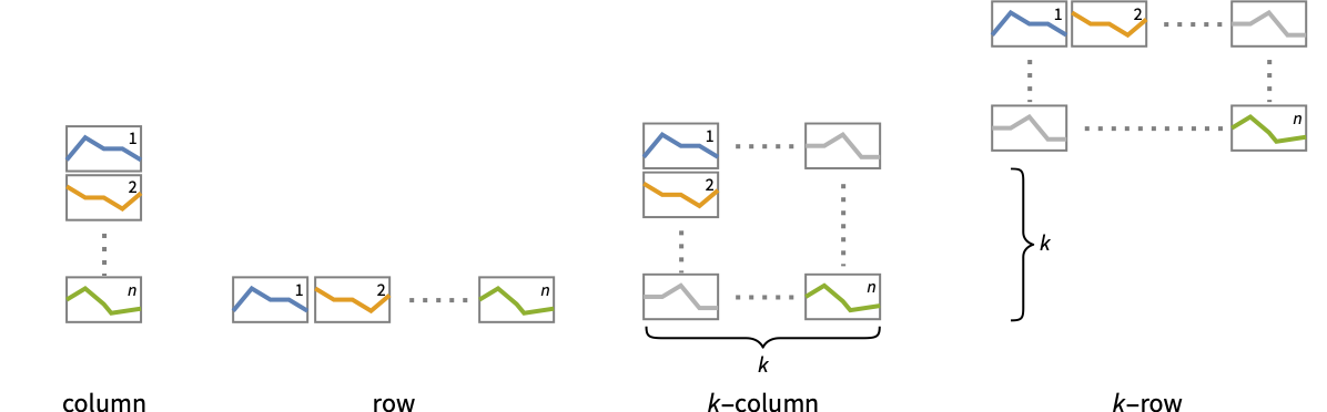
- Possible settings for PlotLayout that show multiple curves in a single plot panel include:
-

"Overlaid" show all the data overlapping 
"Stacked" accumulate the data 
"Percentile" accumulate and normalize the data - Possible settings for PlotLayout that show single curves in multiple plot panels include:
-
"Column" use separate curves in a column of panels "Row" use separate curves in a row of panels {"Column",k},{"Row",k} use k columns or rows {"Column",UpTo[k]},{"Row",UpTo[k]} use at most k columns or rows - Typical settings for PlotLegends include:
-
None no legend Automatic automatically determine legend {lbl1,lbl2,…} use lbl1, lbl2, … as legend labels Placed[lspec,…] specify placement for legend - PlotStylesty specifies the styles to use for each curve. Possible settings include:
-
{sty1,sty2,…} sequence of styles for the datasets <"key"val,…> styling elements for different levels of data - The accepted keys are:
-
"Base" overall style for all the datai "Lists" list of styles styi for each datai - ColorData["DefaultPlotColors"] gives the default sequence of colors used by PlotStyle.
- ScalingFunctions->"scale" scales the
 coordinate; ScalingFunctions{"scalex","scaley"} scales both the
  and
and  coordinates.
 - All explicit
 coordinates in Prolog, Epilog, Ticks, etc. are taken to be dates.
 - Possible highlighting effects for Highlighted and PlotHighlighting include:
-
style highlight the indicated data 
"Ball" highlight and label the indicated point in data 
"Dropline" highlight and label the indicated point in data with droplines to the axes 
"XSlice" highlight and label all points along a vertical slice 
"YSlice" highlight and label all points along a horizontal slice 
Placed[effect,pos] statically highlight the given position pos - Highlight position specifications pos include:
-
x, {x} effect at {x,y} with y chosen automatically {x,y} effect at {x,y} {pos1,pos2,…} multiple positions posi
List of all options
Examples
open all close allBasic Examples (6)
Plot data with explicit date values:
DateListPlot[{{DateObject[{2016, 10, 1}, "Day", "Gregorian", -5.], 10}, {DateObject[{2016, 10, 15}, "Day", "Gregorian", -5.], 17}, {DateObject[{2016, 10, 30}, "Day", "Gregorian", -5.], 15}, {DateObject[{2016, 11, 20}, "Day", "Gregorian", -5.], 20}}]Plot monthly values, starting in August 2000:
DateListPlot[{1, 1, 2, 3, 5, 8, 11}, DateObject[{2000, 8}, "Month"]]Plot multiple time series with a legend:
data1 = TimeSeries[{1, 1, 2, 3, 5, 8, 11}, {DateObject[{2015, 1, 1}, "Day"]}];
data2 = TimeSeries[{5, 8, 9, 6, 2, 4, 7}, {DateObject[{2015, 1, 1}, "Day"]}];DateListPlot[{data1, data2}, PlotLegends -> {"first", "second"}]DateListPlot[{{4, 9, 18, 27, 34, 40, 49, 54, 64, 72}, {1, 9, 11, 16, 18, 25, 34, 43, 49, 54}}, DateObject[{2025, 1, 1}, "Day"], PlotLabels -> {"first", "second"}]Plot an individual component from a time series:
DateListPlot[TimeSeries[TimeEventSeries`TimestampData[Association["UniformlySpacedQ" -> True, "Count" -> 10,
   "Endpoints" -> TabularColumn[Association[
      "Data" -> {2, {{NumericArray[{15706, -2147483648}, "Integer32"], {},
          DataStructure["BitVe ... 7, 34, 40, 49, 54, 64, 72}, {}, None},
           "ElementType" -> "Integer64"]], TabularColumn[Association[
           "Data" -> {{1, 9, 11, 16, 18, 25, 34, 43, 49, 54}, {}, None},
           "ElementType" -> "Integer64"]]}}]]]], Association[]] -> "a", PlotLabels -> Automatic]
Retrieve and plot a historical stock price:
DateListPlot[FinancialData["IBM", DateObject[{2024, 1, 1}, "Day"]]]Scope (49)
Data (11)
Plot a time series of temperatures:
data = WeatherData["KCMI", "MeanTemperature", {{2013, 1, 1}, {2013, 1, 31}, "Day"}]DateListPlot[data, FrameLabel -> Automatic, TargetUnits -> "Fahrenheit"]Plot all the data in TimeSeries or EventSeries:
DateListPlot[TimeSeries[TimeEventSeries`TimestampData[Association["UniformlySpacedQ" -> False,
   "Timestamps" -> TabularColumn[Association[
      "Data" -> {7, {{NumericArray[{-248, 118, 298, 638, 865, 1006, 1216}, "Integer32"], {},
          None}}, None},  ...   "Data" -> {{32, 62, 112, 167, 179, 209, 214}, {}, None}, "ElementType" -> "Integer64"]],
         TabularColumn[Association["Data" -> {{30, 49, 81, 125, 142, 174, 177}, {}, None},
           "ElementType" -> "Integer64"]]}}]]]], Association[]]]
Plot a specific component of a TimeSeries or EventSeries:
trees = TimeSeries[TimeEventSeries`TimestampData[Association["UniformlySpacedQ" -> False,
   "Timestamps" -> TabularColumn[Association[
      "Data" -> {7, {{NumericArray[{-248, 118, 298, 638, 865, 1006, 1216}, "Integer32"], {},
          None}}, None},  ...   "Data" -> {{32, 62, 112, 167, 179, 209, 214}, {}, None}, "ElementType" -> "Integer64"]],
         TabularColumn[Association["Data" -> {{30, 49, 81, 125, 142, 174, 177}, {}, None},
"ElementType" -> "Integer64"]]}}]]]], Association[]];DateListPlot[trees -> "tree 1"]DateListPlot[trees -> {"tree 1", "tree 2"}]Dates given as AbsoluteTime specifications:
data = {{3368649600, 10}, {3369859200, 12}, {3371155200, 15}, {3372969600, 20}};DateListPlot[data]Dates given as DateString specifications:
data = {{"June 2006", 10}, {"August 2006", 12}, {"November 2006", 15}, {"January 2007", 20}};DateListPlot[data]Dates given as elided DateList specifications:
data = {{{2006, 6}, 10}, {{2006, 8}, 12}, {{2006, 11}, 15}, {{2007, 1}, 20}};DateListPlot[data]Plot a series of data using an initial starting date or time:
DateListPlot[Sin[Range[100] / (2Pi)], "August 15, 2006"]DateListPlot[Sin[Range[100] / (2Pi)], {2006, 8, 15, 12, 15, 0}]Plot data spaced equally in time between a starting and ending date:
DateListPlot[Sqrt[Range[10]], {{2006, 5, 5}, {2006, 5, 30}}]Plot data gathered every 90 days, starting on January 1, 2006:
DateListPlot[Range[10], {{2006, 1, 1}, Automatic, {0, 0, 90}}]Plot data gathered on the 15![]() day of each month, starting in January:
day of each month, starting in January:
DateListPlot[Range[10], {{2006, 1, 15}, Automatic, "Month"}]Dates determined by an ending date and a step:
DateListPlot[ArcTan[Range[50] / 5], {Automatic, "September 2010", "Month"}]Use ScalingFunctions to scale the axes:
DateListPlot[FinancialData["IBM", "Jan. 1, 2010"], ScalingFunctions -> "Log"]Special Data (4)
Use Quantity to include units with the data:
DateListPlot[Quantity[Sqrt[Range[10]], "Meters"], {2010, 1, 1}, FrameLabel -> Automatic]Plot data in a QuantityArray:
qa = QuantityArray[RandomReal[{0, 40}, 20], "Fahrenheit"]DateListPlot[qa, {2000, 1, 1}, FrameLabel -> Automatic]Specify the units used with TargetUnits:
DateListPlot[qa, {2000, 1, 1}, TargetUnits -> "Kelvin", FrameLabel -> Automatic]Numeric values in an Association are used as the ![]() coordinates:
coordinates:
DateListPlot[<|"a" -> 2, "b" -> 3, "c" -> 5, "d" -> 7, "e" -> 11, "f" -> 13|>, "Jan, 1, 2010"]Numeric keys and values in an Association are used as the ![]() and
and ![]() coordinates:
coordinates:
DateListPlot[<|2 -> 1, 3 -> 2, 5 -> 3, 7 -> 4, 11 -> 5, 13 -> 6|>]DateListPlot[Table[Around[n, RandomReal[1, 2]], {n, 10}], {2010, 1, 1}]DateListPlot[Table[Interval[RandomReal[{n - 1, n + 1}, 2]], {n, 10}], {2010, 1, 1}]DateListPlot[Table[Interval[RandomReal[{n - 1, n + 1}, 2]], {n, 10}], {2010, 1, 1}, IntervalMarkers -> "Bands"]Tabular Data (1)
Get tabular data for historical populations of several countries:
tab = Tabular[IconizedObject[«Country populations»]]Plot the population of France from 1940 to 2020:
DateListPlot[tab -> {"Date", "France"}]Plot the populations of France, Germany and Australia:
DateListPlot[tab -> {{"Date", "France"}, {"Date", "Germany"}, {"Date", "Australia"}}]Include legends for the plot, using the column names:
DateListPlot[tab -> {{"Date", "France"}, {"Date", "Germany"}, {"Date", "Australia"}}, PlotLegends -> {"France", "Germany", "Australia"}]Wrappers (8)
Use wrappers on individual data, datasets, or collections of datasets:
{DateListPlot[{Style[{1, 1, 2, 3, 5, 8}, Green], {2, 3, 5, 7, 11}}, {2014, 8}], DateListPlot[Style[{{1, 1, 2, 3, 5, 8}, {2, 3, 5, 7, 11}}, Blue], {2014, 8}]}DateListPlot[Style[{Style[{1, 1, 2, 3, 5, 8}, Green], {2, 3, 5, 7, 11}}, Blue], {2014, 8}]Use the value of each point as a tooltip:
DateListPlot[Tooltip[Prime[Range[10]]], {2014, 8}, Mesh -> Full]Use a specific label for all the points:
DateListPlot[Tooltip[Prime[Range[10]], "primes"], {2014, 8}, Mesh -> Full]Use PopupWindow to provide additional drilldown information:
DateListPlot[{1, PopupWindow[2, DateListPlot[FinancialData["IBM", "Jan. 1, 2004"]]], 3}, {2004, 1}, Mesh -> Full, PlotStyle -> PointSize[0.05]]Button can be used to trigger any action:
DateListPlot[{1, Button[2, Speak[2]], 3}, {2014, 8}, Mesh -> Full, PlotStyle -> PointSize[0.05]]Use Annotation for dynamic action when the mouse enters the plot:
data = TemporalData[TimeSeries, {{{7, 12, 15, 20}}, {{{3368649600, 3369859200, 3371155200, 3372969600}}},
  1, {"Continuous", 1}, {"Discrete", 1}, 1, {ValueDimensions -> 1, DateFunction -> Automatic,
ResamplingMethod -> {"Interpolation", InterpolationOrder -> 1}}}, True, 10.2];{DateListPlot[Annotation[data, "label", "Mouse"]], Dynamic[MouseAnnotation[]]}Use Hyperlink to jump to the specified link when clicked:
data = TemporalData[TimeSeries, {{{7, 12, 15, 20}}, {{{3368649600, 3369859200, 3371155200, 3372969600}}},
  1, {"Continuous", 1}, {"Discrete", 1}, 1, {ValueDimensions -> 1, DateFunction -> Automatic,
ResamplingMethod -> {"Interpolation", InterpolationOrder -> 1}}}, True, 10.2];DateListPlot[Hyperlink[data, "http://www.wolfram.com"]]Use StatusArea to display a string in the status area of the current notebook:
data = TemporalData[TimeSeries, {{{7, 12, 15, 20}}, {{{3368649600, 3369859200, 3371155200, 3372969600}}},
  1, {"Continuous", 1}, {"Discrete", 1}, 1, {ValueDimensions -> 1, DateFunction -> Automatic,
ResamplingMethod -> {"Interpolation", InterpolationOrder -> 1}}}, True, 10.2];DateListPlot[StatusArea[data, "String"]]Labeling and Legending (16)
Label data with Labeled:
data1 = Accumulate@RandomInteger[10, 10];data2 = Accumulate@RandomInteger[3, 10];DateListPlot[{Labeled[data1, "company1"], Labeled[data2, "company2"]}, {2010, 1, 1}]Label points with automatically positioned text:
DateListPlot[Table[Labeled[RandomReal[], i], {i, 15}], {2010, 1, 1}, PlotMarkers -> Automatic]Place the labels relative to the points:
Table[DateListPlot[Table[Labeled[RandomReal[], i, p], {i, 6}], {2010, 1, 1}, PlotMarkers -> Automatic, PlotLabel -> p], {p, {Above, Below, Before, After}}]Label data with PlotLabels:
data1 = Accumulate@RandomInteger[10, 10];data2 = Accumulate@RandomInteger[3, 10];DateListPlot[{data1, data2}, {2000}, PlotLabels -> {"company1", "company2"}]Place the label near the points at a date:
DateListPlot[Labeled[Accumulate@RandomInteger[10, 10], "label", {2004}], {2000}]DateListPlot[Labeled[Accumulate@RandomInteger[10, 10], "label", Scaled[0.3]], {2000}]Specify the text position relative to the point:
DateListPlot[Labeled[Accumulate@RandomInteger[10, 10], "label", {Scaled[0.3], Below}], {2000}]Include legends for each curve:
data1 = Accumulate@RandomInteger[10, 20];data2 = Accumulate@RandomInteger[3, 20];DateListPlot[{data1, data2}, {2000}, PlotLegends -> {"company1", "company2"}]data1 = Accumulate@RandomInteger[10, 20];data2 = Accumulate@RandomInteger[3, 20];DateListPlot[{Callout[data1, "company1"], Callout[data2, "company2"]}, {2000, 8}]Place a callout at a named location:
DateListPlot[{{1, 1, 2, 3, 5, 8, 11}, Callout[{4, 7, 8, 5, 3, 4, 1}, "max", Above]}, {2000, 8}]Place a callout at a specific location:
DateListPlot[Callout[{1, 1, 2, 3, 5, 8, 11}, "label", DateObject[{2000, 10, 1}, "Day", "Gregorian", -6.]], {2000, 8}]Specify the maximum size of labels:
data = Rule[TimeSeries[{1, 1, 2, 3, 5, 8, 11}, {"Jan 1, 2015"}], RandomWord[7]];DateListPlot[data, LabelingSize -> 30]DateListPlot[data, LabelingSize -> Full]Use Legended to provide a legend for a specific dataset:
data1 = Accumulate@RandomInteger[10, 20];data2 = Accumulate@RandomInteger[3, 20];DateListPlot[{data1, data2, Legended[data1 - data2, "difference"]}, {200}]Use Placed to change the legend location:
DateListPlot[{data1, data2, Legended[data1 - data2, Placed["difference", Bottom]]}, {200}]Use Association keys as labels:
data1 = Accumulate@RandomInteger[10, 20];data2 = Accumulate@RandomInteger[3, 20];DateListPlot[<|"company A" -> data1, "company B" -> data2|>, {2000}, PlotLabels -> Automatic, PlotLegends -> None]Plots usually have interactive callouts showing the coordinates when you mouse over them:
DateListPlot[Range[10], {2007}]Including specific wrappers or interactions, such as tooltips, turns off the interactive features:
DateListPlot[Callout[Range[10], "hello", "01/01/2012"], {2007}]Choose from multiple interactive highlighting effects:
{DateListPlot[Range[10], {2007}, PlotHighlighting -> "Dropline"], DateListPlot[Range[10], {2007}, PlotHighlighting -> "XSlice"]}Use Highlighted to emphasize specific points in a plot:
DateListPlot[Highlighted[Range[10], Placed["Ball", DateObject[{2011, 1, 1}]]], {2007}]Use Highlighted[…,None] to disable highlighting for a single dataset:
DateListPlot[{Range[10], Highlighted[2 * Range[10], None]}, {2007}]Presentation (9)
Multiple curves are automatically colored to be distinct:
data = {TemporalData[TimeSeries, {{{0.001728865808273472, -0.01590632147490456, -0.0018485884757761806,
    0.006648303196752581, -0.008821574894342765, -0.011374996477267585, 0.014105518254347471,
    -0.005791611372873207, -0.016712024386437596, 0.0442 ... ,
     3473452800, 3473539200, 3473625600, 3473712000, 3473971200}}}, 1, {"Continuous", 1},
  {"Discrete", 1}, 1, {ValueDimensions -> 1, DateFunction -> Automatic,
   ResamplingMethod -> {"Interpolation", InterpolationOrder -> 1}}}, True, 10.4], TemporalData[TimeSeries, {{{-0.012079959639636706, -0.00649603754683159, -0.0034615116740605023,
    0.010034759075811639, -0.010470083438789857, 0.007954880980081347, -0.0021454152647096825,
    0.015971751173178284, -0.004005729627509891, 0.017 ... ,
     3473452800, 3473539200, 3473625600, 3473712000, 3473971200}}}, 1, {"Continuous", 1},
  {"Discrete", 1}, 1, {ValueDimensions -> 1, DateFunction -> Automatic,
ResamplingMethod -> {"Interpolation", InterpolationOrder -> 1}}}, True, 10.4]};DateListPlot[data]Provide explicit styling to different curves:
data = {TemporalData[TimeSeries, {{{0.001728865808273472, -0.01590632147490456, -0.0018485884757761806,
    0.006648303196752581, -0.008821574894342765, -0.011374996477267585, 0.014105518254347471,
    -0.005791611372873207, -0.016712024386437596, 0.0442 ... ,
     3473452800, 3473539200, 3473625600, 3473712000, 3473971200}}}, 1, {"Continuous", 1},
  {"Discrete", 1}, 1, {ValueDimensions -> 1, DateFunction -> Automatic,
   ResamplingMethod -> {"Interpolation", InterpolationOrder -> 1}}}, True, 10.4], TemporalData[TimeSeries, {{{-0.012079959639636706, -0.00649603754683159, -0.0034615116740605023,
    0.010034759075811639, -0.010470083438789857, 0.007954880980081347, -0.0021454152647096825,
    0.015971751173178284, -0.004005729627509891, 0.017 ... ,
     3473452800, 3473539200, 3473625600, 3473712000, 3473971200}}}, 1, {"Continuous", 1},
  {"Discrete", 1}, 1, {ValueDimensions -> 1, DateFunction -> Automatic,
ResamplingMethod -> {"Interpolation", InterpolationOrder -> 1}}}, True, 10.4]};DateListPlot[data, PlotStyle -> {Dashed, Red}]Include legends for each dataset:
DateListPlot[{FinancialData["AAPL", "FractionalChange", {{2010, 1}, {2010, 2}}], FinancialData["IBM", "FractionalChange", {{2010, 1}, {2010, 2}}]}, PlotLegends -> {"AAPL", "IBM"}]Use Legended to provide a legend for a specific dataset:
data = Accumulate[RandomInteger[{-10, 10}, 100]];
avg = MovingAverage[data, 10];DateListPlot[{data, Legended[avg, "moving average"]}, {{2013, 1, 1}, Automatic, "Day"}, Joined -> True]Use a theme with detailed ticks and grid lines:
data = {FinancialData["BAC", "FractionalChange", {{2014, 1}, {2014, 4}}], FinancialData["WFC", "FractionalChange", {{2014, 1}, {2014, 4}}]};DateListPlot[data, PlotTheme -> "Detailed"]DateListPlot[data, PlotTheme -> "Marketing"]data = {TemporalData[TimeSeries, {{{0.001728865808273472, -0.01590632147490456, -0.0018485884757761806,
0.006648303196752581, -0.008821574894342765, -0.011374996477267585, 0.014105518254347471,
-0.005791611372873207, -0.016712024386437596, 0.0442 ... ,
3473452800, 3473539200, 3473625600, 3473712000, 3473971200}}}, 1, {"Continuous", 1},
{"Discrete", 1}, 1, {ValueDimensions -> 1, DateFunction -> Automatic,
ResamplingMethod -> {"Interpolation", InterpolationOrder -> 1}}}, True, 10.4], TemporalData[TimeSeries, {{{-0.012079959639636706, -0.00649603754683159, -0.0034615116740605023,
0.010034759075811639, -0.010470083438789857, 0.007954880980081347, -0.0021454152647096825,
0.015971751173178284, -0.004005729627509891, 0.017 ... ,
3473452800, 3473539200, 3473625600, 3473712000, 3473971200}}}, 1, {"Continuous", 1},
{"Discrete", 1}, 1, {ValueDimensions -> 1, DateFunction -> Automatic,
ResamplingMethod -> {"Interpolation", InterpolationOrder -> 1}}}, True, 10.4]};DateListPlot[data, Filling -> Axis]DateListPlot[data, Filling -> {1 -> {2}}]Use shapes to distinguish different datasets:
data = {TemporalData[TimeSeries, {{{0.001728865808273472, -0.01590632147490456, -0.0018485884757761806,
    0.006648303196752581, -0.008821574894342765, -0.011374996477267585, 0.014105518254347471,
    -0.005791611372873207, -0.016712024386437596, 0.0442 ... ,
     3473452800, 3473539200, 3473625600, 3473712000, 3473971200}}}, 1, {"Continuous", 1},
  {"Discrete", 1}, 1, {ValueDimensions -> 1, DateFunction -> Automatic,
   ResamplingMethod -> {"Interpolation", InterpolationOrder -> 1}}}, True, 10.4], TemporalData[TimeSeries, {{{-0.012079959639636706, -0.00649603754683159, -0.0034615116740605023,
    0.010034759075811639, -0.010470083438789857, 0.007954880980081347, -0.0021454152647096825,
    0.015971751173178284, -0.004005729627509891, 0.017 ... ,
     3473452800, 3473539200, 3473625600, 3473712000, 3473971200}}}, 1, {"Continuous", 1},
  {"Discrete", 1}, 1, {ValueDimensions -> 1, DateFunction -> Automatic,
ResamplingMethod -> {"Interpolation", InterpolationOrder -> 1}}}, True, 10.4]};DateListPlot[data, Mesh -> Full, PlotMarkers -> Automatic]Plot the data in a stacked layout:
data1 = {{DateObject[{2016, 10, 1}, "Day", "Gregorian", -5.], 10}, {DateObject[{2016, 10, 15}, "Day", "Gregorian", -5.], 17}, {DateObject[{2016, 10, 30}, "Day", "Gregorian", -5.], 15}, {DateObject[{2016, 11, 20}, "Day", "Gregorian", -5.], 20}};data2 = {{DateObject[{2016, 10, 1}, "Day", "Gregorian", -5.], 15}, {DateObject[{2016, 10, 15}, "Day", "Gregorian", -5.], 7}, {DateObject[{2016, 10, 30}, "Day", "Gregorian", -5.], 12}, {DateObject[{2016, 11, 20}, "Day", "Gregorian", -5.], 10}};DateListPlot[{data1, data2}, PlotLayout -> "Stacked"]Plot the data as percentiles of the total of the values:
DateListPlot[{data1, data2}, PlotLayout -> "Percentile"]Show multiple curves in a row of separate panels:
DateListPlot[{IconizedObject[«Chicago»], IconizedObject[«Miami»]}, PlotLayout -> "Row"]Use a column instead of a row:
DateListPlot[{IconizedObject[«Chicago»], IconizedObject[«Miami»]}, PlotLayout -> "Column"]DateListPlot[{IconizedObject[«Chicago»], IconizedObject[«Miami»], IconizedObject[«Phoenix»], IconizedObject[«Boston»]}, PlotLayout -> {"Row", 2}, PlotLabels -> {Entity["City", {"Chicago", "Illinois", "UnitedStates"}], Entity["City", {"Miami", "Florida", "UnitedStates"}], Entity["City", {"Phoenix", "Arizona", "UnitedStates"}], Entity["City", {"Boston", "Massachusetts", "UnitedStates"}]}]Options (134)
AspectRatio (3)
By default, DateListPlot uses a fixed height to width ratio for the plot:
data = FinancialData["TWLO", {2016, 1, 1}];DateListPlot[data]Use AspectRatio1 to make the height the same as the width:
data = FinancialData["TWLO", {2016, 1, 1}];DateListPlot[data, AspectRatio -> 1]AspectRatioFull adjusts the height and width to tightly fit inside other constructs:
data = FinancialData["TWLO", {2016, 1, 1}];plot = DateListPlot[data, AspectRatio -> Full];{Framed[Pane[plot, {50, 100}]], Framed[Pane[plot, {100, 100}]], Framed[Pane[plot, {100, 50}]]}Axes (1)
By default, DateListPlot uses a frame instead of axes:
data = FinancialData["TWLO", {2016, 1, 1}];DateListPlot[data, Filling -> Bottom]DateListPlot[data, Filling -> Bottom, Frame -> False, Axes -> True]Turn each axis on individually:
{DateListPlot[data, Joined -> True, Filling -> Bottom, Frame -> False, Axes -> {True, False}], DateListPlot[data, Joined -> True, Filling -> Bottom, Frame -> False, Axes -> {False, True}]}AxesLabel (4)
No axes labels are drawn by default:
DateListPlot[FinancialData["TWLO", {2016, 1, 1}], Frame -> False, Axes -> True]DateListPlot[FinancialData["TWLO", {2016, 1, 1}], Frame -> False, Axes -> True, AxesLabel -> "Price"]DateListPlot[FinancialData["TWLO", {2016, 1, 1}], Frame -> False, Axes -> True, AxesLabel -> {"Year", "Price"}]DateListPlot[FinancialData["TWLO", {2016, 1, 1}], Frame -> False, Axes -> True, AxesLabel -> Automatic]AxesOrigin (2)
The position of the axes is determined automatically:
DateListPlot[FinancialData["TWLO", {2016, 1, 1}], {2007}, Axes -> True, Frame -> False]Specify an explicit origin for the axes:
{DateListPlot[FinancialData["TWLO", {2016, 1, 1}], {2007}, Axes -> True, Frame -> False, AxesOrigin -> {"July 1, 2019", 0}], DateListPlot[FinancialData["TWLO", {2016, 1, 1}], {2007}, Axes -> True, Frame -> False, AxesOrigin -> {"July 1, 2021", 0}]}AxesStyle (1)
Change the style for the axes:
data = FinancialData["TWLO", {2016, 1, 1}];DateListPlot[data, Filling -> Bottom, Frame -> False, Axes -> True, AxesStyle -> Red]Specify the style of each axis:
DateListPlot[data, Filling -> Bottom, Frame -> False, Axes -> True, AxesStyle -> {{Thick, Red}, {Thick, Blue}}]Use different styles for the ticks and the axes:
DateListPlot[data, Filling -> Bottom, Frame -> False, Axes -> True, AxesStyle -> Green, TicksStyle -> StandardGray]Use different styles for the labels and the axes:
DateListPlot[data, Filling -> Bottom, Frame -> False, Axes -> True, AxesStyle -> Green, LabelStyle -> StandardGray]DateFunction (2)
Prepend a year to create dates from {month,day} lists:
data = {{{10, 1}, 8}, {{10, 10}, 10}, {{10, 20}, 12}, {{10, 24}, 14}, {{11, 5}, 15}, {{11, 15}, 20}};DateListPlot[data, DateFunction :> (Join[{2006}, #]&)]Define functions for interpreting ambiguous date strings:
data = {{"06/01/06", 8}, {"07/01/06", 10}, {"08/01/06", 12}, {"09/01/06", 14}, {"10/01/06", 15}, {"11/01/06", 20}};DateListPlot[data, DateFunction :> (DateList[{#, {"Month", "Day", "YearShort"}}]&)]DateListPlot[data, DateFunction :> (DateList[{#, {"Day", "Month", "YearShort"}}]&)]DateListPlot[data, DateFunction :> (DateList[{#, {"YearShort", "Month", "Day"}}]&)]DateTicksFormat (1)
Specify the format of date ticks as DateString elements:
data = {{{2006, 10, 1}, 8}, {{2006, 10, 10}, 10}, {{2006, 10, 20}, 12}, {{2006, 10, 24}, 14}, {{2006, 11, 5}, 15}, {{2006, 11, 15}, 20}};DateListPlot[data, DateTicksFormat -> {"MonthShort", "/", "Day"}]Epilog (1)
Place text using a shortened DateList as the ![]() coordinate:
coordinate:
DateListPlot[Range[10], {2007}, Epilog :> Text["linear trend", {{2010, 1, 15}, 6}]]Filling (1)
Frame (4)
DateListPlot uses a frame by default:
DateListPlot[Range[10], {2007}]Use FrameFalse to turn off the frame:
DateListPlot[Range[10], {2007}, Frame -> False]Draw a frame on the left and right edges:
DateListPlot[Range[10], {2007}, Frame -> {{True, True}, {False, False}}]Draw a frame on the left and bottom edges:
DateListPlot[Range[10], {2007}, Frame -> {{True, False}, {True, False}}]FrameLabel (4)
Place a label along the bottom frame of a plot:
DateListPlot[Range[10], {2007}, FrameLabel -> {"label"}]Frame labels are placed on the bottom and left frame edges by default:
DateListPlot[Range[10], {2007}, FrameLabel -> {"Bottom", "Left"}]Place labels on each of the edges in the frame:
DateListPlot[Range[10], {2007}, FrameLabel -> {{"left", "right"}, {"bottom", "top"}}]Use a customized style for both labels and frame tick labels:
DateListPlot[Range[10], {2007}, FrameLabel -> {{"left", "right"}, {"bottom", "top"}}, LabelStyle -> Directive[Bold, StandardPurple]]FrameStyle (2)
Specify the style of the frame:
DateListPlot[Range[10], {2007}, FrameStyle -> Directive[StandardBrown, Thick]]Specify style for each frame edge:
DateListPlot[Range[10], {2007}, FrameStyle -> {{Directive[Green, Thick], Directive[Red, Thick]}, {Directive[Gray, Thick], Directive[Blue, Thick]}}]FrameTicks (10)
Frame ticks are placed automatically by default:
DateListPlot[Range[10], {2007}]DateListPlot[Range[10], {2007}, FrameTicks -> None]Use different date specifications:
DateListPlot[Sqrt[Range[10]], {2007, 4, 10}, FrameTicks -> {{Automatic, Automatic}, {{"April 12, 2007", "April 18, 2007"}, Automatic}}]DateListPlot[Sqrt[Range[10]], {2007, 4, 10}, FrameTicks -> {{Automatic, Automatic}, {{3385324800, 3385843200}, Automatic}}]Use frame ticks on the bottom edge:
DateListPlot[Range[10], {2007}, FrameTicks -> {{None, None}, {Automatic, None}}]By default, the top and right edges have tick marks but no tick labels:
DateListPlot[Range[10], {2007}, FrameTicks -> Automatic]Use All to include tick labels on all edges:
DateListPlot[Range[10], {2007}, FrameTicks -> All]Place tick marks at specific positions:
DateListPlot[Range[10], {2007}, FrameTicks -> {{{2, .5, 10}, None}, {{"July 1, 2011", "July 1, 2014"}, None}}]Draw frame tick marks at the specified positions with specific labels:
DateListPlot[Range[10], {2007}, FrameTicks -> {{{{2, "two"}, {5, "five"}, {10, "ten"}}, None}, {{{"July 1, 2011", "date 1"}, {"July 1, 2014", "date 2"}}, None}}]Specify the lengths for tick marks as a fraction of the graphics size:
DateListPlot[Range[10], {2007}, FrameTicks -> {{{{2, "two", .15}, {5, "five", .45}, {10, "ten", .95}}, None}, {Automatic, None}}]Use different sizes in the positive and negative directions for each tick mark:
DateListPlot[Range[10], {2007}, FrameTicks -> {{{{2, "two", {.15, .1}}, {5, "five", {.45, .2}}, {10, "ten", {.95, .3}}}, None}, {Automatic, None}}]Specify a style for each frame tick:
DateListPlot[Range[10], {2007}, FrameTicks -> {{{{2, "two", .15, Directive[Blue, Thick]}, {5, "five", .45, Directive[Red, Thick, Dashed]}, {10, "ten", .95, Directive[Green, Thick, Dashed]}}, None}, {Automatic, None}}]Construct a function that places frame ticks at the midpoint and extremes of the frame edge:
minMeanMax[min_, max_] := {{min, min}, {(max + min) / 2, (max + min) / 2}, {max, max}}DateListPlot[Range[10], {2007}, FrameTicks -> {{minMeanMax, None}, {Automatic, None}}, PlotRangePadding -> None]FrameTicksStyle (3)
By default, the frame ticks and frame tick labels use the same styles as the frame:
DateListPlot[Range[10], {2007}, FrameStyle -> Directive[Red]]Specify an overall style for the ticks, including the labels:
DateListPlot[Range[10], {2007}, FrameStyle -> Directive[Red], FrameTicksStyle -> Directive[Blue, Thick]]Use different styles for the different frame edges:
DateListPlot[Range[10], {2007}, FrameTicks -> All, FrameTicksStyle -> {{Directive[Orange, Thick], Blue}, {Red, Green}}]GridLines (1)
Include grid lines at specific dates:
DateListPlot[Sqrt[Range[15]], {2007, 4, 10}, GridLines -> {{{2007, 4, 15}, "Apr 22, 2007"}, None}]Make the first grid line Blue:
DateListPlot[Sqrt[Range[15]], {2007, 4, 10}, GridLines -> {{{{2007, 4, 15}, Blue}, "Apr 22, 2007"}, None}]ImageSize (7)
Use named sizes such as Tiny, Small, Medium and Large:
data = FinancialData["TWLO", {2016, 1, 1}];{DateListPlot[data, ImageSize -> Tiny], DateListPlot[data, ImageSize -> Small]}Specify the width of the plot:
data = FinancialData["TWLO", {2016, 1, 1}];{DateListPlot[data, ImageSize -> 150], DateListPlot[data, AspectRatio -> 1.5, ImageSize -> 150]}Specify the height of the plot:
{DateListPlot[data, ImageSize -> {Automatic, 150}], DateListPlot[data, AspectRatio -> 2, ImageSize -> {Automatic, 150}]}Allow the width and height to be up to a certain size:
data = FinancialData["TWLO", {2016, 1, 1}];{DateListPlot[data, ImageSize -> UpTo[200]], DateListPlot[data, AspectRatio -> 2, ImageSize -> UpTo[200]]}Specify the width and height for a graphic, padding with space if necessary:
data = FinancialData["TWLO", {2016, 1, 1}];DateListPlot[data, ImageSize -> {200, 200}, Background -> Gray]Setting AspectRatioFull will fill the available space:
DateListPlot[data, AspectRatio -> Full, ImageSize -> {200, 200}, Background -> StandardGray]Use maximum sizes for the width and height:
data = FinancialData["TWLO", {2016, 1, 1}];{DateListPlot[data, ImageSize -> {UpTo[150], UpTo[100]}], DateListPlot[data, AspectRatio -> 2, ImageSize -> {UpTo[150], UpTo[100]}]}Use ImageSizeFull to fill the available space in an object:
data = FinancialData["TWLO", {2016, 1, 1}];Framed[Pane[DateListPlot[data, ImageSize -> Full, Background -> StandardGray], {200, 100}]]data = FinancialData["TWLO", {2016, 1, 1}];Specify the image size as a fraction of the available space:
Framed[Pane[DateListPlot[data, ImageSize -> {Scaled[0.5], Scaled[0.5]}, Background -> StandardGray], {200, 100}]]IntervalMarkers (3)
By default, uncertainties are capped:
DateListPlot[Table[Around[RandomReal[], 0.1], 10], Today]Use bars to denote uncertainties without caps:
DateListPlot[Table[Around[RandomReal[], 0.1], 10], Today, IntervalMarkers -> "Bars"]Use bands to represent uncertainties:
DateListPlot[Table[Around[RandomReal[], .1], 10], Today, IntervalMarkers -> "Bands"]IntervalMarkersStyle (2)
Uncertainties automatically inherit the plot style:
DateListPlot[{Table[Around[RandomReal[20], 1], 10], Table[Around[RandomReal[20], 1], 10]}, Today, PlotStyle -> {Red, Blue}]Specify the style for uncertainties:
DateListPlot[{Table[Around[RandomReal[20], 1], 10], Table[Around[RandomReal[20], 1], 10]}, Today, IntervalMarkersStyle -> Gray]Joined (4)
Plot data with points joined by a line:
DateListPlot[Sin[Range[100] / Pi], {2006, 1, 1}, Joined -> True]Plot multiple datasets with points joined:
data1 = {{{2006, 10, 1, 0, 0, 0}, 10}, {{2006, 10, 15, 0, 0, 0}, 12}, {{2006, 10, 30, 0, 0, 0}, 15}, {{2006, 11, 20, 0, 0, 0}, 20}};data2 = {{{2006, 10, 5, 0, 0, 0}, 15}, {{2006, 10, 20, 0, 0, 0}, 8}, {{2006, 11, 10, 0, 0, 0}, 5}, {{2006, 11, 15, 0, 0, 0}, 1}};DateListPlot[{data1, data2}, Joined -> True]Only join points for the first dataset:
DateListPlot[{data1, data2}, Joined -> {True, False}]TimeSeries is shown as continuous lines:
DateListPlot[TimeSeries[TimeEventSeries`TimestampData[Association["UniformlySpacedQ" -> False,
   "Timestamps" -> TabularColumn[Association[
      "Data" -> {12, {{NumericArray[{20089, 20120, 20148, 20179, 20209, 20240, 20270, 20301, 20332,
           20362,  ...       146, 166}, {}, None}, "ElementType" -> "Integer64"]],
         TabularColumn[Association["Data" -> {{204, 188, 235, 227, 234, 264, 302, 293, 259, 229,
              203, 229}, {}, None}, "ElementType" -> "Integer64"]]}}]]]], Association[]]]
EventSeries is shown as discrete points:
DateListPlot[EventSeries[TimeEventSeries`TimestampData[Association["UniformlySpacedQ" -> False,
   "Timestamps" -> TabularColumn[Association[
      "Data" -> {12, {{NumericArray[{20089, 20120, 20148, 20179, 20209, 20240, 20270, 20301, 20332,
           20362, ...       146, 166}, {}, None}, "ElementType" -> "Integer64"]],
         TabularColumn[Association["Data" -> {{204, 188, 235, 227, 234, 264, 302, 293, 259, 229,
              203, 229}, {}, None}, "ElementType" -> "Integer64"]]}}]]]], Association[]]]
LabelingFunction (3)
By default, points are automatically labeled with strings:
DateListPlot[{1, 1, 2, 3, 5, 8} -> {"a", "b", "c", "d", "e", "f"}, {2000}]Use LabelingFunction->None to suppress the labels:
DateListPlot[{1, 1, 2, 3, 5, 8} -> {"a", "b", "c", "d", "e", "f"}, {2000}, LabelingFunction -> None]Put the labels above the points:
DateListPlot[{1, 1, 2, 3, 5, 8} -> {"a", "b", "c", "d", "e", "f"}, {2000}, LabelingFunction -> (Placed[Last@#1, Above] &)]DateListPlot[{1, 1, 2, 3, 5, 8} -> {"a", "b", "c", "d", "e", "f"}, {2000}, LabelingFunction -> (Placed[Last@#1, Tooltip] &), PlotMarkers -> Automatic]LabelingSize (4)
Textual labels are shown at their actual sizes:
DateListPlot[TimeSeries[{1, 1, 2, 3, 5, 8}, {"Jan 1, 2015"}] -> {"healthfulness", "obstreperous", "spectrogram", "vestige", "coinage", "limey"}, ImageSize -> Medium]Image labels are automatically resized:
DateListPlot[TimeSeries[{1, 1, 2, 3, 5, 8}, {"Jan 1, 2015"}] -> {[image], [image], [image], [image], [image], [image]}, ImageSize -> Medium]Specify a maximum size for textual labels:
DateListPlot[TimeSeries[{1, 1, 2, 3, 5, 8}, {"Jan 1, 2015"}] -> {"healthfulness", "obstreperous", "spectrogram", "vestige", "coinage", "limey"}, ImageSize -> Medium, LabelingSize -> 30]Specify a maximum size for image labels:
DateListPlot[TimeSeries[{1, 1, 2, 3, 5, 8}, {"Jan 1, 2015"}] -> {[image], [image], [image], [image], [image], [image]}, ImageSize -> Medium, LabelingSize -> 20]Show image labels at their natural sizes:
DateListPlot[TimeSeries[{1, 1, 2, 3, 5, 8}, {"Jan 1, 2015"}] -> {[image], [image], [image], [image], [image], [image]}, ImageSize -> Medium, LabelingSize -> Full]LabelingTarget (6)
Labels are automatically placed to maximize readability:
DateListPlot[IconizedObject[«data»], Today]DateListPlot[IconizedObject[«data»], Today, LabelingTarget -> All]Use a denser layout for the labels:
DateListPlot[IconizedObject[«data»], Today, LabelingTarget -> "Dense"]Show the half of the labels that are easiest to read:
DateListPlot[IconizedObject[«data»], Today, LabelingTarget -> 0.5]Only allow labels that are orthogonal to the points:
DateListPlot[IconizedObject[«data»], Today, LabelingTarget -> <|"AllowedLabelingPositions" -> "Sides"|>]Only allow labels that are diagonal to the points:
DateListPlot[IconizedObject[«data»], Today, LabelingTarget -> <|"AllowedLabelingPositions" -> "Corners"|>]Allow labels to be clipped by the edges of the plot:
DateListPlot[IconizedObject[«data»], Today, LabelingTarget -> <|"AllowLabelClipping" -> True|>]PlotFit (4)
Automatically fit a model to the data:
DateListPlot[TimeSeries[TimeEventSeries`TimestampData[Association["UniformlySpacedQ" -> False,
   "Timestamps" -> TabularColumn[Association[
      "Data" -> {252, {{{1704153600000, 1704240000000, 1704326400000, 1704412800000, 1704672000000,
           1704758 ... 22,
        139.6699981689453, 140.22000122070312, 139.92999267578125, 137.00999450683594,
        137.49000549316406, 134.2899932861328}, {}, None}}, None},
   "ElementType" -> TypeSpecifier["Quantity"]["Real64", "USDollars"]]], Association[]], PlotFit -> Automatic]
Fit a straight line to the data:
DateListPlot[TimeSeries[TimeEventSeries`TimestampData[Association["UniformlySpacedQ" -> False,
   "Timestamps" -> TabularColumn[Association[
      "Data" -> {252, {{{1704153600000, 1704240000000, 1704326400000, 1704412800000, 1704672000000,
           1704758 ... 22,
        139.6699981689453, 140.22000122070312, 139.92999267578125, 137.00999450683594,
        137.49000549316406, 134.2899932861328}, {}, None}}, None},
   "ElementType" -> TypeSpecifier["Quantity"]["Real64", "USDollars"]]], Association[]], PlotFit -> "Linear"]
Fit a quadratic curve to the data:
DateListPlot[TimeSeries[TimeEventSeries`TimestampData[Association["UniformlySpacedQ" -> False,
   "Timestamps" -> TabularColumn[Association[
      "Data" -> {252, {{{1704153600000, 1704240000000, 1704326400000, 1704412800000, 1704672000000,
           1704758 ... 22,
        139.6699981689453, 140.22000122070312, 139.92999267578125, 137.00999450683594,
        137.49000549316406, 134.2899932861328}, {}, None}}, None},
   "ElementType" -> TypeSpecifier["Quantity"]["Real64", "USDollars"]]], Association[]], PlotFit -> "Quadratic"]
Fit a periodic model to the data:
DateListPlot[TimeSeries[TimeEventSeries`TimestampData[Association["UniformlySpacedQ" -> False,
   "Timestamps" -> TabularColumn[Association[
      "Data" -> {252, {{{1704153600000, 1704240000000, 1704326400000, 1704412800000, 1704672000000,
           1704758 ... 22,
        139.6699981689453, 140.22000122070312, 139.92999267578125, 137.00999450683594,
        137.49000549316406, 134.2899932861328}, {}, None}}, None},
   "ElementType" -> TypeSpecifier["Quantity"]["Real64", "USDollars"]]], Association[]], PlotFit -> PeriodicModel[3]]//Quiet
PlotFitElements (2)
Plot confidence bands for the data, with a default confidence level of 0.95:
DateListPlot[TimeSeries[TimeEventSeries`TimestampData[Association["UniformlySpacedQ" -> False,
   "Timestamps" -> TabularColumn[Association[
      "Data" -> {61, {{NumericArray[{19724, 19725, 19726, 19727, 19730, 19731, 19732, 19733, 19734,
           19738,  ...         94.28900146484375, 95.00199890136719, 92.56099700927734, 90.25, 90.35600280761719}, {},
       None}}, None}, "ElementType" -> TypeSpecifier["Quantity"]["Real64", "USDollars"]]],
 Association["ResamplingMethod" -> "LinearInterpolation"]], PlotFit -> Automatic, PlotFitElements -> "BandCurves"]
Use a confidence level of 0.5 for the bands:
DateListPlot[TimeSeries[TimeEventSeries`TimestampData[Association["UniformlySpacedQ" -> False,
   "Timestamps" -> TabularColumn[Association[
      "Data" -> {61, {{NumericArray[{19724, 19725, 19726, 19727, 19730, 19731, 19732, 19733, 19734,
           19738,  ...         94.28900146484375, 95.00199890136719, 92.56099700927734, 90.25, 90.35600280761719}, {},
       None}}, None}, "ElementType" -> TypeSpecifier["Quantity"]["Real64", "USDollars"]]],
 Association["ResamplingMethod" -> "LinearInterpolation"]], PlotFit -> Automatic, PlotFitElements -> {"BandCurves", <|"ConfidenceLevel" -> 0.5|>}]
Show residual lines from the data points to the fitted curve:
DateListPlot[TimeSeries[TimeEventSeries`TimestampData[Association["UniformlySpacedQ" -> False,
   "Timestamps" -> TabularColumn[Association[
      "Data" -> {61, {{NumericArray[{19724, 19725, 19726, 19727, 19730, 19731, 19732, 19733, 19734,
           19738,  ...         94.28900146484375, 95.00199890136719, 92.56099700927734, 90.25, 90.35600280761719}, {},
       None}}, None}, "ElementType" -> TypeSpecifier["Quantity"]["Real64", "USDollars"]]],
 Association["ResamplingMethod" -> "LinearInterpolation"]], PlotFit -> Automatic, PlotFitElements -> "Residuals"]
Combine the original points with gray residual lines:
DateListPlot[TimeSeries[TimeEventSeries`TimestampData[Association["UniformlySpacedQ" -> False,
   "Timestamps" -> TabularColumn[Association[
      "Data" -> {61, {{NumericArray[{19724, 19725, 19726, 19727, 19730, 19731, 19732, 19733, 19734,
           19738,  ...         94.28900146484375, 95.00199890136719, 92.56099700927734, 90.25, 90.35600280761719}, {},
       None}}, None}, "ElementType" -> TypeSpecifier["Quantity"]["Real64", "USDollars"]]],
 Association["ResamplingMethod" -> "LinearInterpolation"]], PlotFit -> Automatic, PlotFitElements -> {"DataPoints", {"Residuals", <|"Style" -> Opacity[1, StandardRed]|>}}]
PlotHighlighting (9)
Plots have interactive coordinate callouts with the default setting PlotHighlightingAutomatic:
DateListPlot[Range[10], {2007}]Use PlotHighlightingNone to disable the highlighting for the entire plot:
DateListPlot[Range[10], {2007}, PlotHighlighting -> None]Move the mouse over a set of points to highlight it using arbitrary graphics directives:
DateListPlot[{Range[10], 2 * Range[10]}, {2007}, PlotHighlighting -> Directive[Red, AbsolutePointSize[10], DropShadowing[]]]Move the mouse over the points to highlight them with balls and labels:
DateListPlot[{Range[10], 2 * Range[10]}, {2007}, PlotHighlighting -> "Dropline"]Move the mouse over the curve to highlight it with a label and drop lines to the axes:
DateListPlot[Range[10], {2007}, PlotHighlighting -> "Dropline"]Use a ball and label to highlight a specific point in the plot:
DateListPlot[Range[10], {2007}, PlotHighlighting -> Placed["Dropline", DateObject[{2011, 1, 1}]]]Move the mouse over the plot to highlight it with a slice showing ![]() values corresponding to the
values corresponding to the ![]() position:
position:
DateListPlot[{Range[10], 2 * Range[10]}, {2007}, PlotHighlighting -> "XSlice"]Highlight a particular set of points at a fixed ![]() value:
value:
DateListPlot[Range[10], {2007}, PlotHighlighting -> Placed["XSlice", DateObject[{2014, 1, 1}]]]Move the mouse over the plot to highlight it with a slice showing ![]() values corresponding to the
values corresponding to the ![]() position:
position:
DateListPlot[{Range[10], 2 * Range[10]}, {2007}, PlotHighlighting -> "YSlice"]Highlight the curves at a fixed ![]() value:
value:
DateListPlot[{Range[10], 2 * Range[10]}, {2007}, PlotHighlighting -> Placed["YSlice", 10]]Use a component that shows the points on the plot closest to the ![]() position of the mouse cursor:
position of the mouse cursor:
DateListPlot[{Range[10], 2 * Range[10]}, {2007}, PlotHighlighting -> "XNearestPoint"]Specify the style for the points:
DateListPlot[{Range[10], 2 * Range[10]}, {2007}, PlotHighlighting -> {"XNearestPoint", <|"Style" -> StandardGray|>}]Use a component that shows the coordinates on the points closest to the mouse cursor:
DateListPlot[{Range[10], 2 * Range[10]}, {2007}, PlotHighlighting -> "XYLabel"]Use Callout options to change the appearance of the label:
DateListPlot[{Range[10], 2 * Range[10]}, {2007}, PlotHighlighting -> {"XYLabel", <|"Appearance" -> "Corners", "CalloutMarker" -> "Circle"|>}]Combine components to create a custom effect:
DateListPlot[{Range[10], 2 * Range[10]}, {2007}, PlotHighlighting -> {{"XNearestPoint", <|"Style" -> StandardGray|>}, {"XYLabel", <|"Appearance" -> "Corners", "CalloutMarker" -> "Circle"|>}}]PlotInteractivity (3)
Plots have interactive highlighting by default:
DateListPlot[{{2, 3, 5, 7, 11}, {13, 17, 19, 23, 29}}, Today]Turn off all the interactive elements:
DateListPlot[{{2, 3, 5, 7, 11}, {13, 17, 19, 23, 29}}, Today, PlotInteractivity -> False]Allow provided interactive elements and disable automatic ones:
DateListPlot[{{2, 3, 5, 7, 11}, Tooltip[{13, 17, 19, 23, 29}, "hello"]}, Today, PlotInteractivity -> <|"User" -> True, "System" -> False|>]PlotLabel (1)
PlotLabels (4)
data1 = Transpose[{DateRange[{2000, 1, 1}, {2000, 1, 15}], RandomReal[10, 15]}];data2 = Transpose[{DateRange[{2000, 1, 1}, {2000, 1, 15}], RandomReal[10, 15]}];DateListPlot[{data1, data2}, PlotLabels -> {"label1", "label2"}]Use an Association form to specify labels:
DateListPlot[{data1, data2}, PlotLabels -> <|"Lists" -> {"label1", "label2"}|>]Place the label above the data:
ge = FinancialData["GE", "Jan. 1, 2000"];DateListPlot[ge, PlotLabels -> Placed["high", Above]]Place the label below the data at a specific date:
DateListPlot[ge, PlotLabels -> Placed["label", {DateObject[{2009, 1, 1}], Below}]]Use a callout to label the curve:
DateListPlot[ge, PlotLabels -> Callout["label", {DateObject[{2009, 1, 1}], Above}]]PlotLabelAutomatic uses keys of an Association as data labels:
DateListPlot[<|"a" -> Accumulate@RandomInteger[10, 10], "b" -> Accumulate@RandomInteger[10, 10]|>, {2007}, PlotLabels -> Automatic, PlotLegends -> None]Use None to not add a label:
data1 = Transpose[{DateRange[{2000, 1, 1}, {2000, 1, 15}], Accumulate@RandomReal[10, 15]}];
data2 = Transpose[{DateRange[{2000, 1, 1}, {2000, 1, 15}], Accumulate@RandomReal[3, 15]}];DateListPlot[{data1, data2}, PlotLabels -> {"label1", None}]PlotLayout (4)
By default, curves are overlaid on each other:
data1 = {{DateObject[{2016, 10, 1}, "Day", "Gregorian", -5.], 10}, {DateObject[{2016, 10, 15}, "Day", "Gregorian", -5.], 17}, {DateObject[{2016, 10, 30}, "Day", "Gregorian", -5.], 15}, {DateObject[{2016, 11, 20}, "Day", "Gregorian", -5.], 20}};data2 = {{DateObject[{2016, 10, 1}, "Day", "Gregorian", -5.], 15}, {DateObject[{2016, 10, 15}, "Day", "Gregorian", -5.], 7}, {DateObject[{2016, 10, 30}, "Day", "Gregorian", -5.], 12}, {DateObject[{2016, 11, 20}, "Day", "Gregorian", -5.], 10}};DateListPlot[{data1, data2}]Plot the data in a stacked layout:
DateListPlot[{data1, data2}, PlotLayout -> "Stacked"]Plot the data as percentiles of the total of the values:
DateListPlot[{data1, data2}, PlotLayout -> "Percentile"]Place each curve in a separate panel using shared axes:
DateListPlot[{IconizedObject[«Phoenix»], IconizedObject[«Boston»], IconizedObject[«Portland»]}, ImageSize -> Medium, PlotLayout -> "Column"]Use a row instead of a column:
DateListPlot[{IconizedObject[«Phoenix»], IconizedObject[«Boston»], IconizedObject[«Portland»]}, PlotLayout -> "Row"]DateListPlot[{IconizedObject[«Phoenix»], IconizedObject[«Boston»], IconizedObject[«Portland»]}, PlotLayout -> "Row", PlotLabels -> {"Phoenix", "Boston", "Portland"}]DateListPlot[{IconizedObject[«Chicago»], IconizedObject[«Miami»], IconizedObject[«Phoenix»], IconizedObject[«Boston»], IconizedObject[«Portland»], IconizedObject[«Denver»]}, PlotLayout -> {"Column", 4}]DateListPlot[{IconizedObject[«Chicago»], IconizedObject[«Miami»], IconizedObject[«Phoenix»], IconizedObject[«Boston»], IconizedObject[«Portland»], IconizedObject[«Denver»]}, PlotLayout -> {"Column", UpTo[4]}]PlotLegends (7)
PlotLegends matches up styles in the plot:
DateListPlot[{Range[10], Range[10] + 3}, {2007}, PlotStyle -> {Directive[AbsolutePointSize[4], Blue], Directive[AbsolutePointSize[8], Red]}, PlotLegends -> Automatic]PlotLegends matches up markers in the plot:
DateListPlot[{Range[10], Range[10] ^ 2}, {2007}, PlotMarkers -> Automatic, PlotLegends -> Automatic]DateListPlot[{Range[10], Range[10] + 3, Sqrt@Range[10], Log@Range[10]}, {2007}, PlotLegends -> {"a", "b", "c", "d"}]Use an Association form to specify legends:
DateListPlot[{Range[10], Range[10] + 3, Sqrt@Range[10], Log@Range[10]}, {2007}, PlotLegends -> <|"Lists" -> {"a", "b", "c", "d"}|>]Use MetaInformation from a TimeSeries:
data = TemporalData[TimeSeries, {{{{1662.33502197266, 1572.}, {1653.52496337891, 1563.},
    {1634.92498779297, 1536.5}, {1642.40002441406, 1525.5}, {1642.40002441406, 1525.5},
    {1640.23498535156, 1521.5}, {1638.70001220703, 1530.}, {1606.10504150391 ... 1,
  {"Continuous", 1}, {"Discrete", 1}, 2,
  {MetaInformation -> {"MetalList" -> {"Gold", "Platinum"}, "Unit" -> "USDollars"/"TroyOunces"},
   ResamplingMethod -> {"Interpolation", InterpolationOrder -> 1}, ValueDimensions -> 2}}, True,
 10.];
See the available MetaInformation:
data["MetaInformation"]The metal list can be extracted directly:
data["MetalList"]DateListPlot[data, PlotLegends -> data["MetalList"]]Use Placed to specify legend placement:
Table[DateListPlot[{Range[10], Range[10] + 3}, {2007}, PlotLegends -> Placed[Automatic, pos], PlotLabel -> pos], {pos, {Above, Below}}]Table[DateListPlot[{Range[10], Range[10] + 3}, {2007}, PlotLegends -> Placed[Automatic, pos], PlotLabel -> pos], {pos, {Before, After}}]Use PointLegend to change legend appearance:
DateListPlot[{Range[10], Range[10] + 3}, {2007}, PlotLegends -> PointLegend[Automatic, {"list1", "list2"}, LegendFunction -> Panel, LegendMargins -> 5]]PlotRange (1)
PlotStyle (5)
Set a specific style directive:
DateListPlot[TimeSeries[TimeEventSeries`TimestampData[Association["UniformlySpacedQ" -> False,
   "Timestamps" -> TabularColumn[Association[
      "Data" -> {753, {{{1641168000000, 1641254400000, 1641340800000, 1641427200000, 1641513600000,
           1641772 ... 22,
        139.6699981689453, 140.22000122070312, 139.92999267578125, 137.00999450683594,
        137.49000549316406, 134.2899932861328}, {}, None}}, None},
   "ElementType" -> TypeSpecifier["Quantity"]["Real64", "USDollars"]]], Association[]], PlotStyle -> Red]
By default, different styles are chosen for multiple datasets:
DateListPlot[{TimeSeries[TimeEventSeries`TimestampData[Association["UniformlySpacedQ" -> False,
   "Timestamps" -> TabularColumn[Association[
      "Data" -> {1508, {{{1577923200000, 1578009600000, 1578268800000, 1578355200000,
           1578441600000, 157852 ... 4550781, 314.7300109863281, 315.5299987792969, 316.75, 315.1400146484375,
        311.5799865722656, 311.7900085449219, 308.0299987792969}, {}, None}}, None},
   "ElementType" -> TypeSpecifier["Quantity"]["Real64", "USDollars"]]], Association[]], TimeSeries[TimeEventSeries`TimestampData[Association["UniformlySpacedQ" -> False,
   "Timestamps" -> TabularColumn[Association[
      "Data" -> {1508, {{{1577923200000, 1578009600000, 1578268800000, 1578355200000,
           1578441600000, 157852 ... 183.69000244140625, 189.2100067138672,
        188.61000061035156, 190.52999877929688, 188.22000122070312, 187.5399932861328, 186.5}, {},
       None}}, None}, "ElementType" -> TypeSpecifier["Quantity"]["Real64", "USDollars"]]],
 Association[]]}]
Explicitly specify the style for different datasets:
DateListPlot[{TimeSeries[TimeEventSeries`TimestampData[Association["UniformlySpacedQ" -> False,
   "Timestamps" -> TabularColumn[Association[
      "Data" -> {1508, {{{1577923200000, 1578009600000, 1578268800000, 1578355200000,
           1578441600000, 157852 ... 4550781, 314.7300109863281, 315.5299987792969, 316.75, 315.1400146484375,
        311.5799865722656, 311.7900085449219, 308.0299987792969}, {}, None}}, None},
   "ElementType" -> TypeSpecifier["Quantity"]["Real64", "USDollars"]]], Association[]], TimeSeries[TimeEventSeries`TimestampData[Association["UniformlySpacedQ" -> False,
   "Timestamps" -> TabularColumn[Association[
      "Data" -> {1508, {{{1577923200000, 1578009600000, 1578268800000, 1578355200000,
           1578441600000, 157852 ... 183.69000244140625, 189.2100067138672,
        188.61000061035156, 190.52999877929688, 188.22000122070312, 187.5399932861328, 186.5}, {},
       None}}, None}, "ElementType" -> TypeSpecifier["Quantity"]["Real64", "USDollars"]]],
 Association[]]}, PlotStyle -> {RGBColor[0.4, 0.6, 1], RGBColor[0.14, 0.8, 0.14]}]
PlotStyle applies to both lines and points:
DateListPlot[{TimeSeries[TimeEventSeries`TimestampData[Association["UniformlySpacedQ" -> False,
   "Timestamps" -> TabularColumn[Association[
      "Data" -> {1508, {{{1577923200000, 1578009600000, 1578268800000, 1578355200000,
           1578441600000, 157852 ... 4550781, 314.7300109863281, 315.5299987792969, 316.75, 315.1400146484375,
        311.5799865722656, 311.7900085449219, 308.0299987792969}, {}, None}}, None},
   "ElementType" -> TypeSpecifier["Quantity"]["Real64", "USDollars"]]], Association[]], TimeSeries[TimeEventSeries`TimestampData[Association["UniformlySpacedQ" -> False,
   "Timestamps" -> TabularColumn[Association[
      "Data" -> {1508, {{{1577923200000, 1578009600000, 1578268800000, 1578355200000,
           1578441600000, 157852 ... 183.69000244140625, 189.2100067138672,
        188.61000061035156, 190.52999877929688, 188.22000122070312, 187.5399932861328, 186.5}, {},
       None}}, None}, "ElementType" -> TypeSpecifier["Quantity"]["Real64", "USDollars"]]],
 Association[]]}, Joined -> {True, False}, PlotStyle -> RGBColor[0.14, 0.8, 0.14]]
Use the association-based syntax to set a base style for all data:
DateListPlot[EventSeries[TimeEventSeries`TimestampData[Association["UniformlySpacedQ" -> False,
   "Timestamps" -> TabularColumn[Association[
      "Data" -> {12, {{NumericArray[{20089, 20120, 20148, 20179, 20209, 20240, 20270, 20301, 20332,
           20362, ...       146, 166}, {}, None}, "ElementType" -> "Integer64"]],
         TabularColumn[Association["Data" -> {{204, 188, 235, 227, 234, 264, 302, 293, 259, 229,
              203, 229}, {}, None}, "ElementType" -> "Integer64"]]}}]]]], Association[]], PlotStyle -> <|"Base" -> PointSize[Large]|>]
Use a different style for each of the datasets:
DateListPlot[EventSeries[TimeEventSeries`TimestampData[Association["UniformlySpacedQ" -> False,
   "Timestamps" -> TabularColumn[Association[
      "Data" -> {12, {{NumericArray[{20089, 20120, 20148, 20179, 20209, 20240, 20270, 20301, 20332,
           20362, ...       146, 166}, {}, None}, "ElementType" -> "Integer64"]],
         TabularColumn[Association["Data" -> {{204, 188, 235, 227, 234, 264, 302, 293, 259, 229,
              203, 229}, {}, None}, "ElementType" -> "Integer64"]]}}]]]], Association[]], PlotStyle -> <|"Lists" -> {RGBColor[0.14, 0.8, 0.14], RGBColor[0.93, 0.27, 0.27], RGBColor[0.4, 0.6, 1]}|>]
Provide an overall base style as well as styles for each dataset:
DateListPlot[EventSeries[TimeEventSeries`TimestampData[Association["UniformlySpacedQ" -> False,
   "Timestamps" -> TabularColumn[Association[
      "Data" -> {12, {{NumericArray[{20089, 20120, 20148, 20179, 20209, 20240, 20270, 20301, 20332,
           20362, ...       146, 166}, {}, None}, "ElementType" -> "Integer64"]],
         TabularColumn[Association["Data" -> {{204, 188, 235, 227, 234, 264, 302, 293, 259, 229,
              203, 229}, {}, None}, "ElementType" -> "Integer64"]]}}]]]], Association[]], PlotStyle -> <|"Base" -> PointSize[Large], "Lists" -> {StandardGreen, StandardRed, StandardBlue}|>]
PlotTheme (2)
Use a theme with a dark background in a high-contrast color scheme:
DateListPlot[{Sqrt[Range[20]], Log[Range[20]]}, {2007, 1, 1}, PlotTheme -> "Marketing"]DateListPlot[{Sqrt[Range[20]], Log[Range[20]]}, {2007, 1, 1}, PlotTheme -> "Marketing", PlotStyle -> {StandardRed, StandardBlue}]Prolog (1)
Place text using a shortened DateList as the ![]() coordinate:
coordinate:
DateListPlot[Range[10], {2007}, Prolog :> Text["linear trend", {{2010, 1, 15}, 6}]]ScalingFunctions (7)
By default, plots have linear scales in each direction:
DateListPlot[TimeSeries[{1, 1, 4, 9, 25, 64, 121}, {"Jan 1, 2015"}]]Use a log scale in the ![]() direction:
direction:
DateListPlot[TimeSeries[{1, 1, 4, 9, 25, 64, 121}, {"Jan 1, 2015"}], ScalingFunctions -> "Log"]Use a linear scale in the ![]() direction that shows smaller numbers at the top:
direction that shows smaller numbers at the top:
DateListPlot[TimeSeries[{1, 1, 4, 9, 25, 64, 121}, {"Jan 1, 2015"}], ScalingFunctions -> "Reverse"]Use a reciprocal scale in the ![]() direction:
direction:
DateListPlot[TimeSeries[{1, 1, 2, 3, 5, 8, 11}, {"Jan 1, 2015"}], ScalingFunctions -> "Reciprocal"]Use a scale defined by a function and its inverse:
DateListPlot[TimeSeries[{1, 1, 4, 9, 25, 64, 121}, {"Jan 1, 2015"}], ScalingFunctions -> {-Log[#]&, Exp[-#]&}]Positions in FrameTicks and GridLines are automatically scaled:
DateListPlot[TimeSeries[{1, 1, 4, 9, 25, 64, 121}, {"Jan 1, 2015"}], ScalingFunctions -> "Log", FrameTicks -> {Automatic, 2 ^ Range[0, 10]}, GridLines -> {None, 2 ^ Range[0, 10]}]PlotRange is automatically scaled:
DateListPlot[TimeSeries[{1, 1, 4, 9, 25, 64, 121}, {"Jan 1, 2015"}], ScalingFunctions -> "Log", PlotRange -> {0.5, 500}]TargetUnits (1)
Units are automatically extracted from the data:
DateListPlot[Quantity[Sqrt[Range[10]], "Kilograms"], {2010, 1, 1}, FrameLabel -> Automatic]DateListPlot[Quantity[Sqrt[Range[10]], "Kilograms"], {2010, 1, 1}, FrameLabel -> Automatic, TargetUnits -> "Pounds"]Ticks (10)
Ticks are placed automatically in each plot:
DateListPlot[Range[10], {2007}, Axes -> True, Frame -> False]Use TicksNone to draw axes without any tick marks:
DateListPlot[Range[10], {2007}, Frame -> False, Axes -> True, Ticks -> {None, None}]Use ticks on the date axis, but not the ![]() axis:
axis:
DateListPlot[Range[10], {2007}, Frame -> False, Axes -> True, Ticks -> {Automatic, None}]Place tick marks at specific positions:
DateListPlot[Range[10], {2007}, Frame -> False, Axes -> True, Ticks -> {{"July 1, 2011", "July 1, 2014"}, {2, 3, 5, 7, 9}}]Give explicit dates as date strings or absolute times:
DateListPlot[Sqrt[Range[10]], {2007, 4, 10}, Ticks -> {{"April 12, 2007", "April 18, 2007"}, Automatic}, Axes -> True, Frame -> False]DateListPlot[Sqrt[Range[10]], {2007, 4, 10}, Ticks -> {{3385324800, 3385843200}, Automatic}, Axes -> True, Frame -> False]Draw tick marks at the specified positions with the specified labels:
DateListPlot[Range[10], {2007}, Frame -> False, Axes -> True, Ticks -> {{{"July 1, 2011", "year 1"}, {"July 1, 2014", "year 2"}}, {{2, "two"}, {5, "five"}, {9, "nine"}}}]Use specific ticks on one axis and automatic ticks on the other:
DateListPlot[Range[10], {2007}, Frame -> False, Axes -> True, Ticks -> {{{"July 1, 2011", "year 1"}, {"July 1, 2014", "year 2"}}, Automatic}]Specify the lengths for tick marks as a fraction of the graphics size:
DateListPlot[Range[10], {2007}, Frame -> False, Axes -> True, Ticks -> {{{"July 1, 2011", "a", .3}, {"July 1, 2014", "b", .5}}, Automatic}]Use different sizes in the positive and negative directions for each tick:
DateListPlot[Range[10], {2007}, Frame -> False, Axes -> True, Ticks -> {{{"July 1, 2011", "a", {.3, .1}}, {"July 1, 2014", "b", {.5, .2}}}, Automatic}]Specify a style for each tick:
DateListPlot[Range[10], {2007}, Frame -> False, Axes -> True, Ticks -> {{{"July 1, 2011", "a", .3, Directive[Blue, Thick]}, {"July 1, 2014", "b", .5, Directive[StandardGray, Thick, Dashed]}}, Automatic}]Construct a function that places ticks at the midpoint and extremes of the numerical axis:
minMeanMax[min_, max_] := {{min, min}, {(max + min) / 2, (max + min) / 2}, {max, max}}DateListPlot[Range[10], {2007}, Frame -> False, Axes -> True, Ticks -> {Automatic, minMeanMax}, PlotRangePadding -> None]TicksStyle (4)
By default, the ticks and tick labels use the same styles as the axis:
DateListPlot[Range[10], {2007}, Frame -> False, Axes -> True, AxesStyle -> Red]Specify an overall ticks style, including the tick labels:
DateListPlot[Range[10], {2007}, Frame -> False, Axes -> True, TicksStyle -> Directive[Red]]Specify ticks style for each of the axes:
DateListPlot[Range[10], {2007}, Frame -> False, Axes -> True, TicksStyle -> {Directive[Green, Thick], Directive[Blue, Thick]}]Use a different style for the tick labels and tick marks:
DateListPlot[Range[10], {2007}, Frame -> False, Axes -> True, TicksStyle -> Directive[Red, Thick], LabelStyle -> Blue]Applications (2)
data = FinancialData["GE", {2000, 1, 1}];DateListPlot[data, Joined -> True, Filling -> Bottom]Plot data gathered at regular intervals and stored without explicit dates:
data = {56.1, 60.7, 51.6, 52., 57.5, 56.7, 67.4, 69.9, 72.9, 69.7, 70.3, 72.1};DateListPlot[data, {{2006, 6, 1, 8}, Automatic, "Hour"}]DateListPlot[data, {{2006, 6, 1, 8}, Automatic, "Hour"}, DateTicksFormat -> {"Hour12Short", "AMPMLowerCase"}]Properties & Relations (2)
Date coordinates are plotted as absolute times:
data = Transpose[{Table[{1900, 1, 1, i}, {i, 24}], Range[24]}];DateListPlot[data, GridLines -> {{5 10 ^ 4}, None}]A ListPlot using the AbsoluteTime values:
lpdata = data;
lpdata[[All, 1]] = Map[AbsoluteTime, data[[All, 1]]];ListPlot[lpdata, GridLines -> {{5 10 ^ 4}, None}, Frame -> True]DateListLogPlot plots date‐based data on a logarithmic scale:
DateListLogPlot[Exp[Range[15]], {2008, 1, 1}]DateListPlot[Exp[Range[15]], {2008, 1, 1}]Text
Wolfram Research (2007), DateListPlot, Wolfram Language function, https://reference.wolfram.com/language/ref/DateListPlot.html (updated 2026).
CMS
Wolfram Language. 2007. "DateListPlot." Wolfram Language & System Documentation Center. Wolfram Research. Last Modified 2026. https://reference.wolfram.com/language/ref/DateListPlot.html.
APA
Wolfram Language. (2007). DateListPlot. Wolfram Language & System Documentation Center. Retrieved from https://reference.wolfram.com/language/ref/DateListPlot.html