BubbleChart[{{x1,y1,z1},{x2,y2,z2},…}]
位置{xi,yi}に大きさ ziのバブルがあるバブルチャートを作成する.
BubbleChart[{…,wi[{xi,yi,zi},…],…,wj[{xj,yj,zj},…],…}]
バブルの特徴が記号的ラッパー wkで定義されたバブルチャートを作成する.
BubbleChart[{data1,data2,…}]
複数のデータ集合 dataiからバブルチャートを作成する.
BubbleChart
BubbleChart[{{x1,y1,z1},{x2,y2,z2},…}]
位置{xi,yi}に大きさ ziのバブルがあるバブルチャートを作成する.
BubbleChart[{…,wi[{xi,yi,zi},…],…,wj[{xj,yj,zj},…],…}]
バブルの特徴が記号的ラッパー wkで定義されたバブルチャートを作成する.
BubbleChart[{data1,data2,…}]
複数のデータ集合 dataiからバブルチャートを作成する.
詳細とオプション
- BubbleChartのデータ要素は次の形式で与えることができる.
-
{xi,yi,zi} 純粋なバブルの値 {Quantity[xi,ux],Quantity[yi,uy],Quantity[zi,uz]} 単位の付いたバブルの値 <|kxxi,kyyi,kzzi|> キーとバブルの値の連想 wi[{xi,yi,zi},…] 値{xi,yi,zi},ラッパー wiのバブル formi->mi メタデータ miのバブル形 - 値 ziは正でなければならない.
- これらの形式で与えられないデータはバブルチャートの作成の際に無視される.
- BubbleChartのデータ集合は次の形式で与えることができる.
-
{e1,e2,…} ラッパーがある/ない要素のリスト <|k1e1,k2e2,…|> キーと値の連想 TimeSeries[…],EventSeries[…],TemporalData[…] 時系列,事象系列,一時データ WeightedData[…] 拡張データ集合 w[{e1,e2,…},…] データ集合全体に適用されたラッパー w[{data1,data1,…},…] すべてのデータ集合に適用されたラッパー - BubbleChart[objcspec]は,列指定 cspec を用いて,Tabularオブジェクト,TimeSeriesオブジェクトまたはEventSeriesオブジェクト obj から値を抽出してプロットする.
- 次は,表形式データのプロットに使える列指定 cspec の形式である.
-
{colx,coly,colz} 列 x,y,z からのデータをプロットする {{colx1,coly1,colz1},{colx2,coly2,colz2},…} 列の複数の集合をプロットする - グラフの要素に次のラッパーを使用することができる.
-
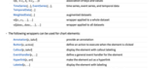
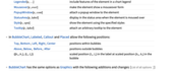
Annotation[e,label] 注釈を与える Button[e,action] 要素がクリックされたときに実行するアクションを定義する Callout[e,label] コールアウトラベルを付けて要素を表示する EventHandler[e,…] 要素の一般的なイベントハンドラを定義する Hyperlink[e,uri] 要素がハイパーリンクとして機能するようにする Labeled[e,…] 要素にラベルを付けて表示する Legended[e,…] グラフの説明文に要素の特徴を含む Mouseover[e,over] 要素がマウスオーバーの形式を示すようにする PopupWindow[e,cont] 要素にポップアップウィンドウを加える StatusArea[e,label] 要素の上にマウスが来たときにステータスエリアに表示する Style[e,opts] 要素を指定したスタイルで示す Tooltip[e,label] 要素に任意のツールチップを加える - BubbleChartでは,Labeled,Callout,Placedで次の位置が取れる.
-
Top,Bottom,Left,Right,Center バブル内の位置 Above,Below, Before, After バブルの外の位置 {{bx,by},{lx,ly}} バブル内のスケールされた位置{bx,by}のラベル内のスケールされた位置{lx,ly} - BubbleChartにはGraphicsと同じオプションに次の追加・変更を加えたものが使える. [全オプションのリスト]
-
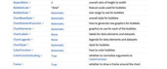
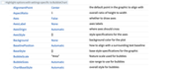
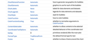
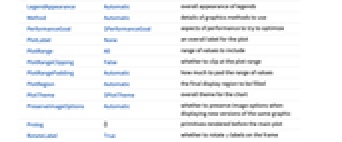
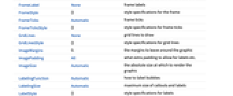
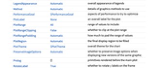
AspectRatio 1 全体的な縦横比 BubbleScale "Area" バブルに使う特徴的大きさのスケール BubbleSizes Automatic バブルに使う大きさの範囲 ChartElementFunction Automatic バブルの生のグラフィックスをどのように生成するか ChartElements Automatic 各バブルに使うグラフィックス ColorFunction Automatic バブルの彩色方法 ColorFunctionScaling True ColorFunctionの引数を正規化するかどうか Frame True グラフ周囲に枠を描くかどうか LabelingFunction Automatic バブルにどのようにラベルを付けるか LabelingSize Automatic コールアウトとラベルの最大サイズ LabelingTarget Automatic 自動的なラベル配置の決定方法 LegendAppearance Automatic 凡例の全体的な外観 PerformanceGoal $PerformanceGoal パフォーマンスのどの面について最適化するか PlotFit None 曲線のバブルへのフィットの仕方 PlotFitElements Automatic バブル内に表示するフィット要素 PlotInteractivity $PlotInteractivity インタラクティブ要素を許可するかどうか PlotLabels None 棒のカテゴリラベル PlotLegends None データ要素とデータ集合の凡例 PlotStyle Automatic 棒のスタイル PlotTheme $PlotTheme グラフの全体的なテーマ ScalingFunctions None 個々の座標をどのようにスケールするか TargetUnits Automatic グラフ内に表示する単位 - BubbleChartは最大の視認性をもってバブルを大きいものから小さいものへと層状に重ねる.
- PlotLegendsの典型的な設定には,次のものが含まれる.
-
None 凡例なし Automatic 凡例を自動的に決定する {lbl1,lbl2,…} lbl1,lbl2,…を凡例ラベルとして用いる Placed[lspec,…] 凡例の配置を指定する - PlotStylesty は,各曲線に使用するスタイルを指定する.可能な設定には次のものが含まれる.
-
{sty1,sty2,…} データに対するスタイルの列 <|"key"val,…|> データの異なるレベルに対するスタイル要素 - 使用可能なキーは次の通りである.
-
"Base" すべての棒に対する全体的なスタイル "Elements" yiを各グループにおける要素とする,要素のスタイルのリスト "Groups" dataiである各値グループのスタイルのリスト - ColorData["DefaultChartColors"]は,PlotStyleによって使用されるデフォルトの色の並びを与える.
- ChartElementFunctionに渡される引数は,ネストしたデータ集合リストにおける各レベルからのバブルの範囲{{xmin,xmax},{ymin,ymax}},値{xi,yi,zi},メタデータ{m1,m2,…}である.
- ChartElementFunctionの組込み設定のリストはChartElementData["BubbleChart"]で得ることができる.
- ColorFunctionに渡される引数は x,y,z である.
- チャートの特徴テーマはデータのグラフィックススタイリングに影響する.テーマには以下が含まれる.
-

"BoldScheme" チャートエレメントスキームの太字要素 
"FadeScheme" チャートエレメントスキームの色褪せた要素 - BubbleChartのオプションおよびその他の構造からのスタイルその他の指定は事実上PlotStyle,ColorFunction,Styleその他のラッパー,ChartElementsとChartElementFunctionの順に適用される.後ろの指定は前の指定を無効にする.
全オプションのリスト
例題
すべて開く すべて閉じる例 (3)
BubbleChart[RandomReal[1, {10, 3}]]BubbleChart[RandomReal[1, {5, 7, 3}]]BubbleChart[RandomReal[1, {5, 7, 3}], PlotStyle -> {RGBColor[0.237736, 0.340215, 0.575113], RGBColor[0.277947, 0.45009699999999997, 0.32815550000000004], RGBColor[0.624866, 0.673302, 0.264296], RGBColor[0.8453409999999999, 0.6248695, 0.3151775], RGBColor[0.72987, 0.239399, 0.230961]}]BubbleChart[RandomReal[1, {10, 3}], ChartElements -> [image]]BubbleChart[RandomReal[1, {10, 3}], ChartElementFunction -> "NoiseBubble"]スコープ (32)
データとラッパー (14)
BubbleChart[{Table[{i, i, 1}, {i, 3}], Table[{i, i + 1, 1}, {i, 3}], Table[{i, i + 2, 1}, {i, 3}]}]data = ReplacePart[Flatten[Table[{i, j, 1}, {i, 4}, {j, 4}], 1], {2 -> Missing[], 4 -> 1 + I, 6 -> foo}]BubbleChart[data, PlotLabels -> Range[16]]BubbleChart[{{Quantity[2, "Feet"], Quantity[-4, "Feet"], Quantity[14, "Feet"]}, {Quantity[6, "Feet"], Quantity[25, "Feet"], Quantity[22, "Feet"]}, {Quantity[-3, "Feet"], Quantity[17, "Feet"], Quantity[1, "Feet"]}, {Quantity[11, "Feet"], Quantity[17, "Feet"], Quantity[7, "Feet"]}, {Quantity[25, "Feet"], Quantity[-3, "Feet"], Quantity[21, "Feet"]}}, FrameLabel -> Automatic]BubbleChart[{{Quantity[2, "Feet"], Quantity[-4, "Feet"], Quantity[14, "Feet"]}, {Quantity[6, "Feet"], Quantity[25, "Feet"], Quantity[22, "Feet"]}, {Quantity[-3, "Feet"], Quantity[17, "Feet"], Quantity[1, "Feet"]}, {Quantity[11, "Feet"], Quantity[17, "Feet"], Quantity[7, "Feet"]}, {Quantity[25, "Feet"], Quantity[-3, "Feet"], Quantity[21, "Feet"]}}, FrameLabel -> Automatic, TargetUnits -> {"Meters", "Yards", "Inches"}]TimeSeries,EventSeries,TemporalData内のタイムスタンプは無視される:
BubbleChart[TimeSeries[{{23, 12, 24}, {15, 3, 9}, {3, 23, 12}, {7, 11, 6}, {5, 24, 20}, {5, 17, 8}}, {"May 24, 1982"}]]BubbleChart[<|"a" -> {3, 1, 5}, "b" -> {2, 2, 4}, "c" -> {1, 2, 3}, "d" -> {2, 1.5, 8}|>]BubbleChart[<|"a" -> {3, 1, 5}, "b" -> {2, 2, 4}, "c" -> {1, 2, 3}, "d" -> {2, 1.5, 8}|>, PlotLabels -> Automatic]BubbleChart[<|"a" -> {3, 1, 5}, "b" -> {2, 2, 4}, "c" -> {1, 2, 3}, "d" -> {2, 1.5, 8}|>, PlotLegends -> Automatic, PlotStyle -> {Hue[0.61, 0.7, 1], Hue[0.17, 0.4, 0.65], Hue[0.64, 0.5, 0.75], Hue[0.45, 0.4, 0.7]}]BubbleChart[<|"a" -> <|"x" -> 3, "y" -> 1, "z" -> 5|>, "b" -> <|"x" -> 2, "y" -> 2, "z" -> 4|>, "c" -> <|"x" -> 1, "y" -> 2, "z" -> 3|>|>, PlotLegends -> Automatic, PlotStyle -> {Hue[0.61, 0.7, 1], Hue[0.17, 0.4, 0.65], Hue[0.64, 0.5, 0.75]}, FrameLabel -> Automatic]BubbleChart[<|"group1" -> <|"a" -> {3, 1, 5}, "b" -> {2, 2, 4}, "c" -> {1, 2, 3}, "d" -> {2, 1.5, 8}|>, "group2" -> <|"a" -> {2, 5, 9}, "b" -> {6, 1, 3}, "c" -> {1, 3, 6}, "d" -> {3, 2, 6}|>|>, PlotLegends -> Automatic, PlotStyle -> {Hue[0.08, 1, 1], Hue[0.17, 0.8, 0.5]}]WeightedData内の重みは無視される:
BubbleChart[WeightedData[{{23, 12, 24}, {15, 3, 9}, {3, 23, 12}, {7, 11, 6}, {5, 24, 20}, {5, 17, 8}}, {0.4, 0.2, 0.6, 0.3, 0.4, 0.3}]]個々のデータ,データ集合,あるいはデータ集合の集合にラッパーを使う:
{d1, d2, d3} = {{1, 2, 1}, {2, 2, 1}, {3, 2, 1}};
{e1, e2, e3} = {{1, 1, 1}, {2, 1, 1}, {3, 1, 1}};{BubbleChart[{{d1, Style[d2, RGBColor[0.93, 0.27, 0.27]], d3}, {e1, e2, e3}}], BubbleChart[{Style[{d1, d2, d3}, RGBColor[0.93, 0.27, 0.27]], {e1, e2, e3}}], BubbleChart[Style[{{d1, d2, d3}, {e1, e2, e3}}, RGBColor[0.93, 0.27, 0.27]]]}{d1, d2, d3} = {{1, 2, 1}, {2, 2, 1}, {3, 2, 1}};
{e1, e2, e3} = {{1, 1, 1}, {2, 1, 1}, {3, 1, 1}};{BubbleChart[{{d1, Style[d2, RGBColor[0.93, 0.27, 0.27]], d3}, {e1, e2, e3}}, PlotStyle -> GrayLevel[0.62]], BubbleChart[{Style[{d1, Style[d2, RGBColor[0.93, 0.27, 0.27]], d3}, RGBColor[0.14, 0.8, 0.14]], {e1, e2, e3}}, PlotStyle -> GrayLevel[0.62]], BubbleChart[Style[{Style[{d1, Style[d2, RGBColor[0.93, 0.27, 0.27]], d3}, RGBColor[0.14, 0.8, 0.14]], {e1, e2, e3}}, RGBColor[0.4, 0.6, 1]], PlotStyle -> GrayLevel[0.62]]}BubbleChart[{{1, 2, 1}, Tooltip[{1, 1, 2}, "median"], {2, 3, 3}}, BubbleSizes -> {0.2, 0.7}]data = Table[Tooltip[{CountryData[c, #]& /@ {"LifeExpectancy", "GDPPerCapita", "Population"}}, CountryData[c, "Flag"]], {c, CountryData["G8"]}];BubbleChart[data]PopupWindowを使って追加的なドリルダウン情報を提供する:
BubbleChart[{{1, 2, 2}, {1, 1, 1}, PopupWindow[{2, 3, 3}, DateListPlot[FinancialData["IBM", "Jan. 1, 2004"]]]}, BubbleSizes -> {0.2, 0.7}]Buttonを使って任意のアクションを開始することができる:
BubbleChart[{{1, 2, 2}, {1, 1, 1}, Button[{2, 3, 3}, Speak[2]]}, BubbleSizes -> {0.2, 0.7}]表形式データ (3)
cars = ResourceData["Sample Tabular Data: Car Models"]馬力と排気量をプロットし,走行距離に応じてバブルのサイズを設定する:
BubbleChart[cars -> {"displacement", "horsepower", "mpg"}]pivot = PivotToColumns[cars, "origin" -> "mpg"]BubbleChart[pivot -> {{"displacement", "horsepower", ExtendedKey["mpg", "europe"]}, {"displacement", "horsepower", ExtendedKey["mpg", "japan"]}, {"displacement", "horsepower", ExtendedKey["mpg", "usa"]}}, PlotLegends -> {"Europe", "Japan", "USA"}]BubbleChart[TimeSeries[TimeEventSeries`TimestampData[Association["UniformlySpacedQ" -> True, "Count" -> 5,
"Endpoints" -> TabularColumn[Association[
"Data" -> {2, {{NumericArray[{20563, -2147483648}, "Integer32"], {},
DataStructure["BitVec ... ularColumn[Association[
"Data" -> {{17, 5, 7, 6, 13}, {}, None}, "ElementType" -> "Integer64"]],
TabularColumn[Association["Data" -> {{3, 2, 2, 1, 1}, {}, None},
"ElementType" -> "Integer64"]]}}]]]], Association[]]]TimeSeriesまたはEventSeriesの成分の値をプロットする:
ts = TimeSeries[TimeEventSeries`TimestampData[Association["UniformlySpacedQ" -> True, "Count" -> 5,
"Endpoints" -> TabularColumn[Association[
"Data" -> {2, {{NumericArray[{20563, -2147483648}, "Integer32"], {},
DataStructure["BitVec ... e" -> "Integer64"]], TabularColumn[Association[
"Data" -> {{3.5511999004449324, 1.777675777376151, 1.3490852490420469,
3.8396388450135266, 4.100051503528421}, {}, None}, "ElementType" -> "Real64"]]}}]]]],
Association[]];BubbleChart[ts -> {"a", "b", "c"}]BubbleChart[ts -> {{"a", "b", "c"}, {"d", "e", "f"}}]スタイルと外観 (6)
BubbleChart[RandomReal[1, {3, 5, 3}], PlotStyle -> {RGBColor[0.93, 0.27, 0.27], RGBColor[0.14, 0.8, 0.14], RGBColor[0.4, 0.6, 1]}]PlotStyleを使ってすべてのグラフ要素に初期スタイルを設定することができる:
BubbleChart[{{1, 2, 2}, {1, 1, 1}, {2, 3, 3}}, PlotStyle -> <|"Base" -> EdgeForm[Dashed], "Elements" -> {RGBColor[0.797253, 0.904982, 0.410498], RGBColor[0.934691, 0.945708, 0.75346], RGBColor[0.769879, 0.92369, 0.977371]}|>, BubbleSizes -> {0.2, 0.7}]Styleを使ってスタイルを無効にすることができる:
BubbleChart[{{1, 2, 2}, {1, 1, 1}, Style[{2, 3, 3}, RGBColor[0.93, 0.27, 0.27]], {3, 4, 1}}, PlotStyle -> GrayLevel[0.62], BubbleSizes -> {0.2, 0.7}]BubbleChart[{{1, 2, 2}, {1, 1, 1}, {2, 3, 3}}, ChartElements -> Graphics3D[Cylinder[], Boxed -> False], BubbleSizes -> {0.2, 0.7}]ChartElementData["BubbleChart"]Table[BubbleChart[{{1, 2, 2}, {1, 1, 1}, {2, 3, 3}}, ChartElementFunction -> f, PlotStyle -> {RGBColor[0.761959, 0.470832, 0.940597], RGBColor[0.9584254999999999, 0.877884, 0.5906629999999999], RGBColor[0.431296, 0.709773, 0.927077]}, BubbleSizes -> {0.2, 0.7}], {f, {"PolyhedronBubble", "MarkerBubble"}}]詳細設定には「パレット」▶「チャートエレメントスキーム」を使う:
BubbleChart[{{1, 2, 2}, {1, 1, 1}, {2, 3, 3}}, ChartElementFunction -> ChartElementDataFunction["Bubble", "Shape" -> "Hexagon"], BubbleSizes -> {0.2, 0.7}]BubbleChart[RandomReal[1, {3, 3, 3}], PlotTheme -> "Business"]コントラストがはっきりしたカラースキームと三次元バブルのテーマを使う:
BubbleChart[RandomReal[1, {3, 3, 3}], PlotTheme -> "Marketing"]ラベルと凡例 (9)
Labeledを使ってバブルにラベルを加える:
BubbleChart[{{1, 2, 1}, Labeled[{1, 1, 2}, "label", Left], {2, 3, 3}}, BubbleSizes -> {0.2, 0.7}]Table[BubbleChart[{{1, 2, 2}, Labeled[{2, 3, 3}, "label", p], {1, 1, 1}}, BubbleSizes -> {0.2, 0.7}, PlotLabel -> p, Ticks -> None], {p, {Bottom, Center, Top}}]Placedを使ってラベルの置き方を制御し,Labeledと同じ位置を使う:
BubbleChart[{{{2, 1, 1}, {1, 1, 1}}, {{1, 2, 2}, {2, 3, 3}}}, PlotLabels -> <|"Elements" -> Placed[{"c1", "c2"}, Center]|>, BubbleSizes -> {0.2, 0.7}]LabelingFunctionを使ってバブルのラベルの値を与える:
labeler[v_, {i_, j_}, {ri_, cj_}] := Placed[{v, ri[[1]], cj[[1]]}, Tooltip, MatrixForm]BubbleChart[{{{2, 3, 3}, {1, 2, 2}, {1, 1, 1}}, {{1, 3, 2}, {2, 1, 1}}}, PlotLabels -> <|"Groups" -> {"r1", "r2"}, "Elements" -> {"c1", "c2", "c3"}|>, FrameTicks -> None, BubbleSizes -> {0.2, 0.7}, LabelingFunction -> labeler]data = Table[Callout[RandomReal[1, 3], RandomWord[]], {i, 20}];BubbleChart[data, LabelingSize -> 30]BubbleChart[data, LabelingSize -> Full]密な点集合については,デフォルトで,ラベルの中にツールチップに変えられるものがある:
data = Table[Callout[RandomReal[1, 3], RandomWord[]], {i, 100}];BubbleChart[data]BubbleChart[data, ImageSize -> 400]data = RandomReal[1, {7, 3}];BubbleChart[{data, data + 1}, PlotLegends -> {"data1", "data2"}, PlotStyle -> {RGBColor[0.761959, 0.470832, 0.940597], RGBColor[0.431296, 0.709773, 0.927077]}]Legendedを使って追加的な凡例項目を加える:
BubbleChart[{{{2, 3, 3}, Legended[Style[{1, 2, 2}, RGBColor[1, 0.75, 0]], "extra"], {1, 1, 1}}, {{1, 3, 2}, {2, 1, 1}}}, PlotLegends -> {"data1", "data2"}, PlotStyle -> {RGBColor[0.761959, 0.470832, 0.940597], RGBColor[0.431296, 0.709773, 0.927077]}]Placedを使うと凡例の位置に影響が出る:
data = RandomReal[1, {7, 3}];Table[BubbleChart[{data, data + 1}, PlotLegends -> Placed[{"data1", "data2"}, p], PlotStyle -> {RGBColor[0.761959, 0.470832, 0.940597], RGBColor[0.431296, 0.709773, 0.927077]}], {p, {Below, Above}}]オプション (122)
AspectRatio (3)
デフォルトで,BubbleChartは縦と横に同じ長さを使う:
BubbleChart[IconizedObject[«data»]]BubbleChart[IconizedObject[«data»], AspectRatio -> 1 / 2]AspectRatioAutomaticは値から範囲を決定する:
BubbleChart[IconizedObject[«data»], AspectRatio -> Automatic]Axes (3)
デフォルトで,BubbleChartは軸の代りに枠を使う:
BubbleChart[IconizedObject[«data»]]BubbleChart[IconizedObject[«data»], Frame -> False, Axes -> True]{BubbleChart[IconizedObject[«data»], Frame -> False, Axes -> {True, False}], BubbleChart[IconizedObject[«data»], Frame -> False, Axes -> {False, True}]}AxesLabel (4)
BubbleChart[IconizedObject[«data»], Frame -> False, Axes -> True]BubbleChart[IconizedObject[«data»], Frame -> False, Axes -> True, AxesLabel -> "Y-axis"]BubbleChart[IconizedObject[«data»], Frame -> False, Axes -> True, AxesLabel -> {"x position", "y position"}]BubbleChart[QuantityArray[IconizedObject[«data»], "Meters"], Frame -> False, Axes -> True, AxesLabel -> Automatic]AxesOrigin (2)
AxesStyle (4)
BubbleChart[IconizedObject[«data»], Frame -> False, Axes -> True, AxesStyle -> RGBColor[0.93, 0.27, 0.27]]**BubbleChart[IconizedObject[«data»], Frame -> False, Axes -> True, AxesStyle -> {{Thick, RGBColor[0.93, 0.27, 0.27]}, {Thick, RGBColor[0.4, 0.6, 1]}}]****BubbleChart[IconizedObject[«data»], Frame -> False, Axes -> True, AxesStyle -> RGBColor[0.14, 0.8, 0.14], TicksStyle -> GrayLevel[0.62]]****BubbleChart[IconizedObject[«data»], Frame -> False, Axes -> True, AxesStyle -> RGBColor[0.14, 0.8, 0.14], LabelStyle -> RGBColor[0.93, 0.27, 0.27]]**BubbleScale (2)
BubbleChart[RandomReal[1, {3, 3, 3}], BubbleSizes -> {0.1, 0.4}, BubbleScale -> "Diameter"]data = Table[{i, i, i}, {i, 10}];Table[BubbleChart[data, BubbleSizes -> {0.1, 0.4}, BubbleScale -> scale, PlotLabel -> scale], {scale, {"Area", "Diameter"}}]BubbleSizes (1)
ChartElementFunction (5)
ChartElementFunctionの組込み設定のリストを得る:
ChartElementData["BubbleChart"]詳細設定には「パレット」▶「チャートエレメントスキーム」を使う:
data = {{1, 0, 1}, {0, 1, 2}, {1, 2, 3}};Table[BubbleChart[data, ChartElementFunction -> f, PlotStyle -> {RGBColor[0.761959, 0.470832, 0.940597], RGBColor[0.9584254999999999, 0.877884, 0.5906629999999999], RGBColor[0.431296, 0.709773, 0.927077]}, PlotLabel -> f], {f, {"Bubble", "MarkerBubble"}}]Table[BubbleChart[data, ChartElementFunction -> f, PlotStyle -> {RGBColor[0.761959, 0.470832, 0.940597], RGBColor[0.9584254999999999, 0.877884, 0.5906629999999999], RGBColor[0.431296, 0.709773, 0.927077]}, PlotLabel -> f], {f, {"SphereBubble", "PolyhedronBubble"}}]Table[BubbleChart[data, ChartElementFunction -> f, PlotStyle -> {RGBColor[0.761959, 0.470832, 0.940597], RGBColor[0.9584254999999999, 0.877884, 0.5906629999999999], RGBColor[0.431296, 0.709773, 0.927077]}, PlotLabel -> f], {f, {"NoiseBubble", "OscillatingBubble"}}]カスタマイズされたChartElementFunctionを書く:
f[{{xmin_, xmax_}, {ymin_, ymax_}}, v_, meta_, style___] :=
{Rectangle[{xmin, ymin}, {xmax, ymax}]}BubbleChart[{{1, 0, 1}, {0, 1, 2}, {1, 2, 3}}, ChartElementFunction -> f]入力から渡されたメタデータ,この場合はデータのグラフ化,を使う:
DataDrilldownBubble[{{xmin_, xmax_}, {ymin_, ymax_}}, v_, {meta_}, style___] :=
PopupWindow[Polygon[{{xmin, ymin}, {xmax, ymax}, {xmin, ymax}, {xmax, ymin}}], PieChart[meta]]DataDrilldownBubble[{{xmin_, xmax_}, {ymin_, ymax_}}, y_, ___] :=
Rectangle[{xmin, ymin}, {xmax, ymax}]BubbleChart[{{1, 0, 1} -> Range[5], {0, 1, 2}, {1, 2, 3} -> RandomReal[1, 10]}, ChartElementFunction -> DataDrilldownBubble]組込み初等関数にはオプションがあるかもしれない.「パレット」▶「チャートエレメントスキーム」を使って設定する:
ChartElementData["MarkerBubble", "Options"]Table[BubbleChart[{{1, 0, 1}, {0, 1, 2}, {1, 2, 3}}, ChartElementFunction -> ChartElementDataFunction["MarkerBubble", "Shape" -> s, "Filled" -> True]], {s, {"CircleTimes", "Diamond"}}]ChartElements (5)
任意のGraphicsオブジェクトに基づいた絵を使ったグラフを作成する:
data = RandomReal[1, {7, 3}];BubbleChart[data, ChartElements -> Graphics[Rectangle[]]]BubbleChart[data, ChartElements -> Graphics3D[Sphere[]]]BubbleChart[data, ChartElements -> ExampleData[{"TestImage", "House"}]]data = {{{1, 0, 3}, {0, 1, 2}, {1, 2, 3}}, {{5, 4, 5}, {4, 5, 6}, {5, 6, 5}}};BubbleChart[data, ChartElements -> {[image], [image]}]BubbleChart[{{1, 1, 1}, {2, 2, 1}, {3, 3, 1}, {4, 4, 1}, {5, 5, 1}}, ChartElements -> {[image], [image], [image]}]スタイルはPlotStyle等で設定されたスタイルから継承される:
BubbleChart[RandomReal[1, {10, 3}], ChartElements -> [image], PlotStyle -> {RGBColor[0.761959, 0.470832, 0.940597], RGBColor[0.9584254999999999, 0.877884, 0.5906629999999999], RGBColor[0.431296, 0.709773, 0.927077]}]グラフィックス中で設定された明示的なスタイルは他のスタイル設定を無効にする:
BubbleChart[RandomReal[1, {10, 3}], ChartElements -> [image], PlotStyle -> {RGBColor[0.761959, 0.470832, 0.940597], RGBColor[0.9584254999999999, 0.877884, 0.5906629999999999], RGBColor[0.431296, 0.709773, 0.927077]}]g = Graphics3D[{Specularity[White, 30], Sphere[]}, ViewPoint -> {0, -Infinity, 0}, Boxed -> False, Lighting -> "Neutral"];BubbleChart[RandomReal[1, {10, 3}], ChartElements -> g, PlotStyle -> {RGBColor[0.782803, 0.164904, 0.400458], RGBColor[0.909499, 0.613916, 0.204196], RGBColor[0.806577, 0.385397, 0.762768], RGBColor[0.698817, 0.873304, 0.295247], RGBColor[0.378897, 0.873304, 0.787549], RGBColor[1, 0.529198, 0.324819], RGBColor[1, 0.998367, 0.434775], RGBColor[0.873304, 0.150484, 0.255131], RGBColor[0.723598, 0.791043, 0.963806], RGBColor[0.85037, 0.558389, 0]}]ColorFunction (3)
BubbleChart[RandomInteger[100, {2, 70, 3}], ColorFunction -> Function[{x, y, r}, Lighter[RGBColor[0.14, 0.8, 0.14], x]]]ColorFunctionScaling->Falseを使ってスケールされていない高さの値を得る:
BubbleChart[{{0, 0, 1}, {0.1, 0.8, 2}, {1, 2, 3}}, ColorFunction -> Function[{x, y, r}, Switch[{x, y, r}, {0, 0, 1}, RGBColor[1, 0.75, 0], {0.1, 0.8, 2}, RGBColor[0.98, 0.56, 0.17], {1, 2, 3}, RGBColor[0.93, 0.27, 0.27]]], ColorFunctionScaling -> False]ColorFunctionはPlotStyle中のスタイルを無効にする:
data = {{0, 0, 1}, {0.1, 0.8, 2}, {1, 2, 3}};BubbleChart[data, PlotStyle -> RGBColor[0.14, 0.8, 0.14], ColorFunction -> "SolarColors"]ColorFunctionを使って異なるスタイル効果を組み合せる:
BubbleChart[data, PlotStyle -> EdgeForm /@ {None, Dashed, Dotted}, ColorFunction -> "SolarColors"]ColorFunctionScaling (2)
BubbleChart[RandomInteger[100, {2, 70, 3}], ColorFunction -> Function[{x, y, r}, Lighter[RGBColor[0.14, 0.8, 0.14], x]]]ColorFunctionScaling->Falseを使ってスケールされていない高さの値を得る:
BubbleChart[{{0, 0, 1}, {0.1, 0.8, 2}, {1, 2, 3}}, ColorFunction -> Function[{x, y, r}, Switch[{x, y, r}, {0, 0, 1}, RGBColor[1, 0.75, 0], {0.1, 0.8, 2}, RGBColor[0.98, 0.56, 0.17], {1, 2, 3}, RGBColor[0.93, 0.27, 0.27]]], ColorFunctionScaling -> False]Frame (4)
BubbleChartはデフォルトで枠を使う:
BubbleChart[IconizedObject[«data»]]BubbleChart[IconizedObject[«data»], Frame -> False]BubbleChart[IconizedObject[«data»], Frame -> {{True, True}, {False, False}}]BubbleChart[IconizedObject[«data»], Frame -> {{True, False}, {True, False}}]FrameLabel (4)
BubbleChart[IconizedObject[«data»], FrameLabel -> {"label"}]BubbleChart[IconizedObject[«data»], FrameLabel -> {"Bottom", "Left"}]BubbleChart[IconizedObject[«data»], FrameLabel -> {{"left", "right"}, {"bottom", "top"}}]BubbleChart[IconizedObject[«data»], FrameLabel -> {{"left", "right"}, {"bottom", "top"}}, LabelStyle -> Directive[Bold, GrayLevel[0.62]]]FrameStyle (2)
BubbleChart[IconizedObject[«data»], FrameStyle -> Directive[GrayLevel[0.62], Thick]]BubbleChart[IconizedObject[«data»], FrameStyle -> {{Directive[RGBColor[0.14, 0.8, 0.14], Thick], Directive[RGBColor[0.93, 0.27, 0.27]]}, {Directive[GrayLevel[0.62], Thick], Directive[RGBColor[0.4, 0.6, 1]]}}]FrameTicks (7)
BubbleChart[IconizedObject[«data»]]デフォルトで,上と右の辺には目盛は置かれるが目盛ラベルは置かれない:
BubbleChart[IconizedObject[«data»]]Allを使ってすべての辺に目盛ラベルを置く:
BubbleChart[IconizedObject[«data»], FrameTicks -> All]BubbleChart[IconizedObject[«data»], FrameTicks -> {{{.1, .5, .8}, Automatic}, {Automatic, Automatic}}]BubbleChart[IconizedObject[«data»], FrameTicks -> {{{{.1, a}, {.5, b}, {.8, c}}, Automatic}, {{{.1, a}, {.5, b}, {.8, c}}, Automatic}}]BubbleChart[IconizedObject[«data»], FrameTicks -> {{{{.1, a, .1}, {.5, b, .1}, {.8, c, .1}}, Automatic}, {{{.1, a, .2}, {.5, b, .2}, {.8, c, .2}}, Automatic}}]BubbleChart[IconizedObject[«data»], FrameTicks -> {{{{.1, a, {.1, .1}}, {.5, b, {.1, .1}}, {.8, c, {.1, .1}}}, Automatic}, {{{.1, a, {.2, .05}}, {.5, b, {.2, .05}}, {.8, c, {.2, .05}}}, Automatic}}]BubbleChart[IconizedObject[«data»], FrameTicks -> {{{{.1, a, {.1, .1}, Directive[Thick, RGBColor[0.4, 0.6, 1], Dashed]}, {.5, b, {.1, .1}, Directive[Thick, RGBColor[0.14, 0.8, 0.14]]}, {.8, c, {.1, .1}, Directive[Thick, RGBColor[0.93, 0.27, 0.27]]}}, Automatic}, {Automatic, Automatic}}]FrameTicksStyle (3)
デフォルトで,枠目盛と枠目盛のラベルには枠と同じスタイルが使われる:
BubbleChart[IconizedObject[«data»], FrameStyle -> Directive[RGBColor[0.93, 0.27, 0.27]]]BubbleChart[IconizedObject[«data»], FrameTicksStyle -> Directive[RGBColor[0.4, 0.6, 1], Thick], FrameStyle -> GrayLevel[0.85]]BubbleChart[IconizedObject[«data»], FrameTicksStyle -> {{Directive[RGBColor[0.93, 0.27, 0.27], Thick], Directive[RGBColor[0.4, 0.6, 1], Thick]}, {Directive[RGBColor[0.98, 0.56, 0.17], Thick], Directive[RGBColor[0.14, 0.8, 0.14], Thick]}}, FrameTicks -> All, FrameStyle -> GrayLevel[0.85]]ImageSize (7)
Tiny,Small,Medium,Largeのような名前付きのサイズを使う:
{BubbleChart[IconizedObject[«data»], ImageSize -> Tiny], BubbleChart[IconizedObject[«data»], ImageSize -> Small]}{BubbleChart[IconizedObject[«data»], ImageSize -> 150], BubbleChart[IconizedObject[«data»], AspectRatio -> 1.5, ImageSize -> 150]}{BubbleChart[IconizedObject[«data»], ImageSize -> {Automatic, 150}], BubbleChart[IconizedObject[«data»], AspectRatio -> 2, ImageSize -> {Automatic, 150}]}{BubbleChart[IconizedObject[«data»], ImageSize -> UpTo[200]], BubbleChart[IconizedObject[«data»], AspectRatio -> 2, ImageSize -> UpTo[200]]}グラフィックスの幅と高さを指定し,必要な場合は空白で充填する:
BubbleChart[IconizedObject[«data»], ImageSize -> {200, 200}, Background -> GrayLevel[0.62]]AspectRatioFullと設定して使用可能な空間を埋める:
BubbleChart[IconizedObject[«data»], AspectRatio -> Full, ImageSize -> {200, 200}, Background -> GrayLevel[0.62]]{BubbleChart[IconizedObject[«data»], ImageSize -> {UpTo[150], UpTo[100]}], BubbleChart[IconizedObject[«data»], AspectRatio -> 2, ImageSize -> {UpTo[150], UpTo[100]}]}ImageSizeFullを使ってオブジェクト内の使用可能な空間を埋める:
Framed[Pane[BubbleChart[IconizedObject[«data»], ImageSize -> Full, Background -> GrayLevel[0.62]], {200, 100}]]Framed[Pane[BubbleChart[IconizedObject[«data»], AspectRatio -> Full, ImageSize -> {Scaled[0.5], Scaled[0.5]}, Background -> GrayLevel[0.62]], {200, 100}]]LabelingFunction (7)
TooltipとStatusAreaからの値で自動的なラベル付けを使う:
BubbleChart[{{0, 0, 1}, {0.1, 0.8, 2}, {1, 2, 3}}, BubbleSizes -> {0.2, 0.7}, LabelingFunction -> Automatic]BubbleChart[{{0, 0, 1}, {0.1, 0.8, 2}, {1, 2, 3}}, BubbleSizes -> {0.2, 0.7}, LabelingFunction -> None]Placedを使ってラベルの置き方を制御する:
Table[BubbleChart[{{1, 0, 1}, {0, 1, 2}, {1, 2, 3}}, BubbleSizes -> {0.2, 0.7}, LabelingFunction -> (Placed[#, p]&), PlotLabel -> p, Ticks -> None], {p, {Bottom, Center, Top}}]Table[BubbleChart[{{1, 0, 1}, {0, 1, 2}, {1, 2, 3}}, PlotRange -> All, BubbleSizes -> {0.2, 0.7}, LabelingFunction -> (Placed[#, p]&), PlotLabel -> p, Ticks -> None], {p, {{0, 0}, {1 / 2, 1 / 2}, {1, 1}}}]Calloutを使って自動的にラベルを置く:
BubbleChart[{{1, 0, 1}, {0, 1, 2}, {1, 2, 3}}, PlotRange -> All, BubbleSizes -> {0.2, 0.7}, LabelingFunction -> (Callout[Row[#, ","], Automatic]&)]記号的位置を使ってCalloutラベルを置く:
Table[BubbleChart[{{1, 0, 1}, {0, 1, 2}, {1, 2, 3}}, PlotRange -> All, BubbleSizes -> {0.2, 0.7}, LabelingFunction -> (Callout[#, p]&)], {p, {Above, Below}}]BubbleChart[{{1, 0, 1}, {0, 1, 2}, {1, 2, 3}}, LabelingFunction -> (Placed[#1, Tooltip, MatrixForm]&), BubbleSizes -> {0.2, 0.7}]bubbleLabel[v : {x_, y_, w_}, level_, {r_, c_}] := Placed[Grid[{{Row[{r[[1]], c[[1]], "Fund"}, " "], SpanFromLeft}, {"Age", x}, {"Return %", y}, {"Market Cap", w}}, Frame -> All, Alignment -> Left], Tooltip]data = {{{1, 11, 300}, {2, 50, 200}, {3, 20, 300}}, {{6, 20, 300}, {2, 8, 600}, {6, 16, 500}}};BubbleChart[data, PlotLabels -> <|"Groups" -> {"Growth", "Value"}, "Elements" -> Placed[{"Small-Cap", "Mid-Cap", "Large-Cap"}, None]|>, LabelingFunction -> bubbleLabel]LabelingSize (4)
BubbleChart[{{0, 0, 1}, {0.1, 0.8, 2}, {1, 2, 3}}, PlotLabels -> Callout[{"healthfulness", "obstreperous", "spectrogram"}]]BubbleChart[{{0, 0, 1}, {0.1, 0.8, 2}, {1, 2, 3}}, PlotLabels -> Callout[{[image], [image], [image]}]]BubbleChart[{{0, 0, 1}, {0.1, 0.8, 2}, {1, 2, 3}}, PlotLabels -> Callout[{"healthfulness", "obstreperous", "spectrogram"}], LabelingSize -> 30]BubbleChart[{{0, 0, 1}, {0.1, 0.8, 2}, {1, 2, 3}}, PlotLabels -> Callout[{[image], [image], [image]}], LabelingSize -> 20]BubbleChart[{{0, 0, 1}, {0.1, 0.8, 2}, {1, 2, 3}}, PlotLabels -> Callout[{[image], [image], [image]}], LabelingSize -> Full]LabelingTarget (7)
BubbleChart[IconizedObject[«data»]]BubbleChart[IconizedObject[«data»], LabelingTarget -> All]BubbleChart[IconizedObject[«data»], LabelingTarget -> "Dense"]BubbleChart[IconizedObject[«data»], LabelingTarget -> 0.25]BubbleChart[IconizedObject[«data»], LabelingTarget -> <|"AllowedLabelingPositions" -> "Sides"|>]BubbleChart[IconizedObject[«data»], LabelingTarget -> <|"AllowedLabelingPositions" -> "Corners"|>]BubbleChart[IconizedObject[«data»], LabelingTarget -> <|"AllowedLabelingPositions" -> {"Right", "Top"}|>]BubbleChart[IconizedObject[«data»], LabelingTarget -> <|"AllowedOverlaps" -> {"Points"}|>]BubbleChart[IconizedObject[«data»], LabelingTarget -> <|"AllowLabelClipping" -> True|>]PerformanceGoal (1)
インタラクティブなハイライト機能があるバブルグラフを生成する:
data = RandomReal[1, {3, 6, 3}];BubbleChart[data, PerformanceGoal -> "Quality"]インタラクティブな動作を使用不可にしてパフォーマンスを向上させる:
BubbleChart[data, PerformanceGoal -> "Speed"]一般に,インタラクティブではないグラフの方がメモリが少なくて済む:
Table[ByteCount@BubbleChart[data, PerformanceGoal -> p], {p, {"Quality", "Speed"}}]PlotInteractivity (4)
バブルの数がそれほど多くないグラフには,ツールチップとマウスオーバー効果が自動的に付けられる:
BubbleChart[{{1, 1, 1}, {2, 2, 2}, {3, 3, 3}}]BubbleChart[{{1, 1, 1}, {2, 2, 2}, {3, 3, 3}}, PlotInteractivity -> False]BubbleChart[{{1, 1, 1}, {2, 2, 2}, Tooltip[{3, 3, 3}, "hello"]}, PlotInteractivity -> False]与えたインタラクティブ要素は有効にして,自動のものは無効にする:
BubbleChart[{{1, 1, 1}, {2, 2, 2}, Tooltip[{3, 3, 3}, "hello"]}, PlotInteractivity -> <|"User" -> True, "System" -> False|>]PlotLabels (9)
BubbleChart[RandomReal[1, {4, 3}], PlotLabels -> {"a", "b", "c", "d"}]デフォルトで ,ラベルはデータ要素またはグループに自動的に関連付けられる:
{BubbleChart[RandomReal[1, {4, 3}], PlotLabels -> {"c1", "c2", "c3"}],
BubbleChart[RandomReal[1, {2, 4, 3}], PlotLabels -> {"r1", "r2", "r3"}]}BubbleChart[RandomReal[1, {4, 3, 3}], PlotLabels -> <|"Elements" -> {"c1", "c2", "c3"}|>]BubbleChart[RandomReal[1, {4, 3, 3}], PlotLabels -> <|"Groups" -> {"r1", "r2"}, "Elements" -> {"c1", "c2", "c3"}|>]データ内のLabeled ラッパーは追加のラベルを配置する:
data = {{1, 0, 1}, Labeled[{0, 1, 2}, "label", Below], {2, 2, 3}};BubbleChart[data, PlotLabels -> {"a", "b", "c"}]Placed を用いて配置に影響を与える:
data = {{1, 0, 1}, {0, 1, 2}, {2, 2, 3}};BubbleChart[data, PlotLabels -> <|"Groups" -> Placed[{"r1", "r2"}, Center], "Elements" -> Placed[{"c1", "c2", "c3"}, Below]|>]Table[BubbleChart[{{1, 0, 1}, {0, 1, 2}, {2, 2, 3}}, PlotLabels -> Placed[{"a", "b", "c"}, p], PlotLabel -> p, Ticks -> None], {p, {Below, Above}}]Table[BubbleChart[{{1, 0, 1}, {0, 1, 2}, {2, 2, 3}}, PlotLabels -> Placed[{"a", "b", "c"}, p], PlotLabel -> p, Ticks -> None], {p, {Before, After}}]Table[BubbleChart[{{1, 0, 1}, {0, 1, 2}, {2, 2, 3}}, PlotLabels -> Placed[{"aa", "bb", "cc"}, p], PlotLabel -> p], {p, {{0, 0}, {1 / 2, 1 / 2}, {1, 1}}}]すべてのラベルを右上隅に配置し,ラベル内の座標を変化させる:
Table[BubbleChart[{{1, 0, 1}, {0, 1, 2}, {2, 2, 3}}, PlotLabels -> Placed[Framed /@ {"aa", "bb", "cc"}, {{1, 1}, p}], Ticks -> None, PlotLabel -> p], {p, {{0, 0}, {1 / 2, 1 / 2}, {1, 1}}}]Placed の第3引数をを使ってフォーマットを制御する:
BubbleChart[{{1, 0, 1}, {0, 1, 2}, {2, 2, 3}}, BubbleSizes -> {0.3, 0.4}, PlotLabels -> Placed[{"aaa", "bbb", "ccc"}, Center, Rotate[#, 45Degree]&]]BubbleChart[{{1, 0, 1}, {0, 1, 2}, {2, 2, 3}}, BubbleSizes -> {0.3, 0.4}, PlotLabels -> Placed[{"aaa", "bbb", "ccc"}, Center, Panel[#, FrameMargins -> 0]&]]BubbleChart[{{1, 0, 1}, {0, 1, 2}, {2, 2, 3}}, PlotLabels -> Placed[{"aaa", "bbb", "ccc"}, Center, Hyperlink[#, "http://www.wolfram.com"]&]]BubbleChart[{{1, 0, 1}, {0, 1, 2}, {2, 2, 3}}, PlotLabels -> Placed[{"aaa", "bbb", "ccc"}, Center, Rotate[#, Pi / 4]&]]Calloutを使ってラベルをコールアウトに接続する:
BubbleChart[{{1, 0, 1}, {0, 1, 2}, {2, 2, 3}}, PlotLabels -> Callout[{"c1", "c2", "c3"}]]Placedを使って複数のラベルを配置する:
BubbleChart[{{1, 0, 1}, {0, 1, 2}, {2, 2, 3}}, BubbleSizes -> {0.4, 0.6}, PlotLabels -> Placed[{{"a", "b", "c"}, {"x", "y", "z"}}, {Top, Bottom}, Framed[#, FrameMargins -> 1, Background -> RGBColor[1, 0.75, 0]]&]]PlotLegends (7)
data = {{{1, 0, 3}, {0, 1, 2}, {1, 2, 1}}, {{5, 4, 1}, {4, 5, 6}, {5, 6, 5}}};BubbleChart[data, PlotLegends -> <|"Elements" -> {"ccc1", "ccc2", "ccc3"}|>, PlotStyle -> <|"Elements" -> {RGBColor[0.761959, 0.470832, 0.940597], RGBColor[0.9584254999999999, 0.877884, 0.5906629999999999], RGBColor[0.431296, 0.709773, 0.927077]}|>]BubbleChart[data, PlotLegends -> <|"Groups" -> {"rr1", "rr2"}|>, PlotStyle -> <|"Groups" -> {RGBColor[0.761959, 0.470832, 0.940597], RGBColor[0.431296, 0.709773, 0.927077]}|>]Legendedを使って追加の凡例項目を追加する:
BubbleChart[{{{1, 0, 3}, Legended[Style[{0, 1, 2}, RGBColor[0.93, 0.27, 0.27]], "aa"], {1, 2, 1}}, {{5, 4, 1}, {4, 5, 6}, {5, 6, 5}}}, PlotStyle -> <|"Elements" -> {RGBColor[0.761959, 0.470832, 0.940597], RGBColor[0.9584254999999999, 0.877884, 0.5906629999999999], RGBColor[0.431296, 0.709773, 0.927077]}|>, PlotLegends -> <|"Elements" -> {"ccc1", "ccc2", "ccc3"}|>]Legendedを使っていくつかの凡例項目を指定する:
BubbleChart[{{1, 0, 3}, Legended[{0, 1, 2}, "aa"], {1, 2, 1}, Legended[{5, 4, 1}, "bb"], {4, 5, 6}}, PlotStyle -> <|"Elements" -> {RGBColor[0.761959, 0.470832, 0.940597], RGBColor[0.898695, 0.686452, 0.6785475], RGBColor[0.9584254999999999, 0.877884, 0.5906629999999999], RGBColor[0.86116075, 0.930182, 0.758764], RGBColor[0.431296, 0.709773, 0.927077]}|>]data = {{{1, 0, 3}, {0, 1, 2}, {1, 2, 1}}, {{5, 4, 1}, {4, 5, 6}, {5, 6, 5}}};BubbleChart[data, PlotLegends -> <|"Groups" -> {"Group A", "Group B"}|>, PlotStyle -> <|"Groups" -> {RGBColor[0.761959, 0.470832, 0.940597], RGBColor[0.431296, 0.709773, 0.927077]}|>]data = {{{1, 0, 3}, {0, 1, 2}, {1, 2, 1}}, {{5, 4, 1}, {4, 5, 6}, {5, 6, 5}}};BubbleChart[data, PlotLegends -> <|"Groups" -> {"Group A", "Group B", "Group C"}|>, PlotStyle -> <|"Groups" -> {RGBColor[0.761959, 0.470832, 0.940597], RGBColor[0.431296, 0.709773, 0.927077]}|>]data = {{{1, 0, 3}, {0, 1, 2}, {1, 2, 1}}, {{5, 4, 1}, {4, 5, 6}, {5, 6, 5}}};BubbleChart[data, PlotLegends -> <|"Groups" -> {"Test A", "Test B"}, "Elements" -> {"John", "Mary", "Bob"}|>, PlotStyle -> <|"Elements" -> {RGBColor[0.761959, 0.470832, 0.940597], RGBColor[0.9584254999999999, 0.877884, 0.5906629999999999], RGBColor[0.431296, 0.709773, 0.927077]}, "Groups" -> {EdgeForm[{Opacity[1], RGBColor[0.93, 0.27, 0.27]}], EdgeForm[{Opacity[1], RGBColor[0.4, 0.6, 1]}]}|>]Placed を用いて,凡例の配置を制御する:
data = {{{1, 0, 3}, {0, 1, 2}, {1, 2, 1}}, {{5, 4, 1}, {4, 5, 6}, {5, 6, 5}}};Table[BubbleChart[data, PlotLegends -> <|"Elements" -> Placed[{"John", "Mary", "Bob"}, pos]|>, PlotStyle -> <|"Elements" -> {RGBColor[0.761959, 0.470832, 0.940597], RGBColor[0.9584254999999999, 0.877884, 0.5906629999999999], RGBColor[0.431296, 0.709773, 0.927077]}|>], {pos, {Below, Above, Before, After}}]PlotStyle (10)
BubbleChart[RandomReal[1, {4, 3}], PlotStyle -> {RGBColor[0.93, 0.27, 0.27], RGBColor[0.14, 0.8, 0.14], RGBColor[0.4, 0.6, 1], RGBColor[1, 0.75, 0]}]BubbleChart[RandomReal[1, {4, 3}], PlotStyle -> Directive[Opacity[0.7], EdgeForm[Dashed], RGBColor[0.3655821205642109, 0.582006632236133, 0.0357851567943297]]]data = {{{1, 0, 3}, {0, 1, 2}, {1, 2, 1}}, {{5, 4, 1}, {4, 5, 6}, {5, 6, 5}}};BubbleChart[data, PlotStyle -> {RGBColor[0.93, 0.27, 0.27], RGBColor[0.4, 0.6, 1]}]BubbleChart[RandomReal[1, {5, 3}], PlotStyle -> <|"Elements" -> {RGBColor[0.93, 0.27, 0.27], RGBColor[0.14, 0.8, 0.14]}|>]BubbleChart[RandomReal[1, {4, 3}], PlotStyle -> <|"Elements" -> {RGBColor[0.93, 0.27, 0.27], RGBColor[0.14, 0.8, 0.14], RGBColor[0.4, 0.6, 1], RGBColor[1, 0.75, 0]}|>]data = {{{1, 0, 3}, {0, 1, 2}, {1, 2, 1}}, {{5, 4, 1}, {4, 5, 6}, {5, 6, 5}}};BubbleChart[data, PlotStyle -> <|"Groups" -> {RGBColor[0.93, 0.27, 0.27], RGBColor[0.14, 0.8, 0.14]}|>]BubbleChart[data, PlotStyle -> <|"Base" -> {EdgeForm[Dashed], Opacity[0.7]}|>]BubbleChart[data, PlotStyle -> <|"Groups" -> {EdgeForm[Dotted], EdgeForm[Dashed]}, "Elements" -> {RGBColor[0.93, 0.27, 0.27], RGBColor[0.14, 0.8, 0.14], RGBColor[0.4, 0.6, 1]}|>]要素スタイルとグループスタイルの両方を指定した場合,要素スタイルがグループスタイルを上書きすることがある:
data = {{{1, 0, 3}, {0, 1, 2}, {1, 2, 1}}, {{5, 4, 1}, {4, 5, 6}, {5, 6, 5}}};BubbleChart[data, PlotStyle -> <|"Elements" -> {RGBColor[0.93, 0.27, 0.27], RGBColor[0.14, 0.8, 0.14], RGBColor[0.4, 0.6, 1]}, "Groups" -> {RGBColor[1, 0.75, 0], RGBColor[0.95, 0.43, 0.96]}|>]BubbleChart[{{1, 0, 3}, Style[{0, 1, 2}, Opacity[0.1]], {1, 2, 1}}, PlotStyle -> {RGBColor[0.93, 0.27, 0.27], RGBColor[0.14, 0.8, 0.14], RGBColor[0.4, 0.6, 1]}]BubbleChart[{{1, 0, 3}, Style[{0, 1, 2}, EdgeForm[Dashed]], {1, 2, 1}}, PlotStyle -> {RGBColor[0.93, 0.27, 0.27], RGBColor[0.14, 0.8, 0.14], RGBColor[0.4, 0.6, 1]}]Style は,PlotStyle の設定を上書きする場合がある:
BubbleChart[{{1, 0, 3}, Style[{0, 1, 2}, RGBColor[1, 0.75, 0]], {1, 2, 1}}, PlotStyle -> {RGBColor[0.93, 0.27, 0.27], RGBColor[0.14, 0.8, 0.14], RGBColor[0.4, 0.6, 1]}]ColorFunction とPlotStyle のスタイルは組み合 せることができる:
BubbleChart[{{1, 0, 3}, {0, 1, 2}, {2, 2, 1}}, PlotStyle -> EdgeForm /@ {Dashed, Dotted, DotDashed}, ColorFunction -> (Blend[{RGBColor[0.4, 0.6, 1], RGBColor[0.93, 0.27, 0.27]}, #]&)]ColorFunction は,PlotStyle の設定を上書きする場合がある:
BubbleChart[{{1, 0, 3}, {0, 1, 2}, {2, 2, 1}}, PlotStyle -> {RGBColor[0.93, 0.27, 0.27], RGBColor[0.14, 0.8, 0.14], RGBColor[0.4, 0.6, 1]}, ColorFunction -> "SolarColors"]ChartElements は,PlotStyleの設定を上書きする場合がある:
BubbleChart[{{1, 0, 3}, {0, 1, 2}, {2, 2, 1}}, ChartElements -> [image], PlotStyle -> {RGBColor[0.93, 0.27, 0.27], RGBColor[0.14, 0.8, 0.14], RGBColor[0.4, 0.6, 1]}]PlotTheme (2)
Ticks (6)
BubbleChart[IconizedObject[«data»], Frame -> False, Axes -> True]BubbleChart[IconizedObject[«data»], Frame -> False, Axes -> True, Ticks -> None]BubbleChart[IconizedObject[«data»], Frame -> False, Axes -> True, Ticks -> {{.1, .5, .8}, {.1, .5, .8}}]BubbleChart[IconizedObject[«data»], Frame -> False, Axes -> True, Ticks -> {{{.1, a}, {.5, b}, {.8, c}}, {{.1, a}, {.5, b}, {.8, c}}}]BubbleChart[IconizedObject[«data»], Frame -> False, Axes -> True, Ticks -> {{{.1, a, .1}, {.5, b, .1}, {.8, c, .1}}, {{.1, a, .2}, {.5, b, .2}, {.8, c, .2}}}]BubbleChart[IconizedObject[«data»], Frame -> False, Axes -> True, Ticks -> {{{.1, a, {.1, .1}}, {.5, b, {.1, .15}}, {.8, c, {.1, .2}}}, Automatic}]BubbleChart[IconizedObject[«data»], Frame -> False, Axes -> True, Ticks -> {{{.04, a, .45, Directive[Thick, RGBColor[0.93, 0.27, 0.27]]}, {.64, b, .35, Directive[RGBColor[0.93, 0.27, 0.27]]}, {.72, c, .1, Directive[Thick, RGBColor[0.4, 0.6, 1]]}}, Automatic}]TicksStyle (4)
デフォルトで,目盛と目盛ラベルには軸と同じスタイルが使われる:
BubbleChart[IconizedObject[«data»], Frame -> False, Axes -> True]BubbleChart[IconizedObject[«data»], Frame -> False, Axes -> True, TicksStyle -> RGBColor[0.93, 0.27, 0.27]]BubbleChart[IconizedObject[«data»], Frame -> False, Axes -> True, TicksStyle -> {Directive[RGBColor[0.93, 0.27, 0.27], Thick], Directive[RGBColor[0.4, 0.6, 1], Thick]}]BubbleChart[IconizedObject[«data»], Frame -> False, Axes -> True, TicksStyle -> Directive[RGBColor[0.93, 0.27, 0.27], Thick], LabelStyle -> RGBColor[0.4, 0.6, 1]]アプリケーション (4)
アフリカ諸国について,一人あたりのGDP,貧困率,人口を表示する:
countries = CountryData["Africa"];
properties = {"PovertyFraction", "GDPPerCapita", "Population"};
data = {#1, Log@QuantityMagnitude@#2, #3}&@@@Table[CountryData[c, p], {c, countries}, {p, properties}];labeler[v_, {r_, c_}, ___] := Placed[Grid[{{Style[countries[[c]], Bold, 12], SpanFromLeft}, {"Poverty", Row[{Round[100v[[1]]], "%"}]}, {"GDP Per Capita", Row[{"$", Round[Exp[v[[2]]]]}]}, {"Population", Row[{NumberForm[v[[3]] 10 ^ -6, {4, 2}], " million"}]}}, Alignment -> Left], Tooltip]BubbleChart[data, PlotStyle -> {RGBColor[0.9215686274509803, 0.49411764705882355, 0.43137254901960786], RGBColor[1., 0.7215686274509804, 0.2196078431372549], RGBColor[0.9490196078431372, 0.8627450980392157, 0.43529411764705883], RGBColor[0.6705882352941176, 0.8784313725490196, 0.9372549019607843], RGBColor[0.3176470588235294, 0.6549019607843137, 0.7529411764705882], RGBColor[0.09019607843137255, 0.33725490196078434, 0.49411764705882355], RGBColor[0.5333333333333333, 0.23529411764705882, 0.3058823529411765], RGBColor[0.8941176470588236, 0.7098039215686275, 0.7490196078431373]}, LabelingFunction -> labeler, FrameLabel -> {"Poverty Fraction", "Log GDP Per Capita"}]輸出入を表すバブルにPieChartを使ってG15諸国の原油に関するデータを表示する:
countries = CountryData["G15"];
properties = {"OilConsumption", "OilProduction", "OilReserves", "OilExports", "OilImports"};
data = Table[CountryData[c, p], {c, countries}, {p, properties}];BubbleChart[data[[All, 1 ;; 3]], ChartElements -> Table[PieChart[d, LabelingFunction -> None], {d, data[[All, 4 ;; 5]]}], BubbleSizes -> {0.05, 0.15}, PlotLabels -> Placed[countries, Tooltip], FrameLabel -> properties[[1 ;; 2]]]data = Table[Tooltip[Flatten@{Reverse@CityData[city, "Coordinates"], CityData[city, "Population"]}, Column[{CityData[city, "Name"], WeatherData[city, "Temperature"] "°C"}]], {city, CityData[{Large, "Japan"}]}];map = Graphics[{LightGray, CountryData["Japan", "Polygon"]}]Show[map, BubbleChart[data, BubbleSizes -> {0.01, 0.15}, PlotStyle -> {RGBColor[0.70135, 0.093019, 0.00140383], RGBColor[0.289647, 0.222614, 0.484169], RGBColor[0.98677, 0.98793, 0.458686], RGBColor[0.42948, 0.524086, 0.719463], RGBColor[0.30808, 0.443137, 0.124895], RGBColor[0.895125, 0.71606, 0.0964523], RGBColor[0.138415, 0.184848, 0.429862], RGBColor[0.882353, 0.0253147, 0.11165], RGBColor[0.895125, 0.870893, 0.632624]}], PlotLabel -> Style["Current Temperature of the Largest Cities in Japan", "Title", 14]]properties = {"Density", "BoilingPoint", "ThermalConductivity"};
elements = Table[ElementData[z], {z, 1, 80}];
data = Table[Table[ElementData[e, p], {p, properties}] -> e, {e, elements}];
clusters = FindClusters[QuantityMagnitude[#[[1]]] -> #[[2]]& /@ data, 10];tooltipLabel[elem_Entity] := Module[{d, bPt, tc, dat}, {d, bPt, tc} = dat = Table[ElementData[elem, p], {p, properties}];
Tooltip[dat, Grid[{{elem}, {"Density", d, "kg/SuperscriptBox[m, 3]"}, {"BoilingPoint", bPt, "°C"}, {"ThermalConductivity", tc, "W/mK"}}, Alignment -> Left]]]BubbleChart[Table[tooltipLabel /@ d, {d, clusters}], ImageSize -> 400, PlotLegends -> <|"Groups" -> Table[Row[{"Cluster ", i}], {i, Length[clusters]}]|>, PlotStyle -> {RGBColor[0.33725490196078434, 0.403921568627451, 0.6235294117647059], RGBColor[0.08627450980392157, 0.1411764705882353, 0.28627450980392155], RGBColor[0.20784313725490197, 0.23921568627450981, 0.3215686274509804], RGBColor[0.7019607843137254, 0.7450980392156863, 0.8235294117647058], RGBColor[1., 0.8784313725490196, 0.5058823529411764], RGBColor[0.4823529411764706, 0.18823529411764706, 0.03529411764705882], RGBColor[1., 0.4549019607843137, 0.2549019607843137], RGBColor[1., 0.26666666666666666, 0.], RGBColor[0.8588235294117647, 0.00784313725490196, 0.00784313725490196]}, FrameLabel -> properties[[1 ;; 2]]]特性と関係 (2)
BubbleChart3Dを使ってバブルチャートを3Dで描画する:
{BubbleChart[{{3, 4, 4}, {3, 6, 3}, {4, 3, 5}}], BubbleChart3D[{{3, 4, 1, 4}, {3, 6, 1, 3}, {4, 3, 1, 5}}]}SectorChart3DとRectangleChart3Dを代りの可視化のために使う:
Table[f[{{3, 4, 4}, {3, 6, 3}, {4, 3, 5}}], {f, {RectangleChart3D, SectorChart3D, BubbleChart}}]おもしろい例題 (2)
成長するバブルサイズを用いて,67を法とする平方に対してインデックスをプロットする:
BubbleChart[Table[{i, Mod[i ^ 2, 67], i}, {i, 300}], BubbleSizes -> {0.01, 0.05}]BubbleChart[RandomReal[1, {80, 3}], Frame -> False, PerformanceGoal -> "Speed", ChartElementFunction -> "FadingRectangle", PlotStyle -> <|"Base" -> EdgeForm[None], "Elements" -> {RGBColor[0.6235294117647059, 0.1450980392156863, 0.12549019607843137], RGBColor[0.6588235294117647, 0.3058823529411765, 0.17254901960784313], RGBColor[0.24313725490196078, 0.11764705882352941, 0.058823529411764705], RGBColor[0.9450980392156862, 0.7529411764705882, 0.6352941176470588], RGBColor[0.8392156862745098, 0.4745098039215686, 0.21176470588235294], RGBColor[0.8274509803921568, 0.7254901960784313, 0.43529411764705883], RGBColor[0.44313725490196076, 0.4980392156862745, 0.5490196078431373], RGBColor[0.24705882352941178, 0.30980392156862746, 0.37254901960784315], RGBColor[0.16862745098039217, 0.23921568627450981, 0.3803921568627451], RGBColor[0.2980392156862745, 0.17647058823529413, 0.19607843137254902]}|>]履歴
2008 で導入 (7.0) | 2010 で更新 (8.0) ▪ 2012 (9.0) ▪ 2014 (10.0) ▪ 2017 (11.1) ▪ 2018 (11.3) ▪ 2025 (14.2) ▪ 2025 (14.3)
テキスト
Wolfram Research (2008), BubbleChart, Wolfram言語関数, https://reference.wolfram.com/language/ref/BubbleChart.html (2025年に更新).
CMS
Wolfram Language. 2008. "BubbleChart." Wolfram Language & System Documentation Center. Wolfram Research. Last Modified 2025. https://reference.wolfram.com/language/ref/BubbleChart.html.
APA
Wolfram Language. (2008). BubbleChart. Wolfram Language & System Documentation Center. Retrieved from https://reference.wolfram.com/language/ref/BubbleChart.html
BibTeX
@misc{reference.wolfram_2026_bubblechart, author="Wolfram Research", title="{BubbleChart}", year="2025", howpublished="\url{https://reference.wolfram.com/language/ref/BubbleChart.html}", note=[Accessed: 10-September-2026]}
BibLaTeX
@online{reference.wolfram_2026_bubblechart, organization={Wolfram Research}, title={BubbleChart}, year={2025}, url={https://reference.wolfram.com/language/ref/BubbleChart.html}, note=[Accessed: 10-September-2026]}