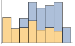
DateHistogram[{date1,date2,…}]
绘制日期 datei 的直方图.
DateHistogram[{date1,date2,…},bspec]
绘制组距规范为 bspec 的直方图.
DateHistogram[{date1,date2,…},bspec,hspec]
绘制根据规范 hspec 计算直方条高度的直方图.
DateHistogram[{data1,data2,…}]
绘制多个数据集 datai 的直方图.
DateHistogram
DateHistogram[{date1,date2,…}]
绘制日期 datei 的直方图.
DateHistogram[{date1,date2,…},bspec]
绘制组距规范为 bspec 的直方图.
DateHistogram[{date1,date2,…},bspec,hspec]
绘制根据规范 hspec 计算直方条高度的直方图.
DateHistogram[{data1,data2,…}]
绘制多个数据集 datai 的直方图.
更多信息和选项
- datei 的可能形式包括:
-
DateObject,TimeObject 日期或时间对象 "string" DateString 规范 {y,m,d,h,m,s} DateList 规范 {y},{y,m},{y,m,d},… 简短日期列表 t 以单个数字给出的绝对时间 - 数据集 datai 具有下列形式和解释:
-
{date1,date2,…} 日期或时间列表 <|"k1"date1,"k2"date2,…|> 关联中的值 TimeSeries,EventSeries 时间序列里的时间 w[datai] 应用于数据集 datai 的封装 - DateHistogram[Tabular[…]cspec] 用列指定 cspec 从表格对象中提取值并绘制.
- 可使用以下形式的列指定 cspec 来绘制表格数据:
-
colx 创建列 colx 中数值的直方图 {colx1,colx2,…} 创建列 colx1, colx2, … 的直方图 - 下列封装 w 可用于数据集 datai:
-
Annotation[datai,label] 提供注释 Button[datai,action] 定义当点击曲线时,要执行的操作 EventHandler[datai,…] 定义曲线的一般事件句柄 Hyperlink[datai,uri] 以曲线作为超链接 Legended[datai,…] 在图例中标出曲线 PopupWindow[datai,cont] 给曲线附加弹出窗口 StatusArea[datai,label] 当在曲线上移动鼠标时在状态区域中显示 Style[datai,opts] 使用指定的样式显示曲线 Tooltip[datai,label] 给曲线附加任意工具提示条 - 可以给出下列组距规范 bspec:
-
n 分成 n 个组 "Year","Month","Day",… 按照日期元素分组 {Δt} 使用日期长度为 Δt 的直方条 {datemin,datemax,Δt} 使用从 datemin 到 datemax 的日期长度为 Δt 的直方条 {{date1,date2,…}} 按界限值 [d1,d2),[d2,d3),… 分组 Automatic 自动确定组距 fb 应用 fb 以得到明确的分组规定 {d1,d2,…} - 日期长度 Δt 可以是带时间单位的量.
- DateHistogram[data,fb] 中的函数 fb 被用于由所有 datei 组成的列表,并且应该返回显式分组界限值列表 {d1,d2,…}.
- 通过给定 DateHistogram[data,bspec,hspec] 中不同的直方条高度规范 hspec ,可以得到不同形式的直方图. 可以使用下列形式:
-
"Count" 落在每个直方条内的值的数量 "CumulativeCount" 累积频数 "SurvivalCount" 生存频数 "Probability" 落在每个直方条内的值的比例 "Intensity" 频数密度函数 "PDF" 概率密度函数 "CDF" 累积分布函数 "SF" 生存函数 "HF" 风险函数 "CHF" 累积风险函数 {"Log",hspec} 经对数转换过的高度指定 fh 通过对直方条和频数应用 fh 获得的高度 - DateHistogram[data,bspec,fh] 中的函数 fh 被应用于两个参数:界限值列表 {{d1,d2},{d2,d3},…} 和相应的频数列表 {c1,c2,…}. 函数应该返回用于每个 ci 的高度列表.
- 只有当 datei 为日期或者时间时,才会被分配给直方条;其他情况被当作缺失数据处理.
- 在 DateHistogram[{data1,data2,…},…] 中,自动确定直方条位置时要综合考虑所有数据集 datai.
- DateHistogram[{…,wi[datai,…],…},…] 根据由符号封装 wi 定义的规范来对和数据集 datai 相关的直方图元素进行渲染.
- 可能的符号封装与 BarChart 的相同,且包括 Style、Labeled、Legended 等.
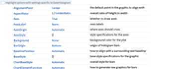
- DateHistogram 和 Graphics 有相同的选项,并有下列添加与修改: [所有选项的列表]
-
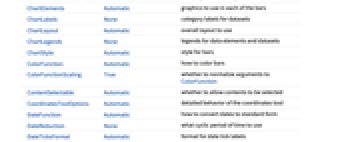
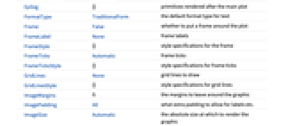
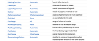
AspectRatio 1/GoldenRatio 整体高宽比 Axes True 是否绘制坐标轴 BarOrigin Bottom 直方条的原点 ChartElementFunction Automatic 如何产生直方条的原始图形 ChartElements Automatic 每个直方条中使用的图形 ColorFunction Automatic 如何为直方条着色 ColorFunctionScaling True 是否将 ColorFunction 的参数归一化 DateFunction Automatic 如何将日期转化为标准形式 DateReduction None 使用什么时间周期 DateTicksFormat Automatic 日期刻度标签的格式 LabelingFunction Automatic 如何给元素添加标签 LegendAppearance Automatic 图例的整体外观 PerformanceGoal $PerformanceGoal 优化的目标 PlotFit None 如何对直方图拟合曲线 PlotFitElements Automatic 拟合元素以在直方图中显示 PlotLabels None 数据集的类别标签 PlotLayout Automatic 要使用的整体布局 PlotLegends None 数据元素和数据集的图例 PlotStyle Automatic 条形的样式 PlotTheme $PlotTheme 直方图的整体主题 TimeZone Automatic 使用的时区 - PlotLegends 的典型设置包括:
-
None 无图例 Automatic 自动确定图例 {lbl1,lbl2,…} 使用 lbl1, lbl2, … 作为图例标签 Placed[lspec,…] 指定图例的位置 - PlotStylesty 指定用于每条曲线的样式. 可用的设置包括:
-
{sty1,sty2,…} 数据集的样式序列 <|"key"val,…|> 不同数据层级的样式元素 - 接受的键为:
-
"Base" 所有 datai 的整体样式 "Lists" 每个 datai 的样式列表 styi - ColorData["DefaultChartColors"] 给出 PlotStyle 使用的默认颜色序列.
- PlotLayout 的以下设置可被用于显示多组数据:
-

"Overlapped" 叠置所有数据 
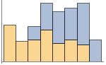
"Stacked" 堆置每个分组的数据 - 在多个面板中显示单组直方条的 PlotLayout 的可能设置包括:
-
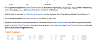
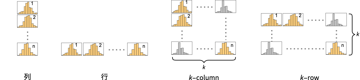
"Column" 在一列面板中分别显示直方条组 "Row" 在一行面板中分别显示直方条组 {"Column",k},{"Row",k} 使用 k 列或行 {"Column",UpTo[k]},{"Row",UpTo[k]} 使用至多 k 列或行 - ChartElementFunction 的参数有分组区域 {{xmin,xmax},{ymin,ymax}}、直方条数值 lists 和来自数据集嵌套列表中每一层的元数据 {m1,m2,…}.
- ChartElementFunction 的内置设置列表可以从 ChartElementData["DateHistogram"] 获得.
- 提供给 ColorFunction 的参数是每个直方条的高度.
- DateHistogram 中从选项和其它构造而来的样式和其他规范实际上是按照顺序 ChartStyle、ColorFunction、Style 和其他封装、ChartElements 和 ChartElementFunction 依次应用,后面的规范覆盖前面的.
所有选项的列表
范例
打开所有单元 关闭所有单元基本范例 (5)
data = {DateObject[{2015, 6, 10}, "Day", "Gregorian", -6.], DateObject[{2015, 6, 26}, "Day", "Gregorian", -6.], DateObject[{2015, 6, 15}, "Day", "Gregorian", -6.], DateObject[{2015, 6, 25}, "Day", "Gregorian", -6.], DateObject[{2015, 6, 23}, "Day", "Gregorian", -6.], DateObject[{2015, 6, 19}, "Day", "Gregorian", -6.], DateObject[{2015, 5, 31}, "Day", "Gregorian", -6.], DateObject[{2015, 6, 6}, "Day", "Gregorian", -6.], DateObject[{2015, 6, 4}, "Day", "Gregorian", -6.], DateObject[{2015, 6, 16}, "Day", "Gregorian", -6.], DateObject[{2015, 5, 29}, "Day", "Gregorian", -6.], DateObject[{2015, 6, 4}, "Day", "Gregorian", -6.], DateObject[{2015, 6, 14}, "Day", "Gregorian", -6.], DateObject[{2015, 6, 3}, "Day", "Gregorian", -6.], DateObject[{2015, 6, 14}, "Day", "Gregorian", -6.], DateObject[{2015, 6, 6}, "Day", "Gregorian", -6.], DateObject[{2015, 6, 10}, "Day", "Gregorian", -6.], DateObject[{2015, 6, 19}, "Day", "Gregorian", -6.], DateObject[{2015, 6, 20}, "Day", "Gregorian", -6.], DateObject[{2015, 6, 21}, "Day", "Gregorian", -6.]};DateHistogram[data]DateHistogram[data, "Day"]DateHistogram[TemporalData[TimeSeries, {{{6., 6.300000190734863, 6.599999904632568, 6.5, 7.199999809265137,
7.199999809265137, 6.099999904632568, 6.800000190734863, 6.800000190734863, 6.900000095367432,
6.900000095367432, 6.900000095367432, 6., 6.19999 ... 896, 3593856774, 3593869244,
3594181712, 3594349654, 3594849854, 3594868197, 3596312288}}}, 1, {"Continuous", 1},
{"Discrete", 1}, 1, {ValueDimensions -> 1, ResamplingMethod ->
{"Interpolation", InterpolationOrder -> 1}}}, True, 10.], "Month"]data1 = RandomChoice[DateRange[{2010, 1, 1}, {2010, 5, 31}, "Day"], 2000];
data2 = RandomChoice[DateRange[{2010, 3, 1}, {2010, 8, 31}, "Day"], 2000];DateHistogram[{data1, data2}]DateHistogram[RandomChoice[DateRange[{2010, 1, 1}, {2010, 5, 31}, "Day"], 200], Automatic, "Probability"]dates = Table[{RandomInteger[{1900, 2010}], IntegerPart@First@RandomReal[NormalDistribution[6, 1], 1], RandomInteger[{1, 31}]}, {2000}];DateHistogram[dates]DateHistogram[dates, "Month", DateReduction -> "Year"]范围 (22)
数据与布局 (8)
data = RandomChoice[DateRange[{2010, 1, 1}, {2010, 5, 31}, "Day"], 200];DateHistogram[data, "Months"]DateHistogram[data, 5]DateHistogram[data, Quantity[2, "Months"]]DateHistogram[data, {DateObject[{2010, 1, 1}], DateObject[{2010, 6, 1}], Quantity[10, "Days"]}]DateHistogram[data, {DateObject[{2010, 1, 1}], Automatic, 5}]DateHistogram[data, {Automatic, DateObject[{2010, 6, 1}], 5}]DateHistogram[data, {{DateObject[{2010, 1, 1}], DateObject[{2010, 2, 1}], DateObject[{2010, 4, 1}], DateObject[{2010, 6, 1}]}}]data = RandomChoice[DateRange[{2010, 1, 1}, {2010, 5, 31}, "Day"], 500];Table[DateHistogram[data, b, PlotLabel -> b], {b, {"Day", "Week", "Month", "Quarter"}}]data = RandomChoice[DateRange[{1950, 1, 1}, {2010, 5, 31}, "Day"], 2000];Table[DateHistogram[data, b, PlotLabel -> b], {b, {"Year", "Decade", "Century", "Millennia"}}]data = RandomChoice[DateRange[{2010, 1, 1, 20}, {2010, 1, 2, 6}, "Minute"], 500];Table[DateHistogram[data, b, PlotLabel -> b], {b, {"Minute", "Hour"}}]data = RandomChoice[DateRange[{2010, 1, 1}, {2010, 5, 31}, "Day"], 100];monthBins[list_] := (Union[DateValue[#, {"Year", "Month"}]& /@ list])monthBins[data]DateHistogram[data, monthBins]data = RandomChoice[DateRange[{2010, 1, 1}, {2010, 5, 31}, "Day"], 200];Table[DateHistogram[data, "Month", h, DateTicksFormat -> {"MonthNameShort"}, PlotLabel -> h], {h, {"Count", "Probability", "Intensity", "CumulativeCount", "CDF", "SF"}}]Association 中的键会被忽略:
DateHistogram[<|"key1" -> {2010, 1, 2}, "key2" -> {2010, 1, 5}, "key3" -> {2010, 1, 6}, "key4" -> {2010, 1, 10}|>]在 TimeSeries、EventSeries 和 TemporalData 中,日期和时间按如下方式绘制:
ed = EarthquakeData[All, 6, {{2001, 1, 1}, {2005, 5, 4}}, "Magnitude"]DateHistogram[ed, "Month"]data1 = RandomChoice[DateRange[{2010, 1, 1}, {2010, 2, 28}, "Day"], 20];
data2 = RandomChoice[DateRange[{2010, 1, 15}, {2010, 3, 31}, "Day"], 20];{DateHistogram[{data1, data2}, "Week", ChartLayout -> "Overlapped"], DateHistogram[{data1, data2}, "Week", ChartLayout -> "Stacked"]}data1 = RandomChoice[DateRange[{2010, 1, 1}, {2010, 2, 28}, "Day"], 20];
data2 = RandomChoice[DateRange[{2010, 1, 15}, {2010, 3, 31}, "Day"], 20];DateHistogram[{data1, data2}, ChartLayout -> "Row"]DateHistogram[{data1, data2}, ChartLayout -> "Column"]表格数据 (1)
tab = Tabular[IconizedObject[«Sharp movements in SP500»]]DateHistogram[tab -> "Date"]DateHistogram[tab -> "Date", DateReduction -> "Year"]使用 PivotToColumns 生成按增加或减少分组的日期列:
pivot = PivotToColumns[tab, "Direction" -> "Date"]DateHistogram[pivot -> {"Drop", "Jump"}, ChartLayout -> "Stacked"]DateHistogram[pivot -> {"Drop", "Jump"}, DateReduction -> "Year", PlotLegends -> {"Drop", "Jump"}, ChartLayout -> "Stacked"]封装 (2)
data1 = RandomChoice[DateRange[{2010, 1, 1}, {2010, 4, 31}, "Day"], 100];
data2 = RandomChoice[DateRange[{2010, 5, 1}, {2010, 8, 31}, "Day"], 100];
data3 = RandomChoice[DateRange[{2010, 9, 1}, {2010, 11, 31}, "Day"], 100];{DateHistogram[{data1, data2, data3}], DateHistogram[{data1, Style[data2, RGBColor[0.14, 0.8, 0.14]], data3}], DateHistogram[Style[{data1, data2, data3}, RGBColor[0.14, 0.8, 0.14]]]}DateHistogram[Style[{data1, Style[data2, RGBColor[0.14, 0.8, 0.14]], data3}, RGBColor[1, 0.75, 0]]]data1 = RandomChoice[DateRange[{2010, 1, 1}, {2010, 4, 31}, "Day"], 100];
data2 = RandomChoice[DateRange[{2010, 5, 1}, {2010, 8, 31}, "Day"], 100];
data3 = RandomChoice[DateRange[{2010, 9, 1}, {2010, 11, 31}, "Day"], 100];DateHistogram[{data1, Tooltip[data2, "my data"], data3}]使用 PopupWindow 提供额外的下钻信息:
DateHistogram[{data1, PopupWindow[data2, DateHistogram[EarthquakeData[All, 6, {"May 1, 2010", "Aug. 1, 2010"}, "Magnitude"]]], data3}]Button 可用于触发任何操作:
DateHistogram[{data1, Button[data2, Speak["my data"]], data3}]样式与外观 (4)
data1 = RandomChoice[DateRange[{2010, 1, 1}, {2010, 4, 31}, "Day"], 100];
data2 = RandomChoice[DateRange[{2010, 5, 1}, {2010, 8, 31}, "Day"], 100];
data3 = RandomChoice[DateRange[{2010, 9, 1}, {2010, 11, 31}, "Day"], 100];DateHistogram[{data1, data2, data3}, PlotStyle -> {RGBColor[0.93, 0.27, 0.27], RGBColor[0.14, 0.8, 0.14], RGBColor[0.4, 0.6, 1]}]使用来自 ColorData 的任意渐变或索引颜色方案:
ChartBaseStyle 可用于为所有图表元素设置初始样式:
DateHistogram[{data1, data2, data3}, PlotStyle -> <|"Lists" -> {RGBColor[0.797253, 0.904982, 0.410498], RGBColor[0.934691, 0.945708, 0.75346], RGBColor[0.769879, 0.92369, 0.977371]}, "Base" -> Directive[EdgeForm[Dotted], Opacity[1]]|>]Style 可用于覆盖样式:
DateHistogram[{data1, Style[data2, RGBColor[0.14, 0.8, 0.14]], data3}, PlotStyle -> GrayLevel[0.62]]DateHistogram[RandomChoice[DateRange[{2010, 1, 1}, {2010, 10, 31}, "Day"], 1000], ChartElements -> Graphics[Disk[]]]ChartElementData["DateHistogram"]data = RandomChoice[DateRange[{2010, 1, 1}, {2010, 10, 31}, "Day"], 1000];Table[DateHistogram[data, ChartElementFunction -> f], {f, {"GlassRectangle", "GradientScaleRectangle"}}]详细设置请使用 Palettes ▶ ChartElementSchemes:
DateHistogram[data, ChartElementFunction -> ChartElementDataFunction["SegmentScaleRectangle", "Segments" -> 7, "ColorScheme" -> "SolarColors"]]DateHistogram[Table[RandomChoice[DateRange[{2010, i, 1}, {2010, i + 2, 31}, "Day"], 1000], {i, {1, 3, 5, 7}}], 50, PlotTheme -> "Monochrome"]标签和图例 (7)
使用 Labeled 为数据集添加标签:
data1 = RandomChoice[DateRange[{2010, 1, 1}, {2010, 4, 31}, "Day"], 100];
data2 = RandomChoice[DateRange[{2010, 5, 1}, {2010, 8, 31}, "Day"], 100];
data3 = RandomChoice[DateRange[{2010, 9, 1}, {2010, 11, 31}, "Day"], 100];DateHistogram[{data1, data2, Labeled[data3, "label", Above]}]data = RandomChoice[DateRange[{2010, 1, 1}, {2010, 10, 31}, "Day"], 1000];Table[DateHistogram[Labeled[data, "label", p], PlotLabel -> p], {p, {Bottom, Center, Top}}]Table[DateHistogram[Labeled[data, "label", p], PlotLabel -> p], {p, {Left, Center, Right}}]使用 LabelingFunction 为条形提供数值标签:
data = EarthquakeData[All, 6, {{2001, 1, 1}, {2005, 12, 31}}, "Magnitude"];DateHistogram[data, 20, LabelingFunction -> Above]使用 Placed 来控制位置和格式:
labeler[v_, {i_, j_}, {ri_, cj_}] := Placed[{CharacterRange["A", "Z"][[j]], v}, Above, Column]DateHistogram[RandomChoice[DateRange[{2010, 1, 1}, {2010, 10, 31}, "Day"], 1000], LabelingFunction -> labeler]data1 = RandomChoice[DateRange[{2010, 1, 1}, {2010, 4, 31}, "Day"], 100];
data2 = RandomChoice[DateRange[{2010, 5, 1}, {2010, 8, 31}, "Day"], 100];
data3 = RandomChoice[DateRange[{2010, 9, 1}, {2010, 11, 31}, "Day"], 100];DateHistogram[{data1, data2, data3}, PlotLegends -> {"Jan~Apr", "May~Aug", "Sep~Dec"}]使用 Legended 添加额外的图例条目:
data1 = RandomChoice[DateRange[{2010, 1, 1}, {2010, 4, 31}, "Day"], 100];
data2 = RandomChoice[DateRange[{2010, 5, 1}, {2010, 8, 31}, "Day"], 100];
data3 = RandomChoice[DateRange[{2010, 9, 1}, {2010, 11, 31}, "Day"], 100];DateHistogram[{data1, Legended[Style[data2, RGBColor[0.93, 0.27, 0.27]], "extra"], data3}, PlotLegends -> {"Jan~Apr", "May~Aug", "Sep~Dec"}]使用 Placed 来影响图例的位置:
data1 = RandomChoice[DateRange[{2010, 1, 1}, {2010, 4, 31}, "Day"], 100];
data2 = RandomChoice[DateRange[{2010, 5, 1}, {2010, 8, 31}, "Day"], 100];
data3 = RandomChoice[DateRange[{2010, 9, 1}, {2010, 11, 31}, "Day"], 100];Table[DateHistogram[{data1, data2, data3}, PlotLegends -> Placed[{"Jan~Apr", "May~Aug", "Sep~Dec"}, p]], {p, {Below, Above}}]选项 (83)
AspectRatio (2)
默认情况下,DateHistogram 对图使用固定的高宽比:
DateHistogram[IconizedObject[«data»]]使用 AspectRatio1 使高度与宽度相同:
DateHistogram[IconizedObject[«data»], AspectRatio -> 1]BarOrigin (1)
ChartBaseStyle (4)
使用 ChartBaseStyle 为条形设置样式:
data1 = RandomChoice[DateRange[{2010, 1, 1}, {2010, 5, 31}, "Day"], 100];
data2 = RandomChoice[DateRange[{2010, 6, 1}, {2010, 10, 31}, "Day"], 100];DateHistogram[data1, ChartBaseStyle -> EdgeForm[Dashed]]DateHistogram[{data1, data2}, ChartBaseStyle -> EdgeForm[Dashed]]ChartBaseStyle 与 ChartStyle 结合使用:
DateHistogram[RandomChoice[DateRange[{2010, 6, 1}, {2010, 10, 31}, "Day"], 100], ChartStyle -> StandardGreen, ChartBaseStyle -> EdgeForm[Dashed]]ChartStyle 可能会覆盖 ChartBaseStyle 的设置:
DateHistogram[RandomChoice[DateRange[{2010, 6, 1}, {2010, 10, 31}, "Day"], 100], ChartStyle -> EdgeForm[], ChartBaseStyle -> EdgeForm[Dashed]]ChartBaseStyle 与 Style 结合使用:
data1 = RandomChoice[DateRange[{2010, 1, 1}, {2010, 4, 31}, "Day"], 100];
data2 = RandomChoice[DateRange[{2010, 5, 1}, {2010, 8, 31}, "Day"], 100];
data3 = RandomChoice[DateRange[{2010, 9, 1}, {2010, 10, 31}, "Day"], 100];DateHistogram[{data1, Style[data2, Yellow], data3}, ChartBaseStyle -> EdgeForm[Dotted]]Style 可以覆盖 ChartBaseStyle 的设置:
DateHistogram[{data1, Style[data2, EdgeForm[None]], data3}, ChartBaseStyle -> EdgeForm[Dotted]]ChartBaseStyle 与 ColorFunction 结合使用:
DateHistogram[{data1, data2, data3}, ChartBaseStyle -> EdgeForm[Dotted], ColorFunction -> "Rainbow"]ColorFunction 可能会覆盖 ChartBaseStyle 的设置:
DateHistogram[{data1, data2, data3}, ChartBaseStyle -> EdgeForm[Dotted], ColorFunction -> (EdgeForm[None]&)]ChartElementFunction (4)
获取 ChartElementFunction 的内置设置列表:
ChartElementData["DateHistogram"]详细设置请使用 Palettes ▶ ChartElementSchemes:
data = RandomChoice[DateRange[{2010, 1, 1}, {2010, 12, 31}, "Day"], 100];Table[DateHistogram[data, ChartElementFunction -> f, PlotLabel -> f], {f, {"Rectangle", "GradientRectangle"}}]Table[DateHistogram[data, ChartElementFunction -> f, PlotLabel -> f], {f, {"FadingRectangle", "GlassRectangle"}}]使用适当的 ChartElementFunction 来显示全局比例:
Table[DateHistogram[data, ChartElementFunction -> f, PlotLabel -> f], {f, {"GradientScaleRectangle", "SegmentScaleRectangle"}}]编写自定义 ChartElementFunction:
f[{{xmin_, xmax_}, {ymin_, ymax_}}, ___] := Rectangle[{xmin, ymin}, {xmax, ymax}]DateHistogram[RandomChoice[DateRange[{2010, 1, 1}, {2010, 12, 31}, "Day"], 100], ChartElementFunction -> f]g[{{xmin_, xmax_}, {ymin_, ymax_}}, ___] := Polygon[{{xmin, ymin}, {xmax, ymax}, {xmin, ymax}, {xmax, ymin}}]DateHistogram[RandomChoice[DateRange[{2010, 1, 1}, {2010, 12, 31}, "Day"], 100], ChartElementFunction -> g]内置元素函数可能带有选项;请使用 Palettes ▶ ChartElementSchemes 来设置它们:
ChartElementData["FadingRectangle", "Options"]data = RandomChoice[DateRange[{2010, 1, 1}, {2010, 5, 31}, "Day"], 100];Table[DateHistogram[data, ChartElementFunction -> ChartElementData["FadingRectangle", "GradientOrigin" -> r], PlotLabel -> r], {r, {Top, Left, Right}}]ChartElements (9)
基于任意 Graphics 对象创建象形图:
DateHistogram[RandomChoice[DateRange[{2010, 1, 1}, {2010, 4, 31}, "Day"], 100], ChartElements -> Graphics[Disk[]]]DateHistogram[RandomChoice[DateRange[{2010, 1, 1}, {2010, 4, 31}, "Day"], 100], ChartElements -> Graphics3D[Sphere[]]]DateHistogram[RandomChoice[DateRange[{2010, 1, 1}, {2010, 4, 31}, "Day"], 100], 6, ChartElements -> ExampleData[{"TestImage", "House"}]]DateHistogram[RandomChoice[DateRange[{2010, 1, 1}, {2010, 4, 31}, "Day"], 100], ChartElements -> {[image], All}]data = RandomChoice[DateRange[{2010, 1, 1}, {2010, 4, 31}, "Day"], 100];Table[DateHistogram[data, ChartElements -> {Graphics[Disk[], AspectRatio -> Full], s}, PlotLabel -> s], {s, {{Scaled[1 / 2], Scaled[0.2]}, {Scaled[1], Scaled[1 / 2]}}}]将 All 用于宽度或高度时,会使该方向拉伸到该条形的完整尺寸:
data = RandomChoice[DateRange[{2010, 1, 1}, {2010, 4, 31}, "Day"], 100];Table[DateHistogram[data, ChartElements -> {[image], s}, PlotLabel -> s], {s, {{Scaled[1 / 2], All}, {All, 1}}}]data1 = RandomChoice[DateRange[{2010, 1, 1}, {2010, 4, 31}, "Day"], 100];
data2 = RandomChoice[DateRange[{2010, 5, 1}, {2010, 8, 31}, "Day"], 100];
data3 = RandomChoice[DateRange[{2010, 9, 1}, {2010, 11, 31}, "Day"], 100];DateHistogram[{data1, data2, data3}, ChartElements -> {[image], [image], [image]}]DateHistogram[{data1, data2, data3}, ChartElements -> {{[image], [image]}, None}]样式继承自通过 ChartStyle 等设置的样式:
DateHistogram[RandomChoice[DateRange[{2010, 1, 1}, {2010, 4, 31}, "Day"], 100], ChartElements -> [image], PlotStyle -> RGBColor[0.14, 0.8, 0.14]]Style 可以覆盖来自 ChartStyle 的设置:
data1 = RandomChoice[DateRange[{2010, 1, 1}, {2010, 4, 31}, "Day"], 100];
data2 = RandomChoice[DateRange[{2010, 5, 1}, {2010, 8, 31}, "Day"], 100];
data3 = RandomChoice[DateRange[{2010, 9, 1}, {2010, 11, 31}, "Day"], 100];DateHistogram[{data1, Style[data2, RGBColor[1, 0.75, 0]], data3}, ChartElements -> [image], PlotStyle -> {RGBColor[0.93, 0.27, 0.27], RGBColor[0.14, 0.8, 0.14], RGBColor[0.4, 0.6, 1]}]DateHistogram[RandomChoice[DateRange[{2010, 1, 1}, {2010, 4, 31}, "Day"], 100], ChartElements -> [image], PlotStyle -> RGBColor[0.14, 0.8, 0.14]]g = Graphics3D[{EdgeForm[], Specularity[White, 30], Cylinder[]}, ViewPoint -> {0, -Infinity, 0}, Boxed -> False, Lighting -> "Neutral", PlotRangePadding -> 0];DateHistogram[RandomChoice[DateRange[{2010, 1, 1}, {2010, 4, 31}, "Day"], 100], ChartElements -> {g, All}, PlotStyle -> RGBColor[0.8, 0.3, 0.8]]ChartLabels (6)
data1 = RandomChoice[DateRange[{2010, 1, 1}, {2010, 4, 31}, "Day"], 100];
data2 = RandomChoice[DateRange[{2010, 5, 1}, {2010, 8, 31}, "Day"], 100];
data3 = RandomChoice[DateRange[{2010, 9, 1}, {2010, 11, 31}, "Day"], 100];DateHistogram[{data1, data2, data3}, PlotLabels -> Placed[{"a", "b", "c"}, Above], PlotRange -> All]使用 Labeled 封装数据集可添加额外标签:
DateHistogram[{data1, Labeled[data2, "label", Center], data3}, PlotLabels -> Placed[{"a", "b", "c"}, Above]]使用 Placed 控制标签位置:
data = RandomChoice[DateRange[{2010, 1, 1}, {2010, 5, 31}, "Day"], 100];Table[DateHistogram[data, PlotLabels -> Placed[{"label"}, p], PlotLabel -> p], {p, {Bottom, Center, Top}}]{DateHistogram[data, Ticks -> None, PlotLabels -> Placed[{"label"}, Below], BarOrigin -> Top], DateHistogram[data, Ticks -> None, PlotLabels -> Placed[{"label"}, Above], BarOrigin -> Bottom]}{DateHistogram[data, Ticks -> None, PlotLabels -> Placed[{"label"}, Before], BarOrigin -> Right], DateHistogram[data, Ticks -> None, PlotLabels -> Placed[{"label"}, After], BarOrigin -> Left]}data = RandomChoice[DateRange[{2010, 1, 1}, {2010, 5, 31}, "Day"], 100];Table[DateHistogram[data, ChartLabels -> Placed[{"label"}, p], Ticks -> None, PlotLabel -> p], {p, {{0, 0}, {0.5, 0.5}, {1, 1}}}]data = RandomChoice[DateRange[{2010, 1, 1}, {2010, 5, 31}, "Day"], 100];Table[DateHistogram[data, ChartLabels -> Placed[{Framed["label"]}, {{0, 0}, p}], Ticks -> None, PlotLabel -> p], {p, {{0, 0}, {0.5, 0.5}, {1, 1}}}]使用 Placed 的第三个参数来控制格式:
DateHistogram[RandomChoice[DateRange[{2010, 1, 1}, {2010, 5, 31}, "Day"], 100], ChartLabels -> Placed[{"label"}, Center, Rotate[#, 45Degree]&], Ticks -> None]DateHistogram[RandomChoice[DateRange[{2010, 1, 1}, {2010, 5, 31}, "Day"], 100], ChartLabels -> Placed[{"aaa"}, Center, Framed[#, FrameMargins -> 1, Background -> LightYellow]&]]DateHistogram[RandomChoice[DateRange[{2010, 1, 1}, {2010, 5, 31}, "Day"], 100], ChartLabels -> Placed[{"aaa"}, Center, "Framed"]]DateHistogram[RandomChoice[DateRange[{2010, 1, 1}, {2010, 5, 31}, "Day"], 100], ChartLabels -> Placed[{"aaa"}, Center, Hyperlink[#, "http://www.wolfram.com"]&]]DateHistogram[RandomChoice[DateRange[{2010, 1, 1}, {2010, 5, 31}, "Day"], 100], ChartLabels -> Placed[{{"aaa"}, {"zzz"}}, {Top, Bottom}]]ChartLayout (4)
data1 = RandomChoice[DateRange[{2010, 1, 1}, {2010, 8, 31}, "Day"], 100];
data2 = RandomChoice[DateRange[{2010, 4, 1}, {2010, 10, 31}, "Day"], 100];Table[DateHistogram[{data1, data2}, ChartLayout -> l, PlotLabel -> l], {l, {"Overlapped", "Stacked"}}]DateHistogram[{IconizedObject[«data 1»], IconizedObject[«data 2»]}, ChartLayout -> Column]DateHistogram[{IconizedObject[«data 1»], IconizedObject[«data 2»]}, ImageSize -> Medium, ChartLayout -> Row]DateHistogram[{IconizedObject[«data 1»], IconizedObject[«data 2»], IconizedObject[«data 3»], IconizedObject[«data 4»]}, ImageSize -> Medium, ChartLayout -> {"Column", 2}]DateHistogram[{IconizedObject[«data 1»], IconizedObject[«data 2»], IconizedObject[«data 3»], IconizedObject[«data 4»], IconizedObject[«data 5»], IconizedObject[«data 6»]}, ChartLayout -> {"Column", UpTo[4]}]DateHistogram[{IconizedObject[«data 1»], IconizedObject[«data 2»], IconizedObject[«data 3»], IconizedObject[«data 4»], IconizedObject[«data 5»], IconizedObject[«data 6»]}, ChartLayout -> {"Column", 4}]ChartLegends (2)
data1 = RandomChoice[DateRange[{2010, 1, 1}, {2010, 4, 31}, "Day"], 100];
data2 = RandomChoice[DateRange[{2010, 5, 1}, {2010, 8, 31}, "Day"], 100];
data3 = RandomChoice[DateRange[{2010, 9, 1}, {2010, 10, 31}, "Day"], 100];DateHistogram[{data1, data2, data3}, ChartLegends -> {"John", "Mary", "Bob"}]使用 Legended 添加额外的图例项:
DateHistogram[{data1, Legended[Style[data2, Red], "Henry"], data3}, ChartLegends -> {"John", "Mary", "Bob"}]使用 Legended 指定各个图例项:
DateHistogram[{data1, Legended[data2, "Mary"], data3}]使用 Placed 来控制图例的位置:
data1 = RandomChoice[DateRange[{2010, 1, 1}, {2010, 4, 31}, "Day"], 100];
data2 = RandomChoice[DateRange[{2010, 5, 1}, {2010, 8, 31}, "Day"], 100];
data3 = RandomChoice[DateRange[{2010, 9, 1}, {2010, 10, 31}, "Day"], 100];Table[DateHistogram[{data1, data2, data3}, ChartLegends -> Placed[{"ccc1", "ccc2", "ccc3"}, p]], {p, {Below, Above}}]ChartStyle (5)
使用 ChartStyle 设置条形的样式:
data = RandomChoice[DateRange[{2010, 1, 1}, {2010, 4, 31}, "Day"], 100];Table[DateHistogram[data, ChartStyle -> s], {s, {Green, EdgeForm[Dotted], Directive[Green, EdgeForm[Dotted]]}}]data1 = RandomChoice[DateRange[{2010, 1, 1}, {2010, 4, 31}, "Day"], 100];
data2 = RandomChoice[DateRange[{2010, 5, 1}, {2010, 8, 31}, "Day"], 100];
data3 = RandomChoice[DateRange[{2010, 9, 1}, {2010, 10, 31}, "Day"], 100];DateHistogram[{data1, data2, data3}, ChartStyle -> {Red, Green, Blue}]使用来自 ColorData 的 "Gradient" 颜色:
DateHistogram[{data1, data2, data3}, ChartStyle -> "Pastel"]使用来自 ColorData 的 "Indexed" 颜色:
DateHistogram[{data1, data2, data3}, ChartStyle -> 93]data1 = RandomChoice[DateRange[{2010, 1, 1}, {2010, 4, 31}, "Day"], 100];
data2 = RandomChoice[DateRange[{2010, 5, 1}, {2010, 8, 31}, "Day"], 100];
data3 = RandomChoice[DateRange[{2010, 9, 1}, {2010, 10, 31}, "Day"], 100];DateHistogram[{data1, data2, data3}, ChartStyle -> {Green, Blue}]Style 会覆盖 ChartStyle 的设置:
data1 = RandomChoice[DateRange[{2010, 1, 1}, {2010, 4, 31}, "Day"], 100];
data2 = RandomChoice[DateRange[{2010, 5, 1}, {2010, 8, 31}, "Day"], 100];
data3 = RandomChoice[DateRange[{2010, 9, 1}, {2010, 10, 31}, "Day"], 100];DateHistogram[{data1, Style[data2, Yellow], data3}, ChartStyle -> Green]ColorFunction 会覆盖 ChartStyle 的设置:
DateHistogram[{data1, data2, data3}, ChartStyle -> {Red, Green, Blue}, ColorFunction -> "SolarColors"]ChartElements 可能会覆盖 ChartStyle 的设置:
DateHistogram[RandomChoice[DateRange[{2010, 1, 1}, {2010, 12, 31}, "Day"], 100], ChartElements -> [image], ChartStyle -> "Pastel"]ColorFunction (4)
DateHistogram[RandomChoice[DateRange[{2010, 1, 1}, {2010, 4, 31}, "Day"], 100], ColorFunction -> Function[{height}, ColorData["Rainbow"][height]]]使用 ColorFunctionScalingFalse 获取未缩放的高度值:
DateHistogram[RandomChoice[DateRange[{2010, 1, 1}, {2010, 4, 31}, "Day"], 200], 20, ColorFunction -> (Which[# < 10, RGBColor[1, 0.75, 0], 10 ≤ # < 15, RGBColor[0.98, 0.56, 0.17], True, RGBColor[0.93, 0.27, 0.27]]&), ColorFunctionScaling -> False]ColorFunction 会覆盖 ChartStyle 中的样式:
DateHistogram[RandomChoice[DateRange[{2010, 1, 1}, {2010, 4, 31}, "Day"], 200], PlotStyle -> RGBColor[0.93, 0.27, 0.27], ColorFunction -> "Pastel"]使用 ColorFunction 来组合不同的样式效果:
DateHistogram[RandomChoice[DateRange[{2010, 1, 1}, {2010, 4, 31}, "Day"], 200], ColorFunction -> Function[{height}, Opacity[height]], PlotStyle -> RGBColor[0.8, 0.3, 0.8]]ColorFunctionScaling (2)
DateHistogram[RandomChoice[DateRange[{2010, 1, 1}, {2010, 5, 31}, "Day"], 200], ColorFunction -> Function[{height}, ColorData["Rainbow"][height]]]使用 ColorFunctionScaling False 以获取未缩放的高度值:
DateHistogram[RandomChoice[DateRange[{2010, 1, 1}, {2010, 5, 31}, "Day"], 200], 15, ColorFunction -> (Which[# < 10, RGBColor[1, 0.75, 0], 10 ≤ # < 15, RGBColor[0.98, 0.56, 0.17], True, RGBColor[0.93, 0.27, 0.27]]&), ColorFunctionScaling -> False]DateFunction (2)
DateReduction (1)
dates = Table[{RandomInteger[{1900, 2010}], RandomInteger[{1, 8}], RandomChoice[Range[10]~Join~Range[20, 30]]}, {200}];DateHistogram[dates]DateHistogram[dates, "Month", DateReduction -> "Year"]DateHistogram[dates, "Day", DateReduction -> "Month"]DateTicksFormat (2)
data = RandomChoice[DateRange[{2010, 1, 1}, {2010, 5, 31}, "Day"], 100];DateHistogram[data, DateTicksFormat -> {"MonthNameShort", "-", "Day"}]data = RandomChoice[DateRange[{2010, 1, 1}, {2010, 1, 4}, "Day"], 100];DateHistogram[data, "Day", DateTicksFormat -> {"DayName"}]LabelingFunction (7)
通过 Tooltip 和 StatusArea 使用自动数值标签:
DateHistogram[RandomChoice[DateRange[{2010, 1, 1}, {2010, 5, 31}, "Day"], 200], LabelingFunction -> Automatic]DateHistogram[RandomChoice[DateRange[{2010, 1, 1}, {2010, 5, 31}, "Day"], 200], LabelingFunction -> None]DateHistogram[RandomChoice[DateRange[{2010, 1, 1}, {2010, 5, 31}, "Day"], 200], 8, LabelingFunction -> Above, Ticks -> None]DateHistogram[RandomChoice[DateRange[{2010, 1, 1}, {2010, 5, 31}, "Day"], 200], 8, LabelingFunction -> After, BarOrigin -> Left, Ticks -> None]DateHistogram[RandomChoice[DateRange[{2010, 1, 1}, {2010, 5, 31}, "Day"], 200], 8, LabelingFunction -> {0.5, 1.2}, Ticks -> None]DateHistogram[RandomChoice[DateRange[{2010, 1, 1}, {2010, 5, 31}, "Day"], 200], 8, LabelingFunction -> (Placed[Row[{"$", #}], Above]&)]labeler[v_, {i_, j_}, {ri_, cj_}] := Placed[{CharacterRange["A", "Z"][[j]], v}, Above, Column]DateHistogram[RandomChoice[DateRange[{2010, 1, 1}, {2010, 5, 31}, "Day"], 200], LabelingFunction -> labeler]labeler[v_, {i_, j_}, {ri_, cj_}] := Placed[Join[ri, cj, {v}], Above, Column]DateHistogram[RandomChoice[DateRange[{2010, 1, 1}, {2010, 5, 31}, "Day"], 200], PlotLabels -> <|"Elements" -> Placed[CharacterRange["A", "Z"], None]|>, LabelingFunction -> labeler]PerformanceGoal (1)
data = RandomChoice[DateRange[{2010, 1, 1}, {2010, 5, 31}, "Day"], 500];DateHistogram[data, PerformanceGoal -> "Quality"]DateHistogram[data, PerformanceGoal -> "Speed"]Table[ByteCount@DateHistogram[data, PerformanceGoal -> p], {p, {"Quality", "Speed"}}]PlotFit (3)
DateHistogram[EntityValue[EntityClass["Satellite", "GNSS"], "LaunchDate"], "Year", PlotFit -> Automatic]DateHistogram[EntityValue[EntityClass["Satellite", "GNSS"], "LaunchDate"], "Year", PlotFit -> "Quadratic"]使用 PolynomialModel 用曲线来近似这些数据:
DateHistogram[EntityValue[EntityClass["Satellite", "GNSS"], "LaunchDate"], "Year", PlotFit -> PolynomialModel[]]PlotLabels (6)
DateHistogram[{EntityValue[EntityClass["Satellite", "CommunicationMission"], "LaunchDate"], EntityValue[EntityClass["Satellite", "GNSS"], "LaunchDate"]}, PlotLabels -> Placed[{"a", "b"}, Above]]使用 Labeled 封装数据集可添加额外标签:
DateHistogram[{Labeled[EntityValue[EntityClass["Satellite", "CommunicationMission"], "LaunchDate"], "label", Center], EntityValue[EntityClass["Satellite", "GNSS"], "LaunchDate"]}, PlotLabels -> Placed[{"a", "b", "c"}, Above]]使用 Placed 控制标签位置:
data = EntityValue[EntityClass["Satellite", "CommunicationMission"], "LaunchDate"];Table[DateHistogram[data, PlotLabels -> Placed[{"label"}, p], PlotLabel -> p], {p, {Bottom, Center, Top}}]{DateHistogram[data, Ticks -> None, ChartLabels -> Placed[{"label"}, Below], BarOrigin -> Top], Histogram[data, Ticks -> None, PlotLabels -> Placed[{"label"}, Above], BarOrigin -> Bottom]}{DateHistogram[data, Ticks -> None, PlotLabels -> Placed[{"label"}, Before], BarOrigin -> Right], DateHistogram[data, Ticks -> None, PlotLabels -> Placed[{"label"}, After], BarOrigin -> Left]}data = EntityValue[EntityClass["Satellite", "CommunicationMission"], "LaunchDate"];Table[DateHistogram[data, PlotLabels -> Placed[{"label"}, p], Ticks -> None, PlotLabel -> p], {p, {{0, 0}, {0.5, 0.5}, {1, 1}}}]data = EntityValue[EntityClass["Satellite", "CommunicationMission"], "LaunchDate"];Table[DateHistogram[data, PlotLabels -> Placed[{Framed["label"]}, {{0, 0}, p}], Ticks -> None, PlotLabel -> p], {p, {{0, 0}, {0.5, 0.5}, {1, 1}}}]使用 Placed 的第三个参数来控制格式:
DateHistogram[EntityValue[EntityClass["Satellite", "CommunicationMission"], "LaunchDate"], PlotLabels -> Placed[{"label"}, Center, Rotate[#, 45Degree]&], Ticks -> None]DateHistogram[EntityValue[EntityClass["Satellite", "CommunicationMission"], "LaunchDate"], PlotLabels -> Placed[{"aaa"}, Center, Framed[#, FrameMargins -> 1, Background -> RGBColor[1, 1, 0.85]]&]]DateHistogram[EntityValue[EntityClass["Satellite", "CommunicationMission"], "LaunchDate"], PlotLabels -> Placed[{"aaa"}, Center, "Framed"]]DateHistogram[EntityValue[EntityClass["Satellite", "CommunicationMission"], "LaunchDate"], PlotLabels -> Placed[{"aaa"}, Center, Hyperlink[#, "http://www.wolfram.com"]&]]DateHistogram[EntityValue[EntityClass["Satellite", "CommunicationMission"], "LaunchDate"], PlotLabels -> Placed[{{"aaa"}, {"zzz"}}, {Top, Bottom}]]PlotLayout (4)
DateHistogram[{EntityValue[EntityClass["Satellite", "CommunicationMission"], "LaunchDate"], EntityValue[EntityClass["Satellite", "GNSS"], "LaunchDate"]}]DateHistogram[{EntityValue[EntityClass["Satellite", "CommunicationMission"], "LaunchDate"], EntityValue[EntityClass["Satellite", "GNSS"], "LaunchDate"]}, PlotLayout -> "Stacked"]DateHistogram[{EntityValue[EntityClass["Satellite", "CommunicationMission"], "LaunchDate"], EntityValue[EntityClass["Satellite", "GNSS"], "LaunchDate"]}, PlotLayout -> Column]DateHistogram[{EntityValue[EntityClass["Satellite", "CommunicationMission"], "LaunchDate"], EntityValue[EntityClass["Satellite", "GNSS"], "LaunchDate"]}, ImageSize -> Medium, PlotLayout -> Row]DateHistogram[{IconizedObject[«Subscript[dates, 1]»], IconizedObject[«Subscript[dates, 2]»], IconizedObject[«Subscript[dates, 3]»], IconizedObject[«Subscript[dates, 4]»]}, "Year", ImageSize -> Medium, PlotLayout -> {"Column", 2}]DateHistogram[{IconizedObject[«Subscript[dates, 1]»], IconizedObject[«Subscript[dates, 2]»], IconizedObject[«Subscript[dates, 3]»], IconizedObject[«Subscript[dates, 4]»], IconizedObject[«Subscript[dates, 5]»], IconizedObject[«Subscript[dates, 6]»]}, "Year", ImageSize -> Medium, PlotLayout -> {"Column", UpTo[4]}]DateHistogram[{IconizedObject[«Subscript[dates, 1]»], IconizedObject[«Subscript[dates, 2]»], IconizedObject[«Subscript[dates, 3]»], IconizedObject[«Subscript[dates, 4]»], IconizedObject[«Subscript[dates, 5]»], IconizedObject[«Subscript[dates, 6]»]}, "Year", ImageSize -> Medium, PlotLayout -> {"Column", 4}]PlotLegends (3)
DateHistogram[{EntityValue[EntityClass["Satellite", "CommunicationMission"], "LaunchDate"], EntityValue[EntityClass["Satellite", "GNSS"], "LaunchDate"]}, PlotLegends -> {"Comm", "GPS"}]使用 Placed 来控制图例的位置:
DateHistogram[{EntityValue[EntityClass["Satellite", "CommunicationMission"], "LaunchDate"], EntityValue[EntityClass["Satellite", "GNSS"], "LaunchDate"]}, PlotLegends -> Placed[{"Comm", "GPS"}, Below]]DateHistogram[{EntityValue[EntityClass["Satellite", "CommunicationMission"], "LaunchDate"], EntityValue[EntityClass["Satellite", "GNSS"], "LaunchDate"]}, PlotLegends -> Placed[{"Comm", "GPS"}, {Left, Top}]]使用 SwatchLegend 来控制图例的外观:
DateHistogram[{EntityValue[EntityClass["Satellite", "CommunicationMission"], "LaunchDate"], EntityValue[EntityClass["Satellite", "GNSS"], "LaunchDate"]}, PlotLegends -> SwatchLegend[Automatic, {"Comm", "GPS"}, LegendFunction -> Framed]]PlotRangePadding (3)
data = RandomChoice[DateRange[{2010, 1, 1}, {2010, 5, 31}, "Day"], 200];Table[DateHistogram[data, Axes -> None, Frame -> True, PlotLabel -> ToString@p, PlotRangePadding -> p], {p, {Automatic, None, 2, Scaled[0.15]}}]data = RandomChoice[DateRange[{2010, 1, 1}, {2010, 5, 31}, "Day"], 200];Table[DateHistogram[data, Axes -> None, Frame -> True, PlotLabel -> ToString@p, PlotRangePadding -> p], {p, {{2, Automatic}, {Automatic, 30}, {Scaled[0.15], Automatic}, {Automatic, Scaled[0.15]}}}]data = RandomChoice[DateRange[{2010, 1, 1}, {2010, 5, 31}, "Day"], 200];Table[DateHistogram[data, Axes -> None, Frame -> True, PlotLabel -> ToString@p, PlotRangePadding -> p], {p, {{{1, 3}, Automatic}, {Automatic, {10, 30}}, {{1, 3}, {10, 30}}}}]PlotStyle (5)
使用 PlotStyle 来设置条形的样式:
DateHistogram[EntityValue[EntityClass["Satellite", "CommunicationMission"], "LaunchDate"], PlotStyle -> RGBColor[0.4, 0.6, 1]]DateHistogram[{EntityValue[EntityClass["Satellite", "CommunicationMission"], "LaunchDate"], EntityValue[EntityClass["Satellite", "GNSS"], "LaunchDate"]}, PlotStyle -> {RGBColor[0.93, 0.27, 0.27], RGBColor[1, 0.75, 0]}]DateHistogram[{EntityValue[EntityClass["Satellite", "CommunicationMission"], "LaunchDate"], EntityValue[EntityClass["Satellite", "GNSS"], "LaunchDate"]}, PlotStyle -> <|"Base" -> Opacity[1]|>]DateHistogram[{EntityValue[EntityClass["Satellite", "CommunicationMission"], "LaunchDate"], EntityValue[EntityClass["Satellite", "GNSS"], "LaunchDate"]}, PlotStyle -> <|"Lists" -> {RGBColor[0, 0.35, 0], RGBColor[0.07, 0.25, 0.6]}|>]DateHistogram[{EntityValue[EntityClass["Satellite", "CommunicationMission"], "LaunchDate"], EntityValue[EntityClass["Satellite", "GNSS"], "LaunchDate"]}, PlotStyle -> <|"Base" -> EdgeForm[White], "Lists" -> {RGBColor[0, 0.35, 0], RGBColor[0.07, 0.25, 0.6]}|>]DateHistogram[{EntityValue[EntityClass["Satellite", "CommunicationMission"], "LaunchDate"], Style[EntityValue[EntityClass["Satellite", "GNSS"], "LaunchDate"], RGBColor[0.93, 0.27, 0.27]]}, PlotStyle -> GrayLevel[0.62]]ColorFunction 会覆盖 PlotStyle 的设置:
DateHistogram[EntityValue[EntityClass["Satellite", "CommunicationMission"], "LaunchDate"], PlotStyle -> GrayLevel[0.62], ColorFunction -> "SolarColors"]ChartElements 可能会覆盖 PlotStyle 的设置:
DateHistogram[EntityValue[EntityClass["Satellite", "CommunicationMission"], "LaunchDate"], ChartElements -> [image], PlotStyle -> RGBColor[0.4, 0.6, 1]]PlotTheme (2)
DateHistogram[Table[RandomChoice[DateRange[{2010, i, 1}, {2010, i + 4, 31}, "Day"], 200], {i, {1, 3, 5}}], 50, PlotTheme -> "Marketing"]DateHistogram[Table[RandomChoice[DateRange[{2010, i, 1}, {2010, i + 4, 31}, "Day"], 200], {i, {1, 3, 5}}], 50, PlotTheme -> "Marketing", PlotStyle -> <|"Lists" -> {RGBColor[0.23780781740448254, 0.6887454706969063, 1.], RGBColor[1., 0.519599248047801, 0.3096774660909407], RGBColor[0., 0.7904116386138192, 0.7051174262187454]}, "Base" -> Opacity[1]|>]TimeZone (1)
图形使用 $TimeZone 的设置显示:
DateHistogram[IconizedObject[«data»]]DateHistogram[IconizedObject[«data»], TimeZone -> 0]应用 (4)
data = EntityValue[EntityClass["Country", "Europe"], "IndependenceDate"];DateHistogram[data, {5, "Decades"}, Ticks -> {"Centuries", Automatic}]ed = EarthquakeData[All, 6, {{2001, 1, 1}, {2005, 12, 31}}, "Magnitude"]DateListPlot[ed, Filling -> 0, Joined -> False]Histogram[ed, {"Log", {5.75, 10, 0.25}}, ScalingFunctions -> "Log"]DateHistogram[ed, "Month"]data = Quiet[DeleteMissing[MovieData[All, EntityProperty["Movie", "ReleaseDate"]]]];DateHistogram[data]DateHistogram[data, "Month", DateReduction -> "Year"]DateHistogram[data, "Day", DateReduction -> "Week"]maildata = Databin["4UYrgYkd"];DateHistogram[Values[maildata], "Day"]DateHistogram[Values[maildata], "Day", DateReduction -> "Week"]DateHistogram[Values[maildata], "Hour", DateReduction -> "Day"]文本
Wolfram Research (2015),DateHistogram,Wolfram 语言函数,https://reference.wolfram.com/language/ref/DateHistogram.html (更新于 2026 年).
CMS
Wolfram 语言. 2015. "DateHistogram." Wolfram 语言与系统参考资料中心. Wolfram Research. 最新版本 2026. https://reference.wolfram.com/language/ref/DateHistogram.html.
APA
Wolfram 语言. (2015). DateHistogram. Wolfram 语言与系统参考资料中心. 追溯自 https://reference.wolfram.com/language/ref/DateHistogram.html 年
BibTeX
@misc{reference.wolfram_2026_datehistogram, author="Wolfram Research", title="{DateHistogram}", year="2026", howpublished="\url{https://reference.wolfram.com/language/ref/DateHistogram.html}", note=[Accessed: 06-September-2026]}
BibLaTeX
@online{reference.wolfram_2026_datehistogram, organization={Wolfram Research}, title={DateHistogram}, year={2026}, url={https://reference.wolfram.com/language/ref/DateHistogram.html}, note=[Accessed: 06-September-2026]}