


TernaryListPlot
TernaryListPlot[{{u1,v1,w1},…,{un,vn,wn}}]
指定された座標 u,v,w を持つ点のリストを重心座標系でプロットする.
TernaryListPlot[{data1,data2,…}]
複数のデータ集合 dataiで三角プロットを描画する.
詳細とオプション
- 三角プロットは三角形プロットあるいは三軸プロットとしても知られている.
- 三角プロットは,通常,地質学における土壌の組成,化学における混合物の元素,栄養学におけるカロリー源のように,全体における3つの成分の相対的な比率を示すために使われる.
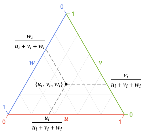
- 各点{ui,vi,wi}は ui/ti, vi/tiと wi/ti を使って正規化される.ここで,ti=ui+vi+wiである.
- 負または実数ではない座標を持つ点は欠落データとみなされる.
- 重心座標系の点{u,v,w}から直交座標系の点{x,y}への変換は{x=v+
 w, y=
w, y= w}で与えられる.
 - TernaryListPlotは正三角形内に点を描画する.座標 u,v,w は,順に底,右,左の辺に相当する.
- 座標 ui,vi,wiは以下の形式で与えることができる.
-
ui 実数値の数 Quantity[ui,unit] 単位が付いた数量 - 上記の形式以外の値は欠落しているものとみなされて表示されない.
- 次の形の dataiは次のように解釈される.
-
<"k1"{u1,v1,w1},"k2"{u2,v2,w2},…> 値{y1,y2,…} {{u1,v1,w1}"lbl1",{u1,v1,w1}"lbl2",…}, {{u1,v1,w1},{u1,v1,w1},…}{"lbl1","lbl2",…} ラベル{lbl1,lbl2,…}が付いた値{y1,y2,…} SparseArray 通常の配列としての値 TimeSeries, EventSeries 時間と値のペア QuantityArray 大きさ NumericArray 通常の配列としての値 WeightedData 重みなしの値 - TernaryListPlot[Tabular[…]cspec]は,列指定 cspec を使って表オブジェクトから値を抽出し,これをプロットする.
- 次は,表形式データのプロットに使用可能な列指定 cspec の形式である.
-
{colu,colv,colw} 列 colu,colv,colwからのデータをプロットする {{colu1,colv1,colw1},{colu2,colv2,colw2},…} 列 colu1,colv1,colw1を集合としてプロットする等 - dataiには次のラッパー w を使うことができる.
-
Annotation[datai,label] データの注釈を与える Button[datai,action] データがクリックされた際に実行する動作を定義する Callout[datai,label] コールアウトでデータにラベルを付ける Callout[datai,label,pos] コールアウトを相対的な位置 pos に置く EventHandler[datai,…] データについての一般的なイベントハンドラを定義する Hyperlink[datai,uri] データをハイパーリンクにする Labeled[datai,label] データにラベルを付ける Labeled[datai,label,pos] ラベルを相対的な位置 pos に置く Legended[datai,label] 凡例でデータを識別する PopupWindow[datai,cont] データにポップアップウィンドウを付ける StatusArea[datai,label] マウスオーバーの際にステータスエリアに表示する Style[datai,styles] データを指定のスタイルで表示する Tooltip[datai,label] データにツールチップを付ける Tooltip[datai] データの値をツールチップとして使う - ラッパー w は複数のレベルで適用できる.
-
{…,w[{ui,vi,wi}],…} 点{xi,yi}を包み込む w[datai] データを包み込む w[{data1,…}] dataiの集合を包み込む w1[w2[…]] ネストしたラッパーを使う - Callout,Labeled,Placedでは以下の位置 pos を使うことができる.
-
Automatic 自動的に置かれたラベル 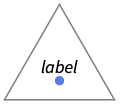
Above データまたは点の上の位置 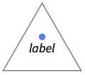
Below データまたは点の下の位置 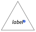
Before データまたは点の前の位置 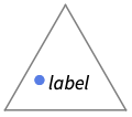
After データまたは点の後ろの位置 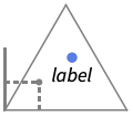
{pos,epos} データの相対的な位置 pos に置かれたラベル内の epos - TernaryListPlotにはGraphicsと同じオプションに以下の追加・変更を加えたものが使える. [全オプションのリスト]
-
AspectRatio Automatic 縦横比 ColorFunction None 点の彩色の決定方法 ColorFunctionScaling True ColorFunctionの引数をスケールするかどうか Frame True プロットの周囲に枠を置くかどうか GridLines Automatic 描画する格子線 GridLinesStyle {} 格子線にどのようにスタイル付けするか Joined False 点を繋ぐかどうか LabelingFunction Automatic 点にどのようにラベルを付けるか LabelingSize Automatic コールアウトとラベルの最大サイズ PerformanceGoal $PerformanceGoal 最適化するパフォーマンスの局面 PlotInteractivity $PlotInteractivity インタラクティブ要素を許可するかどうか PlotLabel None プロットの全体的なラベル PlotLabels None データのラベル PlotLegends None データの凡例 PlotMarkers None 各点を示すマーカー PlotRange Automatic 含める値の範囲 PlotStyle Automatic 点のスタイルを決定するグラフィックスプリミティブ PlotTheme $PlotTheme プロットの全体的なテーマ TargetUnits Automatic プロット内に表示する単位 TernaryPlotCorners Automatic プロットの角の位置の決め方 - PlotRange{rangeu,rangev,rangew}の設定は,3本の軸それぞれの与えられた範囲を使う.範囲は,三角形全体が表示されるように拡張される.
- Axes,Frame,GridLines等の座標の各次元に適用されるオプションには以下の形式を使うことができる.
-
s 各次元に通常の設定 s を使う {su,sv,sw} u 方向に設定 suを使う等 - 設定GridLinesStyleAutomaticは,軸または枠が対応する格子線を描画する際のスタイルを継承する.
- ColorData["DefaultPlotColors"]は,PlotStyleで使われるデフォルトの色のシーケンスを与える.
- ColorFunctionの引数は
 ,
, ,
, である.デフォルトで,最小の値が0で最大の値が1になるようにスケールされる.
 - ColorFunctionScalingFalseの設定は点にスケールされていない正規化された値を使う.
- データに単位を付けて使うときは,すべての成分の単位が互換でなければならない.
- TargetUnitsunit は使用する単位を指定する.
全オプションのリスト
例題
すべて開く すべて閉じる例 (4)
TernaryListPlot[{{0.15, 0.30, 0.55}, {0.25, 0.70, 0.5}, {0.40, 0.50, 0.10}, {0.80, 0.0, 0.20}, {0.55, 0.35, 0.10}, {0.30, 0.45, 0.25}, {0.15, 0.40, 0.45}, {0.80, 0.15, 0.05}, {0.45, 0.30, 0.25}, {0.25, 0.10, 65}}, FrameLabel -> {"A", "B", "C"}]TernaryListPlot[RandomReal[1, {4, 10, 3}]]TernaryListPlot[RandomReal[1, {15, 3}] -> Range[15]]TernaryListPlot[RandomReal[1, {4, 5, 3}], PlotMarkers -> Automatic]スコープ (35)
一般的なデータ (5)
TernaryListPlot[Table[{i, r, 100 - i - r}, {i, 10, 90, 10}, {r, 0, 100 - i}], ...]TernaryListPlot[Table[{r, i, 100 - i - r}, {i, 10, 90, 10}, {r, 0, 100 - i}], ...]TernaryListPlot[Table[{r, 100 - i - r, i}, {i, 10, 90, 10}, {r, 0, 100 - i}], ...]TernaryListPlot[Table[{i, r(100 - i) / (r + 1), (100 - i) / (r + 1)}, {r, {10, 4, 2, 1, 1 / 2, 1 / 4, 1 / 10}}, {i, 0, 100}], ...]TernaryListPlot[Table[{r(100 - i) / (r + 1), i, (100 - i) / (r + 1)}, {r, {10, 4, 2, 1, 1 / 2, 1 / 4, 1 / 10}}, {i, 0, 100}], ...]TernaryListPlot[Table[{r(100 - i) / (r + 1), (100 - i) / (r + 1), i}, {r, {10, 4, 2, 1, 1 / 2, 1 / 4, 1 / 10}}, {i, 0, 100}], ...]Short[data = RandomReal[10, {10, 3}]]Total /@ dataShort[ndata = # / Total[#]& /@ data]Total /@ ndata{TernaryListPlot[data], TernaryListPlot[ndata]}data = ReplacePart[RandomInteger[{1, 10}, {10, 3}], {2 -> Missing[], 4 -> 1 + I, 6 -> foo, 9 -> {-2, -3, -4}}]TernaryListPlot[data]TernaryListPlot[RandomReal[1, {3, 10, 3}]]表形式データ (1)
さまざまな食品100グラムあたりの特定の栄養素のグラム数に関する表形式データを取得する:
tabular = Tabular[IconizedObject[«data»], {"Type", "Name", "TotalFat", "TotalProtein", "TotalCarbs"}]各食品について,脂質,タンパク質,炭水化物のグラム数でTernaryListPlotをプロットする:
TernaryListPlot[tabular -> {"TotalFat", "TotalProtein", "TotalCarbs"}]PivotToColumnsを使って,食品のタイプ別に脂質,炭水化物,タンパク質の列を作成する:
pivot = PivotToColumns[tabular, "Type" -> "TotalFat"]食品のタイプ別に,脂質,タンパク質,炭水化物をプロットする:
TernaryListPlot[pivot -> {{"Meat", "TotalProtein", "TotalCarbs"}, {"Fruits", "TotalProtein", "TotalCarbs"}}, PlotLegends -> {"Meat", "Fruits"}]特殊データ (4)
data = Table[{Quantity[RandomReal[], "Meters"], Quantity[RandomReal[], "Feet"], Quantity[RandomReal[], "Meters"]}, {10}];TernaryListPlot[data]TernaryListPlot[data, TargetUnits -> "Feet"]TernaryListPlot[QuantityArray[StructuredArray`StructuredData[{10, 3},
{{{0.8041756743790625, 0.47912751511486307, 0.012658141262634981},
{0.7988069403413249, 0.7710180820251655, 0.9784925350135298},
{0.6676772794392527, 0.38669537190013403, 0.83302475 ... 17796031747966},
{0.6469722578596451, 0.19952140170247112, 0.3400946028129841},
{0.041851304211702356, 0.04783624467156811, 0.8512879176225363},
{0.31292398630199436, 0.9243290880167649, 0.7170633095932528}}, "Meters", {{1}, {2}}}]]]TernaryListPlot[RandomInteger[{1, 10}, {10, 3}] -> {"a", "b", "c", "d", "e", "f", "g", "h", "i", "j"}]TernaryListPlot[RandomInteger[{1, 10}, {10, 3}] -> {"a", "b", "c", "d", "e", "f", "g", "h", "i", "j"}, LabelingFunction -> Above]データラッパー (5)
個々のデータ,データ集合あるいはデータ集合の集合にラッパーを使う:
{TernaryListPlot[{{{0.6, 0.1, 0.3}, Style[{0.6, 0.2, 0.2}, Red], {0.6, 0.3, 0.1}}, {{0.2, 0.7, 0.1}, {0.2, 0.2, 0.6}, Style[{0.2, 0.4, 0.3}, Green]}}, PlotStyle -> PointSize[0.05]], TernaryListPlot[{Style[{{0.6, 0.1, 0.3}, {0.6, 0.2, 0.2}, {0.6, 0.3, 0.1}}, Red], Style[{{0.2, 0.7, 0.1}, {0.2, 0.2, 0.6}, {0.2, 0.4, 0.3}}, Green]}, PlotStyle -> PointSize[0.05]], TernaryListPlot[Style[{{{0.6, 0.1, 0.3}, {0.6, 0.2, 0.2}, {0.6, 0.3, 0.1}}, {{0.2, 0.7, 0.1}, {0.2, 0.2, 0.6}, {0.2, 0.4, 0.3}}}, Blue], PlotStyle -> PointSize[0.05]]}TernaryListPlot[Style[{Style[{{0.6, 0.1, 0.3}, Style[{0.6, 0.2, 0.2}, Red], {0.6, 0.3, 0.1}}, Green], {{0.2, 0.7, 0.1}, {0.2, 0.2, 0.6}, {0.2, 0.4, 0.3}}}, Blue], PlotStyle -> PointSize[0.05]]TernaryListPlot[{{0.1, 0.8, 0.2}, Callout[{0.2, 0.3, 0.2}, "callout"], {0.5, 0.2, 0.3}, {0.2, 0.2, 0.6}}]各データ集合にStyleを設定する:
TernaryListPlot[{Style[RandomReal[1, {10, 3}], Red], Style[RandomReal[1, {10, 3}], Directive[Opacity[0.5], PointSize[.025], Blue]]}]TernaryListPlot[{Style[{Callout[{1, 2, 3}, "one"], Callout[{1, 1, 1}, "two"]}, Purple], Style[{StatusArea[{2, .5, 2}, "three"], Tooltip[{2, 1, 1}, "four"]}, PointSize[0.025]]}]ラベリングと凡例付け (12)
TernaryListPlot[{{0.1, 0.8, 0.2}, Labeled[{0.2, 0.3, 0.2}, "label"], {0.5, 0.2, 0.3}, {0.2, 0.2, 0.6}}]TernaryListPlot[RandomInteger[{1, 10}, {10, 3}] -> Range[10]]Labeledでデータにラベルを付ける:
TernaryListPlot[{Labeled[Table[{20, r = RandomReal[100 - 20], 100 - 20 - r}, 10], "%20", Left], Labeled[Table[{60, r = RandomReal[100 - 60], 100 - 60 - r}, 10], "%60", Left]}]PlotLabelsでデータにラベルを付ける:
TernaryListPlot[{Table[{20, r = RandomReal[100 - 20], 100 - 20 - r}, 10], Table[{60, r = RandomReal[100 - 60], 100 - 60 - r}, 10]}, PlotLabels -> {"%20", "%60"}]Calloutでデータにラベルを付ける:
TernaryListPlot[{Callout[Table[{20, r = RandomReal[100 - 20], 100 - 20 - r}, 10], "%20"], Callout[Table[{60, r = RandomReal[100 - 60], 100 - 60 - r}, 10], "%60", Left]}]Placedを使ってラベルの位置を制御する:
data = RandomReal[1, {5, 3, 3}];Table[TernaryListPlot[{Table[Flatten[{4, RandomReal[{0.25, 1.25}, 2]}], 10], Table[Flatten[{RandomReal[{0.25, 1.25}, 2], 4}], 10], Table[Flatten[{RandomReal[{0.25, 1.25}], 4, RandomReal[{0.25, 1.25}]}], 10]}, PlotStyle -> PointSize[0.02], PlotLabels -> Placed[Range[3], pos], PlotLabel -> pos, ImageSize -> 225], {pos, {Left, Right, Below, Above}}]data = {Table[Flatten[{4, RandomReal[{0.25, 1.25}, 2]}], 10], Table[Flatten[{RandomReal[{0.25, 1.25}, 2], 4}], 10], Table[Flatten[{RandomReal[{0.25, 1.25}], 4, RandomReal[{0.25, 1.25}]}], 10]};TernaryListPlot[data, PlotLabels -> {"A", "B", "C"}]各データ集合にPlotLegendsを指定する:
TernaryListPlot[data, PlotLegends -> {"data 1", "data 2", "data 3"}]data = Table[Labeled[RandomReal[1, 3], RandomWord[]], {i, 10}];TernaryListPlot[data, LabelingSize -> 40]TernaryListPlot[data, LabelingSize -> Full]点の密な集合についてはデフォルトで,ツールチップに変換されるラベルもある:
data = Table[Callout[RandomReal[1, 3], i], {i, 100}];TernaryListPlot[data]TernaryListPlot[data, ImageSize -> 400]TernaryListPlot[{Table[{20, r = RandomReal[100 - 20], 100 - 20 - r}, 10], Table[{60, r = RandomReal[100 - 60], 100 - 60 - r}, 10]}, PlotLegends -> {"20%", "%60"}]Legendedを使って特定のデータ集合に凡例を付ける:
a = RandomReal[{0.3, 1}, {50, 3}];
b = RandomReal[0.3, {50, 3}];TernaryListPlot[{a, Legended[Mean[{a, b}], "average"], b}]Placedを使って凡例の位置を変える:
TernaryListPlot[{a, Legended[Mean[{a, b}], Placed["average", Below]], b}]TernaryListPlot[<|"One" -> RandomReal[1, {5, 3}], "Two" -> RandomReal[1, {5, 3}], "Three" -> RandomReal[1, {5, 3}]|>, PlotStyle -> PointSize[0.02], PlotLabels -> Automatic]プレゼンテーション (8)
data = RandomReal[1, {3, 10, 3}];TernaryListPlot[data]TernaryListPlot[data, PlotStyle -> {Purple, Brown, Yellow}]ColorFunctionで点に色付けする:
data = RandomReal[1, {200, 3}];TernaryListPlot[data, ColorFunction -> "SunsetColors"]TernaryListPlot[data, ColorFunction -> (ColorData["SunsetColors"][#1 ^ 2 + #2 ^ 2 + #3 ^ 2]&)]Table[TernaryListPlot[RandomReal[1, {2000, 3}], PlotLabel -> Hue[var], ColorFunction -> Function[{a, b, c}, Evaluate[Hue[var]]]], {var, {a, b, c}}]TernaryListPlot[RandomReal[1, {4, 5, 3}], PlotMarkers -> Automatic]TernaryListPlot[RandomReal[1, {4, 5, 3}], PlotMarkers -> {"α", "β", "θ", "δ"}]data = {{0, 0.8, 0.2}, {0.5, 0.3, 0.2}, {0.5, 0.2, 0.3}, {0, 0.2, 0.8}};{TernaryListPlot[Style[data, Joined]], TernaryListPlot[data, Joined -> True]}{d1, d2, d3} = RandomReal[1, {3, 3, 3}];{TernaryListPlot[{Style[d1, Purple], d2, d3}], TernaryListPlot[Style[{d1, d2, d3}, AbsolutePointSize[5]]]}TernaryListPlot[RandomReal[1, {10, 3}], GridLines -> {{{0.2, Red}, {0.5, Blue}, {0.8, Purple}}}]data = RandomReal[1, {10, 3}];TernaryListPlot[data, Frame -> False]FrameTicksStyleを設定する:
TernaryListPlot[data, FrameTicksStyle -> Red]TernaryListPlot[data, Axes -> True]TernaryListPlot[data, AxesStyle -> {Red, Green, Blue}, Axes -> True]軸を表示して0%の線を表示するために枠は表示されないようにする:
TernaryListPlot[data, Frame -> False, GridLinesStyle -> {RGBColor[0.5, 0.19, 0.5], RGBColor[0.02, 0.76, 0.88], RGBColor[0.29, 0.81, 0]}, GridLines -> Automatic, Axes -> True, AxesStyle -> Red]オプション (39)
Axes (1)
AxesStyle (1)
Background (1)
ColorFunction (3)
data = RandomReal[1, {50, 3}];TernaryListPlot[data, ColorFunction -> "Rainbow"]TernaryListPlot[data, ColorFunction -> Function[{x, y, z}, ColorData["Rainbow"][x ^ 2 + y ^ 2 + z ^ 2]]]data = RandomReal[1, {2000, 3}];Table[TernaryListPlot[data, PlotLabel -> Hue[var], ColorFunction -> Function[{a, b, c}, Evaluate[Hue[var]]]], {var, {a, b, c}}]ColorFunctionはPlotStyleを無効にする:
data = RandomReal[1, {50, 3}];TernaryListPlot[data, PlotStyle -> Red, ColorFunction -> "Rainbow"]ColorFunctionScaling (2)
ColorFunctionScaling Falseを使ってスケールされていない値を得る:
TernaryListPlot[RandomReal[1, {50, 3}], ColorFunctionScaling -> False, ColorFunction -> "Rainbow"]ColorFunctionScalingはデフォルトでTrueである:
TernaryListPlot[RandomReal[0.1, {50, 3}], ColorFunctionScaling -> False, ColorFunction -> "Rainbow"]Frame (1)
data = RandomReal[1, {10, 3}];TernaryListPlot[data]TernaryListPlot[data, Frame -> False]TernaryListPlot[data, Frame -> {True, False, True}]TernaryListPlot[data, Frame -> False, GridLinesStyle -> {RGBColor[0.5, 0.19, 0.5], RGBColor[0.02, 0.76, 0.88], RGBColor[0.29, 0.81, 0]}, GridLines -> Automatic]FrameLabel (1)
FrameStyle (1)
data = RandomReal[1, {20, 3}];TernaryListPlot[data, FrameStyle -> {Red, Green, Blue}]Automatic GridLinesStyleはFrameStyleから継承されている:
TernaryListPlot[data, FrameStyle -> {Red, Green, Blue}, GridLinesStyle -> Automatic, GridLines -> Automatic]TernaryListPlot[data, FrameStyle -> AbsoluteThickness[1.5]]FrameTicks (1)
FrameTicksStyle (1)
GridLines (2)
data = RandomReal[1, {20, 3}];TernaryListPlot[data, GridLines -> True]TernaryListPlot[data, GridLines -> False]data = RandomReal[1, {10, 3}];TernaryListPlot[data, GridLines -> {Range[0, 1, 0.3]}]TernaryListPlot[data, GridLines -> {Range[0, 1, 0.3], Range[0, 1, 0.4], Range[0, 1, 0.5]}]TernaryListPlot[data, GridLines -> {{{0.2, Red}, {0.5, Blue}, {0.8, Green}}}]GridLinesはGridLinesStyleを無効にする:
TernaryListPlot[data, GridLines -> {{{0.2, Directive[Red, Dashing[None]]}, {0.5, Blue}, {0.8, Green}}}, GridLinesStyle -> Dashed]GridLinesStyle (1)
data = RandomReal[1, {20, 3}];TernaryListPlot[data, GridLinesStyle -> Blue, GridLines -> Automatic]TernaryListPlot[data, GridLinesStyle -> {Directive[Red, Dotted], Directive[Dashed, Green], Directive[AbsoluteThickness[3], Brown]}, GridLines -> Automatic]Joined (2)
Method (5)
TernaryListPlot[RandomReal[1, {10, 3}], Method -> {"Highlighting" -> True}]TernaryListPlot[RandomReal[1, {10, 3}], Method -> {"Highlighting" -> True, "HighlightColor" -> Red}]TernaryListPlot[RandomReal[1, {10, 3}], Method -> {"Highlighting" -> True, "HighlightColor" -> Red}, Axes -> {True, False, True}]TernaryListPlot[RandomReal[1, {10, 3}], Method -> {"Backdrop" -> LightYellow}]背景幕の範囲はPlotRangeと関係がある:
TernaryListPlot[RandomReal[1, {10, 3}], Method -> {"Backdrop" -> LightYellow}, PlotRange -> {{0, 0.8}, {0, 0.8}, {0, 0.8}}]PlotInteractivity (3)
デフォルトで,プロットにはインタラクティブなハイライト機能がある:
TernaryListPlot[{{19, 4, 77}, {38, 49, 13}, {30, 7, 63}, {23, 60, 17}, {27, 44, 29}, {12, 27, 61}, {11, 19, 70}, {25, 65, 10}, {40, 45, 15}, {36, 30, 34}}]TernaryListPlot[{{19, 4, 77}, {38, 49, 13}, {30, 7, 63}, {23, 60, 17}, {27, 44, 29}, {12, 27, 61}, {11, 19, 70}, {25, 65, 10}, {40, 45, 15}, {36, 30, 34}}, PlotInteractivity -> False]与えたインタラクティブ要素は有効にして,自動のものを無効にする:
TernaryListPlot[{{19, 4, 77}, {38, 49, 13}, {30, 7, 63}, {23, 60, 17}, {27, 44, 29}, {12, 27, 61}, {11, 19, 70}, {25, 65, 10}, {40, 45, 15}, Tooltip[{36, 30, 34}, "hello"]}, PlotInteractivity -> <|"User" -> True, "System" -> False|>]PlotLabels (3)
TernaryListPlot[{Table[Flatten[{4, RandomReal[{0.25, 1.25}, 2]}], 10], Table[Flatten[{RandomReal[{0.25, 1.25}, 2], 4}], 10], Table[Flatten[{RandomReal[{0.25, 1.25}], 4, RandomReal[{0.25, 1.25}]}], 10]}, PlotLabels -> {"A", "B", "C"}]Placedを使ってラベルの位置を制御する:
data = RandomReal[1, {5, 3, 3}];Table[TernaryListPlot[{Table[Flatten[{4, RandomReal[{0.25, 1.25}, 2]}], 10], Table[Flatten[{RandomReal[{0.25, 1.25}, 2], 4}], 10], Table[Flatten[{RandomReal[{0.25, 1.25}], 4, RandomReal[{0.25, 1.25}]}], 10]}, PlotStyle -> PointSize[0.02], PlotLabels -> Placed[Range[3], pos], PlotLabel -> pos, ImageSize -> 225], {pos, {Left, Right, Below, Above}}]data = RandomReal[1, {10, 3}];
d1 = Transpose[Transpose[data] + {0.7, 0.1, 0.1}];
d2 = Transpose[Transpose[data] + {0.1, 0.1, 0.7}];TernaryListPlot[{Table[Flatten[{4, RandomReal[{0.25, 1.25}, 2]}], 10], Table[Flatten[{RandomReal[{0.25, 1.25}, 2], 4}], 10]}, {PlotLabels -> {"aardcark", "barracuda"}, PlotLabels -> {1, 2}, PlotLabels -> {1, 2}}]PlotLegends (1)
異なるデータ集合にAutomaticの凡例を表示する:
data = RandomReal[1, {10, 3}];d1 = Transpose[Transpose[data] + {1, 0, 0}];
d2 = Transpose[Transpose[data] + {0, 0, 1}];
d3 = Transpose[Transpose[data] + {0, 1, 0}];TernaryListPlot[{d1, d2, d3}, PlotLegends -> Automatic]TernaryListPlot[{d1, d2, d3}, PlotLegends -> {"d1", "d2", "d3"}]PlotMarkersを使って各データ集合の凡例を指定する:
TernaryListPlot[{d1, d2, d3}, PlotLegends -> {"d1", "d2", "d3"}, PlotMarkers -> Automatic]PlotMarkers (3)
データ集合を区別するためにいろいろな形をデフォルト順で使う:
TernaryListPlot[IconizedObject[«multi-data»], PlotMarkers -> Automatic]TernaryListPlot[IconizedObject[«multi-data»], PlotMarkers -> None]テキストあるいはタイプセットされたラベルを使ってデータ集合を区別する:
TernaryListPlot[IconizedObject[«multi-data»], PlotMarkers -> {"α", "β", "γ"}]TernaryListPlot[IconizedObject[«multi-data»], PlotMarkers -> {"☺", "", "☹"}]TernaryListPlot[IconizedObject[«multi-data»], PlotMarkers -> {{[image], 0.07}, {[image], 0.07}, {[image], 0.07}}]Table[TernaryListPlot[IconizedObject[«multi-data»], PlotMarkers -> {"α", size}, PlotLabel -> size], {size, {10, 20}}]グラフィックスマーカーのプロットと相対的なサイズを制御する:
Table[TernaryListPlot[IconizedObject[«multi-data»], PlotMarkers -> {[image], size}, PlotLabel -> size], {size, {0.05, 0.1}}]Table[TernaryListPlot[IconizedObject[«multi-data»], PlotMarkers -> {[image], Offset[size]}, PlotLabel -> size], {size, {7, 14}}]定義済みの名前を使ってグラフィックスマーカーのサイズを制御する:
Table[TernaryListPlot[IconizedObject[«multi-data»], PlotMarkers -> {[image], size}, PlotLabel -> size], {size, {Tiny, Small, Medium, Large}}]PlotRange (1)
PlotStyle (3)
TernaryListPlot[RandomReal[1, {2, 10, 3}], PlotStyle -> PointSize[0.03]]TernaryListPlot[IconizedObject[«multi-data»], PlotStyle -> {Red, Orange, Blue}]TernaryListPlot[IconizedObject[«multi-data»], PlotStyle -> {Red, Blue}]TargetUnits (1)
TernaryPlotCorners (1)
data = RandomReal[1, {10, 3}];TernaryListPlot[data]TernaryListPlot[data, TernaryPlotCorners -> "Clockwise"]TernaryListPlot[data, TernaryPlotCorners -> {{1, 0}, {0, 0}, {0, 1}}]アプリケーション (7)
地質学 (2)
TernaryListPlot[IconizedObject[«Soil Data»], FrameLabel -> {Style["Sand", Bold, 16], Style["Silt", Bold, 16], Style["Clay", Bold, 16]}]TernaryListPlot[IconizedObject[«Soil Data»], FrameLabel -> {Style["Sand", Bold, 16], Style["Silt", Bold, 16], Style["Clay", Bold, 16]}, Prolog -> {{Directive[{Opacity[0.5], RGBColor[1, 0.5, 0]}], Polygon[{{0.2, 0.6, 0.2}, {0.2, 0.2, 0.6}, {0.6, 0.2, 0.2}}]}, ...}]農業 (2)
その他 (3)
TernaryListPlot[MapThread[Tooltip[#1, #2]&, {EntityValue[EntityList[Entity["GeographicRegion", "World"][EntityProperty["GeographicRegion", "Countries"]]], {"ElectricityConventionalThermal", "ElectricityNuclear", "ElectricityTotalRenewables"}], EntityList[Entity["GeographicRegion", "World"][EntityProperty["GeographicRegion", "Countries"]]]}], AxesLabel -> {"Fossil fuels", "Nuclear", "Renewables"}, Axes -> True, PlotStyle -> Red]TernaryListPlot[EntityValue[EntityClass["Country", "Countries"], EntityFunction[e, Tooltip[{e[EntityProperty["Country", "ChildPopulation"]], e[EntityProperty["Country", "AdultPopulation"]], e[EntityProperty["Country", "ElderlyPopulation"]]}, e["Name"]]]], FrameLabel -> {"Child", "Adult", "Elderly"}, ColorFunction -> "RoseColors"]食物に含まれる脂肪,炭水化物,タンパク質の相対的な割合を表示する:
TernaryListPlot[Tooltip[{##2}, #]&@@@IconizedObject[«foods»], FrameLabel -> {"Fat", "Carbs", "Protein"}, LabelStyle -> {Bold, 11}, PlotStyle -> PointSize[.015], GridLinesStyle -> Lighter[Gray], ColorFunction -> "Rainbow"]テキスト
Wolfram Research (2022), TernaryListPlot, Wolfram言語関数, https://reference.wolfram.com/language/ref/TernaryListPlot.html (2025年に更新).
CMS
Wolfram Language. 2022. "TernaryListPlot." Wolfram Language & System Documentation Center. Wolfram Research. Last Modified 2025. https://reference.wolfram.com/language/ref/TernaryListPlot.html.
APA
Wolfram Language. (2022). TernaryListPlot. Wolfram Language & System Documentation Center. Retrieved from https://reference.wolfram.com/language/ref/TernaryListPlot.html