DistributionChart[{data1,data2,…}]
制作分布图,图中每一 datai 用一个分布符号表示.
DistributionChart[{data1,data2,…},elems]
使用外观元素 elems 绘制分布图.
DistributionChart[{…,wi[datai,…],…,wj[dataj,…],…}]
制作分布图,其中符号特征由符号式封装 wk 定义.
DistributionChart[{{data1,data2,…},…}]
制作多个数据组 {data1,data2,…} 的分布图.
DistributionChart
DistributionChart[{data1,data2,…}]
制作分布图,图中每一 datai 用一个分布符号表示.
DistributionChart[{data1,data2,…},elems]
使用外观元素 elems 绘制分布图.
DistributionChart[{…,wi[datai,…],…,wj[dataj,…],…}]
制作分布图,其中符号特征由符号式封装 wk 定义.
DistributionChart[{{data1,data2,…},…}]
制作多个数据组 {data1,data2,…} 的分布图.
更多信息和选项
- DistributionChart 亦称为小提琴图.
- DistributionChart 绘图表示各 datai 中值的分布.
- DistributionChart 的数据元素可以以下述形式给出:
-
datai 纯数据集 Quantity[datai,unit] 带单位的数据 datai wi[datai,…] 封装为 wi 的数据 veci formi->mi 元数据为 mi 的数据 - 各 datai 应为一个实数列表 {y1,y2,…}. 非实数元素 yj 将被认为缺失并被排除. 如果 datai 不是实数列表,将认为该数据缺失,这通常将导致分布图中的空隙.
- DistributionChart 的数据集可以以下述形式给出:
-
{data1,data2,…} 带或不带封装的元素列表 <|k1data1,k2data2,…|> 键和数据集的关联 TimeSeries[…],EventSeries[…],TemporalData[…] 时间序列、事件序列和时间数据 WeightedData[…],EventData[…] 增广数据集 w[{data1,data2,…},…] 应用于一个编组数据集的封装 w[{{data1,data1,…},…},…] 应用于所有编组数据集的封装 - DistributionChart[Tabular[…]cspec] 使用列规范 cspec 从表格对象中提取并绘制数值.
- 在绘制表格数据时,允许使用以下形式的列规范 cspec:
-
colx 绘制列 colx 中数值的分布图 {colx1,colx2,…} 绘制 colx1, colx2, … 列的分布图 - datai 可以使用以下包装器:
-
Annotation[e,label] 提供注释 Button[e,action] 定义点击元素时要执行的操作 Callout[e,label] 用 callout 显示该元素 EventHandler[e,…] 为元素定义一般事件处理器 Hyperlink[e,uri] 使元素成为超链接 Labeled[e,…] 显示带标签的元素 Legended[e,…] 在图表图例中包含元素的特征 Mouseover[e,over] 使元素显示为鼠标悬停窗形式 PopupWindow[e,cont] 为元素附加弹出窗口 StatusArea[e,label] 将鼠标移至元素悬停时,状态区域会显示 Style[e,opts] 使用指定样式显示元素 Tooltip[e,label] 为元素附加任意的工具提示 - 可能的外观元素 elems 可以采用如下形式:
-
Automatic 自动分布外观 "name" 名为 "name" 的分布外观 {"name",<|"prop1"val1,…|>} 带有属性 propi 设置为值 vali 的命名外观 - 可能的已命名元素 "name" 包括:
- 外观元素常用的属性包括:
-
"Alignment" Center 如何对元素内容进行对齐 "BoundaryStyle" Automatic 用于元素边界的样式 "FillingStyle" Automatic 元素的填充样式 "LineStyle" None 用于线元素的样式 "LineWidth" Automatic 线元素的长度 "OutlierStyle" None 用于离群值的样式 "PointStyle" None 用于数据点的样式 "Quantiles" None 随元素一起显示的值范围 "QuantileShading" None 是否为分位数区域着色 "QuantileStyle" Automatic 用于分位线的样式 "Range" Automatic 随元素一起显示的值范围 - 对于 "Alignment",可能的设置包括 Left、Right 和 Center.
- 属性 "OutlierStyle" 采用以下设置:
-
Automatic 包含离群值但不显示 None 排除离群值 True 显示所有离群值 style 以样式 style 显示所有离群值 {marker,style} 使用标记 marker 和样式 style 显示所有离群值 {{marker1,style1},{marker2,style2}} 使用 markeri 和 stylei 显示离群值和远离群值 - "LineWidth" 和 "PointWidth" 控制线和点可被绘制的区域宽度. 可能的设置包括:
-
Automatic 将线条和点限制在元素边界内 All 使用边界框的全宽 Scaled[s] 使用边界框宽度的 s 倍 - "Quantiles" 属性可以采用以下设置:
-
None 不显示任何分位线 Automatic 显示四分位线 n 显示 n 个分位区域 {q1,q2,…} 显示分位数 q1,q2,… - 可以使用以下 "QuantileShading" 设置:
-
None 不对分位区域着色 Automatic 自动对分位区域着色 {r1,r2,…} 使用样式 ri 对分位数 qi-1 与 qi 之间的区域着色 - 属性 "Range" 采用以下设置:
-
All 显示全部数据值范围 Automatic 自动确定要显示的数据范围 {min,max} 显示介于 min 与 max 之间的数据 {Scaled[min],Scaled[max]} 显示介于 min 与 max 分位数之间的数据 - "SmoothHistogram" 元素可能包含的属性包括:
-
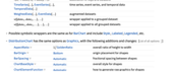
"Kernel" Automatic 平滑密度核函数 "Bandwidth" Automatic 平滑密度带宽 "Filling" True 是否填充平滑直方图内部 "BoxWhisker" False 添加箱线图标记 "BoxWhiskerWidth" Automatic 箱线图标记的宽度 "BoxWhiskerStyle" Automatic 如何设置箱线图标记的样式 - DistributionChart 具有与 Graphics 相同的选项,并有以下增补和变化: [所有选项的列表]
-
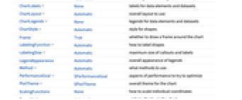
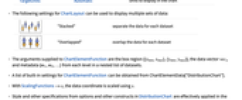
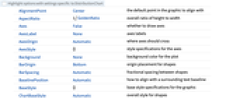
AspectRatio 1/GoldenRatio 高度与宽度的整体比例 BarOrigin Bottom 形状的原点位置 BarSpacing Automatic 各形状之间的分数间距 ChartBaseStyle Automatic 形状的整体样式 ChartElementFunction Automatic 如何生成形状的原始图形 ChartLabels None 数据元素和数据集的标签 ChartLayout Automatic 所用的整体布局 ChartLegends None 数据元素和数据集的标签 ChartStyle Automatic 形状的样式 Frame True 是否绘制环绕图表的边框 LabelingFunction Automatic 如何标记形状 LabelingSize Automatic 标注和标签的最大尺寸 LegendAppearance Automatic 图例的整体外观 Method Automatic 使用何种方法 PerformanceGoal $PerformanceGoal 力图优化的性能方面 PlotInteractivity $PlotInteractivity 是否允许绘制互动元素 PlotTheme $PlotTheme 图表的总体主题 ScalingFunctions None 如何调整单独坐标 TargetUnits Automatic 图表中要显示的单位 - 可用 ChartLayout 的下列设置来显示多组数据:
-
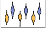
"Stacked" 将每个数据集的数据分开 

"Overlapped" 叠置每个数据集的数据 - 为 ChartElementFunction 提供的参数是盒框区域 {{xmin,xmax},{ymin,ymax}}、数据向量 veci 和数据集嵌套列表中各层的元数据 {m1,m2,…}.
- ChartElementFunction 的内置设置列表可由 ChartElementData["DistributionChart"] 得到.
- 设置为 ScalingFunctions->s 时,数据坐标利用 s 进行调整.
- DistributionChart 中选项及其它结构的样式及其它规范说明按照 ChartStyle、Style 及其它封装、ChartElementFunction 的顺序依次应用,后面的规范说明将覆盖前面的规范说明.
所有选项的列表
范例
打开所有单元 关闭所有单元基本范例 (4)
DistributionChart[RandomReal[BetaDistribution[2, 1 / 4], {6, 100}]]data = Table[RandomVariate[BetaDistribution[2, RandomReal[]], 100], {4}, {2}];DistributionChart[data]data = Table[RandomVariate[NormalDistribution[RandomInteger[5], 1], 100], {2}, {3}];DistributionChart[data, PlotLabels -> <|"Elements" -> {"a", "b", "c"}|>]DistributionChart[data, PlotLegends -> <|"Elements" -> {"a", "b", "c"}|>]data = Table[RandomVariate[NormalDistribution[RandomInteger[5], 1], 100], {2}, {3}];DistributionChart[data]DistributionChart[data, "Violin"]DistributionChart[data, "Histogram"]范围 (43)
数据与布局 (17)
DistributionChart[RandomReal[NormalDistribution[], {1, 100}]]DistributionChart[RandomReal[NormalDistribution[], {3, 100}]]data = RandomVariate[NormalDistribution[0, 1], 100];DistributionChart[{{data, data + 1, data + 2}, {data, data + 1, data + 2}}]data = RandomVariate[NormalDistribution[0, 1], 100];DistributionChart[{{data, data + 1}, {data, data + 1, data + 2, data + 3}}]data = RandomVariate[NormalDistribution[0, 1], 100];DistributionChart[{data, Missing[], data, foo, data}, BarSpacing -> 3]DistributionChart[{I, 1, 2, Missing[], 3, 4, foo, 5}]DistributionChart[{Quantity[33, "Meters"], Quantity[35, "Meters"], Quantity[12, "Meters"], Quantity[8, "Meters"], Quantity[50, "Meters"], Quantity[15, "Meters"], Quantity[24, "Meters"], Quantity[44, "Meters"], Quantity[4, "Meters"], Quantity[37, "Meters"]}, FrameLabel -> Automatic]DistributionChart[{Quantity[33, "Meters"], Quantity[35, "Meters"], Quantity[12, "Meters"], Quantity[8, "Meters"], Quantity[50, "Meters"], Quantity[15, "Meters"], Quantity[24, "Meters"], Quantity[44, "Meters"], Quantity[4, "Meters"], Quantity[37, "Meters"]}, FrameLabel -> Automatic, TargetUnits -> "Feet"]TimeSeries、EventSeries 和 TemporalData 中的时间标记被忽略:
d = RandomVariate[NormalDistribution[], 100];DistributionChart[TimeSeries[d, {"May 24, 1982"}]]d1 = RandomVariate[NormalDistribution[0, 1], 100];
d2 = RandomVariate[NormalDistribution[2, 0.5], 100];DistributionChart[<|"a" -> d1, "b" -> d2, "c" -> d1 + d2|>]DistributionChart[<|"a" -> d1, "b" -> d2, "c" -> d1 + d2|>, PlotLabels -> Automatic]DistributionChart[<|"a" -> d1, "b" -> d2, "c" -> d1 + d2|>, PlotLegends -> Automatic, PlotStyle -> {Hue[0.6, 0.7, 0.8], Hue[0.22, 1, 0.7], Hue[0.75, 0.6, 0.7]}]a1 = RandomVariate[NormalDistribution[0, 2], 100];
a2 = RandomVariate[NormalDistribution[2, 1 / 2], 100];
b1 = RandomVariate[ChiDistribution[1], 100];
b2 = RandomVariate[ChiDistribution[3], 100];DistributionChart[<|"group a" -> <|"a" -> a1, "b" -> a2, "c" -> a1 + a2|>, "group b" -> <|"a" -> b1, "b" -> b2, "c" -> b1 + b2|>|>, PlotLegends -> Automatic, PlotLabels -> {Automatic, None}]使用 WeightedData 对数据添加权值:
data = RandomReal[{-1, 1}, 100];wd = WeightedData[data, data ^ 2]DistributionChart[{data, wd}, PlotLabels -> {"data", "weighted data"}]使用 EventData 添加删失和截断信息:
event = EventData[data, Round[data]]DistributionChart[{data, event}, PlotLabels -> {"data", "censored data"}]d = RandomVariate[NormalDistribution[0, 1], 100];{DistributionChart[{{d, Style[d + 1, RGBColor[0.93, 0.27, 0.27]], d + 2}, {d, d + 1, d + 2}}],
DistributionChart[{Style[{d, d + 1, d + 2}, RGBColor[0.14, 0.8, 0.14]], {d, d + 1, d + 2}}],
DistributionChart[Style[{{d, d + 1, d + 2}, {d, d + 1, d + 2}}, RGBColor[0.4, 0.6, 1]]]}d = RandomVariate[NormalDistribution[0, 1], 100];{DistributionChart[{{d, Style[d + 1, RGBColor[0.93, 0.27, 0.27]], d + 2}, {d, d + 1, d + 2}}],
DistributionChart[{Style[{d, Style[d + 1, RGBColor[0.93, 0.27, 0.27]], d + 2}, RGBColor[0.14, 0.8, 0.14]], {d, d + 1, d + 2}}],
DistributionChart[Style[{Style[{d, Style[d + 1, RGBColor[0.93, 0.27, 0.27]], d + 2}, RGBColor[0.14, 0.8, 0.14]], {d, d + 1, d + 2}}, RGBColor[0.4, 0.6, 1]]]}d = RandomVariate[NormalDistribution[0, 1], 100];DistributionChart[{d, Tooltip[d + 1, "μ = 1"], d + 2}]使用 PopupWindow 提供额外的下钻信息:
d = RandomVariate[NormalDistribution[0, 1], 100];DistributionChart[{d, PopupWindow[d + 1, BoxWhiskerChart[d + 1]], d + 2}]使用 PopupWindow 中的其它图表函数提供更多信息:
DistributionChart[Table[PopupWindow[FinancialData[f, {{2010, 1}, {2010, 6}}], TradingChart[{f, {{2010, 1}, {2010, 6}}}, PlotLabel -> f]], {f, {"MSFT", "ORCL", "ADBE"}}]]Button 可用于触发任何行为:
d = RandomVariate[NormalDistribution[0, 1], 100];DistributionChart[{d, Button[d + 1, Speak["Mean is 1."]], d + 2}]表格数据 (2)
penguins = ResourceData["Sample Tabular Data: Palmer Penguins"]DistributionChart[penguins -> "flipper_length"]pivot = PivotToColumns[penguins, "species" -> "flipper_length"]DistributionChart[pivot -> {ExtendedKey["flipper_length", "Adelie"], ExtendedKey["flipper_length", "Chinstrap"], ExtendedKey["flipper_length", "Gentoo"]}, PlotLabels -> {"Adelie", "Chinstrap", "Gentoo"}]DistributionChart[pivot -> {"Adelie", "Chinstrap", "Gentoo"}, PlotLabels -> {"Adelie", "Chinstrap", "Gentoo"}]外观元素 (9)
DistributionChart[IconizedObject[«data»], "SmoothHistogram"]DistributionChart[IconizedObject[«data»], "Violin"]DistributionChart[IconizedObject[«data»], {"SmoothHistogram", <|"Bandwidth" -> 0.1|>}]DistributionChart[IconizedObject[«data»], {"Violin", <|"Kernel" -> "Triangular"|>}]DistributionChart[IconizedObject[«data»], {"Violin", <|"Kernel" -> {"Bounded", 0, "Gaussian"}|>}]DistributionChart[IconizedObject[«data»], "Histogram"]DistributionChart[IconizedObject[«data»], {"Histogram", <|"Bins" -> 5|>}]DistributionChart[IconizedObject[«data»], {"Histogram", <|"Bins" -> {0.5}|>}]DistributionChart[IconizedObject[«data»], "Density"]DistributionChart[IconizedObject[«data»], {"Density", <|"Bandwidth" -> 0.1|>}]DistributionChart[IconizedObject[«data»], {"Density", <|"Kernel" -> "Triangular"|>}]Table[DistributionChart[IconizedObject[«data»], {appearance, <|"LineWidth" -> Automatic|>}, PlotLabel -> appearance], {appearance, {"SmoothHistogram", "Violin", "Density", "Box"}}]Table[DistributionChart[IconizedObject[«data»], {"SmoothHistogram", <|"LineWidth" -> Scaled[width]|>}, PlotLabel -> width], {width, {0, 0.2, 0.5, 1}}]DistributionChart[IconizedObject[«data»], {"SmoothHistogram", <|"LineWidth" -> Scaled[1], "LineStyle" -> Directive[RGBColor[0.98, 0.56, 0.17], AbsoluteThickness[1]]|>}]Table[DistributionChart[IconizedObject[«data»], {appearance, <|"PointWidth" -> Automatic|>}, PlotLabel -> appearance], {appearance, {"Violin", "SmoothHistogram", "Histogram", "SymmetricalHistogram", "Density", "Box"}}]Table[DistributionChart[IconizedObject[«data»], {"Violin", <|"PointWidth" -> Scaled[width]|>}, PlotLabel -> Scaled[width]], {width, {0, 0.2, 0.5, 1}}]Table[DistributionChart[IconizedObject[«data»], {"Violin", <|"PointWidth" -> width|>}, PlotLabel -> width], {width, {0, 0.2, 0.5, 1}}]DistributionChart[IconizedObject[«data»], {"Violin", <|"PointWidth" -> Scaled[1], "PointStyle" -> Directive[Opacity[0.75], RGBColor[0.98, 0.56, 0.17], AbsolutePointSize[5]]|>}]Table[DistributionChart[IconizedObject[«data»], {appearance, <|"Quantiles" -> Automatic|>}, PlotLabel -> appearance], {appearance, {"SmoothHistogram", "Violin", "Density", "Box"}}]DistributionChart[IconizedObject[«data»], {"SmoothHistogram", <|"Quantiles" -> 10|>}]DistributionChart[IconizedObject[«data»], {"SmoothHistogram", <|"Quantiles" -> {0.1, 0.5, 0.9}|>}]DistributionChart[IconizedObject[«data»], {"SmoothHistogram", <|"Quantiles" -> 5, "QuantileStyle" -> RGBColor[0.8, 0.3, 0.8]|>}]DistributionChart[IconizedObject[«data»], {"SmoothHistogram", <|"Quantiles" -> 5, "QuantileShading" -> True|>}]DistributionChart[IconizedObject[«data»], {"SmoothHistogram", <|"Range" -> {Scaled[0.25], Scaled[0.75]}|>}]DistributionChart[IconizedObject[«data»], {"SmoothHistogram", <|"Range" -> {-1, 9}|>}]Table[DistributionChart[IconizedObject[«data»], {"SmoothHistogram", <|"Alignment" -> alignment|>}, PlotLabel -> alignment, ImageSize -> 225], {alignment, {Before, After, Left, Right}}]样式化与外观 (7)
data = Table[RandomVariate[NormalDistribution[μ, 1], 100], {μ, 0, 4, 1}];DistributionChart[data, PlotStyle -> {RGBColor[0.4, 0.6, 1], RGBColor[0.93, 0.27, 0.27], RGBColor[0.14, 0.8, 0.14], RGBColor[1, 0.75, 0], RGBColor[0.67, 0.54, 0.42]}]PlotStyle 可用于设置所有图表元素的初始样式:
data = Table[RandomVariate[NormalDistribution[μ, 1], 100], {μ, 0, 5, 1}];DistributionChart[data, PlotStyle -> EdgeForm[Dashed]]Style 可用于覆盖样式:
d[μ_] := RandomVariate[NormalDistribution[μ, 1], 100];DistributionChart[{d[1], d[2], Style[d[3], RGBColor[0.93, 0.27, 0.27]], d[4], d[5]}, PlotStyle -> {RGBColor[0.797253, 0.904982, 0.410498], RGBColor[0.934691, 0.945708, 0.75346], RGBColor[0.769879, 0.92369, 0.977371], RGBColor[1, 0.566415, 0.0386511], RGBColor[1, 1, 0.4]}]ChartElementData["DistributionChart"]data = Table[RandomVariate[NormalDistribution[μ, 1], 100], {μ, 0, 5, 1}];Table[DistributionChart[data, PlotStyle -> {RGBColor[0.8352941176470589, 0.5764705882352941, 0.5607843137254902], RGBColor[0.9490196078431372, 0.29411764705882354, 0.050980392156862744], RGBColor[1., 0.7333333333333333, 0.2], RGBColor[0.996078431372549, 0.9490196078431372, 0.44313725490196076], RGBColor[0.7058823529411765, 0.6862745098039216, 0.30196078431372547], RGBColor[0.41568627450980394, 0.5450980392156862, 0.12156862745098039]}, ChartElementFunction -> cf], {cf, {"Density", "HistogramDensity"}}]DistributionChart[data, PlotStyle -> {RGBColor[0.8352941176470589, 0.5764705882352941, 0.5607843137254902], RGBColor[0.9490196078431372, 0.29411764705882354, 0.050980392156862744], RGBColor[1., 0.7333333333333333, 0.2], RGBColor[0.996078431372549, 0.9490196078431372, 0.44313725490196076], RGBColor[0.7058823529411765, 0.6862745098039216, 0.30196078431372547], RGBColor[0.41568627450980394, 0.5450980392156862, 0.12156862745098039]}, ChartElementFunction -> ChartElementData["GlassQuantile", "Quantile" -> 9, "QuantileShading" -> True]]data = Table[RandomVariate[BetaDistribution[μ, 1 / 4], 100], {μ, 1, 4, 1}];Table[DistributionChart[data, PlotLabel -> o, BarOrigin -> o], {o, {Bottom, Top, Left, Right}}]data = Table[RandomVariate[NormalDistribution[μ, 1], 100], {μ, {0, 1, 2}}];Table[DistributionChart[{data, data}, BarSpacing -> sp, PlotLabel -> sp, PlotStyle -> Opacity[0.8]], {sp, {Automatic, {0, 1}, {-0.3, 1}}}]data = RandomVariate[NormalDistribution[RandomInteger[5], 1], {3, 3, 100}];DistributionChart[data, PlotTheme -> "Marketing"]DistributionChart[data, PlotTheme -> "Business"]标签与图例 (8)
使用 Labeled 为形状添加标签:
d[μ_] := RandomVariate[NormalDistribution[μ, 1], 100];DistributionChart[{d[1], Labeled[d[2], "label"], d[3]}]d[μ_] := RandomVariate[BetaDistribution[μ, 0.5], 100];Table[DistributionChart[{Labeled[d[1], "label", p], d[2], d[3]}, PlotLabel -> p, Frame -> False], {p, {Bottom, Center, Top}}]Table[DistributionChart[{Labeled[d[1], "label", p], d[2], d[3]}, PlotLabel -> p, Frame -> False], {p, {Before, After, Above, Below}}]data = Table[RandomVariate[NormalDistribution[μ, 1], 100], {μ, {0, 2}}, {3}];DistributionChart[data, PlotLabels -> <|"Elements" -> {"c1", "c2", "c3"}|>]DistributionChart[data, PlotLabels -> <|"Groups" -> {"r1", "r2"}|>]DistributionChart[data, PlotLabels -> <|"Groups" -> {"r1", "r2"}, "Elements" -> {"c1", "c2", "c3"}|>]使用 Placed 控制标签的位置,使用与 Labeled 相同的位置:
data = Table[RandomVariate[NormalDistribution[μ, 1], 100], {μ, {0, 2}}, {3}];DistributionChart[data, PlotLabels -> <|"Groups" -> Placed[{"r1", "r2"}, Above], "Elements" -> Placed[{"c1", "c2", "c3"}, Center]|>]通过使用 LabelingFunction 为形状提供值标签:
data = Table[RandomVariate[NormalDistribution[μ, 1], 100], {μ, {0, 2}}, {3}];DistributionChart[data, LabelingFunction -> (Placed[Mean[#], Tooltip]&)]使用 Placed 控制位置与格式:
labeler[v_, {i_, j_}, {ri_, cj_}] := Placed[Row[{ri[[1]], cj[[1]]}, ","], Center, Rotate[#, Pi / 4]&]DistributionChart[data, PlotLabels -> <|"Groups" -> {"r1", "r2"}, "Elements" -> {"c1", "c2", "c3"}|>, LabelingFunction -> labeler]data = Table[RandomVariate[NormalDistribution[μ, 1], 100], {μ, {0, 2}}, {3}];DistributionChart[data, PlotLegends -> <|"Elements" -> {"ccc1", "ccc2", "ccc3"}|>, PlotStyle -> <|"Elements" -> {RGBColor[0.761959, 0.470832, 0.940597], RGBColor[0.9584254999999999, 0.877884, 0.5906629999999999], RGBColor[0.431296, 0.709773, 0.927077]}|>]DistributionChart[data, PlotLegends -> <|"Groups" -> {"rr1", "rr2"}|>, PlotStyle -> <|"Groups" -> {RGBColor[0.761959, 0.470832, 0.940597], RGBColor[0.431296, 0.709773, 0.927077]}|>]使用 Legended 添加额外的图例项:
d[μ_] := RandomVariate[NormalDistribution[μ, 1], 100];DistributionChart[{d[1], Legended[d[2], "extra"], d[3]}, PlotLegends -> <|"Elements" -> {"ccc1", "ccc2", "ccc3"}|>, PlotStyle -> {RGBColor[0.761959, 0.470832, 0.940597], RGBColor[0.9584254999999999, 0.877884, 0.5906629999999999], RGBColor[0.431296, 0.709773, 0.927077]}]DistributionChart[Legended[{d[1], d[2], d[3]}, "extra"], PlotLegends -> {"ccc1", "ccc2", "ccc3"}, PlotStyle -> {RGBColor[0.761959, 0.470832, 0.940597], RGBColor[0.9584254999999999, 0.877884, 0.5906629999999999], RGBColor[0.431296, 0.709773, 0.927077]}]使用 Placed 影响图例的位置:
data = Table[RandomVariate[NormalDistribution[μ, 1], 100], {μ, {0, 2}}, {3}];Table[DistributionChart[data, PlotLegends -> <|"Elements" -> Placed[{"ccc1", "ccc2", "ccc3"}, p]|>, PlotStyle -> <|"Elements" -> {RGBColor[0.761959, 0.470832, 0.940597], RGBColor[0.9584254999999999, 0.877884, 0.5906629999999999], RGBColor[0.431296, 0.709773, 0.927077]}|>, ImageSize -> 225], {p, {Below, Above}}]选项 (32)
AspectRatio (3)
默认情况下,DistributionChart 对绘图使用固定的高宽比:
DistributionChart[IconizedObject[«data»]]设置 AspectRatio1 可使宽和高相等:
DistributionChart[IconizedObject[«data»], AspectRatio -> 1]AspectRatioFull 调整高度和宽度以紧密贴合其他结构内部:
plot = DistributionChart[IconizedObject[«data»], AspectRatio -> Full];
{Framed[Pane[plot, {100, 150}]], Framed[Pane[plot, {100, 100}]], Framed[Pane[plot, {150, 100}]]}BarOrigin (1)
BarSpacing (4)
DistributionChart 自动选择条形间距:
Table[DistributionChart[RandomVariate[NormalDistribution[], {n, 100}]], {n, {1, 2, 4, 8}}]Table[DistributionChart[RandomVariate[NormalDistribution[], {n, 2, 100}]], {n, {2, 4}}]Table[DistributionChart[RandomVariate[NormalDistribution[], {5, 100}], BarSpacing -> s, PlotLabel -> s], {s, {Tiny, Small, Medium, Large}}]Table[DistributionChart[RandomVariate[NormalDistribution[], {3, 2, 100}], BarSpacing -> s, PlotLabel -> s], {s, {Tiny, Small, Medium, Large}}]Table[DistributionChart[RandomVariate[NormalDistribution[], {5, 100}], BarSpacing -> s, PlotLabel -> s], {s, {0.25, 0.5, 1, 2}}]Table[DistributionChart[RandomVariate[NormalDistribution[], {4, 2, 100}], BarSpacing -> s, PlotLabel -> s], {s, {{0.25, 0.5}, {0, 1}}}]DistributionChart[RandomVariate[NormalDistribution[], {5, 100}], BarSpacing -> None]DistributionChart[RandomVariate[NormalDistribution[], {3, 2, 100}], BarSpacing -> {None, 1}]ChartElementFunction (5)
得到 ChartElementFunction 的内置设置列表:
ChartElementData["DistributionChart"]data = RandomReal[NormalDistribution[], {5, 100}];Table[DistributionChart[data, ChartElementFunction -> f], {f, {"Quantile", "DensityQuantile", "FadingQuantile", "GlassQuantile"}}]Table[DistributionChart[data, ChartElementFunction -> f], {f, {"Density", "HistogramDensity", "LineDensity", "PointDensity"}}]DistributionChart[RandomVariate[NormalDistribution[0, 1], {8, 100}], ChartElementFunction -> ChartElementData["SmoothDensity", "ColorScheme" -> "DeepSeaColors"]]Table[DistributionChart[RandomVariate[NormalDistribution[], {5, 100}], ChartElementFunction -> ChartElementData[f, "QuantileShading" -> True, "Quantile" -> 10]], {f, {"Quantile", "DensityQuantile", "FadingQuantile", "GlassQuantile"}}]写一个自定义的 ChartElementFunction:
quantileBead[{{xmin_, xmax_}, {ymin_, ymax_}}, data_, metadata_] := Module[{min, max, lq, uq, median}, {min, lq, median, uq, max} = Quantile[data, {0, 0.1, 0.5, 0.9, 1}];
{Line[{{(xmin + xmax) / 2, min}, {(xmin + xmax) / 2, max}}],
Polygon[{{xmin, median}, {(xmin + xmax) / 2, uq}, {xmax, median}, {(xmin + xmax) / 2, lq}}]}
]DistributionChart[RandomReal[NormalDistribution[0, 1], {3, 100}], PlotStyle -> {RGBColor[0.8352941176470589, 0.5764705882352941, 0.5607843137254902], RGBColor[0.9490196078431372, 0.29411764705882354, 0.050980392156862744], RGBColor[1., 0.7333333333333333, 0.2]}, ChartElementFunction -> quantileBead]ChartLayout (2)
ChartLayout 默认情况下被编组:
data = RandomVariate[NormalDistribution[0, 1], {2, 3, 100}];DistributionChart[data]DistributionChart[RandomVariate[NormalDistribution[0, 1], {4, 2, 100}], ChartLayout -> "Overlapped", ChartBaseStyle -> Opacity[0.3]]LabelingFunction (2)
DistributionChart[RandomVariate[NormalDistribution[], {5, 20}]]label[data_, index_, label_] := Grid[{{"Case:", index[[2]]}, {"Year:", label[[2, 1]]}, {"μ:", Mean[data]}}, Alignment -> {{Right, Left}}]DistributionChart[RandomVariate[NormalDistribution[], {5, 20}], LabelingFunction -> (Placed[label[##], Tooltip]&), ChartLabels -> Placed[Range[2005, 2009], None]]LabelingSize (4)
DistributionChart[RandomVariate[NormalDistribution[], {5, 20}], ChartLabels -> {"healthfulness", "obstreperous", "spectrogram", "vestige", "coinage", "limey"}]DistributionChart[RandomVariate[NormalDistribution[], {5, 20}], PlotLabels -> Placed[{[image], [image], [image], [image], [image]}, Axis]]DistributionChart[RandomVariate[NormalDistribution[], {5, 20}], PlotLabels -> {"healthfulness", "obstreperous", "spectrogram", "vestige", "coinage", "limey"}, LabelingSize -> 50]DistributionChart[RandomVariate[NormalDistribution[], {5, 20}], PlotLabels -> {[image], [image], [image], [image], [image]}, LabelingSize -> 30]DistributionChart[RandomVariate[NormalDistribution[], {5, 20}], PlotLabels -> {"healthfulness", "obstreperous", "spectrogram", "vestige", "coinage", "limey"}, LabelingSize -> Full, ImageSize -> Medium]Method (1)
data = Table[RandomReal[NormalDistribution[], i], {i, {100, 400, 900, 1600}}];DistributionChart[data, Method -> {"BoxWidth" -> "Scaled"}, PlotLabels -> Length /@ data]DistributionChart[data, Method -> {"BoxWidth" -> "Scaled", "EqualSpacing" -> False}, PlotLabels -> Length /@ data]DistributionChart[data, Method -> {"BoxWidth" -> "Fixed"}]PerformanceGoal (3)
DistributionChart[RandomVariate[NormalDistribution[], {5, 20}], PerformanceGoal -> "Quality"]DistributionChart[RandomVariate[NormalDistribution[], {5, 20}], PerformanceGoal -> "Speed"]Table[ByteCount@DistributionChart[RandomVariate[NormalDistribution[], {5, 100}], PerformanceGoal -> p], {p, {"Quality", "Speed"}}]PlotInteractivity (4)
DistributionChart[{IconizedObject[«Subscript[data, 1]»], IconizedObject[«Subscript[data, 2]»], IconizedObject[«Subscript[data, 3]»], IconizedObject[«Subscript[data, 4]»]}]DistributionChart[{IconizedObject[«Subscript[data, 1]»], IconizedObject[«Subscript[data, 2]»], IconizedObject[«Subscript[data, 3]»], IconizedObject[«Subscript[data, 4]»]}, PlotInteractivity -> False]DistributionChart[{IconizedObject[«Subscript[data, 1]»], IconizedObject[«Subscript[data, 2]»], IconizedObject[«Subscript[data, 3]»], Tooltip[IconizedObject[«Subscript[data, 4]»], "hello"]}, PlotInteractivity -> False]DistributionChart[{IconizedObject[«Subscript[data, 1]»], IconizedObject[«Subscript[data, 2]»], IconizedObject[«Subscript[data, 3]»], Tooltip[IconizedObject[«Subscript[data, 4]»], "hello"]}, PlotInteractivity -> <|"User" -> True, "System" -> False|>]PlotTheme (1)
data = RandomVariate[NormalDistribution[RandomInteger[5], 1], {3, 3, 100}];DistributionChart[data, PlotTheme -> "Business"]DistributionChart[data, PlotTheme -> {"Business", "FrameGrid"}]DistributionChart[data, PlotTheme -> {"Business", "FrameGrid"}, GridLinesStyle -> LightRed]ScalingFunctions (2)
DistributionChart[RandomReal[NormalDistribution[50, 10], {3, 100}]]DistributionChart[RandomReal[NormalDistribution[50, 10], {3, 100}], ScalingFunctions -> "Log"]data = Range[50] - 25DistributionChart[{data}, ScalingFunctions -> "Log"]应用 (2)
salaries = ExampleData[{"Statistics", "UniversitySalaries"}, "DataElements"];
depts = {"Mathematics", "History", "English", "Chemistry", "Law", "Physics", "Statistics"};
data = Table[Cases[salaries, {d, _, salary_, "A"} :> salary], {d, depts}];
all = Cases[salaries, {_, _, salary_, "A"} :> salary];DistributionChart[data, PlotLabels -> Placed[{depts, Length /@ data}, {Axis, Center}], ChartStyle -> 54, GridLines -> {{{Median[all], Gray}}, None}, BarOrigin -> Left]data = Table[RandomVariate[WienerProcess[2, 3][t], 10 ^ 3], {t, {1, 4, 7, 10, 13}}];DistributionChart[data, PlotLabels -> {1, 4, 7, 10, 13}]属性和关系 (6)
使用 BoxWhiskerChart 显示数据分布:
data = Table[RandomVariate[NormalDistribution[μ, 1], 100], {μ, 0, 4, 1}];BoxWhiskerChart[data]BoxWhiskerChart 是 DistributionChart 的一种特殊情形:
data = Table[RandomVariate[NormalDistribution[μ, 1], 100], {μ, 0, 4, 1}];DistributionChart[data, "BoxWhisker"]使用 Histogram 和 SmoothHistogram 作出一列数据向量的视图:
data = Table[RandomVariate[NormalDistribution[μ, 1], 200], {μ, 0, 8, 4}];{Histogram[data, Automatic, "PDF"], SmoothHistogram[data]}由 DistributionChart 使用的默认形状实际上是由 SmoothHistogram 生成的:
data = RandomVariate[NormalDistribution[], 25];{DistributionChart[data, BarOrigin -> Left], SmoothHistogram[data]}使用 QuantilePlot 和 ProbabilityPlot 将数据与分布比较:
data = RandomVariate[NormalDistribution[0, 1], 200];{QuantilePlot[data], ProbabilityPlot[data]}使用 Histogram3D 和 SmoothHistogram3D 作出二维数据的视图:
data = RandomVariate[NormalDistribution[2, 1], {200, 2}];{Histogram3D[data], SmoothHistogram3D[data]}文本
Wolfram Research (2010),DistributionChart,Wolfram 语言函数,https://reference.wolfram.com/language/ref/DistributionChart.html (更新于 2025 年).
CMS
Wolfram 语言. 2010. "DistributionChart." Wolfram 语言与系统参考资料中心. Wolfram Research. 最新版本 2025. https://reference.wolfram.com/language/ref/DistributionChart.html.
APA
Wolfram 语言. (2010). DistributionChart. Wolfram 语言与系统参考资料中心. 追溯自 https://reference.wolfram.com/language/ref/DistributionChart.html 年
BibTeX
@misc{reference.wolfram_2026_distributionchart, author="Wolfram Research", title="{DistributionChart}", year="2025", howpublished="\url{https://reference.wolfram.com/language/ref/DistributionChart.html}", note=[Accessed: 14-September-2026]}
BibLaTeX
@online{reference.wolfram_2026_distributionchart, organization={Wolfram Research}, title={DistributionChart}, year={2025}, url={https://reference.wolfram.com/language/ref/DistributionChart.html}, note=[Accessed: 14-September-2026]}