

SectorChart3D
SectorChart3D[{{x1,y1,z1},{x2,y2,z2},…}]
制作一个三维扇形图,其扇形角和 xi 成比例,并且有半径 yi 和高度 zi.
SectorChart3D[{…,wi[{xi,yi,zi},…],…,wj[{xj,yj,zj},…],…}]
制作一个三维扇形图,其扇形特性由符号封装 wk 定义.
SectorChart3D[{data1,data2,…}]
绘制多个数据集 datai 的一个三维扇形图.
更多信息和选项
- SectorChart3D 的数据元素可以给出下列形式:
-
{xi,yi,zi} 纯扇形角、半径和高度 {Quantity[xi,ux],Quantity[yi,uy],Quantity[zi,uz]} 具有单位的扇区角度、半径和高度 wi[{xi,yi,zi},…] 大小 {xi,yi,zi} 和封装 wi 的扇形 formi->mi 有元数据 mi 的一个扇形 - 没有按这些形式给出的数据在三维扇形图表的形成过程中被忽略.
- SectorChart3D 中的数据集可以给出下列形式:
-
{e1,e2,…} 有或无包装的元素列表 <k1e1,k2e2,…> 键和长度的相关性 TimeSeries[…],EventSeries[…],TemporalData[…] 时间序列、事件序列和时间数据 WeightedData[…] 具有权值的数据集 w[{e1,e2,…},…] 包装应用于整个数据集 w[{data1,data1,…},…] 包装应用于所有数据集 - SectorChart3D[objcspec] 用列指定 cspec 从 Tabular、TimeSeries 或 EventSeries 对象 obj 中提取值并绘制.
- 可使用以下形式的列指定 cspec 来绘制表格数据:
-
{colx,coly,colz} 绘制列 x、y 和 z 的数据 {{colx1,coly1,colz1},{colx2,coly2,colz2},…} 绘制多组列数据 - 下列包装可以用于图表元素:
-
Annotation[e,label] 提供一个注解 Button[e,action] 当点击元素时,执行的行为 EventHandler[e,…] 定义元素的普通事件处理 Hyperlink[e,uri] 使得元素作为一个超链接 Labeled[e,…] 用标签显示元素 Legended[e,…] 在一个图例中元素的特例 Mouseover[e,over] 使得元素显示为一个鼠标指向的形式 PopupWindow[e,cont] 为元素增加一个弹出窗口 StatusArea[e,label] 当鼠标指向时,在状态栏上显示 Style[e,opts] 用指定的样式显示元素 Tooltip[e,label] 为元素增加一个提示工具 - 在 SectorChart3D 中,Labeled 和 Placed 允许使用下列名称坐标:
-
"RadialOuter","RadialCenter","RadialInner" 扇形内的坐标 "RadialOutside","RadialInside","RadialEdge" 扇形外的坐标 "RadialCallout" 标注线的坐标 {{sθ,sr,sz},{lx,ly}} 缩放标签中坐标 {lx,ly} 到扇形中圆柱坐标 {sθ,sr,sz} - SectorChart3D 有和 Graphics3D 相同的选项,并增加下列变化: [所有选项的列表]
-
Boxed False 是否绘制边界框 BoxRatios {1,1,0.1} 三维边界框各棱边之间的比例 ChartElementFunction Automatic 如何产生扇形的原图形 ColorFunction Automatic 如何着色扇形 ColorFunctionScaling True 是否标准化参数到 ColorFunction LabelingFunction Automatic 如何标注扇形 LegendAppearance Automatic 图例的整体外观 Lighting "Neutral" 添加模拟光源 PerformanceGoal $PerformanceGoal 优化的目标 PlotInteractivity $PlotInteractivity 是否允许交互元素 PlotLabels None 扇区的分类标签 PlotLayout Automatic 使用的整体布局 PlotLegends None 数据元素和数据集的图例 PlotRange Automatic 包含值的范围 PlotStyle Automatic 扇区的样式 PlotTheme $PlotTheme 图表整体主题 SectorOrigin Automatic 初始角度和扇形弧度 SectorSpacing Automatic 扇形间的间距 TargetUnits Automatic 显示在图表中的单位 ViewPoint {0,-2.4,2} 视点位置 - PlotLayout 的以下设置可用于显示多个数据集:
-

"Grouped" 分离每个数据集的数据 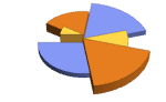
"Stacked" 累积每个数据集的数据 - PlotLegends 的常见设置包括:
-
None 没有图例 Automatic 自动确定图例 {lbl1,lbl2,…} 用 lbl1、lbl2、… 作为图例的标签 Placed[lspec,…] 指定图例的放置 - PlotStylesty 指定每组数据使用的样式. 可能的设置包括:
-
{sty1,sty2,…} 针对数据的一系列样式 <"key"val,…> 针对不同层级的数据的样式元素 - 接受的键有:
-
"Base" 所有扇区的整体样式 "Elements" 针对每组数据中的元素 yi 的样式列表 "Groups" 针对每组数值 datai 的样式列表 - ColorData["DefaultChartColors"] 给出 PlotStyle 使用的默认颜色序列.
- ChartElementFunction 的参数是扇形区域{{θmin,θmax},{rmin,rmax},{zmin,zmax}}, 值 {xi,yi,zi} 和数据集的嵌套列表中每层的元数据 {m1,m2,…}.
- ChartElementFunction 的内置列表可以从ChartElementData["SectorChart3D"] 得到.
- ColorFunction 的参数是 θ、r 和 z.
- SectorChart3D 中选项和其它结构的样式或其它设置按照 PlotStyle、ColorFunction、Style 和 ChartElementFunction,后面的设置会屏蔽之前的设置.
所有选项的列表
范例
打开所有单元 关闭所有单元基本范例 (3)
SectorChart3D[{{2, 2, 3}, {2, 1, 2}, {1, 2, 1}}]SectorChart3D[{{2, 2, 3}, {2, 1, 2}, {1, 2, 1}}, SectorOrigin -> {Automatic, 1}]SectorChart3D[{{{1, 1.5, 3}, {1, 1, 2}, {1, 1, 1}}, {{1, 1, 3}, {1, 1, 2}, {1, 1.5, 1}}}]范围 (28)
数据和布局 (12)
SectorChart3D[{{{1, 1, 3}, {1, 2, 2}, {1, 3, 2}}, {{2, 1, 3}, {2, 2, 3}, {2, 3, 2}}, {{3, 1, 3}, {3, 2, 3}, {3, 3, 1}}}]SectorChart3D[{{{1, 2, 2}, {2, 3, 3}}, {{1, 1, 3}, {2, 2, 3}, {3, 3, 1}}, {{1, 1, 3}, {2, 2, 3}, {3, 3, 2}, {4, 4, 1}}}]SectorChart3D[{{{1, 2, 2}, {2, 3, 3}}, {{1, 1, 3}, {Missing[], 2, 3}, {3, 3, 1}}, {{1, 1, 3}, {2, 2, 3}, {foo, 3, 2}, {4, 4, 1}}}]SectorChart3D[{{Quantity[1, "Seconds"], Quantity[3, "Seconds"], Quantity[5, "Meters"]}, {Quantity[1, "Seconds"], Quantity[7, "Seconds"], Quantity[3, "Meters"]}, {Quantity[2, "Seconds"], Quantity[4, "Seconds"], Quantity[5, "Meters"]}, {Quantity[3, "Seconds"], Quantity[4, "Seconds"], Quantity[7, "Meters"]}, {Quantity[5, "Seconds"], Quantity[4, "Seconds"], Quantity[3, "Meters"]}}]忽略 TimeSeries、EventSeries 和 TemporalData 中的时间戳:
SectorChart3D[TimeSeries[{{19, 16, 10}, {9, 3, 6}, {7, 6, 2}, {17, 12, 5}}, {"May 24, 1982"}]]SectorChart3D[<|"a" -> {1, 3, 1}, "b" -> {2, 4, 3}, "c" -> {5, 3, 5}, "d" -> {3, 5, 2}|>]SectorChart3D[<|"a" -> {1, 3, 1}, "b" -> {2, 4, 3}, "c" -> {5, 3, 5}, "d" -> {3, 5, 2}|>, PlotLabels -> Automatic]SectorChart3D[<|"a" -> {1, 3, 1}, "b" -> {2, 4, 3}, "c" -> {5, 3, 5}, "d" -> {3, 5, 2}|>, PlotStyle -> {Hue[0.61, 0.7, 1], Hue[0.17, 0.4, 0.65], Hue[0.64, 0.5, 0.75], Hue[0.45, 0.4, 0.7]}, PlotLegends -> Automatic]SectorChart3D[<|"group a" -> <|"a" -> {1, 3, 1}, "b" -> {2, 4, 3}, "c" -> {5, 3, 5}, "d" -> {3, 5, 2}|>, "group b" -> <|"a" -> {1, 3, 1}, "b" -> {2, 4, 3}, "c" -> {5, 3, 5}, "d" -> {3, 5, 2}|>|>, PlotLegends -> Automatic]忽略 WeightedData 中的权值:
SectorChart3D[WeightedData[{{5, 4, 6}, {3, 3, 3}, {2, 3, 2}, {3, 3, 4}}, {0.5, 0.2, 0.1, 0.05}]]Table[SectorChart3D[RandomInteger[{1, 4}, {2, 10, 3}], ChartLayout -> l], {l, {"Grouped", "Stacked"}}]Table[SectorChart3D[{{1, 1, 3}, {1, 2, 1}, {2, 3, 2}, {3, 2, 1}}, SectorOrigin -> o, PlotLabel -> o], {o, {{0, "Clockwise"}, {0, "Counterclockwise"}}}]Table[SectorChart3D[{{1, 1, 3}, {1, 2, 1}, {2, 3, 2}, {3, 2, 1}}, SectorOrigin -> o, PlotLabel -> o], {o, {0, Pi / 2}}]Table[SectorChart3D[{{1, 1, 3}, {1, 2, 1}, {2, 3, 2}, {3, 2, 1}}, SectorOrigin -> o, PlotLabel -> o], {o, {{{0, "Clockwise"}, 0}, {{0, "Clockwise"}, 1}}}]data = {{{1, 1, 3}, {2, 2, 2}, {2, 3, 1}}, {{1, 1, 3}, {1, 2, 2}, {2, 3, 2}, {3, 2, 1}}};Table[SectorChart3D[data, SectorSpacing -> s, PlotLabel -> s, PlotStyle -> Opacity[0.8]], {s, {Automatic, {0, 1}, {0.1, 1}}}]表格数据 (3)
tabdata = AggregateRows[Tabular[ResourceData["Sample Data: 1993 US Cars"]], {"AvgPrice" -> (Mean[#AvgPrice]&), "TotalCars" -> (Length[#AvgPrice]&), "AvgWeight" -> (Mean[#Weight]&), "AvgFuelTankCap" -> (Mean[#FuelTankCapacity]&)}, {"Type"}]SectorChart3D[tabdata -> {"TotalCars", "AvgPrice", "AvgWeight"}, PlotLabels -> Normal[tabdata[All, "Type"]]]绘制 TimeSeries 或 EventSeries 中所有分量的值:
SectorChart3D[TimeSeries[TimeEventSeries`TimestampData[Association["UniformlySpacedQ" -> True, "Count" -> 5,
   "Endpoints" -> TabularColumn[Association[
      "Data" -> {2, {{NumericArray[{20563, -2147483648}, "Integer32"], {},
          DataStructure["BitVec ... ularColumn[Association[
           "Data" -> {{17, 5, 7, 6, 13}, {}, None}, "ElementType" -> "Integer64"]],
         TabularColumn[Association["Data" -> {{3, 2, 2, 1, 1}, {}, None},
           "ElementType" -> "Integer64"]]}}]]]], Association[]]]
绘制 TimeSeries 或 EventSeries 中一组分量的值:
ts = TimeSeries[TimeEventSeries`TimestampData[Association["UniformlySpacedQ" -> True, "Count" -> 5,
   "Endpoints" -> TabularColumn[Association[
      "Data" -> {2, {{NumericArray[{20563, -2147483648}, "Integer32"], {},
          DataStructure["BitVec ... e" -> "Integer64"]], TabularColumn[Association[
           "Data" -> {{3.5511999004449324, 1.777675777376151, 1.3490852490420469,
              3.8396388450135266, 4.100051503528421}, {}, None}, "ElementType" -> "Real64"]]}}]]]],
Association[]];SectorChart3D[ts -> {"a", "b", "c"}]SectorChart3D[ts -> {{"a", "b", "c"}, {"d", "e", "f"}}]封装 (4)
{{d1, d2, d3, d4}, {w1, w2, w3, w4}} = {{{2, 1, 3}, {3, 4, 2}, {4, 2, 2}, {3, 4, 1}}, {{2, 2, 3}, {2, 3, 2}, {3, 2, 2}, {4, 3, 1}}};{SectorChart3D[{{d1, Style[d2, RGBColor[0.93, 0.27, 0.27]], d3, d4}, {w1, w2, w3, w4}}], SectorChart3D[{Style[{d1, d2, d3, d4}, RGBColor[0.14, 0.8, 0.14]], {w1, w2, w3, w4}}], SectorChart3D[Style[{{d1, d2, d3, d4}, {w1, w2, w3, w4}}, RGBColor[0.4, 0.6, 1]]]}{SectorChart3D[{{d1, Style[d2, RGBColor[0.93, 0.27, 0.27]], d3, d4}, {w1, w2, w3, w4}}], SectorChart3D[{Style[{d1, Style[d2, RGBColor[0.93, 0.27, 0.27]], d3, d4}, RGBColor[0.14, 0.8, 0.14]], {w1, w2, w3, w4}}], SectorChart3D[Style[{Style[{d1, Style[d2, RGBColor[0.93, 0.27, 0.27]], d3, d4}, RGBColor[0.14, 0.8, 0.14]], {w1, w2, w3, w4}}, RGBColor[0.4, 0.6, 1]]]}SectorChart3D[{{1, 3, 2}, {2, 1, 3}, Tooltip[{3, 3, 1}, "median"], {4, 2, 1}}]SectorChart3D[Table[Tooltip[{CountryData[c, "Population"], CountryData[c, "LifeExpectancy"], 1}, CountryData[c, "Flag"]], {c, CountryData["G8"]}]]用 PopupWindow 提供其它深层的信息:
SectorChart3D[{{1, 3, 2}, {2, 1, 3}, PopupWindow[{3, 3, 2}, DateListPlot[FinancialData["IBM", "Jan. 1, 2004"]]], {4, 2, 1}}]Button 可以用于触发任何操作:
SectorChart3D[{{1, 3, 2}, {2, 1, 3}, Button[{3, 3, 2}, Speak[3]], {4, 2, 1}}]样式和外观 (6)
SectorChart3D[{{1, 3, 2}, {2, 1, 3}, {3, 3, 2}, {4, 2, 1}}, PlotStyle -> {RGBColor[0.93, 0.27, 0.27], RGBColor[0.14, 0.8, 0.14], RGBColor[0.4, 0.6, 1], RGBColor[1, 0.75, 0]}]PlotStyle 可以对所有图表元素设置一个初始样式:
SectorChart3D[{{1, 3, 2}, {2, 1, 3}, {3, 3, 2}, {4, 2, 1}}, PlotStyle -> <|"Base" -> EdgeForm[{Thick, RGBColor[0.93, 0.27, 0.27]}], "Elements" -> 45|>]Style 可以用于屏蔽样式:
SectorChart3D[{{1, 3, 2}, Style[{2, 1, 3}, RGBColor[0.93, 0.27, 0.27]], {3, 3, 2}, {4, 2, 1}}, PlotStyle -> {RGBColor[0.797253, 0.904982, 0.410498], RGBColor[0.934691, 0.945708, 0.75346], RGBColor[0.769879, 0.92369, 0.977371], RGBColor[1, 0.566415, 0.0386511]}]ChartElementData["SectorChart3D"]Table[SectorChart3D[{{1, 3, 2}, {2, 1, 3}, {3, 3, 2}, {4, 2, 1}}, ChartElementFunction -> f, PlotStyle -> {RGBColor[0.823529, 0.788464, 0.657969], RGBColor[0.710414, 0.677302, 0.556176], RGBColor[0.687785, 0.640955, 0.477546], RGBColor[0.610864, 0.569268, 0.42414]}, SectorOrigin -> {Automatic, 1}], {f, {"CylindricalSector3D", "ProfileSector3D", "TorusSector3D"}}]SectorChart3D[{{1, 3, 2}, {2, 1, 3}, {3, 3, 2}, {4, 2, 1}}, SectorOrigin -> {Automatic, 1}, ChartElementFunction -> ChartElementDataFunction["ProfileSector3D", "GradientDirection" -> "Angular"], PlotStyle -> {RGBColor[0.468742, 0., 0.0158236], RGBColor[0.871407, 0.20684366666666665, 0.013399966666666667], RGBColor[0.9899876666666667, 0.5566463333333334, 0.06420996666666667], RGBColor[1., 0.820127, 0.126955]}]SectorChart3D[{{1, 3, 2}, {2, 2, 1}, {3, 3, 4}, {4, 2, 3}}, PlotTheme -> "Marketing"]SectorChart3D[{{{6, 9, 12}, {8, 8, 3}, {8, 9, 7}, {3, 4, 5}, {7, 7, 10}}, {{4, 3, 12}, {3, 5, 7}, {3, 7, 4}, {4, 7, 12}, {9, 6, 5}}}, PlotTheme -> "Monochrome"]标签和图例 (3)
用 Labeled 对一个扇形增加标签:
SectorChart3D[{{1, 3, 2}, {2, 1, 3}, Labeled[{3, 3, 2}, "label"], {4, 2, 1}}]Table[SectorChart3D[{{1, 3, 2}, {2, 1, 3}, Labeled[{3, 3, 2}, "label", p], {4, 2, 1}}, PlotLabel -> p, SectorOrigin -> {Automatic, 1}], {p, {"RadialInner", "RadialCenter", "RadialOuter"}}]Table[SectorChart3D[{{1, 3, 2}, {2, 1, 3}, Labeled[{3, 3, 2}, "label", p], {4, 2, 1}}, PlotLabel -> p, SectorOrigin -> {Automatic, 1}], {p, {"RadialInside", "RadialOutside"}}]Table[SectorChart3D[{Labeled[{1, 3, 2}, "L1", p], Labeled[{2, 1, 3}, "L2", p], Labeled[{3, 3, 2}, "L3", p], Labeled[{4, 2, 1}, "L4", p]}, PlotLabel -> p], {p, {"RadialCallout", "VerticalCallout"}}]用 LabelingFunction 对扇形提供值的标签:
SectorChart3D[{{2, 1, 2}, {2, 3, 3}, {3, 4, 2}, {4, 2, 1}}, LabelingFunction -> "RadialOutside"]选项 (74)
Axes (3)
默认情况下,不绘制 Axes:
SectorChart3D[{{1, 1, 3}, {1, 2, 2}, {2, 3, 2}, {3, 2, 1}}]SectorChart3D[{{1, 1, 3}, {1, 2, 2}, {2, 3, 2}, {3, 2, 1}}, Axes -> True]{SectorChart3D[{{1, 1, 1}, {1, 2, 2}, {2, 3, 2}, {3, 2, 8}}, Axes -> {False, False, True}], SectorChart3D[{{1, 1, 1}, {1, 2, 2}, {2, 3, 2}, {3, 2, 8}}, Axes -> {False, True, False}], SectorChart3D[{{1, 1, 1}, {1, 2, 2}, {2, 3, 2}, {3, 2, 8}}, Axes -> {True, False, False}]}AxesLabel (3)
SectorChart3D[{{1, 1, 3}, {1, 2, 2}, {2, 3, 2}, {3, 2, 1}}, Axes -> True]
SectorChart3D[{{1, 1, 3}, {1, 2, 2}, {2, 3, 2}, {3, 2, 1}}, Axes -> True, AxesLabel -> z]SectorChart3D[{{1, 1, 3}, {1, 2, 2}, {2, 3, 2}, {3, 2, 1}}, Axes -> True, AxesLabel -> {x, y, z}]AxesOrigin (2)
AxesStyle (3)
SectorChart3D[{{1, 1, 3}, {1, 2, 2}, {2, 3, 2}, {3, 2, 1}}, Axes -> True, AxesStyle -> RGBColor[0.93, 0.27, 0.27]]SectorChart3D[{{1, 1, 3}, {1, 2, 2}, {2, 3, 2}, {3, 2, 1}}, Axes -> True, AxesStyle -> {{Thick, RGBColor[0.67, 0.54, 0.42]}, {Thick, RGBColor[0.4, 0.6, 1]}, {Thick, RGBColor[0.14, 0.8, 0.14]}}]SectorChart3D[{{1, 1, 3}, {1, 2, 2}, {2, 3, 2}, {3, 2, 1}}, Axes -> True, AxesStyle -> RGBColor[0.14, 0.8, 0.14], TicksStyle -> RGBColor[0.4, 0.6, 1]]ChartElementFunction (6)
ChartElementFunction 可能的字符值:
ChartElementData["SectorChart3D"]Table[SectorChart3D[Tuples[{1, 2}, 3], ChartElementFunction -> f, SectorOrigin -> {{3Pi / 2, 1}, 1}, PlotStyle -> {RGBColor[0.773754, 0.420615, 0.187213], RGBColor[0.443442, 0.110262, 0.100633], RGBColor[0.877699, 0.728923, 0.228702], RGBColor[0.882353, 0.597772, 0.124285], RGBColor[0.266972, 0.112123, 0.117922], RGBColor[0.683253, 0.00616464, 0.0506752], RGBColor[1, 0.8, 0.4], RGBColor[0.70135, 0.246342, 0.10016]}, PlotLabel -> f], {f, {"CylindricalSector3D", "ProfileSector3D", "TorusSector3D"}}]用 ChartElementData 指定相同的图形渲染函数如上:
SectorChart3D[Tuples[{1, 2}, 3], ChartElementFunction -> Function[{angleRadiusMinMax, yr, meta}, ChartElementData["CylindricalSector3D"][angleRadiusMinMax, yr, meta]]]DataDrilldownSector[{{t0_, t1_}, {r0_, r1_}, {h0_, h1_}}, y_, {data_List}] :=
PopupWindow[ChartElementData["ProfileSector3D"][{{t0, t1}, {r0, r1}, {h0, h1}}, y], BarChart3D[data]]DataDrilldownSector[{{t0_, t1_}, {r0_, r1_}, {h0_, h1_}}, y_, _] :=
ChartElementData["CylindricalSector3D"][{{t0, t1}, {r0, r1}, {h0, h1}}, y]SectorChart3D[{{1, 1, 2} -> Range[5], {1, 2, 3}, {2, 1, 2} -> RandomReal[1, 10], {2, 2, 1}}, ChartElementFunction -> DataDrilldownSector]写入一个定制的 ChartElementFunction:
SectorChart3D[Tuples[{1, 2}, 3], ChartElementFunction -> {"CylindricalSector3D", "ProfileSector3D", "TorusSector3D"}, PlotStyle -> {RGBColor[0.468742, 0., 0.0158236], RGBColor[0.6706774285714285, 0.06984285714285714, 0.009042057142857144], RGBColor[0.8432481428571429, 0.15849014285714286, 0.008003357142857142], RGBColor[0.9277247142857143, 0.30355071428571423, 0.024193185714285713], RGBColor[0.978545, 0.4534661428571428, 0.0459689], RGBColor[0.995709, 0.6082364285714286, 0.07333049999999999], RGBColor[1., 0.7211567142857143, 0.10022122857142858], RGBColor[1., 0.820127, 0.126955]} , SectorOrigin -> {Automatic, 1}]内置基本函数可能有选项,用 面板 ▶ 图表元素方案 设置它们:
ChartElementData["ProfileSector3D", "Options"]Table[SectorChart3D[Tuples[{1, 2}, 3], SectorOrigin -> {Automatic, 1}, ChartElementFunction -> ChartElementDataFunction["ProfileSector3D", "Profile" -> p], PlotLabel -> p], {p, {0.1, 1, 3, 5}}]ColorFunction (4)
SectorChart3D[Table[{Exp[-t ^ 2], Exp[-t ^ 2], 1}, {t, -2, 2, 0.25}], ColorFunction -> Function[{angle, radius}, ColorData["Rainbow"][angle]]]用 ColorFunctionScaling->False,获得未调整的角度值:
SectorChart3D[Tuples[{1, 2}, 3], ColorFunction -> (Switch[{#1, #2}, {1, 1}, RGBColor[1, 0.75, 0], {1, 2}, RGBColor[0.98, 0.56, 0.17], {2, 1}, RGBColor[0.93, 0.27, 0.27], _, RGBColor[0.4, 0.6, 1]]&), ColorFunctionScaling -> False]ColorFunction 屏蔽 PlotStyle 中的样式:
SectorChart3D[Tuples[{1, 2, 3}, 3], PlotStyle -> {RGBColor[0.93, 0.27, 0.27], RGBColor[0.14, 0.8, 0.14], RGBColor[0.67, 0.54, 0.42]}, ColorFunction -> "Pastel"]用 ColorFunction 组合不同样式效果:
SectorChart3D[Table[{Exp[-t ^ 2], Exp[-t ^ 2], 1}, {t, -2, 2, 0.25}], ColorFunction -> Function[{angle, radius}, Opacity[radius]], PlotStyle -> RGBColor[0.8, 0.3, 0.8]]ColorFunctionScaling (2)
用 ColorFunctionScaling->False 得到未调整的高度值:
SectorChart3D[Tuples[{1, 2}, 3], ColorFunction -> (Switch[{#1, #2}, {1, 1}, RGBColor[1, 0.75, 0], {1, 2}, RGBColor[0.98, 0.56, 0.17], {2, 1}, RGBColor[0.93, 0.27, 0.27], _, RGBColor[0.4, 0.6, 1]]&), ColorFunctionScaling -> False]SectorChart3D[{{1, 1, 3}, {1, 2, 2}, {2, 3, 2}, {3, 2, 1}}, ColorFunction -> Function[{angle, radius}, ColorData["Rainbow"][angle radius / 4]], ColorFunctionScaling -> False]ImageSize (7)
使用命名尺寸,例如 Tiny、Small、Medium 和 Large:
{SectorChart3D[{{1, 1, 3}, {1, 2, 2}, {2, 3, 2}, {3, 2, 1}}, ImageSize -> Tiny], SectorChart3D[{{1, 1, 3}, {1, 2, 2}, {2, 3, 2}, {3, 2, 1}}, ImageSize -> Small]}{SectorChart3D[{{1, 1, 3}, {1, 2, 2}, {2, 3, 2}, {3, 2, 1}}, ImageSize -> 150], SectorChart3D[{{1, 1, 3}, {1, 2, 2}, {2, 3, 2}, {3, 2, 1}}, AspectRatio -> 1.5, ImageSize -> 150]}{SectorChart3D[{{1, 1, 3}, {1, 2, 2}, {2, 3, 2}, {3, 2, 1}}, ImageSize -> {Automatic, 150}], SectorChart3D[{{1, 1, 3}, {1, 2, 2}, {2, 3, 2}, {3, 2, 1}}, AspectRatio -> 2, ImageSize -> {Automatic, 150}]}{SectorChart3D[{{1, 1, 3}, {1, 2, 2}, {2, 3, 2}, {3, 2, 1}}, ImageSize -> UpTo[200]], SectorChart3D[{{1, 1, 3}, {1, 2, 2}, {2, 3, 2}, {3, 2, 1}}, AspectRatio -> 2, ImageSize -> UpTo[200]]}SectorChart3D[{{1, 1, 3}, {1, 2, 2}, {2, 3, 2}, {3, 2, 1}}, ImageSize -> {200, 250}, Background -> LightBlue]设置 AspectRatioFull 将填充可用空间:
SectorChart3D[{{1, 1, 3}, {1, 2, 2}, {2, 3, 2}, {3, 2, 1}}, AspectRatio -> Full, ImageSize -> {200, 250}, Background -> LightBlue]{SectorChart3D[{{1, 1, 3}, {1, 2, 2}, {2, 3, 2}, {3, 2, 1}}, ImageSize -> {UpTo[150], UpTo[100]}], SectorChart3D[{{1, 1, 3}, {1, 2, 2}, {2, 3, 2}, {3, 2, 1}}, AspectRatio -> 2, ImageSize -> {UpTo[150], UpTo[100]}]}Framed[Pane[SectorChart3D[{{1, 1, 3}, {1, 2, 2}, {2, 3, 2}, {3, 2, 1}}, ImageSize -> Full, Background -> LightBlue], {200, 200}]]Framed[Pane[SectorChart3D[{{1, 1, 3}, {1, 2, 2}, {2, 3, 2}, {3, 2, 1}}, AspectRatio -> Full, ImageSize -> {Scaled[0.5], Scaled[0.5]}, Background -> LightBlue], {200, 100}]]LabelingFunction (7)
Tooltip 和 StatusArea 使用自动标签:
SectorChart3D[{{1, 1, 3}, {1, 2, 2}, {2, 3, 2}, {3, 2, 1}}, LabelingFunction -> Automatic]SectorChart3D[{{1, 1, 3}, {1, 2, 2}, {2, 3, 2}, {3, 2, 1}}, LabelingFunction -> None]用 Placed 控制标签放置:
Table[SectorChart3D[{{1, 1, 3}, {1, 2, 2}, {2, 3, 2}, {3, 2, 1}}, LabelingFunction -> (Placed[First@#, p]&), PlotLabel -> p, Ticks -> None], {p, {"RadialInner", "RadialCenter", "RadialOuter"}}]Table[SectorChart3D[{{1, 1, 3}, {1, 2, 2}, {2, 3, 2}, {3, 2, 1}}, SectorOrigin -> {Automatic, 4}, LabelingFunction -> (Placed[Last@#, p]&), PlotLabel -> p], {p, {"RadialInside", "RadialOutside", "RadialEdge"}}]Table[SectorChart3D[{{1, 1, 3}, {1, 2, 2}, {2, 3, 2}, {3, 2, 1}}, LabelingFunction -> (Placed[#[[2]], p]&), PlotLabel -> p], {p, {"RadialCallout", "VerticalCallout"}}]Table[SectorChart3D[{{1, 1, 3}, {1, 2, 2}, {2, 3, 2}, {3, 2, 1}}, LabelingFunction -> (Placed[First@#, p]&), PlotLabel -> p, SectorOrigin -> {Automatic, 2}], {p, {{0, 0, 0}, {1 / 2, 1 / 2, 1 / 2}, {1, 1, 1}}}]Table[SectorChart3D[{{1, 2, 2}, {2, 3, 2}, {3, 2, 1}}, PlotLabels -> (Placed[Framed /@ {"aa", "bb", "cc"}, {{1, 1, 1}, p}]), PlotLabel -> p, SectorOrigin -> {Automatic, 2}], {p, {{0, 0}, {1 / 2, 1 / 2}, {1, 1}}}]SectorChart3D[{{1, 1, 3}, {1, 2, 2}, {2, 3, 2}, {3, 2, 1}}, LabelingFunction -> (Placed[Row[{"$", #[[1]]}, " "], "RadialOutside"]&)]PerformanceGoal (3)
SectorChart3D[Tuples[{1, 2, 3}, 3], PerformanceGoal -> "Quality"]SectorChart3D[Tuples[{1, 2, 3}, 3], PerformanceGoal -> "Speed"]Table[ByteCount@SectorChart3D[Tuples[{1, 2, 3}, 3], PerformanceGoal -> p], {p, {"Quality", "Speed"}}]PlotInteractivity (4)
SectorChart3D[{{1, 1, 1}, {2, 1, 2}, {2, 2, 1}}]SectorChart3D[{{1, 1, 1}, {2, 1, 2}, {2, 2, 1}}, PlotInteractivity -> False]SectorChart3D[{{1, 1, 1}, {2, 1, 2}, Tooltip[{2, 2, 1}, "Hello"]}, PlotInteractivity -> False]SectorChart3D[{{1, 1, 1}, {2, 1, 2}, Tooltip[{2, 2, 1}, "Hello"]}, PlotInteractivity -> <|"User" -> True, "System" -> False|>]PlotLabels (6)
SectorChart3D[{{1, 1, 3}, {1, 2, 2}, {2, 3, 2}, {3, 2, 1}}, PlotLabels -> {"a", "b", "c", "d"}]SectorChart3D[{{{1, 2, 3}, {2, 2, 2}, {2, 1, 2}}, {{2, 2, 2}, {1, 2, 2}, {2, 3, 2}}}, PlotLabels -> {"a", "b"}]数据中的 Labeled 封装将会放置额外的标签:
SectorChart3D[{{1, 1, 3}, Labeled[{1, 2, 2}, "label", "RadialOutside"], {2, 3, 2}, {3, 2, 1}}, PlotLabels -> {"a", "b", "c", "d"}]用 Placed 控制标签的放置:
Table[SectorChart3D[{{1, 1, 3}, {1, 2, 2}, {2, 3, 2}, {3, 2, 1}}, PlotLabels -> Placed[{"a", "b", "c", "d"}, p], PlotLabel -> p], {p, {"RadialInner", "RadialCenter", "RadialOuter"}}]Table[SectorChart3D[{{1, 1, 3}, {1, 2, 2}, {2, 3, 2}, {3, 2, 1}}, SectorOrigin -> {Automatic, 1}, PlotLabels -> Placed[{"a", "b", "c", "d"}, p], PlotLabel -> p, Ticks -> None], {p, {"RadialInside", "RadialOutside", "RadialEdge"}}]Table[SectorChart3D[{{1, 1, 3}, {1, 2, 2}, {2, 3, 2}, {3, 2, 1}}, SectorOrigin -> {Automatic, 1}, PlotLabels -> Placed[{"a", "b", "c", "d"}, p], PlotLabel -> p, Ticks -> None], {p, {"RadialCallout", "VerticalCallout"}}]Table[SectorChart3D[{{1, 1, 3}, {1, 2, 2}, {2, 3, 2}, {3, 2, 1}}, SectorOrigin -> {Automatic, 1}, PlotLabels -> Placed[{"aa", "bb", "cc", "dd"}, p], PlotLabel -> p], {p, {{0, 0, 0}, {1 / 2, 1 / 2, 1}, {1, 1, 1}}}]用 Placed 的第三个参数控制格式:
SectorChart3D[{{1, 1, 3}, {1, 2, 2}, {2, 3, 2}, {3, 2, 1}}, PlotLabels -> Placed[{"aaa", "bbb", "ccc", "ddd"}, "RadialOutside", Style[#, RGBColor[0.93, 0.27, 0.27], 16, Bold]&]]SectorChart3D[{{{1, 2, 3}, {2, 2, 2}, {2, 1, 2}}, {{2, 2, 2}, {1, 2, 2}, {2, 3, 2}}}, PlotLabels -> {"r1", "r2"}]SectorChart3D[{{{1, 2, 3}, {2, 2, 2}, {2, 1, 2}}, {{2, 2, 2}, {1, 2, 2}, {2, 3, 2}}}, PlotLabels -> <|"Elements" -> {"c1", "c2", "c3"}|>]SectorChart3D[{{{1, 2, 3}, {2, 2, 2}, {2, 1, 2}}, {{2, 2, 2}, {1, 2, 2}, {2, 3, 2}}}, PlotLabels -> <|"Groups" -> {"r1", "r2"}, "Elements" -> {"c1", "c2", "c3"}|>]用 Placed 来改变放置的位置:
SectorChart3D[{{{1, 2, 3}, {2, 2, 2}, {2, 1, 2}}, {{2, 2, 2}, {1, 2, 2}, {2, 3, 2}}}, PlotLabels -> <|"Groups" -> Placed[{"r1", "r2"}, "RadialOuter"], "Elements" -> Placed[{"c1", "c2", "c3"}, "RadialCenter"]|>]SectorChart3D[{{1, 2, 3}, {2, 2, 2}, {2, 1, 2}}, PlotLabels -> Placed[{{"a", "b", "c"}, {"x", "y", "z"}}, {"RadialCenter", "RadialCallout"}]]PlotLayout (2)
PlotLayout 默认按同心环分组:
data = {{{1, 1, 3}, {2, 2, 2}, {2, 3, 1}}, {{1, 1, 3}, {1, 2, 2}, {2, 3, 2}, {3, 2, 1}}};{SectorChart3D[data], SectorChart3D[data, PlotLayout -> "Grouped"]}data = {{{1, 1, 3}, {2, 2, 2}, {2, 3, 1}}, {{1, 1, 3}, {1, 2, 2}, {2, 3, 2}, {3, 2, 1}}};SectorChart3D[data, PlotLayout -> "Stacked"]SectorChart3D[RandomReal[1, {10, 5, 3}], PlotLayout -> "Stacked"]PlotLegends (7)
SectorChart3D[{{1, 1, 3}, {1, 2, 2}, {2, 3, 2}, {3, 2, 1}}, PlotLegends -> <|"Elements" -> {"ccc1", "ccc2", "ccc3", "ccc4"}|>, PlotStyle -> <|"Elements" -> {RGBColor[0.761959, 0.470832, 0.940597], RGBColor[0.927848, 0.742785, 0.6151383333333333], RGBColor[0.929162, 0.95034, 0.6648153333333333], RGBColor[0.431296, 0.709773, 0.927077]}|>]SectorChart3D[{{{1, 2, 3}, {2, 2, 2}, {2, 1, 2}}, {{2, 2, 2}, {1, 2, 2}, {2, 3, 2}}}, PlotLegends -> <|"Groups" -> {"rr1", "rr2"}|>, PlotStyle -> <|"Groups" -> {RGBColor[0.761959, 0.470832, 0.940597], RGBColor[0.431296, 0.709773, 0.927077]}|>]用 Legended 添加其他图例:
SectorChart3D[{{{1, 2, 3}, Legended[Style[{2, 2, 2}, RGBColor[0.93, 0.27, 0.27]], "aa"], {2, 1, 2}}, {{2, 2, 2}, {1, 2, 2}, {2, 3, 2}}}, PlotStyle -> <|"Elements" -> {RGBColor[0.761959, 0.470832, 0.940597], RGBColor[0.9584254999999999, 0.877884, 0.5906629999999999], RGBColor[0.431296, 0.709773, 0.927077]}|>, PlotLegends -> <|"Elements" -> {"ccc1", "ccc2", "ccc3"}|>]用 Legended 指定几个图例:
SectorChart3D[{{1, 1, 3}, Legended[{1, 2, 2}, "aa"], {2, 3, 2}, {3, 2, 1}}, PlotStyle -> <|"Elements" -> {RGBColor[0.761959, 0.470832, 0.940597], RGBColor[0.8750956, 0.6580038, 0.746929], RGBColor[0.9440982, 0.7955892, 0.5942686], RGBColor[0.9537862, 0.937389, 0.6180996], RGBColor[0.7952328000000001, 0.8988539999999999, 0.8302508], RGBColor[0.431296, 0.709773, 0.927077]}|>]data = {{{1, 1, 3}, {2, 2, 2}, {2, 3, 1}}, {{1, 1, 3}, {1, 2, 2}, {2, 3, 2}, {3, 2, 1}}};SectorChart3D[data, PlotLegends -> {"Group A", "Group B"}, PlotStyle -> <|"Groups" -> {RGBColor[0.761959, 0.470832, 0.940597], RGBColor[0.431296, 0.709773, 0.927077]}|>]data = {{{1, 1, 3}, {2, 2, 2}, {2, 3, 1}}, {{1, 1, 3}, {1, 2, 2}, {2, 3, 2}, {3, 2, 1}}};SectorChart3D[data, PlotLegends -> {"Group A", "Group B", "Group C"}, PlotStyle -> <|"Groups" -> {RGBColor[0.761959, 0.470832, 0.940597], RGBColor[0.431296, 0.709773, 0.927077]}|>]data = {{{1, 1, 3}, {2, 2, 2}, {2, 3, 1}}, {{1, 1, 3}, {1, 2, 2}, {2, 3, 2}, {3, 2, 1}}};SectorChart3D[data, PlotLegends -> <|"Groups" -> {"Test A", "Test B"}, "Elements" -> {"John", "Mary", "Bob"}|>, PlotStyle -> <|"Groups" -> {EdgeForm[Directive[Opacity[1], RGBColor[0.93, 0.27, 0.27], Thickness[0.01]]], EdgeForm[Directive[Opacity[1], Dashed]]}, "Elements" -> {RGBColor[0.761959, 0.470832, 0.940597], RGBColor[0.9584254999999999, 0.877884, 0.5906629999999999], RGBColor[0.431296, 0.709773, 0.927077]}|>]用 Placed 控制图例的放置:
data = {{{1, 1, 3}, {2, 2, 2}, {2, 3, 1}}, {{1, 1, 3}, {1, 2, 2}, {2, 3, 2}, {3, 2, 1}}};Table[SectorChart3D[data, PlotLegends -> Placed[{"John", "Mary", "Bob"}, pos], PlotStyle -> {RGBColor[0.761959, 0.470832, 0.940597], RGBColor[0.431296, 0.709773, 0.927077]}], {pos, {Before, Below}}]Table[SectorChart3D[data, PlotLegends -> Placed[{"John", "Mary", "Bob"}, pos], PlotStyle -> {RGBColor[0.761959, 0.470832, 0.940597], RGBColor[0.431296, 0.709773, 0.927077]}], {pos, {Before, After}}]PlotStyle (5)
用 PlotStyle 设计扇区的样式:
SectorChart3D[{{1, 1, 3}, {1, 2, 2}, {2, 3, 2}, {3, 2, 1}}, PlotStyle -> {RGBColor[0.93, 0.27, 0.27], RGBColor[0.14, 0.8, 0.14], RGBColor[0.4, 0.6, 1], RGBColor[1, 0.75, 0]}]Table[SectorChart3D[{{1, 1, 3}, {1, 2, 2}, {2, 3, 2}, {3, 2, 1}}, PlotStyle -> s], {s, {EdgeForm[{Opacity[1], Blue}], Opacity[0.7]}}]data = {{{1, 1, 3}, {2, 2, 2}, {2, 3, 1}}, {{1, 1, 3}, {1, 2, 2}, {2, 3, 2}, {3, 2, 1}}};SectorChart3D[data, PlotStyle -> {RGBColor[0.93, 0.27, 0.27], RGBColor[0.4, 0.6, 1]}]data = {{{1, 1, 3}, {2, 2, 2}, {2, 3, 1}}, {{1, 1, 3}, {1, 2, 2}, {2, 3, 2}, {3, 2, 1}}};SectorChart3D[data, PlotStyle -> <|"Elements" -> {RGBColor[0.93, 0.27, 0.27], RGBColor[0.14, 0.8, 0.14], RGBColor[0.4, 0.6, 1]}|>]SectorChart3D[data, PlotStyle -> <|"Groups" -> {RGBColor[0.93, 0.27, 0.27], RGBColor[0.14, 0.8, 0.14]}|>]SectorChart3D[data, PlotStyle -> <|"Base" -> EdgeForm[{Thick, Dashed}], "Groups" -> {Opacity[0.3], Opacity[0.9]}, "Elements" -> {RGBColor[0.93, 0.27, 0.27], RGBColor[0.14, 0.8, 0.14], RGBColor[0.4, 0.6, 1]}|>]SectorChart3D[{{1, 1, 2}, Style[{1, 2, 2}, Opacity[0.2]], {2, 3, 2}, {3, 2, 1}}, PlotStyle -> {RGBColor[0.93, 0.27, 0.27], RGBColor[0.14, 0.8, 0.14], RGBColor[0.4, 0.6, 1], RGBColor[1, 0.75, 0]}]SectorChart3D[{{1, 1, 2}, {1, 2, 2}, {2, 3, 2}, {3, 2, 1}, Style[{1, 2, 3}, EdgeForm[None]]}, PlotStyle -> EdgeForm[{Thick, Dashed, Opacity[0.8]}]]"Elements" 或 "Groups" 的设置可能会覆盖 "Base" 的设置:
data = {{{1, 1, 3}, {2, 2, 2}, {2, 3, 1}}, {{1, 1, 3}, {1, 2, 2}, {2, 3, 2}, {3, 2, 1}}};SectorChart3D[data, PlotStyle -> <|"Base" -> EdgeForm[None], "Elements" -> EdgeForm[Dashed]|>]用 ColorFunction 来组合不同的样式效果:
SectorChart3D[Tuples[{1, 2}, 3], PlotStyle -> EdgeForm /@ {Dashed, Dotted, DotDashed}, ColorFunction -> (Blend[{RGBColor[0.4, 0.6, 1], RGBColor[0.93, 0.27, 0.27]}, #]&)]SectorChart3D[RandomReal[{0.4, 1}, {3, 8, 3}], PlotStyle -> <|"Groups" -> "Rainbow"|>, ChartLayout -> "Grouped", ColorFunction -> Function[{height}, Opacity[height]]]SectorChart3D[RandomReal[{0.4, 1}, {3, 8, 3}], PlotStyle -> <|"Groups" -> "Rainbow"|>, ChartLayout -> "Grouped", ColorFunction -> Function[{x, y, z}, RGBColor[x, y, z]]]SectorChart3D[RandomReal[{0.4, 1}, {2, 8, 3}], ChartElementFunction -> "TorusSector3D", PlotStyle -> {RGBColor[0.761959, 0.470832, 0.940597], RGBColor[0.431296, 0.709773, 0.927077]}]PlotTheme (1)
SectorOrigin (4)
{SectorChart3D[{Labeled[{1, 3, 3}, "Begin"], {2, 2, 2}, {2, 3, 1}, {3, 2, 2}}], SectorChart3D[{Labeled[{1, 3, 3}, "Begin"], {2, 2, 2}, {2, 3, 1}, {3, 2, 2}}, SectorOrigin -> {{Pi, "Clockwise"}, 0}]}SectorChart3D[{Labeled[{1, 3, 3}, "Begin"], {2, 2, 2}, {2, 3, 1}, {3, 2, 2}}, SectorOrigin -> {{Pi, "Clockwise"}, 1}]SectorChart3D[{Labeled[{1, 3, 3}, "Begin"], {2, 2, 2}, {2, 3, 1}, {3, 2, 2}}, SectorOrigin -> {{Pi / 2, "Counterclockwise"}, 1}]
SectorChart3D[{Labeled[{1, 3, 3}, "Begin"], {2, 2, 2}, {2, 3, 1}, {3, 2, 2}}, SectorOrigin -> {{Pi / 2, "Clockwise"}, 1}]SectorSpacing (5)
data = {{{1, 1, 3}, {2, 2, 2}, {2, 3, 1}}, {{1, 1, 3}, {1, 2, 2}, {2, 3, 2}, {3, 2, 1}}};SectorChart3D[data, SectorSpacing -> Automatic]data = {{{1, 1, 3}, {2, 2, 2}, {2, 3, 1}}, {{1, 1, 3}, {1, 2, 2}, {2, 3, 2}, {3, 2, 1}}};SectorChart3D[data, SectorSpacing -> None]data = {{{1, 1, 3}, {2, 2, 2}, {2, 3, 1}}, {{1, 1, 3}, {1, 2, 2}, {2, 3, 2}, {3, 2, 1}}};Table[SectorChart3D[data, SectorSpacing -> s, PlotLabel -> s], {s, {Tiny, Small, Medium, Large}}]data = {{{1, 1, 3}, {2, 2, 2}, {2, 3, 1}}, {{1, 1, 3}, {1, 2, 2}, {2, 3, 2}, {3, 2, 1}}};Table[SectorChart3D[data, SectorSpacing -> s, PlotLabel -> s], {s, {Automatic, 1, 3}}]data = {{{1, 1, 3}, {2, 2, 2}, {2, 3, 1}}, {{1, 1, 3}, {1, 2, 2}, {2, 3, 2}, {3, 2, 1}}};Table[SectorChart3D[data, SectorSpacing -> s, PlotLabel -> s], {s, {Automatic, {0.1, 1}, {0.05, 2}}}]应用 (3)
countries = CountryData["Africa"];
properties = {"GDPPerCapita", "PovertyFraction", "Population"};data = Table[With[{v = cp}, Button[v[[2 ;; 4]], Speak[StringJoin[ToString /@ {v[[1]], ", GDP per capita: $", Round[v[[2]]], ", Poverty Fraction: ", v[[3]], ", Population: ", Round[v[[4]]]}]]]], {cp, Table[Prepend[Table[QuantityMagnitude@CountryData[c, p], {p, properties}], c], {c, countries}]}];SectorChart3D[data]data = {10, 30, 50, 40, 70};
sectorData = Table[| | |
| ----------------- | ------- |
| {data[[i]], 1, 3} | i === 3 |
| {data[[i]], 1, 1} | True |, {i, Length@data}]SectorChart3D[sectorData, PlotLabels -> data]countries = CountryData["Africa"];
properties = {"GDP", "PovertyFraction", "Population"};
data = Table[QuantityMagnitude@CountryData[c, p], {c, countries}, {p, properties}];labeler[v_, {r_, c_}, ___] := Placed[Grid[{{Style[countries[[c]], Bold], }, {"GDP", v[[1]]}, {"Poverty", v[[2]]}, {"Population", v[[3]]}}, Alignment -> Left], Tooltip]SectorChart3D[data, LabelingFunction -> labeler]属性和关系 (4)
PieChart3D 是 SectorChart3D 的一个特例:
{SectorChart3D[{{1, 1, 1}, {2, 1, 1}, {3, 1, 1}}], PieChart3D[{1, 2, 3}]}用 SectorChart 得到一个二维饼图:
SectorChart[{{2, 2}, {2, 1}, {1, 2}}]用 BubbleChart 绘制 triples 的气泡图:
BubbleChart[RandomReal[1, {3, 10, 3}]]用 ListPointPlot3D 产生线图形:
ListPointPlot3D[RandomReal[1, {25, 3}], Filling -> Bottom]巧妙范例 (1)
SectorChart3D[RandomReal[10, {2, 200, 3}], ColorFunction -> "DeepSeaColors", PerformanceGoal -> "Speed", Background -> GrayLevel[0.62], PlotStyle -> EdgeForm[None]]文本
Wolfram Research (2008),SectorChart3D,Wolfram 语言函数,https://reference.wolfram.com/language/ref/SectorChart3D.html (更新于 2026 年).
CMS
Wolfram 语言. 2008. "SectorChart3D." Wolfram 语言与系统参考资料中心. Wolfram Research. 最新版本 2026. https://reference.wolfram.com/language/ref/SectorChart3D.html.
APA
Wolfram 语言. (2008). SectorChart3D. Wolfram 语言与系统参考资料中心. 追溯自 https://reference.wolfram.com/language/ref/SectorChart3D.html 年