BoxWhiskerChart[{x1,x2,…}]
値 xiの箱ひげ図を作成する.
BoxWhiskerChart[{x1,x2,…},bwspec]
記号指定 bwspec による箱ひげ図を作成する.
BoxWhiskerChart[{data1,data2,…},…]
各 dataiの記号による箱ひげ図を作成する.
BoxWhiskerChart[{{data1,data2,…},…},…]
複数のデータ集合{data1,data2,…}から箱ひげ図を作成する.
BoxWhiskerChart
BoxWhiskerChart[{x1,x2,…}]
値 xiの箱ひげ図を作成する.
BoxWhiskerChart[{x1,x2,…},bwspec]
記号指定 bwspec による箱ひげ図を作成する.
BoxWhiskerChart[{data1,data2,…},…]
各 dataiの記号による箱ひげ図を作成する.
BoxWhiskerChart[{{data1,data2,…},…},…]
複数のデータ集合{data1,data2,…}から箱ひげ図を作成する.
詳細とオプション
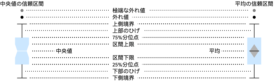
- BoxWhiskerChartは各 datai中の値の分布の概要を表す箱ひげ図を作成する.
- 使用可能な箱ひげ指定 bwspec
-
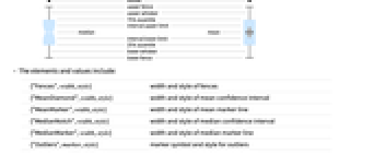
"Notched" 信頼区間中央値のノッチ "Outliers" 外れ値マーカー "Median" 中央値マーカー "Basic" 箱ひげのみ "Mean" 平均値マーカー "Diamond" 信頼区間平均のダイヤモンド {{elem1,val11,…},…} 箱ひげ要素指定 {"name",{elem1,val11,…},…} 要素変更を含む名前付き bwspec - 要素と値
-
{"Fences",width,style} 境界の幅とスタイル {"MeanDiamond",width,style} 平均の信頼区間の幅とスタイル {"MeanMarker",width,style} 平均マーカーラインの幅とスタイル {"MedianNotch",width,style} 中央値の信頼区間の幅とスタイル {"MedianMarker",width,style} 中央値マーカーラインの幅とスタイル {"Outliers",marker,style} 外れ値のマーカー記号とスタイル {"FarOutliers",marker,style} 極端な外れ値のマーカー記号とスタイル {"Whiskers",style} ひげのスタイル - width は箱の幅との割合で与えられる.marker には任意の式が使える.
- BoxWhiskerChartのデータ要素の形式
-
datai 純粋なデータ集合 Quantity[datai,unit] 単位が付いたデータ datai wi[datai,…] ラッパー wiのあるデータ veci formi->mi メタデータ miを含むデータ - 各 dataiは実数のリスト{y1,y2,…}でなければならない.実数ではない要素 yjは欠測値とみなされ,除外される.dataiが実数のリストでない場合は欠測値とみなされ,一般に箱ひげ図では欠落部として表示される.
- BoxWhiskerChartのデータ集合は,次の形式で与えることができる.
-
{data1,data2,…} ラッパーがある/ない要素リスト <|k1data1,k2data2,…|> キーとデータ集合の連想 TimeSeries[…],EventSeries[…],TemporalData[…] 時系列.事象系列,一時データ WeightedData[…],EventData[…] 拡張データ集合 w[{data1,data2,…},…] グループ化されたデータ集合にラッパーを適用 w[{{data1,data1,…},…},…] グループ化されたすべてのデータ集合にラッパーを適用 - BoxWhiskerChart[Tabular[…]cspec]は,列指定 cspec を使って表形式オブジェクトから値を抽出し,これをプロットする.
- 次は,表形式データのプロットに使用可能な列指定 cspec の形式である.
-
colx 列 colxの値についての箱ひげ図をプロットする {colx1,colx2,…} 列 colx1, colx2, …についての箱ひげ図をプロットする - 次は,dataiに使用可能なラッパーである.
-
Annotation[e,label] 注釈を与える Button[e,action] 要素がクリックされたときに実行するアクションを定義する Callout[e,label] 要素をコールアウト付きで表示する EventHandler[e,…] 要素の一般的なイベントハンドラを定義する Hyperlink[e,uri] 要素をハイパーリンクにする Labeled[e,…] 要素にラベルを付けて表示する Legended[e,…] 要素の特徴をグラフの凡例に含める Mouseover[e,over] 要素のマウスオーバーの形式を表示する PopupWindow[e,cont] 要素にポップアップウィンドウを付ける StatusArea[e,label] 要素にマウスオーバーしたときにステータスエリアに表示する Style[e,opts] 要素を指定のスタイルで表示する Tooltip[e,label] 任意のツールチップを要素に付ける - BoxWhiskerChartでのLabeledとPlacedの可能な位置
-
Top,Bottom,Left,Right,Center ボックス内の位置 Above, Below, Before, After ボックスや他の要素の外の位置 Axis 棒の始点の座標軸上 "LowerFence","LowerQuartile","MedianMarker","MeanMarker","UpperQuartile","UpperFence" 箱ひげ要素で与えられる位置 {{bx,by},{lx,ly}} 箱ひげ要素のスケールされた位置{bx,by}にあるラベル内のスケールされた位置{lx,ly} - BoxWhiskerChartにはGraphicsと同じオプションに以下の追加・変更を加えたものが使える. [全オプションのリスト]
-
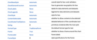
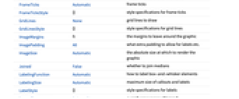
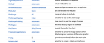
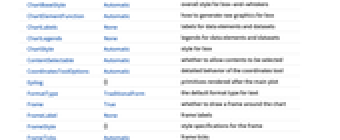
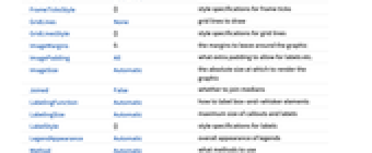
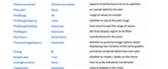
AspectRatio 1/GoldenRatio 全体的な縦横比 BarOrigin Bottom 箱ひげの最小値をどこに置くか BarSpacing Automatic 箱ひげ間のスペースの割合 ChartBaseStyle Automatic 箱ひげの全体的なスタイル ChartElementFunction Automatic 箱に使う生のグラフィックスをどのように生成するか ChartLabels None データ要素とデータ集合のラベル ChartLegends None データ要素とデータ集合の凡例 ChartStyle Automatic 箱のスタイル Frame True グラフの周囲に枠を描くかどうか Joined False 中央値を繋ぐかどうか LabelingFunction Automatic 箱ひげ要素にどのようにラベルを付けるか LabelingSize Automatic コールアウトとラベルの最大サイズ LegendAppearance Automatic 凡例の全体的な外観 Method Automatic 使用するメソッド PerformanceGoal $PerformanceGoal パフォーマンスのどの面について最適化するか PlotInteractivity $PlotInteractivity インタラクティブ要素を許可するかどうか PlotTheme $PlotTheme グラフの全体的なテーマ ScalingFunctions None 個々の座標をどのようにスケールするか TargetUnits Automatic グラフ内に表示する単位 - ChartElementFunctionに渡される引数は,データ集合のネストしたリストの各レベルからの箱の領域{{xmin,xmax},{ymin,ymax}},データ datai,メタデータ {m1,m2,…}である.
- ChartElementFunctionの組込み設定値のリストはChartElementData["BoxWhiskerChart"]から得ることができる.
- ScalingFunctions->s とすると,データ座標は s を使ってスケールされる.
- BoxWhiskerChartのオプションおよびその他の構造からのスタイルその他の指定は,事実上ChartStyle,Styleその他のラッパー,ChartElementFunctionの順に適用され,後の指定が先の指定に優先する.
全オプションのリスト
例題
すべて開く すべて閉じる例 (5)
BoxWhiskerChart[RandomVariate[NormalDistribution[0, 1], 100]]data = Table[RandomVariate[NormalDistribution[μ, 1], 100], {μ, {0, 3, 2, 5}}];BoxWhiskerChart[data]data = Table[RandomVariate[NormalDistribution[μ, 1], 100], {μ, {0, 3, 2, 5}}, {2}];BoxWhiskerChart[data]data = Table[RandomVariate[NormalDistribution[RandomInteger[5], 1], 100], {8}];BoxWhiskerChart[data, "Notched"]BoxWhiskerChart[data, "Outliers"]data = RandomVariate[NormalDistribution[RandomInteger[5], 1], {5, 50}];BoxWhiskerChart[data, "Outliers", PlotStyle -> {RGBColor[0.814481, 0.432822, 0.406287], RGBColor[1, 0.4, 0.4], RGBColor[0.954757, 0.215122, 0.0483253], RGBColor[0.268833, 0.246555, 0.506783], RGBColor[0.570138, 0.0971847, 0.0971847]}]BoxWhiskerChart[data, "Notched", PlotStyle -> {RGBColor[0.814481, 0.432822, 0.406287], RGBColor[1, 0.4, 0.4], RGBColor[0.954757, 0.215122, 0.0483253], RGBColor[0.268833, 0.246555, 0.506783], RGBColor[0.570138, 0.0971847, 0.0971847]}]スコープ (40)
データとラッパー (17)
BoxWhiskerChart[RandomVariate[NormalDistribution[0, 1], 100]]BoxWhiskerChart[RandomReal[NormalDistribution[], {3, 100}]]data = RandomVariate[NormalDistribution[0, 1], 100];BoxWhiskerChart[{{data, data + 1, data + 2}, {data, data + 1, data + 2}}]data = RandomVariate[NormalDistribution[0, 1], 100];BoxWhiskerChart[{{data, data + 1}, {data, data + 1, data + 2, data + 3}}]非実数データは欠測値とみなされ,一般に箱ひげ図ではギャップとして表示される:
data = RandomVariate[NormalDistribution[0, 1], 100];BoxWhiskerChart[{data, Missing[], data, foo, data}, BarSpacing -> 3]BoxWhiskerChart[{I, 1, 2, Missing[], 3, 4, foo, 5}, BarSpacing -> 3]BoxWhiskerChart[{Quantity[33, "Meters"], Quantity[35, "Meters"], Quantity[12, "Meters"], Quantity[8, "Meters"], Quantity[50, "Meters"], Quantity[15, "Meters"], Quantity[24, "Meters"], Quantity[44, "Meters"], Quantity[4, "Meters"], Quantity[37, "Meters"]}, FrameLabel -> Automatic]BoxWhiskerChart[{Quantity[33, "Meters"], Quantity[35, "Meters"], Quantity[12, "Meters"], Quantity[8, "Meters"], Quantity[50, "Meters"], Quantity[15, "Meters"], Quantity[24, "Meters"], Quantity[44, "Meters"], Quantity[4, "Meters"], Quantity[37, "Meters"]}, FrameLabel -> Automatic, TargetUnits -> "Feet"]TimeSeries,EventSeriesおよびTemporalData中のタイムスタンプは無視される:
d = RandomVariate[NormalDistribution[], 100];BoxWhiskerChart[TimeSeries[d, {"May 24, 1982"}]]d1 = RandomVariate[NormalDistribution[0, 1], 100];
d2 = RandomVariate[NormalDistribution[2, 0.5], 100];BoxWhiskerChart[<|"a" -> d1, "b" -> d2, "c" -> d1 + d2|>]BoxWhiskerChart[<|"a" -> d1, "b" -> d2, "c" -> d1 + d2|>, PlotLabels -> Automatic]BoxWhiskerChart[<|"a" -> d1, "b" -> d2, "c" -> d1 + d2|>, PlotLegends -> Automatic, PlotStyle -> {Hue[0.6, 0.7, 0.8], Hue[0.22, 1, 0.7], Hue[0.75, 0.6, 0.7]}]a1 = RandomVariate[NormalDistribution[0, 2], 100];
a2 = RandomVariate[NormalDistribution[2, 1 / 2], 100];
b1 = RandomVariate[ChiDistribution[1], 100];
b2 = RandomVariate[ChiDistribution[3], 100];BoxWhiskerChart[<|"group a" -> <|"a" -> a1, "b" -> a2, "c" -> a1 + a2|>, "group b" -> <|"a" -> b1, "b" -> b2, "c" -> b1 + b2|>|>, PlotLegends -> Automatic, PlotLabels -> Automatic]WeightedDataを使ってデータに重みを加える:
data = RandomReal[{-1, 1}, 100];wd = WeightedData[data, data ^ 2]BoxWhiskerChart[{data, wd}]EventDataを使って打切りと切断の情報を加える:
event = EventData[data, Round[data]]BoxWhiskerChart[{data, event}]個々のデータベクトル,データ集合,あるいはデータ集合のコレクションにラッパーを使う:
d = RandomVariate[NormalDistribution[0, 1], 100];{BoxWhiskerChart[{{d, Style[d + 1, RGBColor[0.93, 0.27, 0.27]], d + 2}, {d, d + 1, d + 2}}],
BoxWhiskerChart[{Style[{d, d + 1, d + 2}, RGBColor[0.14, 0.8, 0.14]], {d, d + 1, d + 2}}],
BoxWhiskerChart[Style[{{d, d + 1, d + 2}, {d, d + 1, d + 2}}, RGBColor[0.4, 0.6, 1]]]}d = RandomVariate[NormalDistribution[0, 1], 100];BoxWhiskerChart[Style[{Style[{d, Style[d + 1, RGBColor[0.93, 0.27, 0.27]], d + 2}, RGBColor[0.14, 0.8, 0.14]], {d, d + 1, d + 2}}, RGBColor[0.4, 0.6, 1]]]d = RandomVariate[NormalDistribution[0, 1], 100];BoxWhiskerChart[{d, Tooltip[d + 1, "μ = 1"], d + 2}]PopupWindowを使って追加的なドリルダウン情報を与える:
d = RandomVariate[NormalDistribution[0, 1], 100];BoxWhiskerChart[{d, PopupWindow[d + 1, DistributionChart[d + 1]], d + 2}]PopupWindowで他のチャート関数を使ってさらに情報を与える:
BoxWhiskerChart[Table[PopupWindow[FinancialData[f, {{2010, 1}, {2010, 6}}], TradingChart[{f, {{2010, 1}, {2010, 6}}}, PlotLabel -> f]], {f, {"MSFT", "ORCL", "ADBE"}}]]Buttonを使って任意のアクションを起すことができる:
d = RandomVariate[NormalDistribution[0, 1], 100];BoxWhiskerChart[{d, Button[d + 1, Speak["Mean is 1."]], d + 2}]表形式データ (1)
penguins = ResourceData["Sample Tabular Data: Palmer Penguins"]BoxWhiskerChart[penguins -> "flipper_length"]pivot = PivotToColumns[penguins, "species" -> "flipper_length"]BoxWhiskerChart[pivot -> {ExtendedKey["flipper_length", "Adelie"], ExtendedKey["flipper_length", "Chinstrap"], ExtendedKey["flipper_length", "Gentoo"]}, PlotLabels -> {"Adelie", "Chinstrap", "Gentoo"}]BoxWhiskerChart[pivot -> {"Adelie", "Chinstrap", "Gentoo"}, PlotLabels -> {"Adelie", "Chinstrap", "Gentoo"}]要素 (11)
data = Table[RandomReal[BetaDistribution[α, 1.5], 100], {α, 1, 5, 1}];Table[BoxWhiskerChart[data, i, PlotLabel -> Text[i]], {i, {"Basic", "Outliers", "Notched", "Median", "Mean", "Diamond"}}]data = Table[RandomReal[BetaDistribution[α, 1.5], 100], {α, 1, 5, 1}];Table[BoxWhiskerChart[data, {{"Whiskers", s}}], {s, {RGBColor[0.93, 0.27, 0.27], Dashed, Thick}}]data = Table[RandomReal[BetaDistribution[α, 1.5], 100], {α, 1, 5, 1}];Table[BoxWhiskerChart[data, {{"Fences", w}}], {w, {0, 0.5, 1}}]Table[BoxWhiskerChart[data, {{"Fences", 1, s}}], {s, {StandardRed, Dashed, Thick}}]data = Table[RandomReal[ParetoDistribution[3, α], 100], {α, 5, 9, 1}];Table[BoxWhiskerChart[data, {{"Outliers", o}}], {o, {"•", "◦", "⊗"}}]Table[BoxWhiskerChart[data, {{"Outliers", "", s}}], {s, {RGBColor[0.93, 0.27, 0.27], RGBColor[0.14, 0.8, 0.14], RGBColor[0.4, 0.6, 1]}}]data = Table[RandomReal[ParetoDistribution[3, α], 100], {α, 5, 9, 1}];Table[BoxWhiskerChart[data, {{"Outliers", ""}, {"FarOutliers", o}}], {o, {"◦", "⊗", "×"}}]Table[BoxWhiskerChart[data, {{"Outliers", ""}, {"FarOutliers", "", s}}], {s, {RGBColor[0.93, 0.27, 0.27], RGBColor[0.14, 0.8, 0.14], RGBColor[0.4, 0.6, 1]}}]data = Table[RandomReal[BetaDistribution[α, 1.5], 100], {α, 1, 5, 1}];Table[BoxWhiskerChart[data, {{"MedianMarker", w}}], {w, {0.1, 0.5, 1}}]Table[BoxWhiskerChart[data, {{"MedianMarker", 0.8, s}}], {s, {RGBColor[0.93, 0.27, 0.27], Dotted, Thick}}]Table[BoxWhiskerChart[data, {{"MedianMarker", m, GrayLevel[0]}}], {m, {"◦", "⊗", "×"}}]BoxWhiskerChart[data, {{"MedianMarker", None}}]data = Table[RandomReal[BetaDistribution[α, 1.5], 100], {α, 1, 5, 1}];Table[BoxWhiskerChart[data, {{"MedianNotch", w}}], {w, {0.1, 0.5, 1}}]Table[BoxWhiskerChart[data, {{"MedianNotch", 0.5, s}}], {s, {None, Darker@RGBColor[1, 0.75, 0]}}]data = Table[RandomReal[BetaDistribution[α, 1.5], 100], {α, 1, 5, 1}];Table[BoxWhiskerChart[data, {{"MedianMarker", None}, {"MeanMarker", w}}], {w, {0.1, 0.5, 1}}]Table[BoxWhiskerChart[data, {{"MedianMarker", None}, {"MeanMarker", 0.8, s}}], {s, {RGBColor[0.93, 0.27, 0.27], Dotted, Thick}}]Table[BoxWhiskerChart[data, {{"MeanMarker", m, GrayLevel[0]}}], {m, {"◦", "⊗", "×"}}]data = Table[RandomReal[BetaDistribution[α, 1.5], 100], {α, 1, 5, 1}];Table[BoxWhiskerChart[data, {{"MeanDiamond", w}}], {w, {0.1, 0.5, 1}}]Table[BoxWhiskerChart[data, {{"MeanDiamond", 0.5, s}}], {s, {None, RGBColor[1, 0.75, 0]}}]data = Table[RandomReal[BetaDistribution[α, 1.5], 100], {α, 1, 5, 1}];BoxWhiskerChart[data, {"Basic", {"Whiskers", Dashed}, {"MeanDiamond", 0.5, GrayLevel[0.62]}}]BoxWhiskerChart[data, {"Notched", {"MedianNotch", 0.5, GrayLevel[1]}, {"MedianMarker", RGBColor[0.4, 0.6, 1]}, {"Outliers", "◦", RGBColor[0.93, 0.27, 0.27]}}]BoxWhiskerChart[data, {"Outliers", {"MedianMarker", RGBColor[0.93, 0.27, 0.27]}, {"MedianNotch", 0.5, GrayLevel[0.62]}}]要素をChartElementFunctionと組み合せる:
data = Table[RandomReal[BetaDistribution[α, 1.5], 100], {α, 1, 5, 1}];BoxWhiskerChart[data, {"Outliers", {"MedianMarker", RGBColor[0.4, 0.6, 1]}, {"MedianNotch", 0.5, Gray}}, PlotStyle -> {RGBColor[0.8352941176470589, 0.5764705882352941, 0.5607843137254902], RGBColor[0.9490196078431372, 0.29411764705882354, 0.050980392156862744], RGBColor[1., 0.7333333333333333, 0.2], RGBColor[0.996078431372549, 0.9490196078431372, 0.44313725490196076], RGBColor[0.7058823529411765, 0.6862745098039216, 0.30196078431372547]}, ChartElementFunction -> "GlassBoxWhisker"]スタイルと外観 (6)
data = Table[RandomVariate[NormalDistribution[μ, 1], 100], {μ, 0, 4, 1}];BoxWhiskerChart[data, PlotStyle -> {RGBColor[0.4, 0.6, 1], RGBColor[0.93, 0.27, 0.27], RGBColor[0.14, 0.8, 0.14], RGBColor[1, 0.75, 0], RGBColor[0.67, 0.54, 0.42]}]Styleを使ってスタイルを無効にすることができる:
d[μ_] := RandomVariate[NormalDistribution[μ, 1], 100];BoxWhiskerChart[{d[1], d[2], Style[d[3], RGBColor[0.93, 0.27, 0.27]], d[4], d[5]}, PlotStyle -> {RGBColor[0.797253, 0.904982, 0.410498], RGBColor[0.934691, 0.945708, 0.75346], RGBColor[0.769879, 0.92369, 0.977371], RGBColor[1, 0.566415, 0.0386511], RGBColor[1, 1, 0.4]}]ChartElementData["BoxWhiskerChart"]data = Table[RandomVariate[NormalDistribution[μ, 1], 100], {μ, 0, 5, 1}];Table[BoxWhiskerChart[data, PlotStyle -> {RGBColor[0.8352941176470589, 0.5764705882352941, 0.5607843137254902], RGBColor[0.9490196078431372, 0.29411764705882354, 0.050980392156862744], RGBColor[1., 0.7333333333333333, 0.2], RGBColor[0.996078431372549, 0.9490196078431372, 0.44313725490196076], RGBColor[0.7058823529411765, 0.6862745098039216, 0.30196078431372547]}, ChartElementFunction -> cf], {cf, {"FadingBoxWhisker", "GlassBoxWhisker"}}]詳細設定には「パレット」▶「チャートエレメントスキーム」を使う:
BoxWhiskerChart[data, ChartElementFunction -> ChartElementData["GradientScaleBoxWhisker", "ColorScheme" -> "RedGreenSplit"]]data = Table[RandomVariate[NormalDistribution[μ, σ], 100], {μ, {0, 4, 2, 6}}, {σ, {1, 1 / 2}}];BoxWhiskerChart[data, PlotTheme -> "Business"]BoxWhiskerChart[data, PlotTheme -> "Scientific"]data = Table[RandomVariate[NormalDistribution[μ, 1], 100], {μ, {0, 1, 2}}];Table[BoxWhiskerChart[data, BarOrigin -> o, PlotLabel -> o], {o, {Bottom, Left, Top, Right}}]data = Table[RandomVariate[NormalDistribution[μ, 1], 100], {μ, {0, 1, 2}}];Table[BoxWhiskerChart[{data, data}, BarSpacing -> sp, PlotLabel -> sp, PlotStyle -> Opacity[0.7]], {sp, {Automatic, {0, 1}, {-0.3, 1}}}]ラベルと凡例 (5)
Labeledを使って箱ひげにラベルを付ける:
d[μ_] := RandomVariate[NormalDistribution[μ, 1], 100];BoxWhiskerChart[{d[1], Labeled[d[2], "label"], d[3]}]d[μ_] := RandomVariate[BetaDistribution[μ, 0.5], 100];Table[BoxWhiskerChart[{Labeled[d[1], "label", p], d[2], d[3]}, PlotLabel -> p, Frame -> False], {p, {Bottom, Center, Top}}]Table[BoxWhiskerChart[{Labeled[d[1], "label", p], d[2], d[3]}, PlotLabel -> p, Frame -> False], {p, {"LowerFence", "LowerQuartile", "UpperQuartile", "UpperFence"}}]LabelingFunctionを使って箱ひげに値のラベルを付ける:
data = Table[RandomVariate[NormalDistribution[μ, 1], 100], {μ, {0, 2}}, {3}];BoxWhiskerChart[data, LabelingFunction -> (Placed[Mean[#], Tooltip]&)]data = Table[RandomVariate[NormalDistribution[μ, 1], 100], {μ, {0, 2}}, {3}];Legendedを使って追加的な凡例を付ける:
d[μ_] := RandomVariate[NormalDistribution[μ, 1], 100];BoxWhiskerChart[{d[1], Legended[d[2], "extra"], d[3]}, PlotLegends -> <|"Elements" -> {"ccc1", "ccc2", "ccc3"}|>, PlotStyle -> {RGBColor[0.761959, 0.470832, 0.940597], RGBColor[0.9584254999999999, 0.877884, 0.5906629999999999], RGBColor[0.431296, 0.709773, 0.927077]}]BoxWhiskerChart[Legended[{d[1], d[2], d[3]}, "extra"], PlotLegends -> {"ccc1", "ccc2", "ccc3"}, PlotStyle -> {RGBColor[0.761959, 0.470832, 0.940597], RGBColor[0.9584254999999999, 0.877884, 0.5906629999999999], RGBColor[0.431296, 0.709773, 0.927077]}]オプション (83)
AspectRatio (3)
デフォルトで,AspectRatioはプロットに固定した縦横比を使う:
BoxWhiskerChart[IconizedObject[«data»]]AspectRatio1として縦と横を同じにする:
BoxWhiskerChart[IconizedObject[«data»], AspectRatio -> 1]AspectRatioFullを使うと,他の構造物の中にピッタリ収まるように縦横が調整される:
plot = BoxWhiskerChart[IconizedObject[«data»], AspectRatio -> Full];{Framed[Pane[plot, {50, 100}]], Framed[Pane[plot, {100, 100}]], Framed[Pane[plot, {100, 50}]]}Axes (4)
デフォルトで,BoxWhiskerChartは軸の代りに枠を使う:
BoxWhiskerChart[IconizedObject[«data»]]BoxWhiskerChart[IconizedObject[«data»], Frame -> False, Axes -> True]AxesOriginを使って軸の交点を指定する:
BoxWhiskerChart[IconizedObject[«data»], Frame -> False, Axes -> True, AxesOrigin -> {0, 0}]{BoxWhiskerChart[IconizedObject[«data»], Frame -> False, Axes -> {False, True}], BoxWhiskerChart[IconizedObject[«data»], Frame -> False, Axes -> {True, False}]}AxesLabel (4)
BoxWhiskerChart[IconizedObject[«data»], Frame -> False, Axes -> True]BoxWhiskerChart[IconizedObject[«data»], Frame -> False, Axes -> True, AxesLabel -> "Data"]BoxWhiskerChart[IconizedObject[«data»], Frame -> False, Axes -> True, AxesLabel -> {"Label 1", "Label 2"}]BoxWhiskerChart[QuantityArray[IconizedObject[«data»], "Meters"], Frame -> False, Axes -> True, AxesLabel -> Automatic]AxesOrigin (2)
AxesStyle (4)
BoxWhiskerChart[IconizedObject[«data»], Frame -> False, Axes -> True, AxesStyle -> RGBColor[0.93, 0.27, 0.27]]BoxWhiskerChart[IconizedObject[«data»], Frame -> False, Axes -> True, AxesStyle -> {Directive[Thick, RGBColor[0.93, 0.27, 0.27]], Directive[Thick, RGBColor[0.4, 0.6, 1]]}]BoxWhiskerChart[IconizedObject[«data»], Frame -> False, Axes -> True, AxesStyle -> RGBColor[0.14, 0.8, 0.14], TicksStyle -> RGBColor[0.4, 0.6, 1]]BoxWhiskerChart[IconizedObject[«data»], Frame -> False, Axes -> True, AxesStyle -> RGBColor[0.14, 0.8, 0.14], LabelStyle -> RGBColor[0.4, 0.6, 1]]BarOrigin (1)
BarSpacing (4)
BoxWhiskerChartは自動的に棒と棒の間隔を選ぶ:
Table[BoxWhiskerChart[RandomVariate[NormalDistribution[], {n, 100}]], {n, {1, 2, 4, 8}}]Table[BoxWhiskerChart[RandomVariate[NormalDistribution[], {n, 2, 100}]], {n, {2, 4}}]Table[BoxWhiskerChart[RandomVariate[NormalDistribution[], {10, 100}], BarSpacing -> s, PlotLabel -> s], {s, {Tiny, Small, Medium, Large}}]Table[BoxWhiskerChart[RandomVariate[NormalDistribution[], {3, 2, 100}], BarSpacing -> s, PlotLabel -> s], {s, {Tiny, Small, Medium, Large}}]Table[BoxWhiskerChart[RandomVariate[NormalDistribution[], {10, 100}], BarSpacing -> s, PlotLabel -> s], {s, {0.25, 0.5, 1, 2}}]Table[BoxWhiskerChart[RandomVariate[NormalDistribution[], {4, 2, 100}], BarSpacing -> s, PlotLabel -> s], {s, {{0.25, 0.5}, {0, 1}}}]BoxWhiskerChart[RandomVariate[NormalDistribution[], {10, 100}], BarSpacing -> None]BoxWhiskerChart[RandomVariate[NormalDistribution[], {3, 2, 100}], BarSpacing -> {None, 1}]ChartElementFunction (3)
ChartElementFunctionの組込み設定のリストを得る:
ChartElementData["BoxWhiskerChart"]詳細設定は「パレット」▶「チャートエレメントスキーム」を使う:
Table[BoxWhiskerChart[RandomVariate[NormalDistribution[], {5, 100}], ChartElementFunction -> f], {f, {"GradientScaleBoxWhisker", "GlassBoxWhisker", "FadingBoxWhisker", "PlateauBoxWhisker"}}]ChartElementFunctionと一緒に名前付きの設定値を使う:
Table[BoxWhiskerChart[RandomVariate[NormalDistribution[], {5, 100}], "Notched", ChartElementFunction -> f], {f, {"GradientScaleBoxWhisker", "GlassBoxWhisker", "FadingBoxWhisker", "PlateauBoxWhisker"}}]Frame (4)
デフォルトで,BoxWhiskerChartは枠を使う:
BoxWhiskerChart[IconizedObject[«data»]]BoxWhiskerChart[IconizedObject[«data»], Frame -> False]BoxWhiskerChart[IconizedObject[«data»], Frame -> {{True, True}, {False, False}}]BoxWhiskerChart[IconizedObject[«data»], Frame -> {{True, False}, {True, False}}]FrameLabel (3)
BoxWhiskerChart[IconizedObject[«data»], FrameLabel -> {"label"}]BoxWhiskerChart[IconizedObject[«data»], FrameLabel -> {"Bottom", "Left"}]BoxWhiskerChart[IconizedObject[«data»], FrameLabel -> {{"left", "right"}, {"bottom", "top"}}]FrameStyle (2)
BoxWhiskerChart[IconizedObject[«data»], FrameStyle -> Directive[RGBColor[0.4, 0.6, 1], Thick]]BoxWhiskerChart[IconizedObject[«data»], FrameStyle -> {{Directive[RGBColor[0.14, 0.8, 0.14], Thick], Directive[RGBColor[0.93, 0.27, 0.27]]}, {Directive[GrayLevel[0.62], Thick], Directive[RGBColor[0.4, 0.6, 1]]}}]FrameTicks (6)
BoxWhiskerChart[IconizedObject[«data»]]Allを使って左と右の両方の辺に目盛ラベルを含める:
BoxWhiskerChart[IconizedObject[«data»], FrameTicks -> All]BoxWhiskerChart[IconizedObject[«data»], FrameTicks -> {{{-3, 0, 3}, Automatic}, {Automatic, Automatic}}]BoxWhiskerChart[IconizedObject[«data»], FrameTicks -> {{{{-3, -a}, {0, b}, {3, a}}, Automatic}, {Automatic, Automatic}}]BoxWhiskerChart[IconizedObject[«data»], FrameTicks -> {{{{-3, -a, .1}, {0, b, .1}, {3, a, .1}}, Automatic}, {Automatic, Automatic}}]BoxWhiskerChart[IconizedObject[«data»], FrameTicks -> {{{{-3, -a, {.1, .2}}, {0, b, {.1, .1}}, {3, a, {.1, .05}}}, Automatic}, {Automatic, Automatic}}]BoxWhiskerChart[IconizedObject[«data»], FrameTicks -> {{{{-3, -a, {.1, .2}, Directive[Thick, RGBColor[0.4, 0.6, 1], Dashed]}, {0, b, {.1, .1}, Directive[Thick, RGBColor[0.14, 0.8, 0.14]]}, {3, a, {.1, .05}, Directive[Thick, RGBColor[0.93, 0.27, 0.27]]}}, Automatic}, {Automatic, Automatic}}]FrameTicksStyle (3)
デフォルトで,枠目盛と枠目盛のラベルには枠と同じスタイルが使われる:
BoxWhiskerChart[IconizedObject[«data»], FrameStyle -> Directive[RGBColor[0.93, 0.27, 0.27]]]BoxWhiskerChart[IconizedObject[«data»], FrameTicksStyle -> Directive[RGBColor[0.4, 0.6, 1], Thick]]BoxWhiskerChart[IconizedObject[«data»], FrameTicks -> All, FrameTicksStyle -> {{Directive[RGBColor[0.93, 0.27, 0.27], Thick], Directive[RGBColor[0.4, 0.6, 1], Thick]}, {Directive[RGBColor[0.98, 0.56, 0.17], Thick], Directive[Darker@RGBColor[0.14, 0.8, 0.14], Thick]}}]ImageSize (7)
Tiny,Small,Medium,Largeのような名前付きのサイズを使う:
{BoxWhiskerChart[IconizedObject[«data»], ImageSize -> Tiny], BoxWhiskerChart[IconizedObject[«data»], ImageSize -> Small]}{BoxWhiskerChart[IconizedObject[«data»], ImageSize -> 150], BoxWhiskerChart[IconizedObject[«data»], AspectRatio -> 1.5, ImageSize -> 150]}{BoxWhiskerChart[IconizedObject[«data»], ImageSize -> {Automatic, 150}], BoxWhiskerChart[IconizedObject[«data»], AspectRatio -> 2, ImageSize -> {Automatic, 150}]}{BoxWhiskerChart[IconizedObject[«data»], ImageSize -> UpTo[200]], BoxWhiskerChart[IconizedObject[«data»], AspectRatio -> 2, ImageSize -> UpTo[200]]}グラフィックスの幅と高さを指定し,必要な場合は空白で充填する:
BoxWhiskerChart[IconizedObject[«data»], ImageSize -> {200, 200}, Background -> GrayLevel[0.62]]AspectRatioFullとすると使用可能な空間が塗り潰される:
BoxWhiskerChart[IconizedObject[«data»], AspectRatio -> Full, ImageSize -> {200, 200}, Background -> GrayLevel[0.62]]{BoxWhiskerChart[IconizedObject[«data»], ImageSize -> {UpTo[150], UpTo[100]}], BoxWhiskerChart[IconizedObject[«data»], AspectRatio -> 2, ImageSize -> {UpTo[150], UpTo[100]}]}ImageSizeFullを使ってオブジェクト内の使用可能な空間を塗り潰す:
Framed[Pane[BoxWhiskerChart[IconizedObject[«data»], ImageSize -> Full, Background -> GrayLevel[0.62]], {200, 100}]]Framed[Pane[BoxWhiskerChart[IconizedObject[«data»], AspectRatio -> Full, ImageSize -> {Scaled[0.5], Scaled[0.5]}, Background -> GrayLevel[0.62]], {200, 100}]]Joined (1)
LabelingFunction (2)
デフォルトで,棒にはデータを要約した表がツールチップとして付けられる:
BoxWhiskerChart[RandomVariate[NormalDistribution[], {5, 100}]]label[data_, index_, label_] := Grid[{{"Case:", index[[2]]}, {"Year:", label[[2, 1]]}, {"μ:", Mean[data]}}, Alignment -> {{Right, Left}}]BoxWhiskerChart[RandomVariate[NormalDistribution[], {5, 100}], LabelingFunction -> (Placed[label[##], Tooltip]&), PlotLabels -> Placed[Range[2005, 2009], None]]LabelingSize (4)
BoxWhiskerChart[RandomVariate[NormalDistribution[], {5, 100}], PlotLabels -> {"healthfulness", "obstreperous", "spectrogram", "vestige", "coinage", "limey"}]BoxWhiskerChart[RandomVariate[NormalDistribution[], {5, 100}], PlotLabels -> Placed[{[image], [image], [image], [image], [image], [image], [image]}, Axis]]BoxWhiskerChart[RandomVariate[NormalDistribution[], {5, 100}], PlotLabels -> {"healthfulness", "obstreperous", "spectrogram", "vestige", "coinage", "limey"}, LabelingSize -> 50]BoxWhiskerChart[RandomVariate[NormalDistribution[], {5, 100}], PlotLabels -> {[image], [image], [image], [image], [image], [image], [image]}, LabelingSize -> 30]BoxWhiskerChart[RandomVariate[NormalDistribution[], {5, 100}], PlotLabels -> {[image], [image], [image], [image], [image], [image], [image]}, LabelingSize -> Full, ImageSize -> Medium]Method (3)
data = Table[RandomReal[NormalDistribution[], i], {i, {100, 400, 900, 1600}}];BoxWhiskerChart[data, Method -> {"BoxWidth" -> "Scaled"}, PlotLabels -> Length /@ data]BoxWhiskerChart[data, Method -> {"BoxWidth" -> "Count"}, PlotLabels -> Length /@ data]BoxWhiskerChart[data, Method -> {"BoxWidth" -> "Scaled", "EqualSpacing" -> False}, PlotLabels -> Length /@ data]BoxWhiskerChart[data, Method -> {"BoxWidth" -> "Fixed"}, PlotLabels -> Length /@ data]BoxWhiskerChartはQuartilesを使って四分位数と外れ値を計算する:
data = {1, 2, 4, 7, 9, 11};Quartiles[data]BoxWhiskerChart[data]代りにQuantileを使う:
Quantile[data, {0, 0.25, 0.5, 0.75, 1}]BoxWhiskerChart[data, Method -> {"BoxRange" -> "Quantile"}]Quantileをモードに基づく推定値の母数とともに使う:
Quantile[data, {0, 1 / 4, 1 / 2, 3 / 4, 1}, {{1, -1}, {0, 1}}]{BoxWhiskerChart[data, Method -> {"BoxRange" -> {{1, -1}, {0, 1}}}], BoxWhiskerChart[data, Method -> {"BoxRange" -> (Quantile[#, {0, 1 / 4, 1 / 2, 3 / 4, 1}, {{1, -1}, {0, 1}}]&)}]}data = RandomVariate[NormalDistribution[], {3, 100}];summaries = Quantile[#, Range[0, 1, 1 / 4]]& /@ data{BoxWhiskerChart[data], BoxWhiskerChart[summaries, Method -> {"BoxRange" -> Identity}]}PerformanceGoal (3)
BoxWhiskerChart[RandomVariate[NormalDistribution[], {5, 100}], PerformanceGoal -> "Quality"]インタラクティブ機能を無効にすることでパフォーマンスを向上させる:
BoxWhiskerChart[RandomVariate[NormalDistribution[], {5, 100}], PerformanceGoal -> "Speed"]一般に,インタラクティブではないグラフの方が必要メモリは少なくて済む:
data = RandomVariate[NormalDistribution[], {5, 100}];Table[ByteCount@BoxWhiskerChart[data, PerformanceGoal -> p], {p, {"Quality", "Speed"}}]PlotInteractivity (4)
棒の数がそれほど多くないグラフには,自動的にツールチップが付けられる:
BoxWhiskerChart[{IconizedObject[«Subscript[data, 1]»], IconizedObject[«Subscript[data, 2]»], IconizedObject[«Subscript[data, 3]»], IconizedObject[«Subscript[data, 4]»]}]BoxWhiskerChart[{IconizedObject[«Subscript[data, 1]»], IconizedObject[«Subscript[data, 2]»], IconizedObject[«Subscript[data, 3]»], IconizedObject[«Subscript[data, 4]»]}, PlotInteractivity -> False]入力の一部として与えられたインタラクティブ要素を無効にする:
BoxWhiskerChart[{IconizedObject[«Subscript[data, 1]»], IconizedObject[«Subscript[data, 2]»], IconizedObject[«Subscript[data, 3]»], Tooltip[IconizedObject[«Subscript[data, 4]»], "hello"]}, PlotInteractivity -> False]与えたインタラクティブ要素を有効にし,自動のものは無効にする:
BoxWhiskerChart[{IconizedObject[«Subscript[data, 1]»], IconizedObject[«Subscript[data, 2]»], IconizedObject[«Subscript[data, 3]»], Tooltip[IconizedObject[«Subscript[data, 4]»], "hello"]}, PlotInteractivity -> <|"User" -> True, "System" -> False|>]Placedを使ってラベル配置を制御する:
Table[BoxWhiskerChart[RandomVariate[NormalDistribution[], {5, 100}], PlotLabels -> Placed[{"a", "b", "c", "d", "e"}, p], PlotLabel -> p], {p, {Bottom, Top, Left, Right}}]PlotTheme (2)
コントラストがはっきりしたカラースキームで,ガラスのような矩形ボックスのテーマを使う:
data = Array[RandomVariate[NormalDistribution[RandomReal[{-2.5, 2.5}], RandomReal[{0.5, 1}]], 200]&, {3, 3}];BoxWhiskerChart[data, PlotTheme -> "Marketing"]data = Array[RandomVariate[NormalDistribution[RandomReal[{0, 8}], RandomReal[{1, 4}]], 200]&, {3, 3}];BoxWhiskerChart[data, PlotTheme -> "Marketing", PlotStyle -> <|"Elements" -> {RGBColor[0.761959, 0.470832, 0.940597], RGBColor[0.9584254999999999, 0.877884, 0.5906629999999999], RGBColor[0.431296, 0.709773, 0.927077]}|>]ScalingFunctions (3)
BoxWhiskerChart[RandomReal[NormalDistribution[], {3, 100}]]BoxWhiskerChart[RandomReal[NormalDistribution[], {3, 100}], ScalingFunctions -> "Log"]data = Range[100] - 25BoxWhiskerChart[data, ScalingFunctions -> "Log"]Ticks (6)
BoxWhiskerChart[IconizedObject[«data»], Frame -> False, Axes -> True]BoxWhiskerChart[IconizedObject[«data»], Frame -> False, Axes -> True, Ticks -> None]BoxWhiskerChart[IconizedObject[«data»], Frame -> False, Axes -> True, Ticks -> {{1, 3}, {-2, 0, 2}}]BoxWhiskerChart[IconizedObject[«data»], Frame -> False, Axes -> True, Ticks -> {{{1, w1}, {2, w2}, {3, w3}}, {{-2, -a}, {0, 0}, {2, a}}}]BoxWhiskerChart[IconizedObject[«data»], Frame -> False, Axes -> True, Ticks -> {{{1, w1, .02}, {2, w2, .02}, {3, w3, .02}}, {{-2, -a, .05}, {0, 0, Automatic}, {2, a, .05}}}]BoxWhiskerChart[IconizedObject[«data»], Frame -> False, Axes -> True, Ticks -> {Automatic, {{-2, -a, {.05, .1}}, {0, 0, {Automatic, .1}}, {2, a, {.05, .1}}}}]BoxWhiskerChart[IconizedObject[«data»], Frame -> False, Axes -> True, Ticks -> {Automatic, {{-2, -a, {.05, .1}, Directive[Thick, RGBColor[0.93, 0.27, 0.27]]}, {0, 0, {Automatic, .1}, Directive[RGBColor[0.14, 0.8, 0.14], Thick]}, {2, a, {.05, .1}, Directive[Thick, RGBColor[0.4, 0.6, 1]]}}}]TicksStyle (4)
デフォルトで,目盛と目盛ラベルには軸と同じスタイルが使われる:
BoxWhiskerChart[IconizedObject[«data»], Frame -> False, Axes -> True]BoxWhiskerChart[IconizedObject[«data»], Frame -> False, Axes -> True, TicksStyle -> RGBColor[0.93, 0.27, 0.27]]BoxWhiskerChart[IconizedObject[«data»], Frame -> False, Axes -> True, TicksStyle -> {Directive[RGBColor[0.93, 0.27, 0.27], Thick], Directive[RGBColor[0.4, 0.6, 1], Thick]}]BoxWhiskerChart[IconizedObject[«data»], Frame -> False, Axes -> True, TicksStyle -> Directive[RGBColor[0.93, 0.27, 0.27], Thick], LabelStyle -> RGBColor[0.4, 0.6, 1]]アプリケーション (3)
salaries = ExampleData[{"Statistics", "UniversitySalaries"}, "DataElements"];
depts = {"Mathematics", "History", "English", "Chemistry", "Law", "Physics", "Statistics"};
data = Table[Cases[salaries, {d, _, salary_, "A"} :> salary], {d, depts}];
all = Cases[salaries, {_, _, salary_, "A"} :> salary];BoxWhiskerChart[data, {"Outliers", {"MedianMarker", 1, Directive[Thick, White]}}, PlotLabels -> Placed[{depts, Length /@ data}, {Axis, Before}], PlotStyle -> {RGBColor[0.6980392156862745, 0.01568627450980392, 0.], RGBColor[0.9215686274509803, 0.49411764705882355, 0.43137254901960786], RGBColor[0.9372549019607843, 0.6274509803921569, 0.16862745098039217], RGBColor[0.9921568627450981, 0.8156862745098039, 0.49019607843137253], RGBColor[0.7254901960784313, 0.8, 0.07058823529411765], RGBColor[0.3176470588235294, 0.49019607843137253, 0.0784313725490196], RGBColor[0.17254901960784313, 0.3607843137254902, 0.07058823529411765]}, GridLines -> {{{Median[all], GrayLevel[0.62]}}, None}, BarOrigin -> Left]2つの母集団の同じ場所の
検定は事実上平均付近で信頼区間が重なる部分を調べる.BoxWhiskerChartは
検定を可視的に行うために使うことができる:
BlockRandom[SeedRandom[1];data1 = RandomVariate[NormalDistribution[1, 1], 100];
data2 = RandomVariate[NormalDistribution[0, 1], 100];
data3 = RandomVariate[NormalDistribution[0, 1], 100];
];平均を表すダイヤモンドは重ならない.帰無仮説は5%レベルで拒絶された:
BoxWhiskerChart[{data1, data2}, {"Diamond", {"MeanDiamond", 1, GrayLevel[0]}}, BarOrigin -> Right]ZTest[{data1, data2}, 1, 0, "ShortTestConclusion", SignificanceLevel -> 0.05]平均を表すダイヤモンドが重なり合う.帰無仮説を拒絶するに足る証拠はない:
BoxWhiskerChart[{data2, data3}, {"Diamond", {"MeanDiamond", 1, GrayLevel[0]}}, BarOrigin -> Right]ZTest[{data2, data3}, 1, 0, "ShortTestConclusion", SignificanceLevel -> 0.05]data = Table[RandomVariate[WienerProcess[2, 3][t], 10 ^ 3], {t, {1, 4, 7, 10, 13}}];BoxWhiskerChart[data, PlotLabels -> {1, 4, 7, 10, 13}]特性と関係 (6)
外れ値と極端な外れ値は,四分位数と四分位範囲を使って定義される:
data = {1, 2, 3, 4, 5, 6, 7, 8, 9, 10, 20, 30};{q1, median, q3} = N[Quartiles[data]]iqr = q3 - q1BoxWhiskerChart[data, {"Outliers", {"Outliers", "●"}, {"FarOutliers", "○"}}, AspectRatio -> 1 / 10, ImageSize -> 500, BarOrigin -> Left, GridLines -> {{{q3 + 1.5iqr, Dashed}, {q3 + 3iqr, Dashed}}, None},
FrameTicks -> {{None, None}, {data, {{q1, "q1"}, {q3, "q3"}, {q3 + 1.5iqr, "near"}, {q3 + 3iqr, "far"}}}}]DistributionChartを使ってデータの分布を示す:
data = Table[RandomVariate[NormalDistribution[μ, 1], 100], {μ, 0, 4, 1}];DistributionChart[data, PlotStyle -> {RGBColor[0.40784313725490196, 0.15294117647058825, 0.13725490196078433], RGBColor[0.6588235294117647, 0.5607843137254902, 0.5333333333333333], RGBColor[0.8313725490196079, 0.43529411764705883, 0.12941176470588237], RGBColor[0.8941176470588236, 0.8274509803921568, 0.7647058823529411], RGBColor[0.9372549019607843, 0.7764705882352941, 0.3137254901960784]}]BoxWhiskerChartはDistributionChartの一つのケースである:
data = Table[RandomVariate[NormalDistribution[μ, 1], 100], {μ, 0, 4, 1}];DistributionChart[data, PlotStyle -> {RGBColor[0.8352941176470589, 0.5764705882352941, 0.5607843137254902], RGBColor[0.9490196078431372, 0.29411764705882354, 0.050980392156862744], RGBColor[1., 0.7333333333333333, 0.2], RGBColor[0.996078431372549, 0.9490196078431372, 0.44313725490196076], RGBColor[0.7058823529411765, 0.6862745098039216, 0.30196078431372547]}, ChartElementFunction -> "BoxWhisker"]HistogramとSmoothHistogramを使ってデータベクトルのリストを可視化する:
data = Table[RandomVariate[NormalDistribution[μ, 1], 200], {μ, 0, 8, 4}];{Histogram[data, Automatic, "PDF"], SmoothHistogram[data]}QuantilePlotとProbabilityPlotを使ってデータと分布を比較する:
data = RandomVariate[NormalDistribution[0, 1], 200];{QuantilePlot[data], ProbabilityPlot[data]}Histogram3DとSmoothHistogram3Dを使って二次元データベクトルを可視化する:
data = RandomVariate[NormalDistribution[2, 1], {200, 2}];{Histogram3D[data], SmoothHistogram3D[data]}履歴
2010 で導入 (8.0) | 2012 で更新 (9.0) ▪ 2014 (10.0) ▪ 2018 (11.3) ▪ 2025 (14.2) ▪ 2025 (14.3)
テキスト
Wolfram Research (2010), BoxWhiskerChart, Wolfram言語関数, https://reference.wolfram.com/language/ref/BoxWhiskerChart.html (2025年に更新).
CMS
Wolfram Language. 2010. "BoxWhiskerChart." Wolfram Language & System Documentation Center. Wolfram Research. Last Modified 2025. https://reference.wolfram.com/language/ref/BoxWhiskerChart.html.
APA
Wolfram Language. (2010). BoxWhiskerChart. Wolfram Language & System Documentation Center. Retrieved from https://reference.wolfram.com/language/ref/BoxWhiskerChart.html
BibTeX
@misc{reference.wolfram_2026_boxwhiskerchart, author="Wolfram Research", title="{BoxWhiskerChart}", year="2025", howpublished="\url{https://reference.wolfram.com/language/ref/BoxWhiskerChart.html}", note=[Accessed: 13-September-2026]}
BibLaTeX
@online{reference.wolfram_2026_boxwhiskerchart, organization={Wolfram Research}, title={BoxWhiskerChart}, year={2025}, url={https://reference.wolfram.com/language/ref/BoxWhiskerChart.html}, note=[Accessed: 13-September-2026]}