BoxWhiskerChart[{x1,x2,…}]
生成值 xi 的盒须图.
BoxWhiskerChart[{x1,x2,…},bwspec]
生成盒须图,其中盒须符号规范为 bwspec.
BoxWhiskerChart[{data1,data2,…},…]
对每个 datai,生成盒须符号图.
BoxWhiskerChart[{{data1,data2,…},…},…]
对多组数据集 {data1,data2,…},生成盒须图.
BoxWhiskerChart
BoxWhiskerChart[{x1,x2,…}]
生成值 xi 的盒须图.
BoxWhiskerChart[{x1,x2,…},bwspec]
生成盒须图,其中盒须符号规范为 bwspec.
BoxWhiskerChart[{data1,data2,…},…]
对每个 datai,生成盒须符号图.
BoxWhiskerChart[{{data1,data2,…},…},…]
对多组数据集 {data1,data2,…},生成盒须图.
更多信息和选项
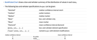
- BoxWhiskerChart 绘制盒须符号来表示各个 datai 值的分布概况.
- 可以给出下列盒须规范说明 bwspec:
-
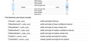
"Notched" 中位数置信区间凹口 "Outliers" 异常值标记 "Median" 中位数标记 "Basic" 只绘制盒须 "Mean" 均值标记 "Diamond" 均值置信区间菱形 {{elem1,val11,…},…} 盒须元素规范说明 {"name",{elem1,val11,…},…} 元素经修正的命名 bwspec - 元素和值包括:
-
{"Fences",width,style} 栅栏的宽度和样式 {"MeanDiamond",width,style} 均值置信区间的宽度和样式 {"MeanMarker",width,style} 均值标记线的宽度和样式 {"MedianNotch",width,style} 中位数置信区间的宽度和样式 {"MedianMarker",width,style} 中位数标记的宽度和样式 {"Outliers",marker,style} 异常值的标记符号和样式 {"FarOutliers",marker,style} 偏远异常值的标记符号和样式 {"Whiskers",style} 须的样式 - width 以盒框宽度的分数形式给出,marker 可为任意表达式.
- BoxWhiskerChart 的数据元素可以以下述形式给出:
-
datai 纯数据集 Quantity[datai,unit] 带单位的数据 datai wi[datai,…] 封装为 wi 的数据 veci formi->mi 元数据为 mi 的数据 - 各 datai 应为一个实数列表 {y1,y2,…}. 非实数元素 yj 将被认为缺失并被排除. 如果 datai 不是实数列表,将认为该数据缺失,这通常将导致盒须图表中的空隙.
- BoxWhiskerChart 的数据集可以以下述形式给出:
-
{data1,data2,…} 带或不带封装的元素列表 <|k1data1,k2data2,…|> 键和数据集的关联 TimeSeries[…],EventSeries[…],TemporalData[…] 时间序列、事件系列和时间数据 WeightedData[…],EventData[…] 扩增数据集 w[{data1,data2,…},…] 应用于一个编组数据集的封装 w[{{data1,data1,…},…},…] 应用于所有编组数据集的封装 - BoxWhiskerChart[Tabular[…]cspec] 用列指定 cspec 从表格对象中提取值并绘制.
- 可使用以下形式的列指定 cspec 来绘制表格数据:
-
colx 绘制列 colx 值的盒须图 {colx1,colx2,…} 绘制列 colx1、colx2、… 的盒须图 - 以下封装器可用于 datai:
-
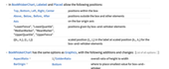
Annotation[e,label] 提供注释 Button[e,action] 定义点击元素时要执行的操作 Callout[e,label] 用 callout 显示该元素 EventHandler[e,…] 为元素定义一般事件处理器 Hyperlink[e,uri] 使元素成为超链接 Labeled[e,…] 显示带标签的元素 Legended[e,…] 在图表图例中包含元素的特征 Mouseover[e,over] 使元素显示鼠标悬停形式 PopupWindow[e,cont] 为元素附加弹出窗口 StatusArea[e,label] 将鼠标移至元素时会在状态区域显示 Style[e,opts] 使用指定样式显示元素 Tooltip[e,label] 为元素添加任意工具提示 - 在 BoxWhiskerChart 中,Labeled 和 Placed 允许下述位置:
-
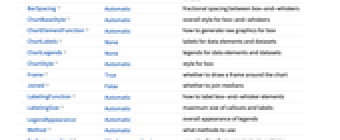
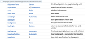
Top,Bottom,Left,Right,Center 盒内位置 Above, Below, Before, After 盒及其它元素以外的位置 Axis 在条形原点轴上 "LowerFence","LowerQuartile","MedianMarker","MeanMarker","UpperQuartile","UpperFence" 由盒须元素给出的位置 {{bx,by},{lx,ly}} 尺度调整的坐标 {lx,ly} ,位于盒须元素上尺度调整的坐标{bx,by} 处的标签上 - BoxWhiskerChart 具有与 Graphics 相同的选项,并有以下增补和变化: [所有选项的列表]
-
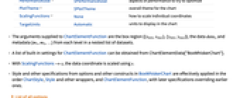
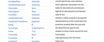
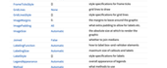
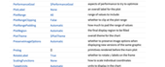
AspectRatio 1/GoldenRatio 整体高宽比 BarOrigin Bottom 盒须上最小值的放置位置 BarSpacing Automatic 盒须之间的分数间距 ChartBaseStyle Automatic 盒须的整体样式 ChartElementFunction Automatic 如何生成盒框的原始图形 ChartLabels None 数据元素和数据集的标签 ChartLegends None 数据元素和数据集的图例 ChartStyle Automatic 盒框样式 Frame True 是否绘制环绕图表的边框 Joined False 是否连接中位数 LabelingFunction Automatic 如何标记盒须元素 LabelingSize Automatic 标注和标签的最大尺寸 LegendAppearance Automatic 图例的整体外观 Method Automatic 使用何种方法 PerformanceGoal $PerformanceGoal 力图优化的性能方面 PlotInteractivity $PlotInteractivity 是否允许绘制互动元素 PlotTheme $PlotTheme 图表的整体主题 ScalingFunctions None 如何调整单独坐标 TargetUnits Automatic 图表中显示的单位 - 为 ChartElementFunction 提供的参数是盒框区域 {{xmin,xmax},{ymin,ymax}}、数据 datai 和数据集嵌套列表中各层的元数据 {m1,m2,…}.
- ChartElementFunction 的内置设置列表可由 ChartElementData["BoxWhiskerChart"] 得到.
- 设置为 ScalingFunctions->s 时,数据坐标利用 s 进行调整.
- BoxWhiskerChart 中选项及其它结构的样式及其它规范说明按照 ChartStyle、Style 及其它封装、ChartElementFunction 的顺序依次应用,后面的规范说明将覆盖前面的规范说明.
所有选项的列表
范例
打开所有单元 关闭所有单元基本范例 (5)
BoxWhiskerChart[RandomVariate[NormalDistribution[0, 1], 100]]data = Table[RandomVariate[NormalDistribution[μ, 1], 100], {μ, {0, 3, 2, 5}}];BoxWhiskerChart[data]data = Table[RandomVariate[NormalDistribution[μ, 1], 100], {μ, {0, 3, 2, 5}}, {2}];BoxWhiskerChart[data]data = Table[RandomVariate[NormalDistribution[RandomInteger[5], 1], 100], {8}];BoxWhiskerChart[data, "Notched"]BoxWhiskerChart[data, "Outliers"]data = RandomVariate[NormalDistribution[RandomInteger[5], 1], {8, 50}];BoxWhiskerChart[data, "Outliers", PlotStyle -> {RGBColor[0.814481, 0.432822, 0.406287], RGBColor[1, 0.4, 0.4], RGBColor[0.954757, 0.215122, 0.0483253], RGBColor[0.268833, 0.246555, 0.506783], RGBColor[0.570138, 0.0971847, 0.0971847]}]BoxWhiskerChart[data, "Notched", PlotStyle -> {RGBColor[0.814481, 0.432822, 0.406287], RGBColor[1, 0.4, 0.4], RGBColor[0.954757, 0.215122, 0.0483253], RGBColor[0.268833, 0.246555, 0.506783], RGBColor[0.570138, 0.0971847, 0.0971847]}]范围 (40)
数据与封装 (17)
BoxWhiskerChart[RandomVariate[NormalDistribution[0, 1], 100]]BoxWhiskerChart[RandomReal[NormalDistribution[], {3, 100}]]data = RandomVariate[NormalDistribution[0, 1], 100];BoxWhiskerChart[{{data, data + 1, data + 2}, {data, data + 1, data + 2}}]data = RandomVariate[NormalDistribution[0, 1], 100];BoxWhiskerChart[{{data, data + 1}, {data, data + 1, data + 2, data + 3}}]data = RandomVariate[NormalDistribution[0, 1], 100];BoxWhiskerChart[{data, Missing[], data, foo, data}, BarSpacing -> 3]BoxWhiskerChart[{I, 1, 2, Missing[], 3, 4, foo, 5}, BarSpacing -> 3]BoxWhiskerChart[{Quantity[33, "Meters"], Quantity[35, "Meters"], Quantity[12, "Meters"], Quantity[8, "Meters"], Quantity[50, "Meters"], Quantity[15, "Meters"], Quantity[24, "Meters"], Quantity[44, "Meters"], Quantity[4, "Meters"], Quantity[37, "Meters"]}, FrameLabel -> Automatic]BoxWhiskerChart[{Quantity[33, "Meters"], Quantity[35, "Meters"], Quantity[12, "Meters"], Quantity[8, "Meters"], Quantity[50, "Meters"], Quantity[15, "Meters"], Quantity[24, "Meters"], Quantity[44, "Meters"], Quantity[4, "Meters"], Quantity[37, "Meters"]}, FrameLabel -> Automatic, TargetUnits -> "Feet"]TimeSeries、EventSeries 和 TemporalData 中的时间标记被忽略:
d = RandomVariate[NormalDistribution[], 100];BoxWhiskerChart[TimeSeries[d, {"May 24, 1982"}]]d1 = RandomVariate[NormalDistribution[0, 1], 100];
d2 = RandomVariate[NormalDistribution[2, 0.5], 100];BoxWhiskerChart[<|"a" -> d1, "b" -> d2, "c" -> d1 + d2|>]BoxWhiskerChart[<|"a" -> d1, "b" -> d2, "c" -> d1 + d2|>, PlotLabels -> Automatic]BoxWhiskerChart[<|"a" -> d1, "b" -> d2, "c" -> d1 + d2|>, PlotLegends -> Automatic, PlotStyle -> {Hue[0.6, 0.7, 0.8], Hue[0.22, 1, 0.7], Hue[0.75, 0.6, 0.7]}]a1 = RandomVariate[NormalDistribution[0, 2], 100];
a2 = RandomVariate[NormalDistribution[2, 1 / 2], 100];
b1 = RandomVariate[ChiDistribution[1], 100];
b2 = RandomVariate[ChiDistribution[3], 100];BoxWhiskerChart[<|"group a" -> <|"a" -> a1, "b" -> a2, "c" -> a1 + a2|>, "group b" -> <|"a" -> b1, "b" -> b2, "c" -> b1 + b2|>|>, PlotLegends -> Automatic, PlotLabels -> Automatic]使用 WeightedData 添加数据权值:
data = RandomReal[{-1, 1}, 100];wd = WeightedData[data, data ^ 2]BoxWhiskerChart[{data, wd}]使用 EventData 添加删失和截断信息:
event = EventData[data, Round[data]]BoxWhiskerChart[{data, event}]d = RandomVariate[NormalDistribution[0, 1], 100];{BoxWhiskerChart[{{d, Style[d + 1, RGBColor[0.93, 0.27, 0.27]], d + 2}, {d, d + 1, d + 2}}],
BoxWhiskerChart[{Style[{d, d + 1, d + 2}, RGBColor[0.14, 0.8, 0.14]], {d, d + 1, d + 2}}],
BoxWhiskerChart[Style[{{d, d + 1, d + 2}, {d, d + 1, d + 2}}, RGBColor[0.4, 0.6, 1]]]}d = RandomVariate[NormalDistribution[0, 1], 100];BoxWhiskerChart[Style[{Style[{d, Style[d + 1, RGBColor[0.93, 0.27, 0.27]], d + 2}, RGBColor[0.14, 0.8, 0.14]], {d, d + 1, d + 2}}, RGBColor[0.4, 0.6, 1]]]d = RandomVariate[NormalDistribution[0, 1], 100];BoxWhiskerChart[{d, Tooltip[d + 1, "μ = 1"], d + 2}]使用 PopupWindow 提供额外的下钻信息:
d = RandomVariate[NormalDistribution[0, 1], 100];BoxWhiskerChart[{d, PopupWindow[d + 1, DistributionChart[d + 1]], d + 2}]在 PopupWindow 中使用另一个图表函数以提供更多信息:
BoxWhiskerChart[Table[PopupWindow[FinancialData[f, {{2010, 1}, {2010, 6}}], TradingChart[{f, {{2010, 1}, {2010, 6}}}, PlotLabel -> f]], {f, {"MSFT", "ORCL", "ADBE"}}]]Button 可用于触发任何行为:
d = RandomVariate[NormalDistribution[0, 1], 100];BoxWhiskerChart[{d, Button[d + 1, Speak["Mean is 1."]], d + 2}]表格数据 (1)
penguins = ResourceData["Sample Tabular Data: Palmer Penguins"]BoxWhiskerChart[penguins -> "flipper_length"]pivot = PivotToColumns[penguins, "species" -> "flipper_length"]BoxWhiskerChart[pivot -> {ExtendedKey["flipper_length", "Adelie"], ExtendedKey["flipper_length", "Chinstrap"], ExtendedKey["flipper_length", "Gentoo"]}, PlotLabels -> {"Adelie", "Chinstrap", "Gentoo"}]BoxWhiskerChart[pivot -> {"Adelie", "Chinstrap", "Gentoo"}, PlotLabels -> {"Adelie", "Chinstrap", "Gentoo"}]元素 (11)
data = Table[RandomReal[BetaDistribution[α, 1.5], 100], {α, 1, 5, 1}];Table[BoxWhiskerChart[data, i, PlotLabel -> Text[i]], {i, {"Basic", "Outliers", "Notched", "Median", "Mean", "Diamond"}}]data = Table[RandomReal[BetaDistribution[α, 1.5], 100], {α, 1, 5, 1}];Table[BoxWhiskerChart[data, {{"Whiskers", s}}], {s, {RGBColor[0.93, 0.27, 0.27], Dashed, Thick}}]data = Table[RandomReal[BetaDistribution[α, 1.5], 100], {α, 1, 5, 1}];Table[BoxWhiskerChart[data, {{"Fences", w}}], {w, {0, 0.5, 1}}]Table[BoxWhiskerChart[data, {{"Fences", 1, s}}], {s, {StandardRed, Dashed, Thick}}]data = Table[RandomReal[ParetoDistribution[3, α], 100], {α, 5, 9, 1}];Table[BoxWhiskerChart[data, {{"Outliers", o}}], {o, {"•", "◦", "⊗"}}]Table[BoxWhiskerChart[data, {{"Outliers", "", s}}], {s, {RGBColor[0.93, 0.27, 0.27], RGBColor[0.14, 0.8, 0.14], RGBColor[0.4, 0.6, 1]}}]data = Table[RandomReal[ParetoDistribution[3, α], 100], {α, 5, 9, 1}];Table[BoxWhiskerChart[data, {{"Outliers", ""}, {"FarOutliers", o}}], {o, {"◦", "⊗", "×"}}]Table[BoxWhiskerChart[data, {{"Outliers", ""}, {"FarOutliers", "", s}}], {s, {RGBColor[0.93, 0.27, 0.27], RGBColor[0.14, 0.8, 0.14], RGBColor[0.4, 0.6, 1]}}]data = Table[RandomReal[BetaDistribution[α, 1.5], 100], {α, 1, 5, 1}];Table[BoxWhiskerChart[data, {{"MedianMarker", w}}], {w, {0.1, 0.5, 1}}]Table[BoxWhiskerChart[data, {{"MedianMarker", 0.8, s}}], {s, {RGBColor[0.93, 0.27, 0.27], Dotted, Thick}}]Table[BoxWhiskerChart[data, {{"MedianMarker", m, GrayLevel[0]}}], {m, {"◦", "⊗", "×"}}]BoxWhiskerChart[data, {{"MedianMarker", None}}]data = Table[RandomReal[BetaDistribution[α, 1.5], 100], {α, 1, 5, 1}];Table[BoxWhiskerChart[data, {{"MedianNotch", w}}], {w, {0.1, 0.5, 1}}]Table[BoxWhiskerChart[data, {{"MedianNotch", 0.5, s}}], {s, {None, Darker@RGBColor[1, 0.75, 0]}}]data = Table[RandomReal[BetaDistribution[α, 1.5], 100], {α, 1, 5, 1}];Table[BoxWhiskerChart[data, {{"MedianMarker", None}, {"MeanMarker", w}}], {w, {0.1, 0.5, 1}}]Table[BoxWhiskerChart[data, {{"MedianMarker", None}, {"MeanMarker", 0.8, s}}], {s, {RGBColor[0.93, 0.27, 0.27], Dotted, Thick}}]Table[BoxWhiskerChart[data, {{"MeanMarker", m, GrayLevel[0]}}], {m, {"◦", "⊗", "×"}}]data = Table[RandomReal[BetaDistribution[α, 1.5], 100], {α, 1, 5, 1}];Table[BoxWhiskerChart[data, {{"MeanDiamond", w}}], {w, {0.1, 0.5, 1}}]Table[BoxWhiskerChart[data, {{"MeanDiamond", 0.5, s}}], {s, {None, RGBColor[1, 0.75, 0]}}]data = Table[RandomReal[BetaDistribution[α, 1.5], 100], {α, 1, 5, 1}];BoxWhiskerChart[data, {"Basic", {"Whiskers", Dashed}, {"MeanDiamond", 0.5, GrayLevel[0.62]}}]BoxWhiskerChart[data, {"Notched", {"MedianNotch", 0.5, GrayLevel[1]}, {"MedianMarker", RGBColor[0.4, 0.6, 1]}, {"Outliers", "◦", RGBColor[0.93, 0.27, 0.27]}}]BoxWhiskerChart[data, {"Outliers", {"MedianMarker", RGBColor[0.93, 0.27, 0.27]}, {"MedianNotch", 0.5, GrayLevel[0.62]}}]将元素与 ChartElementFunction 合并:
data = Table[RandomReal[BetaDistribution[α, 1.5], 100], {α, 1, 5, 1}];BoxWhiskerChart[data, {"Outliers", {"MedianMarker", RGBColor[0.4, 0.6, 1]}, {"MedianNotch", 0.5, Gray}}, PlotStyle -> {RGBColor[0.8352941176470589, 0.5764705882352941, 0.5607843137254902], RGBColor[0.9490196078431372, 0.29411764705882354, 0.050980392156862744], RGBColor[1., 0.7333333333333333, 0.2], RGBColor[0.996078431372549, 0.9490196078431372, 0.44313725490196076], RGBColor[0.7058823529411765, 0.6862745098039216, 0.30196078431372547]}, ChartElementFunction -> "GlassBoxWhisker"]样式化与外观 (6)
data = Table[RandomVariate[NormalDistribution[μ, 1], 100], {μ, 0, 4, 1}];BoxWhiskerChart[data, PlotStyle -> {RGBColor[0.4, 0.6, 1], RGBColor[0.93, 0.27, 0.27], RGBColor[0.14, 0.8, 0.14], RGBColor[1, 0.75, 0], RGBColor[0.67, 0.54, 0.42]}]Style 可用于覆盖样式:
d[μ_] := RandomVariate[NormalDistribution[μ, 1], 100];BoxWhiskerChart[{d[1], d[2], Style[d[3], RGBColor[0.93, 0.27, 0.27]], d[4], d[5]}, PlotStyle -> {RGBColor[0.797253, 0.904982, 0.410498], RGBColor[0.934691, 0.945708, 0.75346], RGBColor[0.769879, 0.92369, 0.977371], RGBColor[1, 0.566415, 0.0386511], RGBColor[1, 1, 0.4]}]ChartElementData["BoxWhiskerChart"]data = Table[RandomVariate[NormalDistribution[μ, 1], 100], {μ, 0, 5, 1}];Table[BoxWhiskerChart[data, PlotStyle -> {RGBColor[0.8352941176470589, 0.5764705882352941, 0.5607843137254902], RGBColor[0.9490196078431372, 0.29411764705882354, 0.050980392156862744], RGBColor[1., 0.7333333333333333, 0.2], RGBColor[0.996078431372549, 0.9490196078431372, 0.44313725490196076], RGBColor[0.7058823529411765, 0.6862745098039216, 0.30196078431372547]}, ChartElementFunction -> cf], {cf, {"FadingBoxWhisker", "GlassBoxWhisker"}}]BoxWhiskerChart[data, ChartElementFunction -> ChartElementData["GradientScaleBoxWhisker", "ColorScheme" -> "RedGreenSplit"]]data = Table[RandomVariate[NormalDistribution[μ, σ], 100], {μ, {0, 4, 2, 6}}, {σ, {1, 1 / 2}}];BoxWhiskerChart[data, PlotTheme -> "Business"]BoxWhiskerChart[data, PlotTheme -> "Scientific"]data = Table[RandomVariate[NormalDistribution[μ, 1], 100], {μ, {0, 1, 2}}];Table[BoxWhiskerChart[data, BarOrigin -> o, PlotLabel -> o], {o, {Bottom, Left, Top, Right}}]data = Table[RandomVariate[NormalDistribution[μ, 1], 100], {μ, {0, 1, 2}}];Table[BoxWhiskerChart[{data, data}, BarSpacing -> sp, PlotLabel -> sp, PlotStyle -> Opacity[0.7]], {sp, {Automatic, {0, 1}, {-0.3, 1}}}]标签与图例 (5)
使用 Labeled 为盒须图添加标签:
d[μ_] := RandomVariate[NormalDistribution[μ, 1], 100];BoxWhiskerChart[{d[1], Labeled[d[2], "label"], d[3]}]d[μ_] := RandomVariate[BetaDistribution[μ, 0.5], 100];Table[BoxWhiskerChart[{Labeled[d[1], "label", p], d[2], d[3]}, PlotLabel -> p, Frame -> False], {p, {Bottom, Center, Top}}]Table[BoxWhiskerChart[{Labeled[d[1], "label", p], d[2], d[3]}, PlotLabel -> p, Frame -> False], {p, {"LowerFence", "LowerQuartile", "UpperQuartile", "UpperFence"}}]通过使用 LabelingFunction 提供盒须的数值标签:
data = Table[RandomVariate[NormalDistribution[μ, 1], 100], {μ, {0, 2}}, {3}];BoxWhiskerChart[data, LabelingFunction -> (Placed[Mean[#], Tooltip]&)]data = Table[RandomVariate[NormalDistribution[μ, 1], 100], {μ, {0, 2}}, {3}];使用 Legended 添加额外的图例项:
d[μ_] := RandomVariate[NormalDistribution[μ, 1], 100];BoxWhiskerChart[{d[1], Legended[d[2], "extra"], d[3]}, PlotLegends -> <|"Elements" -> {"ccc1", "ccc2", "ccc3"}|>, PlotStyle -> {RGBColor[0.761959, 0.470832, 0.940597], RGBColor[0.9584254999999999, 0.877884, 0.5906629999999999], RGBColor[0.431296, 0.709773, 0.927077]}]BoxWhiskerChart[Legended[{d[1], d[2], d[3]}, "extra"], PlotLegends -> {"ccc1", "ccc2", "ccc3"}, PlotStyle -> {RGBColor[0.761959, 0.470832, 0.940597], RGBColor[0.9584254999999999, 0.877884, 0.5906629999999999], RGBColor[0.431296, 0.709773, 0.927077]}]选项 (82)
AspectRatio (3)
默认情况下,AspectRatio 使用绘图的固定高宽比:
BoxWhiskerChart[IconizedObject[«data»]]通过 AspectRatio1 使高度和宽度一致:
BoxWhiskerChart[IconizedObject[«data»], AspectRatio -> 1]AspectRatioFull 调整高度和宽度,使图形正好可以放置在其他结构中:
plot = BoxWhiskerChart[IconizedObject[«data»], AspectRatio -> Full];{Framed[Pane[plot, {50, 100}]], Framed[Pane[plot, {100, 100}]], Framed[Pane[plot, {100, 50}]]}Axes (4)
默认情况下,BoxWhiskerChart 使用边框而非轴:
BoxWhiskerChart[IconizedObject[«data»]]BoxWhiskerChart[IconizedObject[«data»], Frame -> False, Axes -> True]使用 AxesOrigin 可指定轴的相交处:
BoxWhiskerChart[IconizedObject[«data»], Frame -> False, Axes -> True, AxesOrigin -> {0, 0}]{BoxWhiskerChart[IconizedObject[«data»], Frame -> False, Axes -> {False, True}], BoxWhiskerChart[IconizedObject[«data»], Frame -> False, Axes -> {True, False}]}AxesLabel (4)
BoxWhiskerChart[IconizedObject[«data»], Frame -> False, Axes -> True]BoxWhiskerChart[IconizedObject[«data»], Frame -> False, Axes -> True, AxesLabel -> "Data"]BoxWhiskerChart[IconizedObject[«data»], Frame -> False, Axes -> True, AxesLabel -> {"Label 1", "Label 2"}]BoxWhiskerChart[QuantityArray[IconizedObject[«data»], "Meters"], Frame -> False, Axes -> True, AxesLabel -> Automatic]AxesOrigin (2)
AxesStyle (4)
BoxWhiskerChart[IconizedObject[«data»], Frame -> False, Axes -> True, AxesStyle -> RGBColor[0.93, 0.27, 0.27]]BoxWhiskerChart[IconizedObject[«data»], Frame -> False, Axes -> True, AxesStyle -> {Directive[Thick, RGBColor[0.93, 0.27, 0.27]], Directive[Thick, RGBColor[0.4, 0.6, 1]]}]BoxWhiskerChart[IconizedObject[«data»], Frame -> False, Axes -> True, AxesStyle -> RGBColor[0.14, 0.8, 0.14], TicksStyle -> RGBColor[0.4, 0.6, 1]]BoxWhiskerChart[IconizedObject[«data»], Frame -> False, Axes -> True, AxesStyle -> RGBColor[0.14, 0.8, 0.14], LabelStyle -> RGBColor[0.4, 0.6, 1]]BarOrigin (1)
BarSpacing (4)
BoxWhiskerChart 自动选择条形间距:
Table[BoxWhiskerChart[RandomVariate[NormalDistribution[], {n, 100}]], {n, {1, 2, 4, 8}}]Table[BoxWhiskerChart[RandomVariate[NormalDistribution[], {n, 2, 100}]], {n, {2, 4}}]Table[BoxWhiskerChart[RandomVariate[NormalDistribution[], {10, 100}], BarSpacing -> s, PlotLabel -> s], {s, {Tiny, Small, Medium, Large}}]Table[BoxWhiskerChart[RandomVariate[NormalDistribution[], {3, 2, 100}], BarSpacing -> s, PlotLabel -> s], {s, {Tiny, Small, Medium, Large}}]Table[BoxWhiskerChart[RandomVariate[NormalDistribution[], {10, 100}], BarSpacing -> s, PlotLabel -> s], {s, {0.25, 0.5, 1, 2}}]Table[BoxWhiskerChart[RandomVariate[NormalDistribution[], {4, 2, 100}], BarSpacing -> s, PlotLabel -> s], {s, {{0.25, 0.5}, {0, 1}}}]BoxWhiskerChart[RandomVariate[NormalDistribution[], {10, 100}], BarSpacing -> None]BoxWhiskerChart[RandomVariate[NormalDistribution[], {3, 2, 100}], BarSpacing -> {None, 1}]ChartElementFunction (3)
得到 ChartElementFunction 的内置设置列表:
ChartElementData["BoxWhiskerChart"]Table[BoxWhiskerChart[RandomVariate[NormalDistribution[], {5, 100}], ChartElementFunction -> f], {f, {"GradientScaleBoxWhisker", "GlassBoxWhisker", "FadingBoxWhisker", "PlateauBoxWhisker"}}]对 ChartElementFunction 使用已命名的指定:
Table[BoxWhiskerChart[RandomVariate[NormalDistribution[], {5, 100}], "Notched", ChartElementFunction -> f], {f, {"GradientScaleBoxWhisker", "GlassBoxWhisker", "FadingBoxWhisker", "PlateauBoxWhisker"}}]Frame (4)
BoxWhiskerChart 默认情况下使用边框:
BoxWhiskerChart[IconizedObject[«data»]]BoxWhiskerChart[IconizedObject[«data»], Frame -> False]BoxWhiskerChart[IconizedObject[«data»], Frame -> {{True, True}, {False, False}}]BoxWhiskerChart[IconizedObject[«data»], Frame -> {{True, False}, {True, False}}]FrameLabel (3)
BoxWhiskerChart[IconizedObject[«data»], FrameLabel -> {"label"}]BoxWhiskerChart[IconizedObject[«data»], FrameLabel -> {"Bottom", "Left"}]BoxWhiskerChart[IconizedObject[«data»], FrameLabel -> {{"left", "right"}, {"bottom", "top"}}]FrameStyle (2)
BoxWhiskerChart[IconizedObject[«data»], FrameStyle -> Directive[RGBColor[0.4, 0.6, 1], Thick]]BoxWhiskerChart[IconizedObject[«data»], FrameStyle -> {{Directive[RGBColor[0.14, 0.8, 0.14], Thick], Directive[RGBColor[0.93, 0.27, 0.27]]}, {Directive[GrayLevel[0.62], Thick], Directive[RGBColor[0.4, 0.6, 1]]}}]FrameTicks (6)
BoxWhiskerChart[IconizedObject[«data»]]使用 All 可在左边和右边同时包括刻度标签:
BoxWhiskerChart[IconizedObject[«data»], FrameTicks -> All]BoxWhiskerChart[IconizedObject[«data»], FrameTicks -> {{{-3, 0, 3}, Automatic}, {Automatic, Automatic}}]BoxWhiskerChart[IconizedObject[«data»], FrameTicks -> {{{{-3, -a}, {0, b}, {3, a}}, Automatic}, {Automatic, Automatic}}]BoxWhiskerChart[IconizedObject[«data»], FrameTicks -> {{{{-3, -a, .1}, {0, b, .1}, {3, a, .1}}, Automatic}, {Automatic, Automatic}}]BoxWhiskerChart[IconizedObject[«data»], FrameTicks -> {{{{-3, -a, {.1, .2}}, {0, b, {.1, .1}}, {3, a, {.1, .05}}}, Automatic}, {Automatic, Automatic}}]BoxWhiskerChart[IconizedObject[«data»], FrameTicks -> {{{{-3, -a, {.1, .2}, Directive[Thick, RGBColor[0.4, 0.6, 1], Dashed]}, {0, b, {.1, .1}, Directive[Thick, RGBColor[0.14, 0.8, 0.14]]}, {3, a, {.1, .05}, Directive[Thick, RGBColor[0.93, 0.27, 0.27]]}}, Automatic}, {Automatic, Automatic}}]FrameTicksStyle (3)
BoxWhiskerChart[IconizedObject[«data»], FrameStyle -> Directive[RGBColor[0.93, 0.27, 0.27]]]BoxWhiskerChart[IconizedObject[«data»], FrameTicksStyle -> Directive[RGBColor[0.4, 0.6, 1], Thick]]BoxWhiskerChart[IconizedObject[«data»], FrameTicks -> All, FrameTicksStyle -> {{Directive[RGBColor[0.93, 0.27, 0.27], Thick], Directive[RGBColor[0.4, 0.6, 1], Thick]}, {Directive[RGBColor[0.98, 0.56, 0.17], Thick], Directive[Darker@RGBColor[0.14, 0.8, 0.14], Thick]}}]ImageSize (7)
使用有名称的尺寸如 Tiny、Small、Medium 和 Large:
{BoxWhiskerChart[IconizedObject[«data»], ImageSize -> Tiny], BoxWhiskerChart[IconizedObject[«data»], ImageSize -> Small]}{BoxWhiskerChart[IconizedObject[«data»], ImageSize -> 150], BoxWhiskerChart[IconizedObject[«data»], AspectRatio -> 1.5, ImageSize -> 150]}{BoxWhiskerChart[IconizedObject[«data»], ImageSize -> {Automatic, 150}], BoxWhiskerChart[IconizedObject[«data»], AspectRatio -> 2, ImageSize -> {Automatic, 150}]}{BoxWhiskerChart[IconizedObject[«data»], ImageSize -> UpTo[200]], BoxWhiskerChart[IconizedObject[«data»], AspectRatio -> 2, ImageSize -> UpTo[200]]}BoxWhiskerChart[IconizedObject[«data»], ImageSize -> {200, 200}, Background -> GrayLevel[0.62]]设置 AspectRatioFull 将填充可用空间:
BoxWhiskerChart[IconizedObject[«data»], AspectRatio -> Full, ImageSize -> {200, 200}, Background -> GrayLevel[0.62]]{BoxWhiskerChart[IconizedObject[«data»], ImageSize -> {UpTo[150], UpTo[100]}], BoxWhiskerChart[IconizedObject[«data»], AspectRatio -> 2, ImageSize -> {UpTo[150], UpTo[100]}]}设置 ImageSizeFull 可填充对象中的可用空间:
Framed[Pane[BoxWhiskerChart[IconizedObject[«data»], ImageSize -> Full, Background -> GrayLevel[0.62]], {200, 100}]]Framed[Pane[BoxWhiskerChart[IconizedObject[«data»], AspectRatio -> Full, ImageSize -> {Scaled[0.5], Scaled[0.5]}, Background -> GrayLevel[0.62]], {200, 100}]]Joined (1)
LabelingFunction (2)
BoxWhiskerChart[RandomVariate[NormalDistribution[], {5, 100}]]label[data_, index_, label_] := Grid[{{"Case:", index[[2]]}, {"Year:", label[[2, 1]]}, {"μ:", Mean[data]}}, Alignment -> {{Right, Left}}]BoxWhiskerChart[RandomVariate[NormalDistribution[], {5, 100}], LabelingFunction -> (Placed[label[##], Tooltip]&), PlotLabels -> Placed[Range[2005, 2009], None]]LabelingSize (4)
BoxWhiskerChart[RandomVariate[NormalDistribution[], {5, 100}], PlotLabels -> {"healthfulness", "obstreperous", "spectrogram", "vestige", "coinage", "limey"}]BoxWhiskerChart[RandomVariate[NormalDistribution[], {5, 100}], PlotLabels -> Placed[{[image], [image], [image], [image], [image], [image], [image]}, Axis]]BoxWhiskerChart[RandomVariate[NormalDistribution[], {5, 100}], PlotLabels -> {"healthfulness", "obstreperous", "spectrogram", "vestige", "coinage", "limey"}, LabelingSize -> 50]BoxWhiskerChart[RandomVariate[NormalDistribution[], {5, 100}], PlotLabels -> {[image], [image], [image], [image], [image], [image], [image]}, LabelingSize -> 30]BoxWhiskerChart[RandomVariate[NormalDistribution[], {5, 100}], PlotLabels -> {[image], [image], [image], [image], [image], [image], [image]}, LabelingSize -> Full, ImageSize -> Medium]Method (3)
data = Table[RandomReal[NormalDistribution[], i], {i, {100, 400, 900, 1600}}];BoxWhiskerChart[data, Method -> {"BoxWidth" -> "Scaled"}, PlotLabels -> Length /@ data]BoxWhiskerChart[data, Method -> {"BoxWidth" -> "Count"}, PlotLabels -> Length /@ data]BoxWhiskerChart[data, Method -> {"BoxWidth" -> "Scaled", "EqualSpacing" -> False}, PlotLabels -> Length /@ data]BoxWhiskerChart[data, Method -> {"BoxWidth" -> "Fixed"}, PlotLabels -> Length /@ data]BoxWhiskerChart 使用 Quantile 计算四分位数和极端值:
data = {1, 2, 4, 7, 9, 11};Quartiles[data]BoxWhiskerChart[data]使用 Quartiles:
Quantile[data, {0, 0.25, 0.5, 0.75, 1}]BoxWhiskerChart[data, Method -> {"BoxRange" -> "Quantile"}]将带有参数的 Quantile 用于基于模式的估计量:
Quantile[data, {0, 1 / 4, 1 / 2, 3 / 4, 1}, {{1, -1}, {0, 1}}]{BoxWhiskerChart[data, Method -> {"BoxRange" -> {{1, -1}, {0, 1}}}], BoxWhiskerChart[data, Method -> {"BoxRange" -> (Quantile[#, {0, 1 / 4, 1 / 2, 3 / 4, 1}, {{1, -1}, {0, 1}}]&)}]}data = RandomVariate[NormalDistribution[], {3, 100}];summaries = Quantile[#, Range[0, 1, 1 / 4]]& /@ data{BoxWhiskerChart[data], BoxWhiskerChart[summaries, Method -> {"BoxRange" -> Identity}]}PerformanceGoal (3)
BoxWhiskerChart[RandomVariate[NormalDistribution[], {5, 100}], PerformanceGoal -> "Quality"]BoxWhiskerChart[RandomVariate[NormalDistribution[], {5, 100}], PerformanceGoal -> "Speed"]data = RandomVariate[NormalDistribution[], {5, 100}];Table[ByteCount@BoxWhiskerChart[data, PerformanceGoal -> p], {p, {"Quality", "Speed"}}]PlotInteractivity (4)
BoxWhiskerChart[{IconizedObject[«Subscript[data, 1]»], IconizedObject[«Subscript[data, 2]»], IconizedObject[«Subscript[data, 3]»], IconizedObject[«Subscript[data, 4]»]}]BoxWhiskerChart[{IconizedObject[«Subscript[data, 1]»], IconizedObject[«Subscript[data, 2]»], IconizedObject[«Subscript[data, 3]»], IconizedObject[«Subscript[data, 4]»]}, PlotInteractivity -> False]BoxWhiskerChart[{IconizedObject[«Subscript[data, 1]»], IconizedObject[«Subscript[data, 2]»], IconizedObject[«Subscript[data, 3]»], Tooltip[IconizedObject[«Subscript[data, 4]»], "hello"]}, PlotInteractivity -> False]BoxWhiskerChart[{IconizedObject[«Subscript[data, 1]»], IconizedObject[«Subscript[data, 2]»], IconizedObject[«Subscript[data, 3]»], Tooltip[IconizedObject[«Subscript[data, 4]»], "hello"]}, PlotInteractivity -> <|"User" -> True, "System" -> False|>]PlotTheme (2)
data = Array[RandomVariate[NormalDistribution[RandomReal[{-2.5, 2.5}], RandomReal[{0.5, 1}]], 200]&, {3, 3}];BoxWhiskerChart[data, PlotTheme -> "Marketing"]data = Array[RandomVariate[NormalDistribution[RandomReal[{0, 8}], RandomReal[{1, 4}]], 200]&, {3, 3}];BoxWhiskerChart[data, PlotTheme -> "Marketing", PlotStyle -> <|"Elements" -> {RGBColor[0.761959, 0.470832, 0.940597], RGBColor[0.9584254999999999, 0.877884, 0.5906629999999999], RGBColor[0.431296, 0.709773, 0.927077]}|>]ScalingFunctions (3)
BoxWhiskerChart[RandomReal[NormalDistribution[], {3, 100}]]BoxWhiskerChart[RandomReal[NormalDistribution[], {3, 100}], ScalingFunctions -> "Log"]data = Range[100] - 25BoxWhiskerChart[data, ScalingFunctions -> "Log"]Ticks (6)
BoxWhiskerChart[IconizedObject[«data»], Frame -> False, Axes -> True]BoxWhiskerChart[IconizedObject[«data»], Frame -> False, Axes -> True, Ticks -> None]BoxWhiskerChart[IconizedObject[«data»], Frame -> False, Axes -> True, Ticks -> {{1, 3}, {-2, 0, 2}}]BoxWhiskerChart[IconizedObject[«data»], Frame -> False, Axes -> True, Ticks -> {{{1, w1}, {2, w2}, {3, w3}}, {{-2, -a}, {0, 0}, {2, a}}}]BoxWhiskerChart[IconizedObject[«data»], Frame -> False, Axes -> True, Ticks -> {{{1, w1, .02}, {2, w2, .02}, {3, w3, .02}}, {{-2, -a, .05}, {0, 0, Automatic}, {2, a, .05}}}]BoxWhiskerChart[IconizedObject[«data»], Frame -> False, Axes -> True, Ticks -> {Automatic, {{-2, -a, {.05, .1}}, {0, 0, {Automatic, .1}}, {2, a, {.05, .1}}}}]BoxWhiskerChart[IconizedObject[«data»], Frame -> False, Axes -> True, Ticks -> {Automatic, {{-2, -a, {.05, .1}, Directive[Thick, RGBColor[0.93, 0.27, 0.27]]}, {0, 0, {Automatic, .1}, Directive[RGBColor[0.14, 0.8, 0.14], Thick]}, {2, a, {.05, .1}, Directive[Thick, RGBColor[0.4, 0.6, 1]]}}}]TicksStyle (4)
BoxWhiskerChart[IconizedObject[«data»], Frame -> False, Axes -> True]BoxWhiskerChart[IconizedObject[«data»], Frame -> False, Axes -> True, TicksStyle -> RGBColor[0.93, 0.27, 0.27]]BoxWhiskerChart[IconizedObject[«data»], Frame -> False, Axes -> True, TicksStyle -> {Directive[RGBColor[0.93, 0.27, 0.27], Thick], Directive[RGBColor[0.4, 0.6, 1], Thick]}]BoxWhiskerChart[IconizedObject[«data»], Frame -> False, Axes -> True, TicksStyle -> Directive[RGBColor[0.93, 0.27, 0.27], Thick], LabelStyle -> RGBColor[0.4, 0.6, 1]]应用 (3)
salaries = ExampleData[{"Statistics", "UniversitySalaries"}, "DataElements"];
depts = {"Mathematics", "History", "English", "Chemistry", "Law", "Physics", "Statistics"};
data = Table[Cases[salaries, {d, _, salary_, "A"} :> salary], {d, depts}];
all = Cases[salaries, {_, _, salary_, "A"} :> salary];BoxWhiskerChart[data, {"Outliers", {"MedianMarker", 1, Directive[Thick, White]}}, PlotLabels -> Placed[{depts, Length /@ data}, {Axis, Before}], PlotStyle -> {RGBColor[0.6980392156862745, 0.01568627450980392, 0.], RGBColor[0.9215686274509803, 0.49411764705882355, 0.43137254901960786], RGBColor[0.9372549019607843, 0.6274509803921569, 0.16862745098039217], RGBColor[0.9921568627450981, 0.8156862745098039, 0.49019607843137253], RGBColor[0.7254901960784313, 0.8, 0.07058823529411765], RGBColor[0.3176470588235294, 0.49019607843137253, 0.0784313725490196], RGBColor[0.17254901960784313, 0.3607843137254902, 0.07058823529411765]}, GridLines -> {{{Median[all], GrayLevel[0.62]}}, None}, BarOrigin -> Left]两个总体的等位置
检验可有效检验关于总体均值的置信区间的重合度. BoxWhiskerChart 可用于执行可视化的
检验:
BlockRandom[SeedRandom[1];data1 = RandomVariate[NormalDistribution[1, 1], 100];
data2 = RandomVariate[NormalDistribution[0, 1], 100];
data3 = RandomVariate[NormalDistribution[0, 1], 100];
];BoxWhiskerChart[{data1, data2}, {"Diamond", {"MeanDiamond", 1, GrayLevel[0]}}, BarOrigin -> Right]ZTest[{data1, data2}, 1, 0, "ShortTestConclusion", SignificanceLevel -> 0.05]BoxWhiskerChart[{data2, data3}, {"Diamond", {"MeanDiamond", 1, GrayLevel[0]}}, BarOrigin -> Right]ZTest[{data2, data3}, 1, 0, "ShortTestConclusion", SignificanceLevel -> 0.05]data = Table[RandomVariate[WienerProcess[2, 3][t], 10 ^ 3], {t, {1, 4, 7, 10, 13}}];BoxWhiskerChart[data, PlotLabels -> {1, 4, 7, 10, 13}]属性和关系 (6)
data = {1, 2, 3, 4, 5, 6, 7, 8, 9, 10, 20, 30};{q1, median, q3} = N[Quartiles[data]]iqr = q3 - q1BoxWhiskerChart[data, {"Outliers", {"Outliers", "●"}, {"FarOutliers", "○"}}, AspectRatio -> 1 / 10, ImageSize -> 500, BarOrigin -> Left, GridLines -> {{{q3 + 1.5iqr, Dashed}, {q3 + 3iqr, Dashed}}, None},
FrameTicks -> {{None, None}, {data, {{q1, "q1"}, {q3, "q3"}, {q3 + 1.5iqr, "near"}, {q3 + 3iqr, "far"}}}}]使用 DistributionChart 显示数据分布:
data = Table[RandomVariate[NormalDistribution[μ, 1], 100], {μ, 0, 4, 1}];DistributionChart[data, PlotStyle -> {RGBColor[0.40784313725490196, 0.15294117647058825, 0.13725490196078433], RGBColor[0.6588235294117647, 0.5607843137254902, 0.5333333333333333], RGBColor[0.8313725490196079, 0.43529411764705883, 0.12941176470588237], RGBColor[0.8941176470588236, 0.8274509803921568, 0.7647058823529411], RGBColor[0.9372549019607843, 0.7764705882352941, 0.3137254901960784]}]BoxWhiskerChart 是 DistributionChart 的一种特殊情形:
data = Table[RandomVariate[NormalDistribution[μ, 1], 100], {μ, 0, 4, 1}];DistributionChart[data, PlotStyle -> {RGBColor[0.8352941176470589, 0.5764705882352941, 0.5607843137254902], RGBColor[0.9490196078431372, 0.29411764705882354, 0.050980392156862744], RGBColor[1., 0.7333333333333333, 0.2], RGBColor[0.996078431372549, 0.9490196078431372, 0.44313725490196076], RGBColor[0.7058823529411765, 0.6862745098039216, 0.30196078431372547]}, ChartElementFunction -> "BoxWhisker"]使用 Histogram 和 SmoothHistogram 作出一列数据向量的视图:
data = Table[RandomVariate[NormalDistribution[μ, 1], 200], {μ, 0, 8, 4}];{Histogram[data, Automatic, "PDF"], SmoothHistogram[data]}使用 QuantilePlot 与 ProbabilityPlot 将数据与分布比较:
data = RandomVariate[NormalDistribution[0, 1], 200];{QuantilePlot[data], ProbabilityPlot[data]}使用 Histogram3D 和 SmoothHistogram3D 作出二维数据向量的视图:
data = RandomVariate[NormalDistribution[2, 1], {200, 2}];{Histogram3D[data], SmoothHistogram3D[data]}文本
Wolfram Research (2010),BoxWhiskerChart,Wolfram 语言函数,https://reference.wolfram.com/language/ref/BoxWhiskerChart.html (更新于 2025 年).
CMS
Wolfram 语言. 2010. "BoxWhiskerChart." Wolfram 语言与系统参考资料中心. Wolfram Research. 最新版本 2025. https://reference.wolfram.com/language/ref/BoxWhiskerChart.html.
APA
Wolfram 语言. (2010). BoxWhiskerChart. Wolfram 语言与系统参考资料中心. 追溯自 https://reference.wolfram.com/language/ref/BoxWhiskerChart.html 年
BibTeX
@misc{reference.wolfram_2026_boxwhiskerchart, author="Wolfram Research", title="{BoxWhiskerChart}", year="2025", howpublished="\url{https://reference.wolfram.com/language/ref/BoxWhiskerChart.html}", note=[Accessed: 12-August-2026]}
BibLaTeX
@online{reference.wolfram_2026_boxwhiskerchart, organization={Wolfram Research}, title={BoxWhiskerChart}, year={2025}, url={https://reference.wolfram.com/language/ref/BoxWhiskerChart.html}, note=[Accessed: 12-August-2026]}