BarChart3D[{y1,y2,…}]
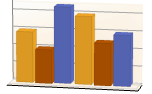
y1, y2, … の3D棒グラフを作成する.
BarChart3D[{…,wi[yi,…],…,wj[yj,…],…}]
棒の特徴を記号的なラッパー wkで定義した3D棒グラフを作成する.
BarChart3D[{data1,data2,…}]
いくつかのデータ集合 dataiの3D棒グラフを作成する.
BarChart3D
BarChart3D[{y1,y2,…}]
y1, y2, … の3D棒グラフを作成する.
BarChart3D[{…,wi[yi,…],…,wj[yj,…],…}]
棒の特徴を記号的なラッパー wkで定義した3D棒グラフを作成する.
BarChart3D[{data1,data2,…}]
いくつかのデータ集合 dataiの3D棒グラフを作成する.
詳細とオプション
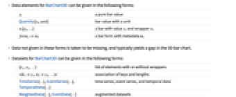
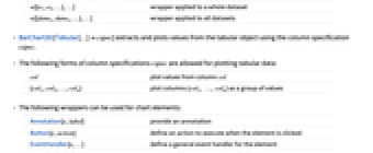
- BarChart3Dのデータ要素は次の形式で与えることができる.
-
yi 純粋な棒の値 wi[yi,…] 値 yi,ラッパー wiの棒 Quantity[yi,unit] 単位のある棒の値 formi->mi メタデータ miを持った棒形式 - 上記形式で与えられないデータは欠損値とみなされ,3D棒グラフでは一般に隙間として表される.
- BarChart3Dのデータ集合は次の形式で与えることができる.
-
{e1,e2,…} ラッパーがある/ない要素のリスト <|k1y1,k2y2,…|> キーと長さの連想 TimeSeries[…],EventSeries[…],TemporalData[…] 時系列,事象系列,一時データ WeightedData[…],EventData[…] 拡張データ集合 w[{e1,e2,…},…] データ集合全体に適用されたラッパー w[{data1,data1,…},…] すべてのデータ集合に適用されたラッパー - BarChart3D[objcspec]は,列指定 cspec を用いて,Tabularオブジェクト,TimeSeriesオブジェクトまたはEventSeriesオブジェクト obj から値を抽出してプロットする.
- 次は,表形式データのプロットに使用できる列指定 cspec の形式である.
-
col 列 col からの値をプロットする {col1,col2,…,coln} 列{col1, …, coln}を値の集合としてプロットする - グラフの要素に次のラッパーを使用することができる.
-
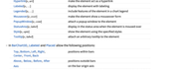
Annotation[e,label] 注釈を与える Button[e,action] 要素がクリックされたときに実行するアクションを定義する EventHandler[e,…] 要素の一般的なイベントハンドラを定義する Hyperlink[e,uri] 要素がハイパーリンクとして機能するようにする Labeled[e,…] 要素にラベルを付けて表示する Legended[e,…] グラフの説明文に要素の特徴を含む Mouseover[e,over] 要素がマウスオーバーの形式を示すようにする PopupWindow[e,cont] 要素にポップアップウィンドウを加える StatusArea[e,label] 要素の上にマウスが来たときにステータスエリアに表示する Style[e,opts] 要素を指定したスタイルで示す Tooltip[e,label] 要素に任意のツールチップを加える - BarChart3Dでは,LabeledとPlacedは次の位置が取れる.
-
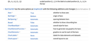
Top,Bottom,Left,Right,Center, Front,Back 棒内の位置 Above, Below, Before, After 棒の外の位置 Axis 棒の始点座標軸の位置 {{bx,by,bz},{lx,ly}} 棒内のスケールされた位置{bx,by,bz}におけるラベル内のスケールされた位置{lx,ly} - BarChart3DにはGraphics3Dと同じオプションに次の追加・変更を加えたものが使える. [全オプションのリスト]
-
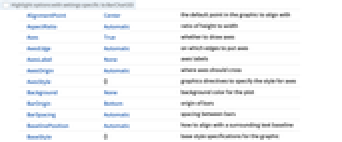
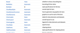
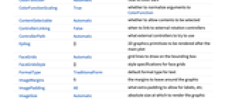
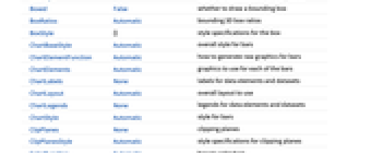
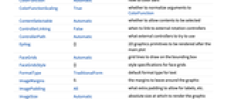
Axes True 軸を描くかどうか BarOrigin Bottom 棒の始点 BarSpacing Automatic 棒と棒の間隔 Boxed False 境界ボックスを描くかどうか ChartElementFunction Automatic 棒の生のグラフィックスをどのように生成するか ChartElements Automatic それぞれの棒に使うグラフィックス ColorFunction Automatic 棒の彩色方法 ColorFunctionScaling True ColorFunctionの引数を正規化するかどうか FaceGrids Automatic 境界ボックスに描く格子線 LabelingFunction Automatic 棒にどのようにラベルを付けるか LegendAppearance Automatic 凡例の全体的な外観 Lighting "Neutral" 使用する擬似光源 PerformanceGoal $PerformanceGoal パフォーマンスのどの面について最適化するか PlotInteractivity $PlotInteractivity インタラクティブ要素を許可するかどうか PlotLabels None 棒のカテゴリラベル PlotLayout Automatic 使用する全体的なレイアウト PlotLegends None データ要素とデータ集合の凡例 PlotStyle Automatic 棒のスタイル PlotTheme $PlotTheme グラフの全体的なテーマ ScalingFunctions None 個々の座標をどのようにスケールするか TargetUnits Automatic グラフ内に表示する単位 ViewPoint Automatic 視点 - 複数のデータ集合は,PlotLayoutの以下の設定を使って表示できる.
-

"Grouped" 各データ集合のデータを分離する 
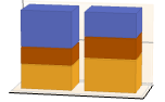
"Stacked" 各データ集合のデータを積み重ねる 
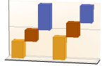
"Stepped" 各データ集合のデータを分離して重ねる 
"Percentile" 各データ集合のデータを重ねて正規化する - PlotLegendsの典型的な設定には,次のものが含まれる.
-
None 凡例なし Automatic 凡例を自動的に決定する {lbl1,lbl2,…} lbl1,lbl2,…を凡例ラベルとして使用する Placed[lspec,…] 凡例の配置を指定する - PlotStylesty は,各曲線に使用するスタイルを指定する.取り得る設定には次のものが含まれる.
-
{sty1,sty2,…} データに対するスタイルの列 <|"key"val,…|> データの異なるレベルに対するスタイル要素 - 受け入れられるキーは次の通りである.
-
"Base" すべての棒に対する全体のスタイル "Elements" 各グループにおける要素 yi のスタイルのリスト "Groups" 値 datai の各グループのスタイルのリスト - ColorData["DefaultChartColors"] は,PlotStyle によって使用される色のデフォルトのシーケンスを与える.
- ChartElementFunctionに渡される引数は,ネストしたデータ集合リストにおける各レベルから棒の範囲{{xmin,xmax},{ymin,ymax},{zmin,zmax}},データ値 yi,メタデータ{m1,m2,…}である.
- ChartElementFunctionの組込み設定のリストはChartElementData["BarChart3D"]で入手できる.
- ColorFunctionに渡される引数は yiである.
- ChartElements->g の設定では,g の引き延ばしたバージョンからなる絵を使った棒にグラフィックス g が使われる.
- BarChart3Dのオプションおよびその他の構造からのスタイルその他の指定は事実上PlotStyle,ColorFunction,Styleその他のラッパー,ChartElementsとChartElementFunctionの順に適用される.後ろの指定は前の指定を無効にする.
全オプションのリスト
例題
すべて開く すべて閉じる例 (3)
BarChart3D[{1, 2, 3}]BarChart3D[{{1, 2, 3}, {1, 3, 2}}]BarChart3D[Range[8], PlotStyle -> {RGBColor[0.237736, 0.340215, 0.575113], RGBColor[0.25826842857142857, 0.3783777142857143, 0.4839005714285714], RGBColor[0.2876055714285714, 0.46943485714285715, 0.2876237142857143], RGBColor[0.4759574285714286, 0.589047, 0.2482417142857143], RGBColor[0.759271, 0.7397234285714285, 0.29226885714285716], RGBColor[0.8685795714285713, 0.7007091428571428, 0.32354785714285716], RGBColor[0.7654144285714286, 0.35909685714285716, 0.2620315714285714], RGBColor[0.72987, 0.239399, 0.230961]}]BarChart3D[Range[5], ChartElements -> [image]]BarChart3D[Range[6], ChartElementFunction -> "ProfileCube", PlotStyle -> {RGBColor[0.761959, 0.470832, 0.940597], RGBColor[0.8750956, 0.6580038, 0.746929], RGBColor[0.9440982, 0.7955892, 0.5942686], RGBColor[0.9537862, 0.937389, 0.6180996], RGBColor[0.7952328000000001, 0.8988539999999999, 0.8302508], RGBColor[0.431296, 0.709773, 0.927077]}]スコープ (31)
データとレイアウト (13)
BarChart3D[{{1, 1, 1}, {2, 2, 2}, {3, 3, 3}}]BarChart3D[{{1, 2}, {1, 2, 3}, {1, 2, 3, 4}}]実数ではないデータは欠測値とみなされ,一般に棒グラフの隙間として表される:
BarChart3D[{{1, Missing[], 3}, {4, 2, 1 + I, 2}, {foo, 2, 4}}]BarChart3D[{Quantity[1, "Feet"], Quantity[3, "Feet"], Quantity[2, "Feet"], Quantity[5, "Feet"], Quantity[7, "Feet"], Quantity[6, "Feet"]}, AxesLabel -> Automatic]BarChart3D[{Quantity[1, "Feet"], Quantity[3, "Feet"], Quantity[2, "Feet"], Quantity[5, "Feet"], Quantity[7, "Feet"], Quantity[6, "Feet"]}, AxesLabel -> Automatic, TargetUnits -> "Meters"]TimeSeries,EventSeries,TemporalData中のタイムスタンプは無視される:
BarChart3D[TimeSeries[{5, 12, 4, 4, 5, 2, 7}, {"April 21, 1981"}]]BarChart3D[<|"a" -> 4, "b" -> 2, "c" -> 6, "d" -> 9, "e" -> 7|>]BarChart3D[<|"a" -> 4, "b" -> 2, "c" -> 6, "d" -> 9, "e" -> 7|>, PlotLabels -> Automatic]BarChart3D[<|"a" -> 4, "b" -> 2, "c" -> 6, "d" -> 9, "e" -> 7|>, PlotStyle -> {Hue[0.58, 0.67, 0.66], Hue[0.17, 1, 0.66], Hue[0.45, 0.75, 0.6], Hue[0.12, 0.7, 0.7], Hue[0.25, 0.7, 0.6]}, PlotLegends -> Automatic]BarChart3D[<|"one" -> <|"a" -> 4, "b" -> 2, "c" -> 6, "d" -> 9, "e" -> 7|>, "two" -> <|"a" -> 2, "b" -> 6, "c" -> 5, "d" -> 6, "e" -> 4|>|>, PlotLegends -> Automatic]WeightedData中の重みは無視される:
BarChart3D[WeightedData[{1, 2, 3, 4, 5}, {0.5, 0.8, 0.2, 0.1, 0.2}]]EventData中の打切りと切断の情報は無視される:
BarChart3D[EventData[{6, 3, 6, 4, 2}, {0, 1, 0, 1, 1}]]Table[BarChart3D[{{1, 2, 3}, {1, 3, 2}}, ChartLayout -> l], {l, {"Grouped", "Stepped"}}]Table[BarChart3D[RandomReal[1, {5, 5}], ChartLayout -> l], {l, {"Stacked", "Percentile"}}]Table[BarChart3D[Range[5], BarOrigin -> o, PlotLabel -> o, ImageSize -> Small], {o, {Bottom, Left, Top, Right}}]Table[BarChart3D[{Range[4], Range[4]}, BarSpacing -> s, PlotLabel -> s, PlotStyle -> Opacity[0.8]], {s, {Automatic, {0, 1}, {-0.3, 1}}}]表形式データ (3)
"class"列と"survived"列で数えられた表形式データを取得する:
titanic = ResourceData["Sample Tabular Data: Titanic"]data = AggregateRows[titanic, "count" -> Function[Length[#class]], "class"]BarChart3D[data -> "count", PlotLabels -> {"1st", "2nd", "3rd"}]AggregateRows[titanic, "count" -> Function[Length[#class]], "survived"]BarChart3D[% -> "count", PlotLabels -> {"survived", "perished"}]pivot = PivotToColumns[AggregateRows[titanic, "count" -> Function[Length[#class]], {"class", "survived"}], "class" -> "count"]BarChart3D[pivot -> {"1st", "2nd", "3rd"}, PlotLabels -> <|"Groups" -> {"survived", "perished"}, "Elements" -> Placed[{"1st", "2nd", "3rd"}, Center]|>]BarChart3D[pivot -> {"1st", "2nd", "3rd"}, PlotLayout -> "Stacked", PlotLabels -> <|"Groups" -> {"survived", "perished"}, "Elements" -> {"1st", "2nd", "3rd"}|>]TimeSeriesあるいはEventSeriesのすべての成分の値をプロットする:
BarChart3D[TimeSeries[TimeEventSeries`TimestampData[Association["UniformlySpacedQ" -> True, "Count" -> 5,
"Endpoints" -> TabularColumn[Association[
"Data" -> {2, {{NumericArray[{20551, -2147483648}, "Integer32"], {},
DataStructure["BitVec ... rColumn[Association[
"Data" -> {{2, 3, 4, 5, 9}, {}, None}, "ElementType" -> "Integer64"]],
TabularColumn[Association["Data" -> {{15, 15, 13, 11, 10}, {}, None},
"ElementType" -> "Integer64"]]}}]]]], Association[]]]TimeSeriesまたはEventSeriesの成分の値をプロットする:
ts = TimeSeries[TimeEventSeries`TimestampData[Association["UniformlySpacedQ" -> True, "Count" -> 5,
"Endpoints" -> TabularColumn[Association[
"Data" -> {2, {{NumericArray[{20551, -2147483648}, "Integer32"], {},
DataStructure["BitVec ... rColumn[Association[
"Data" -> {{2, 3, 4, 5, 9}, {}, None}, "ElementType" -> "Integer64"]],
TabularColumn[Association["Data" -> {{15, 15, 13, 11, 10}, {}, None},
"ElementType" -> "Integer64"]]}}]]]], Association[]];BarChart3D[ts -> "fish"]BarChart3D[ts -> {"cats", "dogs"}]ラッパー (5)
個々のデータ,データ集合,データ集合の集合にラッパーを使う:
{BarChart3D[{{1, Style[2, RGBColor[0.93, 0.27, 0.27]], 3}, {4, 5, 6}}], BarChart3D[{Style[{1, 2, 3}, RGBColor[0.14, 0.8, 0.14]], {4, 5, 6}}], BarChart3D[Style[{{1, 2, 3}, {4, 5, 6}}, RGBColor[0.4, 0.6, 1]]]}{BarChart3D[{{1, Style[2, RGBColor[0.93, 0.27, 0.27]], 3}, {4, 5, 6}}], BarChart3D[{Style[{1, Style[2, RGBColor[0.93, 0.27, 0.27]], 3}, RGBColor[0.14, 0.8, 0.14]], {4, 5, 6}}], BarChart3D[Style[{Style[{1, Style[2, RGBColor[0.93, 0.27, 0.27]], 3}, RGBColor[0.14, 0.8, 0.14]], {4, 5, 6}}, RGBColor[0.4, 0.6, 1]]]}BarChart3D[{1, Tooltip[2, "median"], 3}]BarChart3D[Table[Tooltip[CountryData[c, "Population"] / 10 ^ 8, CountryData[c, "Flag"]], {c, CountryData["G8"]}]]PopupWindowを使って追加的なドリルダウン情報を提供する:
BarChart3D[{1, PopupWindow[2, DateListPlot[FinancialData["IBM", "Jan. 1, 2004"]]], 3}]Buttonを使ってアクションをトリガすることができる:
BarChart3D[{1, Button[2, Speak[2]], 3}]スタイルと外観 (7)
BarChart3D[{1, 2, 3, 4}, PlotStyle -> {RGBColor[0.93, 0.27, 0.27], RGBColor[0.14, 0.8, 0.14], RGBColor[0.4, 0.6, 1], RGBColor[1, 0.75, 0]}]Styleを使ってスタイルを無効にすることができる:
BarChart3D[{1, 2, Style[3, EdgeForm[Directive[Thick, Dashed]]], 4, 5}, PlotStyle -> EdgeForm[None]]BarChart3D[{1, 2, 3}, ChartElements -> Graphics3D[Cylinder[]]]ChartElementData["BarChart3D"]Table[BarChart3D[{1, 2, 3, 4, 5}, ChartElementFunction -> f], {f, {"ProfileCube", "GradientScaleCube"}}]詳細設定には「パレット」▶「チャートエレメントスキーム」を使う:
BarChart3D[{1, 2, 3, 4, 5}, ChartElementFunction -> ChartElementDataFunction["SegmentScaleCube", "Segments" -> 7, "ColorScheme" -> "SolarColors"]]BarChart3D[{1, 2, 3, 4, 5}, Method -> {"Canvas" -> None}]単純な目盛,格子線,コントラストのはっきりしたカラースキームのテーマを使う:
BarChart3D[{{1, 5, 4, 6}, {4, 3, 2, 6}}, PlotTheme -> "Business"]BarChart3D[{{1, 5, 4, 6}, {4, 3, 2, 6}}, PlotTheme -> "Monochrome"]ラベルと凡例 (3)
Labeledを使って棒にラベルを付ける:
BarChart3D[{1, Labeled[2, "label"], 3}]Table[BarChart3D[{1, Labeled[2, "label", p], 3}, PlotLabel -> p, Ticks -> None], {p, {Bottom, Center, Top}}]Table[BarChart3D[{1, Labeled[2, "label", p], 3}, PlotLabel -> p, Ticks -> None], {p, {Left, Center, Right}}]Placedの第3引数を使ってラベルのフォーマットを制御する:
BarChart3D[{1, 2, 3}, PlotLabels -> Placed[{"aaa", "bbb", "ccc"}, Center, Framed[#, FrameMargins -> 1, Background -> StandardYellow]&]]オプション (87)
Axes (3)
デフォルトで,BarChart3Dには軸が描かれる:
BarChart3D[Range[8, 1, -1], PlotStyle -> {RGBColor[0.237736, 0.340215, 0.575113], RGBColor[0.25826842857142857, 0.3783777142857143, 0.4839005714285714], RGBColor[0.2876055714285714, 0.46943485714285715, 0.2876237142857143], RGBColor[0.4759574285714286, 0.589047, 0.2482417142857143], RGBColor[0.759271, 0.7397234285714285, 0.29226885714285716], RGBColor[0.8685795714285713, 0.7007091428571428, 0.32354785714285716], RGBColor[0.7654144285714286, 0.35909685714285716, 0.2620315714285714], RGBColor[0.72987, 0.239399, 0.230961]}]BarChart3D[Range[8, 1, -1], PlotStyle -> {RGBColor[0.237736, 0.340215, 0.575113], RGBColor[0.25826842857142857, 0.3783777142857143, 0.4839005714285714], RGBColor[0.2876055714285714, 0.46943485714285715, 0.2876237142857143], RGBColor[0.4759574285714286, 0.589047, 0.2482417142857143], RGBColor[0.759271, 0.7397234285714285, 0.29226885714285716], RGBColor[0.8685795714285713, 0.7007091428571428, 0.32354785714285716], RGBColor[0.7654144285714286, 0.35909685714285716, 0.2620315714285714], RGBColor[0.72987, 0.239399, 0.230961]}, Axes -> False]BarChart3D[Range[8, 1, -1], PlotStyle -> {RGBColor[0.237736, 0.340215, 0.575113], RGBColor[0.25826842857142857, 0.3783777142857143, 0.4839005714285714], RGBColor[0.2876055714285714, 0.46943485714285715, 0.2876237142857143], RGBColor[0.4759574285714286, 0.589047, 0.2482417142857143], RGBColor[0.759271, 0.7397234285714285, 0.29226885714285716], RGBColor[0.8685795714285713, 0.7007091428571428, 0.32354785714285716], RGBColor[0.7654144285714286, 0.35909685714285716, 0.2620315714285714], RGBColor[0.72987, 0.239399, 0.230961]}, Axes -> {False, False, True}]AxesLabel (4)
BarChart3D[Range[8, 1, -1]]BarChart3D[Range[8, 1, -1], Axes -> True, AxesLabel -> "Data"]BarChart3D[Range[8, 1, -1], Axes -> True, AxesLabel -> {x, y, z}]BarChart3D[QuantityArray[Range[8, 1, -1], "Meters"], Axes -> True, AxesLabel -> Automatic]AxesStyle (4)
BarChart3D[Range[8, 1, -1], PlotStyle -> {RGBColor[0.237736, 0.340215, 0.575113], RGBColor[0.25826842857142857, 0.3783777142857143, 0.4839005714285714], RGBColor[0.2876055714285714, 0.46943485714285715, 0.2876237142857143], RGBColor[0.4759574285714286, 0.589047, 0.2482417142857143], RGBColor[0.759271, 0.7397234285714285, 0.29226885714285716], RGBColor[0.8685795714285713, 0.7007091428571428, 0.32354785714285716], RGBColor[0.7654144285714286, 0.35909685714285716, 0.2620315714285714], RGBColor[0.72987, 0.239399, 0.230961]}, Axes -> True, AxesStyle -> RGBColor[0.93, 0.27, 0.27]]BarChart3D[Range[8, 1, -1], PlotStyle -> {RGBColor[0.237736, 0.340215, 0.575113], RGBColor[0.25826842857142857, 0.3783777142857143, 0.4839005714285714], RGBColor[0.2876055714285714, 0.46943485714285715, 0.2876237142857143], RGBColor[0.4759574285714286, 0.589047, 0.2482417142857143], RGBColor[0.759271, 0.7397234285714285, 0.29226885714285716], RGBColor[0.8685795714285713, 0.7007091428571428, 0.32354785714285716], RGBColor[0.7654144285714286, 0.35909685714285716, 0.2620315714285714], RGBColor[0.72987, 0.239399, 0.230961]}, Axes -> True, AxesStyle -> {Directive[Thick, RGBColor[0.67, 0.54, 0.42]], Directive[Thick, RGBColor[0.4, 0.6, 1]], Directive[Thick, RGBColor[0.8, 0.3, 0.8]]}]**BarChart3D[Range[8, 1, -1], PlotStyle -> {RGBColor[0.237736, 0.340215, 0.575113], RGBColor[0.25826842857142857, 0.3783777142857143, 0.4839005714285714], RGBColor[0.2876055714285714, 0.46943485714285715, 0.2876237142857143], RGBColor[0.4759574285714286, 0.589047, 0.2482417142857143], RGBColor[0.759271, 0.7397234285714285, 0.29226885714285716], RGBColor[0.8685795714285713, 0.7007091428571428, 0.32354785714285716], RGBColor[0.7654144285714286, 0.35909685714285716, 0.2620315714285714], RGBColor[0.72987, 0.239399, 0.230961]}, Axes -> True, AxesStyle -> RGBColor[0.93, 0.27, 0.27], TicksStyle -> RGBColor[0.14, 0.8, 0.14]]**BarChart3D[Range[8, 1, -1], PlotStyle -> {RGBColor[0.237736, 0.340215, 0.575113], RGBColor[0.25826842857142857, 0.3783777142857143, 0.4839005714285714], RGBColor[0.2876055714285714, 0.46943485714285715, 0.2876237142857143], RGBColor[0.4759574285714286, 0.589047, 0.2482417142857143], RGBColor[0.759271, 0.7397234285714285, 0.29226885714285716], RGBColor[0.8685795714285713, 0.7007091428571428, 0.32354785714285716], RGBColor[0.7654144285714286, 0.35909685714285716, 0.2620315714285714], RGBColor[0.72987, 0.239399, 0.230961]}, Axes -> True, AxesStyle -> RGBColor[0.93, 0.27, 0.27], LabelStyle -> RGBColor[0.14, 0.8, 0.14]]BarOrigin (1)
BarSpacing (6)
BarChart3D[{{16, 8, 4}, {5, 3, 2}}, BarSpacing -> Automatic]BarChart3D[{{16, 8, 4}, {5, 3, 2}}, BarSpacing -> None]Table[BarChart3D[{{16, 8, 4}, {5, 3, 2}}, BarSpacing -> s, PlotLabel -> s], {s, {Tiny, Small, Medium, Large}}]Table[BarChart3D[{{16, 8, 4}, {5, 3, 2}}, BarSpacing -> s, PlotLabel -> s], {s, {Automatic, 1, -0.3}}]Table[BarChart3D[{{16, 8, 4}, {5, 3, 2}}, BarSpacing -> s, PlotLabel -> s], {s, {Automatic, {0, 1}, {0, 0.2}}}]棒と棒の間を0.5とし,棒のグループ間にはスペースを置かない:
BarChart3D[{{1, 2, 3}, {4, 5, 6}, {7, 8, 9}}, BarSpacing -> {0.5, 0}, ChartLayout -> "Grid"]ChartElementFunction (6)
ChartElementFunctionの組込み設定のリストを得る:
ChartElementData["BarChart3D"]詳細設定には「パレット」▶「チャートエレメントスキーム」を使う:
Table[BarChart3D[{1, 2, 3, 4, 5}, ChartElementFunction -> f, PlotStyle -> EdgeForm[], ColorFunction -> "SandyTerrain", PlotLabel -> f, ViewPoint -> {2.8, -7.5, 6.7}], {f, {"Cone", "FadingCube", "Cylinder", "ProfileCube"}}]ChartElementFunctionは適切に大域的なスケールを示す:
Table[BarChart3D[{1, 2, 3, 4, 5}, ChartElementFunction -> f, PlotLabel -> f], {f, {"GradientScaleCube", "SegmentScaleCube"}}]Table[BarChart3D[{1, 2, 3, 4, 5}, ChartElementFunction -> f, PlotStyle -> {RGBColor[0.761959, 0.470832, 0.940597], RGBColor[0.898695, 0.686452, 0.6785475], RGBColor[0.9584254999999999, 0.877884, 0.5906629999999999], RGBColor[0.86116075, 0.930182, 0.758764], RGBColor[0.431296, 0.709773, 0.927077]}, PlotLabel -> f, ViewPoint -> {4, -8, 3}], {f, {"SquareWaveCube", "TriangleWaveCube"}}]カスタマイズされたChartElementFunctionを書く:
f[{{xmin_, xmax_}, {ymin_, ymax_}, {zmin_, zmax_}}, ___] := Cuboid[{xmin, ymin, zmin}, {xmax, ymax, zmax}]BarChart3D[{1, 2, 3, 4, 5}, ChartElementFunction -> f, PlotStyle -> GrayLevel[0.85]]ChartElementDataFunctionを使ってカスタマイズしたChartElementFunctionを書く:
f[b : {{xmin_, xmax_}, {ymin_, ymax_}, {zmin_, zmax_}}, ___] := ChartElementDataFunction["ProfileCube", "Profile" -> 2, "TaperRatio" -> 0.6][b]BarChart3D[{1, 2, 3, 4, 5}, ChartElementFunction -> f, PlotStyle -> GrayLevel[0.62]]DropPlanesBar[box : {{xmin_, xmax_}, {ymin_, ymax_}, {zmin_, zmax_}}, y_, {True}] :=
{DropPlanesBar[box], EdgeForm[], Opacity[0.5], Polygon[{{-0.1, ymin, zmax}, {xmax, ymin, zmax}, {xmax, ymax, zmax}, {-0.1, ymax, zmax}}], Opacity[1], Black, Text[y, {-0.1, ymax, zmax}, {1, 0}]}DropPlanesBar[{{xmin_, xmax_}, {ymin_, ymax_}, {zmin_, zmax_}}, ___] := {
EdgeForm[], Opacity[0.7], Cuboid[{xmin, ymin, zmin}, {xmax, ymax, zmax}]
}メタデータをTrueに設定すると,窪んだ面が現れる:
BarChart3D[{23, 71, 42 -> True, 55 -> True}, ChartElementFunction -> DropPlanesBar, PlotStyle -> {RGBColor[0.237736, 0.340215, 0.575113], RGBColor[0.33311066666666667, 0.5032283333333333, 0.26154733333333335], RGBColor[0.8562609999999999, 0.742794, 0.31908333333333333], RGBColor[0.72987, 0.239399, 0.230961]}, ViewPoint -> {-5.17, -8.34, 3.42}, FaceGrids -> None, Axes -> None, PlotLegends -> {"Tim", "John", "Mary", "Bob"}]ChartElements (7)
Graphics3Dオブジェクトに基づいた絵を使ったグラフを作成する:
BarChart3D[{1, 2, 3, 4}, ChartElements -> Graphics3D[Cylinder[]]]BarChart3D[{{1, 2, 3}, {4, 5, 6}}, ChartElements -> {[image], [image], [image]}]BarChart3D[{{1, 2, 3}, {4, 5, 6}}, ChartElements -> {{[image], [image]}, None}]BarChart3D[{1, 2, 3, 4, 5, 6}, ChartElements -> {[image], [image]}]スタイルはPlotStyle等を通してスタイルセットから継承される:
BarChart3D[{1, 2, 3, 4, 5, 6}, ChartElements -> [image], PlotStyle -> {RGBColor[0.761959, 0.470832, 0.940597], RGBColor[0.8750956, 0.6580038, 0.746929], RGBColor[0.9440982, 0.7955892, 0.5942686], RGBColor[0.9537862, 0.937389, 0.6180996], RGBColor[0.7952328000000001, 0.8988539999999999, 0.8302508], RGBColor[0.431296, 0.709773, 0.927077]}]Styleを使って個々のスタイルを無効にする:
BarChart3D[{1, 2, Style[3, RGBColor[0.93, 0.27, 0.27]], 4, 5, 6}, ChartElements -> [image], PlotStyle -> {RGBColor[0.761959, 0.470832, 0.940597], RGBColor[0.8750956, 0.6580038, 0.746929], RGBColor[0.9440982, 0.7955892, 0.5942686], RGBColor[0.9537862, 0.937389, 0.6180996], RGBColor[0.7952328000000001, 0.8988539999999999, 0.8302508], RGBColor[0.431296, 0.709773, 0.927077]}]グラフィックス中の明示的なスタイルはその他のスタイル設定を無効にする:
BarChart3D[{1, 2, 3, 4, 5, 6}, ChartElements -> [image], PlotStyle -> {RGBColor[0.761959, 0.470832, 0.940597], RGBColor[0.8750956, 0.6580038, 0.746929], RGBColor[0.9440982, 0.7955892, 0.5942686], RGBColor[0.9537862, 0.937389, 0.6180996], RGBColor[0.7952328000000001, 0.8988539999999999, 0.8302508], RGBColor[0.431296, 0.709773, 0.927077]}]絵を使ったグラフィックスは常にBarOriginで使われている設定から始まるように回転される:
Table[BarChart3D[{1, 2, 3}, ChartElements -> [image], BarOrigin -> o, PlotLabel -> o, ImageSize -> Tiny], {o, {Bottom, Top, Left, Right}}]ColorFunction (3)
BarChart3D[Table[Exp[-t ^ 2], {t, -2, 2, 0.25}], ColorFunction -> Function[{height}, ColorData["Rainbow"][height]]]ColorDataから"Gradients"色列を使う:
BarChart3D[{1, 2, 3}, ColorFunction -> "SolarColors"]ColorFunctionScaling->Falseを使ってスケールされていない高さの値を得る:
BarChart3D[{1, 2, 3}, ColorFunction -> (Switch[#, 1, RGBColor[1, 0.75, 0], 2, RGBColor[0.98, 0.56, 0.17], 3, RGBColor[0.93, 0.27, 0.27]]&), ColorFunctionScaling -> False]ColorFunctionはPlotStyleの設定を無効にすることがある:
BarChart3D[{1, 2, 3}, PlotStyle -> {RGBColor[0.93, 0.27, 0.27], RGBColor[0.14, 0.8, 0.14], RGBColor[0.4, 0.6, 1]}, ColorFunction -> ColorData["SolarColors"]]ColorFunctionScaling (2)
BarChart3D[{1, 2, 3}, ColorFunction -> (Lighter[Brown, 0.9#]&)]ColorFunctionScaling->Falseを使ってスケールされていない高さの値を得る:
BarChart3D[{1, 2, 3}, ColorFunction -> (Switch[#, 1, RGBColor[1, 0.75, 0], 2, RGBColor[0.98, 0.56, 0.17], 3, RGBColor[0.93, 0.27, 0.27]]&), ColorFunctionScaling -> False]LabelingFunction (6)
TooltipとStatusAreaからの値で自動的なラベル付けを使う:
BarChart3D[{1, 2, 3}, LabelingFunction -> Automatic]BarChart3D[{1, 2, 3}, LabelingFunction -> None]Table[BarChart3D[{1, 2, 3}, LabelingFunction -> p, PlotLabel -> p, Ticks -> None], {p, {Bottom, Center, Top}}]Table[BarChart3D[{1, 2, 3}, LabelingFunction -> p, PlotLabel -> p, Ticks -> None], {p, {Below, Above}}]Table[BarChart3D[{1, 2, 3}, LabelingFunction -> p, BarSpacing -> 0.5, Ticks -> None, PlotLabel -> p], {p, {{0, 0, 0}, {0.5, 0.5, 0.5}, {1, 1, 1}}}]BarChart3D[{10, 20, 30}, LabelingFunction -> (Placed[Style[Row[{#, "%"}], Bold, FontSize -> 12, FontFamily -> "Helvetica"], Above]&)]BarChart3D[{10, 20, 30}, LabelingFunction -> (Placed[#, Bottom, Function[l, Framed[l, FrameMargins -> 1, Background -> StandardYellow]]]&)]PerformanceGoal (3)
BarChart3D[Range[10], PerformanceGoal -> "Quality"]インタラクティブな動作を使用不可にしてパフォーマンスを向上させる:
BarChart3D[Range[10], PerformanceGoal -> "Speed"]一般に,インタラクティブではないグラフの方がメモリが少なくて済む:
Table[ByteCount@BarChart3D[Range[10], PerformanceGoal -> p], {p, {"Quality", "Speed"}}]PlotInteractivity (4)
棒の数がそれほど多くないグラフには,自動的にツールチップが付けられる:
BarChart3D[Range[5]]BarChart3D[Range[5], PlotInteractivity -> False]入力の一部として与えられたインララクティブ要素を無効にする:
BarChart3D[{1, 2, Tooltip[3, "Hello"]}, PlotInteractivity -> False]与えらえたインタラクティブ要素は有効にして,自動のものは無効にする:
BarChart3D[{1, 2, Tooltip[3, "Hello"]}, PlotInteractivity -> <|"User" -> True, "System" -> False|>]PlotLabels (9)
BarChart3D[{1, 2, 3}, PlotLabels -> {"a", "b", "c"}]BarChart3D[{{1, 2, 3}, {1, 2}}, PlotLabels -> {"a", "b"}]データのLabeledラッパーは,追加的なラベルを置く:
BarChart3D[{1, Labeled[2, "label", Center], 3}, PlotLabels -> {"a", "b", "c"}]Placedを使ってラベルの配置を制御する:
Table[BarChart3D[{1, 2, 3}, PlotLabels -> Placed[{"a", "b", "c"}, p], PlotLabel -> p, Ticks -> None], {p, {Bottom, Center, Top}}]Table[BarChart3D[{1, 2, 3}, PlotLabels -> Placed[{"a", "b", "c"}, p], PlotLabel -> p, Ticks -> None], {p, {Below, Above}}]Table[BarChart3D[{1, 2, 3}, PlotLabels -> Placed[{"aaa", "bbb", "ccc"}, p], BarSpacing -> 0.5, Ticks -> None, PlotLabel -> p], {p, {{0, 0, 0}, {.5, .5, .5}, {1, 1, 1}}}]ラベル内のスケールされた位置における棒と相対的な座標に基づく配置:
Table[BarChart3D[{1, 2, 3}, PlotLabels -> Placed[Framed /@ {"a", "b", "c"}, {{1, 1, 1}, p}], BarSpacing -> 0.8, Ticks -> None, PlotLabel -> p], {p, {{0, 0}, {.5, .5}, {1, 1}}}]Placedの第3引数を使ってフォーマットを制御する:
BarChart3D[{1, 2, 3}, PlotLabels -> Placed[{"aaa", "bbb", "ccc"}, Center, Rotate[#, 45Degree]&]]BarChart3D[{1, 2, 3}, PlotLabels -> Placed[{"aaa", "bbb", "ccc"}, Center, Framed[#, FrameMargins -> 1, Background -> StandardYellow]&]]BarChart3D[{{1, 2, 3}, {4, 5, 6}}, PlotLabels -> {"r1", "r2"}]BarChart3D[{{1, 2, 3}, {4, 5, 6}}, PlotLabels -> <|"Elements" -> {"c1", "c2", "c3"}|>]BarChart3D[{{1, 2, 3}, {4, 5, 6}}, PlotLabels -> <|"Groups" -> Placed[{"r1", "r2"}, Above], "Elements" -> Placed[{"c1", "c2", "c3"}, Center]|>]BarChart3D[{1, 2, 3}, PlotLabels -> Placed[{{"a", "b", "c"}, {"x", "y", "z"}}, {Top, Bottom}]]PlotLayout (5)
BarChartは,デフォルトで,グループ化されたレイアウトを使う:
BarChart3D[{{16, 8, 4, 2, 1}, {5, 3, 2, 1, 1}}, PlotLayout -> "Grouped"]BarChart3D[{{16, 8, 4, 2, 1}, {5, 3, 2, 1, 1}}, PlotLayout -> "Stepped"]BarChart3D[{{16, 8, 4, 2, 1}, {5, 3, 2, 1, 1}}, PlotLayout -> "Stacked"]BarChart3D[RandomReal[1, {10, 5}], PlotLayout -> "Stacked"]BarChart3D[{{16, 8, 4, 2, 1}, {5, 3, 2, 1, 1}}, PlotLayout -> "Percentile"]BarChart3D[{{5, 3, 2, 1, 1}, {16, 8, 4, 2, 1}},
ViewPoint -> {1.3, -2.4, 2}, PlotLayout -> "Grid"]PlotLegends (6)
BarChart3D[{{1, 2, 3}, {1, 2}}, PlotStyle -> <|"Elements" -> {RGBColor[0.658579, 0.316091, 0.207507], RGBColor[0.932006, 0.77464, 0.304936], RGBColor[0.290517, 0.358022, 0.190234]}|>, PlotLegends -> <|"Elements" -> {"ccc1", "ccc2", "ccc3"}|>]BarChart3D[{{1, 2, 3}, {4, 5}}, PlotLegends -> <|"Groups" -> {"rr1", "rr2"}|>, PlotStyle -> <|"Groups" -> {RGBColor[0.658579, 0.316091, 0.207507], RGBColor[0.932006, 0.77464, 0.304936], RGBColor[0.290517, 0.358022, 0.190234]}|>]Legendedを使って追加的な凡例項目を加える:
BarChart3D[{{1, Legended[Style[2, RGBColor[0.93, 0.27, 0.27]], "Henry"], 3}, {4, 2}}, PlotStyle -> <|"Elements" -> {RGBColor[0.658579, 0.316091, 0.207507], RGBColor[0.932006, 0.77464, 0.304936], RGBColor[0.290517, 0.358022, 0.190234]}|>, PlotLegends -> <|"Elements" -> {"ccc1", "ccc2", "ccc3"}|>]Legendedを使っていくつかの凡例項目を指定する:
BarChart3D[{1, Legended[2, "aa"], 3, 4, Legended[5, "bb"], 6}, PlotStyle -> <|"Elements" -> {RGBColor[0.658579, 0.316091, 0.207507], RGBColor[0.824658, 0.544191, 0.268712], RGBColor[0.926205, 0.761424, 0.30301], RGBColor[0.913171, 0.762585, 0.298615], RGBColor[0.615762, 0.571419, 0.21246], RGBColor[0.290517, 0.358022, 0.190234]}|>]BarChart3D[{{1, 2, 3}, {4, 5, 6}}, PlotLegends -> <|"Groups" -> {"Group A", "Group B"}|>, PlotStyle -> <|"Groups" -> {RGBColor[0.658579, 0.316091, 0.207507], RGBColor[0.290517, 0.358022, 0.190234]}|>]BarChart3D[{{1, 2, 3}, {4, 5, 6}}, PlotLegends -> <|"Groups" -> {"Group A", "Group B", "Group C"}|>, PlotStyle -> <|"Groups" -> {RGBColor[0.658579, 0.316091, 0.207507], RGBColor[0.290517, 0.358022, 0.190234]}|>]Placedを使って凡例の配置を制御する:
Table[BarChart3D[{{1, 2, 3}, {4, 5, 6}}, PlotLegends -> <|"Elements" -> Placed[{"John", "Mary", "Bob"}, pos]|>, PlotStyle -> <|"Elements" -> {RGBColor[0.658579, 0.316091, 0.207507], RGBColor[0.932006, 0.77464, 0.304936], RGBColor[0.290517, 0.358022, 0.190234]}|>], {pos, {Below, Above, Before, After}}]PlotStyle (8)
PlotStyleを使って棒にスタイル付けする:
BarChart3D[{1, 2, 3, 4}, PlotStyle -> {RGBColor[0.93, 0.27, 0.27], RGBColor[0.14, 0.8, 0.14], RGBColor[0.4, 0.6, 1], RGBColor[1, 0.75, 0]}]BarChart3D[{1, 2, 3}, BarSpacing -> -0.3, PlotStyle -> Directive[Opacity[0.7], EdgeForm[Dashed]]]BarChart3D[{{1, 2, 3}, {1, 2}}, PlotStyle -> {RGBColor[0.93, 0.27, 0.27], RGBColor[0.4, 0.6, 1]}]BarChart3D[{{1, 2, 3}, {4, 5, 6}}, PlotStyle -> <|"Elements" -> {RGBColor[0.93, 0.27, 0.27], RGBColor[0.14, 0.8, 0.14], RGBColor[0.4, 0.6, 1]}|>]BarChart3D[{{1, 2, 3}, {4, 5, 6}}, PlotStyle -> <|"Groups" -> {RGBColor[0.93, 0.27, 0.27], RGBColor[0.14, 0.8, 0.14]}|>]BarChart3D[{{1, 2, 3}, {4, 5, 6}}, PlotStyle -> <|"Base" -> Opacity[0.7]|>]BarChart3D[{{1, 2, 3}, {4, 5, 6}}, PlotStyle -> <|"Base" -> EdgeForm[{Thick, Dashed}], "Groups" -> {Opacity[0.5], Opacity[0.9]}, "Elements" -> {RGBColor[0.93, 0.27, 0.27], RGBColor[0.14, 0.8, 0.14], RGBColor[0.4, 0.6, 1]}|>]行スタイルと列スタイルの両方がある場合,要素スタイルがそれ以前のものを上書きすることがある:
BarChart3D[{{1, 2, 3}, {4, 5, 6}}, PlotStyle -> <|"Elements" -> {RGBColor[0.93, 0.27, 0.27], RGBColor[0.14, 0.8, 0.14], RGBColor[0.4, 0.6, 1]}, "Groups" -> {RGBColor[1, 0.75, 0], RGBColor[0.95, 0.43, 0.96]}|>]BarChart3D[{1, Style[2, Opacity[0.4]], 3}, PlotStyle -> {RGBColor[0.93, 0.27, 0.27], RGBColor[0.14, 0.8, 0.14], RGBColor[0.4, 0.6, 1]}]StyleはPlotStyleの設定を上書きすることがある:
BarChart3D[{1, Style[2, EdgeForm[None]], 3}, PlotStyle -> EdgeForm[{Thick, Dashed}]]"Elements"または"Groups"が"Base"設定を上書きすることがある:
BarChart3D[{1, 2, 3}, PlotStyle -> <|"Base" -> EdgeForm[None], "Elements" -> EdgeForm[Dashed]|>]PlotStyleをColorFunctionと組み合せる:
BarChart3D[{1, 2, 3}, PlotStyle -> EdgeForm[Directive[Thick, Dashed]], ColorFunction -> ColorData["Pastel"]]ColorFunctionはPlotStyleの設定を上書きすることがある:
BarChart3D[{1, 2, 3}, PlotStyle -> EdgeForm[Directive[Thick, Dashed]], ColorFunction -> (EdgeForm[None]&)]ColorFunctionを使って異なるスタイル効果を組み合せる:
BarChart3D[Table[Exp[-t ^ 2], {t, -2, 2, 0.25}], PlotStyle -> <|"Elements" -> "SolarColors"|>, ColorFunction -> Function[{height}, Opacity[height]]]BarChart3D[Partition[Range[24], 8], PlotStyle -> <|"Elements" -> "Rainbow"|>, ChartLayout -> "Grid", ColorFunction -> Function[{height}, Opacity[height]]]明示的なスタイル設定があるChartElementsはPlotStyleのスタイルを上書きすることがある:
BarChart3D[{1, 2, 3}, ChartElements -> [image], PlotStyle -> {RGBColor[0.761959, 0.470832, 0.940597], RGBColor[0.9584254999999999, 0.877884, 0.5906629999999999], RGBColor[0.431296, 0.709773, 0.927077]}]PlotTheme (2)
単純な目盛,暗い背景,コントラストのはっきりしたカラースキームのテーマを使う:
BarChart3D[{8, 3, 7, 5, 2, 4}, PlotTheme -> "Marketing"]BarChart3D[{8, 3, 7, 5, 2, 4}, PlotTheme -> "Marketing", PlotStyle -> {RGBColor[0.23780781740448254, 0.6887454706969063, 1.], RGBColor[1., 0.519599248047801, 0.3096774660909407], RGBColor[0., 0.7904116386138192, 0.7051174262187454], RGBColor[0.9363861336280548, 0.5065369688712918, 0.9811065055712941], RGBColor[0.6869591096151809, 0.6905739930724654, 0.05775022824194669], RGBColor[0., 0.7563567869713205, 1.]}]Ticks (6)
BarChart3D[{20, 5, 10, 35, 60, 75, 140}]BarChart3D[{20, 5, 10, 35, 60, 75, 140}, Ticks -> None]BarChart3D[{20, 5, 10, 35, 60, 75, 140}, Ticks -> {None, None, {60, 80, 120}}]BarChart3D[{20, 5, 10, 35, 60, 75, 140}, Ticks -> {None, None, {{60, a}, {80, b}, {120, c}}}]BarChart3D[{20, 5, 10, 35, 60, 75, 140}, Ticks -> {None, None, {{5, "min", .07}, {80, b, .07}, {140, "max", .47}}}]各目盛を,位置,長さ,ラベル付け,スタイル付けでカスタマイズする:
BarChart3D[{20, 5, 10, 35, 60, 75, 140}, Ticks -> {None, None, {{5, "min", .07, Directive[Thick, RGBColor[0.4, 0.6, 1]]}, {80, b, .07, Directive[Thick, RGBColor[0.14, 0.8, 0.14]]}, {140, "max", .47, Directive[Thick, RGBColor[0.93, 0.27, 0.27]]}}}]TicksStyle (2)
BarChart3D[{20, 5, 10, 35, 60, 75, 140}, TicksStyle -> Directive[RGBColor[0.93, 0.27, 0.27], Bold]]BarChart3D[{20, 5, 10, 35, 60, 75, 140}, TicksStyle -> {Directive[Thick, RGBColor[0.4, 0.6, 1]], Directive[Thick, RGBColor[0.14, 0.8, 0.14]], Directive[Thick, RGBColor[0.93, 0.27, 0.27]]}]アプリケーション (5)
countries = CountryData["G8"];
data = Table[With[{country = c, v = Round@CountryData[c, "GDPPerCapita"]}, Button[v, Speak[StringJoin[country, ", $", ToString[v]]]]], {c, countries}];BarChart3D[data, PlotLabel -> "GDP Per Capita", PlotLabels -> Placed[countries, Center, Rotate[#, Pi / 2]&]]2001年から2007年までのシカゴの月平均気温の3D棒グラフを作成する:
data = Table[WeatherData["KORD", "MeanTemperature", {{i, 1, 1}, {i, 12, 31}, "Month"}], {i, 2001, 2007, 1}];BarChart3D[data, PlotLayout -> "Grid", PlotLabels -> <|"Groups" -> Range[2001, 2007], "Elements" -> Table[DateString[{2001, m}, "MonthNameShort"], {m, 1, 12}]|>, ViewPoint -> {3.33, -8.26, 5.36}, ColorFunction -> "TemperatureMap", LabelingFunction -> (Row[{#, "°C"}]&), PlotLabel -> Style["Chicago Mean Temperature (2001-2007)", "Title", 14]]chemicals = {"Methane", "Ethane", "Ethanol", "HydrogenPeroxide", "Propane", "Urea", "Acetone", "CarbonDioxide", "Butane", "Water"};
chemIcons = Show[ChemicalData[#, "MoleculePlot"], ImageSize -> 50]& /@ chemicals;
chemMolecularMass = ChemicalData[#, "MolecularMass"]& /@ chemicals;
chemicalLabel = Style[Rotate[#, Pi / 2], 11, Bold, FontFamily -> "Helvetica", LightDarkSwitched@Black]& /@ chemicals;BarChart3D[chemMolecularMass, PlotLabels -> Placed[{chemIcons, chemicalLabel}, {Above, Center}], PlotStyle -> {RGBColor[0.8588235294117647, 0.00784313725490196, 0.00784313725490196], RGBColor[1., 0.26666666666666666, 0.], RGBColor[1., 0.4549019607843137, 0.2549019607843137], RGBColor[0.4823529411764706, 0.18823529411764706, 0.03529411764705882], RGBColor[1., 0.8784313725490196, 0.5058823529411764], RGBColor[0.7019607843137254, 0.7450980392156863, 0.8235294117647058], RGBColor[0.20784313725490197, 0.23921568627450981, 0.3215686274509804], RGBColor[0.08627450980392157, 0.1411764705882353, 0.28627450980392155], RGBColor[0.33725490196078434, 0.403921568627451, 0.6235294117647059]}, LabelingFunction -> (Placed[Style[Row[{Style["Molecular Mass : ", Bold], NumberForm[#, {3, 2}], " amu"}], 12, FontFamily -> "Helvetica"], Tooltip]&), PlotRange -> {All, 70}
]data = ColorData["Atoms", "Panel"][[1, 1, 1, 2]] /. {{color_, EventHandler[{Rectangle[__], Inset[Style[element_, __], __]}, _]} :> Labeled[Style[ElementData[element, "AtomicWeight"], color], element, Above], {} -> None};BarChart3D[Reverse /@ data, PlotLayout -> "Grid", ImageSize -> 530, BoxRatios -> {18, 10, 5}, Method -> {"Canvas" -> None}, Boxed -> True, Ticks -> {None, None, Automatic}, ViewPoint -> {6.3, -4.8, 6.6}]companies = {"PG", "MCD", "GS", "C", "AAPL"};
companyNames = FinancialData[#, "Name"]& /@ companies;
data = Transpose[FinancialData[#, "Price", {{2000, 10, 1}, {2008, 10, 1}, "Year"}]["Values"]& /@ companies];tooltipLabel[price_, {row_, col_}, ___] := Row[{"$", price, " ", companyNames[[col]]}]Length[(Labeled[#, Style[Total@#, 12, Bold], Above]& /@ data[[1]])]BarChart3D[Labeled[#, Style[Total@#, 12, Bold], Above]& /@ data, PlotLayout -> "Stacked", PlotStyle -> <|"Elements" -> {RGBColor[0.471412, 0.108766, 0.527016], RGBColor[0.266122, 0.486664, 0.802529], RGBColor[0.513417, 0.72992, 0.440682], RGBColor[0.863512, 0.670771, 0.236564], RGBColor[0.857359, 0.131106, 0.132128]}|>, PlotLegends -> <|"Elements" -> Placed[companyNames, Below]|>, PlotLabels -> <|"Groups" -> Placed[Range[2000, 2008], Below, "Framed"]|>, AxesLabel -> Style["$US", 12], LabelingFunction -> tooltipLabel, PlotLabel -> Style["Portfolio Value (2000-2008)", 16], ImageSize -> 500]特性と関係 (5)
BarChartを使って棒グラフを2Dで描画する:
BarChart[{1, 2, 3, 4}]BarChart3DはRectangleChart3Dの特殊ケースである:
{BarChart3D[{1, 2, 3}], RectangleChart3D[{{1, 1, 1}, {1, 1, 2}, {1, 1, 3}}]}PieChartとPieChart3Dを使ってデータのリストを扇形で可視化する:
{PieChart[{1, 2, 3, 4}], PieChart3D[{1, 2, 3, 4}]}ListPlotとListLinePlotを使って線グラフを作成する:
{ListPlot[{1, 2, 3, 4}, Filling -> Axis], ListLinePlot[{1, 2, 3, 4}]}Histogramを使って自動的にビンを計算し,ヒストグラムを描画する:
Histogram[RandomReal[NormalDistribution[0, 1], 200]]おもしろい例題 (2)
g = ExampleData[{"Geometry3D", "Beethoven"}];BarChart3D[Range[5], ChartElements -> g, PlotStyle -> {RGBColor[0.277546, 0.355398, 0.484215], RGBColor[0.3237638, 0.4512444, 0.4130692], RGBColor[0.4168964, 0.521963, 0.367477], RGBColor[0.5872596000000001, 0.6142422000000001, 0.5153826], RGBColor[0.7880484000000001, 0.7809992, 0.707756], RGBColor[1., 0.997467, 0.914244]}]ChartElementFunctionで外観を変更する:
BarChart3D[RandomReal[1, {5, 5}], ChartElementFunction -> "Cylinder", ChartLayout -> "Stacked", PlotStyle -> <|"Base" -> Directive[Opacity[0.6], Specularity[White, 30]], "Elements" -> {RGBColor[0.468742, 0., 0.0158236], RGBColor[0.822129, 0.122225, 0.0039559], RGBColor[0.969963, 0.376081, 0.0322881], RGBColor[1., 0.646929, 0.0801709], RGBColor[1., 0.820127, 0.126955]}|>]関連するガイド
-
▪
- グラフ化と情報の可視化 ▪
- データの可視化 ▪
- 日付と時刻の可視化
履歴
2008 で導入 (7.0) | 2010 で更新 (8.0) ▪ 2012 (9.0) ▪ 2014 (10.0) ▪ 2025 (14.2) ▪ 2025 (14.3) ▪ 2026 (15.0)
テキスト
Wolfram Research (2008), BarChart3D, Wolfram言語関数, https://reference.wolfram.com/language/ref/BarChart3D.html (2026年に更新).
CMS
Wolfram Language. 2008. "BarChart3D." Wolfram Language & System Documentation Center. Wolfram Research. Last Modified 2026. https://reference.wolfram.com/language/ref/BarChart3D.html.
APA
Wolfram Language. (2008). BarChart3D. Wolfram Language & System Documentation Center. Retrieved from https://reference.wolfram.com/language/ref/BarChart3D.html
BibTeX
@misc{reference.wolfram_2026_barchart3d, author="Wolfram Research", title="{BarChart3D}", year="2026", howpublished="\url{https://reference.wolfram.com/language/ref/BarChart3D.html}", note=[Accessed: 18-August-2026]}
BibLaTeX
@online{reference.wolfram_2026_barchart3d, organization={Wolfram Research}, title={BarChart3D}, year={2026}, url={https://reference.wolfram.com/language/ref/BarChart3D.html}, note=[Accessed: 18-August-2026]}