BarChart3D[{y1,y2,…}]
一个三维条形图,其中条形长度 y1、y2、….
BarChart3D[{…,wi[yi,…],…,wj[yj,…],…}]
一个三维条形图,其中条形特征由符号包装 wk 定义.
BarChart3D[{data1,data2,…}]
从多个数据集 datai 得到一个三维条形图.
BarChart3D
BarChart3D[{y1,y2,…}]
一个三维条形图,其中条形长度 y1、y2、….
BarChart3D[{…,wi[yi,…],…,wj[yj,…],…}]
一个三维条形图,其中条形特征由符号包装 wk 定义.
BarChart3D[{data1,data2,…}]
从多个数据集 datai 得到一个三维条形图.
更多信息和选项
- BarChart3D 的数据元素可以按以下形式给出:
-
yi 一个纯条形值 Quantity[yi,unit] 带有单位的条形值 wi[yi,…] 值为 yi、封装为 wi 的一个条形 formi->mi 元数据为 mi 的条形形式 - 不按这些形式给出的数据被认为是丢失的,并通常在三维条形图中产生一个空隙.
- BarChart3D 的数据集可以以下列形式给出:
-
{e1,e2,…} 有封装或无封装的元素列表 <|k1e1,k2e2,…|> 键和长度的关联 TimeSeries[…],EventSeries[…],TemporalData[…] 时间序列、事件序列和时间数据 WeightedData[…],EventData[…] 扩充数据集 w[{e1,e2,…},…] 应用到一整个数据集的封装 w[{data1,data2,…},…] 应用到全部数据集的封装 - BarChart3D[objcspec] 用列指定 cspec 从 Tabular、TimeSeries 或 EventSeries 对象 obj 中提取值并绘制.
- 可使用以下形式的列指定 cspec 来绘制表格数据:
-
col 绘制列 col 的值 {col1,col2,…,coln} 将列 {col1, …, coln} 的值作为一组数据来绘制 - 下列包装可以用于图表元素中:
-
Annotation[e,label] 提供一个注释 Button[e,action] 定义当点击元素时执行的行为 EventHandler[e,…] 对元素定义一个普通的事件处理器 Hyperlink[e,uri] 元素作为超链接 Labeled[e,…] 用标签显示元素 Legended[e,…] 在图例中包含元素的特点 Mouseover[e,over] 元素显示鼠标指向的形式 PopupWindow[e,cont] 对元素附上一个弹出窗口 StatusArea[e,label] 当鼠标指向元素时,显示在状态栏上 Style[e,opts] 用指定样式显示元素 Tooltip[e,label] 对元素增加任意工具提示 - 在 BarChart3D 中,Labeled 和 Placed 允许使用下列坐标:
-
Top,Bottom,Left,Right,Center, Front,Back 条形图内部的位置 Above, Below, Before, After 条形图外部的位置 Axis 在条形图的原始轴上 {{bx,by,bz},{lx,ly}} 条形图上尺度缩放的坐标 {bx,by,bz}标签中的尺度缩放坐标 {lx,ly} - BarChart3D 有和 Graphics3D 相同的选项,并有下列附加变化: [所有选项的列表]
-
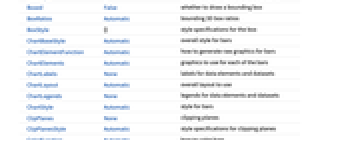
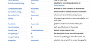
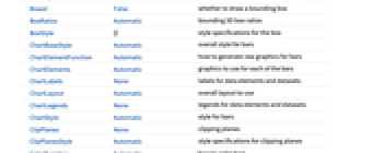
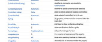
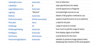
Axes True 是否绘制轴 BarOrigin Bottom 条形的起始位置 BarSpacing Automatic 条形间的间隔 Boxed False 是否绘制边界框 ChartElementFunction Automatic 如何产生条形的原图形 ChartElements Automatic 每个条形使用的图形 ColorFunction Automatic 如何着色条形 ColorFunctionScaling True 是否正规化 ColorFunction 的参数 FaceGrids Automatic 在边界框上绘制的网格线 LabelingFunction Automatic 如何标注条形 LegendAppearance Automatic 图例的整体外观 Lighting "Neutral" 使用的模拟光源 PerformanceGoal $PerformanceGoal 优化的目标 PlotInteractivity $PlotInteractivity 是否允许绘制互动元素 PlotLabels None 直条的类别标签 PlotLayout Automatic 整体布局 PlotLegends None 数据元素和数据集的图例 PlotStyle Automatic 直条的样式 PlotTheme $PlotTheme 图表的整体主题 ScalingFunctions None 如何调整单个坐标 TargetUnits Automatic 在图表中显示的单位 ViewPoint Automatic 观察位置 - 可用下面的 PlotLayout 的设置来显示多组数据:
-

"Grouped" 分别显示每个数据集的数据 
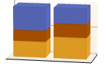
"Stacked" 累置每个数据集的数据 

"Stepped" 累置并分开显示每个数据集的数据 
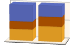
"Percentile" 累置并归一化每个数据集的数据 - PlotLegends 的常见设置包括:
-
None 没有图例 Automatic 自动确定图例 {lbl1,lbl2,…} 用 lbl1, lbl2, … 作为图例的标签 Placed[lspec,…] 指定图例的位置 - PlotStylesty 指定每组数据使用的样式. 可能的设置包括:
-
{sty1,sty2,…} 针对每组数据的一系列样式 <|"key"val,…|> 针对不同层级的数据的样式元素 - 接受的键有:
-
"Base" 所有直条的整体样式 "Elements" 针对每个组中的元素 yi 的样式列表 "Groups" 每个数据组 datai 的样式列表 - ColorData["DefaultChartColors"] 给出 PlotStyle 使用的默认颜色序列.
- 应用到 ChartElementFunction 参数是条形区域 {{xmin,xmax},{ymin,ymax},{zmin,zmax}}、数据值 yi 和从数据集的嵌套列表中每层获得的元数据 {m1,m2,…}.
- ChartElementFunction 的内置设置列表可以从 ChartElementData["BarChart3D"] 得到.
- ColorFunction 的参数是 yi.
- 设置 ChartElements->g,图形 g 将形成包含延伸 g 的条形.
- BarChart3D 中选项及其它结构的样式及其说明按 PlotStyle、ColorFunction、Style 和其它封装函数,如 ChartElements 和 ChartElementFunction 等的先后顺序进行应用,较后的说明会屏蔽较前的说明.
所有选项的列表
范例
打开所有单元 关闭所有单元基本范例 (3)
BarChart3D[{1, 2, 3}]BarChart3D[{{1, 2, 3}, {1, 3, 2}}]BarChart3D[Range[8], PlotStyle -> {RGBColor[0.237736, 0.340215, 0.575113], RGBColor[0.25826842857142857, 0.3783777142857143, 0.4839005714285714], RGBColor[0.2876055714285714, 0.46943485714285715, 0.2876237142857143], RGBColor[0.4759574285714286, 0.589047, 0.2482417142857143], RGBColor[0.759271, 0.7397234285714285, 0.29226885714285716], RGBColor[0.8685795714285713, 0.7007091428571428, 0.32354785714285716], RGBColor[0.7654144285714286, 0.35909685714285716, 0.2620315714285714], RGBColor[0.72987, 0.239399, 0.230961]}]BarChart3D[Range[5], ChartElements -> [image]]BarChart3D[Range[6], ChartElementFunction -> "ProfileCube", PlotStyle -> {RGBColor[0.761959, 0.470832, 0.940597], RGBColor[0.8750956, 0.6580038, 0.746929], RGBColor[0.9440982, 0.7955892, 0.5942686], RGBColor[0.9537862, 0.937389, 0.6180996], RGBColor[0.7952328000000001, 0.8988539999999999, 0.8302508], RGBColor[0.431296, 0.709773, 0.927077]}]范围 (31)
数据和布局 (13)
BarChart3D[{{1, 1, 1}, {2, 2, 2}, {3, 3, 3}}]BarChart3D[{{1, 2}, {1, 2, 3}, {1, 2, 3, 4}}]BarChart3D[{{1, Missing[], 3}, {4, 2, 1 + I, 2}, {foo, 2, 4}}]BarChart3D[{Quantity[1, "Feet"], Quantity[3, "Feet"], Quantity[2, "Feet"], Quantity[5, "Feet"], Quantity[7, "Feet"], Quantity[6, "Feet"]}, AxesLabel -> Automatic]BarChart3D[{Quantity[1, "Feet"], Quantity[3, "Feet"], Quantity[2, "Feet"], Quantity[5, "Feet"], Quantity[7, "Feet"], Quantity[6, "Feet"]}, AxesLabel -> Automatic, TargetUnits -> "Meters"]TimeSeries、EventSeries 和 TemporalData 的时间标记将被忽略:
BarChart3D[TimeSeries[{5, 12, 4, 4, 5, 2, 7}, {"April 21, 1981"}]]BarChart3D[<|"a" -> 4, "b" -> 2, "c" -> 6, "d" -> 9, "e" -> 7|>]BarChart3D[<|"a" -> 4, "b" -> 2, "c" -> 6, "d" -> 9, "e" -> 7|>, PlotLabels -> Automatic]BarChart3D[<|"a" -> 4, "b" -> 2, "c" -> 6, "d" -> 9, "e" -> 7|>, PlotStyle -> {Hue[0.58, 0.67, 0.66], Hue[0.17, 1, 0.66], Hue[0.45, 0.75, 0.6], Hue[0.12, 0.7, 0.7], Hue[0.25, 0.7, 0.6]}, PlotLegends -> Automatic]BarChart3D[<|"one" -> <|"a" -> 4, "b" -> 2, "c" -> 6, "d" -> 9, "e" -> 7|>, "two" -> <|"a" -> 2, "b" -> 6, "c" -> 5, "d" -> 6, "e" -> 4|>|>, PlotLegends -> Automatic]WeightedData 中的权值将被忽略:
BarChart3D[WeightedData[{1, 2, 3, 4, 5}, {0.5, 0.8, 0.2, 0.1, 0.2}]]EventData 中的删失和截断信息将被忽略:
BarChart3D[EventData[{6, 3, 6, 4, 2}, {0, 1, 0, 1, 1}]]Table[BarChart3D[{{1, 2, 3}, {1, 3, 2}}, ChartLayout -> l], {l, {"Grouped", "Stepped"}}]Table[BarChart3D[RandomReal[1, {5, 5}], ChartLayout -> l], {l, {"Stacked", "Percentile"}}]Table[BarChart3D[Range[5], BarOrigin -> o, PlotLabel -> o, ImageSize -> Small], {o, {Bottom, Left, Top, Right}}]Table[BarChart3D[{Range[4], Range[4]}, BarSpacing -> s, PlotLabel -> s, PlotStyle -> Opacity[0.8]], {s, {Automatic, {0, 1}, {-0.3, 1}}}]表格数据 (3)
获取表格数据,按 "class" 和 "survived" 列计数:
titanic = ResourceData["Sample Tabular Data: Titanic"]data = AggregateRows[titanic, "count" -> Function[Length[#class]], "class"]BarChart3D[data -> "count", PlotLabels -> {"1st", "2nd", "3rd"}]AggregateRows[titanic, "count" -> Function[Length[#class]], "survived"]BarChart3D[% -> "count", PlotLabels -> {"survived", "perished"}]pivot = PivotToColumns[AggregateRows[titanic, "count" -> Function[Length[#class]], {"class", "survived"}], "class" -> "count"]BarChart3D[pivot -> {"1st", "2nd", "3rd"}, PlotLabels -> <|"Groups" -> {"survived", "perished"}, "Elements" -> Placed[{"1st", "2nd", "3rd"}, Center]|>]BarChart3D[pivot -> {"1st", "2nd", "3rd"}, PlotLayout -> "Stacked", PlotLabels -> <|"Groups" -> {"survived", "perished"}, "Elements" -> {"1st", "2nd", "3rd"}|>]绘制 TimeSeries 或 EventSeries 中所有分量的值:
BarChart3D[TimeSeries[TimeEventSeries`TimestampData[Association["UniformlySpacedQ" -> True, "Count" -> 5,
"Endpoints" -> TabularColumn[Association[
"Data" -> {2, {{NumericArray[{20551, -2147483648}, "Integer32"], {},
DataStructure["BitVec ... rColumn[Association[
"Data" -> {{2, 3, 4, 5, 9}, {}, None}, "ElementType" -> "Integer64"]],
TabularColumn[Association["Data" -> {{15, 15, 13, 11, 10}, {}, None},
"ElementType" -> "Integer64"]]}}]]]], Association[]]]绘制 TimeSeries 或 EventSeries 中一个分量的值:
ts = TimeSeries[TimeEventSeries`TimestampData[Association["UniformlySpacedQ" -> True, "Count" -> 5,
"Endpoints" -> TabularColumn[Association[
"Data" -> {2, {{NumericArray[{20551, -2147483648}, "Integer32"], {},
DataStructure["BitVec ... rColumn[Association[
"Data" -> {{2, 3, 4, 5, 9}, {}, None}, "ElementType" -> "Integer64"]],
TabularColumn[Association["Data" -> {{15, 15, 13, 11, 10}, {}, None},
"ElementType" -> "Integer64"]]}}]]]], Association[]];BarChart3D[ts -> "fish"]BarChart3D[ts -> {"cats", "dogs"}]封装 (5)
{BarChart3D[{{1, Style[2, RGBColor[0.93, 0.27, 0.27]], 3}, {4, 5, 6}}], BarChart3D[{Style[{1, 2, 3}, RGBColor[0.14, 0.8, 0.14]], {4, 5, 6}}], BarChart3D[Style[{{1, 2, 3}, {4, 5, 6}}, RGBColor[0.4, 0.6, 1]]]}{BarChart3D[{{1, Style[2, RGBColor[0.93, 0.27, 0.27]], 3}, {4, 5, 6}}], BarChart3D[{Style[{1, Style[2, RGBColor[0.93, 0.27, 0.27]], 3}, RGBColor[0.14, 0.8, 0.14]], {4, 5, 6}}], BarChart3D[Style[{Style[{1, Style[2, RGBColor[0.93, 0.27, 0.27]], 3}, RGBColor[0.14, 0.8, 0.14]], {4, 5, 6}}, RGBColor[0.4, 0.6, 1]]]}BarChart3D[{1, Tooltip[2, "median"], 3}]BarChart3D[Table[Tooltip[CountryData[c, "Population"] / 10 ^ 8, CountryData[c, "Flag"]], {c, CountryData["G8"]}]]用 PopupWindow 提供其它的向下钻取(drill down)的信息:
BarChart3D[{1, PopupWindow[2, DateListPlot[FinancialData["IBM", "Jan. 1, 2004"]]], 3}]Button 可以用于触发任何行为:
BarChart3D[{1, Button[2, Speak[2]], 3}]造型和外观 (7)
BarChart3D[{1, 2, 3, 4}, PlotStyle -> {RGBColor[0.93, 0.27, 0.27], RGBColor[0.14, 0.8, 0.14], RGBColor[0.4, 0.6, 1], RGBColor[1, 0.75, 0]}]Style 可以用于覆写样式:
BarChart3D[{1, 2, Style[3, EdgeForm[Directive[Thick, Dashed]]], 4, 5}, PlotStyle -> EdgeForm[None]]BarChart3D[{1, 2, 3}, ChartElements -> Graphics3D[Cylinder[]]]ChartElementData["BarChart3D"]Table[BarChart3D[{1, 2, 3, 4, 5}, ChartElementFunction -> f], {f, {"ProfileCube", "GradientScaleCube"}}]BarChart3D[{1, 2, 3, 4, 5}, ChartElementFunction -> ChartElementDataFunction["SegmentScaleCube", "Segments" -> 7, "ColorScheme" -> "SolarColors"]]BarChart3D[{1, 2, 3, 4, 5}, Method -> {"Canvas" -> None}]BarChart3D[{{1, 5, 4, 6}, {4, 3, 2, 6}}, PlotTheme -> "Business"]BarChart3D[{{1, 5, 4, 6}, {4, 3, 2, 6}}, PlotTheme -> "Monochrome"]标签和图例 (3)
用 Labeled 对一个条形添加标签:
BarChart3D[{1, Labeled[2, "label"], 3}]Table[BarChart3D[{1, Labeled[2, "label", p], 3}, PlotLabel -> p, Ticks -> None], {p, {Bottom, Center, Top}}]Table[BarChart3D[{1, Labeled[2, "label", p], 3}, PlotLabel -> p, Ticks -> None], {p, {Left, Center, Right}}]用 Placed 的第三个参数格式化标签:
BarChart3D[{1, 2, 3}, PlotLabels -> Placed[{"aaa", "bbb", "ccc"}, Center, Framed[#, FrameMargins -> 1, Background -> StandardYellow]&]]选项 (87)
Axes (3)
默认情况下为 BarChart3D 绘制轴:
BarChart3D[Range[8, 1, -1], PlotStyle -> {RGBColor[0.237736, 0.340215, 0.575113], RGBColor[0.25826842857142857, 0.3783777142857143, 0.4839005714285714], RGBColor[0.2876055714285714, 0.46943485714285715, 0.2876237142857143], RGBColor[0.4759574285714286, 0.589047, 0.2482417142857143], RGBColor[0.759271, 0.7397234285714285, 0.29226885714285716], RGBColor[0.8685795714285713, 0.7007091428571428, 0.32354785714285716], RGBColor[0.7654144285714286, 0.35909685714285716, 0.2620315714285714], RGBColor[0.72987, 0.239399, 0.230961]}]BarChart3D[Range[8, 1, -1], PlotStyle -> {RGBColor[0.237736, 0.340215, 0.575113], RGBColor[0.25826842857142857, 0.3783777142857143, 0.4839005714285714], RGBColor[0.2876055714285714, 0.46943485714285715, 0.2876237142857143], RGBColor[0.4759574285714286, 0.589047, 0.2482417142857143], RGBColor[0.759271, 0.7397234285714285, 0.29226885714285716], RGBColor[0.8685795714285713, 0.7007091428571428, 0.32354785714285716], RGBColor[0.7654144285714286, 0.35909685714285716, 0.2620315714285714], RGBColor[0.72987, 0.239399, 0.230961]}, Axes -> False]BarChart3D[Range[8, 1, -1], PlotStyle -> {RGBColor[0.237736, 0.340215, 0.575113], RGBColor[0.25826842857142857, 0.3783777142857143, 0.4839005714285714], RGBColor[0.2876055714285714, 0.46943485714285715, 0.2876237142857143], RGBColor[0.4759574285714286, 0.589047, 0.2482417142857143], RGBColor[0.759271, 0.7397234285714285, 0.29226885714285716], RGBColor[0.8685795714285713, 0.7007091428571428, 0.32354785714285716], RGBColor[0.7654144285714286, 0.35909685714285716, 0.2620315714285714], RGBColor[0.72987, 0.239399, 0.230961]}, Axes -> {False, False, True}]AxesLabel (4)
BarChart3D[Range[8, 1, -1]]BarChart3D[Range[8, 1, -1], Axes -> True, AxesLabel -> "Data"]BarChart3D[Range[8, 1, -1], Axes -> True, AxesLabel -> {x, y, z}]BarChart3D[QuantityArray[Range[8, 1, -1], "Meters"], Axes -> True, AxesLabel -> Automatic]AxesStyle (4)
BarChart3D[Range[8, 1, -1], PlotStyle -> {RGBColor[0.237736, 0.340215, 0.575113], RGBColor[0.25826842857142857, 0.3783777142857143, 0.4839005714285714], RGBColor[0.2876055714285714, 0.46943485714285715, 0.2876237142857143], RGBColor[0.4759574285714286, 0.589047, 0.2482417142857143], RGBColor[0.759271, 0.7397234285714285, 0.29226885714285716], RGBColor[0.8685795714285713, 0.7007091428571428, 0.32354785714285716], RGBColor[0.7654144285714286, 0.35909685714285716, 0.2620315714285714], RGBColor[0.72987, 0.239399, 0.230961]}, Axes -> True, AxesStyle -> RGBColor[0.93, 0.27, 0.27]]BarChart3D[Range[8, 1, -1], PlotStyle -> {RGBColor[0.237736, 0.340215, 0.575113], RGBColor[0.25826842857142857, 0.3783777142857143, 0.4839005714285714], RGBColor[0.2876055714285714, 0.46943485714285715, 0.2876237142857143], RGBColor[0.4759574285714286, 0.589047, 0.2482417142857143], RGBColor[0.759271, 0.7397234285714285, 0.29226885714285716], RGBColor[0.8685795714285713, 0.7007091428571428, 0.32354785714285716], RGBColor[0.7654144285714286, 0.35909685714285716, 0.2620315714285714], RGBColor[0.72987, 0.239399, 0.230961]}, Axes -> True, AxesStyle -> {Directive[Thick, RGBColor[0.67, 0.54, 0.42]], Directive[Thick, RGBColor[0.4, 0.6, 1]], Directive[Thick, RGBColor[0.8, 0.3, 0.8]]}]**BarChart3D[Range[8, 1, -1], PlotStyle -> {RGBColor[0.237736, 0.340215, 0.575113], RGBColor[0.25826842857142857, 0.3783777142857143, 0.4839005714285714], RGBColor[0.2876055714285714, 0.46943485714285715, 0.2876237142857143], RGBColor[0.4759574285714286, 0.589047, 0.2482417142857143], RGBColor[0.759271, 0.7397234285714285, 0.29226885714285716], RGBColor[0.8685795714285713, 0.7007091428571428, 0.32354785714285716], RGBColor[0.7654144285714286, 0.35909685714285716, 0.2620315714285714], RGBColor[0.72987, 0.239399, 0.230961]}, Axes -> True, AxesStyle -> RGBColor[0.93, 0.27, 0.27], TicksStyle -> RGBColor[0.14, 0.8, 0.14]]**BarChart3D[Range[8, 1, -1], PlotStyle -> {RGBColor[0.237736, 0.340215, 0.575113], RGBColor[0.25826842857142857, 0.3783777142857143, 0.4839005714285714], RGBColor[0.2876055714285714, 0.46943485714285715, 0.2876237142857143], RGBColor[0.4759574285714286, 0.589047, 0.2482417142857143], RGBColor[0.759271, 0.7397234285714285, 0.29226885714285716], RGBColor[0.8685795714285713, 0.7007091428571428, 0.32354785714285716], RGBColor[0.7654144285714286, 0.35909685714285716, 0.2620315714285714], RGBColor[0.72987, 0.239399, 0.230961]}, Axes -> True, AxesStyle -> RGBColor[0.93, 0.27, 0.27], LabelStyle -> RGBColor[0.14, 0.8, 0.14]]BarOrigin (1)
BarSpacing (6)
BarChart3D[{{16, 8, 4}, {5, 3, 2}}, BarSpacing -> Automatic]BarChart3D[{{16, 8, 4}, {5, 3, 2}}, BarSpacing -> None]Table[BarChart3D[{{16, 8, 4}, {5, 3, 2}}, BarSpacing -> s, PlotLabel -> s], {s, {Tiny, Small, Medium, Large}}]Table[BarChart3D[{{16, 8, 4}, {5, 3, 2}}, BarSpacing -> s, PlotLabel -> s], {s, {Automatic, 1, -0.3}}]Table[BarChart3D[{{16, 8, 4}, {5, 3, 2}}, BarSpacing -> s, PlotLabel -> s], {s, {Automatic, {0, 1}, {0, 0.2}}}]BarChart3D[{{1, 2, 3}, {4, 5, 6}, {7, 8, 9}}, BarSpacing -> {0.5, 0}, ChartLayout -> "Grid"]ChartElementFunction (6)
获得 ChartElementFunction 的内置设置的列表:
ChartElementData["BarChart3D"]Table[BarChart3D[{1, 2, 3, 4, 5}, ChartElementFunction -> f, PlotStyle -> EdgeForm[], ColorFunction -> "SandyTerrain", PlotLabel -> f, ViewPoint -> {2.8, -7.5, 6.7}], {f, {"Cone", "FadingCube", "Cylinder", "ProfileCube"}}]ChartElementFunction 适合显示全局比例:
Table[BarChart3D[{1, 2, 3, 4, 5}, ChartElementFunction -> f, PlotLabel -> f], {f, {"GradientScaleCube", "SegmentScaleCube"}}]Table[BarChart3D[{1, 2, 3, 4, 5}, ChartElementFunction -> f, PlotStyle -> {RGBColor[0.761959, 0.470832, 0.940597], RGBColor[0.898695, 0.686452, 0.6785475], RGBColor[0.9584254999999999, 0.877884, 0.5906629999999999], RGBColor[0.86116075, 0.930182, 0.758764], RGBColor[0.431296, 0.709773, 0.927077]}, PlotLabel -> f, ViewPoint -> {4, -8, 3}], {f, {"SquareWaveCube", "TriangleWaveCube"}}]写入一个自定义的 ChartElementFunction:
f[{{xmin_, xmax_}, {ymin_, ymax_}, {zmin_, zmax_}}, ___] := Cuboid[{xmin, ymin, zmin}, {xmax, ymax, zmax}]BarChart3D[{1, 2, 3, 4, 5}, ChartElementFunction -> f, PlotStyle -> GrayLevel[0.85]]用 ChartElementDataFunction 写入一个自定义的 ChartElementFunction:
f[b : {{xmin_, xmax_}, {ymin_, ymax_}, {zmin_, zmax_}}, ___] := ChartElementDataFunction["ProfileCube", "Profile" -> 2, "TaperRatio" -> 0.6][b]BarChart3D[{1, 2, 3, 4, 5}, ChartElementFunction -> f, PlotStyle -> GrayLevel[0.62]]DropPlanesBar[box : {{xmin_, xmax_}, {ymin_, ymax_}, {zmin_, zmax_}}, y_, {True}] :=
{DropPlanesBar[box], EdgeForm[], Opacity[0.5], Polygon[{{-0.1, ymin, zmax}, {xmax, ymin, zmax}, {xmax, ymax, zmax}, {-0.1, ymax, zmax}}], Opacity[1], Black, Text[y, {-0.1, ymax, zmax}, {1, 0}]}DropPlanesBar[{{xmin_, xmax_}, {ymin_, ymax_}, {zmin_, zmax_}}, ___] := {
EdgeForm[], Opacity[0.7], Cuboid[{xmin, ymin, zmin}, {xmax, ymax, zmax}]
}元数据设置为 True,打开下落平面:
BarChart3D[{23, 71, 42 -> True, 55 -> True}, ChartElementFunction -> DropPlanesBar, PlotStyle -> {RGBColor[0.237736, 0.340215, 0.575113], RGBColor[0.33311066666666667, 0.5032283333333333, 0.26154733333333335], RGBColor[0.8562609999999999, 0.742794, 0.31908333333333333], RGBColor[0.72987, 0.239399, 0.230961]}, ViewPoint -> {-5.17, -8.34, 3.42}, FaceGrids -> None, Axes -> None, PlotLegends -> {"Tim", "John", "Mary", "Bob"}]ChartElements (7)
创建基于任何 Graphics3D 对象的绘图条形:
BarChart3D[{1, 2, 3, 4}, ChartElements -> Graphics3D[Cylinder[]]]BarChart3D[{{1, 2, 3}, {4, 5, 6}}, ChartElements -> {[image], [image], [image]}]BarChart3D[{{1, 2, 3}, {4, 5, 6}}, ChartElements -> {{[image], [image]}, None}]BarChart3D[{1, 2, 3, 4, 5, 6}, ChartElements -> {[image], [image]}]样式可以继承 PlotStyle 等样式:
BarChart3D[{1, 2, 3, 4, 5, 6}, ChartElements -> [image], PlotStyle -> {RGBColor[0.761959, 0.470832, 0.940597], RGBColor[0.8750956, 0.6580038, 0.746929], RGBColor[0.9440982, 0.7955892, 0.5942686], RGBColor[0.9537862, 0.937389, 0.6180996], RGBColor[0.7952328000000001, 0.8988539999999999, 0.8302508], RGBColor[0.431296, 0.709773, 0.927077]}]用 Style 屏蔽单个样式:
BarChart3D[{1, 2, Style[3, RGBColor[0.93, 0.27, 0.27]], 4, 5, 6}, ChartElements -> [image], PlotStyle -> {RGBColor[0.761959, 0.470832, 0.940597], RGBColor[0.8750956, 0.6580038, 0.746929], RGBColor[0.9440982, 0.7955892, 0.5942686], RGBColor[0.9537862, 0.937389, 0.6180996], RGBColor[0.7952328000000001, 0.8988539999999999, 0.8302508], RGBColor[0.431296, 0.709773, 0.927077]}]BarChart3D[{1, 2, 3, 4, 5, 6}, ChartElements -> [image], PlotStyle -> {RGBColor[0.761959, 0.470832, 0.940597], RGBColor[0.8750956, 0.6580038, 0.746929], RGBColor[0.9440982, 0.7955892, 0.5942686], RGBColor[0.9537862, 0.937389, 0.6180996], RGBColor[0.7952328000000001, 0.8988539999999999, 0.8302508], RGBColor[0.431296, 0.709773, 0.927077]}]绘图图形总是旋转至 BarOrigin 所用的设置开始:
Table[BarChart3D[{1, 2, 3}, ChartElements -> [image], BarOrigin -> o, PlotLabel -> o, ImageSize -> Tiny], {o, {Bottom, Top, Left, Right}}]ColorFunction (3)
BarChart3D[Table[Exp[-t ^ 2], {t, -2, 2, 0.25}], ColorFunction -> Function[{height}, ColorData["Rainbow"][height]]]ColorData 中用 "Gradients" 颜色字符串:
BarChart3D[{1, 2, 3}, ColorFunction -> "SolarColors"]用 ColorFunctionScaling->False,得到未缩放的高度值:
BarChart3D[{1, 2, 3}, ColorFunction -> (Switch[#, 1, RGBColor[1, 0.75, 0], 2, RGBColor[0.98, 0.56, 0.17], 3, RGBColor[0.93, 0.27, 0.27]]&), ColorFunctionScaling -> False]ColorFunction 屏蔽 ChartStyle 的设置:
BarChart3D[{1, 2, 3}, PlotStyle -> {RGBColor[0.93, 0.27, 0.27], RGBColor[0.14, 0.8, 0.14], RGBColor[0.4, 0.6, 1]}, ColorFunction -> ColorData["SolarColors"]]ColorFunctionScaling (2)
BarChart3D[{1, 2, 3}, ColorFunction -> (Lighter[Brown, 0.9#]&)]用 ColorFunctionScaling->False 得到未缩放的高度值:
BarChart3D[{1, 2, 3}, ColorFunction -> (Switch[#, 1, RGBColor[1, 0.75, 0], 2, RGBColor[0.98, 0.56, 0.17], 3, RGBColor[0.93, 0.27, 0.27]]&), ColorFunctionScaling -> False]LabelingFunction (6)
Tooltip 和 StatusArea 使用自动标签值:
BarChart3D[{1, 2, 3}, LabelingFunction -> Automatic]BarChart3D[{1, 2, 3}, LabelingFunction -> None]Table[BarChart3D[{1, 2, 3}, LabelingFunction -> p, PlotLabel -> p, Ticks -> None], {p, {Bottom, Center, Top}}]Table[BarChart3D[{1, 2, 3}, LabelingFunction -> p, PlotLabel -> p, Ticks -> None], {p, {Below, Above}}]Table[BarChart3D[{1, 2, 3}, LabelingFunction -> p, BarSpacing -> 0.5, Ticks -> None, PlotLabel -> p], {p, {{0, 0, 0}, {0.5, 0.5, 0.5}, {1, 1, 1}}}]BarChart3D[{10, 20, 30}, LabelingFunction -> (Placed[Style[Row[{#, "%"}], Bold, FontSize -> 12, FontFamily -> "Helvetica"], Above]&)]BarChart3D[{10, 20, 30}, LabelingFunction -> (Placed[#, Bottom, Function[l, Framed[l, FrameMargins -> 1, Background -> StandardYellow]]]&)]PerformanceGoal (3)
BarChart3D[Range[10], PerformanceGoal -> "Quality"]BarChart3D[Range[10], PerformanceGoal -> "Speed"]Table[ByteCount@BarChart3D[Range[10], PerformanceGoal -> p], {p, {"Quality", "Speed"}}]PlotInteractivity (4)
BarChart3D[Range[5]]BarChart3D[Range[5], PlotInteractivity -> False]BarChart3D[{1, 2, Tooltip[3, "Hello"]}, PlotInteractivity -> False]BarChart3D[{1, 2, Tooltip[3, "Hello"]}, PlotInteractivity -> <|"User" -> True, "System" -> False|>]PlotLabels (9)
BarChart3D[{1, 2, 3}, PlotLabels -> {"a", "b", "c"}]BarChart3D[{{1, 2, 3}, {1, 2}}, PlotLabels -> {"a", "b"}]数据中的 Labeled 封装将会放置额外的标签:
BarChart3D[{1, Labeled[2, "label", Center], 3}, PlotLabels -> {"a", "b", "c"}]用 Placed 控制标签的放置:
Table[BarChart3D[{1, 2, 3}, PlotLabels -> Placed[{"a", "b", "c"}, p], PlotLabel -> p, Ticks -> None], {p, {Bottom, Center, Top}}]Table[BarChart3D[{1, 2, 3}, PlotLabels -> Placed[{"a", "b", "c"}, p], PlotLabel -> p, Ticks -> None], {p, {Below, Above}}]Table[BarChart3D[{1, 2, 3}, PlotLabels -> Placed[{"aaa", "bbb", "ccc"}, p], BarSpacing -> 0.5, Ticks -> None, PlotLabel -> p], {p, {{0, 0, 0}, {.5, .5, .5}, {1, 1, 1}}}]Table[BarChart3D[{1, 2, 3}, PlotLabels -> Placed[Framed /@ {"a", "b", "c"}, {{1, 1, 1}, p}], BarSpacing -> 0.8, Ticks -> None, PlotLabel -> p], {p, {{0, 0}, {.5, .5}, {1, 1}}}]用 Placed 的第三个参数来控制格式:
BarChart3D[{1, 2, 3}, PlotLabels -> Placed[{"aaa", "bbb", "ccc"}, Center, Rotate[#, 45Degree]&]]BarChart3D[{1, 2, 3}, PlotLabels -> Placed[{"aaa", "bbb", "ccc"}, Center, Framed[#, FrameMargins -> 1, Background -> StandardYellow]&]]BarChart3D[{{1, 2, 3}, {4, 5, 6}}, PlotLabels -> {"r1", "r2"}]BarChart3D[{{1, 2, 3}, {4, 5, 6}}, PlotLabels -> <|"Elements" -> {"c1", "c2", "c3"}|>]BarChart3D[{{1, 2, 3}, {4, 5, 6}}, PlotLabels -> <|"Groups" -> Placed[{"r1", "r2"}, Above], "Elements" -> Placed[{"c1", "c2", "c3"}, Center]|>]BarChart3D[{1, 2, 3}, PlotLabels -> Placed[{{"a", "b", "c"}, {"x", "y", "z"}}, {Top, Bottom}]]PlotLayout (5)
默认情况下,BarChart 使用分组布局:
BarChart3D[{{16, 8, 4, 2, 1}, {5, 3, 2, 1, 1}}, PlotLayout -> "Grouped"]BarChart3D[{{16, 8, 4, 2, 1}, {5, 3, 2, 1, 1}}, PlotLayout -> "Stepped"]BarChart3D[{{16, 8, 4, 2, 1}, {5, 3, 2, 1, 1}}, PlotLayout -> "Stacked"]BarChart3D[RandomReal[1, {10, 5}], PlotLayout -> "Stacked"]BarChart3D[{{16, 8, 4, 2, 1}, {5, 3, 2, 1, 1}}, PlotLayout -> "Percentile"]BarChart3D[{{5, 3, 2, 1, 1}, {16, 8, 4, 2, 1}},
ViewPoint -> {1.3, -2.4, 2}, PlotLayout -> "Grid"]PlotLegends (6)
BarChart3D[{{1, 2, 3}, {1, 2}}, PlotStyle -> <|"Elements" -> {RGBColor[0.658579, 0.316091, 0.207507], RGBColor[0.932006, 0.77464, 0.304936], RGBColor[0.290517, 0.358022, 0.190234]}|>, PlotLegends -> <|"Elements" -> {"ccc1", "ccc2", "ccc3"}|>]BarChart3D[{{1, 2, 3}, {4, 5}}, PlotLegends -> <|"Groups" -> {"rr1", "rr2"}|>, PlotStyle -> <|"Groups" -> {RGBColor[0.658579, 0.316091, 0.207507], RGBColor[0.932006, 0.77464, 0.304936], RGBColor[0.290517, 0.358022, 0.190234]}|>]用 Legended 添加其他图例:
BarChart3D[{{1, Legended[Style[2, RGBColor[0.93, 0.27, 0.27]], "Henry"], 3}, {4, 2}}, PlotStyle -> <|"Elements" -> {RGBColor[0.658579, 0.316091, 0.207507], RGBColor[0.932006, 0.77464, 0.304936], RGBColor[0.290517, 0.358022, 0.190234]}|>, PlotLegends -> <|"Elements" -> {"ccc1", "ccc2", "ccc3"}|>]用 Legended 指定几个图例:
BarChart3D[{1, Legended[2, "aa"], 3, 4, Legended[5, "bb"], 6}, PlotStyle -> <|"Elements" -> {RGBColor[0.658579, 0.316091, 0.207507], RGBColor[0.824658, 0.544191, 0.268712], RGBColor[0.926205, 0.761424, 0.30301], RGBColor[0.913171, 0.762585, 0.298615], RGBColor[0.615762, 0.571419, 0.21246], RGBColor[0.290517, 0.358022, 0.190234]}|>]BarChart3D[{{1, 2, 3}, {4, 5, 6}}, PlotLegends -> <|"Groups" -> {"Group A", "Group B"}|>, PlotStyle -> <|"Groups" -> {RGBColor[0.658579, 0.316091, 0.207507], RGBColor[0.290517, 0.358022, 0.190234]}|>]BarChart3D[{{1, 2, 3}, {4, 5, 6}}, PlotLegends -> <|"Groups" -> {"Group A", "Group B", "Group C"}|>, PlotStyle -> <|"Groups" -> {RGBColor[0.658579, 0.316091, 0.207507], RGBColor[0.290517, 0.358022, 0.190234]}|>]用 Placed 控制图例的放置:
Table[BarChart3D[{{1, 2, 3}, {4, 5, 6}}, PlotLegends -> <|"Elements" -> Placed[{"John", "Mary", "Bob"}, pos]|>, PlotStyle -> <|"Elements" -> {RGBColor[0.658579, 0.316091, 0.207507], RGBColor[0.932006, 0.77464, 0.304936], RGBColor[0.290517, 0.358022, 0.190234]}|>], {pos, {Below, Above, Before, After}}]PlotStyle (8)
用 PlotStyle 设计直条的样式:
BarChart3D[{1, 2, 3, 4}, PlotStyle -> {RGBColor[0.93, 0.27, 0.27], RGBColor[0.14, 0.8, 0.14], RGBColor[0.4, 0.6, 1], RGBColor[1, 0.75, 0]}]BarChart3D[{1, 2, 3}, BarSpacing -> -0.3, PlotStyle -> Directive[Opacity[0.7], EdgeForm[Dashed]]]BarChart3D[{{1, 2, 3}, {1, 2}}, PlotStyle -> {RGBColor[0.93, 0.27, 0.27], RGBColor[0.4, 0.6, 1]}]BarChart3D[{{1, 2, 3}, {4, 5, 6}}, PlotStyle -> <|"Elements" -> {RGBColor[0.93, 0.27, 0.27], RGBColor[0.14, 0.8, 0.14], RGBColor[0.4, 0.6, 1]}|>]BarChart3D[{{1, 2, 3}, {4, 5, 6}}, PlotStyle -> <|"Groups" -> {RGBColor[0.93, 0.27, 0.27], RGBColor[0.14, 0.8, 0.14]}|>]BarChart3D[{{1, 2, 3}, {4, 5, 6}}, PlotStyle -> <|"Base" -> Opacity[0.7]|>]BarChart3D[{{1, 2, 3}, {4, 5, 6}}, PlotStyle -> <|"Base" -> EdgeForm[{Thick, Dashed}], "Groups" -> {Opacity[0.5], Opacity[0.9]}, "Elements" -> {RGBColor[0.93, 0.27, 0.27], RGBColor[0.14, 0.8, 0.14], RGBColor[0.4, 0.6, 1]}|>]当同时为行数据和数据指定样式时,元素的样式可能会覆盖先前的样式:
BarChart3D[{{1, 2, 3}, {4, 5, 6}}, PlotStyle -> <|"Elements" -> {RGBColor[0.93, 0.27, 0.27], RGBColor[0.14, 0.8, 0.14], RGBColor[0.4, 0.6, 1]}, "Groups" -> {RGBColor[1, 0.75, 0], RGBColor[0.95, 0.43, 0.96]}|>]BarChart3D[{1, Style[2, Opacity[0.4]], 3}, PlotStyle -> {RGBColor[0.93, 0.27, 0.27], RGBColor[0.14, 0.8, 0.14], RGBColor[0.4, 0.6, 1]}]BarChart3D[{1, Style[2, EdgeForm[None]], 3}, PlotStyle -> EdgeForm[{Thick, Dashed}]]"Elements" 或 "Groups" 可能会覆盖 "Base" 的设置:
BarChart3D[{1, 2, 3}, PlotStyle -> <|"Base" -> EdgeForm[None], "Elements" -> EdgeForm[Dashed]|>]PlotStyle 与 ColorFunction 一起使用:
BarChart3D[{1, 2, 3}, PlotStyle -> EdgeForm[Directive[Thick, Dashed]], ColorFunction -> ColorData["Pastel"]]ColorFunction 可能会覆盖 PlotStyle 的设置:
BarChart3D[{1, 2, 3}, PlotStyle -> EdgeForm[Directive[Thick, Dashed]], ColorFunction -> (EdgeForm[None]&)]用 ColorFunction 将不同的样式组合在一起:
BarChart3D[Table[Exp[-t ^ 2], {t, -2, 2, 0.25}], PlotStyle -> <|"Elements" -> "SolarColors"|>, ColorFunction -> Function[{height}, Opacity[height]]]BarChart3D[Partition[Range[24], 8], PlotStyle -> <|"Elements" -> "Rainbow"|>, ChartLayout -> "Grid", ColorFunction -> Function[{height}, Opacity[height]]]具有显式样式设置的 ChartElements 可能会覆盖 PlotStyle 的设置:
BarChart3D[{1, 2, 3}, ChartElements -> [image], PlotStyle -> {RGBColor[0.761959, 0.470832, 0.940597], RGBColor[0.9584254999999999, 0.877884, 0.5906629999999999], RGBColor[0.431296, 0.709773, 0.927077]}]PlotTheme (2)
BarChart3D[{8, 3, 7, 5, 2, 4}, PlotTheme -> "Marketing"]BarChart3D[{8, 3, 7, 5, 2, 4}, PlotTheme -> "Marketing", PlotStyle -> {RGBColor[0.23780781740448254, 0.6887454706969063, 1.], RGBColor[1., 0.519599248047801, 0.3096774660909407], RGBColor[0., 0.7904116386138192, 0.7051174262187454], RGBColor[0.9363861336280548, 0.5065369688712918, 0.9811065055712941], RGBColor[0.6869591096151809, 0.6905739930724654, 0.05775022824194669], RGBColor[0., 0.7563567869713205, 1.]}]Ticks (6)
BarChart3D[{20, 5, 10, 35, 60, 75, 140}]BarChart3D[{20, 5, 10, 35, 60, 75, 140}, Ticks -> None]BarChart3D[{20, 5, 10, 35, 60, 75, 140}, Ticks -> {None, None, {60, 80, 120}}]BarChart3D[{20, 5, 10, 35, 60, 75, 140}, Ticks -> {None, None, {{60, a}, {80, b}, {120, c}}}]BarChart3D[{20, 5, 10, 35, 60, 75, 140}, Ticks -> {None, None, {{5, "min", .07}, {80, b, .07}, {140, "max", .47}}}]BarChart3D[{20, 5, 10, 35, 60, 75, 140}, Ticks -> {None, None, {{5, "min", .07, Directive[Thick, RGBColor[0.4, 0.6, 1]]}, {80, b, .07, Directive[Thick, RGBColor[0.14, 0.8, 0.14]]}, {140, "max", .47, Directive[Thick, RGBColor[0.93, 0.27, 0.27]]}}}]TicksStyle (2)
BarChart3D[{20, 5, 10, 35, 60, 75, 140}, TicksStyle -> Directive[RGBColor[0.93, 0.27, 0.27], Bold]]BarChart3D[{20, 5, 10, 35, 60, 75, 140}, TicksStyle -> {Directive[Thick, RGBColor[0.4, 0.6, 1]], Directive[Thick, RGBColor[0.14, 0.8, 0.14]], Directive[Thick, RGBColor[0.93, 0.27, 0.27]]}]应用 (5)
countries = CountryData["G8"];
data = Table[With[{country = c, v = Round@CountryData[c, "GDPPerCapita"]}, Button[v, Speak[StringJoin[country, ", $", ToString[v]]]]], {c, countries}];BarChart3D[data, PlotLabel -> "GDP Per Capita", PlotLabels -> Placed[countries, Center, Rotate[#, Pi / 2]&]]创建 2001 年至 2007 年间芝加哥月平均温度的 3D 条形图:
data = Table[WeatherData["KORD", "MeanTemperature", {{i, 1, 1}, {i, 12, 31}, "Month"}], {i, 2001, 2007, 1}];BarChart3D[data, PlotLayout -> "Grid", PlotLabels -> <|"Groups" -> Range[2001, 2007], "Elements" -> Table[DateString[{2001, m}, "MonthNameShort"], {m, 1, 12}]|>, ViewPoint -> {3.33, -8.26, 5.36}, ColorFunction -> "TemperatureMap", LabelingFunction -> (Row[{#, "°C"}]&), PlotLabel -> Style["Chicago Mean Temperature (2001-2007)", "Title", 14]]chemicals = {"Methane", "Ethane", "Ethanol", "HydrogenPeroxide", "Propane", "Urea", "Acetone", "CarbonDioxide", "Butane", "Water"};
chemIcons = Show[ChemicalData[#, "MoleculePlot"], ImageSize -> 50]& /@ chemicals;
chemMolecularMass = ChemicalData[#, "MolecularMass"]& /@ chemicals;
chemicalLabel = Style[Rotate[#, Pi / 2], 11, Bold, FontFamily -> "Helvetica", LightDarkSwitched@Black]& /@ chemicals;BarChart3D[chemMolecularMass, PlotLabels -> Placed[{chemIcons, chemicalLabel}, {Above, Center}], PlotStyle -> {RGBColor[0.8588235294117647, 0.00784313725490196, 0.00784313725490196], RGBColor[1., 0.26666666666666666, 0.], RGBColor[1., 0.4549019607843137, 0.2549019607843137], RGBColor[0.4823529411764706, 0.18823529411764706, 0.03529411764705882], RGBColor[1., 0.8784313725490196, 0.5058823529411764], RGBColor[0.7019607843137254, 0.7450980392156863, 0.8235294117647058], RGBColor[0.20784313725490197, 0.23921568627450981, 0.3215686274509804], RGBColor[0.08627450980392157, 0.1411764705882353, 0.28627450980392155], RGBColor[0.33725490196078434, 0.403921568627451, 0.6235294117647059]}, LabelingFunction -> (Placed[Style[Row[{Style["Molecular Mass : ", Bold], NumberForm[#, {3, 2}], " amu"}], 12, FontFamily -> "Helvetica"], Tooltip]&), PlotRange -> {All, 70}
]data = ColorData["Atoms", "Panel"][[1, 1, 1, 2]] /. {{color_, EventHandler[{Rectangle[__], Inset[Style[element_, __], __]}, _]} :> Labeled[Style[ElementData[element, "AtomicWeight"], color], element, Above], {} -> None};BarChart3D[Reverse /@ data, PlotLayout -> "Grid", ImageSize -> 530, BoxRatios -> {18, 10, 5}, Method -> {"Canvas" -> None}, Boxed -> True, Ticks -> {None, None, Automatic}, ViewPoint -> {6.3, -4.8, 6.6}]companies = {"PG", "MCD", "GS", "C", "AAPL"};
companyNames = FinancialData[#, "Name"]& /@ companies;
data = Transpose[FinancialData[#, "Price", {{2000, 10, 1}, {2008, 10, 1}, "Year"}]["Values"]& /@ companies];tooltipLabel[price_, {row_, col_}, ___] := Row[{"$", price, " ", companyNames[[col]]}]Length[(Labeled[#, Style[Total@#, 12, Bold], Above]& /@ data[[1]])]BarChart3D[Labeled[#, Style[Total@#, 12, Bold], Above]& /@ data, PlotLayout -> "Stacked", PlotStyle -> <|"Elements" -> {RGBColor[0.471412, 0.108766, 0.527016], RGBColor[0.266122, 0.486664, 0.802529], RGBColor[0.513417, 0.72992, 0.440682], RGBColor[0.863512, 0.670771, 0.236564], RGBColor[0.857359, 0.131106, 0.132128]}|>, PlotLegends -> <|"Elements" -> Placed[companyNames, Below]|>, PlotLabels -> <|"Groups" -> Placed[Range[2000, 2008], Below, "Framed"]|>, AxesLabel -> Style["$US", 12], LabelingFunction -> tooltipLabel, PlotLabel -> Style["Portfolio Value (2000-2008)", 16], ImageSize -> 500]属性和关系 (5)
用 BarChart 得到一个二维条形图:
BarChart[{1, 2, 3, 4}]BarChart3D 是 RectangleChart3D 的一个特例:
{BarChart3D[{1, 2, 3}], RectangleChart3D[{{1, 1, 1}, {1, 1, 2}, {1, 1, 3}}]}用 PieChart 和 PieChart3D 可视化显示数据列表:
{PieChart[{1, 2, 3, 4}], PieChart3D[{1, 2, 3, 4}]}用 ListPlot 和 ListLinePlot 产生线条图形:
{ListPlot[{1, 2, 3, 4}, Filling -> Axis], ListLinePlot[{1, 2, 3, 4}]}用 Histogram 自动计算像素组合和绘制直方图:
Histogram[RandomReal[NormalDistribution[0, 1], 200]]巧妙范例 (2)
g = ExampleData[{"Geometry3D", "Beethoven"}];BarChart3D[Range[5], ChartElements -> g, PlotStyle -> {RGBColor[0.277546, 0.355398, 0.484215], RGBColor[0.3237638, 0.4512444, 0.4130692], RGBColor[0.4168964, 0.521963, 0.367477], RGBColor[0.5872596000000001, 0.6142422000000001, 0.5153826], RGBColor[0.7880484000000001, 0.7809992, 0.707756], RGBColor[1., 0.997467, 0.914244]}]用 ChartElementFunction 改变竖条的外观:
BarChart3D[RandomReal[1, {5, 5}], ChartElementFunction -> "Cylinder", ChartLayout -> "Stacked", PlotStyle -> <|"Base" -> Directive[Opacity[0.6], Specularity[White, 30]], "Elements" -> {RGBColor[0.468742, 0., 0.0158236], RGBColor[0.822129, 0.122225, 0.0039559], RGBColor[0.969963, 0.376081, 0.0322881], RGBColor[1., 0.646929, 0.0801709], RGBColor[1., 0.820127, 0.126955]}|>]文本
Wolfram Research (2008),BarChart3D,Wolfram 语言函数,https://reference.wolfram.com/language/ref/BarChart3D.html (更新于 2026 年).
CMS
Wolfram 语言. 2008. "BarChart3D." Wolfram 语言与系统参考资料中心. Wolfram Research. 最新版本 2026. https://reference.wolfram.com/language/ref/BarChart3D.html.
APA
Wolfram 语言. (2008). BarChart3D. Wolfram 语言与系统参考资料中心. 追溯自 https://reference.wolfram.com/language/ref/BarChart3D.html 年
BibTeX
@misc{reference.wolfram_2026_barchart3d, author="Wolfram Research", title="{BarChart3D}", year="2026", howpublished="\url{https://reference.wolfram.com/language/ref/BarChart3D.html}", note=[Accessed: 19-August-2026]}
BibLaTeX
@online{reference.wolfram_2026_barchart3d, organization={Wolfram Research}, title={BarChart3D}, year={2026}, url={https://reference.wolfram.com/language/ref/BarChart3D.html}, note=[Accessed: 19-August-2026]}