


ComplexListPlot
ComplexListPlot[{z1,z2,…}]
plots complex numbers z1, z2, … as points in the complex plane.
ComplexListPlot[{data1,data2,…}]
plots data from all datai.
ComplexListPlot[{…,w[datai,…],…}]
plots ![]() with features defined by the symbolic wrapper w.
with features defined by the symbolic wrapper w.
Details and Options
- The datai have the following forms and interpretations:
-
<"k1"z1,"k2"z2,…> values {z1,z2,…} {z1"lbl1",z2"lbl2",…}, {z1,z2,…}{"lbl1","lbl2",…} values {z1,z2,…} with labels {lbl1,lbl2,…} SparseArray values as a normal array - ComplexListPlot[objcspec] extracts and plots values from the Tabular, TimeSeries or EventSeries object obj using the column specification cspec.
- The following forms of column specifications cspec are allowed for plotting tabular data:
-
col plot complex values from column col {col1,col2,…} plot values from columns col1, col2, … - The following wrappers w can be used for the datai:
-
Annotation[datai,label] provide an annotation for the data Button[datai,action] define an action to execute when the data is clicked Callout[datai,label] label the data with a callout Callout[datai,label,pos] place the callout at relative position pos EventHandler[datai,…] define a general event handler for the data Highlighted[datai,effect] dynamically highlight fi with an effect Highlighted[datai,Placed[effect,pos]] statically highlight fi with an effect at position pos Hyperlink[datai,uri] make the data a hyperlink Labeled[datai,label] label the data Labeled[datai,label,pos] place the label at relative position pos Legended[datai,label] identify the data in a legend PopupWindow[datai,cont] attach a popup window to the data StatusArea[datai,label] display in the status area on mouseover Style[datai,styles] show the data using the specified styles Tooltip[datai,label] attach a tooltip to the data Tooltip[datai] use data values as tooltips - Wrappers w can be applied at multiple levels:
-
{…,w[zi],…} wrap the value zi in data w[datai] wrap the data w[{data1,…}] wrap a collection of datai w1[w2[…]] use nested wrappers - Callout, Labeled and Placed can use the following positions pos:
-
Automatic automatically placed labels Above, Below, Before, After positions around the data x near the data at a position x Scaled[s] scaled position s along the data {s,Above},{s,Below},… relative position at position s along the data {pos,epos} epos in label placed at relative position pos of the data - ComplexListPlot has the same options as Graphics, with the following additions and changes: [List of all options]
-
Axes True whether to draw axes Joined False whether to join points LabelingFunction Automatic how to label points LabelingSize Automatic maximum size of callouts and labels PerformanceGoal $PerformanceGoal aspects of performance to try to optimize PlotHighlighting Automatic highlighting effect for curves PlotLabel None overall label for the plot PlotLabels None labels for data PlotLegends None legends for data PlotMarkers None markers to use to indicate each point PlotRange Automatic range of values to include PlotRangeClipping True whether to clip at the plot range PlotStyle Automatic graphics directives to determine styles of points PlotTheme $PlotTheme overall theme for the plot PolarAxes False whether to draw polar axes PolarAxesOrigin Automatic where to draw polar axes PolarGridLines None polar gridlines to draw PolarTicks Automatic polar axes ticks ScalingFunctions None how to scale individual coordinates - LabelingFunction->f specifies that each point should have a label given by f[value,index,lbls], where value is the value associated with the point, index is its position in the data and lbls is the list of relevant labels.
- Typical settings for PlotLegends include:
-
None no legend Automatic automatically determine legend {lbl1,lbl2,…} use lbl1, lbl2, … as legend labels Placed[lspec,…] specify placement for legend - PlotStylesty specifies the styles to use for each curve. Possible settings include:
-
{sty1,sty2,…} sequence of styles for the datasets <"key"val,…> styling elements for different levels of data - The accepted keys are:
-
"Base" overall style for all the datai "Lists" list of styles styi for each datai - ColorData["DefaultPlotColors"] gives the default sequence of colors used by PlotStyle.
- The arguments supplied to functions in MeshFunctionsare x, y, θ, r where θ and r are the argument and radius of the zi. Functions in ColorFunction are by default supplied with scaled versions of these arguments.
- Possible highlighting effects for Highlighted and PlotHighlighting include:
-

style highlight the indicated data 
"Ball" highlight and label the indicated point in data 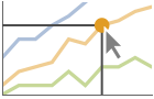
"Dropline" highlight and label the indicated point in data with droplines to the axes 
"XSlice" highlight and label all points along a vertical slice 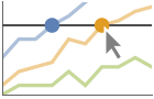
"YSlice" highlight and label all points along a horizontal slice 
Placed[effect,pos] statically highlight the given position pos - Highlight position specifications pos include:
-
x, {x} effect at {x,y}, with y chosen automatically {x,y} effect at {x,y} {pos1,pos2,…} multiple positions posi - ScalingFunctions->"scale" scales the modulus of the zi. ScalingFunctions{"scalex","scaley"} scales the
 and imaginary components, respectively.
List of all options
Examples
open all close allBasic Examples (4)
Plot a set of complex numbers:
ComplexListPlot[{-2 - 2 I, -1 - I, 0, 1 + I, 2 + 2 I}]Plot multiple sets of complex numbers:
ComplexListPlot[{RandomComplex[{0, 1 + I}, 100], RandomComplex[{-2 - 2I, 2 + 2I}, 100]}]data = Table[a t Exp[2 π I t], {a, 2, 4}, {t, 0, 1, 0.02}];
ComplexListPlot[data, PlotLegends -> {"a=2", "a=3", "a=4"}]Label each point with a callout:
ComplexListPlot[Callout[#, #]& /@ Table[E^π I k / 4, {k, 1, 8}]]Scope (39)
Data (7)
A list of complex values ![]() is plotted as a list of
is plotted as a list of ![]() pairs:
pairs:
ComplexListPlot[Sin[Range[40] + 2I]]Plot multiple sets of regular data:
ComplexListPlot[{Sin[Range[40] + 2I], Cos[Range[40] + 2I]}]Non-numeric and missing data is excluded:
ComplexListPlot[{1 + I, 2 + 2I, Missing["NotAvailable"], 4 + 4I, None, 6 + 6I, ""}]Use MaxPlotPoints to limit the number of points used:
data = Table[Exp[2Pi I RandomReal[]], {n, 200}];
Table[ComplexListPlot[data, MaxPlotPoints -> mp], {mp, {Infinity, 100, 50}}]
PlotRange is selected automatically:
{ComplexListPlot[{0, 1 + I, 2 + 2I, 3 + 3I, 4 + 20I, 5 + 5I, 20 + 6I}],
	ComplexListPlot[{0, 1 + I, 2 + 2I, 3 + 3I, 4 + 20I, 5 + 5I, 20 + 6I}, PlotRange -> All]}
Use PlotRange to focus on areas of interest:
{ComplexListPlot[{0, 1 + I, 2 + 2I, 3 + 3I, 4 + 100I, 5 + 5I, 20 + 6I}],
	ComplexListPlot[{0, 1 + I, 2 + 2I, 3 + 3I, 4 + 100I, 5 + 5I, 20 + 6I}, PlotRange -> {0, 7 + 7I}]}
Use ScalingFunctions to scale the axes:
ComplexListPlot[Table[10^k + 2^kI, {k, -2, 5}], ScalingFunctions -> {"Log10", "Log2"}]Tabular Data (1)
Get tabular data of the results of running Newton's method to solve ![]() with random starting seeds:
with random starting seeds:
tab = Tabular[IconizedObject[«data»], {"seed", "solution", "basin"}]Plot all the points in the table:
ComplexListPlot[tab -> "seed", PlotStyle -> AbsolutePointSize[2]]Use PivotToColumns to generate columns for each basin of attraction:
pivot = PivotToColumns[tab, "basin" -> "seed"]Plot each number per region separately:
ComplexListPlot[pivot -> {Key[1], Key[2], Key[3]}, PlotStyle -> AbsolutePointSize[2]]Special Data (4)
Specify strings to use as labels:
ComplexListPlot[{1 + I -> "a", 2 + 2I -> "b", 3 + 3I -> "c", 4 + 4I -> "d", 5 + 3I -> "e", 6 + 2I -> "f", 7 + I -> "g"}]
ComplexListPlot[{1 + I, 2 + 2 I, 3 + 3 I, 4 + 4 I, 5 + 3 I, 6 + 2 I, 7 + I} -> {"a", "b", "c", "d", "e", "f", "g"}]
Specify a location for labels:
ComplexListPlot[{1 + I, 2 + 2 I, 3 + 3 I, 4 + 4 I, 5 + 3 I, 6 + 2 I, 7 + I} -> {"a", "b", "c", "d", "e", "f", "g"}, LabelingFunction -> Above]Numeric values in an Association are used as the ![]() coordinates:
coordinates:
ComplexListPlot[<|"a" -> 2 + I, "b" -> 3 - I, "c" -> 5 + 2I, "d" -> 7, "e" -> 11 + 2I, "f" -> 13 - 3I|>]Plot data in a SparseArray:
ComplexListPlot[SparseArray[RandomComplex[{0, 1 + I}, 25]]]Wrappers (6)
Use wrappers on individual data, datasets or collections of datasets:
{ComplexListPlot[{{1 + I, Style[3 + 2I, Red], 6 + 3I}, {1 + 4I, 3 + 5I, 6 + 6I}}, PlotStyle -> PointSize[0.05]],
	ComplexListPlot[{Style[{1 + I, 3 + 2I, 6 + 3I}, Red], {1 + 4I, 3 + 5I, 6 + 6I}}, PlotStyle -> PointSize[0.05]],
ComplexListPlot[Style[{{1 + I, 3 + 2I, 6 + 3I}, {1 + 4I, 3 + 5I, 6 + 6I}}, Red], PlotStyle -> PointSize[0.05]]}{ComplexListPlot[{{1 + I, Style[3 + 2I, Red], 6 + 3I}, {1 + 4I, 3 + 5I, 6 + 6I}}, PlotStyle -> PointSize[0.05]],
ComplexListPlot[{Style[{1 + I, Style[3 + 2I, Red], 6 + 3I}, Green], {1 + 4I, 3 + 5I, 6 + 6I}}, PlotStyle -> PointSize[0.05]],
ComplexListPlot[Style[{Style[{1 + I, Style[3 + 2I, Red], 6 + 3I}, Green], {1 + 4I, 3 + 5I, 6 + 6I}}, Blue], PlotStyle -> PointSize[0.05]]}Use a specific label for all of the points:
ComplexListPlot[Tooltip[Table[k + Sqrt[k]I, {k, 10}], "square roots"]]Label points with automatically positioned text:
ComplexListPlot[Table[Labeled[RandomComplex[{0, 1 + I}], i], {i, 20}], PlotStyle -> PointSize[Medium], ImageSize -> 300]Use PopupWindow to click an eigenvalue to see a corresponding eigenvector:
{evalues, evecs} = Eigensystem[RandomComplex[{-1 - I, 1 + I}, {4, 4}]];
ComplexListPlot[PopupWindow@@@Transpose[{evalues, evecs}], PlotStyle -> PointSize[0.04]]
Button can be used to trigger any action:
evalues = Eigenvalues[RandomComplex[{-1 - I, 1 + I}, {8, 8}]];
ComplexListPlot[Button[#, Speak[#]]& /@ evalues, PlotStyle -> PointSize[0.02]]
Labeling and Legending (15)
Label points with automatically positioned text:
ComplexListPlot[Table[Labeled[RandomComplex[{0, 1 + I}], i], {i, 20}]]Place the labels relative to the points:
Table[ComplexListPlot[Table[Labeled[RandomComplex[{0, 1 + I}], i, p], {i, 20}], PlotLabel -> p], {p, {Above, Below, Before, After}}]Label data with Labeled:
ComplexListPlot[{
	Labeled[NestList[(0.9 + 0.1I)#&, 1 + I, 30], 0.1], Labeled[NestList[(0.9 + 0.2I)#&, 1 + I, 30], 0.2]
	}]
Label data with PlotLabels:
ComplexListPlot[{
	NestList[(0.9 + 0.1I)#&, 1 + I, 30], NestList[(0.9 + 0.2I)#&, 1 + I, 30]
	}, PlotLabels -> {0.1, 0.2}]
Place the label near the points at a particular ![]() value:
value:
ComplexListPlot[{
	Labeled[NestList[(0.9 + 0.1I)#&, 1 + I, 30], 0.1, 0.1], Labeled[NestList[(0.9 + 0.2I)#&, 1 + I, 30], 0.2, 0.3]
}]ComplexListPlot[{
Labeled[NestList[(0.9 + 0.1I)#&, 1 + I, 30], 0.1, Scaled[0.1]], Labeled[NestList[(0.9 + 0.2I)#&, 1 + I, 30], 0.2, Scaled[0.1]]
}]Specify the text position relative to the point:
ComplexListPlot[{
	Labeled[NestList[(0.9 + 0.1I)#&, 1 + I, 30], 0.1, {Scaled[0.1], Above}], Labeled[NestList[(0.9 + 0.2I)#&, 1 + I, 30], 0.2, {Scaled[0.1], Below}]
	}]
Label data automatically with Callout:
ComplexListPlot[{
	Callout[NestList[(0.9 + 0.1I)#&, 1 + I, 30], 0.1], Callout[NestList[(0.9 + 0.2I)#&, 1 + I, 30], 0.2]
	}]
Place a label with a specific location:
ComplexListPlot[{
	Callout[NestList[(0.9 + 0.1I)#&, 1 + I, 30], 0.1, Above], Callout[NestList[(0.9 + 0.2I)#&, 1 + I, 30], 0.2, Below]
	}]
Specify label names with LabelingFunction:
ComplexListPlot[z /. Solve[z^6 == 1, z], LabelingFunction -> (DisplayForm[RowBox[{"(", #1[[1]], #1[[2]], ")"}]]&)]ComplexListPlot[z /. Solve[z^12 == 1, z], LabelingFunction -> (Arg[#1[[1]] + I#[[2]]]&)]For dense sets of points, some labels may be turned into tooltips by default:
Quiet@ComplexListPlot[z /. Solve[z^50 == 1, z], LabelingFunction -> (Arg[#1[[1]] + I#[[2]]]&)]Increasing the size of the plot will show more labels:
Quiet@ComplexListPlot[z /. Solve[z^50 == 1, z], LabelingFunction -> (Arg[#1[[1]] + I#[[2]]]&), ImageSize -> 500]Include legends for each datai:
ComplexListPlot[{
	NestList[(0.9 + 0.1I)#&, 1 + I, 30], NestList[(0.9 + 0.2I)#&, 1 + I, 30]
	}, PlotLegends -> {0.1, 0.2}]
Use Legended to provide a legend for a specific dataset:
matrix = RandomComplex[{-1 - I, 1 + I}, {10, 10}];
evals1 = Eigenvalues[matrix];
evals2 = Eigenvalues[(matrix + ConjugateTranspose[matrix]/2)];
ComplexListPlot[{evals1, Legended[evals2, "eigenvalues of the
symmetric matrix"]}]
Use Placed to change the legend location:
ComplexListPlot[{evals1, Legended[evals2, Placed["eigenvalues of the symmetric matrix", Below]]}]Use association keys as labels:
ComplexListPlot[<|"random" -> evals1, "symmetric" -> evals2|>, PlotLabels -> Automatic]Plots usually have interactive callouts showing the coordinates when you mouse over them:
ComplexListPlot[{IconizedObject[«data»], IconizedObject[«data2»]}]Presentation (6)
Multiple datasets are automatically colored to be distinct:
f = (z^6 + z^3 + 1/z^10 - 1024);
zeros = z /. Solve[f == 0, z];
poles = z /. Solve[Denominator[f] == 0, z];
ComplexListPlot[{zeros, poles}]
Provide explicit styling to different sets:
ComplexListPlot[{zeros, poles}, PlotStyle -> {Blue, Red}]ComplexListPlot[{zeros, poles}, PlotTheme -> "Marketing"]Include legends for each dataset:
ComplexListPlot[{zeros, poles}, PlotLegends -> {"zeros", "poles"}]Use Legended to provide a legend for a specific dataset:
ComplexListPlot[{zeros, Legended[poles, "poles"]}]Provide an interactive Tooltip for the data:
ComplexListPlot[Table[Tooltip[Exp[2Pi I k / 10], Exp[2Pi I k / 10]], {k, 0, 9}]]Use shapes to distinguish different datasets:
ComplexListPlot[Table[Exp[2Pi I k / n], {n, {3, 5, 7}}, {k, 0, n - 1}], PlotMarkers -> Automatic]Use labels to distinguish different datasets:
ComplexListPlot[Table[Exp[2Pi I k / n], {n, {3, 5, 7}}, {k, 0, n - 1}], PlotMarkers -> {"3", "5", "7"}]Use Joined to connect datasets with lines:
ComplexListPlot[Table[Exp[2Pi I k / 10], {k, 0, 10}], Joined -> True]Use InterpolationOrder to smooth joined data:
Table[ComplexListPlot[Table[Exp[2Pi I k / 10], {k, 0, 10}], Joined -> True, InterpolationOrder -> io], {io, {0, 1, 2}}]Options (156)
AspectRatio (4)
By default, the ratio of the height to width for the plot is determined automatically:
ComplexListPlot[Table[x + I Sin[x], {x, 0, 2Pi, 0.1}]]Use numerical value to specify the height to width ratio:
ComplexListPlot[Table[x + I Sin[x], {x, 0, 2Pi, 0.1}], AspectRatio -> 1 / GoldenRatio]Make the height the same as the width with AspectRatio1:
ComplexListPlot[Table[x + I Sin[x], {x, 0, 2Pi, 0.1}], AspectRatio -> 1]AspectRatioFull adjusts the height and width to tightly fit inside other constructs:
plot = ComplexListPlot[Table[x + I Sin[x], {x, 0, 2Pi, 0.1}], AspectRatio -> Full];
{Framed[Pane[plot, {75, 100}]], Framed[Pane[plot, {100, 100}]], Framed[Pane[plot, {100, 50}]]}
Axes (3)
By default, ComplexListPlot draws axes:
ComplexListPlot[Table[x + I Sin[x], {x, 0, 2 π, 0.1}]]Use AxesOrigin to specify where the axes intersect:
ComplexListPlot[Table[x + I Sin[x], {x, 0, 2 π, 0.1}], Frame -> False, Axes -> True, AxesOrigin -> {0, 0}]Turn each axis on individually:
{ComplexListPlot[Table[x + I Sin[x], {x, 0, 2 π, 0.1}], Axes -> {True, False}], ComplexListPlot[Table[x + I Sin[x], {x, 0, 2 π, 0.1}], Axes -> {False, True}]}AxesLabel (3)
No axes labels are drawn by default:
ComplexListPlot[Table[E^2π I k / 12, {k, 0, 11}]]ComplexListPlot[Table[E^2π I k / 12, {k, 0, 11}], AxesLabel -> "Im"]ComplexListPlot[Table[E^2π I k / 12, {k, 0, 11}], AxesLabel -> {"Real", "Im"}]AxesOrigin (2)
AxesStyle (4)
Change the style for the axes:
ComplexListPlot[Table[x + I Sin[x], {x, 0, 2 π, 0.1}], Frame -> False, Axes -> True, AxesStyle -> Red]Specify the style of each axis:
ComplexListPlot[Table[x + I Sin[x], {x, 0, 2 π, 0.1}], Frame -> False, Axes -> True, AxesStyle -> {{Thick, Red}, {Thick, Blue}}]Use different styles for the ticks and the axes:
ComplexListPlot[Table[x + I Sin[x], {x, 0, 2 π, 0.1}], Frame -> False, Axes -> True, AxesStyle -> Green, TicksStyle -> StandardGray]Use different styles for the labels and the axes:
ComplexListPlot[Table[x + I Sin[x], {x, 0, 2 π, 0.1}], Frame -> False, Axes -> True, AxesStyle -> Green, LabelStyle -> StandardGray]ClippingStyle (4)
ClippingStyle requires at least one dataset to be Joined:
{ComplexListPlot[Table[x + I Sin[x] / x ^ 2, {x, -10, 10, 0.2}], ClippingStyle -> Red],
	ComplexListPlot[Table[x + I Sin[x] / x ^ 2, {x, -10, 10, 0.2}], ClippingStyle -> Red, Joined -> True]}//Quiet
Omit clipped regions of the plot:
ComplexListPlot[Table[x + I Sin[x] / x ^ 2, {x, -10, 10, 0.2}], ClippingStyle -> None, Joined -> True]//QuietShow clipped regions as red at the bottom and thick at the top:
ComplexListPlot[Table[x + I Sin[x] / x ^ 2, {x, -10, 10, 0.2}], ClippingStyle -> {Red, Thick}, Joined -> True]//QuietShow clipped regions as red and thick:
ComplexListPlot[Table[x + I Sin[x] / x ^ 2, {x, -10, 10, 0.2}], ClippingStyle -> Directive[Red, Thick], Joined -> True]//QuietColorFunction (3)
Color by scaled ![]() ,
, ![]() ,
, ![]() and
and ![]() coordinates:
coordinates:
Table[ComplexListPlot[Table[Sin[2x]Exp[I x], {x, 0, 2π, .1}], Joined -> True, PlotLabel -> Hue[var], ColorFunction -> Function[{x, y, θ, r}, Evaluate[Hue[var]]]], {var, {x, y, θ, r}}]ColorFunction has higher priority than PlotStyle for coloring the curve:
ComplexListPlot[Table[t Exp[I t], {t, 0, 4Pi, .1}], ColorFunction -> "Rainbow", Joined -> True, PlotStyle -> Directive[Red, Thick]]Use Automatic in MeshShading to use ColorFunction:
ComplexListPlot[Table[t Exp[I t], {t, 0, 4Pi, .1}], ColorFunction -> "Rainbow", Joined -> True, PlotStyle -> Directive[Red, Thick], Mesh -> 10, MeshShading -> {Automatic, StandardGray}, MeshStyle -> None]ColorFunctionScaling (4)
ColorFunctionScaling requires at least one dataset to be Joined:
{ComplexListPlot[Table[t Exp[I t], {t, 0, 4Pi, .1}], ColorFunction -> "Rainbow", ColorFunctionScaling -> True],
	ComplexListPlot[Table[t Exp[I t], {t, 0, 4Pi, .1}], ColorFunction -> "Rainbow", ColorFunctionScaling -> True, Joined -> True]}
Color the curve based on the scaled ![]() value:
value:
ComplexListPlot[Table[0.25(I + Exp[I t]), {t, 0, 2Pi, .1}], ColorFunction -> Function[{x, y}, Hue[y]], Joined -> True, ColorFunctionScaling -> True]Color the curve based on the unscaled ![]() value:
value:
ComplexListPlot[Table[0.25(I + Exp[I t]), {t, 0, 2Pi, .1}], ColorFunction -> Function[{x, y}, Hue[y]], Joined -> True, ColorFunctionScaling -> False]Color by unscaled ![]() ,
, ![]() ,
, ![]() and
and ![]() coordinates:
coordinates:
Table[ComplexListPlot[Table[Sin[2x]Exp[I x], {x, 0, 2π, .05}], Joined -> True, ColorFunctionScaling -> False, PlotLabel -> Hue[var], ColorFunction -> Function[{x, y, θ, r}, Evaluate[Hue[var]]]], {var, {x, y, θ, r}}]Frame (3)
ComplexListPlot[Table[x + I Sin[x], {x, 0, 2 Pi, 0.1}], AspectRatio -> 1, Frame -> True]Draw a frame on the left and right edges:
ComplexListPlot[Table[x + I Sin[x], {x, 0, 2 Pi, 0.1}], AspectRatio -> 1, Frame -> {{True, True}, {False, False}}]Draw a frame on the left and bottom edges:
ComplexListPlot[Table[x + I Sin[x], {x, 0, 2 Pi, 0.1}], AspectRatio -> 1, Frame -> {{True, False}, {True, False}}]FrameLabel (4)
Place a label along the bottom edge of the frame:
ComplexListPlot[Table[x + I Sin[x], {x, 0, 2 Pi, 0.1}], AspectRatio -> 1, Frame -> True, FrameLabel -> {"label"}]Place labels on the bottom and left edges:
ComplexListPlot[Table[x + I Sin[x], {x, 0, 2 Pi, 0.1}], AspectRatio -> 1, Frame -> True, FrameLabel -> {"bottom", "left"}]Place labels on each of the edges in the frame:
ComplexListPlot[Table[x + I Sin[x], {x, 0, 2 Pi, 0.1}], AspectRatio -> 1, Frame -> True, FrameLabel -> {{"left", "right"}, {"bottom", "top"}}]Use a customized style for both labels and frame tick labels:
ComplexListPlot[Table[x + I Sin[x], {x, 0, 2 Pi, 0.1}], AspectRatio -> 1, Frame -> True, FrameLabel -> {{"left", "right"}, {"bottom", "top"}}, LabelStyle -> Directive[Bold, Red]]FrameStyle (2)
Specify a style for the frame:
ComplexListPlot[Table[x + I Sin[x], {x, 0, 2 Pi, 0.1}], AspectRatio -> 1, Frame -> True, FrameStyle -> Directive[StandardGray, Thick]]Specify a style for each frame edge:
ComplexListPlot[Table[x + I Sin[x], {x, 0, 2 Pi, 0.1}], AspectRatio -> 1, Frame -> True, FrameStyle -> {{Directive[Green, Thick], Directive[Red]}, {Directive[Gray, Thick], Directive[Blue]}}]FrameTicks (9)
Frame ticks are placed automatically by default:
ComplexListPlot[Table[x + I Sin[x], {x, 0, 2 Pi, 0.1}], AspectRatio -> 1, Frame -> True]ComplexListPlot[Table[x + I Sin[x], {x, 0, 2 Pi, 0.1}], AspectRatio -> 1, Frame -> True, FrameTicks -> None]Use frame ticks on the bottom edge:
ComplexListPlot[Table[x + I Sin[x], {x, 0, 2 Pi, 0.1}], AspectRatio -> 1, Frame -> True, FrameTicks -> {{None, None}, {Automatic, None}}]By default, the top and right edges have tick marks but no tick labels:
ComplexListPlot[Table[x + I Sin[x], {x, 0, 2 Pi, 0.1}], AspectRatio -> 1, Frame -> True, FrameTicks -> Automatic]Use All to include tick labels on all edges:
ComplexListPlot[Table[x + I Sin[x], {x, 0, 2 Pi, 0.1}], AspectRatio -> 1, Frame -> True, FrameTicks -> All]Place tick marks at specific positions:
ComplexListPlot[Table[x + I Sin[x], {x, 0, 2 Pi, 0.1}], AspectRatio -> 1, Frame -> True, FrameTicks -> {{{1, .5, -1}, Automatic}, {{1, Pi, 4}, Automatic}}]Draw frame tick marks at specified positions with specific labels:
ComplexListPlot[Table[x + I Sin[x], {x, 0, 2 Pi, 0.1}], AspectRatio -> 1, Frame -> True, FrameTicks -> {{{{1, a}, {.5, b}, {-1, -a}}, Automatic}, {{{1, a}, {Pi, "Pi"}, {6, d}}, Automatic}}]Specify the lengths for tick marks as a fraction of the graphics size:
ComplexListPlot[Table[x + I Sin[x], {x, 0, 2 Pi, 0.1}], AspectRatio -> 1, Frame -> True, FrameTicks -> {{{{1, a}, {.5, b}, {-1, -a}}, Automatic}, {{{1, a, 0.86}, {Pi, "Pi", 0.5}, {6, d, .4}}, Automatic}}]Use different sizes in the positive and negative directions for each tick mark:
ComplexListPlot[Table[x + I Sin[x], {x, 0, 2 Pi, 0.1}], AspectRatio -> 1, Frame -> True, FrameTicks -> {{{{1, a}, {.5, b}, {-1, -a}}, Automatic}, {{{1, a, {0.86, 0.05}}, {Pi, Pi, {0.5, 0.1}}, {6, d, {.4, .2}}}, Automatic}}]Specify a style for each frame tick:
ComplexListPlot[Table[x + I Sin[x], {x, 0, 2 Pi, 0.1}], AspectRatio -> 1, Frame -> True, FrameTicks -> {{{{1, a}, {.5, b}, {-1, -a}}, Automatic}, {{{1, a, 0.86, Directive[Red, Thick]}, {Pi, "Pi", 0.5, Directive[StandardGray, Thick, Dashed]}, {6, d, .4, Darker@Green}}, Automatic}}]Construct a function that places frame ticks at the midpoint and extremes of the frame edge:
minMeanMax[min_, max_] := {{min, min}, {(max + min) / 2, (max + min) / 2}, {max, max}}ComplexListPlot[Table[x + I Sin[x], {x, 0, 2 Pi, 0.1}], AspectRatio -> 1, Frame -> True, FrameTicks -> {{minMeanMax, None}, {minMeanMax, None}}, PlotRangePadding -> None]FrameTicksStyle (3)
By default, frame ticks and frame tick labels use the same styles as the frame:
ComplexListPlot[Table[x + I Sin[x], {x, 0, 2 Pi, 0.1}], AspectRatio -> 1, Frame -> True, FrameStyle -> Directive[Red]]Specify an overall style for the ticks, including the labels:
ComplexListPlot[Table[x + I Sin[x], {x, 0, 2 Pi, 0.1}], AspectRatio -> 1, Frame -> True, FrameStyle -> Directive[Red], FrameTicksStyle -> Directive[Blue, Thick]]Use different styles for the different frame edges:
ComplexListPlot[Table[x + I Sin[x], {x, 0, 2 Pi, 0.1}], AspectRatio -> 1, Frame -> True, FrameTicks -> All, FrameTicksStyle -> {{Purple, Blue}, {Thick, Red}}]ImageSize (8)
Use named sizes such as Tiny, Small, Medium and Large:
{ComplexListPlot[Table[x + I Sin[x], {x, 0, 2Pi, 0.1}], ImageSize -> Tiny], ComplexListPlot[Table[x + I Sin[x], {x, 0, 2Pi, 0.1}], ImageSize -> Small]}Specify the width of the plot:
{ComplexListPlot[Table[x + I Sin[x], {x, 0, 2Pi, 0.1}], ImageSize -> 150], ComplexListPlot[Table[x + I Sin[x], {x, 0, 2Pi, 0.1}], AspectRatio -> 1.5, ImageSize -> 150]}Specify the height of the plot:
{ComplexListPlot[Table[x + I Sin[x], {x, 0, 2Pi, 0.1}], ImageSize -> {Automatic, 150}], ComplexListPlot[Table[x + I Sin[x], {x, 0, 2Pi, 0.1}], AspectRatio -> 1.5, ImageSize -> {Automatic, 150}]}Allow the width and height to be up to a certain size:
{ComplexListPlot[Table[x + I Sin[x], {x, 0, 2Pi, 0.1}], ImageSize -> UpTo[200]], ComplexListPlot[Table[x + I Sin[x], {x, 0, 2Pi, 0.1}], AspectRatio -> 2, ImageSize -> UpTo[200]]}Specify the width and height for a graphic, padding with space if necessary:
ComplexListPlot[Table[x + I Sin[x], {x, 0, 2Pi, 0.1}], ImageSize -> {200, 200}, Background -> StandardBlue]Setting AspectRatioFull will fill the available space:
ComplexListPlot[Table[x + I Sin[x], {x, 0, 2Pi, 0.1}], AspectRatio -> Full, ImageSize -> {200, 200}, Background -> StandardBlue]Use maximum sizes for the width and height:
{ComplexListPlot[Table[x + I Sin[x], {x, 0, 2Pi, 0.1}], ImageSize -> {UpTo[150], UpTo[100]}], ComplexListPlot[Table[x + I Sin[x], {x, 0, 2Pi, 0.1}], AspectRatio -> 2, ImageSize -> {UpTo[150], UpTo[100]}]}Use ImageSizeFull to fill the available space in an object:
Framed[Pane[ComplexListPlot[Table[x + I Sin[x], {x, 0, 2Pi, 0.1}], ImageSize -> Full, Background -> StandardBlue], {200, 100}]]Specify the image size as a fraction of the available space:
Framed[Pane[ComplexListPlot[Table[x + I Sin[x], {x, 0, 2Pi, 0.1}], ImageSize -> {Scaled[0.5], Scaled[0.5]}, Background -> StandardBlue], {200, 100}]]The number of points that are labeled directly may depend on the image size:
data = RandomComplex[{0, 10 + 10I}, 200] -> Range[200];ComplexListPlot[data]Smaller graphics will have fewer labeled points:
ComplexListPlot[data, ImageSize -> 200]Larger graphics will have more labeled points:
ComplexListPlot[data, ImageSize -> 500]InterpolationOrder (4)
InterpolationOrder requires at least one dataset to be Joined:
{ComplexListPlot[Table[t Exp[I t], {t, 0, 4Pi, 1}], InterpolationOrder -> 2], ComplexListPlot[Table[t Exp[I t], {t, 0, 4Pi, 1}], InterpolationOrder -> 2, Joined -> True]}By default, linear interpolation is used:
ComplexListPlot[Table[t Exp[I t], {t, 0, 4Pi, 1}], Joined -> True, InterpolationOrder -> None, Mesh -> Full]Use zero-order or piecewise-constant interpolation:
ComplexListPlot[Table[t Exp[I t], {t, 0, 4Pi, 1}], Joined -> True, InterpolationOrder -> 0, Mesh -> Full]Table[ComplexListPlot[Table[t Exp[I t], {t, 0, 4Pi, 1}], Joined -> True, InterpolationOrder -> i, Mesh -> Full, PlotLabel -> i], {i, 0, 3}]Joined (3)
data = Table[t Exp[2π I t], {t, 0, 10, .1}];
Table[ComplexListPlot[data, Joined -> s], {s, {False, True}}]
Join the first dataset with a line, but use points for the second dataset:
ComplexListPlot[Table[40BesselJ[n, x] + I BesselI[n, x], {n, 1, 2}, {x, 0, 5, .1}], Joined -> {True, False}]Join the dataset with a line and show the original points:
ComplexListPlot[Table[40BesselJ[1, x] + I BesselI[1, x], {x, 0, 5, .1}], Joined -> True, Mesh -> All]LabelingFunction (7)
A Rule can be used to label points if the lists of values and labels are the same length:
ComplexListPlot[{1, E^(2 I π/7), E^(4 I π/7), E^(6 I π/7), E^(8 I π/7), E^(10 I π/7), E^(12 I π/7)} -> {0, 1, 2, 3, 4, 5, 6}]A list of rules and values can be used to label selected points:
ComplexListPlot[{1 -> 0, E^(2 I π/7) -> 1, E^(4 I π/7) -> 2, E^(6 I π/7) -> 3, E^(8 I π/7), E^(10 I π/7), E^(12 I π/7)}]Use LabelingFunctionNone to suppress the labels:
ComplexListPlot[{1, E^(2 I π/7), E^(4 I π/7), E^(6 I π/7), E^(8 I π/7), E^(10 I π/7), E^(12 I π/7)} -> {0, 1, 2, 3, 4, 5, 6}, LabelingFunction -> None]Put the labels above the points:
ComplexListPlot[{1, E^(2 I π/7), E^(4 I π/7), E^(6 I π/7), E^(8 I π/7), E^(10 I π/7), E^(12 I π/7)} -> {0, 1, 2, 3, 4, 5, 6}, LabelingFunction -> Above]Put them in a Tooltip:
ComplexListPlot[{1, E^(2 I π/7), E^(4 I π/7), E^(6 I π/7), E^(8 I π/7), E^(10 I π/7), E^(12 I π/7)} -> {0, 1, 2, 3, 4, 5, 6}, LabelingFunction -> Tooltip]Label the points as ordered pairs:
ComplexListPlot[{1, E^(2 I π/7), E^(4 I π/7), E^(6 I π/7), E^(8 I π/7), E^(10 I π/7), E^(12 I π/7)}, LabelingFunction -> (DisplayForm[ToBoxes[TraditionalForm[#1]] /. {"{" -> "(", "}" -> ")"}]&)]Label the points with their indices:
ComplexListPlot[{1, E^(2 I π/7), E^(4 I π/7), E^(6 I π/7), E^(8 I π/7), E^(10 I π/7), E^(12 I π/7)}, LabelingFunction -> (Last[#2] - 1&)]LabelingSize (3)
Textual labels are shown at their actual sizes:
ComplexListPlot[{1, E^(2 I π/7), E^(4 I π/7), E^(6 I π/7), E^(8 I π/7), E^(10 I π/7), E^(12 I π/7)} -> {"zeroth", "first", "second", "third", "fourth", "fifth", "sixth"}]Specify a maximum size for textual labels:
ComplexListPlot[{1, E^(2 I π/7), E^(4 I π/7), E^(6 I π/7), E^(8 I π/7), E^(10 I π/7), E^(12 I π/7)} -> {"zeroth", "first", "second", "third", "fourth", "fifth", "sixth"}, LabelingSize -> 25]Image labels are automatically resized:
images = {[image], [image], [image], [image], [image], [image], [image]};ComplexListPlot[{1, E^(2 I π/7), E^(4 I π/7), E^(6 I π/7), E^(8 I π/7), E^(10 I π/7), E^(12 I π/7)} -> images]Specify a maximum size for image labels:
ComplexListPlot[{1, E^(2 I π/7), E^(4 I π/7), E^(6 I π/7), E^(8 I π/7), E^(10 I π/7), E^(12 I π/7)} -> images, LabelingSize -> 50]Show image labels at their natural sizes:
ComplexListPlot[{1, E^(2 I π/7), E^(4 I π/7), E^(6 I π/7), E^(8 I π/7), E^(10 I π/7), E^(12 I π/7)} -> images, ImageSize -> 72 8, LabelingSize -> Full]MaxPlotPoints (1)
Use MaxPlotPoints to limit the number of points used:
data = Table[k Exp[2Pi I k / 100], {k, 200}];
Table[ComplexListPlot[data, MaxPlotPoints -> mp], {mp, {Infinity, 100, 50}}]
Mesh (6)
Mesh requires at least one dataset to be Joined:
{ComplexListPlot[Table[t Exp[I t], {t, 20}], Mesh -> 10], ComplexListPlot[Table[t Exp[I t], {t, 20}], Mesh -> 10, Joined -> True]}The initial and final sampling meshes are typically the same:
{ComplexListPlot[Table[t Exp[I t], {t, 20}], Mesh -> Full, Joined -> True], ComplexListPlot[Table[t Exp[I t], {t, 20}], Mesh -> All, Joined -> True]}Interpolated data may introduce points:
{ComplexListPlot[Table[t Exp[I t], {t, 20}], Mesh -> Full, Joined -> True, InterpolationOrder -> 2], ComplexListPlot[Table[t Exp[I t], {t, 20}], Mesh -> All, Joined -> True, InterpolationOrder -> 2]}Use 20 mesh levels evenly spaced in the ![]() direction:
direction:
ComplexListPlot[Table[t Exp[I t], {t, 20}], Mesh -> 20, Joined -> True]Use an explicit list of values for the mesh in the ![]() direction:
direction:
ComplexListPlot[Table[t Exp[I t], {t, 20}], Mesh -> {{-9, 1, 2, 5, 8}}, Joined -> True]Use explicit styles at specific points:
ComplexListPlot[Table[t Exp[I t], {t, 20}], Mesh -> {Table[{x, Directive[Hue[x / 20], PointSize[Large]]}, {x, -10, 10}]}, Joined -> True, ColorFunction -> (Hue[#1 / 20]&), ColorFunctionScaling -> False]MeshFunctions (3)
MeshFunctions requires at least one dataset to be Joined:
{ComplexListPlot[Table[t Exp[I t], {t, 20}], Mesh -> 10, MeshFunctions -> {#1&}], ComplexListPlot[Table[t Exp[I t], {t, 20}], Mesh -> 10, MeshFunctions -> {#1&}, Joined -> True]}Show 5 mesh levels in the ![]() direction (red) and 10 in the
direction (red) and 10 in the ![]() direction (blue):
direction (blue):
ComplexListPlot[Table[t Exp[I t], {t, 20}], Joined -> True, Mesh -> {5, 10}, MeshFunctions -> {#1&, #2&}, MeshStyle -> {Directive[PointSize[Large], Red], Directive[PointSize[Medium], Blue]}]Use a mesh evenly spaced in the ![]() ,
, ![]() ,
, ![]() and
and ![]() directions:
directions:
Table[ComplexListPlot[Table[Sin[2 x] Exp[I x], {x, 0, 2 π, .05}], Joined -> True, Mesh -> 5, MeshStyle -> AbsolutePointSize[5], MeshFunctions -> Function[{x, y, θ, r}, Evaluate[var]], PlotLabel -> var], {var, {x, y, θ, r}}]MeshShading (7)
MeshShading requires at least one dataset to be Joined:
{ComplexListPlot[Table[t Exp[I t], {t, 20}], Mesh -> 10, MeshShading -> {Red, Blue}], ComplexListPlot[Table[t Exp[I t], {t, 20}], Mesh -> 10, MeshShading -> {Red, Blue}, Joined -> True]}Alternate red and blue segments of equal width in the ![]() direction:
direction:
ComplexListPlot[Table[t Exp[I t], {t, 20}], Mesh -> 10, MeshFunctions -> {#1&}, MeshShading -> {Red, Blue}, Joined -> True]Use None to remove segments:
ComplexListPlot[Table[t Exp[I t], {t, 20}], Mesh -> 10, MeshFunctions -> {#1&}, MeshShading -> {Red, None}, Joined -> True]MeshShading can be used with PlotStyle:
ComplexListPlot[Table[t Exp[I t], {t, 20}], Mesh -> 10, MeshFunctions -> {#1&}, MeshShading -> {Red, Blue}, PlotStyle -> Dashed, Joined -> True]MeshShading has higher priority than PlotStyle:
ComplexListPlot[Table[t Exp[I t], {t, 20}], Mesh -> 10, MeshFunctions -> {#1&}, MeshShading -> {Red, Blue}, PlotStyle -> Green, Joined -> True]Use PlotStyle for some segments by setting MeshShading to Automatic:
ComplexListPlot[Table[t Exp[I t], {t, 20}], Mesh -> 10, MeshFunctions -> {#1&}, MeshShading -> {Red, Automatic}, PlotStyle -> StandardBlue, Joined -> True]MeshShading can be used with ColorFunction:
ComplexListPlot[Table[t Exp[I t], {t, 20}], Mesh -> 10, MeshFunctions -> {#1&}, MeshShading -> {StandardGray, Automatic}, ColorFunction -> Function[{x, y}, Hue[x]], Joined -> True]PlotHighlighting (7)
Plots have interactive coordinate callouts with the default setting PlotHighlightingAutomatic:
ComplexListPlot[Table[40BesselJ[2, x] + I BesselI[2, x], {x, 0, 5, .1}]]Use PlotHighlightingNone to disable the highlighting for the entire plot:
ComplexListPlot[Table[40BesselJ[2, x] + I BesselI[2, x], {x, 0, 5, .1}], PlotHighlighting -> None]Use Highlighted[…,None] to disable highlighting for a single set:
ComplexListPlot[{Table[40BesselJ[2, x] + I BesselI[2, x], {x, 0, 5, .2}], Highlighted[Table[40BesselJ[3, x] + I BesselI[3, x], {x, 0, 5, .2}], None]}]Move the mouse over a set of points to highlight it using arbitrary graphics directives:
ComplexListPlot[{Table[40BesselJ[2, x] + I BesselI[2, x], {x, 0, 5, .2}], Table[40BesselJ[3, x] + I BesselI[3, x], {x, 0, 5, .2}]}, PlotHighlighting -> Directive[Red, AbsolutePointSize[10], DropShadowing[]]]Move the mouse over the points to highlight them with balls and labels:
ComplexListPlot[Table[40BesselJ[2, x] + I BesselI[2, x], {x, 0, 5, .2}], PlotHighlighting -> "Dropline"]Move the mouse over the curve to highlight it with a label and droplines to the axes:
ComplexListPlot[Table[40BesselJ[2, x] + I BesselI[2, x], {x, 0, 5, .2}], PlotHighlighting -> "Dropline"]Use a component that shows the points on the plot closest to the ![]() position of the mouse cursor:
position of the mouse cursor:
ComplexListPlot[Table[40BesselJ[2, x] + I BesselI[2, x], {x, 0, 5, .1}], PlotHighlighting -> "XNearestPoint"]Specify the style for the points:
ComplexListPlot[Table[40BesselJ[2, x] + I BesselI[2, x], {x, 0, 5, .1}], PlotHighlighting -> {"XNearestPoint", <|"Style" -> Green|>}]Use a component that shows the coordinates on the points closest to the mouse cursor:
ComplexListPlot[Table[40BesselJ[2, x] + I BesselI[2, x], {x, 0, 5, .1}], PlotHighlighting -> "XYLabel"]Use Callout options to change the appearance of the label:
ComplexListPlot[Table[40BesselJ[2, x] + I BesselI[2, x], {x, 0, 5, .1}], PlotHighlighting -> {"XYLabel", <|"Appearance" -> "Corners", "CalloutMarker" -> "Circle"|>}]Combine components to create a custom effect:
ComplexListPlot[Table[40BesselJ[2, x] + I BesselI[2, x], {x, 0, 5, .1}], PlotHighlighting -> {{"XNearestPoint", <|"Style" -> StandardGray|>}, {"XYLabel", <|"Appearance" -> "Corners", "CalloutMarker" -> "Circle"|>}}]PlotLabel (1)
PlotLabels (5)
Specify text to label sets of points:
ComplexListPlot[{Sin[Range[20] + 2I], Range[-5, 10] + 2I}, PlotLabels -> {"circle", "line"}]Place the labels above the points:
ComplexListPlot[{Sin[Range[20] + 2I], Range[-5, 10] + 2I}, PlotLabels -> Placed[{"circle", "line"}, Above]]Use callouts to identify the points:
ComplexListPlot[{Sin[Range[20] + 2I], Range[-5, 10] + 2I}, PlotLabels -> {Callout["circle", {Scaled[0.25], Above}], Callout["line", {Scaled[0.25], Below}]}]Use the keys from an Association as labels:
ComplexListPlot[<|"circle" -> Sin[Range[20] + 2I], "line" -> Range[-5, 10] + 2I|>, PlotLabels -> Automatic, PlotLegends -> False]Use None to not add a label:
ComplexListPlot[{Sin[Range[20] + 2I], Range[-5, 10] + 2I}, PlotLabels -> {None, "line"}]PlotLegends (6)
Generate a legend using labels:
ComplexListPlot[{Sin[Range[20] + 2I], Range[-5, 10] + 2I}, PlotLegends -> {"circle", "line"}]Generate a legend using placeholders:
ComplexListPlot[{Sin[Range[20] + 2I], Range[-5, 10] + 2I}, PlotLegends -> Automatic]Legends use the same styles as the plot:
ComplexListPlot[{Sin[Range[20] + 2I], Range[-5, 10] + 2I}, PlotLegends -> {"circle", "line"}, PlotStyle -> {Red, Blue}]Use Placed to specify the legend placement:
Table[ComplexListPlot[{Sin[Range[20] + 2I], Range[-5, 10] + 2I}, PlotLegends -> Placed[{"circle", "line"}, pos], PlotStyle -> {Red, Blue}], {pos, {Above, Below, Before, After}}]Place the legend inside the plot:
ComplexListPlot[{Sin[Range[20] + 2I], Range[-5, 10] + 2I}, PlotLegends -> Placed[{"circle", "line"}, {0.85, 0.25}], PlotStyle -> {Red, Blue}]Use PlotLegends to change the appearance:
ComplexListPlot[{Sin[Range[20] + 2I], Range[-5, 10] + 2I}, PlotLegends -> PointLegend[{"circle", "line"}, LegendMarkerSize -> 10, LegendFunction -> Frame]]PlotMarkers (8)
ComplexListPlot normally uses distinct colors to distinguish different sets of data:
ComplexListPlot[Table[Sin[2(t + p)]Exp[I (t + p)], {p, 0, 3Pi / 2, Pi / 2}, {t, 0, Pi / 2, 0.05}], PlotMarkers -> None]Automatically use colors and shapes to distinguish sets of data:
ComplexListPlot[Table[Sin[2(t + p)]Exp[I (t + p)], {p, 0, 3Pi / 2, Pi / 2}, {t, 0, Pi / 2, 0.05}], PlotMarkers -> Automatic]ComplexListPlot[Table[Sin[2(t + p)]Exp[I (t + p)], {p, 0, 3Pi / 2, Pi / 2}, {t, 0, Pi / 2, 0.05}], PlotMarkers -> Automatic, PlotStyle -> StandardBlue]Change the size of the default plot markers:
Table[ComplexListPlot[Table[Sin[2(t + p)]Exp[I (t + p)], {p, 0, 3Pi / 2, Pi / 2}, {t, 0, Pi / 2, 0.05}], PlotMarkers -> {Automatic, s}], {s, {Small, Medium, Large}}]Use arbitrary text for plot markers:
ComplexListPlot[Table[Sin[2(t + p)]Exp[I (t + p)], {p, 0, 3Pi / 2, Pi / 2}, {t, 0, Pi / 2, 0.05}], PlotMarkers -> {"1", "2", "3", "4"}]Use explicit graphics for plot markers:
{m1, m2, m3, m4} = Graphics /@ {Circle[{0, 0}, 1], Disk[{0, 0}, 1], Line[{{-0.5, -0.5}, {0.5, -0.5}, {0.5, 0.5}, {-0.5, 0.5}, {-0.5, -0.5}}], Polygon[{{-0.5, -0.5}, {0.5, -0.5}, {0, Sqrt[3] / 4}}]}ComplexListPlot[Table[Sin[2(t + p)]Exp[I (t + p)], {p, 0, 3Pi / 2, Pi / 2}, {t, 0, Pi / 2, 0.05}], PlotMarkers -> Table[{s, 0.03}, {s, {m1, m2, m3, m4}}]]Use the same symbol for all the sets of data:
ComplexListPlot[Table[Sin[2(t + p)]Exp[I (t + p)], {p, 0, 3Pi / 2, Pi / 2}, {t, 0, Pi / 2, 0.05}], PlotMarkers -> "●"]Explicitly use a symbol and size:
Table[ComplexListPlot[Table[Sin[2(t + p)]Exp[I (t + p)], {p, 0, 3Pi / 2, Pi / 2}, {t, 0, Pi / 2, 0.05}], PlotMarkers -> {"●", s}], {s, {4, 8, 12}}]PlotRange (4)
PlotRange is automatically calculated:
ComplexListPlot[Fourier[Table[Cos[2 π 3 t], {t, 0, 2, 0.05}]]]ComplexListPlot[Fourier[Table[Cos[2 π 3 t], {t, 0, 2, 0.05}]], PlotRange -> All]Explicitly choose the ![]() and
and ![]() ranges:
ranges:
ComplexListPlot[Fourier[Table[Cos[2 π 3 t], {t, 0, 2, 0.05}]], PlotRange -> {{-3, 3}, {-2, 2}}]Implicitly choose the ![]() and
and ![]() ranges by giving complex coordinates of the bottom-left and top-right corners:
ranges by giving complex coordinates of the bottom-left and top-right corners:
ComplexListPlot[Fourier[Table[Cos[2 π 3 t], {t, 0, 2, 0.05}]], PlotRange -> {-3 - 2I, 3 + 2I}]PlotStyle (7)
Use different style directives:
Table[ComplexListPlot[Table[Sin[3x]Exp[I x], {x, 0, Pi, 0.05}], PlotStyle -> ps], {ps, {Red, PointSize[Large], Darker[Green], Directive[Red, PointSize[Large]]}}]By default, different styles are chosen for multiple datasets:
ComplexListPlot[Table[c Sin[3 x]Exp[I x], {c, 3}, {x, 0, Pi, 0.05}]]Explicitly specify the style for different datasets:
ComplexListPlot[Table[c Sin[3 x]Exp[I x], {c, 3}, {x, 0, Pi, 0.05}], PlotStyle -> {Red, Green, Blue}]PlotStyle applies to both curves and points:
ComplexListPlot[Table[c Sin[3 x]Exp[I x], {c, 3}, {x, 0, Pi, 0.05}], PlotStyle -> {Red, Green, Blue}, Joined -> {False, True, False}]PlotStyle can be combined with ColorFunction:
ComplexListPlot[Table[c Sin[3 x]Exp[I x], {c, 3}, {x, 0, Pi, 0.05}], PlotStyle -> Thick, Joined -> True, ColorFunction -> Function[{x, y}, Hue[x]]]PlotStyle can be combined with MeshShading:
ComplexListPlot[Table[c Sin[3 x]Exp[I x], {c, 3}, {x, 0, Pi, 0.05}], PlotStyle -> Dashed, Joined -> True, Mesh -> 10, MeshFunctions -> {#3&}, MeshShading -> {Red, Blue}]MeshStyle by default uses the same style as PlotStyle:
ComplexListPlot[Table[c Sin[3 x]Exp[I x], {c, 3}, {x, 0, Pi, 0.05}], PlotStyle -> Red, Joined -> True, Mesh -> All]PlotTheme (2)
Use a theme with simple ticks and grid lines in a bright color scheme:
ComplexListPlot[Table[c Sin[3 x]Exp[I x], {c, 3}, {x, 0, Pi, 0.05}], PlotTheme -> "Business"]ComplexListPlot[Table[c Sin[3 x]Exp[I x], {c, 3}, {x, 0, Pi, 0.05}], PlotTheme -> "Business", PlotStyle -> {RGBColor[0.23780781740448295, 0.6887454706969063, 1.], RGBColor[1., 0.519599248047801, 0.30967746609094066], RGBColor[0., 0.7904116386138192, 0.7051174262187454]}]PolarAxes (2)
Add polar axes and polar grid lines:
ComplexListPlot[Table[(1 + 3Sin[4t])Exp[I t], {t, 0, 6π, .05}], PolarAxes -> True, PolarGridLines -> True]Control the radial and polar axes independently:
ComplexListPlot[Table[a Cos[3t]Exp[I t], {a, 5}, {t, 0, Pi, 0.05}], PolarAxes -> {True, False}]PolarAxesOrigin (2)
Specify the angular axes and radial axes to intersect at ![]() :
:
ComplexListPlot[Table[(1 + 3Sin[4t])Exp[I t], {t, 0, 6π, .05}], PolarAxes -> True, PolarGridLines -> True, PolarAxesOrigin -> {0, 6}]Place radial axes at the right of the graph:
ComplexListPlot[Table[(1 + 3Sin[4t])Exp[I t], {t, 0, 6π, .05}], PolarAxes -> True, PolarGridLines -> True, PolarAxesOrigin -> {{Right, Up}, Automatic}, PolarTicks -> {None, Automatic}]PolarGridLines (2)
Use automatically chosen polar grid lines:
ComplexListPlot[Table[Sin[4t]Exp[I t], {t, 0, 6π, .05}], PolarAxes -> True, PolarGridLines -> True]Draw grid lines at the specified positions:
ComplexListPlot[Table[2Sin[4t]Exp[I t], {t, 0, 6π, .05}], PolarAxes -> {True, False}, PolarGridLines -> {Range[0, 2Pi, Pi / 4], {1, 2}}, PolarTicks -> {"Degrees", None}]ComplexListPlot[Table[2Sin[4t]Exp[I t], {t, 0, 6π, .05}], PolarAxes -> {False, True}, PolarGridLines -> {Range[0, 2Pi, Pi / 4], {1, 2}}, PolarTicks -> {None, Automatic}, GridLinesStyle -> Orange]PolarTicks (4)
Place polar tick marks and labels automatically:
ComplexListPlot[Table[5Cos[2t]Exp[I t], {t, 0, 6π, .05}], PolarAxes -> Automatic, PolarTicks -> Automatic]ComplexListPlot[Table[5Cos[2t]Exp[I t], {t, 0, 6π, .05}], PolarAxes -> Automatic, PolarTicks -> {Range[-Pi + Pi / 12, Pi, Pi / 12], Automatic}]ComplexListPlot[Table[5Cos[2t]Exp[I t], {t, 0, 6π, .05}], PolarAxes -> Automatic, PolarTicks -> {"Degrees", Automatic}]Place polar tick marks at the specified positions:
ComplexListPlot[Table[6Cos[2t]Exp[I t], {t, 0, 6π, .05}], PolarAxes -> {True, True}, PolarTicks -> {Range[0, 2Pi - Pi / 4, Pi / 4], Range[0, 10, 2]}]ScalingFunctions (3)
A single scaling function scales the data radially:
ComplexListPlot[Table[(10I)^t, {t, -5, 6}], Joined -> True, PlotRange -> All, Mesh -> All, ScalingFunctions -> "Log10"]data = Table[(1/t)Exp[I t], {t, 20}];
{ComplexListPlot[data, Joined -> True, PlotRange -> All, Mesh -> All],
ComplexListPlot[data, Joined -> True, PlotRange -> All, Mesh -> All, ScalingFunctions -> "Reciprocal"]}Specifying two scaling functions scales the data in the ![]() and
and ![]() directions separately:
directions separately:
ComplexListPlot[Table[10^x + I 2^x, {x, 8}], ScalingFunctions -> {"Log10", "Log2"}]None indicates no scaling in the specified direction:
ComplexListPlot[Table[10^x + (-1)^kx I, {k, 2}, {x, -3, 8}], ScalingFunctions -> {"Log10", None}]Ticks (9)
Ticks are placed automatically for each axis:
ComplexListPlot[Table[x + I Sin[x], {x, 0, 2 Pi, 0.1}], AspectRatio -> 1]Use TicksNone to draw axes without any tick marks:
ComplexListPlot[Table[x + I Sin[x], {x, 0, 2 Pi, 0.1}], AspectRatio -> 1, Ticks -> None]Use ticks on the ![]() axis, but not the imaginary axis:
axis, but not the imaginary axis:
ComplexListPlot[Table[x + I Sin[x], {x, 0, 2 Pi, 0.1}], AspectRatio -> 1, Ticks -> {Automatic, None}]Place tick marks at specific positions:
ComplexListPlot[Table[x + I Sin[x], {x, 0, 2 Pi, 0.1}], AspectRatio -> 1, Ticks -> {{1, Pi, 4}, {1, .5, -1}}]Draw tick marks at the specified positions with specific labels:
ComplexListPlot[Table[x + I Sin[x], {x, 0, 2 Pi, 0.1}], AspectRatio -> 1, Ticks -> {{{1, a}, {Pi, "Pi"}, {6, d}}, {{1, a}, {.5, b}, {-1, -a}}}]Use specific ticks on one axis and automatic ticks on the other:
ComplexListPlot[Table[x + I Sin[x], {x, 0, 2 Pi, 0.1}], AspectRatio -> 1, Ticks -> {{{1, a}, {Pi, Pi}, {6, d}}, Automatic}]Specify the lengths for ticks as a fraction of graphics size:
ComplexListPlot[Table[x + I Sin[x], {x, 0, 2 Pi, 0.1}], AspectRatio -> 1, Ticks -> {{{1, a, .36}, {Pi, Pi, .1}, {6, d, 0.05}}, Automatic}]Use different sizes in the positive and negative directions for each tick:
ComplexListPlot[Table[x + I Sin[x], {x, 0, 2 Pi, 0.1}], AspectRatio -> 1, Ticks -> {{{1, a, {.36, 0}}, {Pi, Pi, {.1, .1}}, {6, d, {0.05, .05}}}, Automatic}]Specify a style for each tick:
ComplexListPlot[Table[x + I Sin[x], {x, 0, 2 Pi, 0.1}], AspectRatio -> 1, Ticks -> {{{1, a, {.36, 0}, Red}, {Pi, Pi, {.1, 0.08}, Blue}, {6, d, {0.05, .05}, Purple}}, Automatic}, TicksStyle -> Thick]Construct a function that places ticks at the midpoint and extremes of the axis:
minMeanMax[min_, max_] := {{min, min}, {(max + min) / 2, (max + min) / 2}, {max, max}}ComplexListPlot[Table[x + I Sin[x], {x, 0, 2 Pi, 0.1}], AspectRatio -> 1, Ticks -> {Automatic, minMeanMax}, PlotRangePadding -> None]TicksStyle (4)
By default, the ticks and tick labels use the same styles as the axis:
ComplexListPlot[Table[x + I Sin[x], {x, 0, 2 Pi, 0.1}], AspectRatio -> 1, AxesStyle -> Red]Specify an overall ticks style, including the tick labels:
ComplexListPlot[Table[x + I Sin[x], {x, 0, 2 Pi, 0.1}], AspectRatio -> 1, TicksStyle -> Red]Specify ticks style for each of the axes:
ComplexListPlot[Table[x + I Sin[x], {x, 0, 2 Pi, 0.1}], AspectRatio -> 1, TicksStyle -> {Directive[StandardGreen, Thick], Directive[StandardGray, 12]}]Use a different style for the tick labels and tick marks:
ComplexListPlot[Table[x + I Sin[x], {x, 0, 2 Pi, 0.1}], AspectRatio -> 1, TicksStyle -> Directive[Red, Thick], LabelStyle -> Blue]Applications (9)
Manipulate[ComplexListPlot[Labeled[Exp[#], #]& /@ Table[2Pi I k / n, {k, 0, n - 1}], Prolog -> {Circle[]}, ImageSize -> Medium, PlotMarkers -> {Automatic, Medium}, PlotRange -> {{-1.2, 1.2}, {-1.2, 1.2}}], {{n, 6}, 2, 20, 1}]Plot a discrete time signal and its spectrum:
signal = Table[Mod[i / 2, 10] / 10, {i, 100}];{ListPlot[signal, Filling -> Axis],
ComplexListPlot[Fourier[signal], PlotRange -> All]}Graph zeros of the zeta function:
Quiet@ComplexListPlot[Table[N[ZetaZero[k]], {k, 20}]]Graph eigenvalues of a Cauchy matrix:
matrix = Table[1 / (i + j - I), {i, 1, 10}, {j, 1, 10}];ComplexListPlot[1.Eigenvalues[matrix], ScalingFunctions -> {"Log", "Log"}]roots = NSolve[Sin[2z] == 1 + Cos[Sin[z]] && -2π ≤ Re[z] ≤ 2π && -2π ≤ Im[z] ≤ 2π, z];ComplexListPlot[z /. roots, Ticks -> {Range[-2Pi, 2Pi, Pi], Range[-2Pi, 2Pi, Pi]}]Show Gershgorin discs and eigenvalues for a matrix:
A = {{10 + 6I, -1, 2, 1}, {1.2, 8 - 3I, 2.2, 2.5}, {-2, 3, 2 + 5I, 1}, {1, -1, -1, I - 11}};{MatrixForm[A],
ComplexListPlot[Eigenvalues[A], PlotStyle -> Directive[Red, PointSize[.02]], PlotRange -> {{-15, 15}, {-10, 15}}, Prolog -> {Opacity[.4], StandardBlue,
MapIndexed[Disk[{Re[#1[[#2]]][[1]], Im[#1[[#2]]][[1]]}, (Total[Abs[#1]] - Abs[#1[[#2]]])[[1]]]&, A]}]}Show the eigenvalues for a PDE problem. Seek solutions of the structurally damped wave equation ![]() ,
, ![]() of the form
of the form ![]() :
:
ϵ = .1;
eValues = Flatten[Table[{(1/2) (-n^2 ϵ - n Sqrt[-4 + n^2 ϵ^2]), (1/2) (-n^2 ϵ + n Sqrt[-4 + n^2 ϵ^2])}, {n, 1, 100}]];
ComplexListPlot[eValues, PlotRange -> {{-42, 1}, {-11, 11}}, PlotStyle -> Directive[Red, PointSize[.015]], Epilog -> {Gray, Circle[{-(1/ϵ), 0}, (1/ϵ)]}]
Visualize iterations of Newton's method:
ComplexListPlot[Last[Reap[FindRoot[z^3 - 1, {z, 2 - 0.7I}, Method -> "Newton", EvaluationMonitor :> Sow[z]]]], Joined -> True, Mesh -> Full, LabelingFunction -> (Last[#2] - 1&)]The eigenvalues of bipartite graphs are symmetric about the imaginary axis:
g = Graph[{16, 110, 211, 411, 52, 54, 69, 74, 76, 78, 710, 81, 92, 98, 118}, VertexStyle -> {v_ ? OddQ -> Red, v_ ? EvenQ -> Blue}];{g, ComplexListPlot[Eigenvalues[AdjacencyMatrix[g]]]}Properties & Relations (9)
Use ListPlot, ListLinePlot or ListPolarPlot for real data:
{ListPlot[Table[{x, Exp[x]}, {x, -Pi, Pi, .1}]],
	ListLinePlot[Table[{x, Exp[x]}, {x, -Pi, Pi, .1}]],
	ListPolarPlot[Table[{x, Exp[x]}, {x, -Pi, Pi, .1}]]}
ComplexListPlot is closely related to ListPlot:
data = Table[Exp[I x], {x, -Pi, Pi, .1}];
{ComplexListPlot[data], ListPlot[ReIm[data], AspectRatio -> Automatic]}
Use ComplexPlot to use color to show the argument and magnitude of a function:
ComplexPlot[Log[z], {z, 3}]Use ComplexPlot3D to use the ![]() axis for the magnitude:
axis for the magnitude:
ComplexPlot3D[Log[z], {z, 3}]Use ComplexArrayPlot for arrays of complex numbers:
ComplexArrayPlot[Table[x ^ 3 + I y ^ 2, {x, -2, 2, 0.1}, {y, -2, 2, 0.1}]]Use ReImPlot and AbsArgPlot to plot complex values over the real numbers:
ReImPlot[Log[x], {x, -3, 3}]AbsArgPlot[Log[x], {x, -3, 3}]ComplexContourPlot plots curves over the complexes:
ComplexContourPlot[Abs[Log[z]] == 1, {z, 3}]ComplexRegionPlot plots regions over the complexes:
ComplexRegionPlot[Abs[Log[z]] < 1, {z, 3}]ComplexStreamPlot and ComplexVectorPlot treat complex numbers as directions:
ComplexStreamPlot[Log[z], {z, 3}]ComplexVectorPlot[Log[z], {z, 3}]Possible Issues (2)
Real-valued data is plotted along the ![]() axis.:
axis.:
{ListPlot[{10, 11, 12, 13}], ListPlot[{{10, 0}, {11, 0}, {12, 0}, {13, 0}}], ComplexListPlot[{10, 11, 12, 13}]}Radial scaling is different when using the same scaling functions in the real and imaginary directions:
data = Table[(10I)^t, {t, -4, 4, .1}];
{ComplexListPlot[data, Joined -> True, Mesh -> All, ScalingFunctions -> "Log10"],
	ComplexListPlot[data, Joined -> True, Mesh -> All, ScalingFunctions -> {"Log10", "Log10"}]}
Neat Examples (3)
Eigenvalue analysis of the weighted adjacency matrix of the wins by teams in the National Hockey League in the 2010–2011 regular season:
g = ExampleData[{"NetworkGraph", "NationalHockeyLeague"}]
ComplexListPlot[Eigenvalues[WeightedAdjacencyMatrix[g]], PlotStyle -> {Orange, PointSize[.02]}, PlotRange -> All]
Symmetry in the real parts of the eigenvalues of an adjacency matrix for a graph suggests that the graph may be bipartite, but in this case the graph is not bipartite:
g = ExampleData[{"NetworkGraph", "SimpleFoodWeb"}]
ComplexListPlot[Eigenvalues[AdjacencyMatrix[g]], PlotStyle -> {Black, PointSize[.025]}, PlotRange -> All]
BipartiteGraphQ[g]
Compute an integer two times the numbers in {0,1,…,n-1} modulo ![]() :
:
n = 7;
TableForm[Transpose@Table[{x, 2 x, Mod[2 x, n]}, {x, 0, n - 1}], TableHeadings -> {{x, 2 x, Mod[2  x, n]}, None}, TableAlignments -> Right]
Graphically represent the integer ![]() as the point
as the point ![]() in the complex plane and connect the dots between the points representing
in the complex plane and connect the dots between the points representing ![]() and
and ![]() :
:
lines = Table[{Exp[2π I x / n], Exp[2π I Mod[2 x, n] / n]}, {x, 0, n - 1}];
labels = Table[Text[x, 1.1{Cos[(2π x/n)], Sin[(2π x/n)]}], {x, 0, n - 1}];
ComplexListPlot[lines, Joined -> True, Epilog -> {Circle[], labels}, PlotStyle -> StandardBlue, PlotRange -> 1.2, Ticks -> None] /. Line -> Arrow
If you use a larger value of ![]() , then an envelope appears:
, then an envelope appears:
n = 250;
lines = Table[{Exp[2π I x / n], Exp[2π I Mod[2 x, n] / n]}, {x, 0, n - 1}];
ComplexListPlot[lines, Joined -> True, Epilog -> {Circle[]}, Ticks -> None, PlotStyle -> Directive[Thin, RGBColor[0.29, 0.588, 0.612]]]
Use multiples of three and five instead:
lines = Table[{Exp[2π I x / n], Exp[2π I Mod[3 x, n] / n]}, {x, 0, n - 1}];
ComplexListPlot[lines, Joined -> True, Epilog -> {Circle[]}, Ticks -> None, PlotStyle -> Directive[Thin, RGBColor[0.886243, 0.527215, 0.0910023]]]lines = Table[{Exp[2π I x / n], Exp[2π I Mod[5 x, n] / n]}, {x, 0, n - 1}];
ComplexListPlot[lines, Joined -> True, Epilog -> {Circle[]}, Ticks -> None, PlotStyle -> Directive[Thin, RGBColor[0.613966, 0.37652, 0.585084]]]Text
Wolfram Research (2019), ComplexListPlot, Wolfram Language function, https://reference.wolfram.com/language/ref/ComplexListPlot.html (updated 2026).
CMS
Wolfram Language. 2019. "ComplexListPlot." Wolfram Language & System Documentation Center. Wolfram Research. Last Modified 2026. https://reference.wolfram.com/language/ref/ComplexListPlot.html.
APA
Wolfram Language. (2019). ComplexListPlot. Wolfram Language & System Documentation Center. Retrieved from https://reference.wolfram.com/language/ref/ComplexListPlot.html