Manipulate
Manipulate[expr,{u,umin,umax}]
generates a version of expr with controls added to allow interactive manipulation of the value of u.
Manipulate[expr,{u,umin,umax,du}]
allows the value of u to vary between umin and umax in steps du.
Manipulate[expr,{{u,uinit},umin,umax,…}]
takes the initial value of u to be uinit.
Manipulate[expr,{{u,uinit,ulbl},…}]
labels the controls for u with ulbl.
Manipulate[expr,{u,{u1,u2,…}}]
allows u to take on discrete values u1,u2,….
Manipulate[expr,{u,…},{v,…},…]
provides controls to manipulate each of the u,v,….
Manipulate[expr,"cu"{u,…},"cv"{v,…},…]
links the controls to the specified controllers on an external device.
Details and Options
- The expression expr can be any graphic or other expression. If it is None, only the controls are displayed.
- The following forms by default yield particular forms of controls:
-
{u,umin,umax} manipulator (slider, animator, etc.) {u,umin,umax,du} discrete manipulator with step du {u,{xmin,ymin},{xmax,ymax}} 2D slider {u,Locator} a locator in a graphic {u,{u1,u2,…}} setter bar for few elements; popup menu for more {u,{u1->lbl1,u2->lbl2,…}} setter bar or popup menu with labels for elements {u,{True, False}} checkbox {u,color} color slider {u} blank input field {u,FormObject[…]} form with specified fields {u,func} create an arbitrary control from a function {{u,uinit},…} control with initial value uinit {{u,uinit,ulbl},…} control with label ulbl {{u,…},…,opts} control with particular options Control[…] general control object Delimiter horizontal delimiter string, view, cell expression, etc. explicit text, view, cell, etc. annotations - Possible annotations given in place of controls include expressions with heads String, Style, Row, Item, Text, ExpressionCell, TextCell as well as views and layout constructs such as TabView, Grid, and Multicolumn.
- Inside annotations, controls can be specified using Control.
- The label ulbl for a control can be any expression.
- The option setting ControlType->type attempts to use controls of the specified type.
- Possible control types include: Animator, Checkbox, CheckboxBar, ColorSetter, ColorSlider, FormControl, InputField, IntervalSlider, Manipulator, PopupMenu, RadioButton or RadioButtonBar, Setter or SetterBar, Slider, Slider2D, TogglerBar, Trigger, and VerticalSlider. None can also be used.
- ControlType options can be given separately for each variable. Options for the controls can also be given within the specification for the variables.
- ControlType->Trigger specifies that a particular variable should be controlled by a trigger.
- The control specification {u,umin,umax,…,Appearance->"Labeled"} yields a slider with the value displayed as a label.
- In the form {u,func}, Dynamic[u] is given as the first argument to func.
- The form {u,umin,umax,func} can also be used; what is evaluated is then func[Dynamic[u],{umin,umax}].
- The form {u} is equivalent to {u, InputField}. {u, ColorSlider} gives a default color slider as a control.
- In the form {u,Locator}, the value of u is a list giving x and y coordinates. The coordinates refer either to the first graphic in expr, or range from 0 to 1 in each direction across expr.
- The form {{u,{{x1,y1},{x2,y2},…}},Locator} sets up a locator for each of the {xi,yi}, and makes the value of u be the list of all {xi,yi}.
- The form {{u,uinit},{xmin,ymin},{xmax,ymax},Locator} specifies a range for the locators.
- The option setting LocatorAutoCreate->All specifies that new locators should be added for clicks that do not hit existing locators.
 Click deletes locators.
 - {{u,{}},Locator,LocatorAutoCreate->All} starts with no locators, but allows locators to be created.
- If a variable u is used more than once, linked controls for it are given.
- The option setting ControlPlacement->pos specifies that controls should be placed at position pos relative to expr. Possible settings for pos are Bottom, Left, Right, and Top.
- The placement of an annotation can be specified by enclosing it in an Item that has a ControlPlacement option.
- The following overall options can be given:
-
Alignment Automatic how to align the output in the display area AppearanceElements Automatic overall control elements to include in the displayed output AutoAction False whether to change controls automatically when the mouse is over them AutorunSequencing Automatic how autorun should use the controls BaselinePosition Automatic alignment relative to surrounding text BaseStyle {} base style specifications for the Manipulate Bookmarks {} bookmark settings ContentSize Automatic the absolute size for the content area ContinuousAction Automatic whether to update continuously when controls are changed ControllerLinking Automatic when to activate links to external controllers ControllerMethod None how external controllers should operate ControllerPath Automatic what external controllers to try to use ControlPlacement Automatic placement of controls ControlType Automatic type of controls to use Deinitialization None an expression to be evaluated if the output from the Manipulate is deleted Deployed False whether to make the displayed output deployed Evaluator Automatic the kernel to use for evaluations ExcludedContexts Automatic contexts excluded from SaveDefinitions FrameLabel None labels for the outer frame FrameMargins Automatic margins inside the overall frame ImageMargins 0 margins around the whole Manipulate IncludedContexts All contexts considered for SaveDefinitions Initialization None an expression to be evaluated when output is first displayed InterpolationOrder Automatic interpolation order for animating transitions between bookmarks KeyframeActions Automatic control settings for timed keyframe LabelStyle {} style specifications for the controls area LocalizeVariables True whether to localize the variables Paneled True whether to put the displayed output in a panel PreserveImageOptions True whether to preserve image size and other options when regenerating graphics RotateLabel False whether to rotate y labels on the frame SaveDefinitions False whether to save all definitions associated with expr ShrinkingDelay 0 how long to delay before shrinking if the displayed object gets smaller SynchronousInitialization True whether to perform initialization synchronously SynchronousUpdating Automatic whether to update synchronously TouchscreenAutoZoom False whether to zoom to fullscreen when activated on a touchscreen TouchscreenControlPlacement Automatic placement of controls on a touchscreen TrackedSymbols Full symbols whose changes trigger updates in the output UndoTrackedVariables None variables that, when changed, should be tracked by the front end's undo mechanism UnsavedVariables None variables whose values should not be saved - The options ControlPlacement and ControlType can be given separately for each variable, in the form {u,spec,opts}.
- Manipulate is a scoping construct that implements lexical scoping.
- Manipulate generates a DynamicModule object, with the variables u, v, etc. specified as local.
- With the default setting UnsavedVariables->{}, values of the variables u, v, etc. are automatically saved in notebooks, and restored when the notebooks are reopened.
- With a setting Initialization:>expr, the expression expr is evaluated when Manipulate is executed, or when the result is first displayed in a particular session.
- The setting for AppearanceElements can be a list in any order of the following: "ContentResizeArea", "HideControlsButton", "ManipulateMenu", "SnapshotButton". By default, only "ManipulateMenu" is included.
- Clicking the snapshot button creates a cell directly below the Manipulate output, containing input of the form With[{u=uval,…},expr] specifying current values of all variables.
- With the setting ContinuousAction->None, an explicit Update button is displayed, and expr is not reevaluated until this is clicked.
- With the default setting TrackedSymbols->Automatic, only symbols that appear explicitly in expr are tracked.
- TrackedSymbols->True tracks symbols that appear in the controls of Manipulate.
- With TrackedSymbols->All, the output is updated whenever any symbol encountered in its evaluation is changed.
- With the default setting ControllerLinking->Automatic, controls in a Manipulate respond to specified controllers on an external device whenever the Manipulate is part of the current selection.
- Controllers on an external device such as a gamepad can include joysticks, buttons, etc.
- Typical external controller specifications include:
-
"X" or "X1" x primary x value "Y" or "Y1" y primary y value "Z" or "Z1" z primary z value "XY" or "XY1" {x,y} primary 2-axis controller value "XYZ" or "XYZ1" {x,y,z} primary 3-axis controller value "X2", "Y2", "XY2", etc. x, y, {x,y}, etc. values from a secondary controller "XCyclic", etc. x, etc. values taken to be cyclic "XAbsolute", etc. x, etc. values from absolute control positions "B1", "B2", etc. b1, b2, etc. toggling button states "B1Absolute", "B2Absolute", etc. b1, b2, etc. instantaneous button states - Raw external controller specification names for devices active in a particular Wolfram System session can typically be found using ControllerInformation.
- With the default setting ControllerMethod->Automatic, a controller specification such as "X" means that the displacement of a control such as a joystick by default determines the rate of change of the corresponding variable x. If an alternate state is selected, for example by depressing the joystick, then the absolute position of the control directly determines the value of x.
- With a controller specification such as "XAbsolute", the absolute position of a control such as a joystick determines the value of the corresponding variable x.
- With a controller specification such as "XCyclic", the value of the corresponding variable x is typically taken to wrap around cyclically when the control reaches the end of its range.
- A controller specification such as "XYZ" may be associated with multiple controls on an external device, such as axes on two distinct joysticks on a single controller.
- On a gamepad or other device with two joysticks, "XY1" typically refers to the left joystick, and "XY2" to the right one. If a gamepad has a "hat" control, this is typically referred to as "XY3".
- Button controller specifications such as "B1" toggle between True and False whenever the corresponding button is pressed.
- Absolute specifications such as "B1Absolute" yield True while the button is being pressed, and False otherwise.
- The settings for BaseStyle and LabelStyle are appended to the default styles typically given by the "Manipulate" and "ManipulateLabel" styles in the current stylesheet.
Examples
open allclose allBasic Examples (4)
Scope (29)
Content (6)
Controls (12)
Use a number of standard controls including Checkbox:
SetterBar with labels for each element:
Multiple Locator objects:
Multiple Locator objects with customized appearances:
Multiple Locator objects with invisible appearances, further customized in the graphic:
Allow additional locators to be created with ![]() Click:
Click:
Use Control inside constructs like Row or Grid to lay out your controls in arbitrary ways:
Use ControlType to specify the type of control:
Presentation (8)
Use default values and annotations for individual controls:
Use any type of expression as an annotation, including typesetting and graphics:
Make the annotation update dynamically:
Break Manipulate controls into groups using Delimiter, Item, etc.:
Use ControlPlacement to place individual controls:
Use both ControlPlacement and annotation elements:
Use dynamically updating annotations as well:
Annotations can contain Control objects or other layout constructs:
Controller Devices (3)
By default, controllers only affect a Manipulate when it is selected; use All to override this:
Use ControllerPath to specify the class of controller to use:
Setting ControllerMethod to "Absolute" forces absolute associations rather than relative ones:
Generalizations & Extensions (2)
Options (68)
AppearanceElements (2)
By default, Manipulate only contains a Manipulator:
Use AppearanceElements to specify more controls to be displayed:
AutoAction (2)
By default, no values change until you click in the slider area:
By setting AutoAction, the values change as the mouse moves over the slider area:
AutorunSequencing (4)
By choosing Autorun from the Manipulate menu, each variable is automatically run through:
Use AutorunSequencing to control the order of variables in Autorun:
Specify a different duration for each variable (default 5):
Specify All to run through all variables simultaneously:
ContinuousAction (3)
By default, variables are continuously updated:
Setting ContinuousAction to False updates only when the control is released:
Setting it to None does not update the contents until the Update button is clicked:
ControllerLinking (5)
By default, the output will respond to an external controller if the object is selected:
Using Full makes the output respond only if the object is within the current selection:
Using All makes the output always respond to external controllers:
Using True makes the output respond whenever the notebook has focus:
Using False makes the output never respond to external controllers:
ControllerMethod (2)
By default, the variables will be associated with suitable controls on the controller device:
Setting ControllerMethod to "Absolute" forces absolute associations rather than relative ones:
ControllerPath (6)
By default, Manipulate responds to the first controller that supports all necessary controls:
Use "Gamepad" to specify a controller typically including two analog controls:
Use "Joystick" to specify a controller typically including one primary analog control:
Use "Multi-Axis Controller" for controllers such as those with six analog degrees of freedom:
Use "Detachable" to specify a controller not built into a computer:
Use "BuiltIn" to specify a controller built into a computer:
ControlPlacement (2)
Specify the location of the controls:
ControlPlacement also affects annotations, whether or not they contain Control objects:
ControlType (11)
By default, Manipulate chooses a Manipulator to control the specified variable:
Use ControlType to specify the type of control to use, including None:
Slider and VerticalSlider:
RadioButton, Setter, Checkbox, and PopupMenu:
ColorSetter and ColorSlider:
Specify the control type for each Manipulate variable separately:
ControlType can be combined with individual variable control specifications:
ControlType affects controls specified by Control in the same way:
In the Automatic setting, an appropriate controller is selected:
Deinitialization (1)
Use Deinitialization to evaluate expressions when Manipulate is no longer displayed:
Deployed (2)
By default, both the content and the controls are interactive:
Use Deployed to restrict interactivity to the controls:
ExcludedContexts (1)
By default, certain system-internal contexts are not saved in the initialization option:
Use ExcludedContexts{} to save definitions of all non-protected symbols:
FrameLabel (3)
IncludedContexts (1)
Initialization (1)
Use Initialization to specify evaluations necessary for the Manipulate output:
LabelStyle (3)
LocalizeVariables (2)
By default, the variables are localized:
By setting LocalizeVariables, the variables are treated as global:
SaveDefinitions (2)
By default, external definitions are lost between kernel sessions:
By setting SaveDefinitions to True, the external definitions are saved with the output:
SynchronousInitialization (2)
SynchronousUpdating (2)
By default, the evaluation will time out after five seconds:
SynchronousUpdating is disabled; the evaluation will not time out:
Applications (3)
Properties & Relations (5)
Use InputForm to get Manipulate input:
InputForm on the actual object also reflects the current state:
Use Setting on the output to access the displayed expression:
Use Dynamic to localize updates and prevent the entire expression from updating:
Use Appearance->"Open" to display all the Manipulator controls:
Use IntervalSlider options to change the behavior of the control:
Possible Issues (6)
When manipulating plots, the PlotRange may vary and cause resizing:
Use a fixed PlotRange to prevent resizing:
When manipulating plots, the tick sizes may vary and cause resizing:
Use either a fixed PlotRange or ImagePadding to prevent resizing:
Manipulate only "notices" explicit visible parameters:
The parameter a is not explicitly visible in f:
Redefine f to include the parameter a explicitly:
Manipulate can support any number of Locator controls, as long as the initial value of each one is a single point:
If a Manipulate contains a Locator control whose initial value is a list of points, then that Manipulate can contain no other Locator controls:
Mixing single-point locators and multi-point locators in the same Manipulate will generate a warning:

By default, definitions attached to "System`" symbols are not pulled in:
Use ExcludedContexts{} to pull in definitions from all contexts:
Alternatively, attach definitions to your own symbols:
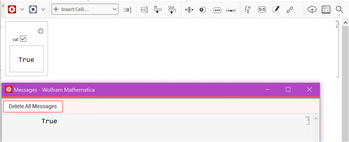
Evaluations producing side effects such as messages sometimes print to the messages notebook:
Text
Wolfram Research (2007), Manipulate, Wolfram Language function, https://reference.wolfram.com/language/ref/Manipulate.html (updated 2024).
CMS
Wolfram Language. 2007. "Manipulate." Wolfram Language & System Documentation Center. Wolfram Research. Last Modified 2024. https://reference.wolfram.com/language/ref/Manipulate.html.
APA
Wolfram Language. (2007). Manipulate. Wolfram Language & System Documentation Center. Retrieved from https://reference.wolfram.com/language/ref/Manipulate.html

