DateListLogPlot[{{date1,y1},{date2,y2},…}]
一連の日付における値 yiで対数プロットを作成する.
DateListLogPlot[{y1,y2,…},datespec]
datespec で指定された等間隔の日付で対数プロットを作成する.
DateListLogPlot[tseries]
時系列 tseries をプロットする.
DateListLogPlot[{data1,data2,…}]
すべての dataiからデータをプロットする.
DateListLogPlot[{…,w[datai],…}]
記号的ラッパー w で定義された特徴で dataiをプロットする.
DateListLogPlot
DateListLogPlot[{{date1,y1},{date2,y2},…}]
一連の日付における値 yiで対数プロットを作成する.
DateListLogPlot[{y1,y2,…},datespec]
datespec で指定された等間隔の日付で対数プロットを作成する.
DateListLogPlot[tseries]
時系列 tseries をプロットする.
DateListLogPlot[{data1,data2,…}]
すべての dataiからデータをプロットする.
DateListLogPlot[{…,w[datai],…}]
記号的ラッパー w で定義された特徴で dataiをプロットする.
詳細とオプション
- DateListLogPlotは片対数時系列プロットあるいは時系列プロットとしても知られている.
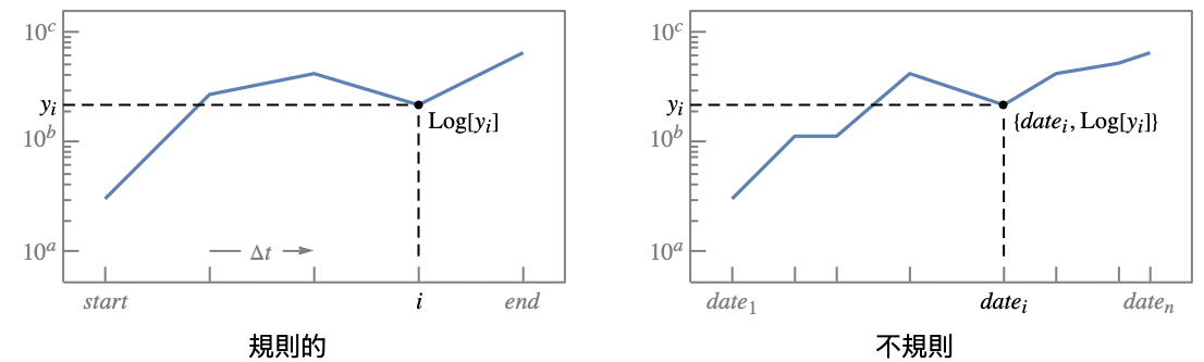
- DateListLogPlotは,事実上,Log[yi]に基づいて点をプロットするが,目盛はスケールされていない値 yiを示し,指数関数的な成長が直線に見えるようにする.
- 規則的なデータ{y1,…,yn}は点{datei,yi}を通る関数曲線としてプロットされる.dateiは datespec の始まりの日から終りの日までの間に均等に置かれる.
- 不規則データ{{date1,y1},…,{daten,yn}}は点{datei,yi}を順に通る順序曲線としてプロットされる.
- dateiが取り得る形式には次のようなものがある.
-
DateObject[…],TimeObject[…] 日付オブジェクトあるいは時のオブジェクト "string" DateString指定 {y,m,d,h,m,s} DateList指定 {y},{y,m},{y,m,d},… 短縮された日付のリスト t 1つの数字として与えられる絶対的な時間 - 短縮された日付リストでは,省略された要素はデフォルト値{y,1,1,0,0,0}を取るものとされる.
- datespec が取り得る形式には次のようなものがある.
-
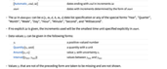
{start,end} start から end までの日付を等しい増分で {start,Automatic,Δt} start から始まる日付を増分Δt で {Automatic,end,Δt} end で終る日付を増分Δt で start 日付を start 形式で決定された増分で - datespec におけるΔt は,{y,m,d,h,m,s}の日付リストの指定でもよく,特殊形"Year","Quarter","Month","Week","Day","Hour","Minute","Second","Millisecond"のいずれかでもよい.
- 明示的なΔt が与えられていなければ,使用される増分は start で明示的に指定される最小の時間単位となる.
- データ値 yiは次の形式で与えることができる.
-
yi 実数値の数 Quantity[yi,unit] 単位の付いた数量 Around[yi,ei] 不確かさが eiの値 yi Interval[{ymin,ymax}] yminから ymaxまでの値 - 上記の形ではない値 yiは欠落しているとみなされ,表示されない.
- dataiには次の形式と解釈が使える.
-
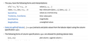
<|"k1"y1,"k2"y2,…|> 値{y1,y2,…} <|date1y1,date2y2,…|> キーと値のペア{{date1,y1},{date2,y2},…} SparseArray 通常の配列としての値 TimeSeries, EventSeries 時と値のペア QuantityArray 大きさ WeightedData 重みなしの値 - DateListLogPlot[Tabular[…]cspec]は,列指定 cspec を使って表形式オブジェクトから値を抽出し,これをプロットする.
- 次は,表形式データのプロットに使用可能な列指定 cspec の形式である.
-
{colx,coly} 列 y と列 x {{colx1,coly1},{colx2,coly2},…} 列 y1と列 x1,列 y2と列 x2等 coly, {coly} 列 y を一連の値としてプロットする {{coly1},…,{colyi},…} 列 y1, y2, …を一連の値としてプロットする - colx はAutomaticでもよい.この場合は,DataRangeを使って一連の値が生成される.
- DateListLogPlot[TimeSeries[…]cspec]およびDateListLogPlot[EventSeries[…]cspec]は,成分指定 cspec を用いて時系列または事象系列から値を抽出し,プロットする.
- 系列データの指定には,以下の成分指定形式 cspec が使用できる.
-
com タイムスタンプと成分 com をプロットする {com1,com2,…} タイムスタンプと各成分 comiをプロットする - dataiには次のラッパー w を使うことができる.
-
Annotation[datai,label] データの注釈を与える Button[datai,action] 点がクリックされた際に実行する動作を定義する EventHandler[datai,…] 点の一般的なイベントハンドラを定義する Highlighted[datai,effect] 効果を使って fiを動的にハイライトする Highlighted[datai,Placed[effect,pos]] 位置 pos で効果を使って fiを静的にハイライトする Hyperlink[datai,uri] 点をハイパーリンクにする Labeled[datai,label] データにラベルを付ける Legended[datai,label] 凡例でデータを識別する PopupWindow[datai,cont] 点にポップアップウィンドウを付ける StatusArea[datai,label] マウスオーバーの際にステータスエリアに表示する Style[datai,styles] 点を指定されたスタイルで示す Tooltip[datai,label] 点にツールチップを付ける Tooltip[datai] データ値を点のツールチップとして使う - ラッパー w は複数のレベルで適用することができる.
-
{…,w[yi],…} リスト中の値 yiを囲む {…,w[{datei,yi}],…} 点{datei,yi}を囲む w[datai] データ dataiを囲む w[{data1,…}] データ集合を囲む w1[w2[…]] ネストしたラッパーを使う - DateListLogPlotでは,LabeledとPlacedは次の位置を使うことができる.
-
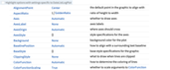
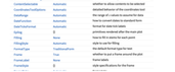
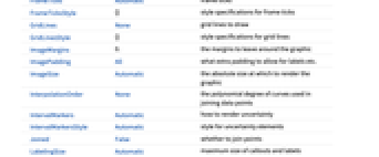
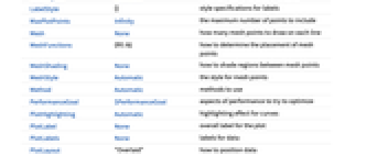
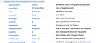
Automatic ラベルを自動的に置く Above, Below, Before, After データ周囲の位置 date dateのデータ近く Scaled[s] データに沿った,スケールされた位置 s {s,Above},{s,Below},… データに沿った,位置 s と相対的な位置 {pos,epos} データと相対的な位置 pos に置かれたラベル内の epos - DateListLogPlotには,Graphicsと同じオプションに次の追加・変更を加えたものをオプションとして使うことができる. [全オプションのリスト]
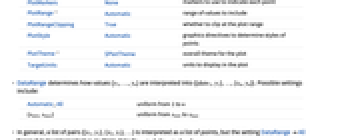
- DataRangeは,値{y1,…,yn}をどのように解釈して{{date1,y1},…,{xn,yn}}とするかを決定する.次は可能な設定である.
-
Automatic,All 1 から n に一様に {xmin,xmax} xminから xmaxに一様に - 一般に,ペアのリスト{{x1,y1},{x2,y2},…}は点のリストと解釈されるが,DataRangeAllとすると複数データ{{y11,y12},{y21,y23},…}としての解釈が強制される.
- デフォルト設定のJoinedAutomaticは,ほとんどの形式のデータを結合された曲線として描画するが,EventSeriesからのデータは離散点として表示する.
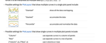
- 次は,単一のパネル内に複数の曲線を表示する際のPlotLayoutの可能な設定である.
-

"Overlaid" すべてのデータを重ねて表示する 

"Stacked" データを積み重ねる 

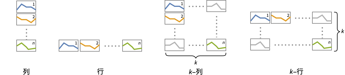
"Percentile" データを積み重ねて正規化する - 次は,複数のプロットパネルで単一の曲線を示すPlotLayoutの可能な設定である.
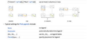
-
"Column" パネルの列で別々の曲線を使う "Row" パネルの行で別々の曲線を使う {"Column",k},{"Row",k} k 列(または行)使う {"Column",UpTo[k]},{"Row",UpTo[k]} 最大で k 列(または行)使う - PlotLegendsのよく使われる設定
-
None 凡例は使わない Automatic 凡例を自動的に決定する {lbl1,lbl2,…} lbl1, lbl2, …を凡例ラベルとして使う Placed[lspec,…] 凡例の置き方を指定する - PlotStylesty は,各曲線に用いるスタイルを指定する.可能な設定には以下がある.
-
{sty1,sty2,…} データ集合に対するスタイルの列 <|"key"val,…|> データの異なるレベルに対するスタイル要素 - 受け付けられるキーは次の通りである.
-
"Base" すべての dataiに対する全体的なスタイル "Lists" dataiごとのスタイル styiのリスト - ColorData["DefaultPlotColors"]は,PlotStyleで使われるデフォルトの色のシーケンスを与える.
- Prolog,Epilog,Ticks等における明示的な
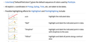
座標はすべて日付と解釈される. - 次は,HighlightedとPlotHighlightingに使用可能なハイライト効果である.
-

style 指定されたデータをハイライトする 

"Ball" データ上の指定された点をハイライトしてラベルを付ける 

"Dropline" データ上の指定された点を軸までのドロップラインでハイライトしてラベルを付ける 

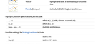
"XSlice" 垂直スライスに沿ったすべての点をハイライトしてラベルを付ける 

"YSlice" 水平スライスに沿ったすべての点をハイライトしてラベルを付ける 

Placed[effect,pos] 指定の位置 pos を静的にハイライトする - ハイライトの位置指定 pos には次がある.
-
x, {x} {x,y}における効果.y は自動的に選択される {x,y} {x,y}における効果 {pos1,pos2,…} 複数の位置 posi - 次は,ScalingFunctionsの可能な設定である.
-
sy y 軸をスケールする {sx,sy} x 軸と y 軸をスケールする - 次は,よく使われる組込みのスケーリング関数 s である.
-
"Reverse" 

座標の向きを逆にする "Infinite" 

無限スケール - y 軸についてのスケールはデフォルトの対数スケールの後で適用される.
全オプションのリスト
例題
すべて開く すべて閉じる例 (7)
DateListLogPlot[{{DateObject[{2016, 10, 1}, "Day", "Gregorian", -5.], 10}, {DateObject[{2016, 10, 15}, "Day", "Gregorian", -5.], 647}, {DateObject[{2016, 10, 30}, "Day", "Gregorian", -5.], 1532}, {DateObject[{2016, 11, 20}, "Day", "Gregorian", -5.], 205}}]DateListLogPlot[Range[50, 1000, 50], {2007, 1, 1}]data1 = {{{2000}, 1}, {{2002}, 10}, {{2005}, 100}, {{2008}, 1000}};
data2 = {{{2001}, 200}, {{2003}, 500}, {{2006}, 300}, {{2008}, 10}};DateListLogPlot[{data1, data2}, Joined -> True]DateListLogPlot[{Prime[Range[10]], Exp[Range[10]]}, {1981, 4, 21}, PlotLegends -> {"data1", "data2"}]DateListLogPlot[{Prime[Range[10]], Exp[Range[10]]}, {1981, 4, 21}, Joined -> True, PlotLabels -> {"first", "second"}]DateListLogPlot[TimeSeries[TimeEventSeries`TimestampData[Association["UniformlySpacedQ" -> True, "Count" -> 10,
"Endpoints" -> TabularColumn[Association[
"Data" -> {2, {{NumericArray[{15706, -2147483648}, "Integer32"], {},
DataStructure["BitVe ... 7, 34, 40, 49, 54, 64, 72}, {}, None},
"ElementType" -> "Integer64"]], TabularColumn[Association[
"Data" -> {{1, 9, 11, 16, 18, 25, 34, 43, 49, 54}, {}, None},
"ElementType" -> "Integer64"]]}}]]]], Association[]] -> "a", PlotLabels -> Automatic]DateListLogPlot[FinancialData["^GSPC", {DateObject[{2000}, "Year"], DateObject[{2003}, "Year"]}]]スコープ (44)
データ (11)
TimeSeriesをプロットする:
ts = TemporalData[TimeSeries, {{{67.7, 69.61, 69.45, 71.3, 72.95, 73.7, 73.41, 72.82, 73.59, 73.93,
72.88, 72.24, 72.47, 71.49, 71.49, 69.51, 70.73, 71.13, 69.92, 69.43, 70.61, 70.25, 71.62, 72.,
72.48, 73.93, 74.52, 73.34, 73.18, 73.09, 73.5, ... 05600, 3631392000, 3631478400, 3631564800, 3631824000,
3631910400, 3631996800, 3632083200}}}, 1, {"Continuous", 1}, {"Discrete", 1}, 1,
{ValueDimensions -> 1, ResamplingMethod -> {"Interpolation", InterpolationOrder -> 1}}}, True,
10.1];DateListLogPlot[ts]TimeSeriesまたはEventSeriesのすべてのデータをプロットする:
DateListLogPlot[TimeSeries[TimeEventSeries`TimestampData[Association["UniformlySpacedQ" -> False,
"Timestamps" -> TabularColumn[Association[
"Data" -> {7, {{NumericArray[{-248, 118, 298, 638, 865, 1006, 1216}, "Integer32"], {},
None}}, None}, ... "Data" -> {{32, 62, 112, 167, 179, 209, 214}, {}, None}, "ElementType" -> "Integer64"]],
TabularColumn[Association["Data" -> {{30, 49, 81, 125, 142, 174, 177}, {}, None},
"ElementType" -> "Integer64"]]}}]]]], Association[]]]TimeSeriesまたはEventSeriesの特定の成分をプロットする:
trees = TimeSeries[TimeEventSeries`TimestampData[Association["UniformlySpacedQ" -> False,
"Timestamps" -> TabularColumn[Association[
"Data" -> {7, {{NumericArray[{-248, 118, 298, 638, 865, 1006, 1216}, "Integer32"], {},
None}}, None}, ... "Data" -> {{32, 62, 112, 167, 179, 209, 214}, {}, None}, "ElementType" -> "Integer64"]],
TabularColumn[Association["Data" -> {{30, 49, 81, 125, 142, 174, 177}, {}, None},
"ElementType" -> "Integer64"]]}}]]]], Association[]];DateListLogPlot[trees -> "tree 1"]DateListLogPlot[trees -> {"tree 1", "tree 2"}]AbsoluteTime指定:
data = {{3155673600, 1}, {3218832000, 10}, {3313526400, 100}, {3408134400, 1000}};DateListLogPlot[data]DateString指定として与えられた日付:
data = {{"July 2005", 50}, {"August 2006", 120}, {"September 2007", 500}, {"March 2008", 1200}};DateListLogPlot[data]省略されたDateList指定として与えられた日付:
data = {{{2005, 7}, 50}, {{2006, 8}, 120}, {{2007, 9}, 500}, {{2008, 3}, 1200}};DateListLogPlot[data]DateListLogPlot[Range[10, 1000, 10], "August 15, 2006"]DateListLogPlot[Range[10, 1000, 10], {2006, 8, 15, 12, 15}]DateListLogPlot[Exp[Range[15]], {{2008, 5, 1}, {2008, 5, 30}}]2006年1月1日から始めて90日ごとに集められたデータをプロットする:
DateListLogPlot[Range[10], {{2006, 1, 1}, Automatic, {0, 0, 90}}]DateListLogPlot[Range[10], {{2008, 1, 15}, Automatic, "Month"}]DateListLogPlot[Sqrt[Range[50] / 5], {Automatic, "September 2010", "Month"}]ScalingFunctionsを使ってプロット中のデータをスケールする:
DateListLogPlot[FinancialData["AAPL", {2005}], ScalingFunctions -> "Reverse"]特殊データ (5)
Quantityを使ってデータに単位を加える:
DateListLogPlot[Quantity[Exp[Range[10]], "Meters"], {2010, 1, 1}, FrameLabel -> Automatic]QuantityArray中のデータをプロットする:
qa = QuantityArray[2 ^ RandomReal[{0, 5}, 20], "Fahrenheit"]DateListLogPlot[qa, {2000, 1, 1}, FrameLabel -> Automatic]TargetUnitsを使って単位を指定する:
DateListLogPlot[qa, {2000, 1, 1}, TargetUnits -> "Kelvin", FrameLabel -> Automatic]Association中の数値は
座標として使われる:
DateListLogPlot[<|"a" -> 4, "b" -> 27, "c" -> 5, "d" -> 128, "e" -> 81, "f" -> 32|>, "Jan, 1, 2010"]Association中の数値によるキーと値は
座標と
座標として使われる:
DateListLogPlot[<|2 -> 1, 3 -> 16, 5 -> 8, 7 -> 81, 11 -> 32, 13 -> 729|>]TimeSeriesを直接プロットする:
data = CountryData["UnitedStates", {{"Population"}, {1988, 2013}}]DateListLogPlot[data, FrameLabel -> Automatic]DateListLogPlot[Table[Around[Exp[n], RandomReal[Exp[n], 2]], {n, 10}], {2010, 1, 1}]DateListLogPlot[Table[Interval[RandomReal[Exp[n], 2]], {n, 10}], {2010, 1, 1}]DateListLogPlot[Table[Interval[RandomReal[Exp[n], 2]], {n, 10}], {2010, 1, 1}, IntervalMarkers -> "Bands"]表形式データ (1)
tab = Tabular[IconizedObject[«Country populations»]]フランスの1940年から2020年までの人口を対数スケールでプロットする:
DateListLogPlot[tab -> {"Date", "France"}]DateListLogPlot[tab -> {{"Date", "France"}, {"Date", "Germany"}, {"Date", "Australia"}}]DateListLogPlot[tab -> {{"Date", "France"}, {"Date", "Germany"}, {"Date", "Australia"}}, PlotLegends -> {"France", "Germany", "Australia"}]ラッパー (8)
個々のデータ,データ集合,データ集合の集合にラッパーを使う:
{DateListLogPlot[{Style[{2, 2, 4, 8, 32, 256}, Green], {4, 8, 32, 128, 874}}, {2014, 8}], DateListLogPlot[Style[{{2, 2, 4, 8, 32, 256}, {4, 8, 32, 128, 874}}, Blue], {2014, 8}]}DateListLogPlot[Style[{Style[{1, 1, 2, 3, 5, 8}, Green], {2, 3, 5, 7, 11}}, Blue], {2014, 8}]DateListLogPlot[Tooltip[Prime[Range[10]]], {2014, 8}, Mesh -> Full]DateListLogPlot[Tooltip[Prime[Range[10]], "primes"], {2014, 8}, Mesh -> Full]PopupWindowを使って追加的なドリルダウン情報を加える:
DateListLogPlot[{1, PopupWindow[8, DateListPlot[FinancialData["IBM", "Jan. 1, 2004"]]], 20}, {2004, 1}, Mesh -> Full, PlotStyle -> PointSize[0.05]]Buttonを使ってアクションを誘発することができる:
DateListLogPlot[{1, Button[20, Speak[2]], 163}, {2014, 8}, Mesh -> Full, PlotStyle -> PointSize[0.05]]マウスがプロット内に来たときに,動的アクションにAnnotationを使う:
data = TemporalData[TimeSeries, {{{7, 12, 15, 20}}, {{{3368649600, 3369859200, 3371155200, 3372969600}}},
1, {"Continuous", 1}, {"Discrete", 1}, 1, {ValueDimensions -> 1, DateFunction -> Automatic,
ResamplingMethod -> {"Interpolation", InterpolationOrder -> 1}}}, True, 10.2];{DateListLogPlot[Annotation[data, "label", "Mouse"]], Dynamic[MouseAnnotation[]]}Hyperlinkを使ってクリックされたときに指定されたリンクにジャンプする:
data = TemporalData[TimeSeries, {{{7, 12, 15, 20}}, {{{3368649600, 3369859200, 3371155200, 3372969600}}},
1, {"Continuous", 1}, {"Discrete", 1}, 1, {ValueDimensions -> 1, DateFunction -> Automatic,
ResamplingMethod -> {"Interpolation", InterpolationOrder -> 1}}}, True, 10.2];DateListLogPlot[Hyperlink[data, "http://www.wolfram.com"]]StatusAreaを使って現行ノートブックのステータスエリアに文字列を表示する:
data = TemporalData[TimeSeries, {{{7, 12, 15, 20}}, {{{3368649600, 3369859200, 3371155200, 3372969600}}},
1, {"Continuous", 1}, {"Discrete", 1}, 1, {ValueDimensions -> 1, DateFunction -> Automatic,
ResamplingMethod -> {"Interpolation", InterpolationOrder -> 1}}}, True, 10.2];DateListLogPlot[StatusArea[data, "String"]]ラベルと凡例 (12)
DateListLogPlot[Table[Labeled[2 ^ RandomInteger[{1, 6}], i], {i, 15}], {2010, 1, 1}, PlotMarkers -> Automatic]Table[DateListLogPlot[Table[Labeled[10 ^ RandomReal[], i, p], {i, 6}], {2010, 1, 1}, PlotMarkers -> Automatic, PlotLabel -> p], {p, {Above, Below, Before, After}}]Labeledでデータにラベルを付ける:
data1 = Accumulate@RandomInteger[10, 10];data2 = Accumulate@RandomInteger[3, 10];DateListLogPlot[{Labeled[data1, "label1"], Labeled[data2, "label2"]}, {2010, 1, 1}]PlotLabelsでデータにラベルを付ける:
data1 = Accumulate@RandomInteger[10, 10];data2 = Accumulate@RandomInteger[3, 10];DateListLogPlot[{data1, data2}, {2000}, PlotLabels -> {"label1", "label2"}]DateListLogPlot[Labeled[Accumulate@RandomInteger[10, 10], "label", {2004}], {2000}]DateListLogPlot[Labeled[Accumulate@RandomInteger[10, 10], "label", Scaled[0.3]], {2000}]DateListLogPlot[Labeled[Accumulate@RandomInteger[10, 10], "label", {Scaled[0.3], Below}], {2000}]data = Rule[TimeSeries[{1, 1, 2, 3, 5, 8, 11}, {"Jan 1, 2015"}], RandomWord[7]];DateListLogPlot[data, LabelingSize -> 30]DateListLogPlot[data, LabelingSize -> Full]密な点集合については,デフォルトで,ラベルの中にツールチップに変えられるものがあるかもしれない:
data = Rule[TimeSeries[RandomReal[1, 100], {"Jan 1, 2015"}], RandomWord[100]];DateListLogPlot[data, PlotMarkers -> Automatic]プロットサイズを大きくすると,より多くのラベルが表示される:
DateListLogPlot[data, ImageSize -> 400, PlotMarkers -> Automatic]percentChange[tick_] := Block[{stock}, stock = FinancialData[tick, {{2005, 1}, {2010, 12}}];
stock / stock["Values"][[1]]
]DateListLogPlot[{percentChange["AAPL"], percentChange["IBM"]}, PlotLegends -> {"APPL", "IBM"}]Legendedラッパーを使って凡例を加える:
percentChange[tick_] := Block[{stock}, stock = FinancialData[tick, {{2008, 1}, {2009, 12}}];
stock / stock["Values"][[1]]
]DateListLogPlot[{percentChange["AAPL"], Legended[percentChange["^GSPC"], "SP500"]}, PlotLabel -> "Apple stock change"]Placedを使って凡例の位置を変える:
DateListLogPlot[{percentChange["AAPL"], Legended[percentChange["^GSPC"], Placed["SP500", Bottom]]}, PlotLabel -> "Apple stock change"]プロットには,通常,マウスオーバー時に座標を表示するインタラクティブなコールアウトが含まれる:
DateListLogPlot[Range[10], {2007}]特定のラッパーやツールティップ等のインタラクションを含めると,インタラクティブな機能がオフになる:
DateListLogPlot[Callout[Range[10], "hello", "01/01/2012"], {2007}]{DateListLogPlot[Range[10], {2022}, PlotHighlighting -> "Dropline"], DateListLogPlot[Range[10], {2022}, PlotHighlighting -> "XSlice"]}Highlighted を使ってプロット中の特定の点を強調する:
DateListLogPlot[Highlighted[Range[10], Placed["Ball", DateObject[{2011, 1, 1}]]], {2007}]プレゼンテーション (7)
data = {TemporalData[TimeSeries, {{{0.9999999999999999, 1.0004619378384927, 0.9240915206432619,
0.9117224134808988, 0.8789262545874013, 0.9207554744090412, 0.9136727619541947,
0.8863169899093283, 0.917573420315935, 0.8675836588061994, 0.819338935 ... 3468009600, 3468096000, 3468268800, 3468528000,
3468614400}}}, 1, {"Continuous", 1}, {"Discrete", 1}, 1,
{ValueDimensions -> 1, DateFunction -> Automatic, ResamplingMethod ->
{"Interpolation", InterpolationOrder -> 1}}}, True, 10.4], TemporalData[TimeSeries, {{{1., 1.0020059056262276, 0.9659947873510472, 0.9556786739172456,
0.9321806616085635, 0.9390581231309778, 0.9544368681031753, 0.9329448402705406,
0.9831884411570828, 0.9726812408168122, 0.9707707997939994, 0.9657 ... 3468009600, 3468096000, 3468268800, 3468528000,
3468614400}}}, 1, {"Continuous", 1}, {"Discrete", 1}, 1,
{ValueDimensions -> 1, DateFunction -> Automatic, ResamplingMethod ->
{"Interpolation", InterpolationOrder -> 1}}}, True, 10.4]};DateListLogPlot[data]data = {TemporalData[TimeSeries, {{{0.9999999999999999, 1.0004619378384927, 0.9240915206432619,
0.9117224134808988, 0.8789262545874013, 0.9207554744090412, 0.9136727619541947,
0.8863169899093283, 0.917573420315935, 0.8675836588061994, 0.819338935 ... 3468009600, 3468096000, 3468268800, 3468528000,
3468614400}}}, 1, {"Continuous", 1}, {"Discrete", 1}, 1,
{ValueDimensions -> 1, DateFunction -> Automatic, ResamplingMethod ->
{"Interpolation", InterpolationOrder -> 1}}}, True, 10.4], TemporalData[TimeSeries, {{{1., 1.0020059056262276, 0.9659947873510472, 0.9556786739172456,
0.9321806616085635, 0.9390581231309778, 0.9544368681031753, 0.9329448402705406,
0.9831884411570828, 0.9726812408168122, 0.9707707997939994, 0.9657 ... 3468009600, 3468096000, 3468268800, 3468528000,
3468614400}}}, 1, {"Continuous", 1}, {"Discrete", 1}, 1,
{ValueDimensions -> 1, DateFunction -> Automatic, ResamplingMethod ->
{"Interpolation", InterpolationOrder -> 1}}}, True, 10.4]};DateListLogPlot[data, PlotStyle -> {Dashed, Red}]DateListLogPlot[{TemporalData[TimeSeries, {{{0.9999999999999999, 1.0004619378384927, 0.9240915206432619,
0.9117224134808988, 0.8789262545874013, 0.9207554744090412, 0.9136727619541947,
0.8863169899093283, 0.917573420315935, 0.8675836588061994, 0.819338935 ... 3468009600, 3468096000, 3468268800, 3468528000,
3468614400}}}, 1, {"Continuous", 1}, {"Discrete", 1}, 1,
{ValueDimensions -> 1, DateFunction -> Automatic, ResamplingMethod ->
{"Interpolation", InterpolationOrder -> 1}}}, True, 10.4], TemporalData[TimeSeries, {{{1., 1.0020059056262276, 0.9659947873510472, 0.9556786739172456,
0.9321806616085635, 0.9390581231309778, 0.9544368681031753, 0.9329448402705406,
0.9831884411570828, 0.9726812408168122, 0.9707707997939994, 0.9657 ... 3468009600, 3468096000, 3468268800, 3468528000,
3468614400}}}, 1, {"Continuous", 1}, {"Discrete", 1}, 1,
{ValueDimensions -> 1, DateFunction -> Automatic, ResamplingMethod ->
{"Interpolation", InterpolationOrder -> 1}}}, True, 10.4]}, PlotLegends -> {"label1", "label2"}]Legendedを使って特定のデータ集合に凡例を与える:
data = TimeSeries@FinancialData["AAPL", {{2010, 1, 1}, {2011, 1, 1}}];
avg = MovingAverage[data, 30];DateListLogPlot[{data, Legended[avg, "moving average"]}, {{2013, 1, 1}, Automatic, "Day"}, Joined -> True]data = {TemporalData[TimeSeries, {{{0.9999999999999999, 1.0004619378384927, 0.9240915206432619,
0.9117224134808988, 0.8789262545874013, 0.9207554744090412, 0.9136727619541947,
0.8863169899093283, 0.917573420315935, 0.8675836588061994, 0.819338935 ... 3468009600, 3468096000, 3468268800, 3468528000,
3468614400}}}, 1, {"Continuous", 1}, {"Discrete", 1}, 1,
{ValueDimensions -> 1, DateFunction -> Automatic, ResamplingMethod ->
{"Interpolation", InterpolationOrder -> 1}}}, True, 10.4], TemporalData[TimeSeries, {{{1., 1.0020059056262276, 0.9659947873510472, 0.9556786739172456,
0.9321806616085635, 0.9390581231309778, 0.9544368681031753, 0.9329448402705406,
0.9831884411570828, 0.9726812408168122, 0.9707707997939994, 0.9657 ... 3468009600, 3468096000, 3468268800, 3468528000,
3468614400}}}, 1, {"Continuous", 1}, {"Discrete", 1}, 1,
{ValueDimensions -> 1, DateFunction -> Automatic, ResamplingMethod ->
{"Interpolation", InterpolationOrder -> 1}}}, True, 10.4]};DateListLogPlot[data, PlotTheme -> "Detailed"]DateListLogPlot[data, PlotTheme -> "Marketing"]data = {TemporalData[TimeSeries, {{{0.9999999999999999, 1.0004619378384927, 0.9240915206432619,
0.9117224134808988, 0.8789262545874013, 0.9207554744090412, 0.9136727619541947,
0.8863169899093283, 0.917573420315935, 0.8675836588061994, 0.819338935 ... 3410467200, 3410553600, 3410640000, 3410726400,
3410812800}}}, 1, {"Continuous", 1}, {"Discrete", 1}, 1,
{ValueDimensions -> 1, DateFunction -> Automatic, ResamplingMethod ->
{"Interpolation", InterpolationOrder -> 1}}}, True, 10.4], TemporalData[TimeSeries, {{{1., 1.0020059056262276, 0.9659947873510472, 0.9556786739172456,
0.9321806616085635, 0.9390581231309778, 0.9544368681031753, 0.9329448402705406,
0.9831884411570828, 0.9726812408168122, 0.9707707997939994, 0.9657 ... 3410467200, 3410553600, 3410640000, 3410726400,
3410812800}}}, 1, {"Continuous", 1}, {"Discrete", 1}, 1,
{ValueDimensions -> 1, DateFunction -> Automatic, ResamplingMethod ->
{"Interpolation", InterpolationOrder -> 1}}}, True, 10.4]};DateListLogPlot[data, Filling -> Axis]DateListLogPlot[data, Filling -> {1 -> {2}}]data1 = {{DateObject[{2016, 10, 1}, "Day", "Gregorian", -5.], 10}, {DateObject[{2016, 10, 15}, "Day", "Gregorian", -5.], 17}, {DateObject[{2016, 10, 30}, "Day", "Gregorian", -5.], 15}, {DateObject[{2016, 11, 20}, "Day", "Gregorian", -5.], 20}};data2 = {{DateObject[{2016, 10, 1}, "Day", "Gregorian", -5.], 15}, {DateObject[{2016, 10, 15}, "Day", "Gregorian", -5.], 7}, {DateObject[{2016, 10, 30}, "Day", "Gregorian", -5.], 12}, {DateObject[{2016, 11, 20}, "Day", "Gregorian", -5.], 10}};DateListLogPlot[{data1, data2}, PlotLayout -> "Stacked"]オプション (122)
AspectRatio (3)
デフォルトで,AspectRatioはプロットに固定の縦横比を使う:
DateListLogPlot[FinancialData["TWLO", {{2018, 1, 1}, {2021, 6, 1}}]]AspectRatio1を使って縦と横を等しくする:
DateListLogPlot[FinancialData["TWLO", {{2018, 1, 1}, {2021, 6, 1}}], AspectRatio -> 1]AspectRatioFullは,別の構造物の中にぴったり収まるように高さと幅を調整する:
plot = DateListLogPlot[FinancialData["TWLO", {{2018, 1, 1}, {2021, 6, 1}}], AspectRatio -> Full];{Framed[Pane[plot, {50, 100}]], Framed[Pane[plot, {100, 100}]], Framed[Pane[plot, {100, 50}]]}Axes (1)
デフォルトで,DateListLogPlotは軸ではなく枠を使う:
data = FinancialData["TWLO", {{2018, 1, 1}, {2021, 6, 1}}];DateListLogPlot[data]DateListLogPlot[data, Frame -> False, Axes -> True]AxesOriginを使って軸の交点を指定する:
DateListLogPlot[data, Frame -> False, Axes -> True, AxesOrigin -> {DateObject[{2020, 3, 15}], 0}]{DateListLogPlot[data, Joined -> True, Filling -> Bottom, Frame -> False, Axes -> {True, False}], DateListLogPlot[data, Joined -> True, Filling -> Bottom, Frame -> False, Axes -> {False, True}]}AxesLabel (4)
DateListLogPlot[FinancialData["TWLO", {{2018, 1, 1}, {2021, 6, 1}}], Frame -> False, Axes -> True]DateListLogPlot[FinancialData["TWLO", {{2018, 1, 1}, {2021, 6, 1}}], Frame -> False, Axes -> True, AxesLabel -> "Price"]DateListLogPlot[FinancialData["TWLO", {{2018, 1, 1}, {2021, 6, 1}}], Frame -> False, Axes -> True, AxesLabel -> {"Year", "Price"}]DateListLogPlot[FinancialData["TWLO", {{2018, 1, 1}, {2021, 6, 1}}], Frame -> False, Axes -> True, AxesLabel -> Automatic]AxesOrigin (2)
AxesStyle (1)
data = FinancialData["TWLO", {{2018, 1, 1}, {2021, 6, 1}}];DateListLogPlot[data, Frame -> False, Axes -> True, AxesStyle -> Red]DateListLogPlot[data, Frame -> False, Axes -> True, AxesStyle -> {{Thick, Red}, {Thick, Blue}}]DateListLogPlot[data, Frame -> False, Axes -> True, AxesStyle -> Green, TicksStyle -> StandardGray]DateListLogPlot[data, Frame -> False, Axes -> True, AxesStyle -> Green, LabelStyle -> StandardGray]DateFunction (2)
{month,day}のリストの先頭に年を追加して日付を作る:
data = {{{10, 1}, 8}, {{10, 10}, 100}, {{10, 20}, 120}, {{10, 24}, 400}, {{11, 5}, 250}, {{11, 15}, 500}};DateListLogPlot[data, DateFunction :> (Join[{2008}, #]&)]data = {{"06/01/06", 8}, {"07/01/06", 100}, {"08/01/06", 120}, {"09/01/06", 400}, {"10/01/06", 250}, {"11/01/06", 500}};DateListLogPlot[data, DateFunction :> (DateList[{#, {"Month", "Day", "YearShort"}}]&)]DateListLogPlot[data, DateFunction :> (DateList[{#, {"Day", "Month", "YearShort"}}]&)]DateListLogPlot[data, DateFunction :> (DateList[{#, {"YearShort", "Month", "Day"}}]&)]DateTicksFormat (1)
日付目盛の形式をDateString要素として指定する:
data = {{{2008, 1, 3}, 80}, {{2008, 1, 10}, 100}, {{2008, 1, 20}, 120}, {{2008, 2, 4}, 400}, {{2008, 2, 15}, 250}, {{2008, 2, 26}, 700}};DateListLogPlot[data, DateTicksFormat -> {"MonthShort", "/", "Day"}]Filling (1)
Frame (3)
DateListLogPlotは,デフォルトで,枠を使う:
DateListLogPlot[Range[10], {2007}]DateListLogPlot[Range[10], {2007}, Frame -> False]DateListLogPlot[Range[10], {2007}, Frame -> {{True, True}, {False, False}}]DateListLogPlot[Range[10], {2007}, Frame -> {{True, False}, {True, False}}]FrameLabel (4)
DateListLogPlot[Range[10], {2007}, FrameLabel -> {"label"}]DateListLogPlot[Range[10], {2007}, FrameLabel -> {"Bottom", "Left"}]DateListLogPlot[Range[10], {2007}, FrameLabel -> {{"left", "right"}, {"bottom", "top"}}]DateListLogPlot[Range[10], {2007}, FrameLabel -> {{"left", "right"}, {"bottom", "top"}}, LabelStyle -> Directive[Bold, StandardPurple]]FrameStyle (2)
DateListLogPlot[Range[10], {2007}, FrameStyle -> Directive[StandardGray, Thick]]DateListLogPlot[Range[10], {2007}, FrameStyle -> {{Directive[StandardGreen, Thick], Directive[Red, Thick]}, {Directive[Gray, Thick], Directive[Blue, Thick]}}]FrameTicks (10)
DateListLogPlot[Range[10], {2007}]DateListLogPlot[Range[10], {2007}, FrameTicks -> None]DateListLogPlot[Sqrt[Range[10]], {2008, 1}, FrameTicks -> {{Automatic, Automatic}, {{"April 2008", "June 2008"}, Automatic}}]DateListLogPlot[Sqrt[Range[10]], {2008, 1}, FrameTicks -> {{Automatic, Automatic}, {{3415996800, 3421267200}, Automatic}}]DateListLogPlot[Range[10], {2007}, FrameTicks -> {{None, None}, {Automatic, None}}]デフォルトで,上と右の辺には目盛が置かれるが目盛ラベルは置かれない:
DateListLogPlot[Range[10], {2007}, FrameTicks -> Automatic]Allを使ってすべての辺に目盛ラベルを置く:
DateListLogPlot[Range[10], {2007}, FrameTicks -> All]DateListLogPlot[Range[10], {2007}, FrameTicks -> {{{2, .5, 10}, None}, {{"July 1, 2011", "July 1, 2014"}, None}}]DateListLogPlot[Range[10], {2007}, FrameTicks -> {{{{2, "two"}, {5, "five"}, {10, "ten"}}, None}, {{{"July 1, 2011", "date 1"}, {"July 1, 2014", "date 2"}}, None}}]DateListLogPlot[Range[10], {2007}, FrameTicks -> {{{{2, "two", .15}, {5, "five", .45}, {10, "ten", .95}}, None}, {Automatic, None}}]DateListLogPlot[Range[10], {2007}, FrameTicks -> {{{{2, "two", {.15, .1}}, {5, "five", {.45, .2}}, {10, "ten", {.95, .3}}}, None}, {Automatic, None}}]DateListLogPlot[Range[10], {2007}, FrameTicks -> {{{{2, "two", .15, Directive[Blue, Thick]}, {5, "five", .45, Directive[Red, Thick, Dashed]}, {10, "ten", .95, Directive[Green, Thick, Dashed]}}, None}, {Automatic, None}}]minMeanMax[min_, max_] := {{min, min}, {(max + min) / 2, (max + min) / 2}, {max, max}}DateListLogPlot[Range[10], {2007}, FrameTicks -> {{minMeanMax, None}, {Automatic, None}}, PlotRangePadding -> None]FrameTicksStyle (3)
デフォルトで,枠目盛と枠目盛ラベルには枠と同じスタイルが使われる:
DateListLogPlot[Range[10], {2007}, FrameStyle -> Directive[Red]]DateListLogPlot[Range[10], {2007}, FrameStyle -> Directive[Red], FrameTicksStyle -> Directive[Blue, Thick]]DateListLogPlot[Range[10], {2007}, FrameTicks -> All, FrameTicksStyle -> {{Directive[Orange, Thick], Blue}, {Red, Green}}]GridLines (1)
DateListLogPlot[Sqrt[Range[10]], {2008, 1}, GridLines -> {{{2008, 4}, "June 15, 2008"}, None}]最初の格子線をBlueにする:
DateListLogPlot[Sqrt[Range[10]], {2008, 1}, GridLines -> {{{{2008, 4}, Blue}, "June 15, 2008"}, None}]ImageSize (7)
Tiny,Small,Medium,Large等の名前付きのサイズを使う:
{DateListLogPlot[Range[50, 1000, 50], {2007, 1, 1}, ImageSize -> Tiny], DateListLogPlot[Range[50, 1000, 50], {2007, 1, 1}, ImageSize -> Small]}{DateListLogPlot[Range[50, 1000, 50], {2007, 1, 1}, ImageSize -> 150], DateListLogPlot[Range[50, 1000, 50], {2007, 1, 1}, AspectRatio -> 1.5, ImageSize -> 150]}{DateListLogPlot[Range[50, 1000, 50], {2007, 1, 1}, ImageSize -> {Automatic, 150}], DateListLogPlot[Range[50, 1000, 50], {2007, 1, 1}, AspectRatio -> 2, ImageSize -> {Automatic, 150}]}{DateListLogPlot[Range[50, 1000, 50], {2007, 1, 1}, ImageSize -> UpTo[200]], DateListLogPlot[Range[50, 1000, 50], {2007, 1, 1}, AspectRatio -> 2, ImageSize -> UpTo[200]]}グラフィックスの幅と高さを指定して,必要であればスペースを充填する:
DateListLogPlot[Range[50, 1000, 50], {2007, 1, 1}, ImageSize -> {200, 200}, Background -> StandardGray]AspectRatioFullとすると使用可能なスペースが塗り潰される:
DateListLogPlot[Range[50, 1000, 50], {2007, 1, 1}, AspectRatio -> Full, ImageSize -> {200, 200}, Background -> StandardGray]{DateListLogPlot[Range[50, 1000, 50], {2007, 1, 1}, ImageSize -> {UpTo[150], UpTo[100]}], DateListLogPlot[Range[50, 1000, 50], {2007, 1, 1}, AspectRatio -> 2, ImageSize -> {UpTo[150], UpTo[100]}]}ImageSizeFullを使ってオブジェクト内の使用可能なスペースを塗り潰す:
Framed[Pane[DateListLogPlot[Range[50, 1000, 50], {2007, 1, 1}, ImageSize -> Full, Background -> StandardGray], {200, 100}]]Framed[Pane[DateListLogPlot[Range[50, 1000, 50], {2007, 1, 1}, ImageSize -> {Scaled[0.5], Scaled[0.5]}, Background -> StandardGray], {200, 100}]]IntervalMarkers (3)
DateListLogPlot[Table[Around[RandomReal[{1, 100}], 5], 10], Today]DateListLogPlot[Table[Around[RandomReal[{1, 100}], 5], 10], Today, IntervalMarkers -> "Bars"]DateListLogPlot[Table[Around[RandomReal[{1, 100}], 5], 10], Today, IntervalMarkers -> "Bands"]IntervalMarkersStyle (2)
Joined (4)
DateListLogPlot[Range[100], {2008, 1}, Joined -> True]data1 = {{{2000}, 1}, {{2002}, 10}, {{2005}, 100}, {{2008}, 1000}};data2 = {{{2001}, 200}, {{2003}, 500}, {{2006}, 300}, {{2008}, 10}};DateListLogPlot[{data1, data2}, Joined -> True]DateListLogPlot[{data1, data2}, Joined -> {True, False}]TimeSeriesは連続した線として表示される:
DateListLogPlot[TimeSeries[TimeEventSeries`TimestampData[Association["UniformlySpacedQ" -> False,
"Timestamps" -> TabularColumn[Association[
"Data" -> {12, {{NumericArray[{20089, 20120, 20148, 20179, 20209, 20240, 20270, 20301, 20332,
20362, ... 146, 166}, {}, None}, "ElementType" -> "Integer64"]],
TabularColumn[Association["Data" -> {{204, 188, 235, 227, 234, 264, 302, 293, 259, 229,
203, 229}, {}, None}, "ElementType" -> "Integer64"]]}}]]]], Association[]]]EventSeriesは離散点として表示される:
DateListLogPlot[EventSeries[TimeEventSeries`TimestampData[Association["UniformlySpacedQ" -> False,
"Timestamps" -> TabularColumn[Association[
"Data" -> {12, {{NumericArray[{20089, 20120, 20148, 20179, 20209, 20240, 20270, 20301, 20332,
20362, ... 146, 166}, {}, None}, "ElementType" -> "Integer64"]],
TabularColumn[Association["Data" -> {{204, 188, 235, 227, 234, 264, 302, 293, 259, 229,
203, 229}, {}, None}, "ElementType" -> "Integer64"]]}}]]]], Association[]]]LabelingFunction (3)
DateListLogPlot[{1, 2, 3, 6, 8, 10} -> {"a", "b", "c", "d", "e", "f"}, {2000}]LabelingFunction->Noneを使ってラベルが付かないようにする:
DateListLogPlot[{1, 2, 3, 6, 8, 10} -> {"a", "b", "c", "d", "e", "f"}, {2000}, LabelingFunction -> None]DateListLogPlot[{1, 2, 3, 6, 8, 10} -> {"a", "b", "c", "d", "e", "f"}, {2000}, LabelingFunction -> (Placed[Last@#1, Above] &)]DateListLogPlot[{1, 2, 3, 6, 8, 10} -> {"a", "b", "c", "d", "e", "f"}, {2000}, LabelingFunction -> (Placed[Last@#1, Tooltip] &), PlotMarkers -> Automatic]LabelingSize (4)
DateListLogPlot[TimeSeries[{.1, 1, 20, 300, 500, 8000}, {"Jan 1, 2015"}] -> {"healthfulness", "obstreperous", "spectrogram", "vestige", "coinage", "limey"}, ImageSize -> Medium]DateListLogPlot[TimeSeries[{.1, 1, 20, 300, 500, 8000}, {"Jan 1, 2015"}] -> {[image], [image], [image], [image], [image], [image]}, ImageSize -> Medium]DateListLogPlot[TimeSeries[{.1, 1, 20, 300, 500, 8000}, {"Jan 1, 2015"}] -> {"healthfulness", "obstreperous", "spectrogram", "vestige", "coinage", "limey"}, ImageSize -> Medium, LabelingSize -> 30]DateListLogPlot[TimeSeries[{.1, 1, 20, 300, 500, 8000}, {"Jan 1, 2015"}] -> {[image], [image], [image], [image], [image], [image]}, ImageSize -> Medium, LabelingSize -> 20]DateListLogPlot[TimeSeries[{.1, 1, 20, 300, 500, 8000}, {"Jan 1, 2015"}] -> {[image], [image], [image], [image], [image], [image]}, ImageSize -> Medium, LabelingSize -> Full]LabelingTarget (6)
DateListLogPlot[IconizedObject[«data»], Today]DateListLogPlot[IconizedObject[«data»], Today, LabelingTarget -> All]DateListLogPlot[IconizedObject[«data»], Today, LabelingTarget -> "Dense"]DateListLogPlot[IconizedObject[«data»], Today, LabelingTarget -> 0.5]DateListLogPlot[IconizedObject[«data»], Today, LabelingTarget -> <|"AllowedLabelingPositions" -> "Sides"|>]DateListLogPlot[IconizedObject[«data»], Today, LabelingTarget -> <|"AllowedLabelingPositions" -> "Corners"|>]DateListLogPlot[IconizedObject[«data»], Today, LabelingTarget -> <|"AllowLabelClipping" -> True|>]PlotFit (4)
DateListLogPlot[TimeSeries[TimeEventSeries`TimestampData[Association["UniformlySpacedQ" -> False,
"Timestamps" -> TabularColumn[Association[
"Data" -> {252, {{{1704153600000, 1704240000000, 1704326400000, 1704412800000, 1704672000000,
1704758 ... 22,
139.6699981689453, 140.22000122070312, 139.92999267578125, 137.00999450683594,
137.49000549316406, 134.2899932861328}, {}, None}}, None},
"ElementType" -> TypeSpecifier["Quantity"]["Real64", "USDollars"]]], Association[]], PlotFit -> Automatic]DateListLogPlot[TimeSeries[TimeEventSeries`TimestampData[Association["UniformlySpacedQ" -> False,
"Timestamps" -> TabularColumn[Association[
"Data" -> {252, {{{1704153600000, 1704240000000, 1704326400000, 1704412800000, 1704672000000,
1704758 ... 22,
139.6699981689453, 140.22000122070312, 139.92999267578125, 137.00999450683594,
137.49000549316406, 134.2899932861328}, {}, None}}, None},
"ElementType" -> TypeSpecifier["Quantity"]["Real64", "USDollars"]]], Association[]], PlotFit -> "Linear"]Fit a quadratic curve to the data:
DateListLogPlot[TimeSeries[TimeEventSeries`TimestampData[Association["UniformlySpacedQ" -> False,
"Timestamps" -> TabularColumn[Association[
"Data" -> {252, {{{1704153600000, 1704240000000, 1704326400000, 1704412800000, 1704672000000,
1704758 ... 22,
139.6699981689453, 140.22000122070312, 139.92999267578125, 137.00999450683594,
137.49000549316406, 134.2899932861328}, {}, None}}, None},
"ElementType" -> TypeSpecifier["Quantity"]["Real64", "USDollars"]]], Association[]], PlotFit -> "Quadratic"]DateListLogPlot[TimeSeries[TimeEventSeries`TimestampData[Association["UniformlySpacedQ" -> False,
"Timestamps" -> TabularColumn[Association[
"Data" -> {252, {{{1704153600000, 1704240000000, 1704326400000, 1704412800000, 1704672000000,
1704758 ... 22,
139.6699981689453, 140.22000122070312, 139.92999267578125, 137.00999450683594,
137.49000549316406, 134.2899932861328}, {}, None}}, None},
"ElementType" -> TypeSpecifier["Quantity"]["Real64", "USDollars"]]], Association[]], PlotFit -> PeriodicModel[3]]//QuietPlotFitElements (2)
データに対する信頼帯を,デフォルトの0.95の信頼水準でプロットする:
DateListLogPlot[TimeSeries[TimeEventSeries`TimestampData[Association["UniformlySpacedQ" -> False,
"Timestamps" -> TabularColumn[Association[
"Data" -> {61, {{NumericArray[{19724, 19725, 19726, 19727, 19730, 19731, 19732, 19733, 19734,
19738, ... 94.28900146484375, 95.00199890136719, 92.56099700927734, 90.25, 90.35600280761719}, {},
None}}, None}, "ElementType" -> TypeSpecifier["Quantity"]["Real64", "USDollars"]]],
Association["ResamplingMethod" -> "LinearInterpolation"]], PlotFit -> Automatic, PlotFitElements -> "BandCurves"]DateListLogPlot[TimeSeries[TimeEventSeries`TimestampData[Association["UniformlySpacedQ" -> False,
"Timestamps" -> TabularColumn[Association[
"Data" -> {61, {{NumericArray[{19724, 19725, 19726, 19727, 19730, 19731, 19732, 19733, 19734,
19738, ... 94.28900146484375, 95.00199890136719, 92.56099700927734, 90.25, 90.35600280761719}, {},
None}}, None}, "ElementType" -> TypeSpecifier["Quantity"]["Real64", "USDollars"]]],
Association["ResamplingMethod" -> "LinearInterpolation"]], PlotFit -> Automatic, PlotFitElements -> {"BandCurves", <|"ConfidenceLevel" -> 0.5|>}]DateListLogPlot[TimeSeries[TimeEventSeries`TimestampData[Association["UniformlySpacedQ" -> False,
"Timestamps" -> TabularColumn[Association[
"Data" -> {61, {{NumericArray[{19724, 19725, 19726, 19727, 19730, 19731, 19732, 19733, 19734,
19738, ... 94.28900146484375, 95.00199890136719, 92.56099700927734, 90.25, 90.35600280761719}, {},
None}}, None}, "ElementType" -> TypeSpecifier["Quantity"]["Real64", "USDollars"]]],
Association["ResamplingMethod" -> "LinearInterpolation"]], PlotFit -> Automatic, PlotFitElements -> "Residuals"]DateListLogPlot[TimeSeries[TimeEventSeries`TimestampData[Association["UniformlySpacedQ" -> False,
"Timestamps" -> TabularColumn[Association[
"Data" -> {61, {{NumericArray[{19724, 19725, 19726, 19727, 19730, 19731, 19732, 19733, 19734,
19738, ... 94.28900146484375, 95.00199890136719, 92.56099700927734, 90.25, 90.35600280761719}, {},
None}}, None}, "ElementType" -> TypeSpecifier["Quantity"]["Real64", "USDollars"]]],
Association["ResamplingMethod" -> "LinearInterpolation"]], PlotFit -> Automatic, PlotFitElements -> {"DataPoints", {"Residuals", <|"Style" -> Opacity[1, StandardRed]|>}}]PlotHighlighting (10)
デフォルト設定のPlotHighlightingAutomaticのとき,プロットにはインタラクティブな座標のコールアウトが付けられる:
DateListLogPlot[Range[10], {2007}]PlotHighlightingNoneとしてプロット全体のハイライトを無効にする:
DateListLogPlot[Range[10], {2007}, PlotHighlighting -> None]Highlighted[…,None]を使って単一の集合のハイライトを無効にする:
DateListLogPlot[{Range[10], Highlighted[2 * Range[10], None]}, {2007}]点の集合上でマウスを動かして,任意のグラフィックス指示子でハイライトする:
DateListLogPlot[{Range[10], 2 * Range[10]}, {2007}, PlotHighlighting -> Directive[Red, AbsolutePointSize[10], DropShadowing[]]]曲線状でマウスを動かして,ラベルと軸へのドロップラインでハイライトする:
DateListLogPlot[Range[10], {2007}, PlotHighlighting -> "Dropline"]DateListLogPlot[Range[10], {2007}, PlotHighlighting -> Placed["Dropline", DateObject[{2010, 1, 1}]]]DateListLogPlot[{Range[10], 2 * Range[10]}, {2007}, PlotHighlighting -> "Dropline"]DateListLogPlot[{Range[10], 2 * Range[10]}, {2007}, PlotHighlighting -> Placed["Dropline", DateObject[{2011, 1, 1}]]]プロット上でマウスを動かして,
位置に対応する
の値を示すスライスでハイライトする:
DateListLogPlot[{Range[10], 2 * Range[10]}, {2007}, PlotHighlighting -> "XSlice"]DateListLogPlot[Range[10], {2007}, PlotHighlighting -> Placed["XSlice", DateObject[{2011, 1, 1}]]]プロット上でマウスを動かして,
の位置に対応する
の値を示すスライスでハイライトする:
DateListLogPlot[{Range[10], 2 * Range[10]}, {2007}, PlotHighlighting -> "YSlice"]DateListLogPlot[{Range[10], 2 * Range[10]}, {2007}, PlotHighlighting -> Placed["YSlice", 4]]マウスカーソルの
位置に最も近いプロット上の点を表示する成分を使用する:
DateListLogPlot[{Range[10], 2 * Range[10]}, {2007}, PlotHighlighting -> "XNearestPoint"]DateListLogPlot[{Range[10], 2 * Range[10]}, {2007}, PlotHighlighting -> {"XNearestPoint", <|"Style" -> StandardGray|>}]DateListLogPlot[{Range[10], 2 * Range[10]}, {2007}, PlotHighlighting -> "XYLabel"]Calloutオプションを使ってラベルの外観を変える:
DateListLogPlot[{Range[10], 2 * Range[10]}, {2007}, PlotHighlighting -> {"XYLabel", <|"Appearance" -> "Corners", "CalloutMarker" -> "Circle"|>}]DateListLogPlot[{Range[10], 2 * Range[10]}, {2007}, PlotHighlighting -> {{"XNearestPoint", <|"Style" -> StandardGray|>}, {"XYLabel", <|"Appearance" -> "Corners", "CalloutMarker" -> "Circle"|>}}]PlotHighlightingでラベルをカスタマイズする:
DateListLogPlot[{Range[10], 2 * Range[10]}, {2007}, PlotHighlighting -> {"XYLabel", <|"NumberForm" -> 4, "LabelingFunction" -> (Grid[{{"x", First[#1]}, {"y", Last[#1]}}]&)|>}]PlotInteractivity (3)
デフォルトで,プロットにはインタラクティブなハイライト機能がある:
DateListLogPlot[{{2, 3, 5, 7, 11}, {13, 17, 19, 23, 29}}, Today]DateListLogPlot[{{2, 3, 5, 7, 11}, {13, 17, 19, 23, 29}}, Today, PlotInteractivity -> False]与えられたインタラクティブ要素は許可し,自動的な要素は無効にする:
DateListLogPlot[{{2, 3, 5, 7, 11}, Tooltip[{13, 17, 19, 23, 29}, "hello"]}, Today, PlotInteractivity -> <|"User" -> True, "System" -> False|>]PlotLabel (1)
PlotLabels (4)
data1 = Transpose[{DateRange[{2000, 1, 1}, {2000, 1, 15}], RandomReal[10, 15]}];data2 = Transpose[{DateRange[{2000, 1, 1}, {2000, 1, 15}], RandomReal[10, 15]}];DateListLogPlot[{data1, data2}, PlotLabels -> {"label1", "label2"}]ge = FinancialData["GE", {"Jan. 1, 2000", "Jan. 1, 2010"}];DateListLogPlot[ge, PlotLabels -> Placed["high", Above]]DateListLogPlot[ge, PlotLabels -> Placed["crisis", {{2009, 1, 1}, Below}]]PlotLabels->Automaticは連想のキーをデータのラベルとして使う:
DateListLogPlot[<|"a" -> Accumulate@RandomInteger[10, 10], "b" -> Accumulate@RandomInteger[10, 10]|>, {2007}, PlotLabels -> Automatic, PlotLegends -> None]Noneを使ってラベルを付けないようにする:
data1 = Transpose[{DateRange[{2000, 1, 1}, {2000, 1, 15}], Accumulate@RandomReal[10, 15]}];
data2 = Transpose[{DateRange[{2000, 1, 1}, {2000, 1, 15}], Accumulate@RandomReal[3, 15]}];DateListLogPlot[{data1, data2}, PlotLabels -> {"label1", None}]PlotLayout (2)
data1 = {{DateObject[{2016, 10, 1}, "Day", "Gregorian", -5.], 10}, {DateObject[{2016, 10, 15}, "Day", "Gregorian", -5.], 17}, {DateObject[{2016, 10, 30}, "Day", "Gregorian", -5.], 15}, {DateObject[{2016, 11, 20}, "Day", "Gregorian", -5.], 20}};data2 = {{DateObject[{2016, 10, 1}, "Day", "Gregorian", -5.], 15}, {DateObject[{2016, 10, 15}, "Day", "Gregorian", -5.], 7}, {DateObject[{2016, 10, 30}, "Day", "Gregorian", -5.], 12}, {DateObject[{2016, 11, 20}, "Day", "Gregorian", -5.], 10}};DateListLogPlot[{data1, data2}]DateListLogPlot[{data1, data2}, PlotLayout -> "Stacked"]data[n_] := Transpose[{DateRange[{2000, 1, 1}, {2000, 1, 15}], Exp[RandomReal[3, 15]]}];
DateListLogPlot[{data[1], data[2], data[3]}, ImageSize -> Medium, PlotLayout -> "Column"]DateListLogPlot[{data[1], data[2], data[3]}, ImageSize -> Medium, PlotLayout -> "Row"]PlotLegends (7)
DateListLogPlot[Range[10], {2007}, PlotLegends -> True]PlotLegendsは,プロット中で自動的にスタイルを合わせる:
DateListLogPlot[{Range[10], Range[10]//Prime}, {2007}, PlotStyle -> {Blue, Red}, PlotLegends -> Automatic]PlotLegendsは,プロット中で自動的にマーカーを合わせる:
DateListLogPlot[{Range[10], Range[10] ^ 2}, {2007}, PlotMarkers -> Automatic, PlotLegends -> Automatic]Joined->Automaticを凡例中で使ってプロットを合わせる:
DateListLogPlot[{Range[10], Range[10] ^ 2}, {2007}, PlotStyle -> {Green, Orange}, Joined -> {True, False}, PlotLegends -> PointLegend[Automatic, Joined -> Automatic]]DateListLogPlot[{Range[10], Range[10]^2, Sqrt@Range[10]}, {2007}, PlotLegends -> {"a", "b", "c"}]Placedを使って凡例の置き方を指定する:
Table[DateListLogPlot[{Range[10], Range[10] ^ 2}, {2007}, PlotLegends -> Placed[Automatic, pos], PlotLabel -> pos], {pos, {Above, Below}}]Table[DateListLogPlot[{Range[10], Range[10] ^ 2}, {2007}, PlotLegends -> Placed[Automatic, pos], PlotLabel -> pos], {pos, {Before, After}}]PointLegendを使って凡例の外観を変える:
DateListLogPlot[{Range[10], Range[10] ^ 2}, {2007}, PlotLegends -> LineLegend[Automatic, {"list1", "list2"}, LegendFunction -> Panel, LegendMargins -> 5]]PlotRange (1)
PlotStyle (5)
DateListLogPlot[TimeSeries[TimeEventSeries`TimestampData[Association["UniformlySpacedQ" -> False,
"Timestamps" -> TabularColumn[Association[
"Data" -> {753, {{{1641168000000, 1641254400000, 1641340800000, 1641427200000, 1641513600000,
1641772 ... 22,
139.6699981689453, 140.22000122070312, 139.92999267578125, 137.00999450683594,
137.49000549316406, 134.2899932861328}, {}, None}}, None},
"ElementType" -> TypeSpecifier["Quantity"]["Real64", "USDollars"]]], Association[]], PlotStyle -> Red]デフォルトで,複数のデータ集合には異なるスタイルが選ばれる:
DateListLogPlot[{TimeSeries[TimeEventSeries`TimestampData[Association["UniformlySpacedQ" -> False,
"Timestamps" -> TabularColumn[Association[
"Data" -> {1508, {{{1577923200000, 1578009600000, 1578268800000, 1578355200000,
1578441600000, 157852 ... 4550781, 314.7300109863281, 315.5299987792969, 316.75, 315.1400146484375,
311.5799865722656, 311.7900085449219, 308.0299987792969}, {}, None}}, None},
"ElementType" -> TypeSpecifier["Quantity"]["Real64", "USDollars"]]], Association[]], TimeSeries[TimeEventSeries`TimestampData[Association["UniformlySpacedQ" -> False,
"Timestamps" -> TabularColumn[Association[
"Data" -> {1508, {{{1577923200000, 1578009600000, 1578268800000, 1578355200000,
1578441600000, 157852 ... 183.69000244140625, 189.2100067138672,
188.61000061035156, 190.52999877929688, 188.22000122070312, 187.5399932861328, 186.5}, {},
None}}, None}, "ElementType" -> TypeSpecifier["Quantity"]["Real64", "USDollars"]]],
Association[]]}]DateListLogPlot[{TimeSeries[TimeEventSeries`TimestampData[Association["UniformlySpacedQ" -> False,
"Timestamps" -> TabularColumn[Association[
"Data" -> {1508, {{{1577923200000, 1578009600000, 1578268800000, 1578355200000,
1578441600000, 157852 ... 4550781, 314.7300109863281, 315.5299987792969, 316.75, 315.1400146484375,
311.5799865722656, 311.7900085449219, 308.0299987792969}, {}, None}}, None},
"ElementType" -> TypeSpecifier["Quantity"]["Real64", "USDollars"]]], Association[]], TimeSeries[TimeEventSeries`TimestampData[Association["UniformlySpacedQ" -> False,
"Timestamps" -> TabularColumn[Association[
"Data" -> {1508, {{{1577923200000, 1578009600000, 1578268800000, 1578355200000,
1578441600000, 157852 ... 183.69000244140625, 189.2100067138672,
188.61000061035156, 190.52999877929688, 188.22000122070312, 187.5399932861328, 186.5}, {},
None}}, None}, "ElementType" -> TypeSpecifier["Quantity"]["Real64", "USDollars"]]],
Association[]]}, PlotStyle -> {StandardBlue, StandardGreen}]PlotStyleは線と点の両方に適用される:
DateListLogPlot[{TimeSeries[TimeEventSeries`TimestampData[Association["UniformlySpacedQ" -> False,
"Timestamps" -> TabularColumn[Association[
"Data" -> {1508, {{{1577923200000, 1578009600000, 1578268800000, 1578355200000,
1578441600000, 157852 ... 4550781, 314.7300109863281, 315.5299987792969, 316.75, 315.1400146484375,
311.5799865722656, 311.7900085449219, 308.0299987792969}, {}, None}}, None},
"ElementType" -> TypeSpecifier["Quantity"]["Real64", "USDollars"]]], Association[]], TimeSeries[TimeEventSeries`TimestampData[Association["UniformlySpacedQ" -> False,
"Timestamps" -> TabularColumn[Association[
"Data" -> {1508, {{{1577923200000, 1578009600000, 1578268800000, 1578355200000,
1578441600000, 157852 ... 183.69000244140625, 189.2100067138672,
188.61000061035156, 190.52999877929688, 188.22000122070312, 187.5399932861328, 186.5}, {},
None}}, None}, "ElementType" -> TypeSpecifier["Quantity"]["Real64", "USDollars"]]],
Association[]]}, Joined -> {True, False}, PlotStyle -> StandardGreen]連想に基づくシンタックスを使ってすべてのデータのベーススタイルを設定する:
DateListLogPlot[EventSeries[TimeEventSeries`TimestampData[Association["UniformlySpacedQ" -> False,
"Timestamps" -> TabularColumn[Association[
"Data" -> {12, {{NumericArray[{20089, 20120, 20148, 20179, 20209, 20240, 20270, 20301, 20332,
20362, ... 146, 166}, {}, None}, "ElementType" -> "Integer64"]],
TabularColumn[Association["Data" -> {{204, 188, 235, 227, 234, 264, 302, 293, 259, 229,
203, 229}, {}, None}, "ElementType" -> "Integer64"]]}}]]]], Association[]], PlotStyle -> <|"Base" -> PointSize[Large]|>]DateListLogPlot[EventSeries[TimeEventSeries`TimestampData[Association["UniformlySpacedQ" -> False,
"Timestamps" -> TabularColumn[Association[
"Data" -> {12, {{NumericArray[{20089, 20120, 20148, 20179, 20209, 20240, 20270, 20301, 20332,
20362, ... 146, 166}, {}, None}, "ElementType" -> "Integer64"]],
TabularColumn[Association["Data" -> {{204, 188, 235, 227, 234, 264, 302, 293, 259, 229,
203, 229}, {}, None}, "ElementType" -> "Integer64"]]}}]]]], Association[]], PlotStyle -> <|"Lists" -> {StandardGreen, StandardRed, StandardBlue}|>]各データ集合本スタイルに加えて全体的なベーススタイルを与える:
DateListLogPlot[EventSeries[TimeEventSeries`TimestampData[Association["UniformlySpacedQ" -> False,
"Timestamps" -> TabularColumn[Association[
"Data" -> {12, {{NumericArray[{20089, 20120, 20148, 20179, 20209, 20240, 20270, 20301, 20332,
20362, ... 146, 166}, {}, None}, "ElementType" -> "Integer64"]],
TabularColumn[Association["Data" -> {{204, 188, 235, 227, 234, 264, 302, 293, 259, 229,
203, 229}, {}, None}, "ElementType" -> "Integer64"]]}}]]]], Association[]], PlotStyle -> <|"Base" -> PointSize[Large], "Lists" -> {StandardGreen, StandardRed, StandardBlue}|>]PlotTheme (1)
ScalingFunctions (2)
デフォルトで,DateListLogPlotは x 軸にDateスケール,y 軸にLogスケールを使う:
DateListLogPlot[IconizedObject[«Data»]]DateListLogPlot[IconizedObject[«Data»], ScalingFunctions -> "Reverse"]Ticks (9)
DateListLogPlot[Range[10], {2007}, Axes -> True, Frame -> False]DateListLogPlot[Range[10], {2007}, Frame -> False, Axes -> True, Ticks -> {None, None}]DateListLogPlot[Range[10], {2007}, Frame -> False, Axes -> True, Ticks -> {Automatic, None}]DateListLogPlot[Range[10], {2007}, Frame -> False, Axes -> True, Ticks -> {{"July 1, 2011", "July 1, 2014"}, {2, 3, 5, 7, 9}}]DateListLogPlot[Range[10], {2007}, Frame -> False, Axes -> True, Ticks -> {{{"July 1, 2011", "year 1"}, {"July 1, 2014", "year 2"}}, {{2, "two"}, {5, "five"}, {9, "nine"}}}]DateListLogPlot[Range[10], {2007}, Frame -> False, Axes -> True, Ticks -> {{{"July 1, 2011", "year 1"}, {"July 1, 2014", "year 2"}}, Automatic}]DateListLogPlot[Range[10], {2007}, Frame -> False, Axes -> True, Ticks -> {{{"July 1, 2011", "a", .3}, {"July 1, 2014", "b", .5}}, Automatic}]DateListLogPlot[Range[10], {2007}, Frame -> False, Axes -> True, Ticks -> {{{"July 1, 2011", "a", {.1, .1}}, {"July 1, 2014", "b", {.25, .2}}}, Automatic}]DateListLogPlot[Range[10], {2007}, Frame -> False, Axes -> True, Ticks -> {{{"July 1, 2011", "a", .4, Directive[Blue, Thick]}, {"July 1, 2014", "b", .5, Directive[StandardGray, Thick, Dashed]}}, Automatic}]minMeanMax[min_, max_] := {{min, min}, {(max + min) / 2, (max + min) / 2}, {max, max}}DateListLogPlot[Range[10], {2007}, Frame -> False, Axes -> True, Ticks -> {Automatic, minMeanMax}, PlotRangePadding -> None]TicksStyle (4)
デフォルトで,目盛と目盛ラベルには軸と同じスタイルが使われる:
DateListLogPlot[Range[10], {2007}, Frame -> False, Axes -> True, AxesStyle -> Red]DateListLogPlot[Range[10], {2007}, Frame -> False, Axes -> True, TicksStyle -> Directive[Red]]DateListLogPlot[Range[10], {2007}, Frame -> False, Axes -> True, TicksStyle -> {Directive[StandardGray, Thick], Directive[Blue, Thick]}]DateListLogPlot[Range[10], {2007}, Frame -> False, Axes -> True, TicksStyle -> Directive[Red, Thick], LabelStyle -> Blue]アプリケーション (2)
data = FinancialData["GE", {{2000, 1, 1}, {2015, 1, 1}}];DateListLogPlot[data, Joined -> True, Filling -> Bottom]規則的な間隔で集められ明示的な日付なしで保存されたデータをプロットする:
data = {438.1, 86.5, 142.1, 213.5, 466.2, 401.8, 366.8, 267.5, 385.2, 549.1, 100.5, 217.9};DateListLogPlot[data, {{2008, 6, 1, 8}, Automatic, "Hour"}]DateListLogPlot[data, {{2008, 6, 1, 8}, Automatic, "Hour"}, DateTicksFormat -> {"Hour12Short", "AMPMLowerCase"}]特性と関係 (2)
data = Transpose[{Table[{1900, 1, 1, i}, {i, 24}], Range[24]}];DateListLogPlot[data, GridLines -> {{5 10 ^ 4}, None}]AbsoluteTime値を使ったListLogPlot:
lpdata = data;
lpdata[[All, 1]] = Map[AbsoluteTime, data[[All, 1]]];ListLogPlot[lpdata, GridLines -> {{5 10 ^ 4}, None}, Frame -> True]DateListPlotは日付に基づいたデータを線形スケール上でプロットする:
DateListPlot[Range[20], {2008, 1, 1}]DateListLogPlot[Range[20], {2008, 1, 1}]履歴
2008 で導入 (7.0) | 2012 で更新 (9.0) ▪ 2014 (10.0) ▪ 2016 (10.4) ▪ 2018 (11.3) ▪ 2019 (12.0) ▪ 2022 (13.1) ▪ 2023 (13.3) ▪ 2025 (14.2) ▪ 2025 (14.3) ▪ 2026 (15.0)
テキスト
Wolfram Research (2008), DateListLogPlot, Wolfram言語関数, https://reference.wolfram.com/language/ref/DateListLogPlot.html (2026年に更新).
CMS
Wolfram Language. 2008. "DateListLogPlot." Wolfram Language & System Documentation Center. Wolfram Research. Last Modified 2026. https://reference.wolfram.com/language/ref/DateListLogPlot.html.
APA
Wolfram Language. (2008). DateListLogPlot. Wolfram Language & System Documentation Center. Retrieved from https://reference.wolfram.com/language/ref/DateListLogPlot.html
BibTeX
@misc{reference.wolfram_2026_datelistlogplot, author="Wolfram Research", title="{DateListLogPlot}", year="2026", howpublished="\url{https://reference.wolfram.com/language/ref/DateListLogPlot.html}", note=[Accessed: 15-September-2026]}
BibLaTeX
@online{reference.wolfram_2026_datelistlogplot, organization={Wolfram Research}, title={DateListLogPlot}, year={2026}, url={https://reference.wolfram.com/language/ref/DateListLogPlot.html}, note=[Accessed: 15-September-2026]}