DateListLogPlot[{{date1,y1},{date2,y2},…}]
绘制一个对数图,在一个日期序列上,具有值 yi.
DateListLogPlot[{y1,y2,…},datespec]
绘制一个对数图,日期序列由 datespec 指定的等间隔区间确定.
DateListLogPlot[tseries]
绘制时间序列 tseries.
DateListLogPlot[{data1,data2,…}]
从所有的 datai 绘制数据.
DateListLogPlot[{…,w[datai],…}]
绘制 datai,并带有由符号封装 w 定义的特征.
DateListLogPlot
DateListLogPlot[{{date1,y1},{date2,y2},…}]
绘制一个对数图,在一个日期序列上,具有值 yi.
DateListLogPlot[{y1,y2,…},datespec]
绘制一个对数图,日期序列由 datespec 指定的等间隔区间确定.
DateListLogPlot[tseries]
绘制时间序列 tseries.
DateListLogPlot[{data1,data2,…}]
从所有的 datai 绘制数据.
DateListLogPlot[{…,w[datai],…}]
绘制 datai,并带有由符号封装 w 定义的特征.
更多信息和选项
- DateListLogPlot 也被称为半对数时间序列图 (semi-log time series plot) 或时间顺序图 (chronological plot).
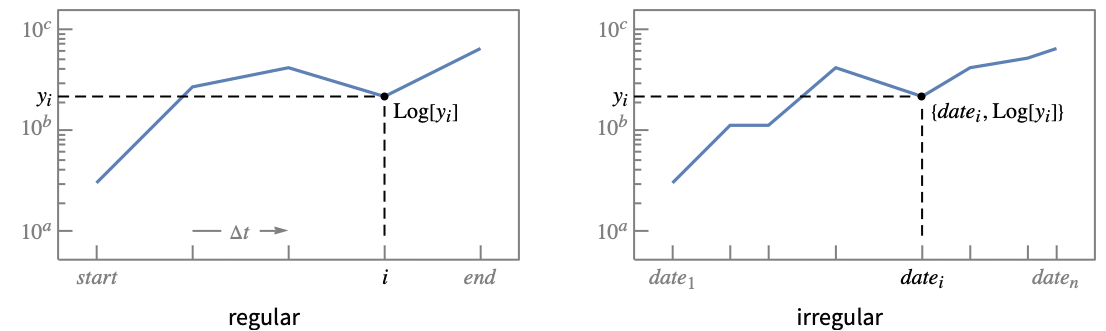
- DateListLogPlot 有效地绘制基于 Log[yi] 的点,但用刻度线表示未缩放的值 yi,使指数增长看起来是一条直线.
- 常规数据 {y1,…,yn} 绘制成通过点 {datei,yi} 的函数曲线,其中 datei 在 datespec 的开始和结束日期之间均匀间隔.
- 非常规数据 {{date1,y1},…,{daten,yn}} 绘制为通过点 {datei,yi} 且按时间顺序的有序曲线.
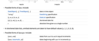
- datei 的可能形式包括:
-
DateObject[…],TimeObject[…] 日期或时间对象 "string" DateString 规范 {y,m,d,h,m,s} DateList 规范 {y},{y,m},{y,m,d},… 短日期列表 t 由单个数给出的绝对时间 - 在短日期列表中,省略的元素取默认值 {y,1,1,0,0,0}.
- datespec 的可能形式包括:
-
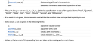
{start,end} 从 start 到 end 增量相等的日期 {start,Automatic,Δt} 从 start 开始,增量为 Δt 的日期 {Automatic,end,Δt} 以 end 结束,增量为 Δt 的日期 start 增量由 start 决定的日期 - datespec 中的 Δt 可以是 {y,m,d,h,m,s} 日期列表或下面任意一个特殊形式:"Year"、"Quarter"、"Month"、"Week"、"Day"、"Hour"、"Minute"、"Second" 以及 "Millisecond".
- 如果没有明确给出 Δt,则增量是 start 中显式指定的最小时间单位.
- 数据值 yi 可以下列形式给出:
-
yi 实值 Quantity[yi,unit] 带单位的量 Around[yi,ei] 具有不确定性 ei 的值 yi Interval[{ymin,ymax}] 介于 ymin 和 ymax 之间的值 - 不是上述形式的值 yi 被认为是缺失值并不会显示.
- datai 具有下列形式和解释:
-
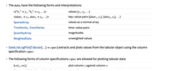
<|"k1"y1,"k2"y2,…|> 值 {y1,y2,…} <|date1y1,date2y2,…|> 键-值对 {{date1,y1},{date2,y2},…} SparseArray 和普通数组一样的值 TimeSeries, EventSeries 键-值对 QuantityArray 数量级 WeightedData 无权重值 - DateListLogPlot[Tabular[…]cspec] 用列指定 cspec 从表格对象中提取值并绘制.
- 可使用以下形式的列指定 cspec 来绘制表格数据:
-
{colx,coly} 相对于 x 列数据绘制 y 列数据 {{colx1,coly1},{colx2,coly2},…} 相对于 x1 列数据绘制 y1 列数据,y2 相对于 x2, … coly, {coly} 以序列形式绘制 y 列的值 {{coly1},…,{colyi},…} 以序列形式绘制 y1, y2, … 列的值 - colx 也可以是 Automatic,在这种情况下,用 DataRange 生成序列的值.
- DateListLogPlot[TimeSeries[…]cspec] 和 DateListLogPlot[EventSeries[…]cspec] 用分量指定 cspec 从时间或事件序列中提取值并绘制.
- 可使用以下形式的分量指定 cspec 来绘制序列数据:
-
com 绘制分量 com 与时间戳 {com1,com2,…} 绘制每个分量 comi 与时间戳 - 下列封装 w 可以用在 datai 上:
-
Annotation[datai,label] 给数据提供注释 Button[datai,action] 定义一个动作,在点被点击时执行 EventHandler[datai,…] 为点定义一般的事件句柄 Highlighted[datai,effect] 动态突出 fi 的效果 Highlighted[datai,Placed[effect,pos]] 静态突出 fi 在位置 pos 处的效果 Hyperlink[datai,uri] 给点创建超链接 Labeled[datai,label] 给数据添加标签 Legended[datai,label] 在图例中标记数据 PopupWindow[datai,cont] 给点附上弹出窗口 StatusArea[datai,label] 鼠标悬停时在状态栏上显示 Style[datai,styles] 用指定样式显示点 Tooltip[datai,label] 给点附上提示条 Tooltip[datai] 使用数据值作为点的提示条内容 - 封装 w 可用于多个层级:
-
{…,w[yi],…} 在列表中封装值 yi {…,w[{datei,yi}],…} 封装点 {datei,yi} w[datai] 封装数据 datai w[{data1,…}] 封装一组数据 w1[w2[…]] 使用嵌套封装 - 在 DateListLogPlot 中,Labeled 和 Placed 可以是下列位置:
-
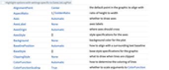
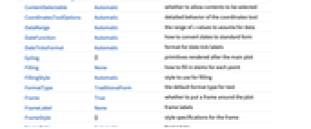
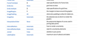
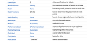
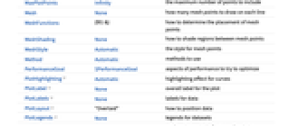
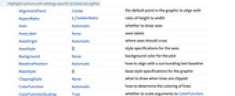
Automatic 自动放置标签 Above, Below, Before, After 围绕数据的位置 date 让数据靠近 date Scaled[s] 沿着数据缩放位置 s {s,Above},{s,Below},… 沿着数据在位置 s 处的相对位置 {pos,epos} 标签中的 epos 放在数据的相对位置 pos 处 - DateListLogPlot 和 Graphics 有相同的选项,除了下列增加和修改的地方: [所有选项的列表]
- DataRange 确定了值 {y1,…,yn} 如何解释成 {{date1,y1},…,{xn,yn}}. 可能的设置包括:
-
Automatic,All 均匀地从 1 到 n {xmin,xmax} 均匀地从 xmin 到 xmax - 一般来说,一组数值对 {{x1,y1},{x2,y2},…} 会被解释成一组点,但设置 DataRangeAll 会把它强制解释成多个数据 {{y11,y12},{y21,y23},…}.
- 默认设置 JoinedAutomatic 将大多数形式的数据绘制为连起来的曲线,但将来自 EventSeries 的数据显示为离散的点.
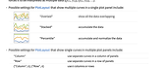
- 在单个绘图面板中显示多条曲线的 PlotLayout 的可能设置包括:
-

"Overlaid" 重叠显示所有数据 

"Stacked" 堆置数据 

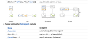
"Percentile" 堆置并归一化数据 - 在多个绘图面板中显示单个曲线的 PlotLayout 的可能设置包括:
-
"Column" 在一列面板中使用单独的曲线 "Row" 在一行面板中使用单独的曲线 {"Column",k},{"Row",k} 使用 k 列或行 {"Column",UpTo[k]},{"Row",UpTo[k]} 使用至多 k 列或行 - PlotLegends 的典型设置包括:
-
None 无图例 Automatic 自动确定图例 {lbl1,lbl2,…} 用 lbl1、lbl2、… 作为图例标签 Placed[lspec,…] 指定图例的位置 - PlotStylesty 指定每条曲线使用的样式. 可能的设置包括:
-
{sty1,sty2,…} 针对每个数据集的一系列样式 <|"key"val,…|> 针对不同层级的数据的样式元素 - 接受的键有:
-
"Base" 所有 datai 的整体样式 "Lists" 针对每个 datai 的样式 styi 的列表 - ColorData["DefaultPlotColors"] 给出 PlotStyle 使用的默认颜色序列.
- 在 Prolog、Epilog、Ticks 等里面的所有显式
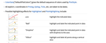
坐标都被认为是日期. - Highlighted 和 PlotHighlighting 的可能突出显示效果包括:
-

style 突出显示指定的数据 

"Ball" 突出显示并标记数据中的指定点 

"Dropline" 突出显示并为数据中的指定点添加标签,并在轴线上标出垂线 

"XSlice" 突出显示并标记沿垂直切面的所有点 

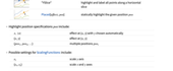
"YSlice" 突出显示并标记沿水平切面的所有点 

Placed[effect,pos] 静态突出显示给定位置 pos - 突出显示位置规格 pos 包括:
-
x, {x} {x,y} 处的效果,其中 y 为自动选择 {x,y} {x,y} 处的效果 {pos1,pos2,…} 多个位置 posi - ScalingFunctions 的可能设置包括:
-
sy 缩放 y 轴 {sx,sy} 缩放 x 和 y 轴 - 常见的内置缩放函数 s 包括:
-
"Reverse" 

反转坐标方向 "Infinite" 

无限标尺 - 在应用默认对数刻度后应用 y 轴的刻度.
所有选项的列表
范例
打开所有单元 关闭所有单元基本范例 (7)
DateListLogPlot[{{DateObject[{2016, 10, 1}, "Day", "Gregorian", -5.], 10}, {DateObject[{2016, 10, 15}, "Day", "Gregorian", -5.], 647}, {DateObject[{2016, 10, 30}, "Day", "Gregorian", -5.], 1532}, {DateObject[{2016, 11, 20}, "Day", "Gregorian", -5.], 205}}]DateListLogPlot[Range[50, 1000, 50], {2007, 1, 1}]data1 = {{{2000}, 1}, {{2002}, 10}, {{2005}, 100}, {{2008}, 1000}};
data2 = {{{2001}, 200}, {{2003}, 500}, {{2006}, 300}, {{2008}, 10}};DateListLogPlot[{data1, data2}, Joined -> True]DateListLogPlot[{Prime[Range[10]], Exp[Range[10]]}, {1981, 4, 21}, PlotLegends -> {"data1", "data2"}]DateListLogPlot[{Prime[Range[10]], Exp[Range[10]]}, {1981, 4, 21}, Joined -> True, PlotLabels -> {"first", "second"}]DateListLogPlot[TimeSeries[TimeEventSeries`TimestampData[Association["UniformlySpacedQ" -> True, "Count" -> 10,
"Endpoints" -> TabularColumn[Association[
"Data" -> {2, {{NumericArray[{15706, -2147483648}, "Integer32"], {},
DataStructure["BitVe ... 7, 34, 40, 49, 54, 64, 72}, {}, None},
"ElementType" -> "Integer64"]], TabularColumn[Association[
"Data" -> {{1, 9, 11, 16, 18, 25, 34, 43, 49, 54}, {}, None},
"ElementType" -> "Integer64"]]}}]]]], Association[]] -> "a", PlotLabels -> Automatic]DateListLogPlot[FinancialData["^GSPC", {DateObject[{2000}, "Year"], DateObject[{2003}, "Year"]}]]范围 (44)
数据 (11)
绘制 TimeSeries:
ts = TemporalData[TimeSeries, {{{67.7, 69.61, 69.45, 71.3, 72.95, 73.7, 73.41, 72.82, 73.59, 73.93,
72.88, 72.24, 72.47, 71.49, 71.49, 69.51, 70.73, 71.13, 69.92, 69.43, 70.61, 70.25, 71.62, 72.,
72.48, 73.93, 74.52, 73.34, 73.18, 73.09, 73.5, ... 05600, 3631392000, 3631478400, 3631564800, 3631824000,
3631910400, 3631996800, 3632083200}}}, 1, {"Continuous", 1}, {"Discrete", 1}, 1,
{ValueDimensions -> 1, ResamplingMethod -> {"Interpolation", InterpolationOrder -> 1}}}, True,
10.1];DateListLogPlot[ts]绘制 TimeSeries 或 EventSeries 中的所有数据:
DateListLogPlot[TimeSeries[TimeEventSeries`TimestampData[Association["UniformlySpacedQ" -> False,
"Timestamps" -> TabularColumn[Association[
"Data" -> {7, {{NumericArray[{-248, 118, 298, 638, 865, 1006, 1216}, "Integer32"], {},
None}}, None}, ... "Data" -> {{32, 62, 112, 167, 179, 209, 214}, {}, None}, "ElementType" -> "Integer64"]],
TabularColumn[Association["Data" -> {{30, 49, 81, 125, 142, 174, 177}, {}, None},
"ElementType" -> "Integer64"]]}}]]]], Association[]]]绘制 TimeSeries 或 EventSeries 的特定分量:
trees = TimeSeries[TimeEventSeries`TimestampData[Association["UniformlySpacedQ" -> False,
"Timestamps" -> TabularColumn[Association[
"Data" -> {7, {{NumericArray[{-248, 118, 298, 638, 865, 1006, 1216}, "Integer32"], {},
None}}, None}, ... "Data" -> {{32, 62, 112, 167, 179, 209, 214}, {}, None}, "ElementType" -> "Integer64"]],
TabularColumn[Association["Data" -> {{30, 49, 81, 125, 142, 174, 177}, {}, None},
"ElementType" -> "Integer64"]]}}]]]], Association[]];DateListLogPlot[trees -> "tree 1"]DateListLogPlot[trees -> {"tree 1", "tree 2"}]用 AbsoluteTime 规范给出日期:
data = {{3155673600, 1}, {3218832000, 10}, {3313526400, 100}, {3408134400, 1000}};DateListLogPlot[data]用 DateString 规范给出日期:
data = {{"July 2005", 50}, {"August 2006", 120}, {"September 2007", 500}, {"March 2008", 1200}};DateListLogPlot[data]以简略 DateList 规范给出日期:
data = {{{2005, 7}, 50}, {{2006, 8}, 120}, {{2007, 9}, 500}, {{2008, 3}, 1200}};DateListLogPlot[data]DateListLogPlot[Range[10, 1000, 10], "August 15, 2006"]DateListLogPlot[Range[10, 1000, 10], {2006, 8, 15, 12, 15}]DateListLogPlot[Exp[Range[15]], {{2008, 5, 1}, {2008, 5, 30}}]绘制开始于 2006 年 1 月 1 日,每隔 90 天采集一次所得的数据集合:
DateListLogPlot[Range[10], {{2006, 1, 1}, Automatic, {0, 0, 90}}] 绘制从 1 月份开始,在每个月的第 15
天采集一次所得的数据集合:
DateListLogPlot[Range[10], {{2008, 1, 15}, Automatic, "Month"}]DateListLogPlot[Sqrt[Range[50] / 5], {Automatic, "September 2010", "Month"}]用 ScalingFunctions 缩放绘图中的数据:
DateListLogPlot[FinancialData["AAPL", {2005}], ScalingFunctions -> "Reverse"]特殊数据 (5)
用 Quantity 来包含带单位的数据:
DateListLogPlot[Quantity[Exp[Range[10]], "Meters"], {2010, 1, 1}, FrameLabel -> Automatic]绘制 QuantityArray 中的数据:
qa = QuantityArray[2 ^ RandomReal[{0, 5}, 20], "Fahrenheit"]DateListLogPlot[qa, {2000, 1, 1}, FrameLabel -> Automatic]用 TargetUnits 指定单位:
DateListLogPlot[qa, {2000, 1, 1}, TargetUnits -> "Kelvin", FrameLabel -> Automatic]Association 中的数值值被用作
坐标:
DateListLogPlot[<|"a" -> 4, "b" -> 27, "c" -> 5, "d" -> 128, "e" -> 81, "f" -> 32|>, "Jan, 1, 2010"]Association 中的数值键及值被用作
和
坐标:
DateListLogPlot[<|2 -> 1, 3 -> 16, 5 -> 8, 7 -> 81, 11 -> 32, 13 -> 729|>]直接绘制 TimeSeries:
data = CountryData["UnitedStates", {{"Population"}, {1988, 2013}}]DateListLogPlot[data, FrameLabel -> Automatic]DateListLogPlot[Table[Around[Exp[n], RandomReal[Exp[n], 2]], {n, 10}], {2010, 1, 1}]DateListLogPlot[Table[Interval[RandomReal[Exp[n], 2]], {n, 10}], {2010, 1, 1}]DateListLogPlot[Table[Interval[RandomReal[Exp[n], 2]], {n, 10}], {2010, 1, 1}, IntervalMarkers -> "Bands"]表格数据 (1)
tab = Tabular[IconizedObject[«Country populations»]]DateListLogPlot[tab -> {"Date", "France"}]DateListLogPlot[tab -> {{"Date", "France"}, {"Date", "Germany"}, {"Date", "Australia"}}]DateListLogPlot[tab -> {{"Date", "France"}, {"Date", "Germany"}, {"Date", "Australia"}}, PlotLegends -> {"France", "Germany", "Australia"}]封装 (8)
{DateListLogPlot[{Style[{2, 2, 4, 8, 32, 256}, Green], {4, 8, 32, 128, 874}}, {2014, 8}], DateListLogPlot[Style[{{2, 2, 4, 8, 32, 256}, {4, 8, 32, 128, 874}}, Blue], {2014, 8}]}DateListLogPlot[Style[{Style[{1, 1, 2, 3, 5, 8}, Green], {2, 3, 5, 7, 11}}, Blue], {2014, 8}]DateListLogPlot[Tooltip[Prime[Range[10]]], {2014, 8}, Mesh -> Full]DateListLogPlot[Tooltip[Prime[Range[10]], "primes"], {2014, 8}, Mesh -> Full]用 PopupWindow 提供额外的深入信息:
DateListLogPlot[{1, PopupWindow[8, DateListPlot[FinancialData["IBM", "Jan. 1, 2004"]]], 20}, {2004, 1}, Mesh -> Full, PlotStyle -> PointSize[0.05]]Button 可用于触发任意动作:
DateListLogPlot[{1, Button[20, Speak[2]], 163}, {2014, 8}, Mesh -> Full, PlotStyle -> PointSize[0.05]]把 Annotation 用于当鼠标进入图线时的动态动作:
data = TemporalData[TimeSeries, {{{7, 12, 15, 20}}, {{{3368649600, 3369859200, 3371155200, 3372969600}}},
1, {"Continuous", 1}, {"Discrete", 1}, 1, {ValueDimensions -> 1, DateFunction -> Automatic,
ResamplingMethod -> {"Interpolation", InterpolationOrder -> 1}}}, True, 10.2];{DateListLogPlot[Annotation[data, "label", "Mouse"]], Dynamic[MouseAnnotation[]]}把 Hyperlink 用作当点击时转向指定链接:
data = TemporalData[TimeSeries, {{{7, 12, 15, 20}}, {{{3368649600, 3369859200, 3371155200, 3372969600}}},
1, {"Continuous", 1}, {"Discrete", 1}, 1, {ValueDimensions -> 1, DateFunction -> Automatic,
ResamplingMethod -> {"Interpolation", InterpolationOrder -> 1}}}, True, 10.2];DateListLogPlot[Hyperlink[data, "http://www.wolfram.com"]]用 StatusArea 在当前笔记本的状态栏显示字符串:
data = TemporalData[TimeSeries, {{{7, 12, 15, 20}}, {{{3368649600, 3369859200, 3371155200, 3372969600}}},
1, {"Continuous", 1}, {"Discrete", 1}, 1, {ValueDimensions -> 1, DateFunction -> Automatic,
ResamplingMethod -> {"Interpolation", InterpolationOrder -> 1}}}, True, 10.2];DateListLogPlot[StatusArea[data, "String"]]标签和图例 (12)
DateListLogPlot[Table[Labeled[2 ^ RandomInteger[{1, 6}], i], {i, 15}], {2010, 1, 1}, PlotMarkers -> Automatic]Table[DateListLogPlot[Table[Labeled[10 ^ RandomReal[], i, p], {i, 6}], {2010, 1, 1}, PlotMarkers -> Automatic, PlotLabel -> p], {p, {Above, Below, Before, After}}]用 Labeled 给数据添加标签:
data1 = Accumulate@RandomInteger[10, 10];data2 = Accumulate@RandomInteger[3, 10];DateListLogPlot[{Labeled[data1, "label1"], Labeled[data2, "label2"]}, {2010, 1, 1}]用 PlotLabels 给数据添加标签:
data1 = Accumulate@RandomInteger[10, 10];data2 = Accumulate@RandomInteger[3, 10];DateListLogPlot[{data1, data2}, {2000}, PlotLabels -> {"label1", "label2"}]DateListLogPlot[Labeled[Accumulate@RandomInteger[10, 10], "label", {2004}], {2000}]DateListLogPlot[Labeled[Accumulate@RandomInteger[10, 10], "label", Scaled[0.3]], {2000}]DateListLogPlot[Labeled[Accumulate@RandomInteger[10, 10], "label", {Scaled[0.3], Below}], {2000}]data = Rule[TimeSeries[{1, 1, 2, 3, 5, 8, 11}, {"Jan 1, 2015"}], RandomWord[7]];DateListLogPlot[data, LabelingSize -> 30]DateListLogPlot[data, LabelingSize -> Full]data = Rule[TimeSeries[RandomReal[1, 100], {"Jan 1, 2015"}], RandomWord[100]];DateListLogPlot[data, PlotMarkers -> Automatic]DateListLogPlot[data, ImageSize -> 400, PlotMarkers -> Automatic]percentChange[tick_] := Block[{stock}, stock = FinancialData[tick, {{2005, 1}, {2010, 12}}];
stock / stock["Values"][[1]]
]DateListLogPlot[{percentChange["AAPL"], percentChange["IBM"]}, PlotLegends -> {"APPL", "IBM"}]用 Legended 封装来添加图例:
percentChange[tick_] := Block[{stock}, stock = FinancialData[tick, {{2008, 1}, {2009, 12}}];
stock / stock["Values"][[1]]
]DateListLogPlot[{percentChange["AAPL"], Legended[percentChange["^GSPC"], "SP500"]}, PlotLabel -> "Apple stock change"]用 Placed 改变图例位置:
DateListLogPlot[{percentChange["AAPL"], Legended[percentChange["^GSPC"], Placed["SP500", Bottom]]}, PlotLabel -> "Apple stock change"]当你把鼠标移到绘图上方时,绘图通常有显示坐标的交互式callout:
DateListLogPlot[Range[10], {2007}]DateListLogPlot[Callout[Range[10], "hello", "01/01/2012"], {2007}]{DateListLogPlot[Range[10], {2022}, PlotHighlighting -> "Dropline"], DateListLogPlot[Range[10], {2022}, PlotHighlighting -> "XSlice"]}用 Highlighted 强调图中特定的点:
DateListLogPlot[Highlighted[Range[10], Placed["Ball", DateObject[{2011, 1, 1}]]], {2007}]外观 (7)
data = {TemporalData[TimeSeries, {{{0.9999999999999999, 1.0004619378384927, 0.9240915206432619,
0.9117224134808988, 0.8789262545874013, 0.9207554744090412, 0.9136727619541947,
0.8863169899093283, 0.917573420315935, 0.8675836588061994, 0.819338935 ... 3468009600, 3468096000, 3468268800, 3468528000,
3468614400}}}, 1, {"Continuous", 1}, {"Discrete", 1}, 1,
{ValueDimensions -> 1, DateFunction -> Automatic, ResamplingMethod ->
{"Interpolation", InterpolationOrder -> 1}}}, True, 10.4], TemporalData[TimeSeries, {{{1., 1.0020059056262276, 0.9659947873510472, 0.9556786739172456,
0.9321806616085635, 0.9390581231309778, 0.9544368681031753, 0.9329448402705406,
0.9831884411570828, 0.9726812408168122, 0.9707707997939994, 0.9657 ... 3468009600, 3468096000, 3468268800, 3468528000,
3468614400}}}, 1, {"Continuous", 1}, {"Discrete", 1}, 1,
{ValueDimensions -> 1, DateFunction -> Automatic, ResamplingMethod ->
{"Interpolation", InterpolationOrder -> 1}}}, True, 10.4]};DateListLogPlot[data]data = {TemporalData[TimeSeries, {{{0.9999999999999999, 1.0004619378384927, 0.9240915206432619,
0.9117224134808988, 0.8789262545874013, 0.9207554744090412, 0.9136727619541947,
0.8863169899093283, 0.917573420315935, 0.8675836588061994, 0.819338935 ... 3468009600, 3468096000, 3468268800, 3468528000,
3468614400}}}, 1, {"Continuous", 1}, {"Discrete", 1}, 1,
{ValueDimensions -> 1, DateFunction -> Automatic, ResamplingMethod ->
{"Interpolation", InterpolationOrder -> 1}}}, True, 10.4], TemporalData[TimeSeries, {{{1., 1.0020059056262276, 0.9659947873510472, 0.9556786739172456,
0.9321806616085635, 0.9390581231309778, 0.9544368681031753, 0.9329448402705406,
0.9831884411570828, 0.9726812408168122, 0.9707707997939994, 0.9657 ... 3468009600, 3468096000, 3468268800, 3468528000,
3468614400}}}, 1, {"Continuous", 1}, {"Discrete", 1}, 1,
{ValueDimensions -> 1, DateFunction -> Automatic, ResamplingMethod ->
{"Interpolation", InterpolationOrder -> 1}}}, True, 10.4]};DateListLogPlot[data, PlotStyle -> {Dashed, Red}]DateListLogPlot[{TemporalData[TimeSeries, {{{0.9999999999999999, 1.0004619378384927, 0.9240915206432619,
0.9117224134808988, 0.8789262545874013, 0.9207554744090412, 0.9136727619541947,
0.8863169899093283, 0.917573420315935, 0.8675836588061994, 0.819338935 ... 3468009600, 3468096000, 3468268800, 3468528000,
3468614400}}}, 1, {"Continuous", 1}, {"Discrete", 1}, 1,
{ValueDimensions -> 1, DateFunction -> Automatic, ResamplingMethod ->
{"Interpolation", InterpolationOrder -> 1}}}, True, 10.4], TemporalData[TimeSeries, {{{1., 1.0020059056262276, 0.9659947873510472, 0.9556786739172456,
0.9321806616085635, 0.9390581231309778, 0.9544368681031753, 0.9329448402705406,
0.9831884411570828, 0.9726812408168122, 0.9707707997939994, 0.9657 ... 3468009600, 3468096000, 3468268800, 3468528000,
3468614400}}}, 1, {"Continuous", 1}, {"Discrete", 1}, 1,
{ValueDimensions -> 1, DateFunction -> Automatic, ResamplingMethod ->
{"Interpolation", InterpolationOrder -> 1}}}, True, 10.4]}, PlotLegends -> {"label1", "label2"}]用 Legended 给指定数据集添加图例:
data = TimeSeries@FinancialData["AAPL", {{2010, 1, 1}, {2011, 1, 1}}];
avg = MovingAverage[data, 30];DateListLogPlot[{data, Legended[avg, "moving average"]}, {{2013, 1, 1}, Automatic, "Day"}, Joined -> True]data = {TemporalData[TimeSeries, {{{0.9999999999999999, 1.0004619378384927, 0.9240915206432619,
0.9117224134808988, 0.8789262545874013, 0.9207554744090412, 0.9136727619541947,
0.8863169899093283, 0.917573420315935, 0.8675836588061994, 0.819338935 ... 3468009600, 3468096000, 3468268800, 3468528000,
3468614400}}}, 1, {"Continuous", 1}, {"Discrete", 1}, 1,
{ValueDimensions -> 1, DateFunction -> Automatic, ResamplingMethod ->
{"Interpolation", InterpolationOrder -> 1}}}, True, 10.4], TemporalData[TimeSeries, {{{1., 1.0020059056262276, 0.9659947873510472, 0.9556786739172456,
0.9321806616085635, 0.9390581231309778, 0.9544368681031753, 0.9329448402705406,
0.9831884411570828, 0.9726812408168122, 0.9707707997939994, 0.9657 ... 3468009600, 3468096000, 3468268800, 3468528000,
3468614400}}}, 1, {"Continuous", 1}, {"Discrete", 1}, 1,
{ValueDimensions -> 1, DateFunction -> Automatic, ResamplingMethod ->
{"Interpolation", InterpolationOrder -> 1}}}, True, 10.4]};DateListLogPlot[data, PlotTheme -> "Detailed"]DateListLogPlot[data, PlotTheme -> "Marketing"]data = {TemporalData[TimeSeries, {{{0.9999999999999999, 1.0004619378384927, 0.9240915206432619,
0.9117224134808988, 0.8789262545874013, 0.9207554744090412, 0.9136727619541947,
0.8863169899093283, 0.917573420315935, 0.8675836588061994, 0.819338935 ... 3410467200, 3410553600, 3410640000, 3410726400,
3410812800}}}, 1, {"Continuous", 1}, {"Discrete", 1}, 1,
{ValueDimensions -> 1, DateFunction -> Automatic, ResamplingMethod ->
{"Interpolation", InterpolationOrder -> 1}}}, True, 10.4], TemporalData[TimeSeries, {{{1., 1.0020059056262276, 0.9659947873510472, 0.9556786739172456,
0.9321806616085635, 0.9390581231309778, 0.9544368681031753, 0.9329448402705406,
0.9831884411570828, 0.9726812408168122, 0.9707707997939994, 0.9657 ... 3410467200, 3410553600, 3410640000, 3410726400,
3410812800}}}, 1, {"Continuous", 1}, {"Discrete", 1}, 1,
{ValueDimensions -> 1, DateFunction -> Automatic, ResamplingMethod ->
{"Interpolation", InterpolationOrder -> 1}}}, True, 10.4]};DateListLogPlot[data, Filling -> Axis]DateListLogPlot[data, Filling -> {1 -> {2}}]data1 = {{DateObject[{2016, 10, 1}, "Day", "Gregorian", -5.], 10}, {DateObject[{2016, 10, 15}, "Day", "Gregorian", -5.], 17}, {DateObject[{2016, 10, 30}, "Day", "Gregorian", -5.], 15}, {DateObject[{2016, 11, 20}, "Day", "Gregorian", -5.], 20}};data2 = {{DateObject[{2016, 10, 1}, "Day", "Gregorian", -5.], 15}, {DateObject[{2016, 10, 15}, "Day", "Gregorian", -5.], 7}, {DateObject[{2016, 10, 30}, "Day", "Gregorian", -5.], 12}, {DateObject[{2016, 11, 20}, "Day", "Gregorian", -5.], 10}};DateListLogPlot[{data1, data2}, PlotLayout -> "Stacked"]选项 (109)
AspectRatio (3)
默认情况下,AspectRatio 对绘图使用固定的高宽比:
DateListLogPlot[FinancialData["TWLO", {{2018, 1, 1}, {2021, 6, 1}}]]设置 AspectRatio1 可使高度与宽度相同:
DateListLogPlot[FinancialData["TWLO", {{2018, 1, 1}, {2021, 6, 1}}], AspectRatio -> 1]AspectRatioFull 调整高度和宽度以便可以恰当地放在其他结构的里面:
plot = DateListLogPlot[FinancialData["TWLO", {{2018, 1, 1}, {2021, 6, 1}}], AspectRatio -> Full];{Framed[Pane[plot, {50, 100}]], Framed[Pane[plot, {100, 100}]], Framed[Pane[plot, {100, 50}]]}Axes (1)
默认情况下,DateListStepPlot 使用边框,而不是坐标轴:
data = FinancialData["TWLO", {{2018, 1, 1}, {2021, 6, 1}}];DateListLogPlot[data]DateListLogPlot[data, Frame -> False, Axes -> True]用 AxesOrigin 指定坐标轴相交的地方:
DateListLogPlot[data, Frame -> False, Axes -> True, AxesOrigin -> {DateObject[{2020, 3, 15}], 0}]{DateListLogPlot[data, Joined -> True, Filling -> Bottom, Frame -> False, Axes -> {True, False}], DateListLogPlot[data, Joined -> True, Filling -> Bottom, Frame -> False, Axes -> {False, True}]}AxesLabel (4)
DateListLogPlot[FinancialData["TWLO", {{2018, 1, 1}, {2021, 6, 1}}], Frame -> False, Axes -> True]DateListLogPlot[FinancialData["TWLO", {{2018, 1, 1}, {2021, 6, 1}}], Frame -> False, Axes -> True, AxesLabel -> "Price"]DateListLogPlot[FinancialData["TWLO", {{2018, 1, 1}, {2021, 6, 1}}], Frame -> False, Axes -> True, AxesLabel -> {"Year", "Price"}]DateListLogPlot[FinancialData["TWLO", {{2018, 1, 1}, {2021, 6, 1}}], Frame -> False, Axes -> True, AxesLabel -> Automatic]AxesOrigin (2)
AxesStyle (1)
data = FinancialData["TWLO", {{2018, 1, 1}, {2021, 6, 1}}];DateListLogPlot[data, Frame -> False, Axes -> True, AxesStyle -> Red]DateListLogPlot[data, Frame -> False, Axes -> True, AxesStyle -> {{Thick, Red}, {Thick, Blue}}]DateListLogPlot[data, Frame -> False, Axes -> True, AxesStyle -> Green, TicksStyle -> StandardGray]DateListLogPlot[data, Frame -> False, Axes -> True, AxesStyle -> Green, LabelStyle -> StandardGray]DateFunction (2)
在 {month,day} 列表中数据的前面加上年份生成日期:
data = {{{10, 1}, 8}, {{10, 10}, 100}, {{10, 20}, 120}, {{10, 24}, 400}, {{11, 5}, 250}, {{11, 15}, 500}};DateListLogPlot[data, DateFunction :> (Join[{2008}, #]&)]data = {{"06/01/06", 8}, {"07/01/06", 100}, {"08/01/06", 120}, {"09/01/06", 400}, {"10/01/06", 250}, {"11/01/06", 500}};DateListLogPlot[data, DateFunction :> (DateList[{#, {"Month", "Day", "YearShort"}}]&)]DateListLogPlot[data, DateFunction :> (DateList[{#, {"Day", "Month", "YearShort"}}]&)]DateListLogPlot[data, DateFunction :> (DateList[{#, {"YearShort", "Month", "Day"}}]&)]DateTicksFormat (1)
以 DateString 元素形式指明日期刻度的格式:
data = {{{2008, 1, 3}, 80}, {{2008, 1, 10}, 100}, {{2008, 1, 20}, 120}, {{2008, 2, 4}, 400}, {{2008, 2, 15}, 250}, {{2008, 2, 26}, 700}};DateListLogPlot[data, DateTicksFormat -> {"MonthShort", "/", "Day"}]Filling (1)
Frame (3)
默认情况下,DateListLogPlot 显示边框:
DateListLogPlot[Range[10], {2007}]DateListLogPlot[Range[10], {2007}, Frame -> False]DateListLogPlot[Range[10], {2007}, Frame -> {{True, True}, {False, False}}]DateListLogPlot[Range[10], {2007}, Frame -> {{True, False}, {True, False}}]FrameLabel (4)
DateListLogPlot[Range[10], {2007}, FrameLabel -> {"label"}]DateListLogPlot[Range[10], {2007}, FrameLabel -> {"Bottom", "Left"}]DateListLogPlot[Range[10], {2007}, FrameLabel -> {{"left", "right"}, {"bottom", "top"}}]DateListLogPlot[Range[10], {2007}, FrameLabel -> {{"left", "right"}, {"bottom", "top"}}, LabelStyle -> Directive[Bold, StandardPurple]]FrameStyle (2)
DateListLogPlot[Range[10], {2007}, FrameStyle -> Directive[StandardGray, Thick]]DateListLogPlot[Range[10], {2007}, FrameStyle -> {{Directive[StandardGreen, Thick], Directive[Red, Thick]}, {Directive[Gray, Thick], Directive[Blue, Thick]}}]FrameTicks (10)
DateListLogPlot[Range[10], {2007}]DateListLogPlot[Range[10], {2007}, FrameTicks -> None]DateListLogPlot[Sqrt[Range[10]], {2008, 1}, FrameTicks -> {{Automatic, Automatic}, {{"April 2008", "June 2008"}, Automatic}}]DateListLogPlot[Sqrt[Range[10]], {2008, 1}, FrameTicks -> {{Automatic, Automatic}, {{3415996800, 3421267200}, Automatic}}]DateListLogPlot[Range[10], {2007}, FrameTicks -> {{None, None}, {Automatic, None}}]DateListLogPlot[Range[10], {2007}, FrameTicks -> Automatic]用 All 在所有边框处显示刻度的标签:
DateListLogPlot[Range[10], {2007}, FrameTicks -> All]DateListLogPlot[Range[10], {2007}, FrameTicks -> {{{2, .5, 10}, None}, {{"July 1, 2011", "July 1, 2014"}, None}}]DateListLogPlot[Range[10], {2007}, FrameTicks -> {{{{2, "two"}, {5, "five"}, {10, "ten"}}, None}, {{{"July 1, 2011", "date 1"}, {"July 1, 2014", "date 2"}}, None}}]DateListLogPlot[Range[10], {2007}, FrameTicks -> {{{{2, "two", .15}, {5, "five", .45}, {10, "ten", .95}}, None}, {Automatic, None}}]DateListLogPlot[Range[10], {2007}, FrameTicks -> {{{{2, "two", {.15, .1}}, {5, "five", {.45, .2}}, {10, "ten", {.95, .3}}}, None}, {Automatic, None}}]DateListLogPlot[Range[10], {2007}, FrameTicks -> {{{{2, "two", .15, Directive[Blue, Thick]}, {5, "five", .45, Directive[Red, Thick, Dashed]}, {10, "ten", .95, Directive[Green, Thick, Dashed]}}, None}, {Automatic, None}}]minMeanMax[min_, max_] := {{min, min}, {(max + min) / 2, (max + min) / 2}, {max, max}}DateListLogPlot[Range[10], {2007}, FrameTicks -> {{minMeanMax, None}, {Automatic, None}}, PlotRangePadding -> None]FrameTicksStyle (3)
DateListLogPlot[Range[10], {2007}, FrameStyle -> Directive[Red]]DateListLogPlot[Range[10], {2007}, FrameStyle -> Directive[Red], FrameTicksStyle -> Directive[Blue, Thick]]DateListLogPlot[Range[10], {2007}, FrameTicks -> All, FrameTicksStyle -> {{Directive[Orange, Thick], Blue}, {Red, Green}}]GridLines (1)
DateListLogPlot[Sqrt[Range[10]], {2008, 1}, GridLines -> {{{2008, 4}, "June 15, 2008"}, None}]将第一条网格线设为 Blue:
DateListLogPlot[Sqrt[Range[10]], {2008, 1}, GridLines -> {{{{2008, 4}, Blue}, "June 15, 2008"}, None}]ImageSize (7)
使用已命名尺寸,如 Tiny、Small、Medium 和 Large:
{DateListLogPlot[Range[50, 1000, 50], {2007, 1, 1}, ImageSize -> Tiny], DateListLogPlot[Range[50, 1000, 50], {2007, 1, 1}, ImageSize -> Small]}{DateListLogPlot[Range[50, 1000, 50], {2007, 1, 1}, ImageSize -> 150], DateListLogPlot[Range[50, 1000, 50], {2007, 1, 1}, AspectRatio -> 1.5, ImageSize -> 150]}{DateListLogPlot[Range[50, 1000, 50], {2007, 1, 1}, ImageSize -> {Automatic, 150}], DateListLogPlot[Range[50, 1000, 50], {2007, 1, 1}, AspectRatio -> 2, ImageSize -> {Automatic, 150}]}{DateListLogPlot[Range[50, 1000, 50], {2007, 1, 1}, ImageSize -> UpTo[200]], DateListLogPlot[Range[50, 1000, 50], {2007, 1, 1}, AspectRatio -> 2, ImageSize -> UpTo[200]]}DateListLogPlot[Range[50, 1000, 50], {2007, 1, 1}, ImageSize -> {200, 200}, Background -> StandardGray]设置 AspectRatioFull 将填充可用空间:
DateListLogPlot[Range[50, 1000, 50], {2007, 1, 1}, AspectRatio -> Full, ImageSize -> {200, 200}, Background -> StandardGray]{DateListLogPlot[Range[50, 1000, 50], {2007, 1, 1}, ImageSize -> {UpTo[150], UpTo[100]}], DateListLogPlot[Range[50, 1000, 50], {2007, 1, 1}, AspectRatio -> 2, ImageSize -> {UpTo[150], UpTo[100]}]}Framed[Pane[DateListLogPlot[Range[50, 1000, 50], {2007, 1, 1}, ImageSize -> Full, Background -> StandardGray], {200, 100}]]Framed[Pane[DateListLogPlot[Range[50, 1000, 50], {2007, 1, 1}, ImageSize -> {Scaled[0.5], Scaled[0.5]}, Background -> StandardGray], {200, 100}]]IntervalMarkers (3)
DateListLogPlot[Table[Around[RandomReal[{1, 100}], 5], 10], Today]DateListLogPlot[Table[Around[RandomReal[{1, 100}], 5], 10], Today, IntervalMarkers -> "Bars"]DateListLogPlot[Table[Around[RandomReal[{1, 100}], 5], 10], Today, IntervalMarkers -> "Bands"]IntervalMarkersStyle (2)
Joined (2)
DateListLogPlot[Range[100], {2008, 1}, Joined -> True]data1 = {{{2000}, 1}, {{2002}, 10}, {{2005}, 100}, {{2008}, 1000}};data2 = {{{2001}, 200}, {{2003}, 500}, {{2006}, 300}, {{2008}, 10}};DateListLogPlot[{data1, data2}, Joined -> True]DateListLogPlot[{data1, data2}, Joined -> {True, False}]LabelingFunction (3)
DateListLogPlot[{1, 2, 3, 6, 8, 10} -> {"a", "b", "c", "d", "e", "f"}, {2000}]使用 LabelingFunction->None 压缩标签:
DateListLogPlot[{1, 2, 3, 6, 8, 10} -> {"a", "b", "c", "d", "e", "f"}, {2000}, LabelingFunction -> None]DateListLogPlot[{1, 2, 3, 6, 8, 10} -> {"a", "b", "c", "d", "e", "f"}, {2000}, LabelingFunction -> (Placed[Last@#1, Above] &)]DateListLogPlot[{1, 2, 3, 6, 8, 10} -> {"a", "b", "c", "d", "e", "f"}, {2000}, LabelingFunction -> (Placed[Last@#1, Tooltip] &), PlotMarkers -> Automatic]LabelingSize (4)
DateListLogPlot[TimeSeries[{.1, 1, 20, 300, 500, 8000}, {"Jan 1, 2015"}] -> {"healthfulness", "obstreperous", "spectrogram", "vestige", "coinage", "limey"}, ImageSize -> Medium]DateListLogPlot[TimeSeries[{.1, 1, 20, 300, 500, 8000}, {"Jan 1, 2015"}] -> {[image], [image], [image], [image], [image], [image]}, ImageSize -> Medium]DateListLogPlot[TimeSeries[{.1, 1, 20, 300, 500, 8000}, {"Jan 1, 2015"}] -> {"healthfulness", "obstreperous", "spectrogram", "vestige", "coinage", "limey"}, ImageSize -> Medium, LabelingSize -> 30]DateListLogPlot[TimeSeries[{.1, 1, 20, 300, 500, 8000}, {"Jan 1, 2015"}] -> {[image], [image], [image], [image], [image], [image]}, ImageSize -> Medium, LabelingSize -> 20]DateListLogPlot[TimeSeries[{.1, 1, 20, 300, 500, 8000}, {"Jan 1, 2015"}] -> {[image], [image], [image], [image], [image], [image]}, ImageSize -> Medium, LabelingSize -> Full]LabelingTarget (6)
DateListLogPlot[IconizedObject[«data»], Today]DateListLogPlot[IconizedObject[«data»], Today, LabelingTarget -> All]DateListLogPlot[IconizedObject[«data»], Today, LabelingTarget -> "Dense"]DateListLogPlot[IconizedObject[«data»], Today, LabelingTarget -> 0.5]DateListLogPlot[IconizedObject[«data»], Today, LabelingTarget -> <|"AllowedLabelingPositions" -> "Sides"|>]DateListLogPlot[IconizedObject[«data»], Today, LabelingTarget -> <|"AllowedLabelingPositions" -> "Corners"|>]DateListLogPlot[IconizedObject[«data»], Today, LabelingTarget -> <|"AllowLabelClipping" -> True|>]PlotHighlighting (10)
默认设定 PlotHighlightingAutomatic 可在绘图中显示交互式 callout:
DateListLogPlot[Range[10], {2007}]用 PlotHighlightingNone 禁止突出显示整个绘图:
DateListLogPlot[Range[10], {2007}, PlotHighlighting -> None]用 Highlighted[…,None] 禁止突出显示某个曲线:
DateListLogPlot[{Range[10], Highlighted[2 * Range[10], None]}, {2007}]DateListLogPlot[{Range[10], 2 * Range[10]}, {2007}, PlotHighlighting -> Directive[Red, AbsolutePointSize[10], DropShadowing[]]]DateListLogPlot[Range[10], {2007}, PlotHighlighting -> "Dropline"]DateListLogPlot[Range[10], {2007}, PlotHighlighting -> Placed["Dropline", DateObject[{2010, 1, 1}]]]DateListLogPlot[{Range[10], 2 * Range[10]}, {2007}, PlotHighlighting -> "Dropline"]DateListLogPlot[{Range[10], 2 * Range[10]}, {2007}, PlotHighlighting -> Placed["Dropline", DateObject[{2011, 1, 1}]]]DateListLogPlot[{Range[10], 2 * Range[10]}, {2007}, PlotHighlighting -> "XSlice"]DateListLogPlot[Range[10], {2007}, PlotHighlighting -> Placed["XSlice", DateObject[{2011, 1, 1}]]]DateListLogPlot[{Range[10], 2 * Range[10]}, {2007}, PlotHighlighting -> "YSlice"]DateListLogPlot[{Range[10], 2 * Range[10]}, {2007}, PlotHighlighting -> Placed["YSlice", 4]]DateListLogPlot[{Range[10], 2 * Range[10]}, {2007}, PlotHighlighting -> "XNearestPoint"]DateListLogPlot[{Range[10], 2 * Range[10]}, {2007}, PlotHighlighting -> {"XNearestPoint", <|"Style" -> Black|>}]DateListLogPlot[{Range[10], 2 * Range[10]}, {2007}, PlotHighlighting -> "XYLabel"]用 Callout 选项来改变标签的外观:
DateListLogPlot[{Range[10], 2 * Range[10]}, {2007}, PlotHighlighting -> {"XYLabel", <|"Appearance" -> "Corners", "CalloutMarker" -> "Circle"|>}]DateListLogPlot[{Range[10], 2 * Range[10]}, {2007}, PlotHighlighting -> {{"XNearestPoint", <|"Style" -> Black|>}, {"XYLabel", <|"Appearance" -> "Corners", "CalloutMarker" -> "Circle"|>}}]Customize labels with PlotHighlighting:
DateListLogPlot[{Range[10], 2 * Range[10]}, {2007}, PlotHighlighting -> {"XYLabel", <|"NumberForm" -> 4, "LabelingFunction" -> (Grid[{{"x", First[#1]}, {"y", Last[#1]}}]&)|>}]PlotInteractivity (3)
DateListLogPlot[{{2, 3, 5, 7, 11}, {13, 17, 19, 23, 29}}, Today]DateListLogPlot[{{2, 3, 5, 7, 11}, {13, 17, 19, 23, 29}}, Today, PlotInteractivity -> False]DateListLogPlot[{{2, 3, 5, 7, 11}, Tooltip[{13, 17, 19, 23, 29}, "hello"]}, Today, PlotInteractivity -> <|"User" -> True, "System" -> False|>]PlotLabel (1)
PlotLabels (4)
data1 = Transpose[{DateRange[{2000, 1, 1}, {2000, 1, 15}], RandomReal[10, 15]}];data2 = Transpose[{DateRange[{2000, 1, 1}, {2000, 1, 15}], RandomReal[10, 15]}];DateListLogPlot[{data1, data2}, PlotLabels -> {"label1", "label2"}]ge = FinancialData["GE", "Jan. 1, 2000"];DateListLogPlot[ge, PlotLabels -> Placed["high", Above]]DateListLogPlot[ge, PlotLabels -> Placed["crisis", {{2009, 1, 1}, Below}]]PlotLabels->Automatic 使用关联中的键作为数据标签:
DateListLogPlot[<|"a" -> Accumulate@RandomInteger[10, 10], "b" -> Accumulate@RandomInteger[10, 10]|>, {2007}, PlotLabels -> Automatic, PlotLegends -> None]用 None 不添加标签:
data1 = Transpose[{DateRange[{2000, 1, 1}, {2000, 1, 15}], Accumulate@RandomReal[10, 15]}];
data2 = Transpose[{DateRange[{2000, 1, 1}, {2000, 1, 15}], Accumulate@RandomReal[3, 15]}];DateListLogPlot[{data1, data2}, PlotLabels -> {"label1", None}]PlotLayout (2)
data1 = {{DateObject[{2016, 10, 1}, "Day", "Gregorian", -5.], 10}, {DateObject[{2016, 10, 15}, "Day", "Gregorian", -5.], 17}, {DateObject[{2016, 10, 30}, "Day", "Gregorian", -5.], 15}, {DateObject[{2016, 11, 20}, "Day", "Gregorian", -5.], 20}};data2 = {{DateObject[{2016, 10, 1}, "Day", "Gregorian", -5.], 15}, {DateObject[{2016, 10, 15}, "Day", "Gregorian", -5.], 7}, {DateObject[{2016, 10, 30}, "Day", "Gregorian", -5.], 12}, {DateObject[{2016, 11, 20}, "Day", "Gregorian", -5.], 10}};DateListLogPlot[{data1, data2}]DateListLogPlot[{data1, data2}, PlotLayout -> "Stacked"]data[n_] := Transpose[{DateRange[{2000, 1, 1}, {2000, 1, 15}], Exp[RandomReal[3, 15]]}];
DateListLogPlot[{data[1], data[2], data[3]}, ImageSize -> Medium, PlotLayout -> "Column"]DateListLogPlot[{data[1], data[2], data[3]}, ImageSize -> Medium, PlotLayout -> "Row"]PlotLegends (7)
DateListLogPlot[Range[10], {2007}, PlotLegends -> True]PlotLegends 自动匹配图的样式:
DateListLogPlot[{Range[10], Range[10]//Prime}, {2007}, PlotStyle -> {Blue, Red}, PlotLegends -> Automatic]PlotLegends 自动匹配图中的数据点标记符号:
DateListLogPlot[{Range[10], Range[10] ^ 2}, {2007}, PlotMarkers -> Automatic, PlotLegends -> Automatic]将 Joined->Automatic 用于图例,以匹配图形:
DateListLogPlot[{Range[10], Range[10] ^ 2}, {2007}, PlotStyle -> {Green, Orange}, Joined -> {True, False}, PlotLegends -> PointLegend[Automatic, Joined -> Automatic]]DateListLogPlot[{Range[10], Range[10]^2, Sqrt@Range[10]}, {2007}, PlotLegends -> {"a", "b", "c"}]用 Placed 指定图例的位置:
Table[DateListLogPlot[{Range[10], Range[10] ^ 2}, {2007}, PlotLegends -> Placed[Automatic, pos], PlotLabel -> pos], {pos, {Above, Below}}]Table[DateListLogPlot[{Range[10], Range[10] ^ 2}, {2007}, PlotLegends -> Placed[Automatic, pos], PlotLabel -> pos], {pos, {Before, After}}]用 PointLegend 改变图例外观:
DateListLogPlot[{Range[10], Range[10] ^ 2}, {2007}, PlotLegends -> LineLegend[Automatic, {"list1", "list2"}, LegendFunction -> Panel, LegendMargins -> 5]]PlotRange (1)
PlotTheme (1)
ScalingFunctions (2)
默认情况下,DateListLogPlot 在 x 轴上使用 Date 刻度,在 y 轴上使用 Log 刻度:
DateListLogPlot[IconizedObject[«Data»]]DateListLogPlot[IconizedObject[«Data»], ScalingFunctions -> "Reverse"]Ticks (9)
DateListLogPlot[Range[10], {2007}, Axes -> True, Frame -> False]DateListLogPlot[Range[10], {2007}, Frame -> False, Axes -> True, Ticks -> {None, None}]DateListLogPlot[Range[10], {2007}, Frame -> False, Axes -> True, Ticks -> {Automatic, None}]DateListLogPlot[Range[10], {2007}, Frame -> False, Axes -> True, Ticks -> {{"July 1, 2011", "July 1, 2014"}, {2, 3, 5, 7, 9}}]DateListLogPlot[Range[10], {2007}, Frame -> False, Axes -> True, Ticks -> {{{"July 1, 2011", "year 1"}, {"July 1, 2014", "year 2"}}, {{2, "two"}, {5, "five"}, {9, "nine"}}}]DateListLogPlot[Range[10], {2007}, Frame -> False, Axes -> True, Ticks -> {{{"July 1, 2011", "year 1"}, {"July 1, 2014", "year 2"}}, Automatic}]DateListLogPlot[Range[10], {2007}, Frame -> False, Axes -> True, Ticks -> {{{"July 1, 2011", "a", .3}, {"July 1, 2014", "b", .5}}, Automatic}]DateListLogPlot[Range[10], {2007}, Frame -> False, Axes -> True, Ticks -> {{{"July 1, 2011", "a", {.1, .1}}, {"July 1, 2014", "b", {.25, .2}}}, Automatic}]DateListLogPlot[Range[10], {2007}, Frame -> False, Axes -> True, Ticks -> {{{"July 1, 2011", "a", .4, Directive[Blue, Thick]}, {"July 1, 2014", "b", .5, Directive[StandardGray, Thick, Dashed]}}, Automatic}]minMeanMax[min_, max_] := {{min, min}, {(max + min) / 2, (max + min) / 2}, {max, max}}DateListLogPlot[Range[10], {2007}, Frame -> False, Axes -> True, Ticks -> {Automatic, minMeanMax}, PlotRangePadding -> None]TicksStyle (4)
DateListLogPlot[Range[10], {2007}, Frame -> False, Axes -> True, AxesStyle -> Red]DateListLogPlot[Range[10], {2007}, Frame -> False, Axes -> True, TicksStyle -> Directive[Red]]DateListLogPlot[Range[10], {2007}, Frame -> False, Axes -> True, TicksStyle -> {Directive[StandardGray, Thick], Directive[Blue, Thick]}]DateListLogPlot[Range[10], {2007}, Frame -> False, Axes -> True, TicksStyle -> Directive[Red, Thick], LabelStyle -> Blue]应用 (2)
data = FinancialData["GE", {2000, 1, 1}];DateListLogPlot[data, Joined -> True, Filling -> Bottom]data = {438.1, 86.5, 142.1, 213.5, 466.2, 401.8, 366.8, 267.5, 385.2, 549.1, 100.5, 217.9};DateListLogPlot[data, {{2008, 6, 1, 8}, Automatic, "Hour"}]DateListLogPlot[data, {{2008, 6, 1, 8}, Automatic, "Hour"}, DateTicksFormat -> {"Hour12Short", "AMPMLowerCase"}]属性和关系 (2)
data = Transpose[{Table[{1900, 1, 1, i}, {i, 24}], Range[24]}];DateListLogPlot[data, GridLines -> {{5 10 ^ 4}, None}]用 AbsoluteTime 值的一个 ListLogPlot:
lpdata = data;
lpdata[[All, 1]] = Map[AbsoluteTime, data[[All, 1]]];ListLogPlot[lpdata, GridLines -> {{5 10 ^ 4}, None}, Frame -> True]DateListPlot 在线性尺度上绘制一个基于日期的数据:
DateListPlot[Range[20], {2008, 1, 1}]DateListLogPlot[Range[20], {2008, 1, 1}]历史
2008年引入 (7.0) | 在以下年份被更新:2012 (9.0) ▪ 2014 (10.0) ▪ 2016 (10.4) ▪ 2018 (11.3) ▪ 2019 (12.0) ▪ 2022 (13.1) ▪ 2023 (13.3) ▪ 2025 (14.2) ▪ 2025 (14.3) ▪ 2026 (15.0)
文本
Wolfram Research (2008),DateListLogPlot,Wolfram 语言函数,https://reference.wolfram.com/language/ref/DateListLogPlot.html (更新于 2026 年).
CMS
Wolfram 语言. 2008. "DateListLogPlot." Wolfram 语言与系统参考资料中心. Wolfram Research. 最新版本 2026. https://reference.wolfram.com/language/ref/DateListLogPlot.html.
APA
Wolfram 语言. (2008). DateListLogPlot. Wolfram 语言与系统参考资料中心. 追溯自 https://reference.wolfram.com/language/ref/DateListLogPlot.html 年
BibTeX
@misc{reference.wolfram_2026_datelistlogplot, author="Wolfram Research", title="{DateListLogPlot}", year="2026", howpublished="\url{https://reference.wolfram.com/language/ref/DateListLogPlot.html}", note=[Accessed: 10-September-2026]}
BibLaTeX
@online{reference.wolfram_2026_datelistlogplot, organization={Wolfram Research}, title={DateListLogPlot}, year={2026}, url={https://reference.wolfram.com/language/ref/DateListLogPlot.html}, note=[Accessed: 10-September-2026]}