Textual Input and Output
x ^ 2 + Sqrt[y]Plus[Power[x, 2], Sqrt[y]]x^2 + Sqrt[y]x ^ 2 + Sqrt[y]OutputForm[x ^ 2 + Sqrt[y]]InputForm[x ^ 2 + Sqrt[y]]FullForm[x ^ 2 + Sqrt[y]]| FullForm[expr] | the internal form of an expression |
| InputForm[expr] | a form suitable for direct keyboard input |
| OutputForm[expr] | a two‐dimensional form using only keyboard characters |
| StandardForm[expr] | the default form used in Wolfram System notebooks |
TraditionalForm[x ^ 2 + Sqrt[y] + Gamma[z] EllipticK[z]]TeXForm[x ^ 2 + Sqrt[y]]MathMLForm[x ^ 2 + Sqrt[y]]CForm[x ^ 2 + Sqrt[y]]FortranForm[x ^ 2 + Sqrt[y]]| TraditionalForm[expr] | traditional mathematical notation |
| TeXForm[expr] | output suitable for export to TeX |
| MathMLForm[expr] | output suitable for use with MathML on the web |
| CForm[expr] | output suitable for export to C |
| FortranForm[expr] | output suitable for export to Fortran |
convert from a textual form to an expression | |
Processing | do computations on the expression |
Output | convert the resulting expression to textual form |
x ^ 2FortranForm[%]%t = FortranForm[x ^ 2 + y ^ 2]%t{t ^ 2, 1 / t}one‐dimensional strings | InputForm
,
FullForm
, etc.
|
two‐dimensional boxes | StandardForm
,
TraditionalForm
, etc.
|
ToString[x ^ 2 + y ^ 3, InputForm]FullForm[%]Characters[%]ToBoxes[x ^ 2 + y ^ 3, StandardForm]ToBoxes[x ^ 2 + y ^ 3, StandardForm]//InputForm

| ToString[expr,form] | create a string representing the specified textual form of expr |
| ToBoxes[expr,form] | create a box structure representing the specified textual form of expr |
| ToExpression[input] | create an expression by interpreting strings or boxes |
ToExpression["2 + 3 + x/y"]ToBoxes[2 + x ^ 2, StandardForm]ToExpression[%]| FullForm | explicit functional notation |
| InputForm | one‐dimensional notation |
| StandardForm | two‐dimensional notation |
Plus[1, Power[x, 2]]1 + x ^ 21 + x^2| ToExpression[input,form] | attempt to create an expression assuming that input is given in the specified textual form |
ToExpression["f(6)", TraditionalForm]ToExpression["f(6)", StandardForm]| Short[expr] | show a one‐line outline of expr |
| Short[expr,n] | show an n‐line outline of expr |
| Shallow[expr] | show the "top parts" of expr |
| Shallow[expr,{depth,length}] | show the parts of expr to the specified depth and length |
t = Expand[(1 + x + y) ^ 12];Short[t]Short[t, 4]Short[InputForm[t]]Shallow[t]Shallow[t, {Infinity, 10}]fib[n_] := fib[n - 1] + fib[n - 2];fib[0] = fib[1] = 1tr = Trace[fib[8]];Shallow[tr]Short[tr, 4]lst = Range[10^6]"This is a string."InputForm[%]| StringForm["cccc``cccc",x1,x2,…] | output a string in which successive `` are replaced by successive xi |
| StringForm["cccc`i`cccc",x1,x2,…] | output a string in which each `i` is replaced by the corresponding xi |
StringForm["x = ``, y = ``", 3, (1 + u) ^ 2]StringForm["{`1`, `2`, `1`}", a, b]StringForm["The `` of `` is ``.", TeXForm, a / b, TeXForm[a / b]]StringForm["Q: `` -> ``", a, b]InputForm[%]InputForm[ToString[%]]| Row[{expr1,expr2,…}] | give the output forms of the expri concatenated together |
| Row[list, s] | insert s between successive elements |
| Spacer[w] | a space of w points that can be used in Row |
| Invisible[expr] | a space determined by the physical dimensions of expr |
Row[{"[x = ", 56, "]"}]Row[{"[y = ", Subscript[a, b], "]"}]Row[{a, b, c, d}, "⟷"]Row[{"x", Spacer[10], "y"}]| Column[{expr1,expr2,…}] | a left‐aligned column of objects |
| Column[list,alignment] | |
| Column[list,alignment,s] | a column with elements separated by s x-heights |
Column[{a + b, x ^ 2}]| Defer[expr] | give the output form of expr, with expr maintained unevaluated |
| Interpretation[e,expr] | give an output which displays as e, but evaluates as expr |
Defer[1 + 1]Defer[x = 3]x = 3Interpretation[y, x]2 x| ScientificForm[expr] | print all numbers in scientific notation |
| EngineeringForm[expr] |
print all numbers in engineering notation (exponents divisible by 3)
|
| AccountingForm[expr] | print all numbers in standard accounting format |
{6.7 ^ -4, 6.7 ^ 6, 6.7 ^ 8}ScientificForm[%]EngineeringForm[%]AccountingForm[{5.6, -6.7, 10. ^ 7}]| NumberForm[expr,tot] | print at most tot digits of all approximate real numbers in expr |
| ScientificForm[expr,tot] | use scientific notation with at most tot digits |
| EngineeringForm[expr,tot] | use engineering notation with at most tot digits |
N[Pi ^ 9, 30]
NumberForm[%, 10]EngineeringForm[%, 12]option name | default value | |
| DigitBlock | Infinity | maximum length of blocks of digits between breaks |
| NumberSeparator | {","," "} | strings to insert at breaks between blocks of digits to the left and right of a decimal point |
| NumberPoint | "." | string to use for a decimal point |
| NumberMultiplier | "∖[Times]" | string to use for the multiplication sign in scientific notation |
| NumberSigns | {"-",""} | strings to use for signs of negative and positive numbers |
| NumberPadding | {"",""} | strings to use for padding on the left and right |
| SignPadding | False | whether to insert padding after the sign |
| NumberFormat | Automatic | function to generate final format of number |
| ExponentFunction | Automatic | function to determine the exponent to use |
NumberForm[30!, DigitBlock -> 3]NumberForm[30!, DigitBlock -> 5, NumberSeparator -> " "]NumberForm[{4.5, -6.8}, NumberSigns -> {"-", "+"}, NumberPoint -> "|"]
{8. ^ 5, 11. ^ 7, 13. ^ 9}NumberForm[%, ExponentFunction -> (If[-10 < # < 10, Null, #]&)]NumberForm[%, ExponentFunction -> (3 Quotient[#, 3]&)]NumberForm[{5.6 ^ 10, 7.8 ^ 20}, NumberFormat -> (Row[{#1, "e", #3}]&)]FortranForm[7.8 ^ 20]| PaddedForm[expr,tot] | print with all numbers having room for tot digits, padding with leading spaces if necessary |
| PaddedForm[expr,{tot,frac}] | print with all numbers having room for tot digits, with exactly frac digits to the right of the decimal point |
| NumberForm[expr,{tot,frac}] | print with all numbers having at most tot digits, exactly frac of them to the right of the decimal point |
| Column[{expr1,expr2,…}] | print with the expri left aligned in a column |
PaddedForm[{456, 12345, 12}, 7]PaddedForm[Column[{456, 12345, 12}], 7]PaddedForm[{-6.7, 6.888, 6.99999}, {7, 4}]NumberForm[{-6.7, 6.888, 6.99999}, {7, 4}]PaddedForm[{-6.7, 6.888, 6.99999}, {7, 4}, SignPadding -> True]PaddedForm[Column[{6.7 10 ^ 8, 48.7, -2.3 10 ^ -16}], {4, 2}]PaddedForm[{-6.7, 6.888, 6.99999}, {7, 4}, NumberPadding -> {" ", " "}]| BaseForm[expr,b] | print with all numbers given in base b |
BaseForm[2342424, 2]BaseForm[242345341, 16]BaseForm[2.3, 2]BaseForm[2.3 10 ^ 8, 2]| Column[list] | typeset as a column of elements |
| Grid[list] | typeset as a grid of elements |
| TableForm[list] | print in tabular form |
Table[(i + 45) ^ j, {i, 3}, {j, 3}]Grid[%]TableForm[%%]Column[Range[5]]FullForm[%]Grid[{{"disk", Graphics[Disk[], ImageSize -> 25]}, {"square", Graphics[Rectangle[], ImageSize -> 25]}}]| PaddedForm[Column[list],tot] | print a column with all numbers padded to have room for tot digits |
| PaddedForm[Grid[list],tot] | print a table with all numbers padded to have room for tot digits |
| PaddedForm[Grid[list],{tot,frac}] | put frac digits to the right of the decimal point in all approximate real numbers |
fac = {10!, 15!, 20!}Column[fac]PaddedForm[Column[fac], 20]Column[fac, Alignment -> {Right}]PaddedForm[Column[{6.7, 6.888, 6.99999}], {8, 5}]| SpanFromLeft | span from the element on the left |
| SpanFromAbove | span from the element above |
| SpanFromBoth | span from the element above and to the left |
Grid[{{"t", SpanFromLeft, SpanFromLeft, SpanFromLeft}, {"a", "b", "c", "d"}}]Grid[{{"t", "a"}, {SpanFromAbove, "b"}}]Grid[{{"t", SpanFromLeft, "a"}, {SpanFromAbove, SpanFromBoth, "b"}, {"c", "d", "e"}}]option | default value | |
| Background | None | what background colors to use |
| BaselinePosition | Automatic | what to align with a surrounding text baseline |
| BaseStyle | {} | base style specifications for the grid |
| Frame | None | where to draw frames in the grid |
| FrameStyle | Automatic | style to use for frames |
Grid[{{"a", "b"}, {"c", "d"}}, Frame -> True]Grid[{{"a", "b"}, {"c", "d"}}, Frame -> True, FrameStyle -> {Brown, AbsoluteThickness[5]}]Grid[{{"a", "b"}, {"c", "d"}}, Background -> Pink, Frame -> True]Row[{"A matrix:", Grid[{{1, 2}, {3, 4}}, BaselinePosition -> Top]}]Row[{"A matrix:", Grid[{{1, 2}, {3, 4}}, BaselinePosition -> Bottom]}]Grid[{{"a", "bit"}, {"of", "text"}}, BaseStyle -> {"Subsection"}]Column[{1, 2, 3, 4}, Background -> Pink, Frame -> True]option | default value | |
| Alignment | {Center,Baseline} | horizontal and vertical alignment of items |
| Dividers | None | where to draw divider lines in the grid |
| ItemSize | Automatic | width and height of each item |
| ItemStyle | None | styles for columns and rows |
| Spacings | {0.8,0.1} | horizontal and vertical spacings |
Grid[{{"ten", 10!}, {"twenty", 20!}}]Grid[{{"ten", 10!}, {"twenty", 20!}}, Alignment -> {Right, Baseline}]Grid[{{"ten", 10!}, {"twenty", 20!}}, Alignment -> {{Left, Right}, Baseline}]Grid[{{1, 2, 3}, {4, 5, 6}, {7, 8, 9}}, Background -> {{Orange, None, Cyan}, {None, Green, None}}]Grid[{{1, 2}, {3, 4}}, ItemStyle -> {{Red, Automatic}, {Bold, Italic}}]Grid[{{1, 2, 3, 4, 5, 6}, {7, 8, 9, 10, 11, 12}}, Dividers -> {{None, {Red}, None}, None}]Grid[{{1, 2, 3, 4, 5, 6}, {7, 8, 9, 10, 11, 12}}, Dividers -> {{None, {Red, Blue}, None}, None}]Grid[{{1, 2}, {3, 4}}, Dividers -> All, ItemSize -> {3, 1}]Style[Grid[{{1, 2}, {3, 4}}, Dividers -> All, ItemSize -> {3, 1}], FontSize -> 18]Grid[{{Button["Left button"], Button["Right button"]}}, ItemSize -> {{{Scaled[0.25]}}, Full}]Grid[{{1, 2}, {3, 4}}, Frame -> True, Spacings -> {{1, 0, 1}, {1, 1, 1}}]option | default value | |
| Alignment | {Center,Baseline} | horizontal and vertical alignment of items |
| Background | None | what background colors to use |
| BaseStyle | {} | base style specifications for the item |
| Frame | None | where to draw frames around the item |
| FrameStyle | Automatic | style to use for frames |
| ItemSize | Automatic | width and height of each item |
Grid[{{1, 2}, {Item[3, Background -> StandardGreen, Frame -> True], 4}}]Column[{1, 2, Item[3, Background -> Pink]}, Background -> StandardBlue]Column[{Item["Some aligned text", Frame -> True, ItemSize -> {15, 3}, Alignment -> {Center, Bottom}], "caption"}]Column[{Item[N[Pi, 20], ItemSize -> {10, 2}], "digits of pi"}]Column[{Item[N[Pi, 50], ItemSize -> {10, 2}], "digits of pi"}]Formatting Higher-Dimensional Data
TableForm[Array[a, {2, 2}]]TableForm[{Array[a, {2, 2}], Array[b, {2, 2}]}]TableForm[{{Array[a, {2, 2}], Array[b, {2, 2}]}, {Array[c, {2, 2}], Array[d, {2, 2}]}}] ‐dimensional table, successive dimensions are alternately given as columns and rows. By setting the option TableDirections->{dir1,dir2,…}, where the diri are Column or Row, you can specify explicitly which way each dimension should be given. By default, the option is effectively set to {Column,Row,Column,Row,…}.
 TableForm[{Array[a, {2, 2}], Array[b, {2, 2}]}, TableDirections -> {Row, Row, Column}]TableForm[{{a, a, a}, {b, b}}]TableForm[{{a, {{p, q}, {r, s}}, a, a}, {{x, y}, b, b}}]TableForm[{{a, {x, y}}, {c, d}}, TableDepth -> 2]option name | default value | |
| TableDepth | Infinity | maximum number of levels to include in the table |
| TableDirections | {Column,Row,Column,…} | whether to arrange dimensions as rows or columns |
| TableAlignments | {Left,Bottom,Left,…} | how to align the entries in each dimension |
| TableSpacing | {1,3,0,1,0,…} | how many spaces to put between entries in each dimension |
| TableHeadings | {None,None,…} | how to label the entries in each dimension |
TableForm[{a, bbbb, cccccccc}]TableForm[{a, bbbb, cccccccc}, TableAlignments -> Center]TableForm[{{a, b}, {ccc, d}}, TableSpacing -> {0, 6}]| None | no labels in any dimension |
| Automatic | successive integer labels in each dimension |
| {{lbl11,lbl12,…},…} | explicit labels |
TableForm[Array[a, {2, 2, 2}], TableHeadings -> Automatic]TableForm[{{a, b, c}, {ap, bp, cp}}, TableHeadings -> {Automatic, {"first", "middle", "last"}}]TableForm[{{2, 3, 4}, {5, 6, 1}}, TableHeadings -> {{"row a", "row b", "row c"}, None}]| Style[expr,options] | print with the specified style options |
| Style[expr,"style"] | print with the specified cell style |
{x ^ 2, Style[x ^ 2, FontWeight -> "Bold"]}Table[Style["text", FontSize -> s], {s, 10, 20}]Style["some text", FontFamily -> "Helvetica"]Style["text", 20, Italic]option |
typical setting(s)
| |
| FontSize | 12 | size of characters in printer's points |
| FontWeight | "Plain" or "Bold" | weight of characters |
| FontSlant | "Plain" or "Italic" | slant of characters |
| FontFamily | "Courier"
,
"Times"
,
"Helvetica" | font family |
| FontColor | GrayLevel[0] | color of characters |
| Background | GrayLevel[1] | background color for characters |
Style[x ^ 2 + y ^ 2, "Section"]ToBoxes[a + b]DisplayForm[%]| DisplayForm[boxes] | show boxes as they would be displayed |
RowBox[{"a", "+", "b"}]//DisplayFormSubscriptBox["a", "i"]//DisplayFormRowBox[{SubscriptBox["a", "1"], SubscriptBox["b", "2"]}]//DisplayForm| "text" | literal text | |||||||||
| RowBox[{a,b,…}] | a row of boxes or strings a,b,… | |||||||||
| GridBox[{{a1,b1,…},{a2,b2,…},…}] | ||||||||||
a grid of boxes
| ||||||||||
| SubscriptBox[a,b] | subscript ab | |||||||||
| SuperscriptBox[a,b] | superscript ab | |||||||||
| SubsuperscriptBox[a,b,c] | subscript and superscript  | |||||||||
| UnderscriptBox[a,b] | underscript  | |||||||||
| OverscriptBox[a,b] | overscript  | |||||||||
| UnderoverscriptBox[a,b,c] | underscript and overscript  | |||||||||
| FractionBox[a,b] | fraction  | |||||||||
| SqrtBox[a] | square root  | |||||||||
| RadicalBox[a,b] | b th root  | |||||||||
RadicalBox[FractionBox[x, y], n]//DisplayFormSuperscriptBox[SubscriptBox[a, b], c]//DisplayFormSubsuperscriptBox[a, b, c]//DisplayForm| FrameBox[box] | render box with a frame drawn around it |
| GridBox[list,RowLines->True] | put lines between rows in a GridBox |
| GridBox[list,ColumnLines->True] | put lines between columns |
| GridBox[list,RowLines->{True,False}] | |
put a line below the first row, but not subsequent ones
| |
FrameBox[FractionBox["x", "y"]]//DisplayFormGridBox[Table[i + j, {i, 3}, {j, 3}], RowLines -> True, ColumnLines -> True]//DisplayFormFrameBox[%]//DisplayForm| StyleBox[boxes,options] | render boxes with the specified option settings |
| StyleBox[boxes,"style"] | render boxes in the specified style |
StyleBox["name", FontSlant -> "Italic"]//DisplayFormStyleBox["name", "Section"]//DisplayFormStyleBox["name", "Section", FontColor -> GrayLevel[0.5]]//DisplayForm| FormBox[boxes,form] | interpret boxes using rules associated with the specified form |
| InterpretationBox[boxes,expr] | interpret boxes as representing the expression expr |
| TagBox[boxes,tag] | use tag to guide the interpretation of boxes |
| ErrorBox[boxes] | indicate an error and do not attempt further interpretation of boxes |
SuperscriptBox["x", "2"]//DisplayFormToExpression[%]//InputFormInterpretationBox[SuperscriptBox["x", "2"], vec[x, 2]]//DisplayFormToExpression[%]//InputFormoption | default value | |
| Editable | Automatic | whether to allow the contents to be edited |
| Selectable | True | whether to allow the contents to be selected |
| Deletable | True | whether to allow the box to be deleted |
| DeletionWarning | False | whether to issue a warning if the box is deleted |
| BoxAutoDelete | False | whether to strip the box if its contents are modified |
| StripWrapperBoxes | False |
ToExpression[StyleBox[x, FontColor -> RGBColor[1, 0, 0]]] == x\(x\^2\)ToExpression[%]//FullForm\(x\^2\)\!\(x\^2\)FullForm[\!\(x\^2\)]"\( x \^ 2 \)"2
x2 3
box 1: x ; box 2: y| ∖(box1,box2,…∖) | RowBox[box1,box2,…] |
| box1∖^box2 | SuperscriptBox[box1,box2] |
| box1∖_box2 | SubscriptBox[box1,box2] |
| box1∖_box2∖%box3 | SubsuperscriptBox[box1,box2,box3] |
| box1∖&box2 | OverscriptBox[box1,box2] |
| box1∖+box2 | UnderscriptBox[box1,box2] |
| box1∖+box2∖%box3 | UnderoverscriptBox[box1,box2,box3] |
| box1∖/box2 | FractionBox[box1,box2] |
| ∖@box | SqrtBox[box] |
| \@box1\%box2 | RadicalBox[box1,box2] |
| form∖` box | FormBox[box,form] |
| \*input | construct boxes from input |
\(x\/(y + z)\)//DisplayForm\(x\/y + z\)//DisplayForm\(x\/\(y + z\)\)//DisplayForm\(x\/\(y + z\)\)\(aa + bb\)//FullForm\(aa + bb\)//FullForm\(aa + bb / cc\)//FullForm\(aa + bb / \)//FullForm\(\*GridBox[{{"a", "b"}, {"c", "d"}}]\)//DisplayForm\(\*StyleBox["text", FontWeight -> "Bold"]\)//DisplayForm\(x + \*GridBox[{{"a", "b"}, {\(c\^2\), \(d\/\*GridBox[{{"x", "y"}, {"x", "y"}}]\)}}]\)//DisplayForm| ∖!∖(input∖) | interpret input in the current form |
| ∖!∖(form∖`input∖) | interpret input using the specified form |
\!\(c(1 + x)\)\!\(TraditionalForm\`c(1 + x)\)| ToString[expr,form] | create a string representing the specified textual form of expr |
| ToBoxes[expr,form] | create boxes representing the specified textual form of expr |
| ToExpression[input,form] | create an expression by interpreting a string or boxes as input in the specified textual form |
| ToString[expr] | create a string using OutputForm |
| ToBoxes[expr] | create boxes using StandardForm |
| ToExpression[input] | create an expression using StandardForm |
x ^ 2 + y ^ 2ToString[x ^ 2 + y ^ 2, InputForm]FullForm[%]ToString[x ^ 2 + y ^ 2, StandardForm]//FullFormToBoxes[x ^ 2 + y ^ 2, StandardForm]ToString[x ^ 2 + y ^ 2, OutputForm]FullForm[%]Style[%, FontFamily -> "Times"]ToString[StringForm["``^10 = ``", 4, 4 ^ 10]]//InputForm| InputForm | strings corresponding to keyboard input |
| StandardForm | strings or boxes corresponding to standard two‐dimensional input (default) |
| TraditionalForm | strings or boxes mimicking traditional mathematical notation |
ToExpression["x^2 + y^2"]ToExpression[RowBox[{SuperscriptBox["x", "2"], "+", SuperscriptBox["y", "2"]}]]ToExpression["c(1 + x) + log(x)", TraditionalForm]| ToExpression[input,form,h] |
create an expression, then wrap it with head
h
|
ToExpression["1 + 1"]ToExpression["1 + 1", StandardForm, Hold]ReleaseHold[%]| SyntaxQ["string"] | determine whether a string represents syntactically correct Wolfram Language input |
| SyntaxLength["string"] | find out how long a sequence of characters starting at the beginning of a string is syntactically correct |
ToExpression["1 +/+ 2"]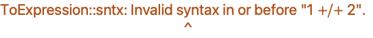
ToExpression["1 + 2 + "]
SyntaxQ["1 +/+ 2"]SyntaxLength["1 +/+ 2"]SyntaxLength["1 + 2 + "]| a
,
xyz
,
αβγ | symbols |
| "some text"
,
"α+β" | strings |
| 123.456
,
3*^45 | numbers |
| +
,
->
,
≠ | operators |
| (*comment*) | input to be ignored |
prefix | !x | Not[x] |
postfix | x! | Factorial[x] |
infix | x+y+z | Plus[x,y,z] |
matchfix | {x,y,z} | List[x,y,z] |
compound | x/:y=z | TagSet[x,y,z] |
overfix |  | OverHat[x] |
{FullForm[a * b + c], FullForm[a + b * c]}a * b + c//ff@a * b + cFullForm[a * (b + c)]Extensions of symbol names | x_
,
#2
,
e::s
, etc.
|
Function application variants | e[e]
,
e@@e
, etc.
|
Power‐related operators | √e
,
e^e
, etc.
|
Multiplication‐related operators
| ∇e
,
e/e
,
e⊗e
,
ee
, etc.
|
Addition‐related operators | e⊕e
,
e+e
,
e⋃e
, etc.
|
Relational operators | e==e
,
e∼e
,
e⪡e
,
e⧏e
,
e∈e
, etc.
|
Arrow and vector operators | e⟶e
,
e↗e
,
e⇌e
,
e⥓e
, etc.
|
Logic operators | ∀ee
,
e&&e
,
e∨e
,
e⊢e
, etc.
|
Pattern and rule operators | e..
,
ee
,
e->e
,
e/.e
, etc.
|
Pure function operator | e& |
Assignment operators | e=e
,
e:=e
, etc.
|
Compound expression | e;e |
Subscript[∀, x]Subscript[∃, y]x⊗y≻y∧m ≠ 0n⧐̸mFullForm[%]{x -> # ^ 2&, (x -> # ^ 2)&, x -> (# ^ 2&)}FullForm[a + b + c + d]FullForm[a ^ b ^ c ^ d] ,
,  , and
, and  from any alphabet are treated just like ordinary English letters, and can for example appear in the names of symbols. The same is true of letter‐like forms such as
  ,
,  , and
, and  .
.  and
and  are infix operators, while
  is a prefix operator, and
  and
and  are matchfix operators.
a ⊕ b ⊕ c//FullForm
a × a × a × b × b × c∫ k[x] ⅆx//FullForm∫ a[x] b[x] ⅆx + c[x]∫ (a[x] + b[x]) ⅆx + c[x]x^a + bSubscript[∂, x]x^n
Underoverscript[∑, n = 1, ∞](1/n^s)
Underoverscript[∑, n = 1, ∞](1/n^s) + n
2⊕3//FullForm
2⊕3
x_ ⊕ y_ := Mod[x + y, 2]
2 ⊕ 3| x⊕y | CirclePlus[x,y] |
| x≈y | TildeTilde[x,y] |
| x∴y | Therefore[x,y] |
| x↔y | LeftRightArrow[x,y] |
| ∇x | Del[x] |
| x | Square[x] |
| 〈x,y,…〉 | AngleBracket[x,y,…] |
x ≡ yFullForm[%] and
and  do have built‐in precedences. "Operator Input Forms" lists all the operators recognized by the Wolfram Language, in order of their precedence.
Clear[CirclePlus, CircleTimes];
x ⊗ y ⊕ z//FullForm| xy | Subscript[x,y] |
| x+ | SubPlus[x] |
| x- | SubMinus[x] |
| x* | SubStar[x] |
| x+ | SuperPlus[x] |
| x- | SuperMinus[x] |
| x* | SuperStar[x] |
| x† | SuperDagger[x] |
 | Overscript[x,y] |
 | Underscript[x,y] |
 | OverBar[x] |
 | OverVector[x] |
 | OverTilde[x] |
 | OverHat[x] |
 | OverDot[x] |
 | UnderBar[x] |
Subscript[x, 2] + Subscript[y, 2]//InputFormx^2 + y^2//InputFormx^† + y^ + //InputFormOverscript[x, _] + Overscript[y, ^ ]//InputFormFormat[bin[x_, y_]] := MatrixForm[{{x}, {y}}]bin[i + j, k]FullForm[%]| Format[expr1]:=expr2 | define expr1 to be formatted like expr2 |
| Format[expr1,form]:=expr2 | give a definition only for a particular output form |
Format[xrep[n_]] := StringJoin[Table["x", {n}]]xrep[1] + xrep[4] + xrep[9]% /. xrep[n_] -> x ^ n| Prefix[f[x],h] | prefix form h x |
| Postfix[f[x],h] | postfix form x h |
| Infix[f[x,y,…],h] | infix form x h y h… |
| Prefix[f[x]] | standard prefix form f@x |
| Postfix[f[x]] | standard postfix form x//f |
| Infix[f[x,y,…]] | standard infix form x~f~y~f~… |
| PrecedenceForm[expr,n] | an object to be parenthesized with a precedence level n |
Prefix[f[x], "<>"]s = Infix[{a, b, c}, "≺≻"]s + 2
 is treated as an operator with precedence 100. This precedence turns out to be low enough that parentheses are inserted:
PrecedenceForm[s, 100] ^ 2Format[x, TeXForm] := "{\\bf x}"TeXForm[1 + x ^ 2]| MakeBoxes[expr,form] | construct boxes to represent expr in the specified form |
| MakeExpression[boxes,form] | construct an expression corresponding to boxes |
MakeBoxes[2 + 2, StandardForm]MakeExpression[%, StandardForm] for which the Wolfram Language already has built‐in input and output rules.
CirclePlus[u, v, w]
u ⊕ v ⊕ w//FullFormgplus/:MakeBoxes[gplus[x_, y_, n_], StandardForm] := RowBox[{MakeBoxes[x, StandardForm], SubscriptBox["⊕", MakeBoxes[n, StandardForm]], MakeBoxes[y, StandardForm]}]
gplus[a, b, m + n]aSubscript[⊕, m + n]b
MakeExpression[RowBox[{x_, SubscriptBox["⊕", n_], y_}], StandardForm] := MakeExpression[RowBox[{"gplus", "[", x, ",", y, ",", n, "]"}], StandardForm]
aSubscript[⊕, m + n]b//FullForm■ Break input into tokens. |
■ Strip spacing characters. |
■ Construct boxes using built‐in operator precedences. |
■ Strip StyleBox and other boxes not intended for interpretation. |
■ Apply rules defined for MakeExpression. |
| Print[expr1,expr2,…] | print the expri, with no spaces in between, but with a newline (line feed) at the end |
Print[a, b];Print[c]
Do[Print[i, " ", i ^ 2], {i, 5}]
Print[Grid[{{1, 2}, {3, 4}}]]
Print[StringForm["x = ``, y = ``", a ^ 2, b ^ 2]]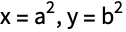
Print["A sine wave:", Plot[Sin[x], {x, 0, 2π}]]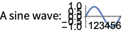
Print[InputForm[a ^ 2 + b ^ 2]]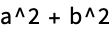
Styling Output
Table[If[PrimeQ[i], Style[i, Bold], Style[i, Gray]], {i, 1, 100}]Menu | Style[] option | Style[] directive |
| Format ▶ Size ▶ 14 | FontSize->14 | 14 |
| Format ▶ Text Color ▶ Gray | FontColor->Gray | Gray |
| Format ▶ Face ▶ Bold | FontWeight->Bold | Bold |
| Format ▶ Face ▶ Italic | FontSlant->Italic | Italic |
| Format ▶ Background Color ▶ Yellow | Background->Yellow | |
| Format ▶ Font | FontFamily->"Times" | |
| Format ▶ Style ▶ Subsection | "Subsection" |
Style[%, FontFamily -> "Helvetica"]Text[%%]Grid Layout
ptable = Table[If[PrimeQ[i], Style[i, Bold], Style[i, Gray]], {i, 1, 100}];Grid[Partition[ptable, 10]]Grid[Partition[ptable, 10], Alignment -> Right, Frame -> True, Background -> StandardBlue]Column[Options[Column]]Grid[{Range[15]!}]Grid[{Range[15]!}, ItemSize -> Full]Row[Range[15]!]Row[Range[15]!, ","]Using Output as Input
Grid[Partition[Take[ptable, 16], 4], Alignment -> Right, Frame -> True, Background -> StandardBlue](| | | | |
| -----: | ----: | -----: | -: |
| 1 | **2** | **3** | 4 |
| **5** | 6 | **7** | 8 |
| 9 | 10 | **11** | 12 |
| **13** | 14 | 15 | 16 | + 5)^3//Expand% //. {Grid[a_, ___] :> a, Style[a_, ___] :> a}Special Grid Entries
Grid[{
	{1, 2, 3, 4, 5},
	{6, 7, SpanFromLeft, SpanFromLeft, 10},
	{11, SpanFromAbove, SpanFromBoth, SpanFromBoth, 15},
{16, 17, 18, 19, 20}}, Frame -> All]| | | | | | | | | | |
| -- | -- | -- | -- | -- | -- | -- | - | - | -- |
| 1 | 2 | 3 | 4 | 5 | 6 | 7 | 8 | 9 | 10 |
| 11 | 12 | 13 | | 15 | 16 | | | | |
| 21 | 22 | | | 25 | | | | | |
| 31 | 32 | 33 | 34 | 35 | | | | | |
| 41 | | | | | | | | | |
| 51 | 52 | 53 | 54 | 55 | | | | | |
| 61 | 62 | 63 | | | | | | | |
| 71 | 72 | | | | 76 | 77 | | | |
| 81 | 82 | | | | 86 | | | | |
| 91 | 92 | | | | 96 | | | | |//InputFormGrid[Partition[Table[If[PrimeQ[i], Item[i, Background -> StandardGray], i], {i, 1, 100}], 10], Background -> StandardBlue]Grid[Partition[Table[If[PrimeQ[i], Grid[{{i}}, Frame -> True], i], {i, 1, 100}], 10]]Grid[Partition[Table[If[PrimeQ[i], Item[i, Frame -> True], i], {i, 1, 100}], 10]]Frames and Labels
Table[If[PrimeQ[i], Framed[i, Background -> StandardGray], i], {i, 1, 100}]Labeled[
Grid[Partition[ptable, 10], Alignment -> Right, Frame -> True],
Text[Row[{Style["• Prime", Bold], Style["• Composite", Gray]}, Spacer[15]]]]Panel[%]Panel[ptable, "Primes and Composites"]Panel[ptable, {"Primes and Composites"}, {{Bottom, Right}}]Other Annotations
Table[Tooltip[i, Divisors[i]], {i, 1, 100}]Table[Mouseover[i, Framed[Divisors[i], Background -> LightYellow]], {i, 1, 100}]Table[StatusArea[i, Divisors[i]], {i, 1, 100}]Table[PopupWindow[i, Divisors[i]], {i, 1, 100}]Table[Annotation[i, Divisors[i], "Mouse"], {i, 1, 100}]
Dynamic[MouseAnnotation[]]Graphics[{LightBlue, EdgeForm[Gray], Tooltip[CountryData[#, "SchematicPolygon"], #]& /@ CountryData[]}, ImageSize -> Full]Default Styles
Panel[Range[10]]Panel[Range[10], BaseStyle -> {"StandardForm"}]Grid[Partition[ptable, 10], BaseStyle -> {FontColor -> Blue}]Default Options
Table[If[PrimeQ[i], Framed[i], i], {i, 1, 100}]biglist = {1, Framed[2], Framed[3], 4, Framed[5], 6, Framed[7], 8, 9, 10, Framed[11], 12, Framed[13], 14, 15, 16, Framed[17], 18, Framed[19], 20, 21, 22, Framed[23], 24, 25, 26, 27, 28, Framed[29], 30, Framed[31], 32, 33, 34, 35, 36, Framed[37], 38, 39, 40, Framed[41], 42, Framed[43], 44, 45, 46, Framed[47], 48, 49, 50, 51, 52, Framed[53], 54, 55, 56, 57, 58, Framed[59], 60, Framed[61], 62, 63, 64, 65, 66, Framed[67], 68, 69, 70, Framed[71], 72, Framed[73], 74, 75, 76, 77, 78, Framed[79], 80, 81, 82, Framed[83], 84, 85, 86, 87, 88, Framed[89], 90, 91, 92, 93, 94, 95, 96, Framed[97], 98, 99, 100}Style[biglist, DefaultOptions -> {Framed -> {Background -> StandardGray, FrameStyle -> Blue}}]Mathematical Typesetting
{Subscript[a, b], Superscript[a, b], Underscript[a, b], Overscript[a, b], Subsuperscript[a, b, c], Underoverscript[a, b, c]}Table[Row[{i, Row[Superscript @@@ FactorInteger[i], "×"]}, "=="], {i, 100}]Using the Box Language
{a, b, RawBoxes[SubscriptBox["c", "d"]], e}The Basic Constructs
These constructs can be placed into three families: constructs that appear within notebooks as typesetting structures, functions that generate graphics whose contents are arranged on a grid, and constructs that can appear inside grids to adjust details of formatting.
Grid Family
| Grid[{{expr11,expr12,…},{expr21,expr22,…},…}] | |
an object that formats with the exprij arranged in a two-dimensional grid | |
| Column[{expr1,expr2,…}] | an object that formats with the expri arranged in a column, with expr1 above expr2, etc. |
| Row[{expr1,expr2,…}] | an object that formats with the expri arranged in a row, potentially extending over several lines |
Grid[{{"a", "b", "c"}, {"d", "e", "f"}, {"g", "h", "i"}}]Column[{"a", "b", "c", "d"}]Row[CharacterRange["a", "z"]]Graphics Grid Family
| GraphicsGrid[{{g11,g12,…},…}] | generates a graphic in which the gij are laid out in a two-dimensional grid |
| GraphicsColumn[{g1,g2,…}] | generates a graphic in which the gi are laid out in a column, with g1 above g2, etc. |
| GraphicsRow[{g1,g2,…}] | generates a graphic in which the gi are laid out in a row |
GraphicsGrid[{{[image], [image]}, {[image], [image]}}]GraphicsColumn[{[image], [image], [image]}]GraphicsRow[{[image], [image], [image]}]Embedded Constructs Family
| Item[expr,options] | displays with expr as the content, and with the specified options applied to the region containing expr |
| SpanFromLeft | indicates that the position is occupied by the contents on the left |
| SpanFromAbove | indicates that the position is occupied by the contents above |
| SpanFromBoth | indicates that the position is occupied from both above and left |
Grid[{{Item["a", Background -> Red, Frame -> True], "b", "c"}, {"d", "e", "f"}, {"g", "h", "i"}}]Grid[{{"a", SpanFromLeft, "c"}, {"d", "e", "f"}, {"g", "h", "i"}}, Frame -> All]Grid[{{"a", "b", "c"}, {SpanFromAbove, "e", "f"}, {"g", "h", "i"}}, Frame -> All]Grid[{{"a", SpanFromLeft, "c"}, {SpanFromAbove, SpanFromBoth, "f"}, {"g", "h", "i"}}, Frame -> All]Classes of Functionality
Grid and related constructs allow considerable appearance customization, often with very little syntax. The tables below indicate the kind of functionality that is supported; it is explained in detail in later sections.
In addition to these styling features, various forms of interactive editing and dynamic behavior are possible.
Options Syntax
A variety of options exist for adjusting the details of a grid's appearance. This section describes the common syntax shared by many of these options. This syntax provides a way to assign option values not only for the entire grid, but also for individual rows, columns, and even items.
The overall syntax for many options, such as Background, is based on forms like Background->{specx,specy}, where specx is itself a modular syntax that contains values for different columns, while specy contains values for the different rows.
| spec | apply spec to all items |
| {specx} | apply specx at successive horizontal positions |
| {specx,specy} | apply speck at successive horizontal and vertical positions |
| {specx,specy,rules} | give rules for the items based on their i,j position in the array |
Grid[{{1, 2, 3}, {4, 5, 6}, {7, 8, 9}}, Background -> {{1 -> Red, 2 -> Green, 3 -> Blue}, Automatic}]Grid[{{1, 2, 3}, {4, 5, 6}, {7, 8, 9}}, Background -> {{Red, Green, Blue}, Automatic}]These two methods have different strengths, as described in "Using Rules" and "Using Lists".
Using Rules
Rules provide a direct and readable method to give a specific row or column a specific value.
Grid[Table[x, {4}, {4}], Background -> {{1 -> Red, 3 -> Red}, Automatic}]Grid[Table[x, {4}, {4}], Background -> {Automatic, {1 -> Red, 3 -> Red}}]When there are a large number of rows or columns, rules are a convenient way to set the properties of just a few of them.
Grid[Table[x, {4}, {10}], Background -> {{1 -> Red, 3 -> Red, -2 -> Red}, Automatic}]Rules can also be used to give values to specific grid elements or subregions. Note, however, that while conceptually similar, this following syntax is separate from the discussion of specx and specy.
Grid[Table[x, {4}, {10}], Background -> {Automatic, Automatic, {3, 3} -> Red}]Grid[Table[x, {4}, {10}], Background -> {Automatic, Automatic, {{1, 3}, {1, 3}} -> Red}]Rules are an efficient way to specify the exceptions to the value that otherwise exists. However, they are less efficient when the intention is to manually specify a value for each piece of the grid.
Grid[Table[x, {4}, {10}], Background -> {{1 -> Red, 2 -> Blue, 3 -> Red, 4 -> Blue, 5 -> Red, 6 -> Blue, 7 -> Red, 8 -> Blue, 9 -> Red, 10 -> Blue}, Automatic}]To achieve repetitive patterns, it is instead recommended to use the list syntax described in the next section.
Using Lists
Giving sequential values in a list is a compact and convenient way to specify large numbers of option values for adjacent rows or columns.
Grid[Table[x, {4}, {10}], Background -> {{Red, Green, Blue, Orange, Magenta}, Automatic}]Additionally, sublists can be used to denote cyclic use of values.
Grid[Table[x, {4}, {10}], Background -> {{{Red, Green}}, Automatic}]These cyclic sublists can be padded at the beginning or end.
Grid[Table[x, {4}, {10}], Background -> {{Blue, Orange, {Red, Green}}, Automatic}]Grid[Table[x, {4}, {10}], Background -> {{{Red, Green}, Blue, Orange}, Automatic}]Grid[Table[x, {4}, {10}], Background -> {{Green, {Automatic}, Blue, Orange}, Automatic}]Because positions in the list correspond to positions in the grid, specifying a single value in the middle requires giving all previous values. To achieve this more directly, use rules as described in the section "Using Rules".
Grid[Table[x, {4}, {10}], Background -> {{Automatic, Automatic, Automatic, Automatic, Red}, Automatic}]Grid[Table[x, {4}, {10}], Background -> {{5 -> Red}, Automatic}]Using Both
It is possible to have the best of both worlds, using the list syntax for specifying repetitive portions of the grid while also using the rule syntax to specify exceptions.
Grid[Table[x, {4}, {10}], Background -> {{{{Blue, Green}}, {1 -> Red, -1 -> Red}}, Automatic}]Grid[Table[x, {4}, {10}], Background -> {{Blue, {1 -> Red, 5 -> Red}}, Automatic}]| {s1,s2,…,sn} | use s1 through sn; then use defaults |
| {{c}} | use c in all cases |
| {{c1,c2}} | alternate between c1 and c2 |
| {{c1,c2,…}} | cycle through all ci |
| {s,{c}} | use s, then repeatedly use c |
| {s1,{c},sn} | use s1, then repeatedly use c, but use sn at the end |
| {s1,s2,…,{c1,c2,…},sm,…,sn
}
| use the first sequence of si at the beginning, then cyclically use the ci, then use the last sequence of si at the end |
| {s1,s2,…,{},sm,…,sn} | use the first sequence of si at the beginning and the last sequence at the end |
| {i1->v1,i2->v2,…} | specify what to use at positions ik |
| {spec,rules} | use rules to override specifications in spec |
Columns, Rows, Gutters, and Items
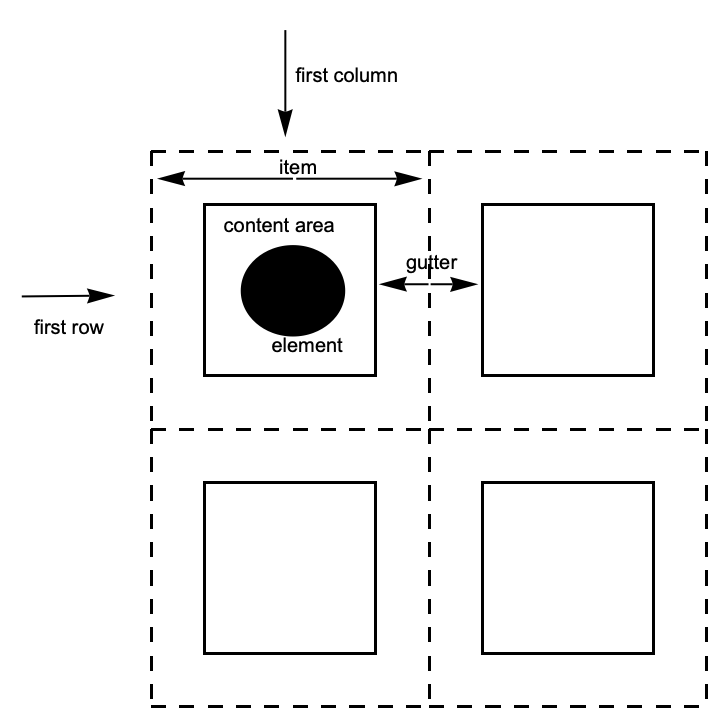
| column | vertical sequence of items |
| row | horizontal sequence of items |
| item | the region containing a grid element |
| gutter | the border between consecutive rows or columns |
Grid and GraphicsGrid follow the same conventions for describing the different possible slices of the grid. Column, GraphicsColumn, and GraphicsRow follow the same general conventions, except that they only deal in one of the two possible dimensions. Finally, Row does not participate in this system at all.
The World of Options
The following table identifies the slices each listed option can address. No option is valid for all constructs; refer to the key below to see which option can occur for a given construct.
Note that Row does not take any options.
Columns, Then Rows
To remember the syntax for options, the most important step is knowing that specific values for the columns are specified first, and values for rows are specified second.
| opt->val | use val for all items |
| opt->{colspec,rowspec} | use colspec for columns, rowspec for rows |
| opt->{colspec} | use colspec for columns, defaults for rows |
In the Wolfram Language, options with a horizontal setting h and a vertical setting v are specified as opt->{h,v}. ImageSize and PlotRange are two common options that help establish this convention.
In a grid, these horizontal and vertical settings correspond to values for the columns and rows, respectively. This is because columns are stacked horizontally, and so their properties—such as width and location—correspond to the horizontal dimension. Rows are stacked vertically, and their properties correspond to the vertical dimension.
Graphics[{}, ImageSize -> {100, 50}, Background -> StandardGray]Grid[{{1, 2, 3}, {4, 5, 6}, {7, 8, 9}}, ItemSize -> {2, 1}, Frame -> All]Grid[{{1, 2, 3}, {4, 5, 6}, {7, 8, 9}}, ItemSize -> {{1, 2, 3}, 1}, Frame -> All]Grid[{{1, 2, 3}, {4, 5, 6}, {7, 8, 9}}, ItemSize -> {1, {1, 2, 3}}, Frame -> All]Grid[{{1, 2, 3}, {4, 5, 6}, {7, 8, 9}}, Background -> {{Red, Green, Blue}, Automatic}]Gutters
Many Grid options deal with properties that can ultimately be associated with a column, row, or item in the grid.
However there are also options that deal with gutters between rows and columns.
Grid[Table[x, {3}, {13}], Dividers -> {None, {2 -> True}}]Grid[Table[x, {3}, {13}], Frame -> {None, {2 -> True}}]The syntax for Dividers and Spacings is exactly the same as for the other options. For a grid with n items in a particular direction, Dividers and Spacings can specify settings for the n+1 gaps between elements, starting before the first element and ending after the last element.
Items
The most granular level of description is the item. Each item in a grid can have its own value for options such as Background, Alignment, and Frame.
Grid[{{Item[a, Background -> Red], b}, {c, d}}]Grid[{{a, b}, {c, d}}, Background -> {Automatic, Automatic, {{1, 1} -> Red}}]Grid[Table[x, {5}, {5}], Background -> {Automatic, Automatic, Table[{i, i} -> Red, {i, 1, 5}]}]Grid[Table[x, {5}, {5}], Background -> {Automatic, Automatic, {{{2, 4}, {2, 4}} -> Red}}]Grid[Table[x, {5}, {5}], Frame -> {None, None, {{{2, 4}, {2, 4}} -> True}}]Dividers and Frames
| Dividers | draw dividers between columns or rows |
| Frame | put a frame around regions of the grid |
| FrameStyle | use an overall style for the lines |
Grid[Table[x, {4}, {7}], Frame -> True]Grid[Table[x, {4}, {7}], Frame -> {2 -> True, 3 -> True}]Frame always draws a line on all four faces of the enclosed region. Dividers allows a finer level of control.
Grid[Table[x, {4}, {7}], Dividers -> {2 -> True}]One result is that when using dividers, the resulting lines run in only a single direction.
Grid[Table[x, {4}, {7}], Dividers -> {All, None}]Grid[Table[x, {4}, {7}], Frame -> {All, None}]Grid[Table[x, {4}, {7}], Dividers -> Center]Styling Dividers and Frames
Grid[Table[x, {4}, {7}], Dividers -> {All, None}, FrameStyle -> Red]Grid[Table[x, {4}, {7}], Frame -> {All, None}, FrameStyle -> Red]Grid[Table[x, {4}, {7}], Dividers -> {{Brown, {1 -> Red, -1 -> Green}}, None}]Grid[Table[x, {4}, {7}], Frame -> {{{{Brown}}, {1 -> Red, -1 -> Green}}, None}]Precedence
When conflicting styles are given, Dividers has precedence over Frame, and they have precedence over FrameStyle. Styles from Item take precedence over all others.
Grid[Table[x, {4}, {7}], Dividers -> {2 -> True, 3 -> True}, Frame -> {None, 4 -> True}]Grid[{{x, x, x, x, x, x, x}, {x, Item[x, Frame -> Green], x, x, x, x, x}, {x, x, x, x, x, x, x}, {x, x, x, x, x, x, x}}, Dividers -> {2 -> Red, 2 -> Red}, Frame -> {{1 -> True}, 4 -> Orange}, FrameStyle -> Directive[Dashing[2], Thickness[2], Blue]]Alignment and Positioning
Grid[{{1, 10}, {100, 1000}, {10000, 100000}}, Alignment -> Right]Grid[{{1, 10}, {100, 1000}, {10000, 100000}}, Alignment -> {{Right, Left}}]Grid[{{1, 10}, {100, 1000}, {10000, 100000}}, Alignment -> {{Right, Left}, Automatic, {{1, 1} -> Left, {1, 2} -> Right}}]Grid[{{Item[1, Alignment -> Left], Item[10, Alignment -> Right]}, {100, 1000}, {10000, 100000}}, Alignment -> {{Right, Left}}]Column[{1234., 123.4, 12.34, 1.234}, Alignment -> "."]{a, Grid[{{1, 2}, {3, 4}}], b}{a, Grid[{{1, 2}, {3, 4}}, BaselinePosition -> Bottom, Frame -> True], b}{a, Grid[{{1, 2}, {3, 4}}, BaselinePosition -> {2, 1}, Frame -> True], b}Background and Style
Common Cases
Though an element can have its own background, awkward gaps result when you put elements together.
Grid[{{Style[a, Background -> Brown], Style[b, Background -> Brown]}}]Grid and related functions place a background across the entire group of items in which the elements are contained.
Grid[{{a, b}}, Background -> Brown]With more sophisticated syntax, a variety of patterns is easy to achieve.
Grid[Table[x, {5}, {7}], Background -> {{{Brown, None}}}]Grid[Table[x, {5}, {7}], Background -> {None, {{Brown, None}}}]Grid[Table[x, {5}, {7}], Background -> {5 -> Brown, 4 -> Brown}]Grid[{{"The ", "quick ", Item["brown", Background -> Brown], " fox ", "jumps ", "over ", "the ", "lazy ", "dog."}}]Precedence of Overlapping Background Settings
Grid[Table[x, {3}, {7}], Background -> {{{Brown, None}}, {{StandardGreen, None}}}]Grid[Table[x, {3}, {7}], Background -> {{{Brown, None}}, {1 -> StandardGreen, 3 -> StandardGreen}}]Grid[Table[x, {3}, {7}], Background -> {{1 -> Brown, 3 -> Brown, 5 -> Brown, 7 -> Brown}, {{StandardGreen, None}}}]Grid[{{Item[x, Background -> Red], x, x, x, x, x, x}, {x, x, x, x, x, x, x}, {x, x, x, x, x, x, x}}, Background -> {{1 -> Brown, 3 -> Brown, 5 -> Brown, 7 -> Brown}, {{StandardGreen, None}}}]Spanning and Nesting
Grid[{{"a", SpanFromLeft, "c"}, {"d", "e", "f"}, {"g", "h", "i"}}, Frame -> All]Grid[{{"a", "b", "c"}, {SpanFromAbove, "e", "f"}, {"g", "h", "i"}}, Frame -> All]Grid[{{"a", SpanFromLeft, "c"}, {SpanFromAbove, SpanFromBoth, "f"}, {"g", "h", "i"}}, Frame -> All]Grid[{{"a", SpanFromLeft, "c"}, {SpanFromAbove, SpanFromBoth, SpanFromLeft}, {"g", "h", "i"}}, Frame -> All]Row[{Column[{a, b, c}], Column[{d, e}], f}]Grid[{{Grid[{{a, b}, {c, d}}], e}, {f, g}}]Sizing and Spacing
Sizing in Grid
Grid will typically not modify the size of its elements. Also, rows and columns are by default made as narrow as possible while accommodating the contents.
Grid[{{a, b}, {[image], [image]}}, Frame -> All]Notice in the above example that the second row is much taller than the first, the second column thinner than the first, and the sizes of the elements were not modified in any way.
If elements in the grid are interactively or dynamically changed, the size of the entire grid will automatically adjust as appropriate.
A useful exception is that Button will by default expand to fill the available space.
Grid[{{a, b}, {Button[c], [image]}}, Frame -> All]ItemSize can be used to override the default behavior.
Grid[{{a, b}, {Button[c], [image]}}, Frame -> All, ItemSize -> All]Grid[Table[x, {3}, {7}], Frame -> All, ItemSize -> {{1, 2, 3, 4, 5, 6, 7}, 1}]The units used for ItemSize are the typesetting units known as "exs" and "ems."
It is also possible to specify widths as a fraction of the enclosing area by using Scaled.
Grid[Table[x, {3}, {7}], Frame -> All, ItemSize -> {{Scaled[.3], Scaled[.3], 3, 4, 5, 6, 7}, 1}]Line Wrapping in Grid
Textual items will line wrap if the columns are too narrow. Notice that this forces the rows to be taller than the minimum specified.
Grid[Table[xxxx, {3}, {7}], Frame -> All, ItemSize -> {{1, 2, 3, 4, 5, 6, 7}, 1}]Grid[{{100!}, {200!}}, Frame -> All, ItemSize -> Automatic]Grid[{{100!}, {110!}}, Frame -> All, ItemSize -> Full]Sizing in GraphicsGrid
GraphicsGrid will by default return a grid whose items are all the same size.
randomgrid = Table[Graphics[Circle[], ImageSize -> Automatic,
AspectRatio -> RandomReal[]], {3}, {5}];GraphicsGrid[randomgrid, Frame -> All]It will automatically choose an aspect ratio that is appropriate for the overall collection of elements.
Compare this with the equivalent Grid example, which does not impose either an overall size or an aspect ratio.
Grid[randomgrid, Frame -> All]GraphicsGrid does not support an ItemSize option, but it does support ImageSize.
GraphicsGrid[randomgrid, ImageSize -> 200, Frame -> All]| Input[] | read an expression as input |
| InputString[] | read a string as input |
| Input["prompt"] |
issue a prompt, then read an expression
|
| InputString["prompt"] |
issue a prompt, then read a string
|
| Quiet[expr] | evaluate expr without printing any messages |
| Quiet[expr,{s1::tag,s2::tag,…}] | evaluate expr without printing the specified messages |
| Off[s::tag] |
switch off a message, so it is not printed
|
| On[s::tag] | switch on a message |
Log[a, b, c]
Quiet[Log[a, b, c]]Log[a, b, c]
Off[Log::argt]Log[a, b, c]| s::tag | give the text of a message |
| s::tag=string | set the text of a message |
| Messages[s] | show all messages associated with s |
LinearSolve[{{1, 1}, {2, 2}}, {3, 5}]
LinearSolve::nosolLinearSolve::nosol = "Matrix encountered is not invertible."LinearSolve[{{1, 1}, {2, 2}}, {3, 5}]
Sqrt[a, b]
General::argxQuiet[{Sin[a, b], Sqrt[a, b]}, Sqrt::argx]
Quiet[{Sin[a, b], Sqrt[a, b]}, General::argx]Entropy[x]
IdentityMatrix[4, x]
Quiet[{Entropy[x], IdentityMatrix[4, x]}, General::targ]
| $MessageList | a list of the messages produced during a particular computation |
| MessageList[n] | a list of the messages produced during the processing of the n th input line in a Wolfram Language session |
Sqrt[a, b, c];Exp[a, b];$MessageList
InputForm[%]| Check[expr,failexpr] | if no messages are generated during the evaluation of expr, then return expr; otherwise return failexpr |
| Check[expr,failexpr,s1::t1,s2::t2,…] | check only for the messages si::ti |
Check[1 ^ 0, err]Check[0 ^ 0, err]
Check[Sin[1, 2], err, General::ind]
| Message[s::tag] | print a message |
| Message[s::tag,expr1,…] | print a message, with the expri spliced into its string form |
f::overflow = "Factorial argument `1` too large."f[x_] := If[x > 10, (Message[f::overflow, x];Infinity), x!]f[20]
Off[f::overflow]f[20]| $Language="lang" | set the language to use |
$Language = "French"Sqrt[a, b, c]
| symbol::tag | the default form of a message |
| symbol::tag::Language | a message in a particular language |
If[a > b, (*then*) p, (*else*) q]| f::usage="text" | define the usage message for a function |
| ?f | get information about a function |
| ??f | get more information about a function |
f[x_] := x ^ 2f::usage = "f[x] gives the square of x."? f??f? Plot *