


ListLinePlot
ListLinePlot[{y1,…,yn}]
绘制穿过点 {1,y1}、…、{n,yn} 的曲线.
ListLinePlot[{{x1,y1},…,{xn,yn}}]
绘制穿过点 {x1,y1}、…、{xn,yn} 的曲线.
ListLinePlot[{data1,data2,…}]
绘制所有 datai 的曲线.
ListLinePlot[{…,w[datai,…],…}]
绘制 datai,其特征由符号封装 w 所定义.
更多信息和选项
- ListLinePlot 亦称为曲线图.
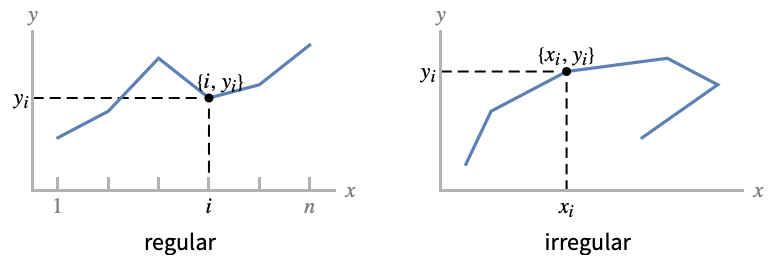
- 常规数据 {y1,…,yn} 被绘制为穿过点 {i,yi} 的功能曲线.
- 不规则数据 {{x1,y1},…,{xn,yn}} 被绘制为穿过点 {xi,yi} 的自由曲线.
- 可以用下列形式给出 xi 和 yi 的值:
-
xi 实数 Quantity[xi,unit] 带有单位的量 Around[xi,ei] 带有不确定性 ei 的值 xi Interval[{xmin,xmax}] 介于 xmin 和 xmax 间的值 - 不具有上述格式的数值 xi 和 yi 将被视为缺失值,并且不显示.
- datai 具有下列格式和解释:
-
<"k1"y1,"k2"y2,…> 数值 {y1,y2,…} <x1y1,x2y2,…> 键值对 {{x1,y1},{x2,y2},…} {y1"lbl1",y2"lbl2",…}, {y1,y2,…}{"lbl1","lbl2",…} 有 {lbl1,lbl2,…} 标签的值 {y1,y2,…} SparseArray 以一般数组形式给出的数值 TimeSeries, EventSeries 时间数值对 QuantityArray 量值 WeightedData 未加权的值 - ListLinePlot[Tabular[…]cspec] 使用列规范 cspec 从表格对象中提取并绘制数值.
- 在绘制表格数据时,允许使用以下形式的列规范 cspec:
-
{colx,coly} 绘制列 y 与列 x 的对比图 {{colx1,coly1},{colx2,coly2},…} 绘制列 y1 与列 x1、列 y2 与列 x2、 … 的对比图 coly, {coly} 将列 y 绘制为一个值序列 {{coly1},…,{colyi},…} 将列 y1, y2, … 绘制为值序列 - colx 也可以是 Automatic,在这种情况下,将使用 DataRange 生成序贯值.
- ListLinePlot[TimeSeries[…]cspec] 和 ListLinePlot[EventSeries[…]cspec] 用分量指定 cspec 从时间或事件序列中提取值并绘制.
- 可使用以下形式的分量指定 cspec 来绘制序列数据:
-
com 绘制分量 com 与时间戳 {com1,com2,…} 绘制每个分量 comi 与时间戳 - 可将下列封装 w 用于 datai:
-
Annotation[datai,label] 为数据提供注释 Button[datai,action] 定义数据被点击时要执行的操作 Callout[datai,label] 用 callout 来标记数据 Callout[datai,label,pos] 在相对位置 pos 上放置 callout EventHandler[datai,events] 定义数据的通用事件处理程序 Highlighted[datai,effect] 用某种效果动态突出显示 fi Highlighted[datai,Placed[effect,pos]] 在位置 pos 处用某种效果静态突出显示 fi Hyperlink[datai,uri] 把数据变为一个超链接 Labeled[datai,label] 标记数据 Labeled[datai,label,pos] 在相对位置 pos 上放置标签 Legended[datai,label] 在图例中标识数据 PopupWindow[datai,cont] 为数据添加弹出窗口 StatusArea[datai,label] 当鼠标移过时在状态栏中显示 Style[datai,styles] 用指定样式显示数据 Tooltip[datai,label] 在曲线上添加提示条 - 可在多个层级上应用封装 w:
-
{…,w[yi],…} 封装数据中的值 yi {…,w[{xi,yi}],…} 封装点 {xi,yi} w[datai] 封装数据 w[{data1,…}] 封装一组 datai w1[w2[…]] 使用嵌套封装 - 在 Callout、Labeled 和 Placed 中可使用以下位置 pos:
-

Above 曲线上方的位置 
Below 曲线下面的位置 
Before 曲线前面的位置 
After 曲线后面的位置 
"Start" 每条曲线开始的位置 
"End" 每条曲线结束的位置 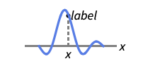
x 靠近曲线的位置 x 处 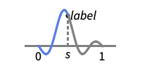
Scaled[s] 沿曲线的缩放位置 s 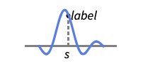
{s,Above} 沿曲线的位置 s 处,在该处曲线的上面 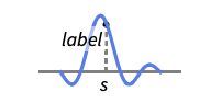
{s,Below} 沿曲线的位置 s 处,在该处曲线的下面 
{pos,epos} 曲线的位置 pos 处标签内的 epos 处 - ListLinePlot 和 Graphics 有相同的选项,不同之处和更多选项如下所示: [所有选项的列表]
- DataRange 确定如何将数据 {y1,…,yn} 解释成 {{x1,y1},…,{xn,yn}}. 可能的设置包括:
-
Automatic,All 从 1 到 n 均匀排列 {xmin,xmax} 从 xmin 到 xmax 均匀排列 - 通常情况下数据对列表 {{x1,y1},{x2,y2},…} 会被解释成一列点,但设置 DataRangeAll 会强制将其解释为多个数据源 {{y11,y12},{y21,y23},…}. »
- LabelingFunction->f 指明每个点应该有由 f[value,index,lbls] 给定的标签,其中 value 是与点关联的值,index 是在 data 中的位置,lbls 是相关标签的列表.
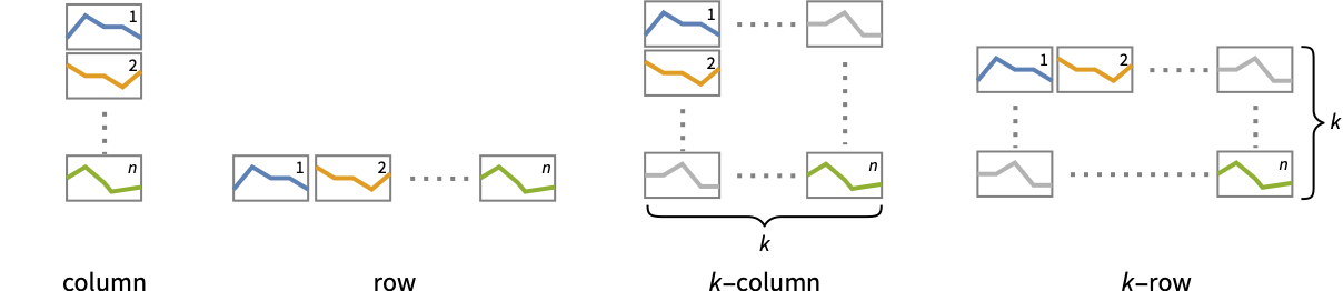
- PlotLayout 在单个绘图面板上显示多条曲线的可能设置包括:
-

"Overlaid" 显示所有重叠数据 
"Stacked" 累计数据 
"Percentile" 累计并标准化数据 - 在多个绘图面板中显示单个曲线的 PlotLayout 的可能设置包括:
-
"Column" 在一列面板中使用不同曲线 "Row" 在一行面板中使用不同曲线 {"Column",k},{"Row",k} 使用 k 列或行 {"Column",UpTo[k]},{"Row",UpTo[k]} 使用至多 k 列或行 - 对 Highlighted 和 PlotHighlighting 的可能高亮效果包括:
-
style 突出显示指定曲线 
"Ball" 高亮并标注曲线中的指定点 
"Dropline" 用垂线标出曲线中的指定点并在坐标轴上添加标签 
"XSlice" 高亮并标注垂直截面上的所有点 
"YSlice" 高亮并标注水平截面上的所有点 
Placed[effect,pos] 静态突出显示给定位置 pos - PlotLegends 的典型设置包括:
-
None 无图例 Automatic 自动确定图例 {lbl1,lbl2,…} 用 lbl1、lbl2、… 作为图例的标签 Placed[lspec,…] 为图例指定位置 - PlotStylesty 指定每条曲线使用的样式. 可能的设置包括:
-
{sty1,sty2,…} 针对每个数据集的一系列样式 <"key"val,…> 针对不同层级的数据的样式元素 - 接受的键有:
-
"Base" 所有 datai 的整体样式 "Lists" 针对每个 datai 的样式 styi 的列表 - ColorData["DefaultPlotColors"] 给出 PlotStyle 使用的默认颜色序列.
- ScalingFunctions->"scale" 缩放
 坐标;ScalingFunctions{"scalex","scaley"} 同时缩放
  和
和  坐标.
坐标.
所有选项的列表
范例
打开所有单元 关闭所有单元基本范例 (6)
ListLinePlot[{1, 1, 2, 3, 5, 8}]ListLinePlot[Prime[Range[25]], Filling -> Axis]ListLinePlot[Table[{Cos[k 2Pi / 7], Sin[k 2Pi / 7]}, {k, 0, 21, 3}], Frame -> True, Axes -> False]ListLinePlot[Table[Accumulate[RandomReal[{-1, 1}, 250]], {3}], Filling -> Axis, PlotLegends -> {"one", "two", "three"}]ListLinePlot[{Labeled[Sqrt[Range[40]], "sqrt"], Labeled[Log[Range[40, 80]], "log"]}, PlotLayout -> "Row"]ListLinePlot[Quantity[{0, 3, 6, 8, 10, 11, 11, 16, 20, 22}, "Centimeters"], AxesLabel -> Automatic]范围 (58)
普通数据 (10)
ListLinePlot[{1, 2, 3, 5, 8, 13, 21}]ListLinePlot[{{1, 1}, {2, 2}, {3, 4}, {5, 8}, {8, 16}, {13, 32}, {21, 64}}]ListLinePlot[{{1, 2, 3, 5, 8, 13, 21}, {1, 2, 4, 8, 16, 32, 64}}]ListLinePlot[{1, 2, 3, 4, 25, 8, 9}]ListLinePlot[{1, 2, 4, 3, 5, 9, 8, 7}, DataRange -> {0, 1}]ListLinePlot[{1, 2, 3, None, 5, 6, Missing["NotAvailable"], 8, 9}]使用 InterpolationOrder 使数据平滑:
{ListLinePlot[{1, 2, 4, 7, 3, 5, 8, 10, 9}], ListLinePlot[{1, 2, 4, 7, 3, 5, 8, 10, 9}, InterpolationOrder -> 2]}使用 MaxPlotPoints 来限制使用点的数量:
ListLinePlot[Table[Sin[5x], {x, 0, 2Pi, 0.1}], MaxPlotPoints -> 10]ListLinePlot[Table[{x, Sin[5x]}, {x, 0, 2Pi, 0.1}], MaxPlotPoints -> 10]使用 PlotRange 来关注感兴趣的区域:
{ListLinePlot[Table[x ^ 4 - x ^ 2 + 1, {x, -2, 2, 0.1}]], ListLinePlot[Table[x ^ 4 - x ^ 2 + 1, {x, -2, 2, 0.1}], PlotRange -> {0, 2}]}使用 ScalingFunctions 缩放轴:
ListLinePlot[Factorial[Range[20]], ScalingFunctions -> "Log"]表格数据 (3)
timings = Tabular[IconizedObject[«timings»], {"vertices", "edges", "connected", "edge coloring", "spanning tree", "shortest tour"}]ListLinePlot[timings -> {"vertices", "edge coloring"}]ListLinePlot[timings -> "edge coloring"]ListLinePlot[timings -> {{"vertices", "edge coloring"}, {"vertices", "shortest tour"}}, MultiaxisArrangement -> All]绘制 TimeSeries 或 EventSeries 中的所有数据:
ListLinePlot[TimeSeries[TimeEventSeries`TimestampData[Association["UniformlySpacedQ" -> False,
   "Timestamps" -> TabularColumn[Association[
      "Data" -> {7, {{NumericArray[{-248, 118, 298, 638, 865, 1006, 1216}, "Integer32"], {},
          None}}, None},  ...   "Data" -> {{32, 62, 112, 167, 179, 209, 214}, {}, None}, "ElementType" -> "Integer64"]],
         TabularColumn[Association["Data" -> {{30, 49, 81, 125, 142, 174, 177}, {}, None},
           "ElementType" -> "Integer64"]]}}]]]], Association[]]]
绘制 TimeSeries 或 EventSeries 中的特定分量:
trees = TimeSeries[TimeEventSeries`TimestampData[Association["UniformlySpacedQ" -> False,
   "Timestamps" -> TabularColumn[Association[
      "Data" -> {7, {{NumericArray[{-248, 118, 298, 638, 865, 1006, 1216}, "Integer32"], {},
          None}}, None},  ...   "Data" -> {{32, 62, 112, 167, 179, 209, 214}, {}, None}, "ElementType" -> "Integer64"]],
         TabularColumn[Association["Data" -> {{30, 49, 81, 125, 142, 174, 177}, {}, None},
"ElementType" -> "Integer64"]]}}]]]], Association[]];ListLinePlot[trees -> "tree 1"]ListLinePlot[trees -> {"tree 1", "tree 2"}]特殊数据 (9)
使用 Quantity 在数据中包含单位:
ListLinePlot[Quantity[Sqrt[Range[10]], "Meters"], AxesLabel -> Automatic]data = EntityValue[EntityClass["Element", All], {"AtomicMass", "MeltingPoint"}];ListLinePlot[data, AxesLabel -> Automatic]在 QuantityArray 中绘制数据:
data = QuantityArray[EntityValue[EntityClass["Element", All], {"AtomicMass", "MeltingPoint"}]]ListLinePlot[data, AxesLabel -> Automatic]指定在 TargetUnits 中使用的单位:
ListLinePlot[data, TargetUnits -> {Automatic, "Kelvin"}, AxesLabel -> Automatic]ListLinePlot[Table[Around[RandomReal[5], RandomReal[0.5]], 20]]ListLinePlot[Table[Interval[RandomReal[5] + {-0.5, 0.5}], 20]]ListLinePlot[Table[Interval[RandomReal[5] + {-0.5, 0.5}], 20], IntervalMarkers -> "Bands"]ListLinePlot[{2 -> "a", 3 -> "b", 5 -> "c", 7 -> "d", 11 -> "e", 13 -> "f", 17 -> "g"}]ListLinePlot[{2, 3, 5, 7, 11, 13, 17} -> {"a", "b", "c", "d", "e", "f", "g"}]ListLinePlot[{2, 3, 5, 7, 11, 13, 17} -> {"a", "b", "c", "d", "e", "f", "g"}, LabelingFunction -> Below]Association 中的数字值用作 y 坐标:
ListLinePlot[<|"a" -> 2, "b" -> 3, "c" -> 5, "d" -> 7, "e" -> 11, "f" -> 13|>]Association 中的数字键和值用作 x 和 y 坐标:
ListLinePlot[<|2 -> 1, 3 -> 2, 5 -> 3, 7 -> 4, 11 -> 5, 13 -> 6|>]绘制 TimeSeries,采用自动设置的日期刻度:
data = CountryData["UnitedStates", {{"Population"}, {1988, 2013}}]ListLinePlot[data, AxesLabel -> Automatic]在 SparseArray 中绘制数据:
ListLinePlot[SparseArray[Table[Prime[i] -> 1, {i, 25}]]]忽略 WeightedData 中的权重:
ListLinePlot[WeightedData[{2, 3, 5, 7, 11, 13, 17, 19, 23, 29}, {1, 2, 3, 4, 5, 6, 7, 8, 9, 10}]]数据封装 (7)
{ListLinePlot[{Style[{1, 2, 3}, Green], {4, 5, 6}}], ListLinePlot[Style[{{1, 2, 3}, {4, 5, 6}}, Blue]]}ListLinePlot[Tooltip[Prime[Range[20]]], Mesh -> Full]ListLinePlot[Tooltip[Prime[Range[20]], "primes"]]使用 PopupWindow 提供额外下拉信息:
ListLinePlot[PopupWindow[{1, 2, 3}, DateListPlot[FinancialData["IBM", "Jan. 1, 2004"]]]]Button 可用于触发任何行为:
ListLinePlot[Button[{1, 2, 3}, Speak["Hello"]]]将 Annotation 用于鼠标进入图线的动态行为:
{ListLinePlot[Annotation[Prime[Range[20]], "label", "Mouse"]], Dynamic[MouseAnnotation[]]}点击时,使用 Hyperlink 跳到特定链接:
ListLinePlot[Hyperlink[Prime[Range[20]], "http://www.wolfram.com"]]使用 StatusArea 在当前笔记本的状态栏中显示字符串:
ListLinePlot[StatusArea[Prime[Range[20]], "String"]]添加标签和图例 (14)
用 Labeled 标记数据源:
data = Table[Table[{x, f}, {x, 0, 2Pi, 0.1}], {f, {Sin[x], Sin[2x]}}];ListLinePlot[MapThread[Labeled[#1, #2]&, {data, {Sin[x], Sin[2x]}}]]用 PlotLabels 指定标签:
data = Table[Table[{x, f}, {x, 0, 2Pi, 0.1}], {f, {Sin[x], Sin[2x]}}];ListLinePlot[data, PlotLabels -> {Sin[x], Sin[2x]}]ListLinePlot[Labeled[Table[{x, Sin[x]}, {x, 0, 2Pi, 0.1}], "sin(x)", 3]]ListLinePlot[Labeled[Table[{x, Sin[x]}, {x, 0, 2Pi, 0.1}], "sin(x)", Scaled[0.25]]]ListLinePlot[Labeled[Table[{x, Sin[x]}, {x, 0, 2Pi, 0.1}], Sin[x], {Scaled[0.25], Above}]]用 Callout 自动标记数据:
ListLinePlot[{Callout[Table[PartitionsQ[n], {n, 18}], PartitionsQ[n]], Callout[Table[n, {n, 18}], n]}]ListLinePlot[Callout[Table[n ^ Sin[n], {n, 1, 10, 0.25}], "label", Above]]ListLinePlot[Callout[Table[n ^ Sin[n], {n, 1, 10, 0.25}], "label", 25]]用 LabelingFunction 指定标签名:
ListLinePlot[Prime[Range[10]], LabelingFunction -> (#1 &)]data = Table[Labeled[Prime[i], RandomWord[]], {i, 10}];ListLinePlot[data, LabelingSize -> 30]ListLinePlot[data, LabelingSize -> Full]data = Table[Table[{x, f}, {x, 0, 2Pi, 0.1}], {f, {Sin[x], Sin[2x]}}];ListLinePlot[data, PlotLegends -> {Sin[x], Sin[2x]}]使用 Legended 为特定数据集提供图例:
upper = RandomReal[{1.5, 2}, 50];
lower = RandomReal[0.5, 50];ListLinePlot[{lower, Legended[Mean[{lower, upper}], "average"], upper}]使用 Placed 改变图例位置:
ListLinePlot[{lower, Legended[Mean[{lower, upper}], Placed["average", Below]], upper}]ListLinePlot[<|"fibonacci" -> Fibonacci[Range[10]], "primes" -> Prime[Range[10]]|>, PlotLabels -> Automatic, PlotLegends -> None]ListLinePlot[{...}]ListLinePlot[Callout[{...}, "hello", 13]]{ListLinePlot[{{...}, {...}}, PlotHighlighting -> "Dropline"], ListLinePlot[{{...}, {...}}, PlotHighlighting -> "XSlice"]}使用 Highlighted 来强调图中的特定点:
ListLinePlot[Highlighted[{...}, Placed["Ball", 7]]]ListLinePlot[Highlighted[{...}, Placed["Ball", {{7}, {17}}]]]演示 (15)
data = Table[Table[{x, f}, {x, 0, 2Pi, 0.1}], {f, {Sin[x], Sin[2x]}}];ListLinePlot[data]data = Table[Table[{x, f}, {x, 0, 2Pi, 0.1}], {f, {Sin[x], Sin[2x]}}];ListLinePlot[data, PlotStyle -> {Dashed, Red}]ListLinePlot[{Prime[Range[20]], Range[20]}, PlotTheme -> "Marketing"]data = Table[Table[{x, f}, {x, 0, 2Pi, 0.1}], {f, {Sin[x], Sin[2x]}}];ListLinePlot[data, PlotLegends -> {Sin[x], Sin[2x]}]使用 Legended 提供特定数据集的图例:
upper = RandomReal[{1.5, 2}, 50];
lower = RandomReal[0.5, 50];ListLinePlot[{lower, Legended[Mean[{lower, upper}], "average"], upper}]ListLinePlot[Table[{k, Binomial[15, k]}, {k, 0, 15}], AxesLabel -> {k, None}, PlotLabel -> Binomial[15, k]]为数据提供交互式 Tooltip:
ListLinePlot[Tooltip[Table[If[PrimeQ[x], Tooltip[x, Row[{"prime: ", x}]], x], {x, 1, 25}]], Mesh -> All]ListLinePlot[{Tooltip[{1, 2, 4, 8, 16, 32, 64}, TraditionalForm[2 ^ k]], Tooltip[{1, 2, 3, 5, 8, 13, 21}, TraditionalForm[Fibonacci[k]]]}, Mesh -> Full]ListLinePlot[{{1, 2, 4, 8, 16, 32, 64}, {1, 2, 3, 5, 8, 13, 21}}, Filling -> {1 -> {2}}]ListLinePlot[{1, 2, 3, 5, 8, 13, 21}, Mesh -> 10]ListLinePlot[{Tooltip[{1, 2, 4, 8, 16, 32, 64}, TraditionalForm[2 ^ k]], Tooltip[{1, 2, 3, 5, 8, 13, 21}, TraditionalForm[Fibonacci[k]]]}, Mesh -> Full, PlotMarkers -> Automatic]ListLinePlot[{1, 2, 3, 5, 8, 13, 21}, Mesh -> 10, MeshShading -> {Red, None, Blue}]ListLinePlot[{IconizedObject[«walk #1»], IconizedObject[«walk #2»]}, PlotLayout -> "Row"]ListLinePlot[{IconizedObject[«walk #1»], IconizedObject[«walk #2»]}, PlotLayout -> "Column"]ListLinePlot[{IconizedObject[«walk #1»], IconizedObject[«walk #2»], IconizedObject[«walk #3»], IconizedObject[«walk #4»]}, PlotLayout -> {"Row", 2}]data = {{10, 9, 4, 3, 5, 3, 5, 5, 2, 6}, {2, 10, 5, 6, 9, 4, 9, 3, 7, 2}, {7, 8, 3, 4, 4, 2, 6, 3, 8, 7}};ListLinePlot[data, PlotLayout -> "Stacked", Joined -> True]ListLinePlot[data, PlotLayout -> "Percentile", Joined -> True]ListLinePlot[{Prime[Range[10]], Range[10] ^ 2}, MultiaxisArrangement -> All]ListLinePlot[{Range[10], Prime[Range[10]], Range[10] ^ 2}, MultiaxisArrangement -> {Right -> {1, 2}, Left -> 3}]ListLinePlot[{Range[10], Prime[Range[10]], Range[10] ^ 2}, MultiaxisArrangement -> {Right -> {{1, 2}}, Left -> 3}]选项 (162)
ClippingStyle (5)
ListLinePlot[Table[{x, Sin[x] / x ^ 2}, {x, -10, 10, 0.2}], ClippingStyle -> None]//QuietListLinePlot[Table[{x, Sin[x] / x ^ 2}, {x, -10, 10, 0.2}], ClippingStyle -> Automatic, PlotStyle -> Thick]//QuietListLinePlot[Table[{x, Sin[x] / x ^ 2}, {x, -10, 10, 0.2}], ClippingStyle -> Red]//QuietListLinePlot[Table[{x, Sin[x] / x ^ 2}, {x, -10, 10, 0.2}], ClippingStyle -> {Red, Thick}]//QuietListLinePlot[Table[{x, Sin[x] / x ^ 2}, {x, -10, 10, 0.2}], ClippingStyle -> Directive[Red, Thick]]//QuietColorFunction (5)
Table[ListLinePlot[Sinc[Range[0, 10, 0.1]], ColorFunction -> Function[{x, y}, f], PlotLabel -> f, PlotStyle -> Thick], {f, {Hue[x], Hue[y]}}]ListLinePlot[Sinc[Range[0, 10, 0.1]], ColorFunction -> "DarkRainbow"]ListLinePlot[Sinc[Range[0, 10, 0.1]], ColorFunction -> Function[{x, y}, Hue[x]], Filling -> Axis]ListLinePlot[Array[Prime, 100], ColorFunction -> Function[{x, y}, Blend[{Yellow, Red}, x]], Filling -> Axis]对于着色曲线,ColorFunction 比 PlotStyle 有更高的优先级:
ListLinePlot[Sinc[Range[0, 10, 0.1]], ColorFunction -> "DarkRainbow", PlotStyle -> Directive[Red, Thick]]用 MeshShading 中的 Automatic 来使用 ColorFunction:
ListLinePlot[Sin[Range[0, 10, 0.1]], ColorFunction -> "Rainbow", PlotStyle -> Directive[Red, Thick], Mesh -> 10, MeshShading -> {Automatic, StandardGray}, MeshStyle -> None]ColorFunctionScaling (2)
ListLinePlot[Table[x ^ 2Exp[-x ^ 2], {x, -5, 5, 0.1}], ColorFunction -> Function[{x, y}, Hue[y]], PlotStyle -> Thick, ColorFunctionScaling -> True]ListLinePlot[Table[x ^ 2Exp[-x ^ 2], {x, -5, 5, 0.1}], ColorFunction -> Function[{x, y}, Hue[y]], PlotStyle -> Thick, ColorFunctionScaling -> False]DataRange (5)
ListLinePlot[Table[Sin[x], {x, 0, 2Pi, 0.1}]]ListLinePlot[Table[Sin[x], {x, 0, 2Pi, 0.1}], DataRange -> {0, 2Pi}]ListLinePlot[{{1, 2, 3}, {4, 5, 6, 7}, {8, 9, 10, 11, 12}}, DataRange -> {0, 1}]ListLinePlot[{{1, 1}, {2, 2}, {3, 2}}]在此情况下指定 DataRange 无效,因为 ![]() 值是数据的一部分:
值是数据的一部分:
ListLinePlot[{{1, 1}, {2, 2}, {3, 2}}, DataRange -> {0, 1}]ListLinePlot[{{1, 1}, {2, 2}, {3, 2}}, DataRange -> All, AxesOrigin -> {0, 0}]Filling (8)
Table[ListLinePlot[Table[Prime[n], {n, 30}], Filling -> c], {c, {Top, Bottom, Axis, Prime[15]}}]ListLinePlot[{Table[Sin[n / 3], {n, 20}], Table[Cos[n / 3], {n, 20}]}, Filling -> Axis]ListLinePlot[{Table[Sin[n / 3], {n, 20}], Table[Cos[n / 3], {n, 20}]}, Filling -> {1 -> Axis}]ListLinePlot[{Table[Sin[n / 3], {n, 20}], Table[Cos[n / 3], {n, 20}]}, Filling -> {1 -> {2}}]ListLinePlot[{Table[Sin[n / 3], {n, 20}], Table[Cos[n / 3], {n, 20}]}, Filling -> {1 -> {{2}, StandardCyan}}]ListLinePlot[{Table[Sin[n / 3], {n, 20}], Table[Cos[n / 3], {n, 20}]}, Filling -> {1 -> {1 / 2, Orange}}]在曲线 1 和 2 之间进行填充;曲线 1 在曲线 2 下面时使用黄色,曲线 1 在曲线 2 上面时使用绿色:
ListLinePlot[{Table[Sin[n / 3], {n, 20}], Table[Cos[n / 3], {n, 20}]}, Filling -> {1 -> {{2}, {StandardYellow, StandardGreen}}}]ListLinePlot[{Table[{i, i ^ 2 + 1}, {i, 0, 5}], Table[{i, i ^ 2 - 20}, {i, 2, 7}]}, Filling -> {1 -> {2}}]FillingStyle (4)
Table[ListLinePlot[Table[{x, Sin[x]}, {x, 0, 2Pi, 0.1}], Filling -> Axis, FillingStyle -> c], {c, {Red, StandardGreen, Blue, StandardYellow}}]ListLinePlot[{Table[{x, Sin[x]}, {x, 0, 2Pi, 0.1}], Table[{x, Cos[x]}, {x, 0, 2Pi, 0.1}]}, Filling -> Axis, FillingStyle -> Directive[Opacity[0.5], Orange]]ListLinePlot[Table[{x, Sin[x]}, {x, 0, 2Pi, 0.1}], Filling -> Axis, FillingStyle -> {Red, Blue}]从 ColorFunction 中获取可变填充样式:
ListLinePlot[Table[{x, Sin[x]}, {x, 0, 2Pi, 0.1}], ColorFunction -> Function[{x, y}, Hue[y]], Filling -> Axis, FillingStyle -> Automatic]InterpolationOrder (3)
ListLinePlot[{{1, 4, 2, 3, 10, 8, 2}}, Mesh -> Full]ListLinePlot[{{1, 4, 2, 3, 10, 8, 2}}, InterpolationOrder -> 2, Mesh -> Full]ListLinePlot[{{1, 4, 2, 3, 10, 8, 2}}, InterpolationOrder -> 0, Mesh -> Full]IntervalMarkers (3)
ListLinePlot[Table[Around[RandomReal[], 0.1], 10]]ListLinePlot[Table[Around[RandomReal[], 0.1], 10], IntervalMarkers -> "Bars"]ListLinePlot[Table[Around[RandomReal[], .1], 10], IntervalMarkers -> "Bands"]IntervalMarkersStyle (2)
ListLinePlot[{Table[Around[RandomReal[20], 1], 10], Table[Around[RandomReal[20], 1], 10]}, PlotStyle -> {Red, Blue}]ListLinePlot[{Table[Around[RandomReal[20], 1], 10], Table[Around[RandomReal[20], 1], 10]}, IntervalMarkersStyle -> Gray]Joined (3)
ListLinePlot[Fibonacci[Range[11]]]ListLinePlot[Fibonacci[Range[11]], Joined -> False]ListLinePlot[{Table[Prime[n], {n, 10}], Fibonacci[Range[9]]}, Joined -> {True, False}]LabelingFunction (6)
ListLinePlot[{1, 1, 2, 3, 5, 8} -> {"a", "b", "c", "d", "e", "f"}]用 LabelingFunction->None 来抑制标签的显示:
ListLinePlot[{1, 1, 2, 3, 5, 8} -> {"a", "b", "c", "d", "e", "f"}, LabelingFunction -> None]ListLinePlot[{1, 1, 2, 3, 5, 8} -> {"a", "b", "c", "d", "e", "f"}, LabelingFunction -> Above]ListLinePlot[{1, 1, 2, 3, 5, 8} -> {"a", "b", "c", "d", "e", "f"}, LabelingFunction -> Callout[Automatic, Automatic]]ListLinePlot[{1, 1, 2, 3, 5, 8} -> {"a", "b", "c", "d", "e", "f"}, LabelingFunction -> (#1&)]ListLinePlot[{1, 1, 2, 3, 5, 8} -> {"a", "b", "c", "d", "e", "f"}, LabelingFunction -> (#2&)]LabelingSize (4)
ListLinePlot[{1, 1, 2, 3, 5, 8} -> {"healthfulness", "obstreperous", "spectrogram", "vestige", "coinage", "limey"}, ImageSize -> Medium]ListLinePlot[{1, 1, 2, 3, 5, 8} -> {[image], [image], [image], [image], [image], [image]}, ImageSize -> Medium]ListLinePlot[{1, 1, 2, 3, 5, 8} -> {"healthfulness", "obstreperous", "spectrogram", "vestige", "coinage", "limey"}, ImageSize -> Medium, LabelingSize -> 30]ListLinePlot[{1, 1, 2, 3, 5, 8} -> {[image], [image], [image], [image], [image], [image]}, ImageSize -> Medium, LabelingSize -> 20]ListLinePlot[{1, 1, 2, 3, 5, 8} -> {[image], [image], [image], [image], [image], [image]}, ImageSize -> Medium, LabelingSize -> Full]LabelingTarget (6)
ListLinePlot[IconizedObject[«data»]]ListLinePlot[IconizedObject[«data»], LabelingTarget -> All]ListLinePlot[IconizedObject[«data»], LabelingTarget -> "Dense"]ListLinePlot[IconizedObject[«data»], LabelingTarget -> 0.5]ListLinePlot[IconizedObject[«data»], LabelingTarget -> <|"AllowedLabelingPositions" -> "Sides"|>]ListLinePlot[IconizedObject[«data»], LabelingTarget -> <|"AllowedLabelingPositions" -> "Corners"|>]ListLinePlot[IconizedObject[«data»], LabelingTarget -> <|"AllowLabelClipping" -> True|>]MaxPlotPoints (4)
ListLinePlot[Table[Sin[10x], {x, 0, 2Pi, 0.1}]]Table[ListLinePlot[Table[Sin[2Pi n / 10], {n, 100}], MaxPlotPoints -> mp], {mp, {Infinity, 50, 30}}]ListLinePlot[Sin[Range[10^6]2.Pi / 10^5] + RandomReal[0.3, 10^6], MaxPlotPoints -> 10^3]Table[ListLinePlot[Table[{n, Sin[2Pi n / 10]}, {n, 100}], MaxPlotPoints -> mp], {mp, {Infinity, 50, 30}}]Table[ListLinePlot[Table[{Sqrt[n]Cos[n / 5], Sqrt[n]Sin[n / 5]}, {n, 100}], MaxPlotPoints -> mp], {mp, {Infinity, 50, 30}}]ListLinePlot[{1, 2, 3, None, 5, 6, 7, 8, None, 10, 11, 12}, MaxPlotPoints -> 3, Mesh -> All]Mesh (5)
{ListLinePlot[Table[Sin[x], {x, 8}], Mesh -> Full], ListLinePlot[Table[Sin[x], {x, 8}], Mesh -> All]}{ListLinePlot[Table[Sin[x], {x, 8}], Mesh -> Full, InterpolationOrder -> 2], ListLinePlot[Table[Sin[x], {x, 8}], Mesh -> All, InterpolationOrder -> 2]}ListLinePlot[Table[Sin[x], {x, 0, 2Pi, 0.1}], Mesh -> 20]ListLinePlot[Table[{x, Sin[x]}, {x, 0, 2Pi, 0.1}], Mesh -> {Range[0, 2Pi, Pi / 4]}, MeshStyle -> PointSize[Medium]]ListLinePlot[Table[{x, Sin[x]}, {x, 0, 2Pi, 2Pi / 20}], Mesh -> {Table[{x, Hue[x / (2Pi)]}, {x, 0., 2Pi, 2Pi / 8}]}]MeshFunctions (2)
Table[ListLinePlot[Table[Binomial[15, k], {k, 0, 15}], MeshFunctions -> {Function[{x, y}, Evaluate[f]]}, Mesh -> 9, PlotLabel -> f], {f, {x, y}}]在 ![]() 方向(红色)上显示 5 个网格点,在
方向(红色)上显示 5 个网格点,在 ![]() 方向(蓝色)上显示 10 个网格点:
方向(蓝色)上显示 10 个网格点:
ListLinePlot[Table[Binomial[15, k], {k, 0, 15}], Mesh -> {5, 10}, MeshFunctions -> {#1&, #2&}, MeshStyle -> {Directive[PointSize[Medium], Red], Blue}]MeshShading (6)
ListLinePlot[Table[Binomial[15, k], {k, 0, 15}], Mesh -> 10, MeshFunctions -> {#1&}, MeshShading -> {Red, Blue}]用 None 去掉一些线段:
ListLinePlot[Table[Binomial[15, k], {k, 0, 15}], Mesh -> 10, MeshFunctions -> {#1&}, MeshShading -> {Red, None}]MeshShading 可以带 PlotStyle 使用:
ListLinePlot[Table[Binomial[15, k], {k, 0, 15}], Mesh -> 10, PlotStyle -> Thick, MeshFunctions -> {#1&}, MeshShading -> {Red, Blue}]对于曲线设计,MeshShading 的优先权高于 PlotStyle:
ListLinePlot[Table[Binomial[15, k], {k, 0, 15}], Mesh -> 10, PlotStyle -> Green, MeshFunctions -> {#1&}, MeshShading -> {Red, Blue}]对一些段使用 PlotStyle,设置 MeshShading 到 Automatic:
ListLinePlot[Table[Binomial[15, k], {k, 0, 15}], Mesh -> 10, PlotStyle -> Directive[Thick, Yellow], MeshFunctions -> {#1&}, MeshShading -> {Red, Automatic}]MeshShading 可以带 ColorFunction 使用:
ListLinePlot[Table[Binomial[15, k], {k, 0, 15}], Mesh -> 10, PlotStyle -> Thick, MeshFunctions -> {#1&}, MeshShading -> {StandardGray, Automatic},
	ColorFunction -> Function[{x, y}, Hue[x]]]
MeshStyle (4)
ListLinePlot[Table[Binomial[15, k], {k, 0, 15}], Mesh -> 10, MeshStyle -> Automatic]ListLinePlot[Table[Binomial[15, k], {k, 0, 15}], Mesh -> 10, MeshStyle -> Red]ListLinePlot[Table[Binomial[15, k], {k, 0, 15}], Mesh -> 10, MeshStyle -> {Red, Blue}, MeshFunctions -> {#1&, #2&}]ListLinePlot[Table[Binomial[15, k], {k, 0, 15}], Mesh -> 10, MeshStyle -> Directive[PointSize[Large], Red]]MultiaxisArrangement (5)
ListLinePlot[{Range[10], Prime[Range[10]]}]ListLinePlot[{Range[10], Prime[Range[10]]}, MultiaxisArrangement -> All]ListLinePlot[{Range[10], Prime[Range[10]], Range[10] ^ 2}, MultiaxisArrangement -> All]ListLinePlot[{Range[10], Prime[Range[10]], Range[10] ^ 2}, MultiaxisArrangement -> {{1, 2}, 3}]ListLinePlot[{Range[10], Prime[Range[10]], Range[10] ^ 2}, MultiaxisArrangement -> {Right -> {1, 2}, Left -> 3}]ListLinePlot[{Range[10], Prime[Range[10]], Range[10] ^ 2}, MultiaxisArrangement -> {Right -> {{1, 2}}, Left -> 3}]PlotFit (4)
ListLinePlot[IconizedObject[«data»], PlotFit -> Automatic]ListLinePlot[IconizedObject[«data»], PlotFit -> "Linear"]ListLinePlot[IconizedObject[«data»], PlotFit -> "Quadratic"]用 PowerModel 近似数据:
ListLinePlot[IconizedObject[«data»], PlotFit -> PowerModel[]]PlotFitElements (3)
ListLinePlot[IconizedObject[«data»], PlotFit -> Automatic]ListLinePlot[IconizedObject[«data»], PlotFit -> Automatic, PlotFitElements -> "BandCurves"]ListLinePlot[IconizedObject[«data»], PlotFit -> Automatic, PlotFitElements -> {"BandCurves", <|"ConfidenceLevel" -> 0.5|>}]ListLinePlot[IconizedObject[«data»], PlotFit -> Automatic, PlotFitElements -> "Residuals"]ListLinePlot[IconizedObject[«data»], PlotFit -> Automatic, PlotFitElements -> {"DataPoints", {"Residuals", <|"Style" -> Opacity[1, StandardRed]|>}}]PlotHighlighting (9)
绘图具有默认设置为 PlotHighlightingAutomatic 的交互式坐标标注:
ListPlot[{IconizedObject[«primes»], IconizedObject[«squares»]}]使用 PlotHighlightingNone 禁用整个绘图的高亮效果:
ListPlot[{IconizedObject[«primes»], IconizedObject[«squares»]}, PlotHighlighting -> None]使用 Highlighted[…,None] 禁用单组点的高亮效果:
ListPlot[{IconizedObject[«primes»], Highlighted[IconizedObject[«squares»], None]}]ListPlot[{IconizedObject[«primes»], IconizedObject[«squares»]}, PlotHighlighting -> Directive[Red, AbsolutePointSize[10], DropShadowing[]]]ListPlot[IconizedObject[«primes»], PlotHighlighting -> "Ball"]ListPlot[Highlighted[IconizedObject[«primes»], Placed["Ball", 7]]]ListPlot[IconizedObject[«primes»], PlotHighlighting -> "Dropline"]ListPlot[Highlighted[IconizedObject[«primes»], Placed["Dropline", 7]]]将鼠标移到图上,通过显示与 ![]() 位置对应的
位置对应的 ![]() 值的切片来高亮显示它:
值的切片来高亮显示它:
ListPlot[{IconizedObject[«primes»], IconizedObject[«squares»]}, PlotHighlighting -> "XSlice"]ListPlot[{Highlighted[IconizedObject[«primes»], Placed["XSlice", 17]], IconizedObject[«squares»]}]将鼠标移到图上,通过显示与 ![]() 位置对应的
位置对应的 ![]() 值的切片来高亮显示它:
值的切片来高亮显示它:
ListPlot[{IconizedObject[«primes»], IconizedObject[«squares»]}, PlotHighlighting -> "YSlice"]ListPlot[{IconizedObject[«primes»], IconizedObject[«squares»]}, PlotHighlighting -> Placed["YSlice", 300]]ListLinePlot[{IconizedObject[«primes»], IconizedObject[«squares»]}, PlotHighlighting -> "XNearestPoint"]ListLinePlot[{IconizedObject[«primes»], IconizedObject[«squares»]}, PlotHighlighting -> {"XNearestPoint", <|"Style" -> StandardGray|>}]ListLinePlot[{IconizedObject[«primes»], IconizedObject[«squares»]}, PlotHighlighting -> "XYLabel"]使用 Callout 选项更改标签的外观:
ListLinePlot[IconizedObject[«primes»], PlotHighlighting -> {"XYLabel", <|"Appearance" -> "Corners", "CalloutMarker" -> "Circle"|>}]ListLinePlot[IconizedObject[«primes»], PlotHighlighting -> {{"XNearestPoint", <|"Style" -> StandardGray|>}, {"XYLabel", <|"Appearance" -> "Corners", "CalloutMarker" -> "Circle"|>}}]PlotInteractivity (3)
ListLinePlot[{2, 3, 5, 7, 11, 13, 17, 19, 23, 29}]ListLinePlot[{2, 3, 5, 7, 11, 13, 17, 19, 23, 29}, PlotInteractivity -> False]ListLinePlot[{2, 3, 5, 7, 11, 13, 17, 19, 23, Tooltip[29, "hello"]}, PlotInteractivity -> <|"User" -> True, "System" -> False|>]PlotLabel (1)
PlotLabels (6)
ListLinePlot[{Sin[Range[0, 2Pi, 0.1]], Cos[Range[0, 2Pi, 0.1]]}, PlotLabels -> {"sine", "cosine"}]用 Association 指定标签:
ListLinePlot[{Sin[Range[0, 2Pi, 0.1]], Cos[Range[0, 2Pi, 0.1]]}, PlotLabels -> <|"Lists" -> {"sine", "cosine"}|>]ListLinePlot[{Sin[Range[0, 2Pi, 0.1]], Cos[Range[0, 2Pi, 0.1]]}, PlotLabels -> Placed[{"sine", "cosine"}, Above]]ListLinePlot[{Sin[Range[0, 2Pi, 0.1]], Cos[Range[0, 2Pi, 0.1]]}, PlotLabels -> {Callout["sin", {Scaled[0.25], Above}], Callout["cos", {Scaled[0.5], Below}]}]ListLinePlot[<|"sine" -> Sin[Range[0, 2Pi, 0.1]], "cosine" -> Cos[Range[0, 2Pi, 0.1]]|>, PlotLabels -> Automatic, PlotLegends -> None]使用 None 不标记数据源:
ListLinePlot[{Sin[Range[0, 2Pi, 0.1]], Cos[Range[0, 2Pi, 0.1]]}, PlotLabels -> {"sine", None}]PlotLayout (3)
data = {{10, 9, 4, 3, 5, 3, 5, 5, 2, 6}, {2, 10, 5, 6, 9, 4, 9, 3, 7, 2}, {7, 8, 3, 4, 4, 2, 6, 3, 8, 7}};ListLinePlot[data]ListLinePlot[data, PlotLayout -> "Stacked"]ListLinePlot[data, PlotLayout -> "Percentile"]ListLinePlot[data, PlotLayout -> "Column", ImageSize -> Medium]ListLinePlot[data, PlotLayout -> "Row", ImageSize -> Medium]ListLinePlot[IconizedObject[«data»], ImageSize -> Medium, Joined -> True, PlotLayout -> {"Column", 4}]ListLinePlot[IconizedObject[«data»], ImageSize -> Medium, Joined -> True, PlotLayout -> {"Column", UpTo[4]}]ListLinePlot[{{...}, {...}}, Joined -> True, PlotLayout -> "Column", ImageSize -> Medium, PlotLabels -> {"First", "Second"}]PlotLegends (6)
ListLinePlot[{Sqrt[Range[40]], Log[Range[40]]}, PlotLegends -> {"sqrt", "log"}]用 Association 指定图例:
ListLinePlot[{Sqrt[Range[40]], Log[Range[40]]}, PlotLegends -> <|"Lists" -> {"sqrt", "log"}|>]ListLinePlot[{Sqrt[Range[40]], Log[Range[40]]}, PlotLegends -> Automatic]ListLinePlot[{Sqrt[Range[40]], Log[Range[40]]}, PlotStyle -> {Red, Blue}, PlotLegends -> {"sqrt", "log"}]用 Placed 来指定图例的位置:
Table[ListLinePlot[{Sqrt[Range[40]], Log[Range[40]]}, PlotLabel -> pos, PlotLegends -> Placed[{"sqrt", "log"}, pos]], {pos, {Above, Below, Before, After}}]ListLinePlot[{Sqrt[Range[40]], Log[Range[40]]}, PlotStyle -> {Red, Blue}, PlotLegends -> Placed[{"sqrt", "log"}, {0.85, 0.3}]]用 LineLegend 来改变图例外观:
ListLinePlot[{Sqrt[Range[40]], Log[Range[40]]}, PlotStyle -> {Red, Blue}, PlotLegends -> LineLegend[{"sqrt", "log"}, LegendMarkerSize -> 10, LegendFunction -> Frame]]PlotMarkers (8)
ListLinePlot 通常使用鲜明的颜色区分不同的数据组:
ListLinePlot[Table[n ^ (1 / p), {p, 4}, {n, 10}], PlotMarkers -> None]ListLinePlot[Table[n ^ (1 / p), {p, 4}, {n, 10}], PlotMarkers -> Automatic]ListLinePlot[Table[n ^ (1 / p), {p, 4}, {n, 10}], PlotMarkers -> Automatic, PlotStyle -> StandardBlue]Table[ListLinePlot[Table[n ^ (1 / p), {p, 4}, {n, 5}], PlotMarkers -> {Automatic, s}], {s, {Small, Medium}}]ListLinePlot[Table[n ^ (1 / p), {p, 4}, {n, 10}], PlotMarkers -> {"1", "2", "3", "4"}]{m1, m2, m3, m4} = Graphics /@ {Circle[{0, 0}, 1], Disk[{0, 0}, 1], Line[{{-0.5, -0.5}, {0.5, -0.5}, {0.5, 0.5}, {-0.5, 0.5}, {-0.5, -0.5}}], Polygon[{{-0.5, -0.5}, {0.5, -0.5}, {0.5, 0.5}, {-0.5, 0.5}}]}ListLinePlot[Table[n ^ (1 / p), {p, 4}, {n, 10}], PlotMarkers -> Table[{s, 0.05}, {s, {m1, m2, m3, m4}}]]ListLinePlot[Table[n ^ (1 / p), {p, 4}, {n, 10}], PlotMarkers -> "●"]Table[ListLinePlot[Table[n ^ (1 / p), {p, 4}, {n, 10}], PlotMarkers -> {"●", s}], {s, {4, 8, 12}}]PlotRange (2)
PlotRange 自动计算:
ListLinePlot[{1, 2, 3, 45, 6, 7, 8}]ListLinePlot[{1, 2, 3, 45, 6, 7, 8}, PlotRange -> All]PlotStyle (7)
Table[ListLinePlot[Table[Binomial[10, k], {k, 0, 10}], PlotStyle -> ps], {ps, {Red, Thick, Dashed, Directive[Red, Thick]}}]ListLinePlot[Table[Table[Sin[k x], {x, 0, 2Pi, 0.1}], {k, {1, 2, 3}}]]ListLinePlot[Table[Table[Sin[k x], {x, 0, 2Pi, 0.1}], {k, {1, 2, 3}}], PlotStyle -> {Red, Green, Blue}]ListLinePlot[{IconizedObject[«p»], IconizedObject[«p^2»], IconizedObject[«p^3»]}, PlotStyle -> <|"Base" -> AbsoluteThickness[1]|>]ListLinePlot[{IconizedObject[«p»], IconizedObject[«p^2»], IconizedObject[«p^3»]}, PlotStyle -> <|"Lists" -> {StandardGreen, StandardRed, StandardBlue}|>]ListLinePlot[{IconizedObject[«p»], IconizedObject[«p^2»], IconizedObject[«p^3»]}, PlotStyle -> <|"Base" -> AbsoluteThickness[1], "Lists" -> {StandardGreen, StandardRed, StandardBlue}|>]PlotStyle 和 ColorFunction 连用:
ListLinePlot[Table[Sin[x], {x, 0, 2Pi, 0.1}], PlotStyle -> Thick, ColorFunction -> Function[{x, y}, Hue[y]]]PlotStyle 可以和 MeshShading 连用:
ListLinePlot[Table[Sin[x], {x, 0, 2Pi, 0.1}], PlotStyle -> Directive[Opacity[0.5], Thick], Mesh -> 10, MeshFunctions -> {#1&}, MeshShading -> {Red, Blue}]MeshStyle 缺省情况下,使用的样式和 PlotStyle 一样:
ListLinePlot[Table[Sin[x], {x, 0, 2Pi, 0.1}], PlotStyle -> Red, Mesh -> All]PlotTheme (3)
ListLinePlot[{Prime[Range[10]], Fibonacci[Range[10]], Range[10]}, PlotTheme -> "Business"]ListLinePlot[{Prime[Range[10]], Fibonacci[Range[10]], Range[10]}, PlotTheme -> "Business", PlotStyle -> 96]ListLinePlot[{Prime[Range[10]], Fibonacci[Range[10]], Range[10]}, PlotTheme -> "Minimal"]ScalingFunctions (9)
ListLinePlot[{1, 5, 10, 35, 60, 75, 140}]ListLinePlot[{1, 5, 10, 35, 60, 75, 140}, ScalingFunctions -> "Log"]ListLinePlot[{1, 5, 10, 35, 60, 75, 140}, ScalingFunctions -> "Reverse"]ListLinePlot[{1, 5, 10, 35, 60, 75, 140}, ScalingFunctions -> "Reciprocal"]ListLinePlot[{1, 5, 10, 35, 60, 75, 140}, ScalingFunctions -> {"Reverse", "Log"}]ListLinePlot[{1, 5, 10, 35, 60, 75, 140}, ScalingFunctions -> {"Reverse", None}]ListLinePlot[{1, 5, 10, 35, 60, 75, 140}, ScalingFunctions -> {None, {-Log[#]&, Exp[-#]&}}]ListLinePlot[{1, 5, 10, 35, 60, 75, 140}, ScalingFunctions -> "Log", Ticks -> {Automatic, 2 ^ Range[10]}, GridLines -> {None, 2 ^ Range[10]}]自动缩放 PlotRange 和 AxesOrigin:
ListLinePlot[{1, 5, 10, 35, 60, 75, 140}, ScalingFunctions -> "Log", PlotRange -> {1, 100}, AxesOrigin -> {Automatic, 10}]TargetUnits (2)
Ticks (10)
ListLinePlot[Sinc[Range[0, 10, 0.1]]]ListLinePlot[Sinc[Range[0, 10, 0.1]], Ticks -> None]ListLinePlot[Sinc[Range[0, 10, 0.1]], Ticks -> {Automatic, None}]ListLinePlot[Sinc[Range[0, 10, 0.1]], Ticks -> {{1, 50, 80}, {.1, .5, 1}}]ListLinePlot[Sinc[Range[0, 10, 0.1]], Ticks -> {{{10, a}, {50, b}, {80, c}}, {{.1, d}, {.5, e}, {1, f}}}]ListLinePlot[Sinc[Range[0, 10, 0.1]], Ticks -> {{{10, a}, {50, b}, {80, c}}, {{.1, d}, {.5, e}, {1, f}}}]ListLinePlot[Sinc[Range[0, 10, 0.1]], Ticks -> {{{10, a}, {50, b}, {80, c}}, Automatic}]ListLinePlot[Sinc[Range[0, 10, 0.1]], Ticks -> {{{10, a, 0.1}, {50, b, 0.1}, {80, c, 0.1}}, Automatic}]ListLinePlot[Sinc[Range[0, 10, 0.1]], Ticks -> {{{10, a, {0.5, 0.25}}, {50, b, {0.45, 0.15}}, {80, c, {0.35, 0.05}}}, Automatic}]ListLinePlot[Sinc[Range[0, 10, 0.1]], Ticks -> {{{10, a, 0.1, Red}, {50, b, 0.1, Blue}, {80, c, 0.1, Purple}}, Automatic}, TicksStyle -> Thick]minMeanMax[min_, max_] := {{min, min}, {(max + min) / 2, (max + min) / 2}, {max, max}}ListLinePlot[Sinc[Range[0, 10, 0.1]], Ticks -> {Automatic, minMeanMax}, PlotRangePadding -> None]TicksStyle (4)
ListLinePlot[Sinc[Range[0, 10, 0.1]], AxesStyle -> Red]ListLinePlot[Sinc[Range[0, 10, 0.1]], TicksStyle -> Red]ListLinePlot[Sinc[Range[0, 10, 0.1]], TicksStyle -> {Directive[StandardBlue, Thick], Directive[StandardGray, 15]}]ListLinePlot[Sinc[Range[0, 10, 0.1]],
TicksStyle -> Directive[Red, Thick], LabelStyle -> StandardBlue]应用 (9)
ListLinePlot[{Table[Prime[n], {n, 80}], Table[n Log[n], {n, 80}]}]ListLinePlot[Accumulate[RandomReal[{-1, 1}, 250]]]ListLinePlot[Accumulate[RandomReal[{-1, 1}, {250, 2}]]]ListLinePlot[Accumulate[RandomChoice[{{1, 0}, {-1, 0}, {0, 1}, {0, -1}}, 250]], AspectRatio -> Automatic]pts = RandomReal[10, {100, 2}];ListLinePlot[pts[[Last@FindShortestTour[pts]]], Mesh -> All]data = {{2, 3, 3, 4, 8, 8, 8, 8, 9, 10}, {1, 1, 4, 5, 5, 6, 7, 9, 9, 10}, {1, 2, 4, 5, 7, 7, 8, 9, 9, 10}};ListLinePlot[Accumulate[data], Filling -> {1 -> Axis, 2 -> {1}, 3 -> {2}}, PlotStyle -> {Red, Orange, Blue}]显示 GraphData 中不同数量的结点对应的图的数量:
ListLinePlot[Table[Length[GraphData[n]], {n, 50}]]ListLinePlot[Table[ElementData[z, "Density"], {z, 118}]]n = StringLength /@ Names["System`*"];ListLinePlot[Sort[Tally[n]]]Table[ListLinePlot[Sort@Reap[f[Sinc[x], {x, 0, 15}, EvaluationMonitor :> Sow[{x, Sinc[x]}]]][[2, 1]], Filling -> Axis, Mesh -> All, PlotLabel -> f, PlotRange -> All], {f, {NIntegrate, Plot, NSum}}]绘制 Plot3D 指令执行时在 ![]() ,
,![]() 空间的顺序示例:
空间的顺序示例:
Reap[Plot3D[Sin[x y], {x, 0, 2}, {y, 0, 2}, EvaluationMonitor :> Sow[{x, y}]], _, ListLinePlot[#2, AspectRatio -> Automatic]&]属性和关系 (13)
ListLinePlot[{{1, 2}, {3, 6}, {7, 5}}]ListLinePlot[{{1, 2}, {3, 6}, {7, 5}}, DataRange -> All]ListLinePlot 是 ListPlot 的一个特例:
{ListLinePlot[Table[Binomial[9, k], {k, 0, 9}]],
	ListPlot[Table[Binomial[9, k], {k, 0, 9}], Joined -> True]}
使用 Plot 图形化函数:
{Plot[Sin[x ^ 2], {x, 0, 5}], ListLinePlot[Table[{x, Sin[x ^ 2]}, {x, 0, 5, 0.1}]]}对数数据点使用 ListLogPlot、ListLogLogPlot 和 ListLogLinearPlot:
ListLogPlot[Table[Binomial[25, k], {k, 0, 25}], Joined -> True]对极坐标图使用 ListPolarPlot:
ListPolarPlot[Table[{x, Sqrt[x]}, {x, 0, 2Pi, 0.1}], Joined -> True]用 DateListPlot 显示超时数据:
DateListPlot[{34, 51, 11, 5, 39, 47, 28, 42, 66, 13, 24, 31}, {2006, 1}, Joined -> True]用 ListPointPlot3D 显示三维数据点:
ListPointPlot3D[Table[Sin[j ^ 2 + i], {i, 0, Pi, 0.1}, {j, 0, Pi, 0.1}]]使用 ListLinePlot3D 绘制经过一个点列表的曲线:
ListLinePlot3D[Table[{Cos[t], Sin[t], Sin[5t]}, {t, 0, 2Pi, 0.1}]]ListLinePlot3D[Table[Sin[j ^ 2 + i], {i, 0, 3, 0.25}, {j, 0, 3, 0.1}]]用 ListPlot3D 从数据创建表面:
ListPlot3D[Table[Sin[j ^ 2 + i], {i, 0, Pi, 0.1}, {j, 0, Pi, 0.1}]]用 ListContourPlot 从连续数据创建等高线:
ListContourPlot[Table[Sin[j ^ 2 + i], {i, 0, Pi, 0.1}, {j, 0, Pi, 0.1}]]用 ListDensityPlot 从连续数据中创建密度:
ListDensityPlot[Table[Sin[j ^ 2 + i], {i, 0, Pi, 0.1}, {j, 0, Pi, 0.1}]]对离散值阵列使用 ArrayPlot 和 MatrixPlot:
ArrayPlot[Table[GCD[i, j], {i, 1, 20}, {j, 1, 20}]]对参数曲线使用 ParametricPlot:
{ParametricPlot[{Cos[θ], Sin[θ]}, {θ, 0, 2Pi}], ListLinePlot[Table[{Cos[θ], Sin[θ]}, {θ, 0, 2Pi, 0.1}], AspectRatio -> 1]}可能存在的问题 (2)
ListLinePlot[Table[Sin[10x], {x, 0, 2Pi, 0.1}], MaxPlotPoints -> 30]ListLinePlot[Table[Sin[10x], {x, 0, 2Pi, 0.1}], MaxPlotPoints -> 50]data = Table[{x, Sin[x]}, {x, RandomReal[{0, 2Pi}, 100]}];ListLinePlot[data]ListLinePlot[Sort[data]]文本
Wolfram Research (2007),ListLinePlot,Wolfram 语言函数,https://reference.wolfram.com/language/ref/ListLinePlot.html (更新于 2026 年).
CMS
Wolfram 语言. 2007. "ListLinePlot." Wolfram 语言与系统参考资料中心. Wolfram Research. 最新版本 2026. https://reference.wolfram.com/language/ref/ListLinePlot.html.
APA
Wolfram 语言. (2007). ListLinePlot. Wolfram 语言与系统参考资料中心. 追溯自 https://reference.wolfram.com/language/ref/ListLinePlot.html 年